
Color can do more than look pretty. It can guide eyes, boost mood, and make your design feel alive.
If you use contrast with intention, your visuals start speaking louder.
1. Neon Meets Soft Pastels

Picture a bright neon accent, like electric teal, laid beside a soft pastel background such as blush or mint. The result feels playful and sharp at the same time.
Use neon sparingly on key elements like buttons, headings, or small icon details so it stays exciting instead of overwhelming. Pairing it with pastels also helps readability, since the eye gets a calm surface to rest on.
If you want a quick personal touch, match the neon to a favorite brand color or a season palette you love. For a budget-friendly approach, try using a single neon sticker-style color in one or two places rather than repainting everything.
2. Earthy Clay Against Crisp White
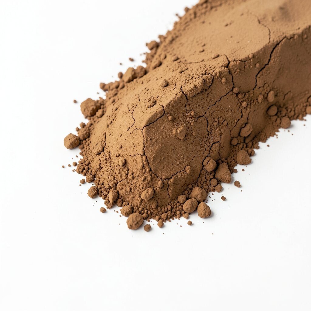
Think of terracotta clay tones set next to clean white space. It feels warm, grounded, and easy to read.
This contrast works especially well for posters, menus, and product pages because white space keeps the layout airy while clay adds personality. You also get a natural, “made on purpose” vibe that fits current design tastes leaning toward organic textures.
To personalize, choose a clay shade that matches your theme, like brick for a bold mood or sand for a calmer one. If cost matters, start with typography and icons in clay while keeping your background white to avoid major redesigns.
3. Deep Navy With Electric Yellow Highlights

Imagine a deep navy canvas with small bursts of electric yellow. The contrast is dramatic, like streetlights cutting through a night sky.
This combination grabs attention fast and makes calls to action feel important without turning your whole design into noise. Yellow accents also create a sense of motion, even on still images, which is great for landing pages and hero banners.
Try limiting yellow to interactive items like links, small badges, or hover states so the navy stays dominant. If you want it to feel more unique, swap yellow for a golden chartreuse depending on your audience mood.
When you want to keep costs low, use a consistent navy background and update only accent colors in your existing templates. Many modern design systems let you change contrast colors in minutes.
4. Monochrome Dark With One Fiery Accent

Choose a mostly monochrome look, like deep charcoal, and add one fiery accent such as vivid orange or hot red. The visual focus becomes instantly clear.
This approach feels sleek and modern, and it helps viewers understand the hierarchy because everything else stays calm. Current trends often favor minimal palettes with controlled punch, especially in app UI and editorial layouts.
5. Emerald Green Over Soft Gray Layers
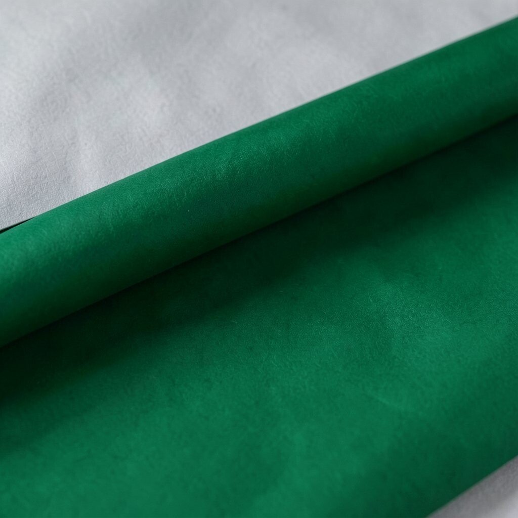
Picture emerald green floating over a soft gray background with layered depth. It looks fresh, balanced, and a little luxurious.
Green and gray contrast gives you a clean, professional feel while keeping the design friendly. Emerald also pairs well with photography, making skin tones and natural textures look richer.
For personalization, test multiple greens, from forest to jewel, and see which one matches your brand story. If you have a tight budget, start by changing only text and button colors and keep your existing layout spacing.
6. Bright Coral With Cool Teal Details
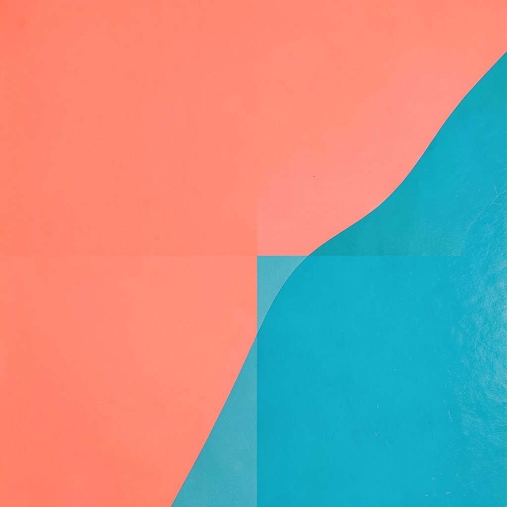
Set a bright coral tone near cool teal accents, like you’re mixing sunset warmth with ocean calm. The colors bounce off each other in a fun, energetic way.
This contrast adds personality while still feeling structured, especially when you keep one color as the main background and the other as highlights. Coral draws attention, and teal helps guide the eye toward details like icons, bullet points, or small captions.
To personalize, choose the coral that matches your mood, then echo it in one repeated element like a line, badge, or border. For cost considerations, try using gradients created from two brand colors in one hero section rather than rebuilding the entire design.
7. Black Typography On a Cream Paper Backdrop
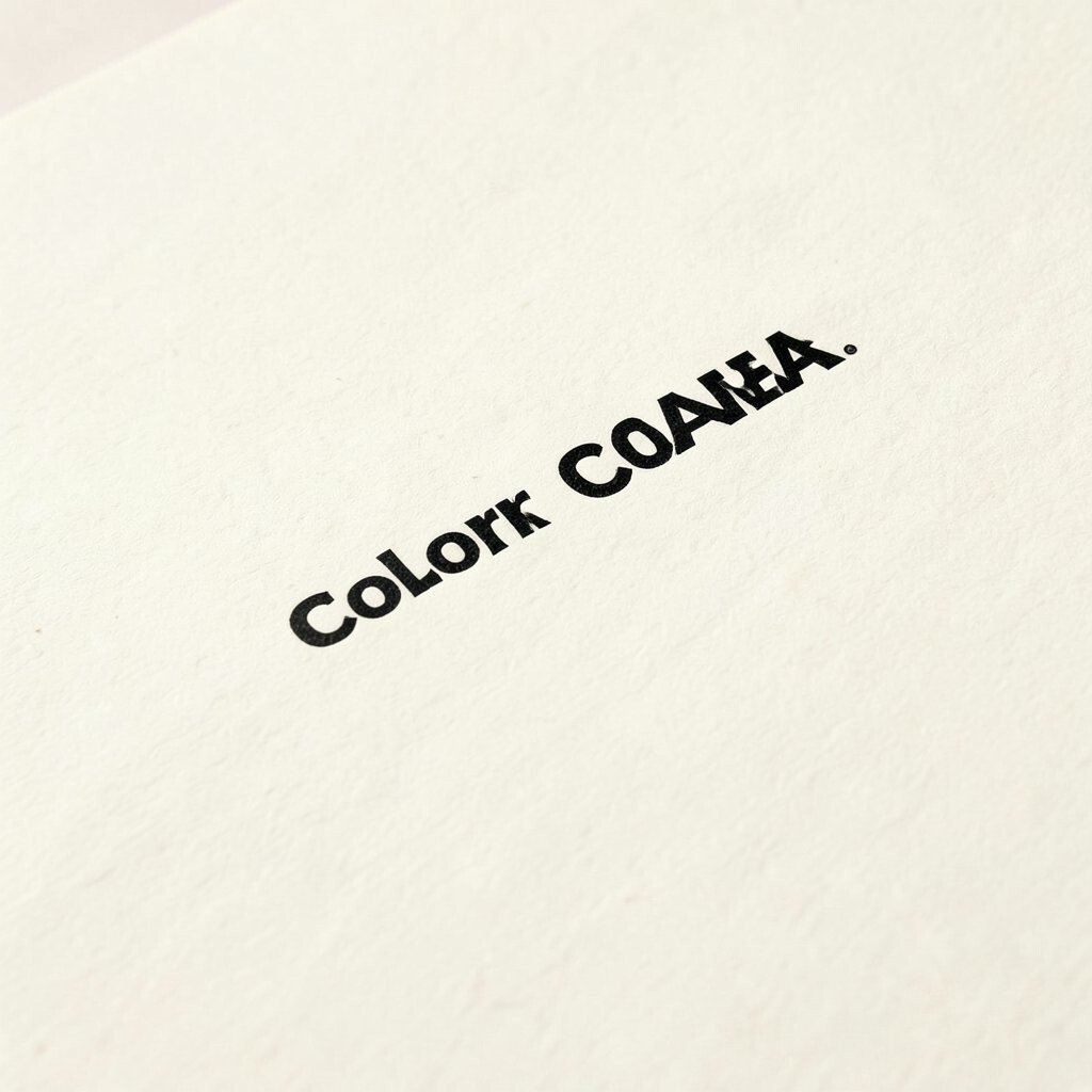
Think of bold black text sitting on a warm cream surface, like reading a premium booklet. It feels classic, confident, and easy on the eyes.
This contrast is great for long-form content because cream reduces harshness compared to pure white. It also looks tasteful in both digital and print, which is handy if you mix channels like social graphics and email newsletters.
For a unique twist, add a small accent color to underline key phrases or highlight quotes. Keep your main palette simple, since the cream and black contrast already does the heavy lifting.
8. Royal Purple With Crisp Mint Spacing
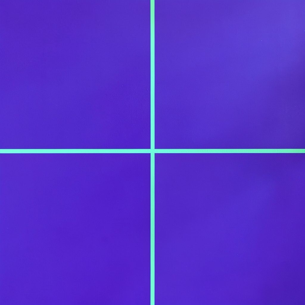
Imagine royal purple blocks separated by mint colored breathing room. The contrast feels creative and fresh, like a gallery wall with a modern twist.
Purple can signal creativity, while mint keeps it light and readable. Using mint as spacing around sections also helps layout clarity, especially for cards, feature lists, and product grids.
9. Steel Blue With Amber Warmth

Picture steel blue dominating a layout, with amber touches like small icons, progress markers, or warning badges. The combo feels trustworthy but still lively.
This contrast creates a strong hierarchy because blue is steady and amber pulls attention. It’s especially useful for dashboards, onboarding screens, and any design that needs both calm structure and noticeable actions.
For personalization, match amber to your “signal” color, such as a brand highlight or a user goal color. If cost is a concern, you can often update only the UI states and keep your existing background assets.
Look for current trends that use muted cool bases with warm interactive elements, since that pattern feels modern and user-friendly.
10. White Space With Neon Pink Framing
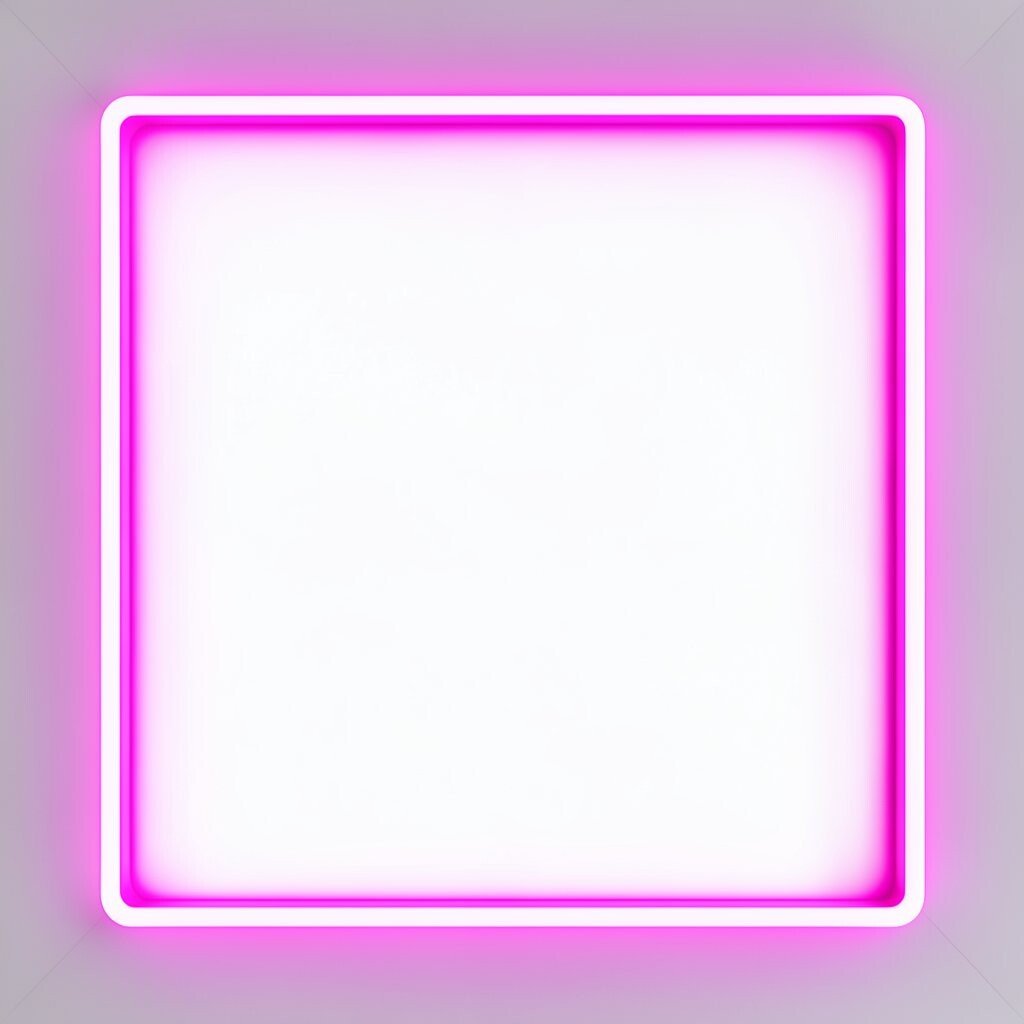
Use lots of white space, then add neon pink frames around images or text boxes. It feels clean, but the pink border adds a party-like energy.
This contrast works well when you want your content to feel premium and airy while still having bold moments. Neon pink framing also makes images feel more intentional, which is great for portfolios and product spotlights.
Personalize by choosing your framing shape, like rounded rectangles, torn-paper edges, or angled stripes. To keep expenses down, apply the frame as a reusable style in your design tool and reuse it across multiple pages.
11. Ochre Mustard Against Soft Lavender
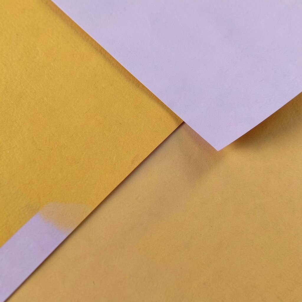
Think of ochre mustard graphics set over soft lavender backgrounds. The warmth and coolness mix creates an inviting, slightly artsy look.
This contrast can boost emotional connection because mustard feels human and energetic, while lavender adds calm. It also looks great with illustrations and pastel photography, which fits the current trend toward gentler, human-friendly visuals.
If you want it to feel more unique, use mustard for small labels and lavender for large background areas. Budget-wise, you can update a handful of key sections first, like your header and main cards, before touching everything else.
12. Magenta Gradients Over Deep Charcoal
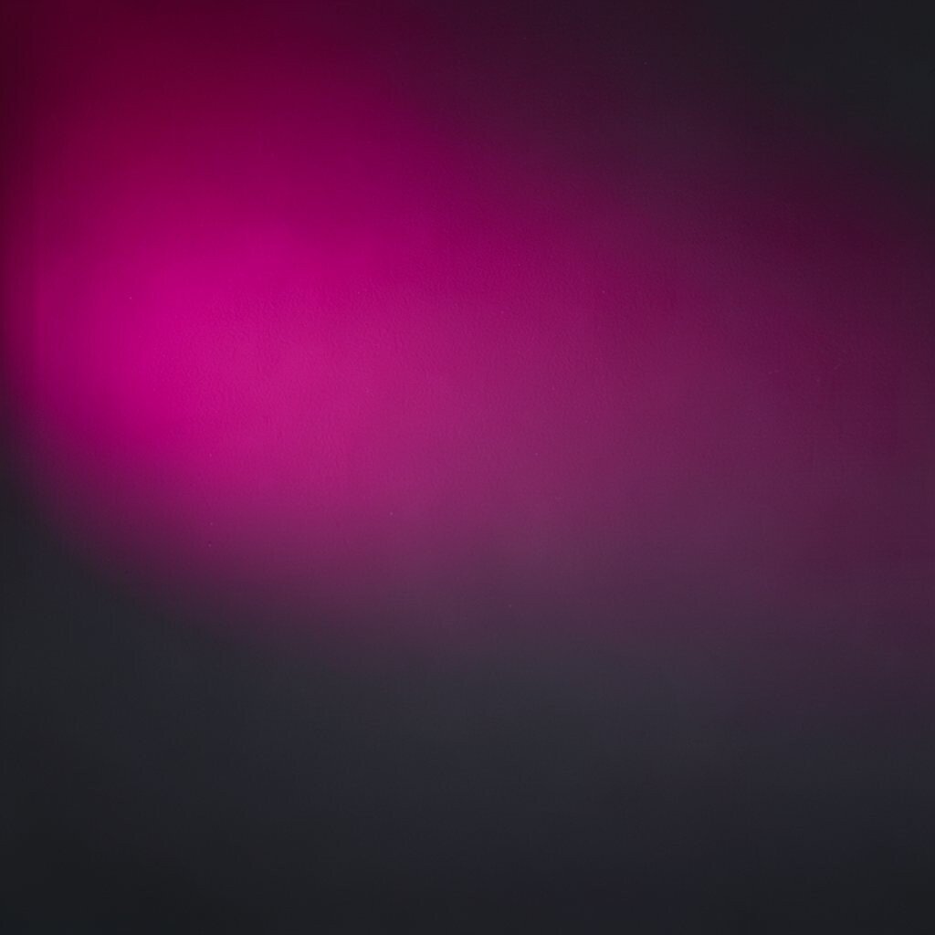
Picture a deep charcoal base with a magenta gradient flowing across a hero image or banner. The contrast feels bold, techy, and full of energy.
Gradients add motion-like depth, and charcoal keeps everything readable. This combo is common in modern brand styles because it works for both entertainment brands and futuristic product pages.
To personalize, rotate the gradient direction or change the magenta shade to match your brand mood, from playful pink to intense fuchsia. If cost matters, use one gradient file across multiple sizes, which saves time and keeps the style consistent.
13. Teal Tiles With Creamy Off-White Highlights
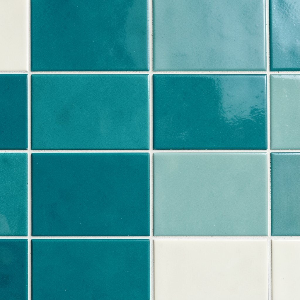
Imagine a grid of teal tiles, with creamy off-white highlights cutting through the pattern. It looks crisp, organized, and visually satisfying.
Tile-based contrast is great for sections like galleries, feature cards, and pricing options because it creates clear structure. The creamy off-white keeps the design warm and helps viewers read text on top of the light elements.
For uniqueness, vary the tile brightness in one row or column, so the pattern feels designed rather than stamped. If you’re keeping costs low, use simple CSS-like blocks in web layouts or repeatable shapes in your editor.
14. Hot Pink Accents On a Dark Olive Base
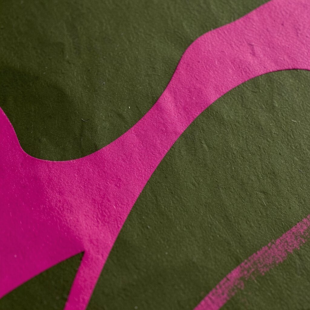
Place hot pink accents on a dark olive background, like neon flowers in a moody garden. The contrast feels bold, unexpected, and memorable.
This pairing is strong because olive grounds the look while hot pink adds a sudden pop. It also offers a fresh alternative to black backgrounds, which many designs already use.
To personalize, pick olive shades that match your brand vibe, from muted sage to deep hunting olive. Cost considerations are manageable since you can keep your layout and switch only the background tone and accent color.
Try using hot pink for tiny details like counters, icons, or hover states so the design stays readable.
15. Bright Lime Text Over Midnight Blue Panels
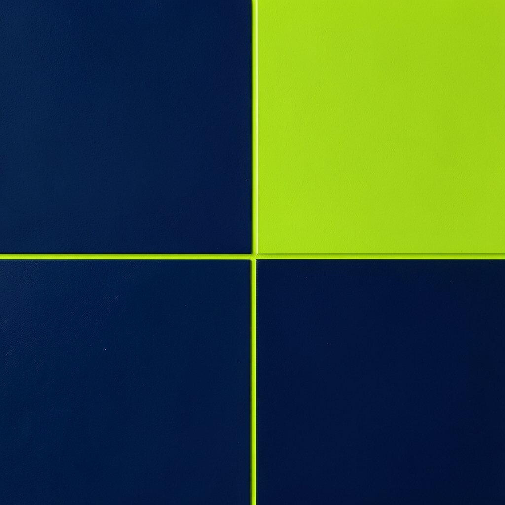
Visualize midnight blue panels with bright lime text standing out sharply. The contrast is loud in the best way, like a sign glowing at night.
Lime on dark blue is highly noticeable, which helps when you need clear navigation, key stats, or standout headings. You also get an energetic feel that suits sports brands, events, and youth-focused products.
For personalization, adjust the lime intensity so it feels closer to your brand, like softer chartreuse for a gentler mood. If cost is a factor, use the same panel color across your site and only update text and icon colors to reduce rework.
16. Color-Blocked Diagonals With Neutral Rebalancing
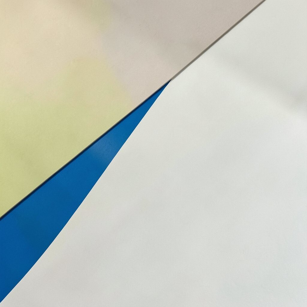
Use diagonals to split two strong colors, then add neutral rebalancing such as light gray or warm beige around the edges. The result feels dynamic, playful, and surprisingly easy to control.
Diagonal blocks create motion and excitement, while neutrals help keep text readable and reduce visual fatigue. This style also matches current trends in bold layouts, especially in hero sections, event promos, and bold packaging graphics.
To make it personal, pick two brand colors for the diagonals and use a third neutral tone for borders, captions, or padding. If you want to manage cost, keep your design reusable by storing diagonal shapes as components and swapping only the colors.
Try testing on multiple devices so you can see how contrast holds up in smaller spaces, then fine-tune the neutral balance until it feels just right.