
Fabric swatches can turn a plain wall into something warm and full of character. They bring color, texture, and a handmade feel that framed prints often cannot match.
A gallery wall made from swatches also feels personal and fresh. It can be bold, calm, playful, or elegant, depending on the fabrics you choose.
1. Mix Soft Neutrals for a Calm Hallway Look
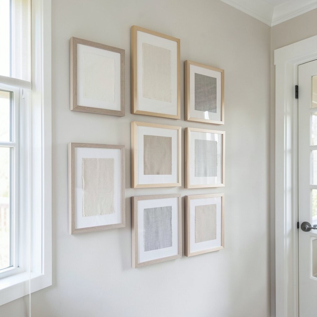
Soft beige, cream, taupe, and gray swatches make a gallery wall feel quiet and cozy. When each piece is framed with a simple mat, the wall looks neat and polished.
This style works well in hallways, bedrooms, and reading corners because it does not shout for attention. It is also easy on the budget since neutral fabric scraps and basic frames are often affordable.
2. Build a Bold Color Block Wall in the Living Room

Bright swatches in red, blue, gold, and green can create a lively wall that feels full of energy. The framed pieces look like tiny art squares when arranged in a clean grid.
This idea is great for people who love color but do not want to paint the whole room. You can keep costs low by using leftover fabric samples from craft stores, upholstery shops, or old projects.
For a more modern look, use matching black frames and leave equal space between each piece. If you want a personal touch, pick colors that match your pillows, rug, or favorite chair.
3. Create a Theme Around One Fabric Family
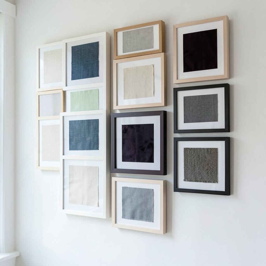
A wall made from swatches in the same fabric family can look calm and smart. Think of linen in many shades, velvet in deep tones, or cotton prints with a shared style.
This kind of wall feels special because it shows small changes in texture and color. It is a nice way to make a room feel planned without being too perfect.
Try arranging the frames from light to dark or from smooth to textured. That simple order can make the wall feel more stylish and current.
If you are watching your spending, ask fabric stores for sample cards or remnant pieces. These are often low cost and sometimes free, which makes the project even more fun.
4. Use Vintage Swatches for a Cozy Storybook Wall
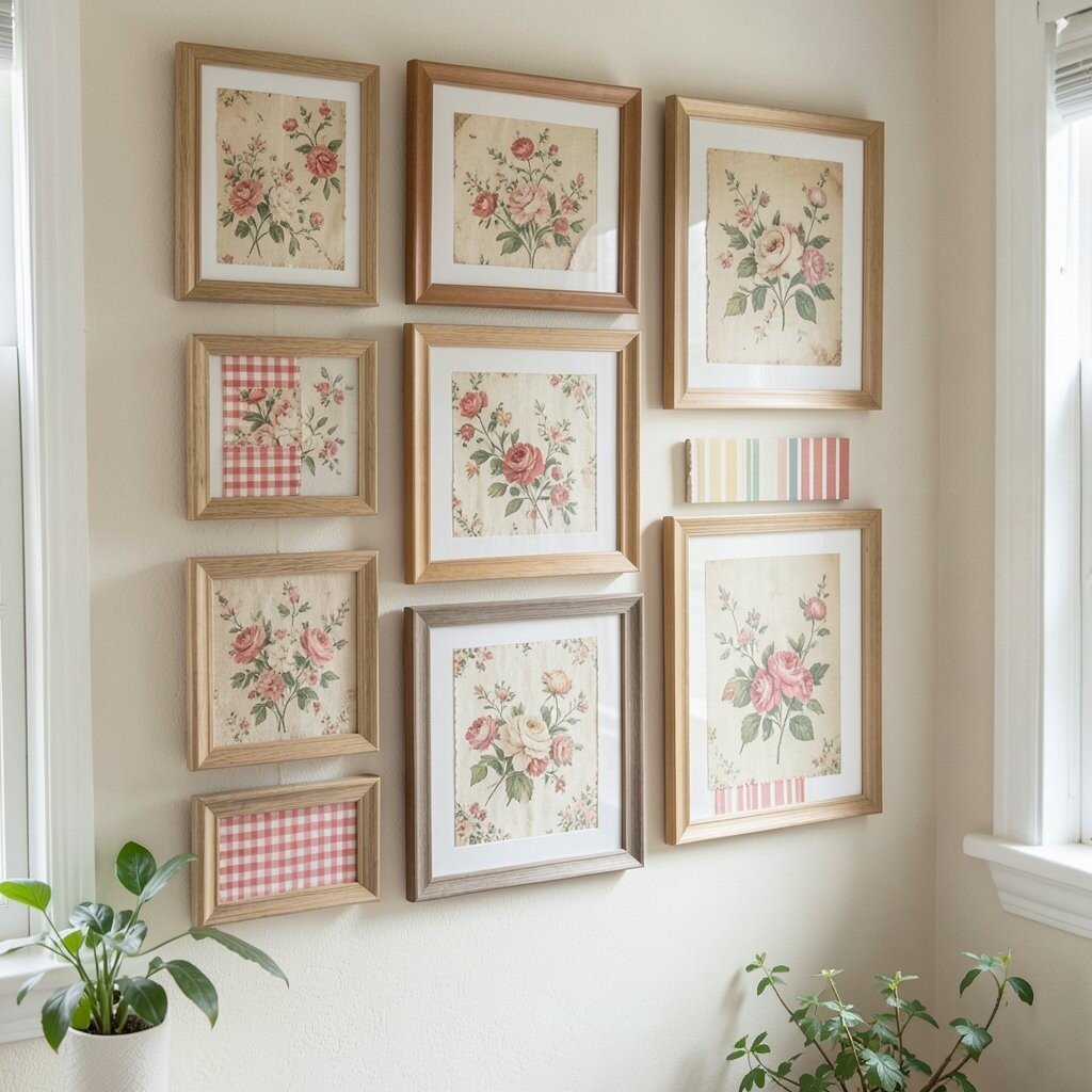
Old fabric swatches with faded florals, tiny checks, or classic stripes can bring a sweet vintage mood. Framed on the wall, they look like little keepsakes from another time.
This style adds charm to bedrooms, nurseries, and cottage-style homes. It feels unique because no two worn swatches age in exactly the same way.
5. Make a Grid Wall with Matching Frames
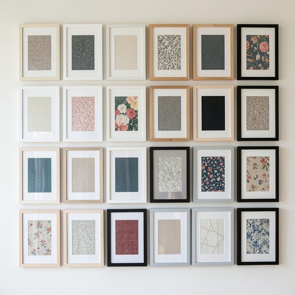
A clean grid can make framed swatches look sharp and modern. The repeated shape gives the wall a neat rhythm, while the fabric keeps it from feeling cold.
This is a smart choice for people who like order and easy styling. It also helps small swatches feel more important because each one gets its own space.
Choose frames in one finish, like white, wood, or matte black, to keep the look steady. If you want a trendy touch, use wide mats so the fabric looks like it belongs in a gallery.
6. Try Asymmetrical Placement for an Artsy Feel
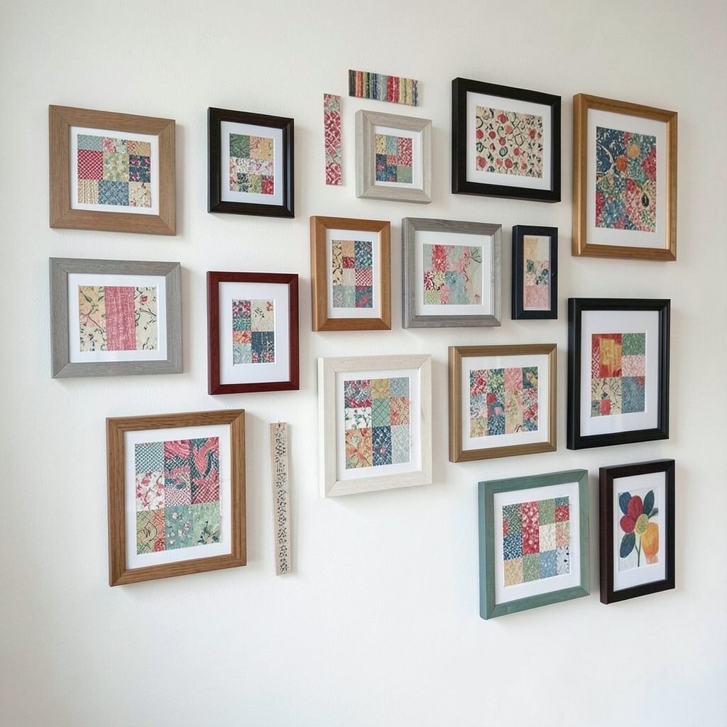
An uneven layout can make a swatch wall feel relaxed and creative. Different frame sizes and shapes give the whole display a lively, handmade look.
This style is great for people who do not want a stiff or formal wall. It lets you use odd pieces, like tiny samples or long strips, without worry.
To keep it from feeling messy, repeat a few colors or textures across the wall. That small trick helps the eye move around the display in a pleasant way.
You can save money by mixing thrifted frames with new ones. Spray paint can help them match if the styles are different.
7. Highlight Texture with Thick Fabrics and Deep Frames
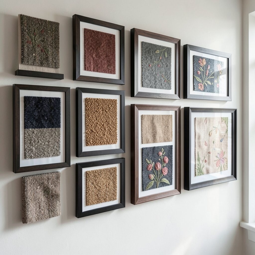
Swatches made from tweed, boucle, wool, or embroidered cloth can look rich and full of life. Deep frames give these fabrics room to stand out and cast soft shadows.
This idea feels fancy without needing expensive art. It works especially well in rooms that need warmth, like dens, offices, and winter living spaces.
8. Arrange Swatches by Color Family for a Rainbow Effect
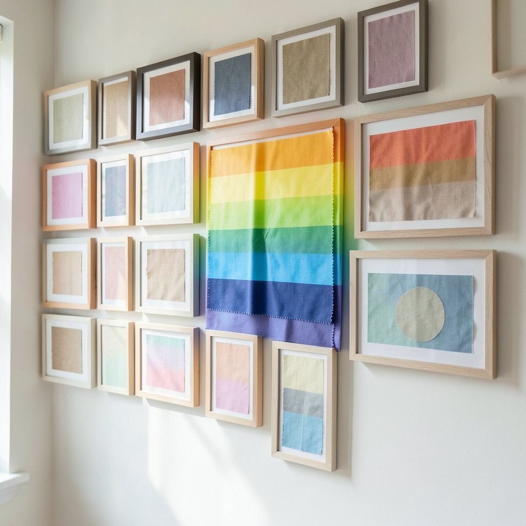
When fabric swatches move from one color family to the next, the wall feels cheerful and smooth. It can look like a soft rainbow made from cloth instead of paint.
This style is eye-catching and easy to personalize. You can make it bright and playful or keep it gentle with dusty shades and muted tones.
It is a good way to use many leftover samples at once, which can help keep costs down. A simple frame style works best so the colors stay in the spotlight.
For a current look, try blending earthy tones with a few clear accent colors. That mix feels fresh and still friendly.
9. Pair Fabric Swatches with Small Labels or Notes
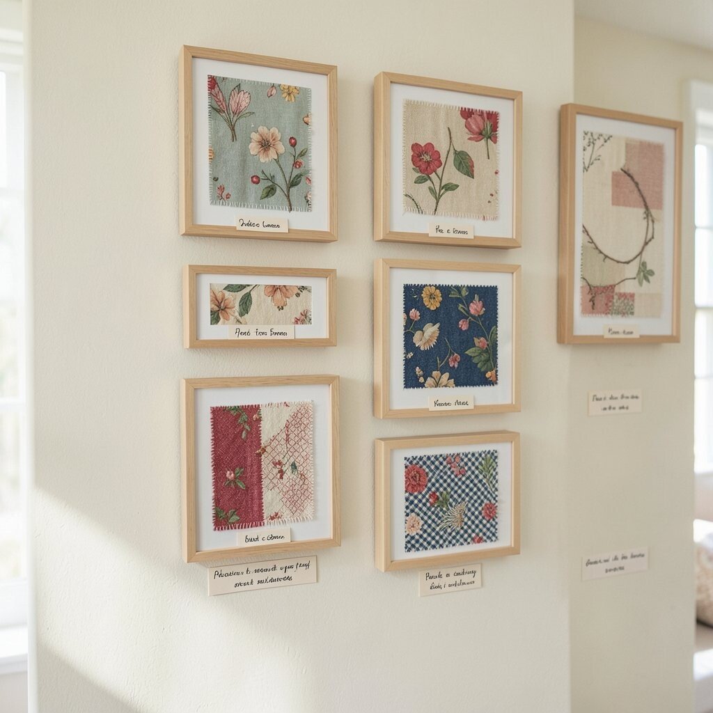
Adding tiny labels under each swatch can make the wall feel thoughtful and useful. You might write the fabric name, the place it came from, or a short memory tied to it.
This idea works well in craft rooms, sewing spaces, and home offices. It gives the wall a personal story that guests will want to read.
Labels can be printed, handwritten, or even stamped for a handmade feel. If you want a cleaner look, keep the text small and use simple paper cards.
10. Make a Dark and Moody Accent Wall
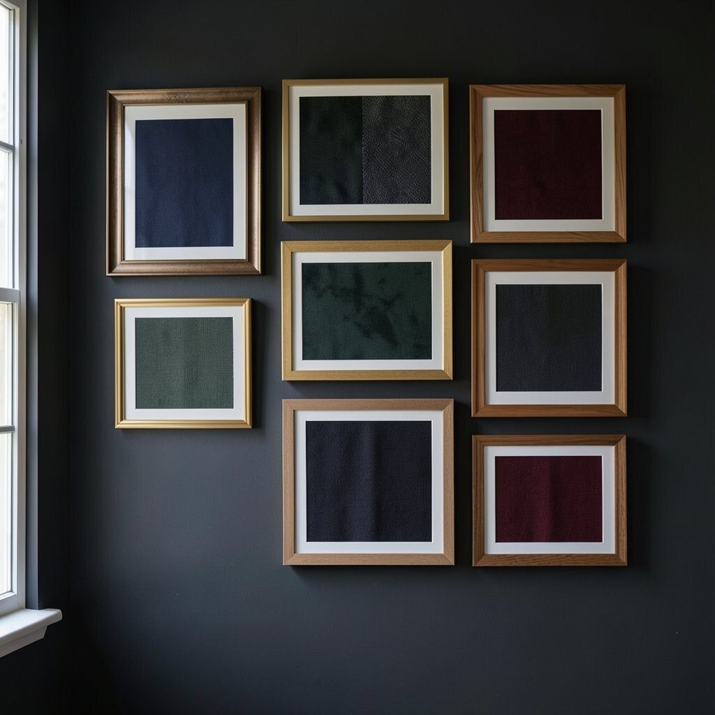
Deep navy, forest green, charcoal, and burgundy swatches can create a rich and cozy mood. Framed together, they look strong and elegant without needing bright colors.
This style is perfect for rooms that need a little drama. It can also make light-colored furniture and walls stand out more.
Dark fabrics often show texture in a lovely way, so even simple materials can look special. To save money, use sample pieces from upholstery projects or curtain leftovers.
Gold or brass frames can add a modern touch and make the display feel more polished. If you want a softer mood, try wood frames with warm tones.
11. Use a Mix of Patterned and Solid Swatches
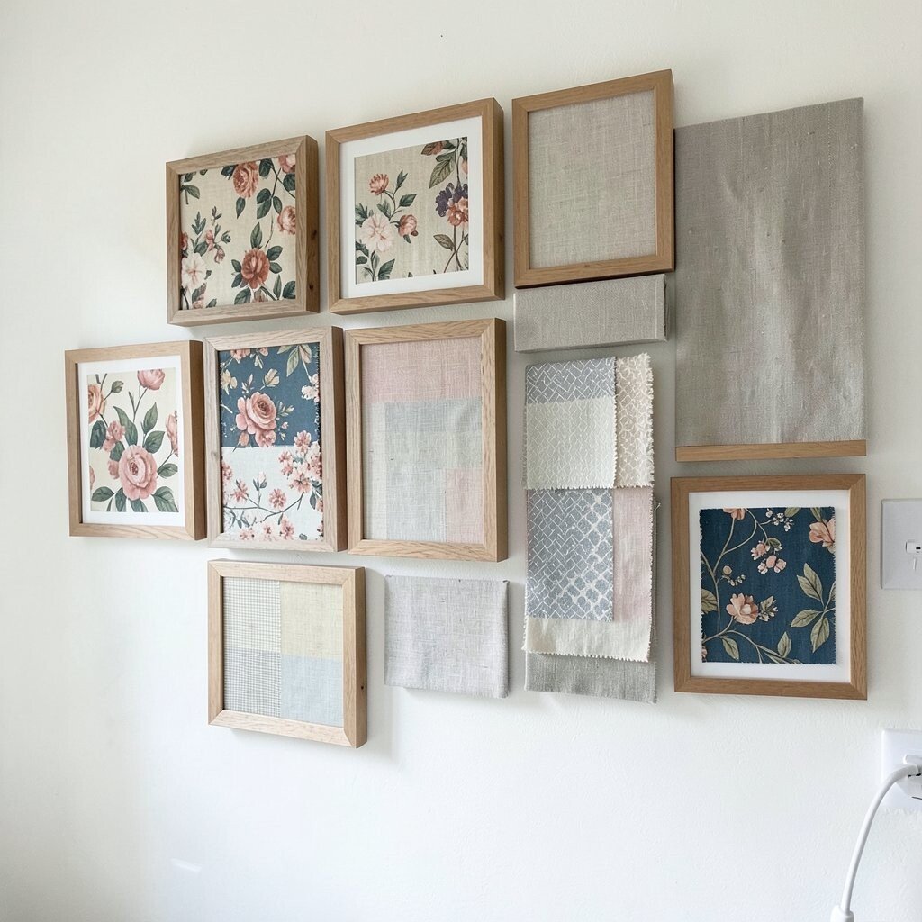
Patterns and solids together can make a gallery wall feel balanced and full of motion. A floral swatch next to a plain linen square can create a nice visual break.
This mix is helpful if you have many different samples and want them to work together. It also gives you more room to show your style without making the wall too busy.
Try repeating one pattern color in the solid pieces so the wall feels tied together. That simple move makes the whole arrangement look more planned.
12. Frame Large Swatches as Statement Pieces
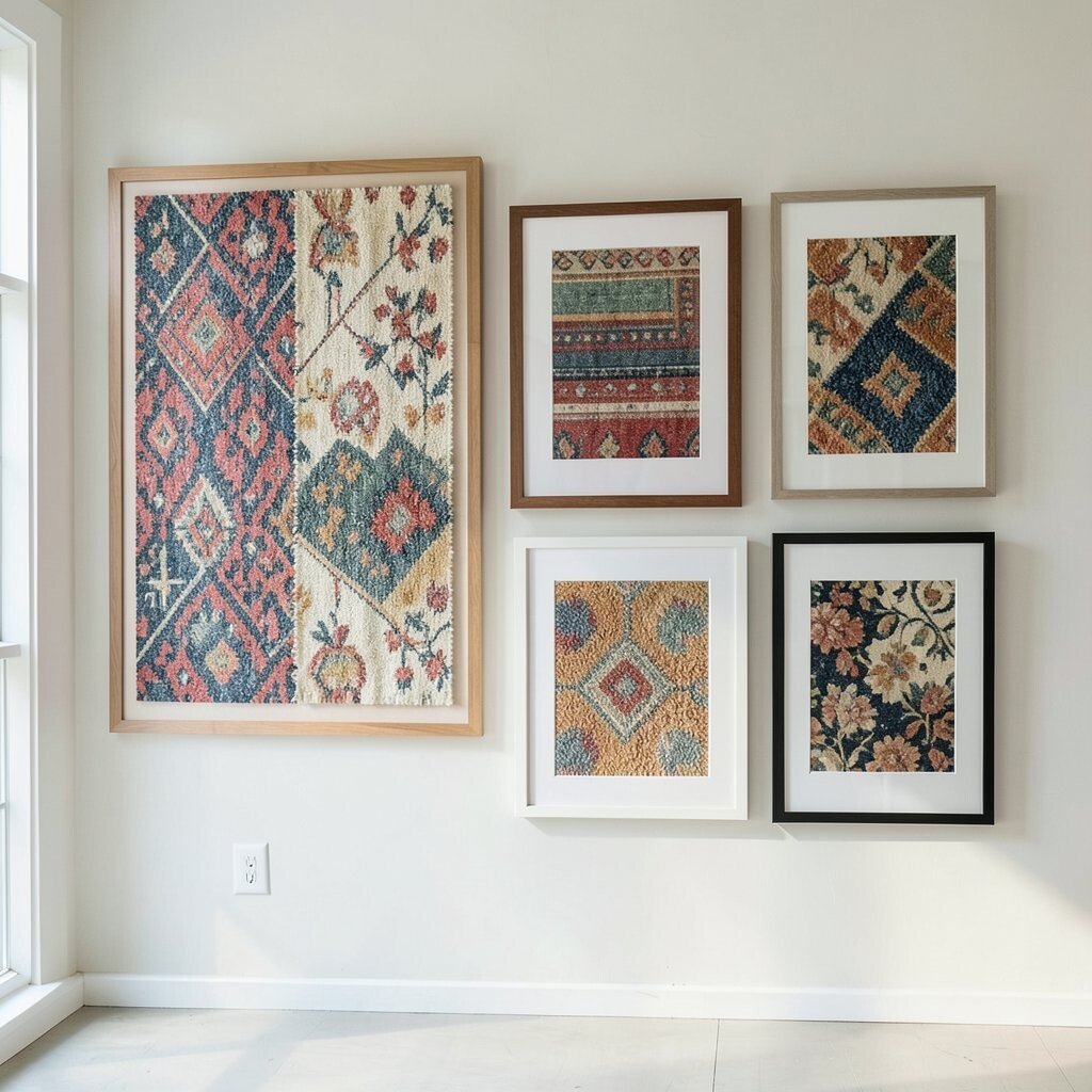
Big swatches can act like art on their own, especially when the fabric has a strong print or rich weave. One large framed piece can anchor a wall and set the tone for the room.
This is a smart choice if you want impact without filling every inch of the wall. It can also be easier on the budget because you need fewer frames and fewer samples.
Hang a few large pieces with wide spacing so each one can breathe. If you like a more current style, choose oversized mats and simple frames for a clean finish.
Personalize the look by picking fabrics from places that matter to you, like a favorite trip, family home, or special project. That extra meaning makes the wall feel one of a kind.
13. Create a Rotating Swatch Wall That Changes with the Seasons
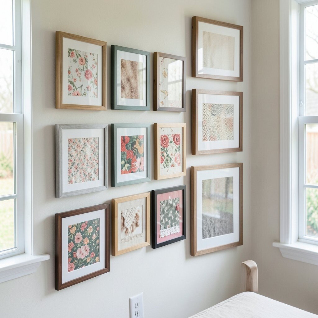
A rotating swatch wall keeps your room feeling fresh all year long. You can swap in light cottons for warm months and cozy wool or velvet for cooler days.
This idea is fun because the wall never feels stuck. It also lets you use more of your fabric stash over time, which is great for saving money and reducing waste.
Use frames with easy-open backs so changing the swatches is quick. If you want a personal touch, match the fabrics to holidays, family events, or your mood for the season.