There’s something magic about color that feels like light. Abstract canvas art can make a room feel softer, fresher, and more you.
Even a small change in wall art can nudge your mood in a good direction. Below are practical ideas you can use right away, with plenty of ways to personalize them.
1. Color-Drift Waves That Feel Like Morning Sun
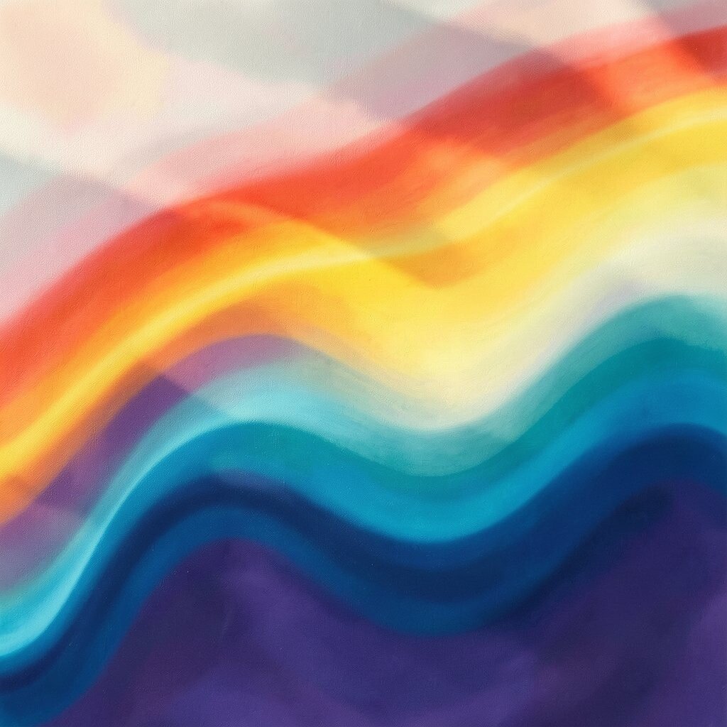
Picture loose swirls of warm peach, pale gold, and creamy white moving across a canvas like gentle tidewater. The look can make a blank corner feel brighter without shouting.
Choose a size that fits your wall like a window, not a billboard. For a clean glow, match one color from the painting to a throw blanket or vase so your space feels pulled together.
To personalize it, add a tiny anchor color from your room, like muted terracotta or soft coral, so the canvas connects to everyday life.
2. Minimal Line Abstractions for an Airy, Calm Look
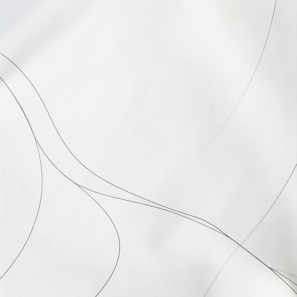
Think of thin ink-like strokes floating over a light background. The empty space around the lines helps your room breathe.
Pick a neutral palette such as soft gray, ivory, and charcoal for a modern vibe that still feels cozy. If you have busy furniture, minimal canvas imagery keeps the visual noise low.
For practical styling, hang it at eye level and keep it centered above a console or chair. When you want personalization on a budget, choose a print-on-canvas version with the same line style, then add a matching frame for a custom feel.
3. Bold Geometric Blocks That Add Friendly Energy
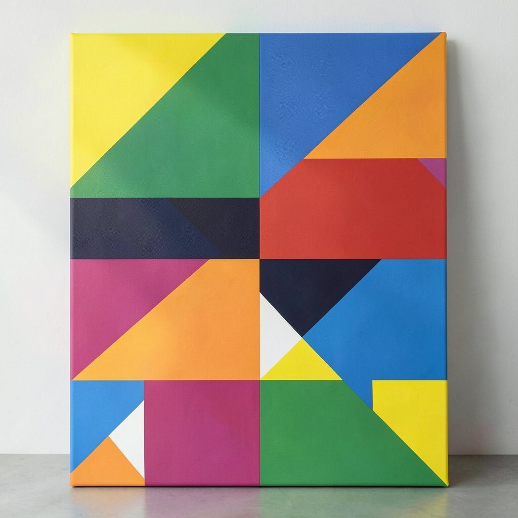
Imagine playful squares and angled shapes layered like friendly building blocks. Even with a simple design, the contrast makes your wall feel lively.
Go for a limited set of colors, like cobalt, mustard, and white, so the geometry stays fun instead of chaotic. This works especially well in entryways because it creates an upbeat first impression.
To make it practical, measure the wall and choose a canvas width that leaves breathing room on both sides. If you’re cost-conscious, look for poster-sized canvases and stretch them into frames, or choose ready-to-hang art with thick texture.
For personalization, add your own meaning by selecting shapes that match your interests, like triangles for adventure or circles for togetherness.
4. Earthy Terrain Textures That Ground the Room
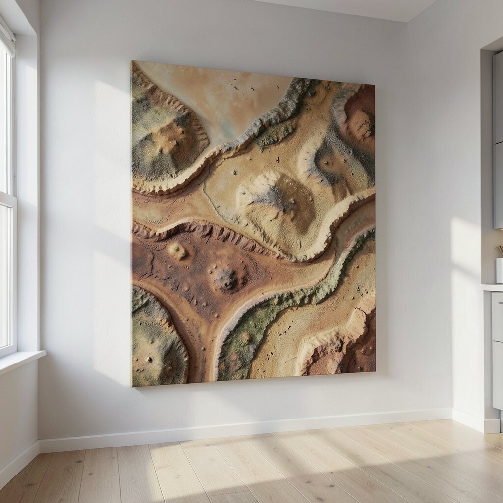
Picture rolling landscapes created with sandy tones, mossy greens, and warm browns. The surface texture can look almost like dry brush or sculpted paint.
This kind of abstract canvas imagery brings a calm, grounded feeling that works well in bedrooms and reading corners. It pairs nicely with natural materials like wood, linen, and rattan.
To keep it from feeling heavy, balance the earthy colors with light bedding or bright lampshades. If you want a practical upgrade without spending much, search for canvases that already have texture and choose a matte varnish so glare stays low.
5. Ocean-Ink Swirls for a Cool, Soothing Mood
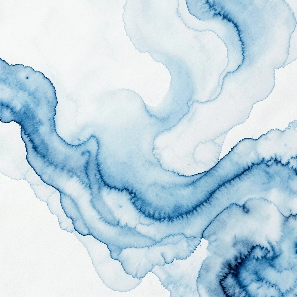
Think of indigo, seafoam, and ink-dark strokes that spiral like water currents. The painting can make your space feel cooler, even on hot days.
Pick soft gradients rather than harsh stripes if you want a soothing effect. This imagery is great for bathrooms, studios, and any room where you want the pace to slow down.
To personalize it, mirror the direction of the swirl with your décor lines, like orienting a rug pattern or curtain folds to match. For cost considerations, consider a smaller canvas cluster so you get the look of motion without committing to a large single purchase.
6. Sunset Ombre Fields That Glow After Dark

Imagine a smooth ombre that moves from rosy pink to warm orange and then into muted cream. It’s the kind of gradient that looks like the last bit of sunset hanging in the air.
Choose warmer tones if your room is cool and gray, because the color will add comfort and warmth. Place it where evening light hits, like near a window, to make the art feel extra alive.
For practical tips, keep other colors simple so the canvas remains the star. If you want to save money, buy a medium size canvas print and spend on a high-quality frame, since a good frame elevates everything.
7. Collage-Like Abstract Layers for a Playful Story
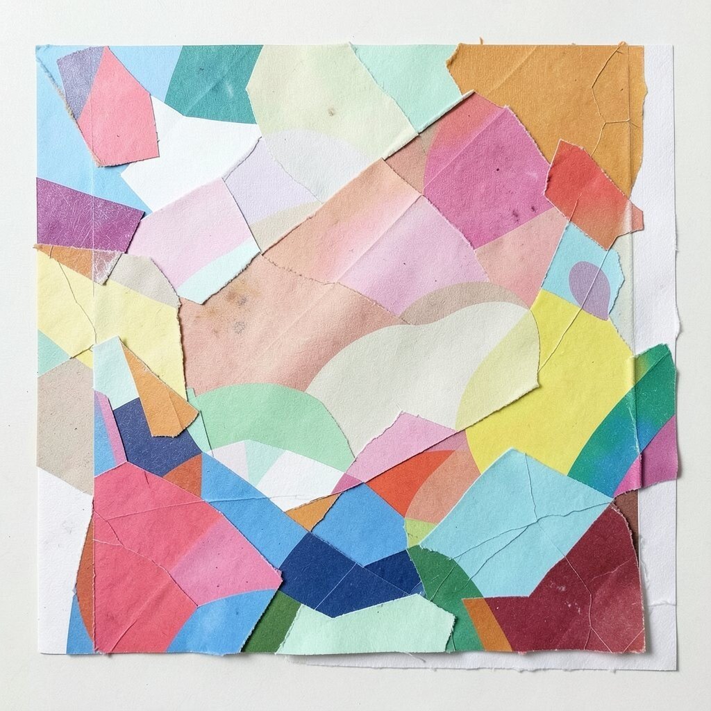
Think of torn-paper textures, magazine-like shapes, and paint drips arranged into one cohesive design. The result feels handmade and full of tiny surprises.
This style adds personality fast, especially in rooms that feel a little too neat. It also helps hide small wall imperfections because the visual layers give your eye something to focus on.
To personalize it, match the art’s dominant colors to your room’s main textiles, like your couch cushions or curtains. If you’re creative, you can even add a small custom detail, such as a brushed-on dot in your favorite color, and seal it properly.
8. High-Contrast Black and Cream for Modern Drama
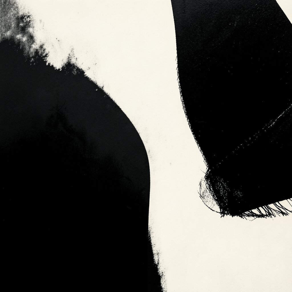
Picture bold swirls or thick strokes that stand out against a light background. Black and cream abstract canvas imagery brings instant structure and modern flair.
This works well when you have lots of patterns, because the artwork adds contrast without adding too many competing colors. Use it to frame a clean layout, like a sofa against a simple wall.
For practical styling, pair it with warm lighting, like a soft lamp with a yellow bulb, to keep the look cozy. If cost is a factor, choose a canvas with a limited color palette, since simple designs often have more affordable options.
To personalize, pick the artwork that feels like your favorite music mood, then bring in one accent color from the painting through décor.
9. Soft Pastel Blends for a Light, Cozy Feel
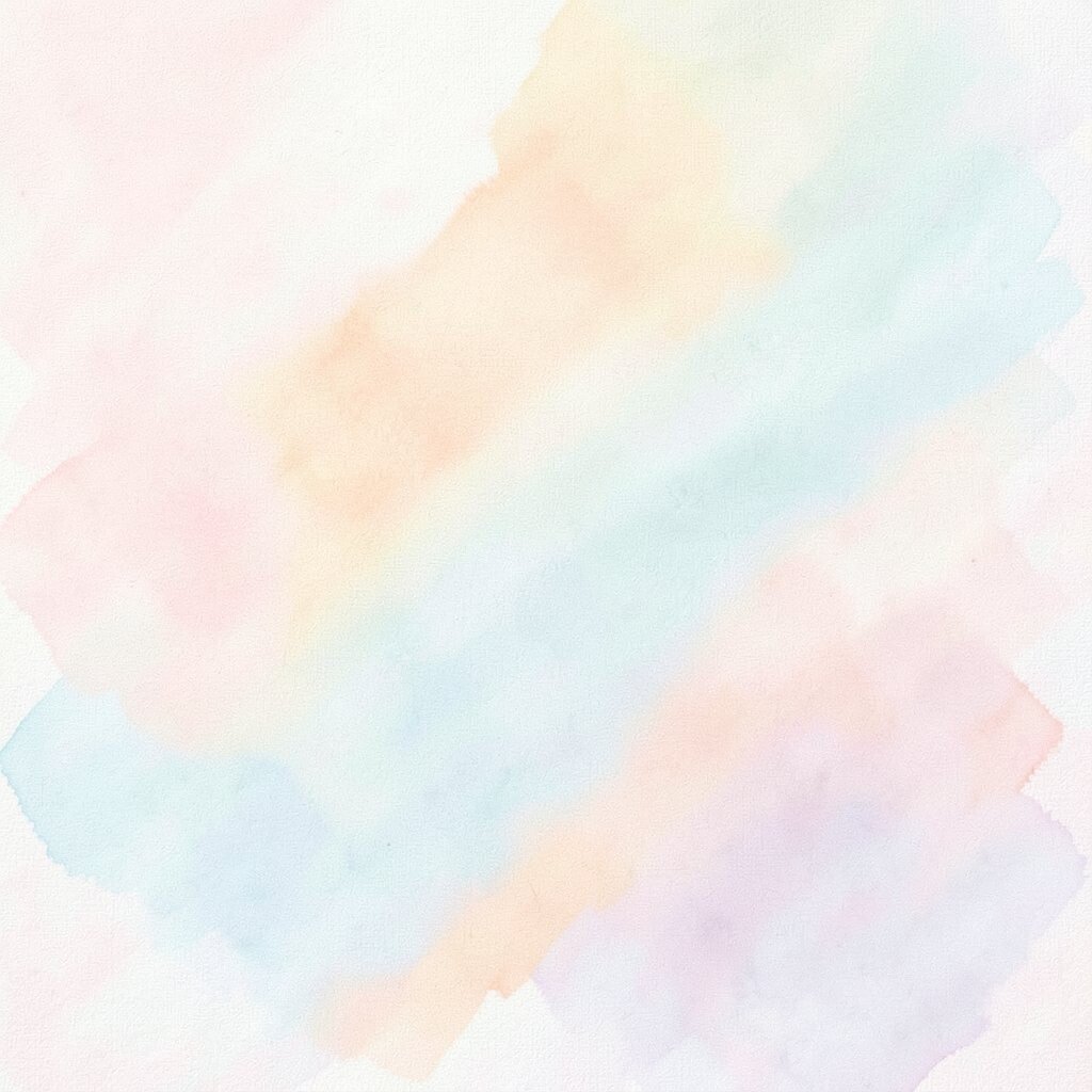
Imagine lavender, powder blue, and pale peach fading into each other like cotton candy clouds. This kind of abstract art creates gentle energy that still looks stylish.
Pastels are great for brightening small rooms because they reflect light and keep the space feeling open. They also pair beautifully with white walls and light wood floors.
For a practical approach, choose a canvas with a clear focal area, so your eyes know where to rest. If you want personalization without heavy spending, mix pastel art with textured décor like knit throws and ceramic vases for depth.
10. Color-Splatter Motion for an Artsy, Youthful Pop
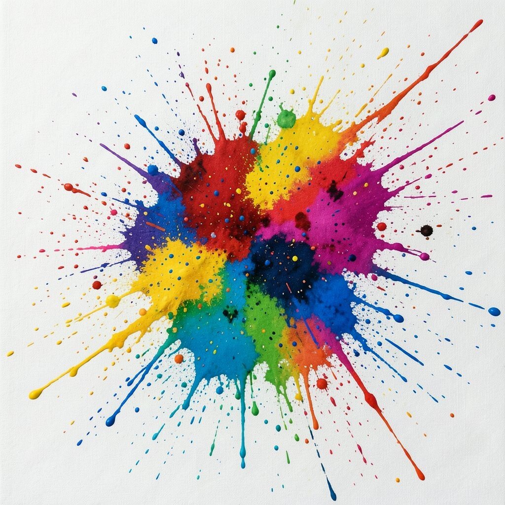
Picture paint splashes and dotted drips that look like energy frozen in time. The movement feels playful, like a creative burst across the wall.
This style brightens spaces that need more fun, especially home offices and kids’ rooms. It can also make a plain wall feel less empty and more expressive.
To keep it practical, match the splatter colors to items you already own, such as your rug or chair fabric. For cost considerations, smaller canvases grouped together can create a big effect without spending on one massive piece.
11. Symmetry Meets Abstract for Order Without Boredom
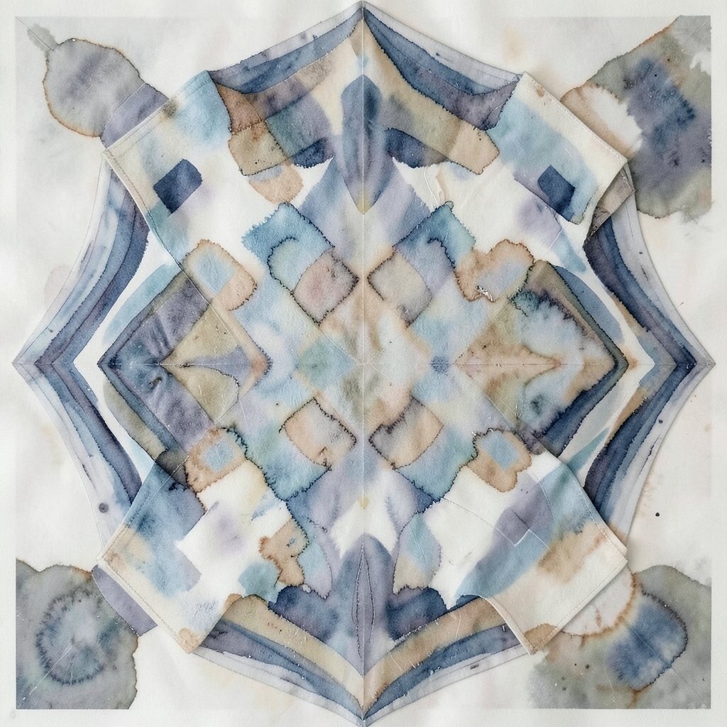
Think of mirrored shapes and balanced color blocks, like a calm design that still feels artistic. Symmetry gives structure, while abstract styling keeps it interesting.
This helps the room feel more organized, especially in spaces with mixed furniture styles. If your décor feels “almost right,” symmetry often fixes the missing piece.
Try hanging it above a bed, mantel, or dining table so the alignment works with your layout. For personalization, add one accent that repeats elsewhere, like a cushion in the same color family, so the whole room feels intentional.
If you’re budget-minded, consider a canvas with a simple symmetrical print, then upgrade the hardware for an extra clean look.
12. Botanical-Inspired Abstracts for Fresh, Gentle Life
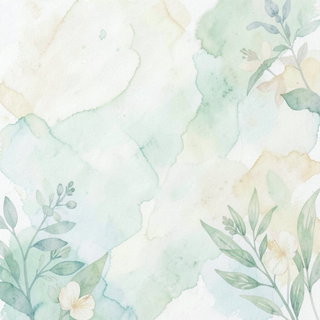
Imagine abstract leaves suggested through curved strokes and layered greens, yellows, and warm neutrals. It feels like nature’s calm without getting too literal.
These canvases brighten your home by adding a fresh color rhythm, especially in rooms that lack plants. They also blend well with farmhouse, modern, and coastal décor.
For practical tips, place one near natural light so the greens look vibrant. To personalize, choose a palette that matches your favorite plant, like sage for calm or bright lime for cheerful energy.
13. Night-Sky Hues That Feel Cozy and Dreamy
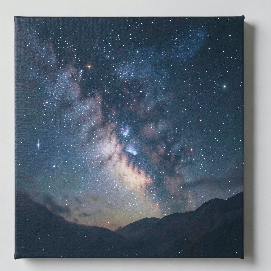
Picture deep navy, starry gray, and soft violet blended in a swirling pattern. Even though it uses darker shades, it often feels comforting and bright because of the glowing tones.
This kind of abstract canvas imagery is great for bedrooms and reading nooks, where you want a dreamy atmosphere. It pairs well with warm lights, textured bedding, and metallic accents like brushed gold.
To make it practical, avoid overly small artwork in dark spaces, since it can disappear from view. If cost is a concern, look for canvases with subtle texture, since the surface detail makes even affordable prints feel richer.
14. Retro Color Spirals That Bring Nostalgia
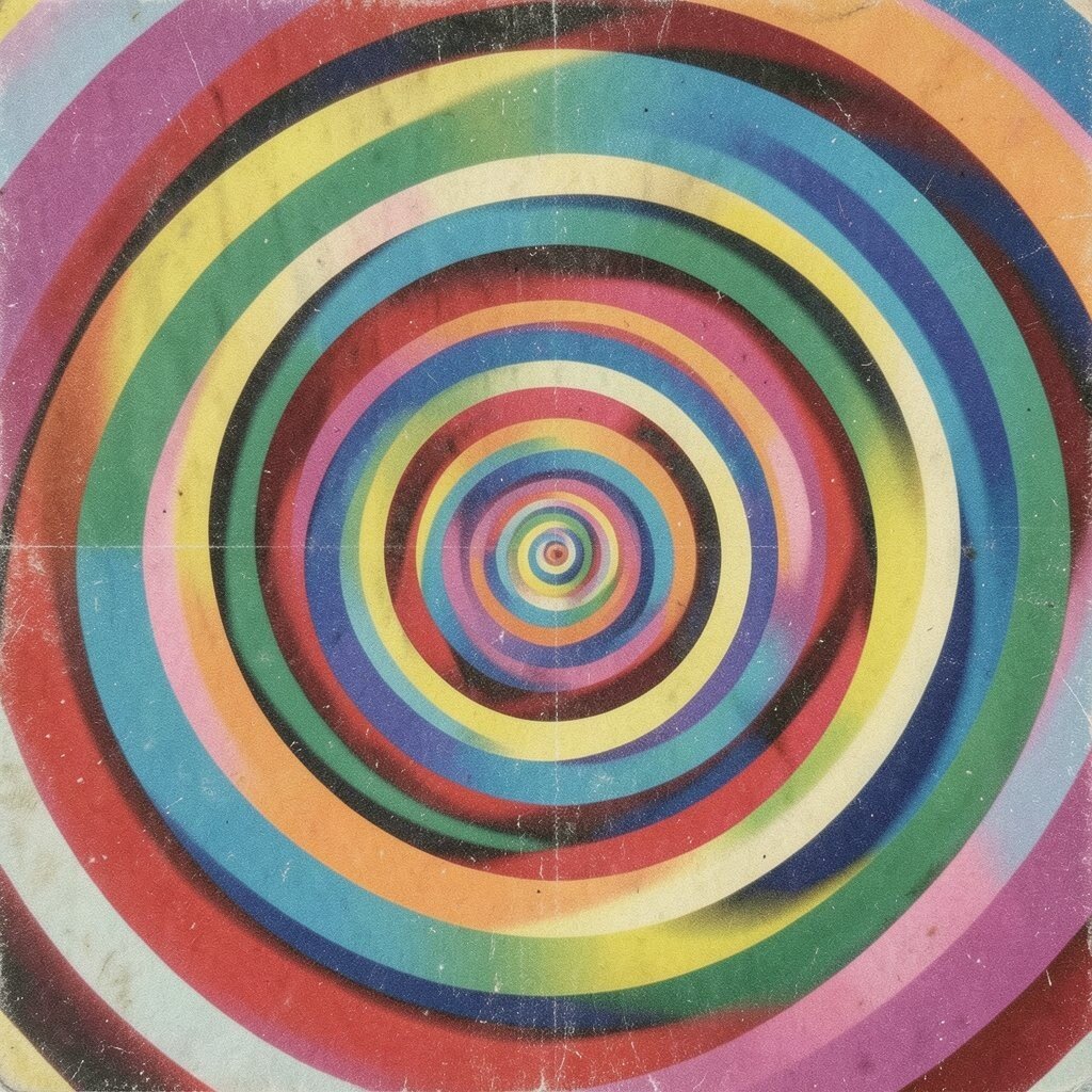
Think of winding curves and bold bands that nod to vintage posters and mid-century design. The vibe feels playful and bright, like a warm memory on your wall.
This style stands out in modern rooms because it adds a pop of personality. It also works well in hallways since the eye naturally follows the spiral.
For personalization, choose a color palette that echoes your kitchen or living room accents, like teal, burnt orange, or sunny yellow. If you want to control spending, buy one larger statement piece rather than several small ones that can quickly add up.
To keep it looking intentional, keep your frame simple and let the colors do the talking.
15. Soft Watercolor Veils for Effortless Elegance
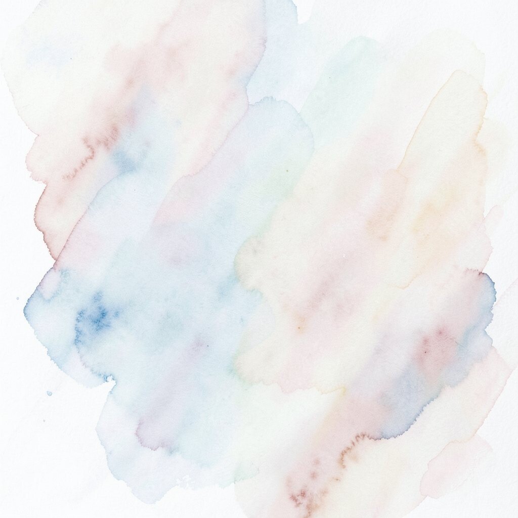
Imagine translucent washes of color, like watercolor caught mid-air. The edges blur and blend, creating a gentle, elegant look.
This style is ideal for spaces that need softness, such as nurseries, bedrooms, and quiet living rooms. It can also make hard furniture feel more relaxed by adding organic shapes.
For practical tips, choose a canvas with enough contrast so the design stays visible from across the room. If you’re cost-conscious, consider smaller formats and place them where they’re truly seen, like beside a reading lamp or on a narrow wall.
16. Metallic Glimmer Accents for a Luxe Lift
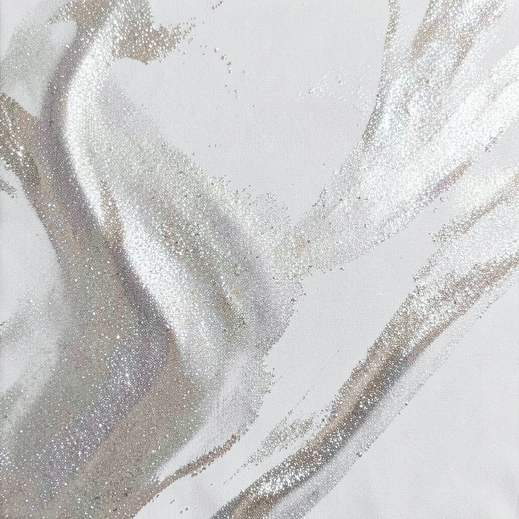
Picture abstract brush strokes with subtle metallic highlights, like copper, champagne, or silver catching light. The shimmer can make even a simple room feel polished.
This is a great choice for dining areas and entryways because it catches your lighting and creates small moments of sparkle. Just be mindful to balance metallic tones with matte décor so the space doesn’t feel too shiny.
To personalize, match the metal tone to your existing hardware, like brass or chrome. For cost considerations, you can often find budget-friendly canvases with printed metallic effects, and you can also add real metallic accents with a careful seal if you enjoy DIY.
Keep the artwork clean and dust-free so the highlights look crisp over time.
17. Monochrome Abstract Frames for Quiet Sophistication
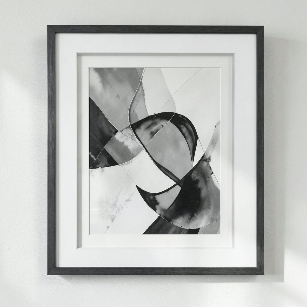
Imagine variations of one color family, like different shades of blue or gray, arranged into abstract forms. The look feels calm, modern, and quietly confident.
Monochrome art brightens your space by creating harmony, which makes every other element feel more intentional. It’s also super practical if you have many colors in your décor, because you won’t add extra competition.
For personalization, choose the exact shade that matches your favorite item, like a cushion or ceramic mug color. If you’re watching the budget, opt for a canvas with a strong texture, because surface detail makes monochrome art look more expensive even when it isn’t.
Hang it in a spot where natural light touches it, so the subtle differences show up throughout the day.