The air is softer, and the colors feel warmer. Your home can wear that feeling too.
1. Burnished Sienna Drapes
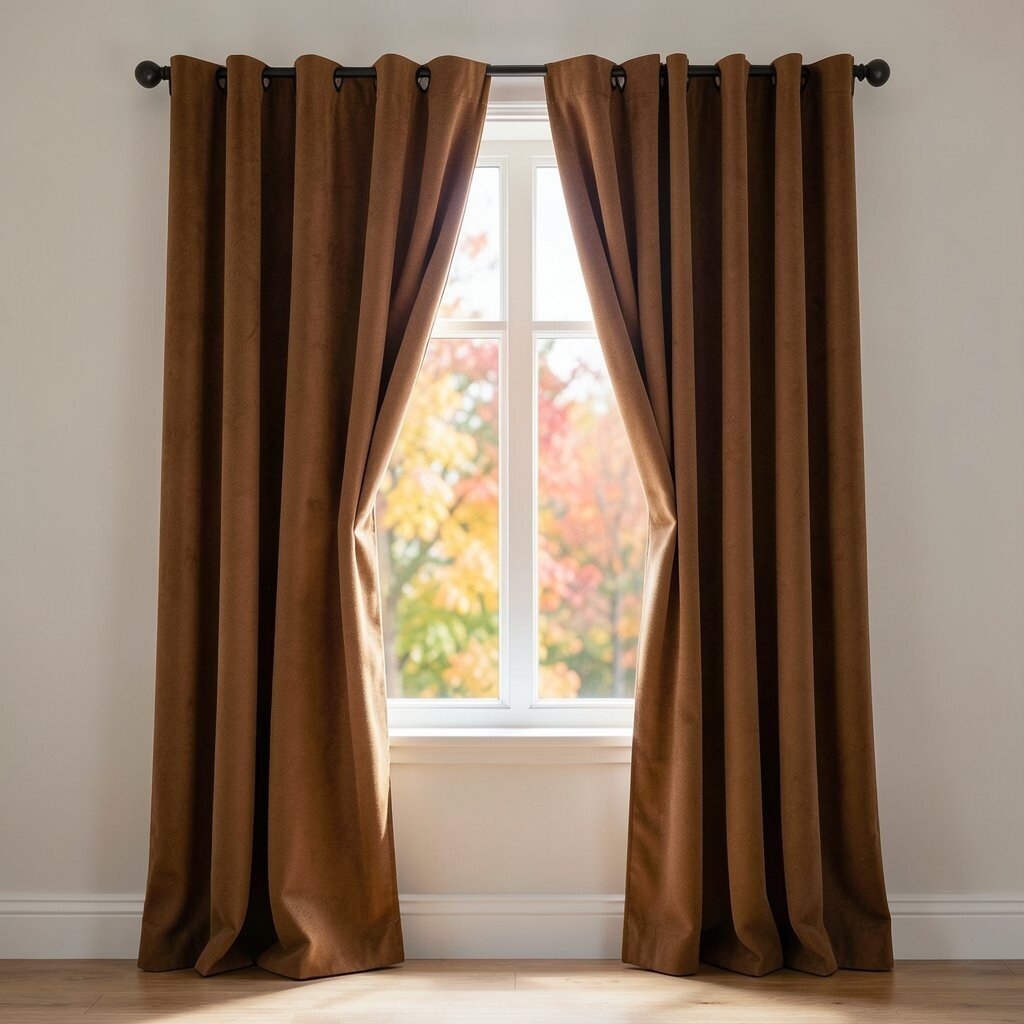
Burnished sienna looks like sunset light that found fabric. It brings instant warmth to a room that feels too plain or too cool.
Choose sheer panels for a gentle glow, or go heavier for a cozy, grounded feel. Pair the color with cream bedding, light oak furniture, and brass picture frames for a balanced look. For easy personalization, swap curtain tiebacks seasonally using ribbon in rust, caramel, or deep clay.
2. Cranberry Velvet Accents
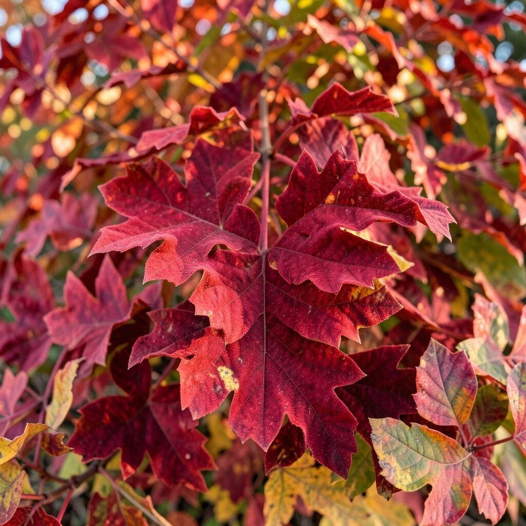
Cranberry velvet adds a rich, almost jewel-like depth without feeling heavy. When sunlight hits it, the texture makes the whole space look more inviting.
Use it in small ways like throw pillows, a footstool cover, or a chair slipcover. Keep surrounding walls in warm neutrals so the cranberry pops like a favorite sweater. If you want a budget-friendly approach, search for pre-loved velvet or buy one statement item and repeat the shade with artwork or a candle.
To stay current, blend cranberry with terracotta and muted gold instead of bright primary colors. This color story still feels modern, but it keeps the autumn mood strong.
3. Honeyed Marigold Wall Art
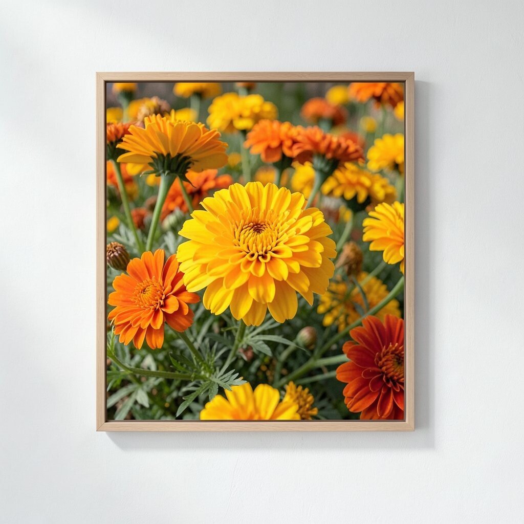
Honeyed marigold can brighten a space the way morning light does. Even a small amount makes corners feel less gloomy and more cheerful.
Try marigold through framed prints, a gallery wall, or a single large canvas. If you are nervous about painting, start with paint swatches or removable wall decals in marigold tones. The beauty is that you can keep swapping pieces as your taste changes.
To make it feel tailored, match the marigold to a specific item you already love, like a patterned rug or a family photo frame. Current trends lean toward warm yellow-golds mixed with soft greige, so your style will feel fresh.
4. Mushroom Taupe for Calm Rooms
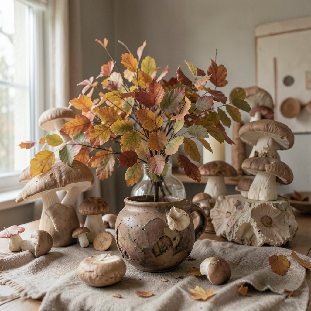
Mushroom taupe is the quiet friend of fall color palettes. It looks smooth and comforting, like a cozy sweater laid on a chair.
Paint an accent wall, update shelves, or choose bedding in taupe that leans slightly warm. Pair it with white trim, black hardware, or natural wood for a clean, relaxed vibe. This shade works especially well in living rooms because it balances richer colors you might add later.
5. Fig Jam Purple in Textiles

Fig jam purple feels like autumn fruit pressed into velvet-soft tones. It adds a creative spark without turning your home into a dramatic stage.
Bring it in through a knitted throw, curtains, or a patterned blanket that you rotate across seasons. The trick is to combine it with gentle shades like oatmeal, taupe, and dark green so the purple stays cozy. For personalization, echo the purple in small decor like a vase, a framed botanical print, or a single colored book spine.
If you love a trend-forward look, pair fig jam with deep olive and warm brass. Those combinations are showing up more often in modern interiors because they feel rich and grounded.
6. Olive Grove Green in Kitchen Details
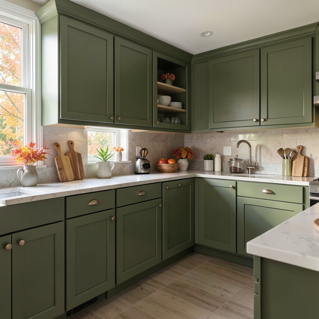
Olive grove green makes kitchens feel fresh and lived-in. It gives the space a natural vibe that still looks polished and modern.
Use it on cabinet hardware, a runner rug, or even barstool cushions in a deep olive shade. For a quick upgrade, swap dish towels, a soap dispenser, or canisters to echo the color across everyday items. Budget-wise, these small changes are often cheaper than a full paint job.
7. Terracotta Tile-Look Flooring Moments

Terracotta tones feel like baked clay and afternoon sun. They make floors, rugs, and entry spaces look warmer right away.
Even if you cannot change actual flooring, you can create the same effect with terracotta patterned rugs, peel-and-stick tiles, or a doormat. Choose tones that are slightly muted, not neon, so it stays true to fall and easy to style. To personalize, bring in a second earth color like caramel or soft brown so the terracotta feels intentional.
8. Dusty Teal for Serene Seating
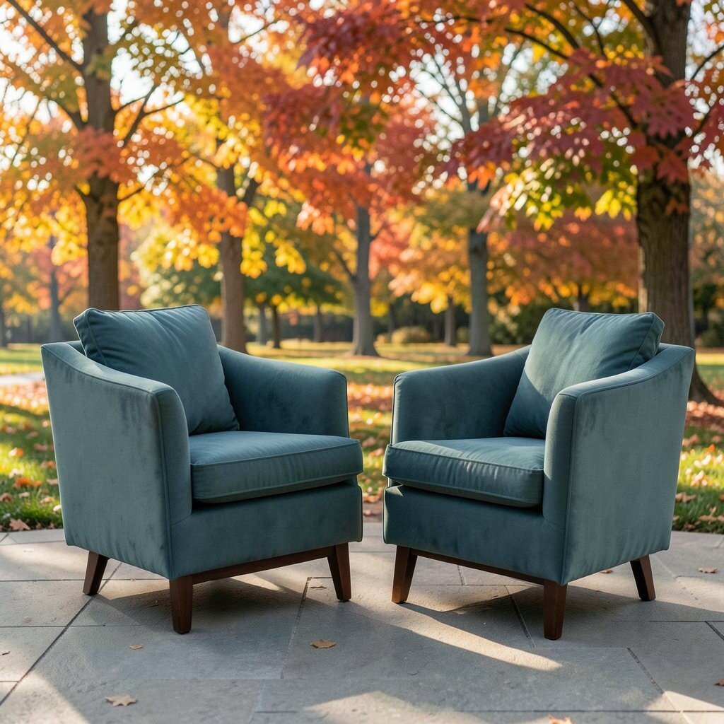
Dusty teal brings a calm, slightly dramatic mood to seating areas. It pairs nicely with both warm and cool accents, which makes it easy to style.
Try it through upholstery fabric, decorative cushions, or a woven basket with a teal tint. Keep the rest of the room in soft creams, warm whites, and light woods so the teal feels smooth rather than cold. Current trends often mix muted teal with clay and beige, so your home will feel like it fits today’s look.
9. Maple Leaf Orange in Cozy Layers

Maple leaf orange feels playful, like a scarf you cannot wait to wear. It brightens a room while still staying gentle enough for everyday life.
Use orange in layered textiles such as pillows, a throw, or a knitted blanket. If you want it to feel more grown-up, choose an orange that leans toward rust or terracotta instead of bright tangerine. Add one grounding element like a dark brown wood frame or a warm gray rug to keep the vibe balanced.
For cost considerations, start with one orange accent piece and repeat the shade in small decor. That approach gives you the look without needing to repaint anything.
10. Soft Sage for Airy Living Rooms
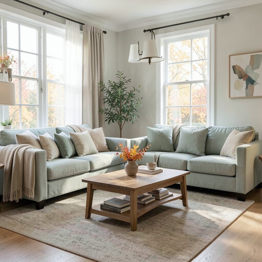
Soft sage helps a room breathe. It feels refreshing and gentle, especially in spaces that get afternoon light.
Paint a smaller area like a nook, update trim with sage-inspired color, or choose furniture in a sage fabric tone. Sage also looks great with natural textures like linen, rattan, and woven baskets. To personalize, pick a sage that matches the undertone of your wood floors, whether they lean honey, neutral, or slightly cool.
11. Smoky Charcoal for Modern Contrast
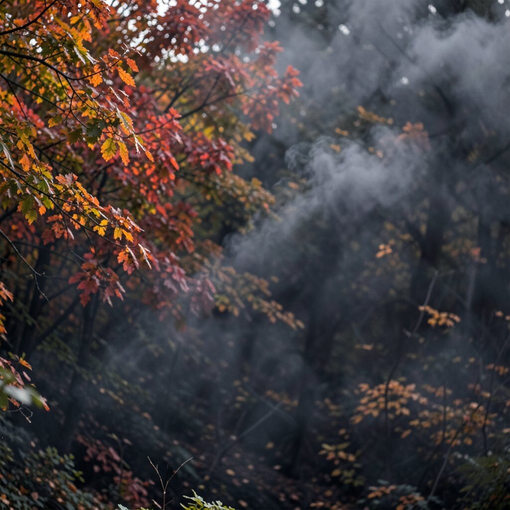
Smoky charcoal adds elegance without sadness. It creates contrast that makes warmer fall colors look even more vivid.
Use charcoal in frames, a console, lamp bases, or patterned rugs with charcoal lines. Keep the walls light so the space stays bright and open. If you want a trend-ready look, pair charcoal with warm metallics like brushed brass and copper for a cozy modern finish.
12. Oat Cream for Cozy Everywhere
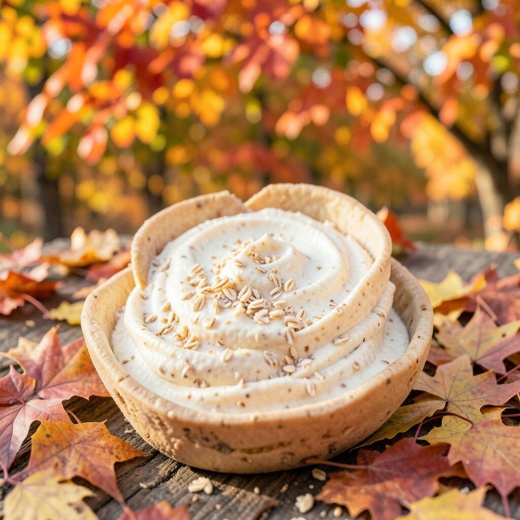
Oat cream is a warm neutral that makes everything feel softer. It helps autumn colors look welcoming instead of loud.
Choose oat cream for walls, curtains, or bedding when you want a calm base. It also works well with darker accents like cranberry, olive, and fig jam purple. For practical styling, use oat cream to tone down bold colors in small rooms where you want comfort, not clutter.
13. Rusted Iron Details for Entryways
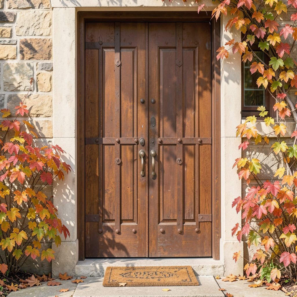
Rusted iron tones look vintage and strong, like hardware from an old farmhouse. They bring character to entryways that need a little more personality.
Update hooks, towel bars, or cabinet pulls with rust-like finishes, or use decor such as a metal tray and candlesticks. Pair these details with warm wood, cream walls, and natural fiber mats for a layered look. If you are working with a tighter budget, you can often swap hardware for far less than buying new furniture.
To personalize, choose one rust focal point, like a front-door wreath with rust ribbon or a lantern with warm amber light inside.
14. Black Tea Brown for Grounded Styling
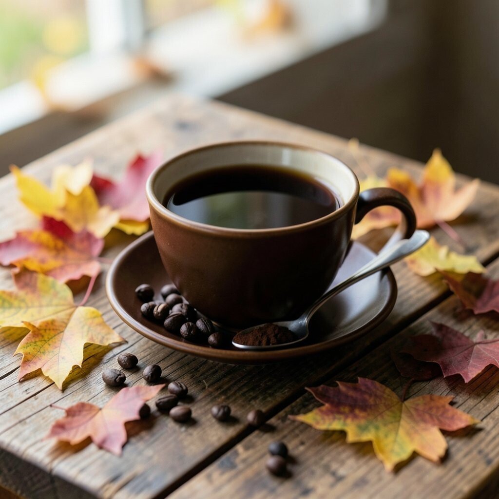
Black tea brown makes a room feel steady and grounded. It is perfect when you want warmth but do not want the color to shout.
Try it in leather-like accessories, a coffee table finish, or a woven rug with brown depth. Combine black tea brown with soft gold accents, creamy whites, and muted greens for a balanced fall palette. For a practical tip, keep high-traffic surfaces in easier-to-clean fabrics and use the darkest tones on furniture that can handle daily life.
15. Apricot Glow in Lamps and Lighting
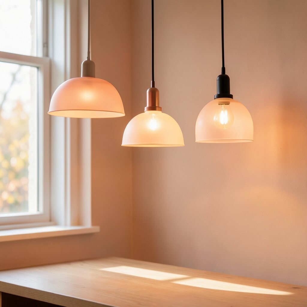
Apricot glow is the color of soft light coming through a shade. It makes evenings feel cozy and adds warmth to rooms that get dim quickly.
Choose apricot lampshades, warm bulbs, or decorative shades that cast a gentle hue. Pair the glow with off-white walls and honey wood so the light reflects nicely. If you want an easy personalization idea, match the lamp color to a curtain or throw so the room feels like a set.
For cost considerations, lighting changes are often one of the fastest upgrades, and they also affect how all your other colors look.
16. Deep Pine Green for Statement Plants
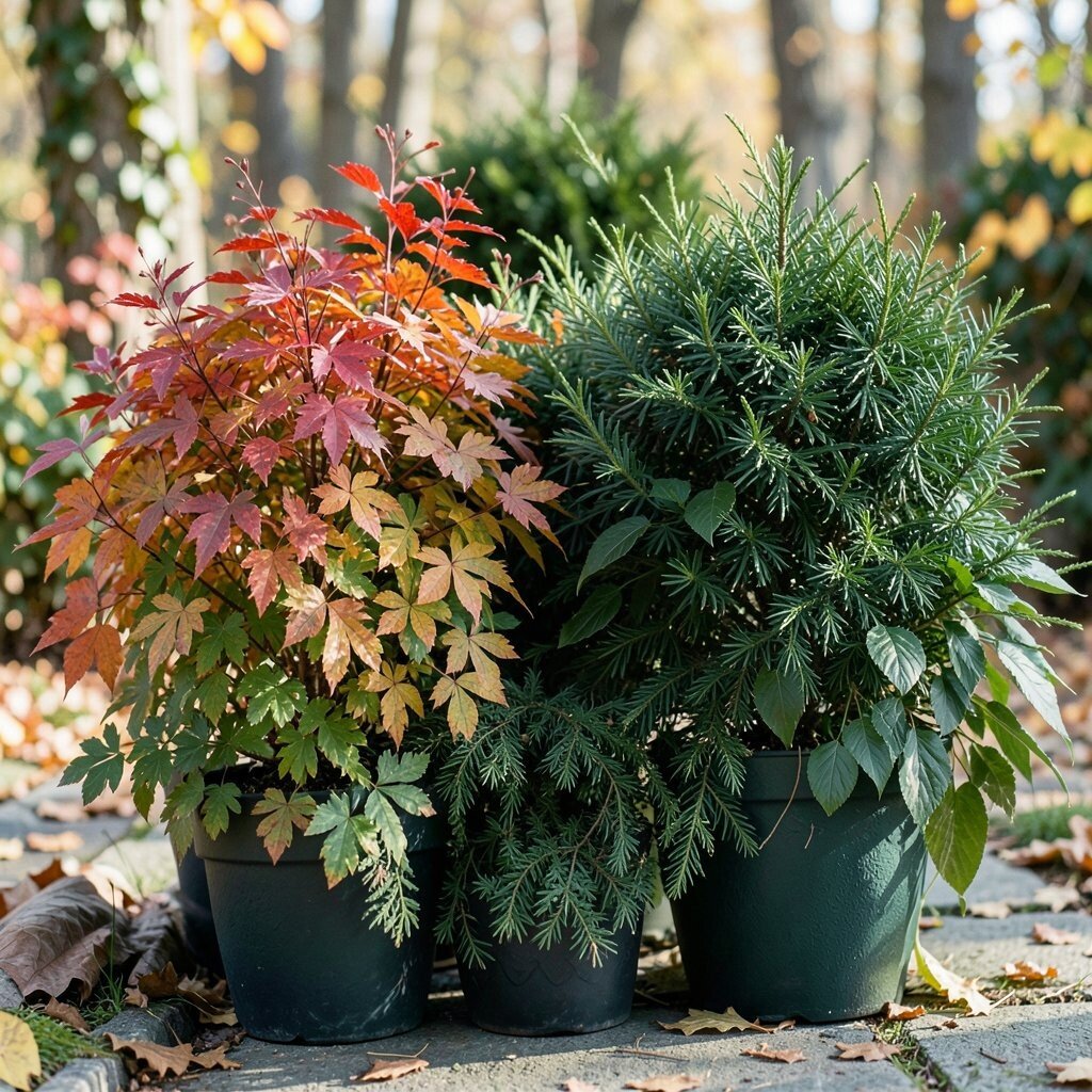
Deep pine green adds a dramatic, forest-like richness. It is a great match for textured decor and makes greenery look even healthier.
Use deep pine in planters, picture frames, or a standout cabinet color in a hallway or dining nook. Pair it with warm cream textiles and natural wood to keep the look cozy. If you love current trends, lean into plant-forward styling and add a tall leafy plant or a bold faux arrangement for year-round impact.
17. Champagne Gold for Sparkly Finishes

Champagne gold brings a gentle sparkle that feels celebratory without being too flashy. It helps fall colors look brighter and more luxurious.
Incorporate gold through mirrors, picture frames, lamp bases, or small decor like vases and trays. Keep the rest of the palette in earthy tones so gold acts like a highlight, not the main theme. For personalization, choose finishes that match each other across the room, like all brushed champagne rather than mixing every metal you own.
This is also an easy way to upgrade on a budget because small gold accents can change the whole mood.
18. Stormy Sky Blue for Unexpected Warmth
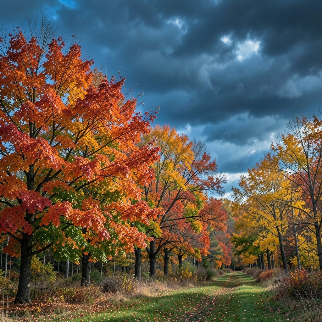
Stormy sky blue might sound surprising, but it makes autumn colors look even more alive. It adds a cool counterpoint that keeps the palette from feeling too heavy.
Use it in throw pillows, art prints, or a rug with muted blue tones. Pair blue with warm browns, honeyed yellows, and terracotta so the room feels balanced. A practical tip is to repeat the blue in at least two places, like a pillow and a small frame, so it looks intentional and not accidental.
To personalize, choose a shade of stormy blue that matches your existing denim, artwork accents, or the undertone of your favorite patterned rug.