The right artwork can make a workspace feel like yours. Abstract canvases bring energy, soften busy corners, and start conversations without saying a word.
From bold splashes to quiet color fields, these ideas help you choose art that looks great and works hard for your daily routine.
1. Electric Color Splash Above the Desk
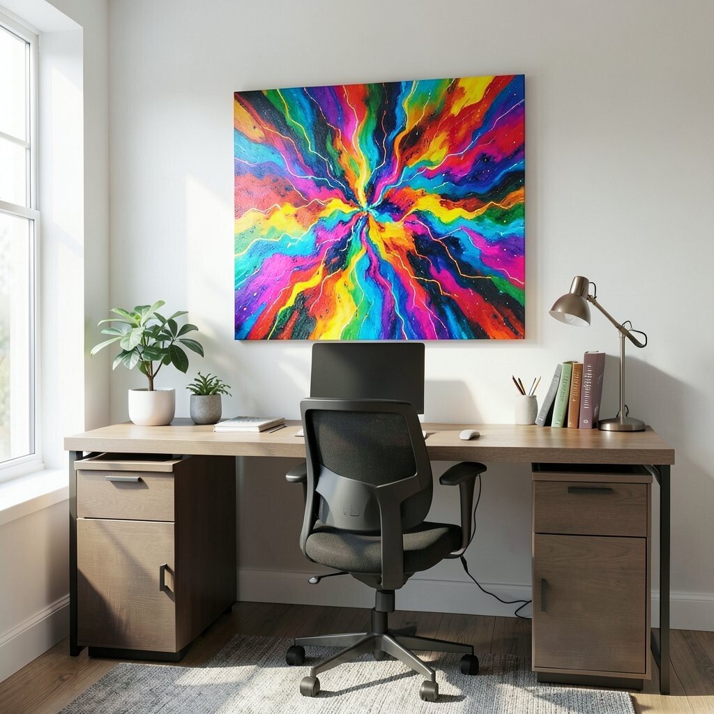
A canvas that looks like it was painted with pure momentum can instantly wake up your desk area. Think of fiery magentas, bright oranges, and sharp teal streaks that move like a visual drumbeat across the surface.
Place it where you naturally glance while planning your day, such as above a monitor or slightly to the side for easy viewing. You’ll get a daily mood boost, and the busy visuals can also distract you from the stress of notifications.
2. Monochrome Waves With One Surprise Hue
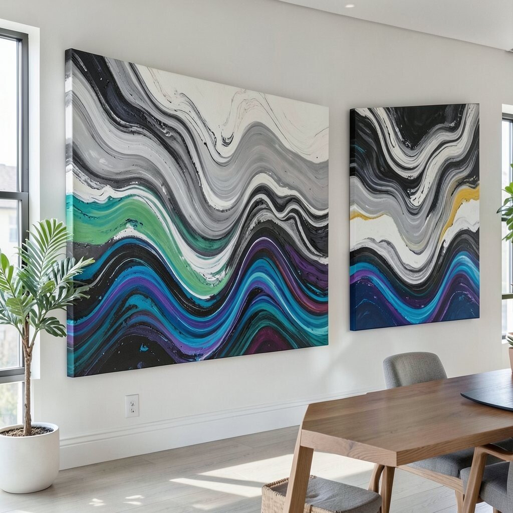
If you love calm, try a mostly black-and-white abstract with gentle waves and soft brush textures. Add one unexpected color, like a lime green line or a sunny yellow splash, so your eye has something playful to land on.
This style feels modern, and it pairs well with neutral desks, simple shelving, and clean cable setups. Keep the surprising hue echoed elsewhere with a small lamp, folder, or notebook so the whole room feels coordinated.
You can find affordable prints that mimic canvas texture if you want to stay budget-friendly. If buying originals, consider smaller sizes first to control cost while still getting that bold focal effect.
3. Oversized Geometric Chaos in a Corner Nook
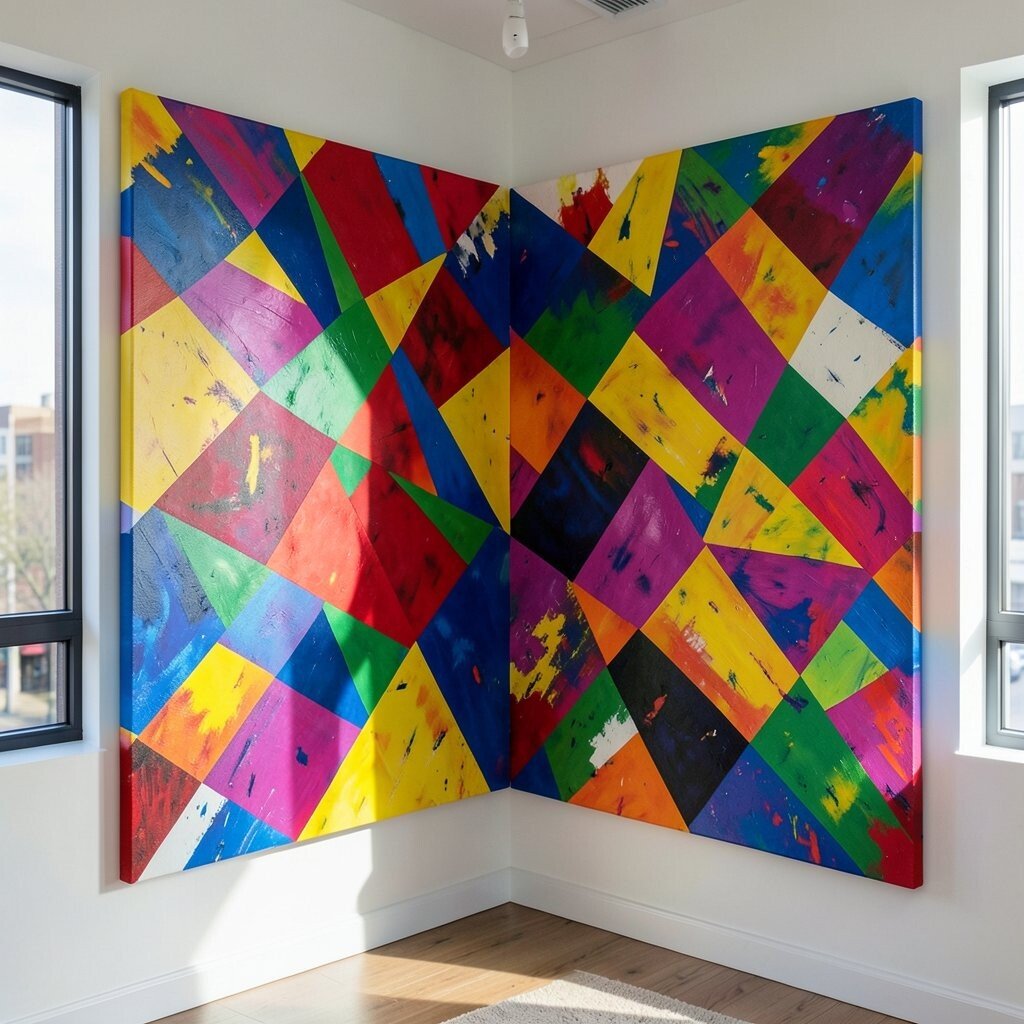
Sometimes the best office art sits where people don’t expect it, like on the wall that covers the corner of a storage nook. A geometric abstract with overlapping shapes can look like a playful map, full of angles that feel both orderly and messy in a fun way.
Choose a piece with a few large shapes so it reads clearly from your usual standing or walking path. This helps the room feel designed, not cluttered, even if your shelves are filled with books, supplies, and small gadgets.
To personalize it, match one or two colors to your office chair or a rug pattern. If you’re budget-conscious, look for gallery-style canvases on sale, or use a print in a canvas wrap so it still feels substantial.
If you have high traffic in that corner, the bold design can become a quick visual reset during breaks. The shapes also hide minor wall imperfections, which is great when you rent or can’t patch everything perfectly.
4. Soft Pastel Mist for Creative Focus
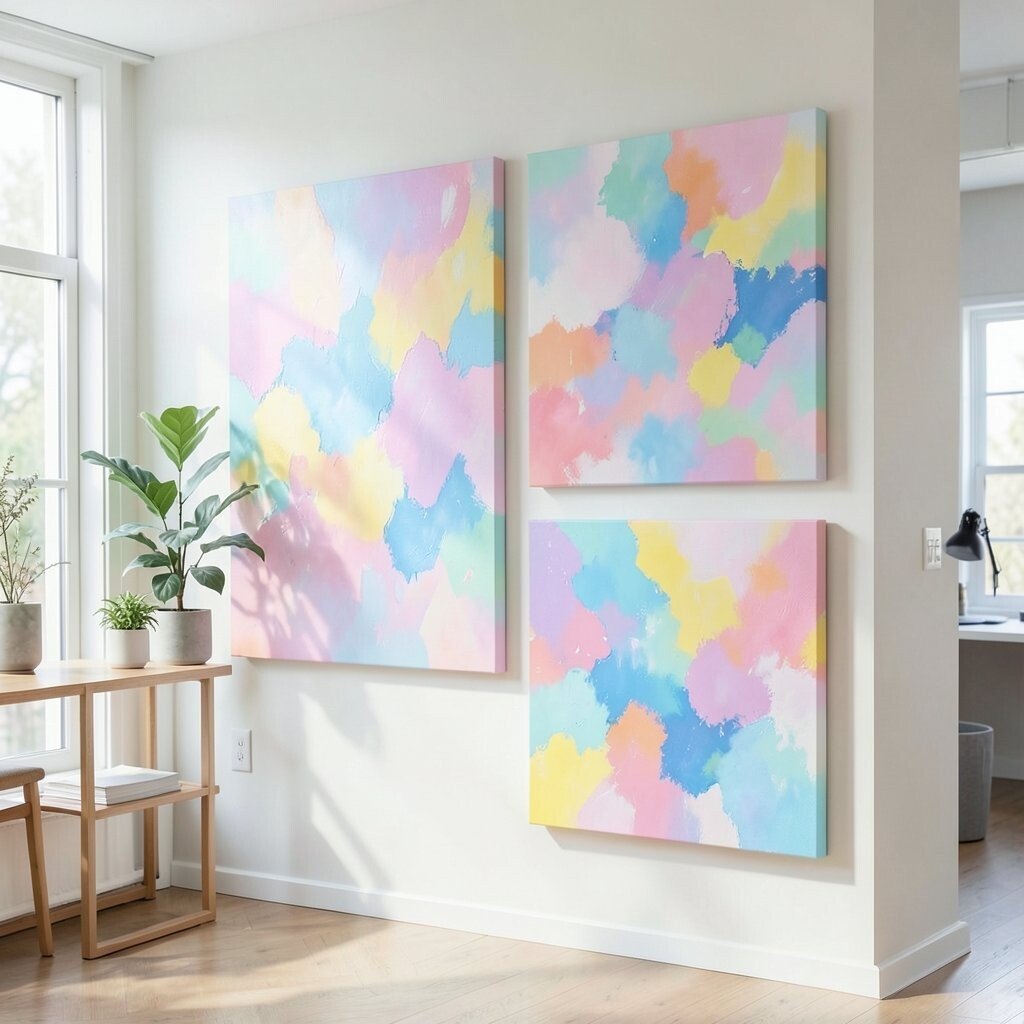
For a calmer workday, go with a pastel abstract that looks like layered mist. Colors like powder blue, dusty rose, and pale lavender can blend into each other with light, airy brushwork.
Put it near where you sketch, write, or brainstorm, since gentle colors help the space feel less intense. When your eyes need a break from screens, a smooth canvas makes that pause feel easy.
5. Thick-Texture Palette Knife Statement Piece
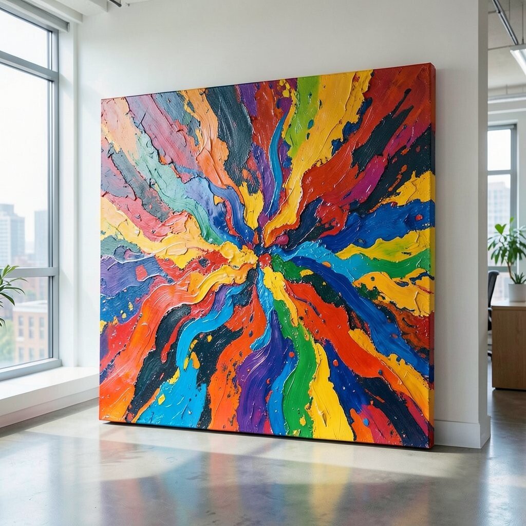
A canvas made with thick paint and palette-knife marks can feel almost sculptural. You’ll notice raised swirls and ridges that catch light and create tiny shadows, making the art change throughout the day.
When you hang a textured piece where daylight hits it, the wall gains depth without extra decor. This is a great benefit if your office feels flat or you want something that feels tactile even from a distance.
For cost considerations, medium-sized textured originals can be surprisingly affordable compared to huge statement works. If you choose a print, look for ones that clearly show texture so it doesn’t feel too smooth.
6. Sunset Gradient With Hard-Edge Cuts
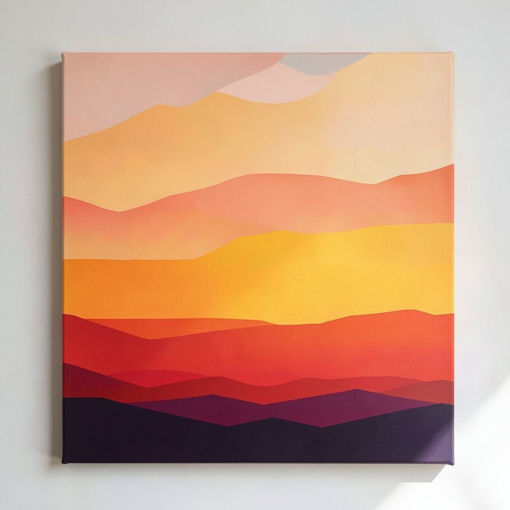
A sunset-inspired abstract can be bold without being loud, especially when it uses clean, hard-edge layers. Imagine deep coral fading into golden yellow, then interrupted by crisp blocks of navy or charcoal.
This kind of artwork adds warmth and direction, which can help if your office needs a clearer focus. It also looks great with modern furniture, black metal shelves, or a desk with a dark finish.
7. City Rhythm Through Layered Brush Strokes
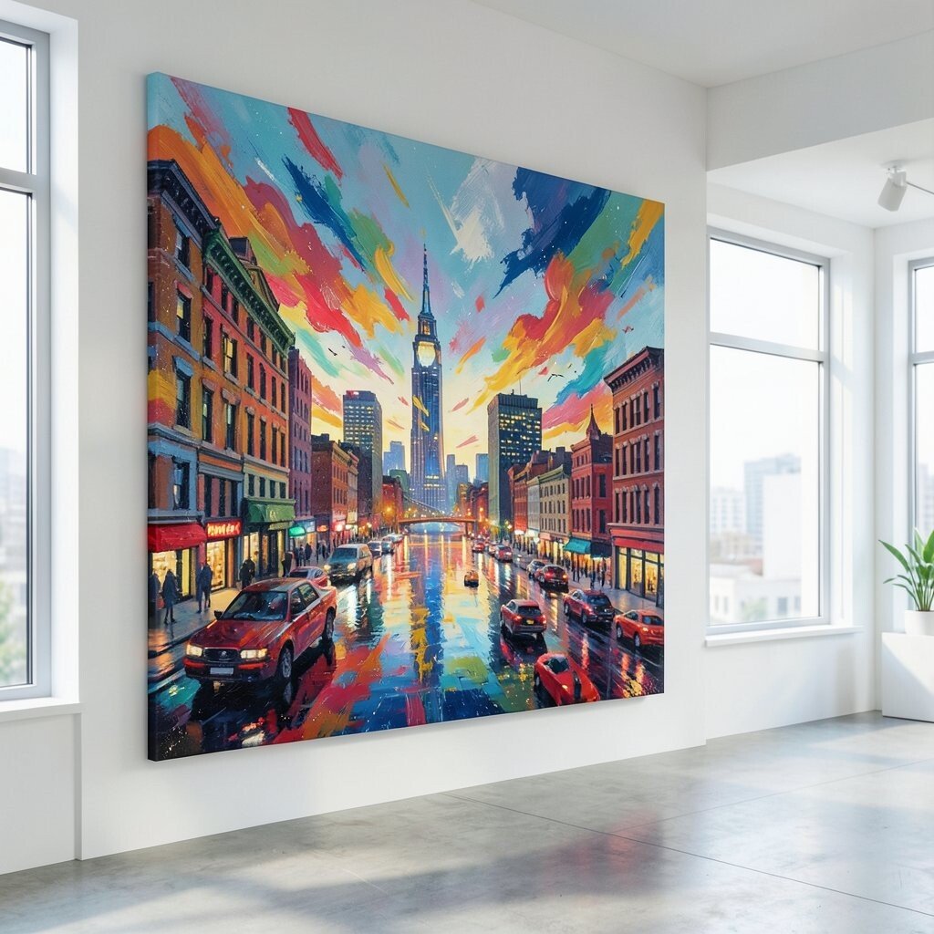
Think of a canvas that suggests street motion, like layered brush strokes that overlap in quick turns. You might see vertical lines like building edges, with swooshing arcs that feel like cars in motion.
This visual rhythm makes an office feel alive, especially if you spend most of your day indoors. It can also support personalization when you choose colors tied to your favorite neighborhood or commute vibes.
Try placing it somewhere you review plans, since movement in art can keep your mind engaged. If you want it to feel intentionally styled, repeat one accent color in desk items like a pen cup or sticky notes.
8. Botanical Abstract for a Nature-Loving Twist
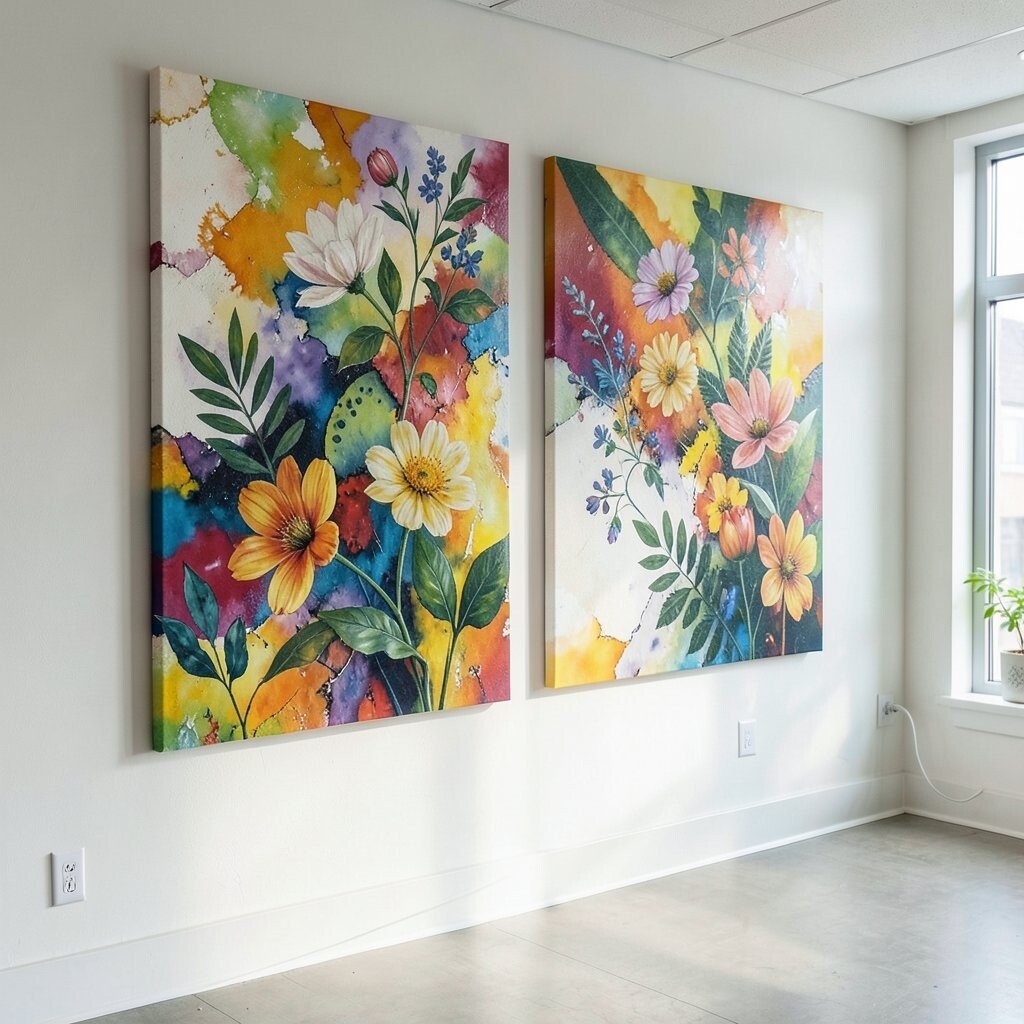
You don’t need realistic leaves to get a nature vibe from abstract art. Look for shapes that echo vines, fronds, or seed pods, even if they’re rendered with paint splashes and playful forms.
This idea brings calm energy into eclectic office spaces, especially when you use green, teal, and warm earth tones. It pairs nicely with plants, natural wood desks, and woven baskets, so it doesn’t fight your other decor.
9. Cool Tones and Floating Dots Like Stardust
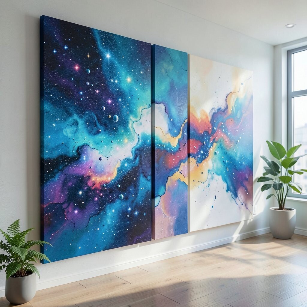
A canvas filled with floating dots and soft gradients can feel like stardust in a work setting. Imagine icy blues and smoky grays with small circles that look like light sources hovering across the surface.
These pieces create a gentle sense of space, which helps small offices feel less boxed in. If your office has busy patterns already, the dots can act like a soothing visual break.
To personalize, match the dominant blue to your wall color or your monitor background theme. You can also choose a size that balances your desk height, so the art sits at a comfortable viewing level.
10. Warm Earthy Swirls for Grounded Energy
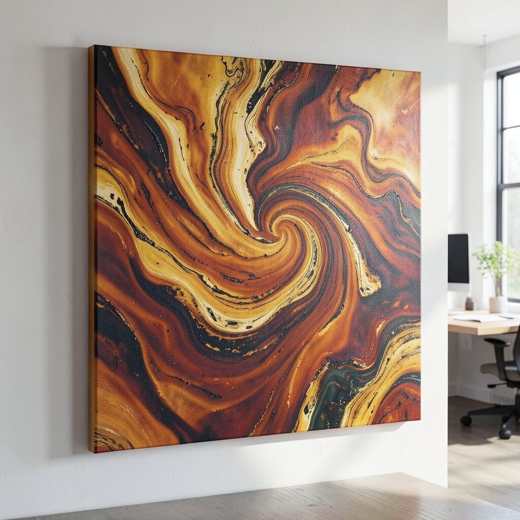
Not all vibrant art has to be bright in every direction. An abstract with earthy swirls in rust, terracotta, ochre, and deep brown can feel warm and steady, like a cozy kitchen table but made for work.
This style gives a grounded vibe that’s perfect for people who want creativity without feeling scattered. It also complements leather accessories, walnut shelves, and rugs with subtle texture.
11. Bold Red and Black Conflict-Beauty Composition
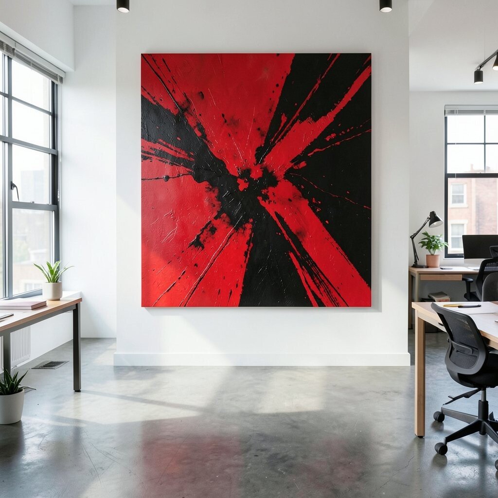
If your office style leans edgy, try an abstract that plays with bold red and black contrast. You might see aggressive brush marks, sharp diagonal strokes, or blocks of color that look like a battle scene from a distance.
The benefit here is impact, because strong contrast pulls your attention to the wall and can make the whole space feel intentional. For practicality, place it away from glare so you can enjoy the details without squinting.
To keep it from overwhelming the room, balance the intensity with calmer items like light-colored curtains or a simple desk lamp. Cost can vary, but looking for limited-color works often helps because fewer pigments can reduce production complexity.
12. Playful Primary Colors for a Joy-Forward Office
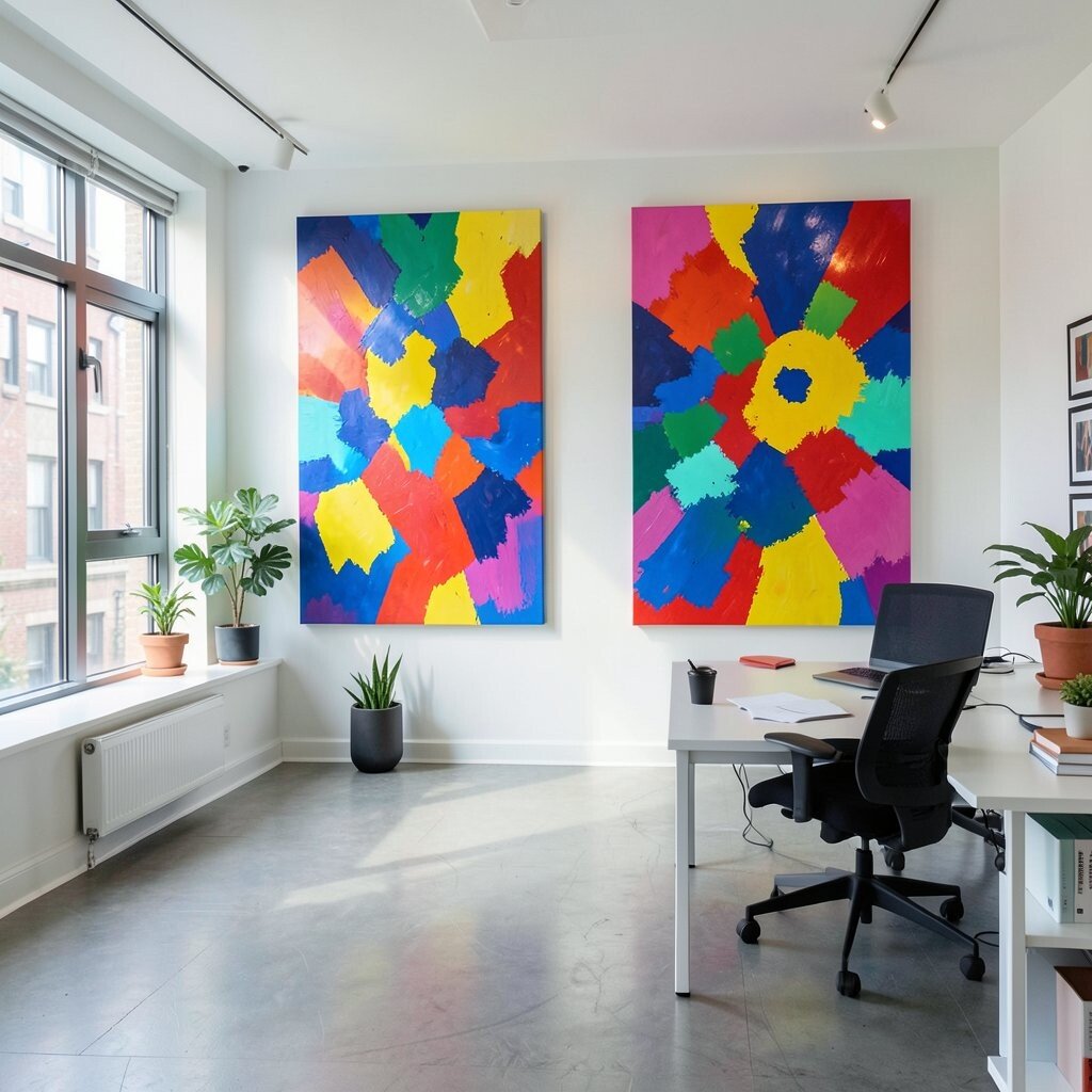
A bright primary palette can make even a quiet office feel fun. Look for abstracts with pops of red, blue, and yellow arranged in unexpected ways, like children’s art grown up into a gallery piece.
This artwork supports morale, especially if you handle repetitive tasks or manage a lot of emails. It also blends beautifully with eclectic decor, because primary colors can unify mismatched items.
If you want personalization, pick a layout that echoes your favorite things, like guitar picks, street signs, or board game pieces. You can also choose a slightly smaller canvas and add a matching frame color to tie it into your desk setup.
13. Color-Field Minimalism With a Soft Edge
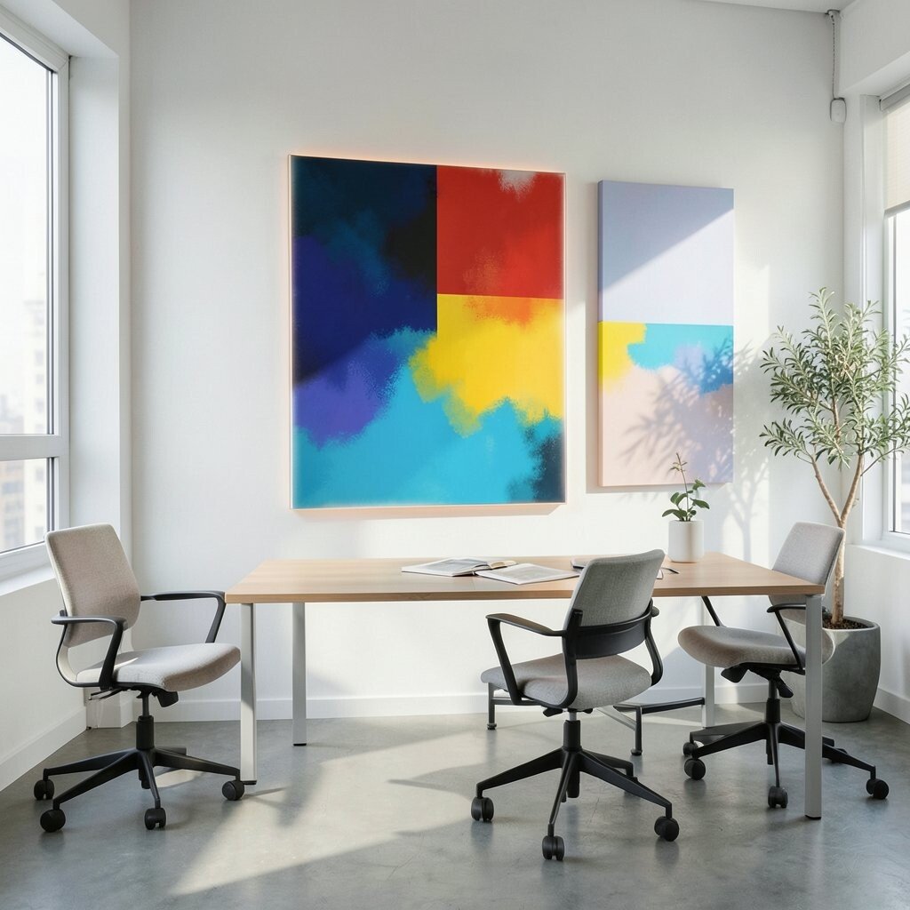
Some of the most striking abstract canvases feel simple, like a field of one main color with a soft gradient at the edges. You might find muted sage, muted teal, or warm beige with subtle variations that make the surface feel deep.
Color-field art fits current trends that favor calm, modern aesthetics in work spaces. It helps your mind settle, and the soft edge keeps the room from feeling harsh.
For practical placement, choose a canvas large enough to read from across the room, not so small that it disappears behind shelves. If budget is a concern, consider a high-quality print with matte finish, since it can look elegant and keep glare low.
Personalize it by choosing a color that matches your office mood, like a gentle green for focus or a warm tint for comfort.
14. Ocean-Themed Abstract With Brushed Motion
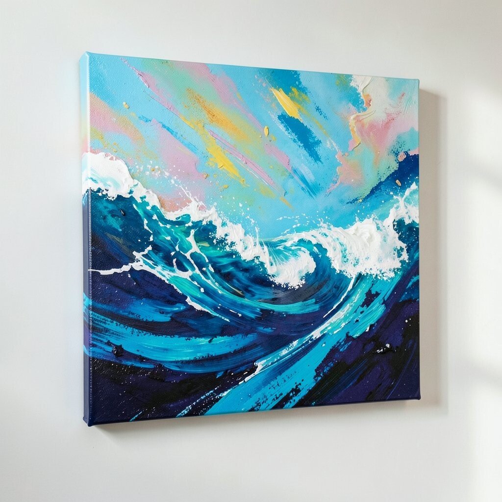
Bring a coastal feeling to your office with an abstract that suggests waves and currents. You’ll notice layered blues, seafoam greens, and white streaks that look like foam caught mid-swell.
This design can reduce the sense of stress in your day, since the colors feel like a breath of fresh air. It also works well if you have a lot of metal, glass, or cool-toned furniture because it adds organic softness.
15. Gold Accents and Metallic Lines for a Luxe Feel
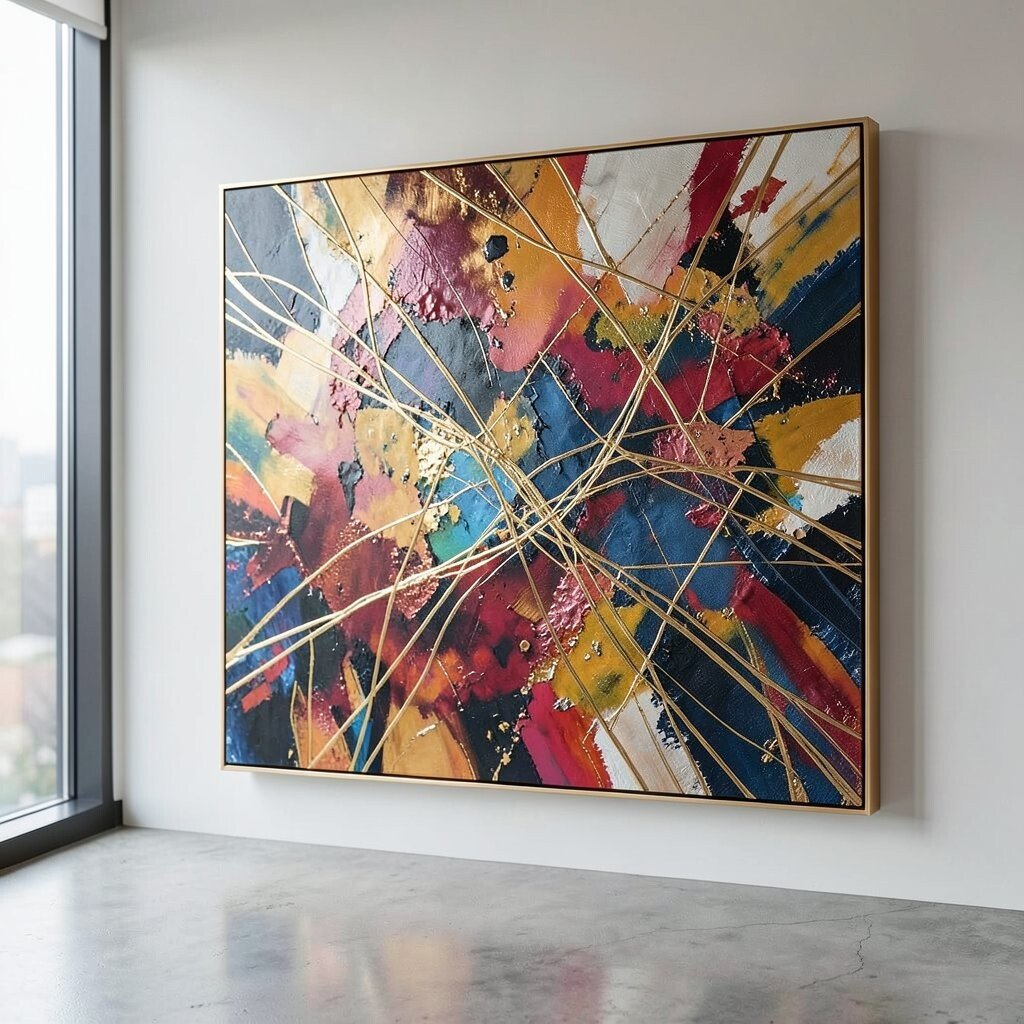
If you want a little office glamour, choose an abstract with gold accents. Metallic lines can wrap through a darker base like midnight navy, charcoal, or rich plum, giving the art a premium sparkle.
This kind of canvas looks fantastic in eclectic spaces because it pairs with many materials, from brass desk tools to patterned textiles. Just keep the rest of your accessories balanced, so you’re not fighting too many shiny surfaces.
For cost considerations, you can often find pieces with metallic touches rather than full metallic coverage, which keeps the price friendlier. To make it feel truly yours, mirror the gold with a simple frame, a pen holder, or even a small tray on the desk.
16. Monstrous Fun: Surreal Shapes and Friendly Monsters
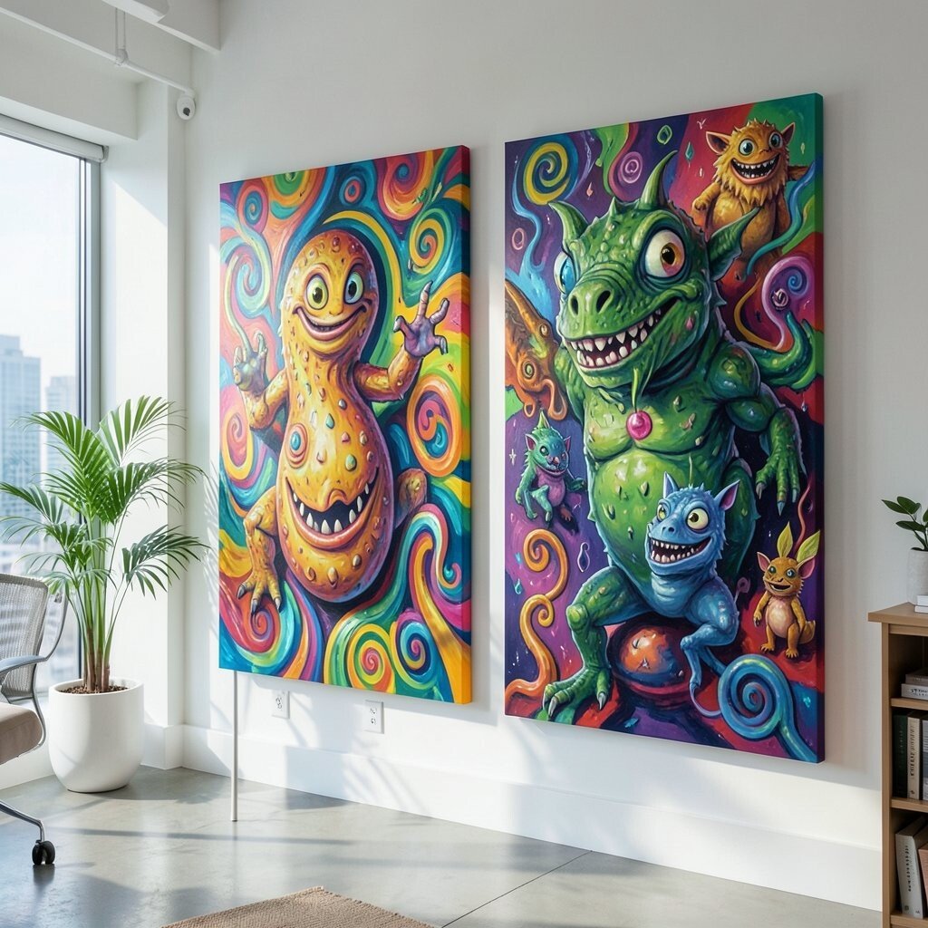
Abstract doesn’t have to be serious, and a surreal canvas can turn your office into a playful studio. Look for friendly monster-like shapes, rounded faces, or whimsical forms that feel odd but safe, often mixed with bright color pops.
This is a great benefit for teams or busy households because it creates positive energy and makes the room feel welcoming. It can also serve as a conversation starter during client visits, which helps you seem approachable.
17. Custom Mixed-Media Look With Your Own Color Story
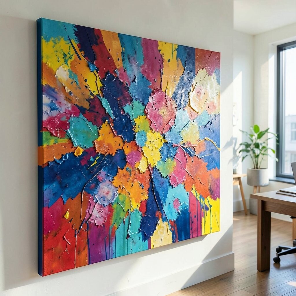
If you really want the artwork to feel like it belongs to you, choose a mixed-media abstract style that looks layered and personal. You might see collage-like textures, stitched lines, or layered paint that feels like it grew over time rather than arriving all at once.
The practical advantage is flexibility, since you can guide the palette to match your office personality. Pick a color story based on things you already love, like book covers, fabric swatches, or the colors on your favorite mugs.
For personalization, consider adding your own tiny element, such as a handwritten date or a small symbol that matters to you, even if it stays subtle. Cost can stay under control by ordering a canvas print from your chosen colors or working with a local artist who offers smaller custom sizes.
This approach also matches current trends toward personalization and handmade textures, so your space feels current without looking like a clone. When the colors match your daily life, you’ll notice the room feels easier to work in, not just prettier.