A tiny grid can turn into a big mood. With pixels, you can make something personal without needing a studio budget.
Let each pattern feel like a small tool you can reuse. You’ll build confidence while training your eye for shape, balance, and rhythm.
1. Pixel Constellation Tapping
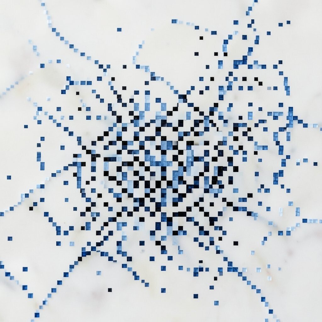
Imagine a soft night-sky canvas where bright dots punch through deep color. Place tiny star clusters like constellations that your fingers can almost feel.
Start with one color for the “stars” and one for the “sky.” Keep most pixels empty so the clusters stand out, then vary the star sizes by using single pixels and tiny bursts. Personalize it by naming your clusters after friends, pets, or moods, and redraw one pattern until it feels like yours.
Use it as a background for posters, social posts, or app icons to give a calm, cozy vibe. You can also animate it later by shifting star positions by a few pixels, which matches current interest in subtle motion. For a practical workflow, sketch the big cluster shapes first, then drop stars where they “anchor” the composition. If you’re cost-conscious, reuse the same palette and only swap star colors to create a full set without extra tools.
2. Checkerboard Micro-Waves
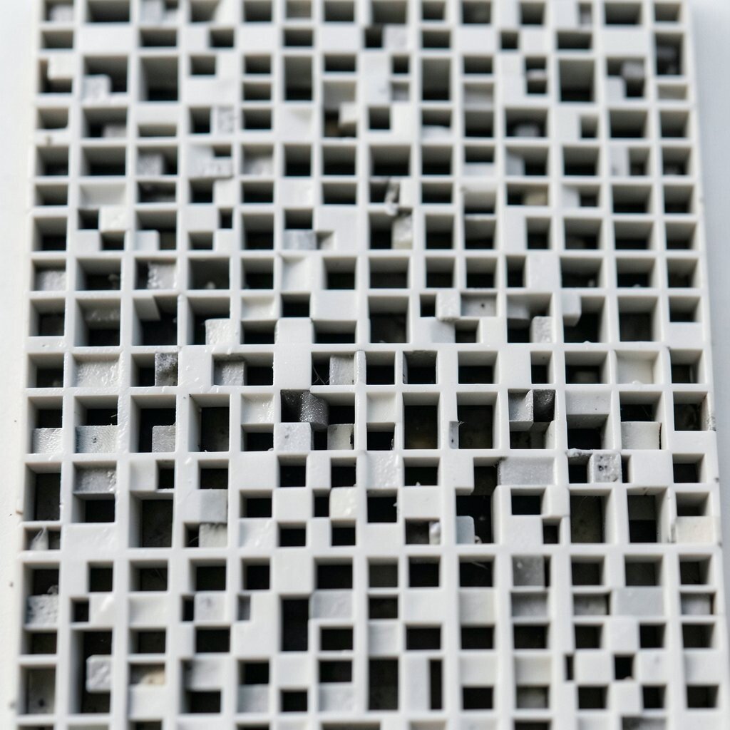
Picture a checkerboard that subtly bends, like waves moving under glass. Each square acts like a little step, creating a gentle rhythm across the whole image.
Use a limited palette such as two or three related colors so the wave effect stays smooth. Build the pattern by offsetting rows one pixel at a time, then alternate darker and lighter blocks for depth.
Make it personal by matching your colors to your room, favorite sneakers, or a brand mood board. This style fits current tastes for clean geometry paired with soft gradients, even when you stay fully pixel-based. For practicality, plan a repeating tile you can reuse at multiple sizes, saving time when you need new wallpapers or sticker designs.
3. Neon Circuit Threading
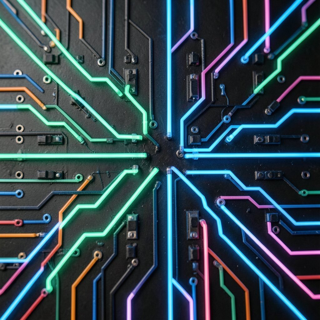
Think of thin neon lines weaving like circuits across a dark field. The look feels futuristic, but the layout can still stay friendly and readable.
Start by drawing one winding “trace” that crosses itself in safe places, then add small connection nodes. Use bright accent colors against a near-black background so each junction pops.
To personalize, change the circuit “logic” by making connections spell a word, like a short name or a tiny mantra. This pattern works great for album art, game UI highlights, and modern banners because it reads well at small sizes. Keep it practical by limiting line thickness to a few pixels and using a repeating corner pattern, which makes your final work look intentional instead of messy.
If you want to keep costs low, reuse the same background and only redraw the glowing lines in new colors. Current trends lean toward cyber-friendly art and playful tech aesthetics, so it’s a perfect fit for fan pages and digital stickers.
4. Autumn Leaf Pixel Mosaic
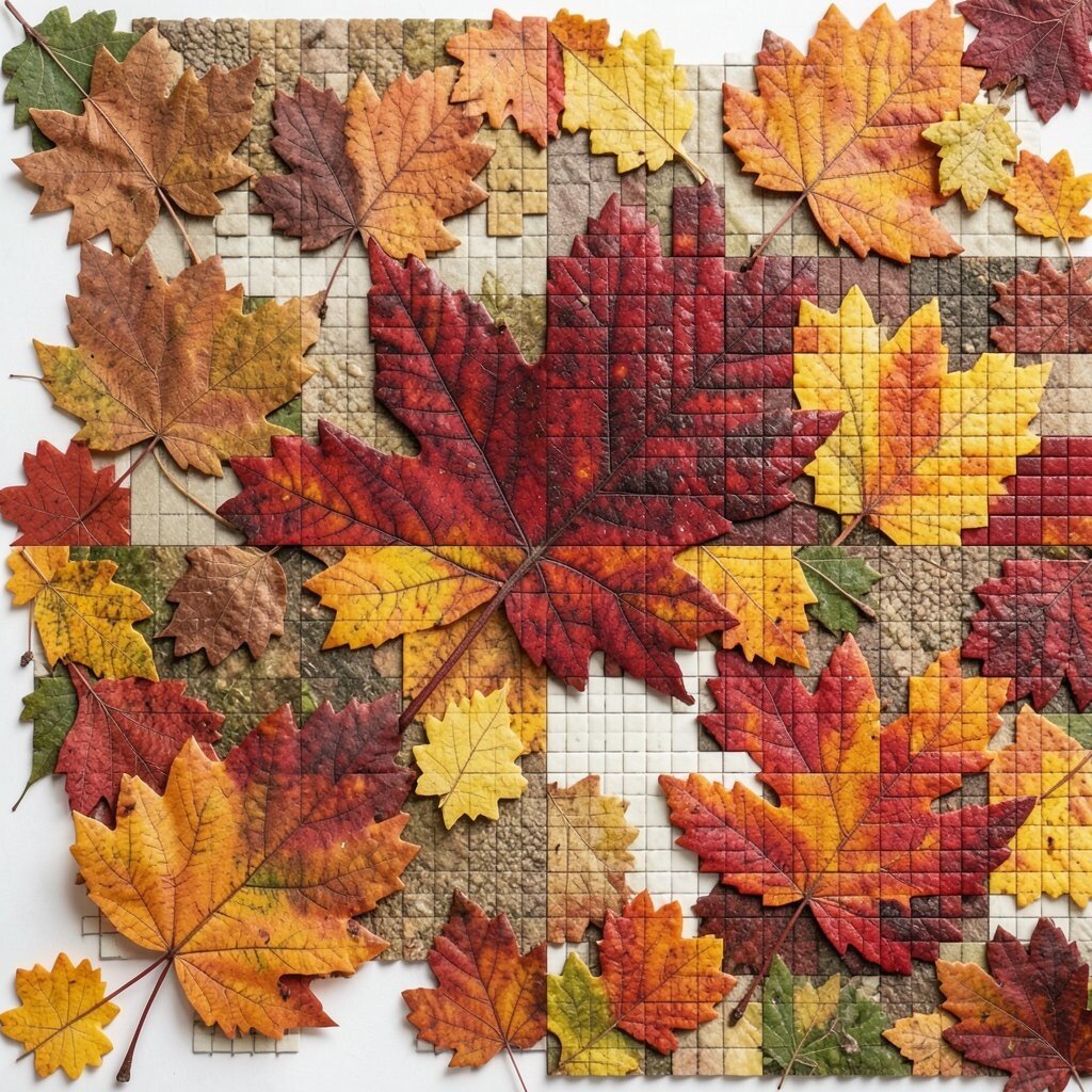
Imagine a leaf made of small squares, each one catching a different shade of fall. The edges look crisp, while the inside feels warm and textured.
Choose a leaf shape you like, then build it from the center outward using a gradient of browns, oranges, and gold. Add a simple vein by placing a narrow strip of pixels that runs through the middle.
Make it personal by creating leaves from plants you actually see in your neighborhood. This pattern also works as a repeating border for journals, wrapping paper, and classroom crafts. To keep things practical, draw a tiny leaf “template” first, then mirror it to create consistent variations.
If you’re budget-minded, stick to a small palette and reuse your best leaf tile as a stamp. People love autumn-themed content in seasonal design cycles, so your pixel mosaic will feel timely without needing expensive materials.
5. Rainbow Barcode Stripes
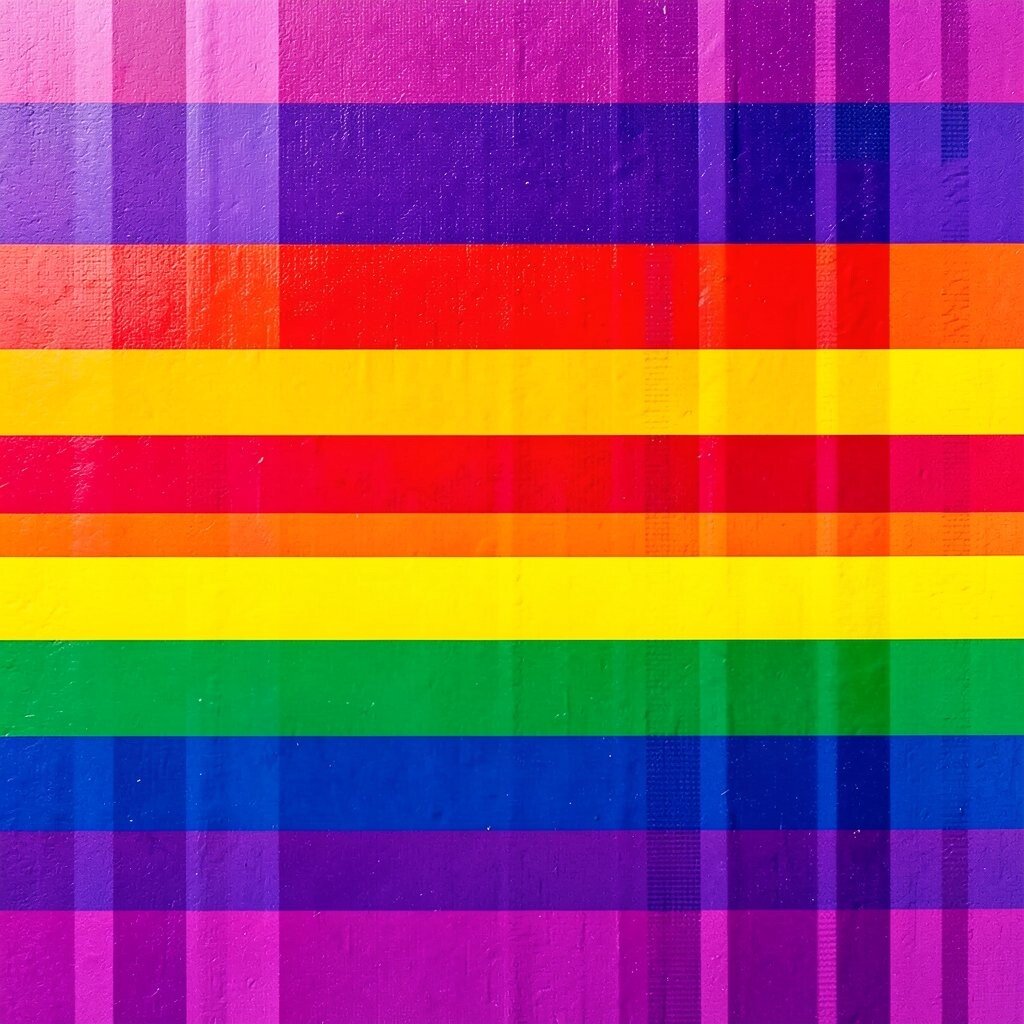
Picture vertical stripes that look like a playful barcode, but each strip is a color. The result is bold, simple, and surprisingly cheerful.
Use stripes that follow a rainbow order, then break the rule with a few “mistakes” to keep it human. Vary stripe widths using one-pixel, two-pixel, and three-pixel blocks so the barcode feels lively.
Personalize it by swapping the rainbow order for your own favorite color sequence, like teal to purple or rose to amber. It’s great for book spines, greeting cards, and game badges because the shape is instantly readable. For practical tips, keep the background plain and let the stripes do the talking, since busy scenes can make small pixels harder to see.
Cost considerations are friendly here because you can reuse one template across many prints. Current trends often celebrate bold, minimal graphics, and this pattern fits that style while staying fun and easy to remake.
6. Pocket Garden Sprout Rows
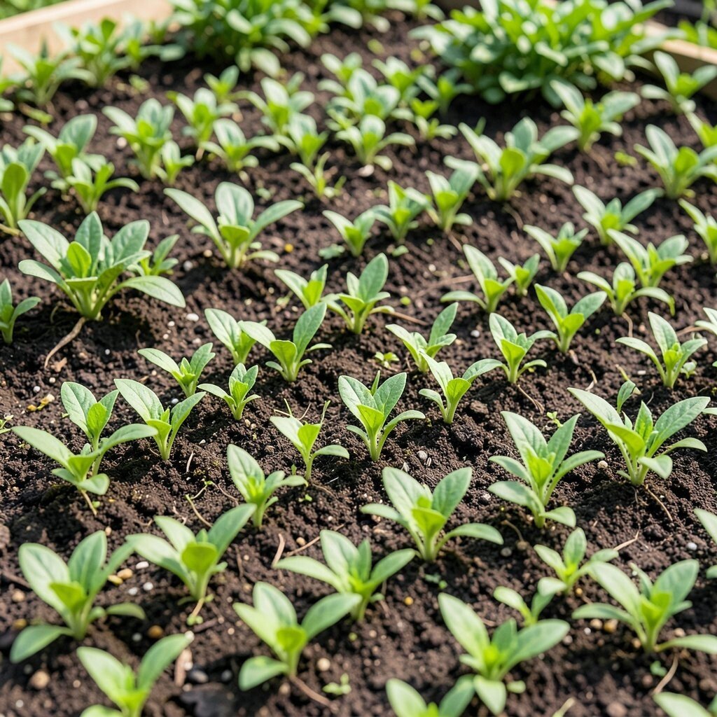
Imagine a tiny garden where sprouts line up in neat rows like a calm parade. Each sprout can be a few pixels tall, yet it still feels alive.
Use two greens for the sprout tops and a darker green for stems, then plant them across the grid with small spacing gaps. Add tiny dots of yellow or white like pollen or sun specks to make it feel fresh.
To personalize, arrange sprouts in patterns that resemble your own handwriting rhythm. Use it as a repeating wallpaper, a phone case skin, or a border for digital notebooks. It benefits the designer because the repeating structure helps you practice spacing, symmetry, and alignment without overthinking.
For practical tips, keep the sprout size consistent so the pattern reads as a garden and not as random shapes. If you’re thinking about cost, make one small “sprout sprite” and reuse it in many positions instead of redrawing the whole scene every time.
7. Doodle Face Smile Tiles
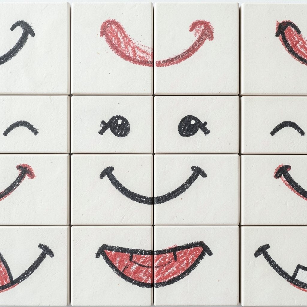
Think of a grid full of tiny faces, each one sharing a vibe but never fully identical. Some smiles curve up, others tilt sideways, and the expression feels real.
Start with a basic head shape and place eyes using two pixels each. Then vary the mouth by changing pixel placement, from a gentle curve to a wide grin.
Personalize it by adding accessories like tiny hats, headphones, or star-shaped cheeks. This pattern stands out because it combines cuteness with structure, and people tend to share face grids in current social media trends. For practical tips, create a few “mood presets” so you can quickly generate new tiles when you need content.
If you’re keeping costs low, use the same face outline and only swap accessories or mouth styles. Pixel faces also work well for stickers and simple merch, since the shapes stay clear even when printed small.
8. Minimal Sky Horizon Steps
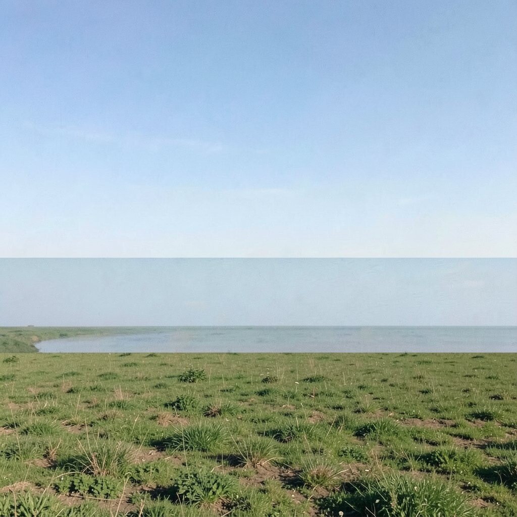
Picture a horizon built from small steps, like layers of clouds or gentle hills. The entire image feels balanced and quiet, like a morning window view.
Choose a background color for the sky, then add stepped bands using slightly lighter and darker shades. Keep the top band smooth and the bottom band chunkier to create a sense of depth.
Personalize it by matching the sky to a real memory, like the color you saw at sunset after rain. This pattern benefits beginners because it teaches how to build gradients using discrete blocks. It also stays unique since your horizon steps can be tall, short, jagged, or perfectly smooth depending on your mood.
For practical tips, test your pattern at a small size early so you can adjust band thickness. Cost considerations are simple too because a limited palette and few bands mean less rework when you create multiple versions.
9. Tartan Plaid Pixel Grid
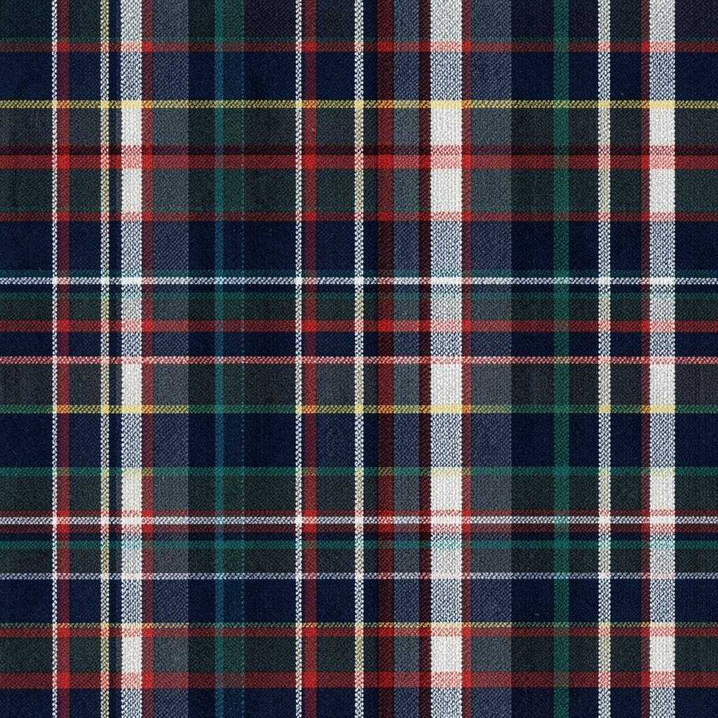
Think of plaid as a woven look, but translated into pixels like a tiny fabric sample. The pattern feels cozy, classic, and instantly recognizable.
Use two primary colors and two accent colors, then build horizontal and vertical stripes that cross. Change stripe thickness in a repeating cycle so the plaid looks structured rather than random.
Personalize it by choosing colors that match your favorite sweater, scarf, or a school team. This pattern remains unique because you can create different tartan families by shifting the cross alignment and stripe rhythm. For practical tips, start with a small tile and expand outward once the crossing looks right.
If you want to keep things budget-friendly, use a color palette from clothing you already own and scan inspiration from photos. Current trends often bring back classic textiles, and pixel plaid gives that vibe in a modern digital format.
10. Geometric Starburst Confetti
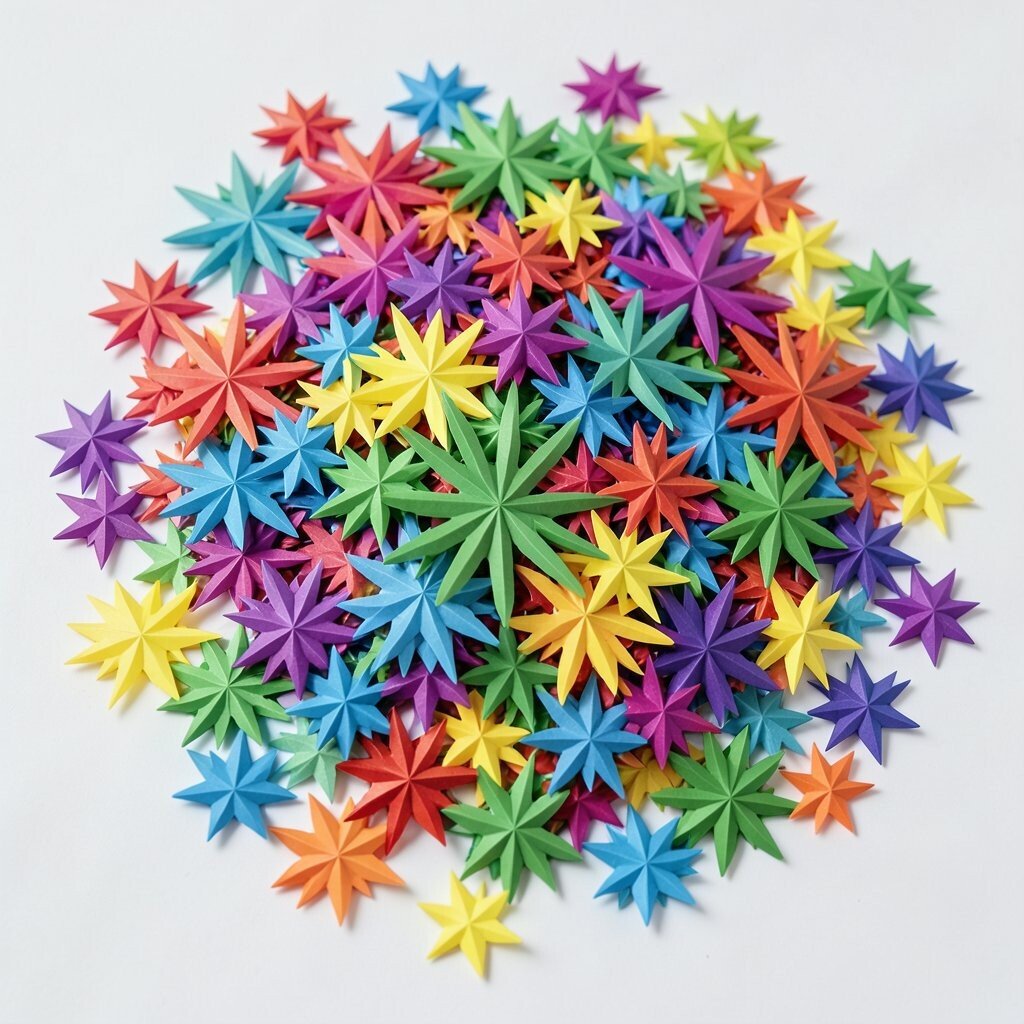
Imagine a starburst made of pixel triangles that explode outward like confetti. The center feels energetic, but the edges stay crisp and controlled.
Create the burst by placing a central point, then building symmetrical rays using triangle shapes of increasing length. Add tiny gaps so the rays don’t become a solid block.
Personalize it by setting the center color to something meaningful, like a birthstone hue or a team color. This pattern benefits your creativity because symmetry helps you focus on choices like ray spacing and color order. It’s also unique since you can shift the ray colors to match any theme.
For practical tips, keep the burst within the safe area of your canvas so it doesn’t crop badly when used as an icon. Cost considerations are low because you only need a few ray colors, and you can reuse them across many confetti variations.
11. Pixel Water Droplet Ripples

Picture a single droplet hitting a surface, then expanding rings forming pixel ripples. It looks calm, but it still feels like something is happening.
Draw a small droplet shape using lighter and darker pixels, then add circular rings that grow outward. Make each ring thinner as it expands so the ripple fades gently.
Personalize it by changing the droplet color to represent something, like ocean blue, rain gray, or soda pop fizz. This pattern is useful for backgrounds, loading screens, and small animations because the motion is easy to simulate by shifting ring positions. For practical tips, align the rings on a grid center so the circle stays round at pixel size.
If you’re thinking about cost, reuse one droplet template and change only the palette for different seasonal versions. Current trends in calm, soothing visuals often use water-like motifs, and this pixel ripple style fits right in.
12. Candy Checker Diagonal Drift
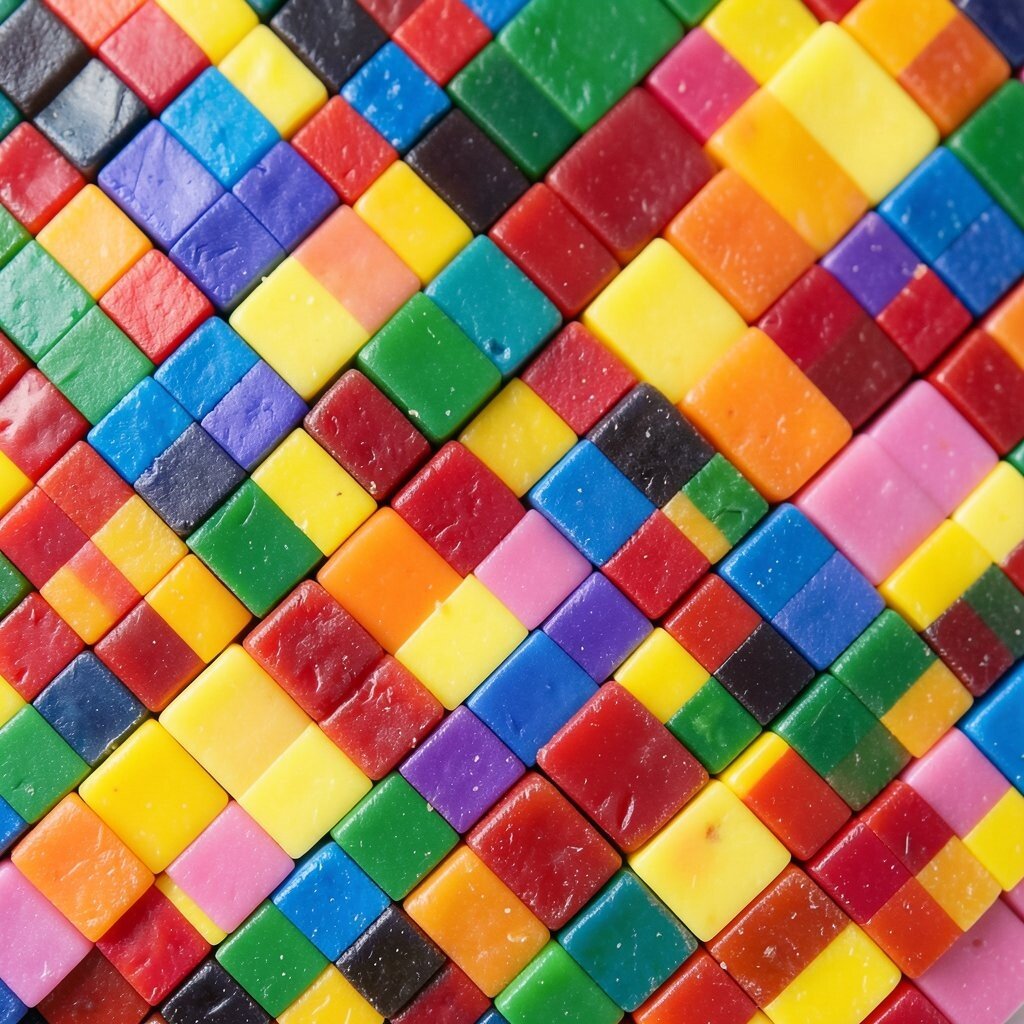
Imagine candy squares sliding diagonally across the screen, like they’re floating in slow motion. The diagonal drift feels playful, yet the pattern stays organized.
Pick two candy colors and arrange them as a checker, then offset each row so the checkers “drift” across the grid. Add a third tiny accent color for highlights in a few squares to keep it from looking flat.
Personalize it by choosing flavors you love, such as cherry red and vanilla cream, then apply a consistent highlight rule. This pattern benefits you because it trains you to see how diagonal motion changes the whole composition. It’s also unique since the drift direction can be flipped, giving you instant variations.
For practical tips, avoid too many colors so the squares stay readable. Cost considerations are easy, since a tiny palette and repeatable drift rules let you generate lots of designs for very little effort.
13. Pixel Animal Pawprint Repeat
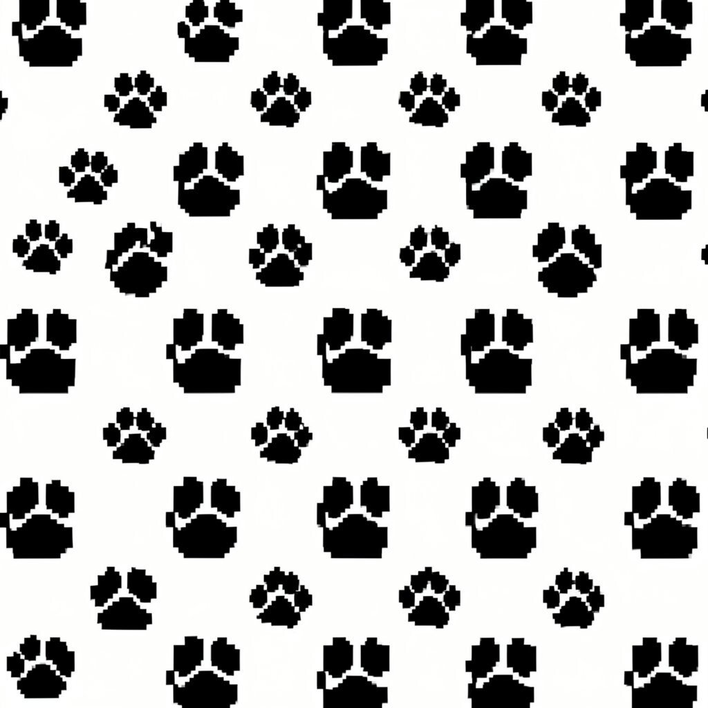
Picture repeating pawprints stamped across a background like a trail. It’s cute, cozy, and full of friendly energy.
Design one pawprint with a toe cluster and a heel area, then repeat it in rows with slight offsets. Use two shades for the paw so it feels dimensional, not flat.
Personalize it by resizing the pawprints to match different animals, or by changing toe shapes slightly for variety. This pattern stands out because repeating icons create a playful rhythm that works well for stickers, packaging, and fabric-like backgrounds. For practical tips, keep spacing consistent so the trail feels even and not crowded.
If you want low cost, use one pawprint tile and recolor it for themed sets like spooky, spring, or sports. Current trends in pet-themed art remain strong online, and this pixel version brings a modern twist to a timeless idea.
14. Dream Map Compass Rose
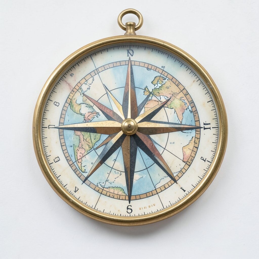
Imagine a compass rose made of pixels, pointing in multiple directions like a map fragment. The center can feel mystical, like you’re charting a secret route.
Start with a cross shape for the main directions, then add diagonal points to create more rays. Use alternating colors for the rays, which helps the compass stay readable at small sizes.
Personalize it by adding tiny symbols near the directions, like a heart for north, a star for east, or a moon for west. This pattern benefits creativity by teaching you to build radial symmetry and balance. It also stays unique because you can shift symbols to create different “map moods.”
For practical tips, keep the outer rays shorter than you think so the design doesn’t get cramped. Cost considerations are minimal because you can reuse the same compass framework and swap symbol colors for many themed versions.
15. Pixel Brick Wall Sunset Glow
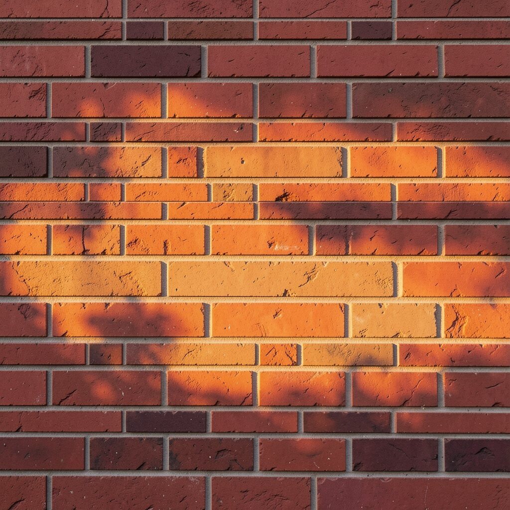
Picture a brick wall where each brick is crisp, but the edges glow like a sunset. The contrast gives the scene warmth and structure at the same time.
Draw bricks with consistent pixel rows and offset every other row to mimic real masonry. Then add a glow overlay by using a gradient-like set of lighter pixels near the top or where the “sun” would sit.
Personalize it by choosing the glow color based on your mood, like warm orange, pinkish dusk, or even neon green for a fantasy setting. This pattern benefits you because brick alignment teaches you repetition, spacing, and scale control. It’s unique since your glow placement can make the same brick base feel entirely different.
For practical tips, keep the brick pattern tight and let only the glow change dramatically. Cost considerations are low because brick tiles are easy to repeat, and you won’t need complex drawing tools to make it look polished.
16. Minimal Moon Phases Lattice
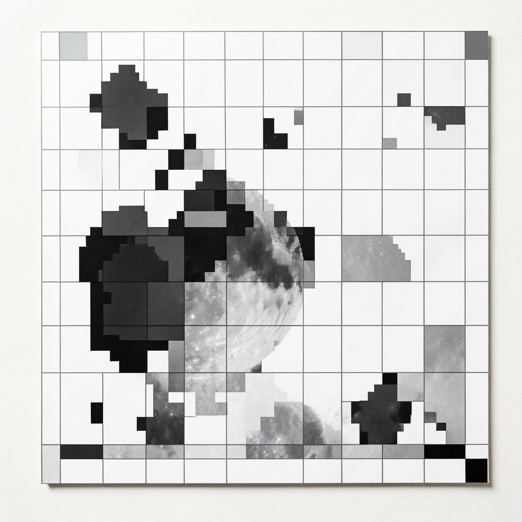
Imagine a neat lattice of moon phases, each one a tiny square portrait. The repeating rhythm feels soothing and a bit poetic.
Create a series of moons by using pixel circles with different missing sections for each phase. Arrange them in a grid and keep the background dark so the moons stay clear.
Personalize it by labeling your grid mentally, like “new beginnings” on one phase and “rest” on another, then swap colors to match your favorite evening palette. This pattern stands out because it mixes basic shapes with meaningful variation, making it great for calendars, wallpapers, and gift tags. For practical tips, test contrast by viewing your image at a small size so the phases don’t blur together.
If you’re cost-conscious, use a single moon circle template and carve variations by deleting a few pixels. Current trends favor slow, calm aesthetics online, and lunar imagery continues to be popular for that reason.
17. Retro Game HUD Health Bars
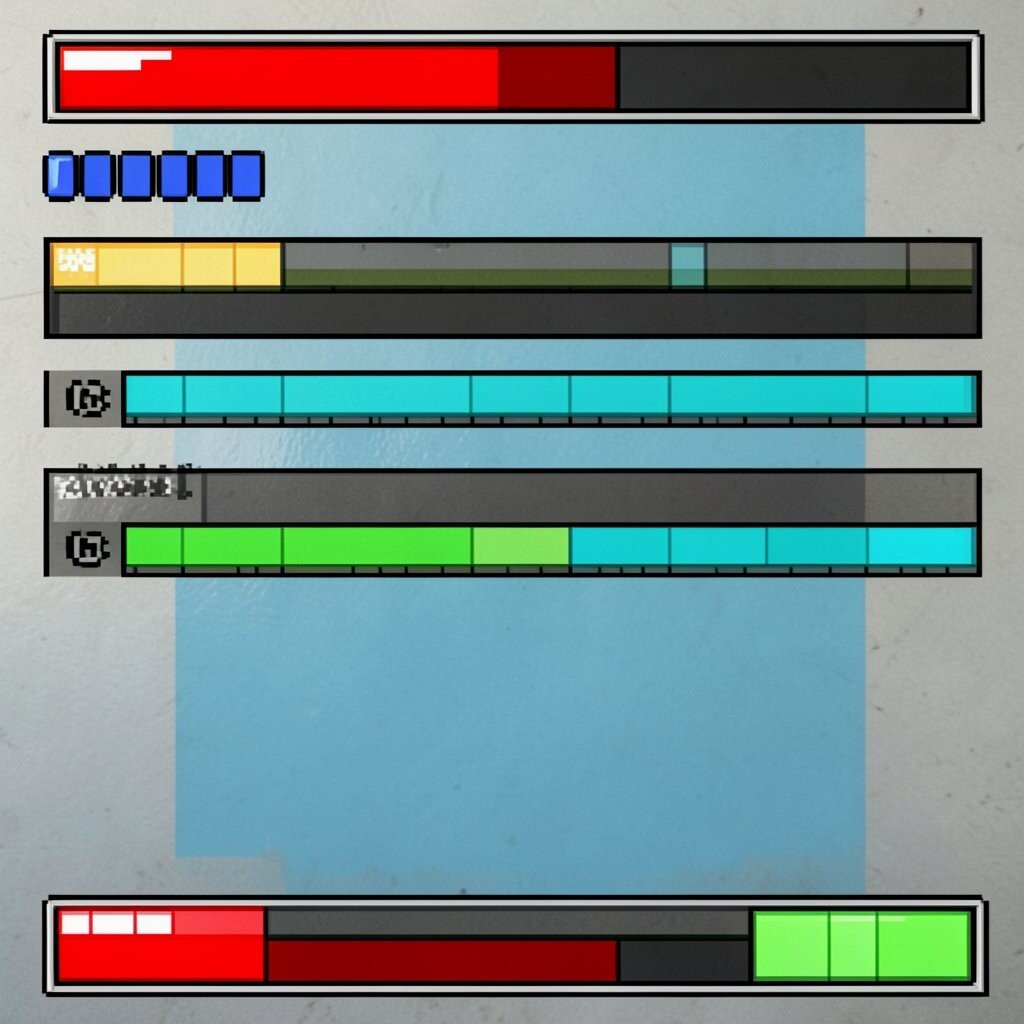
Picture a retro heads-up display with pixel health bars that feel playful and bright. Even if it’s just a background, it instantly signals action and fun.
Build bars using small rectangles and a segmented fill so it looks like classic game UI. Add a tiny icon next to the bar, like a heart pixel symbol, then keep colors consistent with your theme.
Personalize it by designing bars for different moods, such as “focus,” “energy,” or “courage,” and then adjust bar colors accordingly. This pattern benefits your creativity because it’s basically design thinking for clarity, hierarchy, and spacing. It’s unique since you can mimic the style of your favorite games without copying a specific screenshot.
For practical tips, remember that readability matters more than details, so limit the height and keep textless shapes. Cost considerations are friendly too because you can reuse the same bar layout across multiple sets by recoloring and swapping icons.
18. Pixel Landscape Cloud Staircase
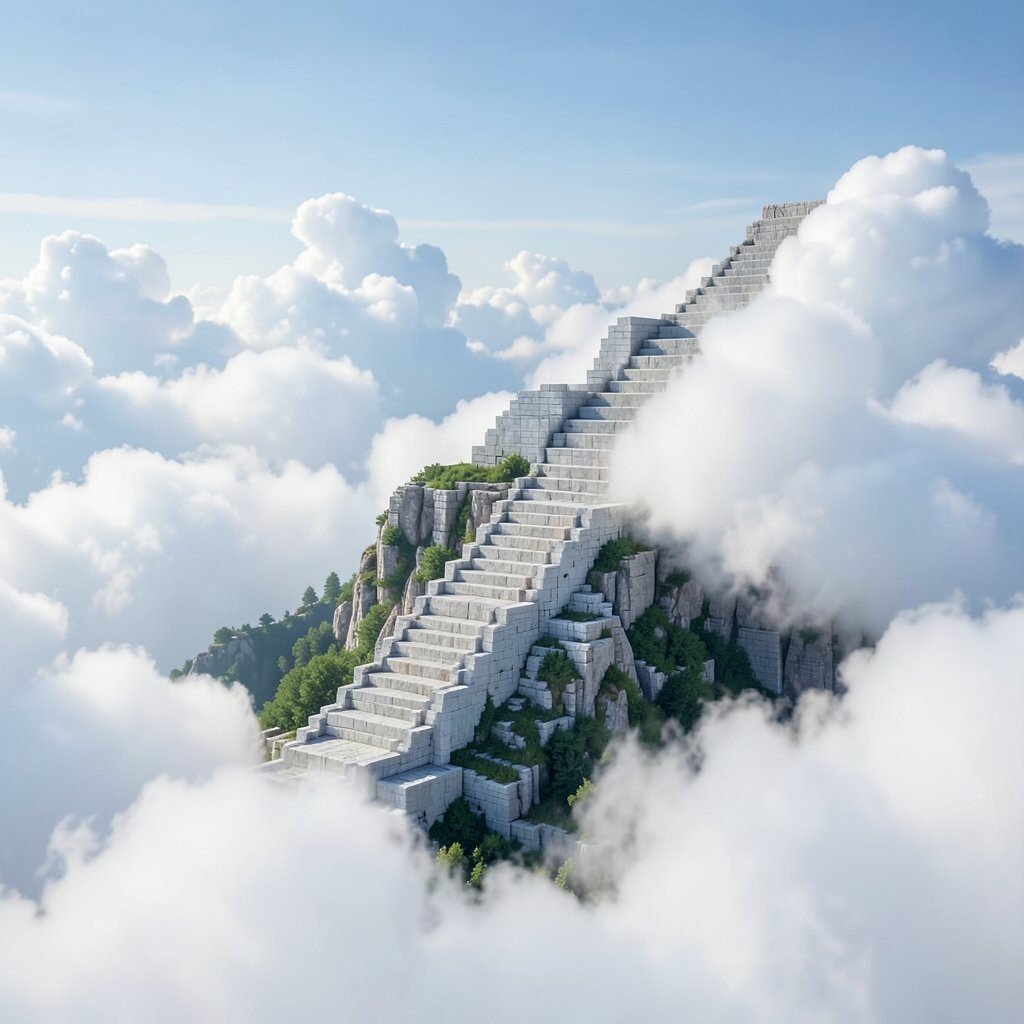
Imagine clouds stacked like a staircase, getting taller and softer as they move across the sky. The effect feels dreamy, light, and surprisingly comforting.
Use repeating cloud lumps made from small rounded clusters, then arrange them into steps that rise and fall. Keep shadow pixels to one side so the clouds look puffy instead of flat.
Personalize it by turning the staircase into a path that suggests a destination, like a tiny mountain peak at the far edge. This pattern benefits you because it encourages layered thinking, even with simple shapes. It’s unique since the cloud height and spacing can create different vibes from calm to whimsical.
For practical tips, keep your palette limited and choose one highlight color so the clouds feel cohesive. Cost considerations are low because you can stamp one cloud cluster repeatedly, then adjust only the row offsets to create the staircase movement.