There’s something about shiplap that makes a kitchen feel calm and welcoming. Add lively color and you get a space that looks fresh, not fussy.
From soft whites to punchy accents, these ideas help you build a bright kitchen that feels like you. You’ll find practical steps, style tricks, and ways to keep the project budget-friendly.
1. Crisp White Shiplap With Warm Sunlit Lighting
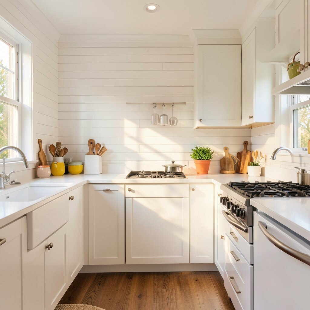
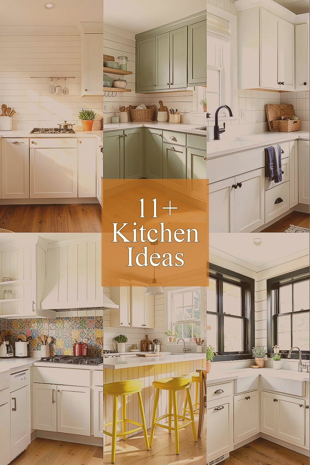
Picture clean white shiplap running across the walls like gentle waves. Pair it with warm ceiling lighting so the whole room glows instead of looking harsh.
Warm light helps the wood tones in cabinets and floors feel richer without adding visual clutter. Choose a color temperature that feels like late afternoon sunshine, then place the brightest light over prep zones like counters and the sink. If you love a cozy vibe, add a dimmer so you can shift from morning brightness to evening softness.
To make the white walls feel extra airy, keep nearby finishes in light neutrals such as creamy grout, pale hardware, and matte cabinet fronts. A reflective backsplash, like glossy tile or a smooth slab, bounces light around and reduces shadowy corners. For personalization, try a single colorful runner or a set of matching canisters on the counter to bring energy without overwhelming the calm foundation.
2. Sage Green Cabinets With Buttery Wood Details
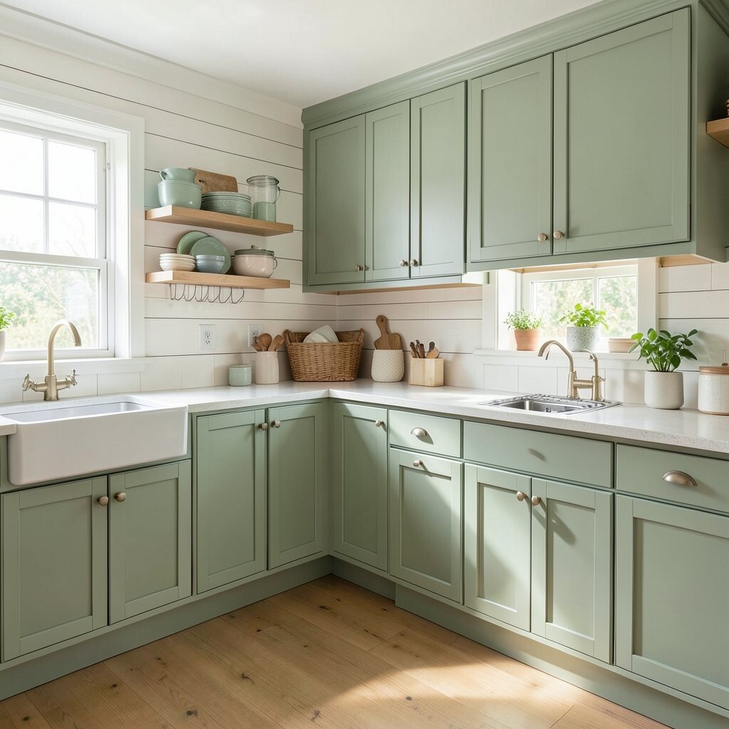
Imagine shiplap walls in off-white while sage green cabinets create a cool, fresh backdrop. Add warm wood touches like open shelving or a butcher-block section to keep it inviting.
Sage green is a current favorite because it reads soothing and natural, especially in kitchens with lots of daylight. When paired with shiplap, it feels modern but still gentle, not too cold or too trendy. Keep the hardware simple, such as brushed brass or warm bronze, so the look stays polished.
For a practical approach, paint small cabinet test panels first and view them at different times of day. Consider using a durable cabinet paint designed for kitchens, since drawers and doors get heavy use. If you want color on a budget, swap only cabinet pulls and add a painted accent shelf, rather than repainting every surface right away.
3. Navy Accents on Hardware, Towels, And a Small Statement Piece

Navy accents can look bold yet still airy when your base is bright. Think shiplap walls, pale countertops, and navy touches like cabinet pulls, a dish set, or a framed print.
This kind of color pop is unique because it feels tailored instead of random. Use navy in two or three places only so your eye knows where to rest. A single statement item, like a navy ceramic utensil crock or a small art piece above the stove, creates focus without darkening the room.
If you want an easy personalization route, rotate seasonal towels and switch artwork with the seasons. Navy also pairs well with many backsplash styles, from subway tile to colorful mosaic patterns. For cost considerations, start with hardware if you’re ready for a quick update, since hardware changes can feel like a full refresh.
When you choose navy, pick a tone that leans slightly warm if your lighting is warm, or slightly cool if your lighting is cooler. Test colors against the wall and countertop before committing. The result should feel crisp, not heavy, especially with bright shiplap keeping the walls light.
4. Colorful Backsplash Tile That Highlights the Shiplap Texture
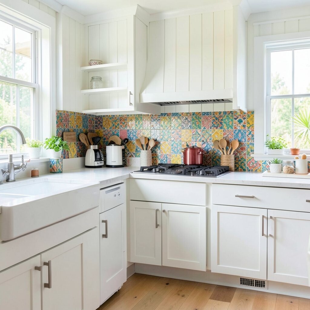
A backsplash with playful color makes shiplap look richer because textures play well together. Picture small glossy tiles in soft blue or sunny yellow tucked between a light countertop and open shelves.
Colorful backsplashes are trending because they give kitchens a handmade feel without needing a full remodel. Keep the rest of the kitchen mostly light so the tile stays the star. If you worry about matching, choose a tile that includes both cool and warm hues so it blends with multiple decor styles.
For a practical tip, use grout that matches the dominant tile color or a light neutral that won’t distract. Installing tile can be a bigger project, so you might start with a smaller focus area behind the sink first. If you’re aiming to keep costs down, look for sales on tile lots or choose a simpler pattern that still feels fun.
5. Sunny Yellow Bar Stools and a Light-Color Dining Nook
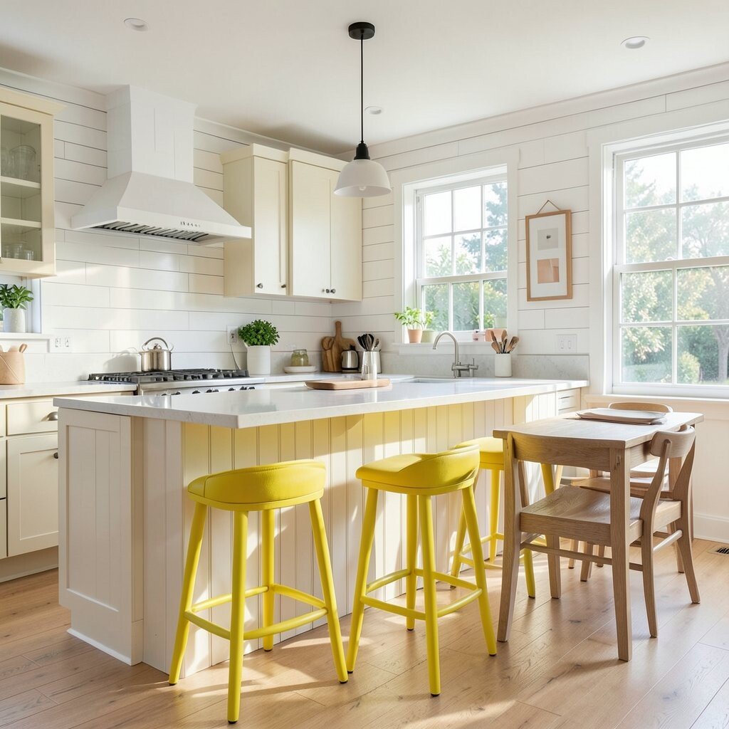
Yellow accents can brighten up a shiplap kitchen fast. Imagine bar stools in a cheerful yellow with light cushions, plus a dining nook that feels open and welcoming.
Yellow helps the room feel more energetic, and it looks especially great when shiplap is white or pale gray. For a practical setup, keep the table top and chairs in light woods so the color feels like a highlight, not a wall of color. If your kitchen is small, choose stools with open backs or lighter frames to avoid blocking the sight lines.
To personalize the look, add a small tray in yellow tones on the counter or a matching vase on the table. Consider washable seat covers if you have kids or pets, since bright colors show crumbs more easily. If you’re watching your budget, swap just the stools first, then add wall decor later after you see how the room feels.
6. Black Window Frames Over Shiplap for Graphic Contrast

For a crisp, modern twist, use black window frames or black trim around a bright window. The shiplap stays light and breezy, while the black outlines add a clean, tailored edge.
This contrast makes the kitchen feel more designed, because your eyes land on sharp lines instead of blurred surfaces. If you can’t change the frames, you can still get a similar look with black curtain rods, slim black hardware, and a matte black faucet. Just keep black accents grouped so the style feels intentional.
To make it practical, measure first and choose narrow hardware that fits the existing spaces without forcing you into bigger repairs. A black faucet with a matching shower-style sprayer can also upgrade daily tasks at the sink. When you want personalization, add a black-and-white patterned runner and keep the rest of the colors soft.
7. Terracotta and Cream Warm Countertops With Matching Canisters

Warm counters help shiplap feel cozy while keeping the kitchen bright. Picture creamy countertops with subtle speckles and terracotta accents in storage jars and a small pottery bowl.
Terracotta is a standout choice because it adds an earthy warmth that pairs perfectly with wood tones and white shiplap. It also fits current trends toward natural materials and “lived-in” styling that still looks clean. If you’re worried about color fading, choose matte finishes and simple shapes that age gracefully.
For everyday practicality, keep frequently used items in labeled canisters so the countertop stays tidy. Use matching lids and a consistent jar size to make the display look neat without effort. If budget is a concern, buy one set in terracotta tones and build your collection slowly as you replace older containers.
8. Pastel Pendant Lights Hanging Over a Bright Prep Zone
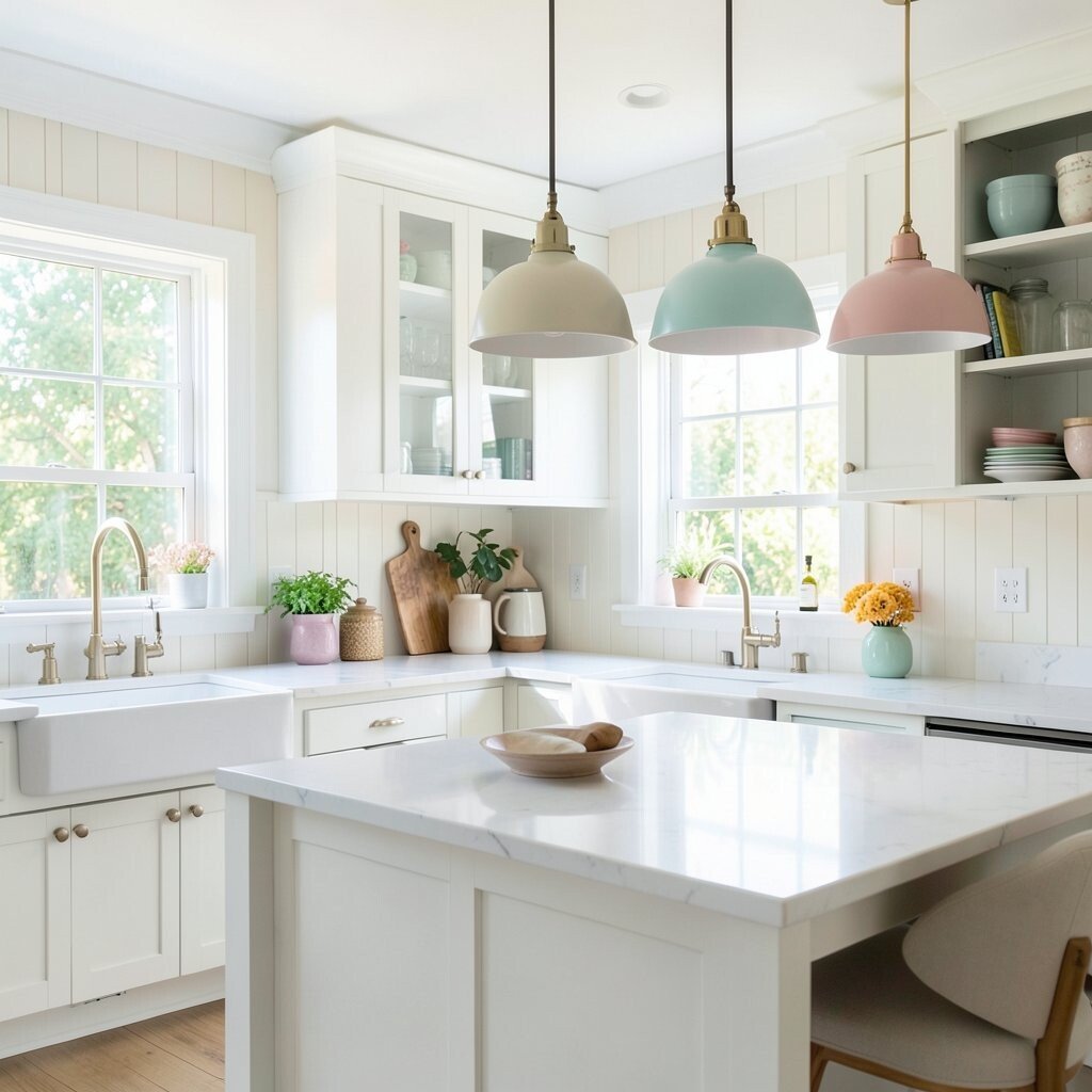
Pendant lights can turn shiplap walls into a stage for color. Imagine pastel shades in mint, peach, or pale blue, hanging over an island or prep table.
Pastel lighting trends are popular because they add charm without overpowering the room. The best part is that you can swap bulb color temperature and keep the mood fresh even as seasons change. Choose shades that are easy to clean, especially if you cook often and splatter happens.
For practical tips, measure the clearance above the counter so lights feel comfortable for everyday use. Consider dimmable bulbs so you can go from bright task lighting to softer evening glow. If you want personalization, match the pendant color to a backsplash accent or to small decor like a cutting board and utensil holder.
Cost-wise, pendant lights vary widely, so set a realistic range and prioritize installation quality. Sometimes spending a little more on fixtures that distribute light evenly saves you from buying extra lighting later.
9. Open Shelving With Color-Coordinated Dishes and Glassware

Open shelving makes a shiplap kitchen feel lighter because it keeps the walls from feeling too closed in. Style it with bright dishware and clear glass so the room looks full but still airy.
Color-coordinated dishes feel unique because they act like an instant art display. Choose a small palette, such as white with cobalt accents or cream with sunny touches, and stick to it. When you arrange items by color and height, shelves look styled even when you’re busy.
For practical use, keep everyday dishes within easy reach and save the prettiest pieces for the middle or upper shelf. Add baskets on the bottom shelf for linens or snack supplies to keep clutter from showing. If you’re working on a budget, consider refinishing existing shelves or painting shelf boards to match your shiplap.
10. Colorful Wall Art Gallery Against Soft Shiplap

A small gallery wall on shiplap is an easy way to add personality without construction work. Use colorful prints, framed photos, or botanical art that matches your kitchen’s accent color.
This idea feels especially bright because frames pop against the pale wood texture. Keep the frames consistent in finish, like matte black or brushed brass, so the gallery looks intentional instead of messy. If you love variety, choose a color theme across pieces so everything still feels like it belongs.
For practical tips, use a level and plan the grid spacing before hanging. Consider removable picture-hanging strips for shiplap areas if your walls allow it and you don’t want to patch later. If you’re personalizing on a budget, print your favorite designs and use affordable frames that you can upgrade over time.
11. Textured Rug and Curtain Pairing in Bright Complementary Colors
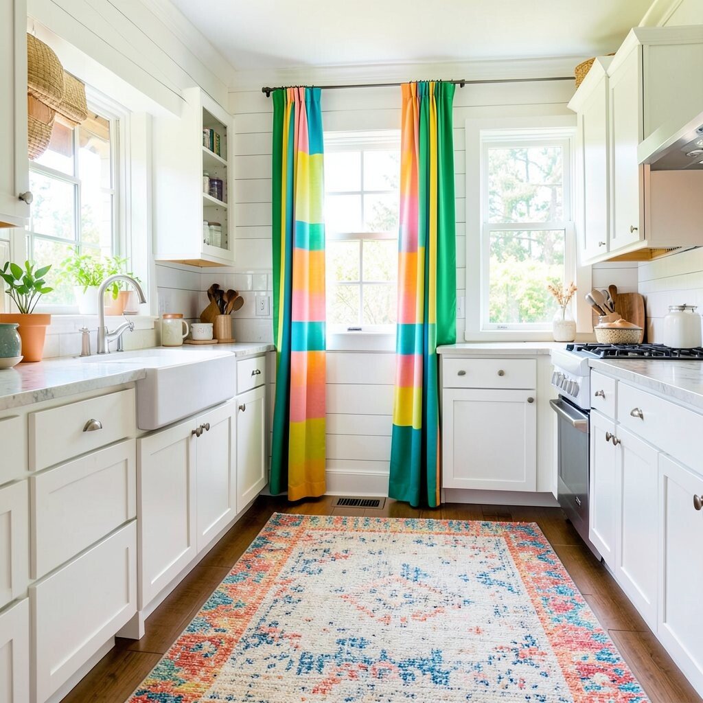
Small fabric changes can make a shiplap kitchen look instantly fresher. Add a textured rug and curtains in complementary bright colors so the room feels warm and finished.
This pairing works because shiplap brings texture to the walls, and fabrics add softness underfoot. Choose a rug with a pattern that hides everyday life, like subtle speckles or light stripes, so it stays appealing longer. Pick curtain colors that echo your accents, such as a coral throw tone or a soft blue note from your backsplash.
For a practical approach, pick washable or easy-to-clean fabrics since kitchens collect dust and splashes. Keep curtain length right so it doesn’t touch hot appliances or create hazards near the stove. If you’re cost-conscious, update one item at a time, like the rug first, then add new curtains when the budget allows.
12. Mix-and-Match Colorful Storage in Matching Organization Zones
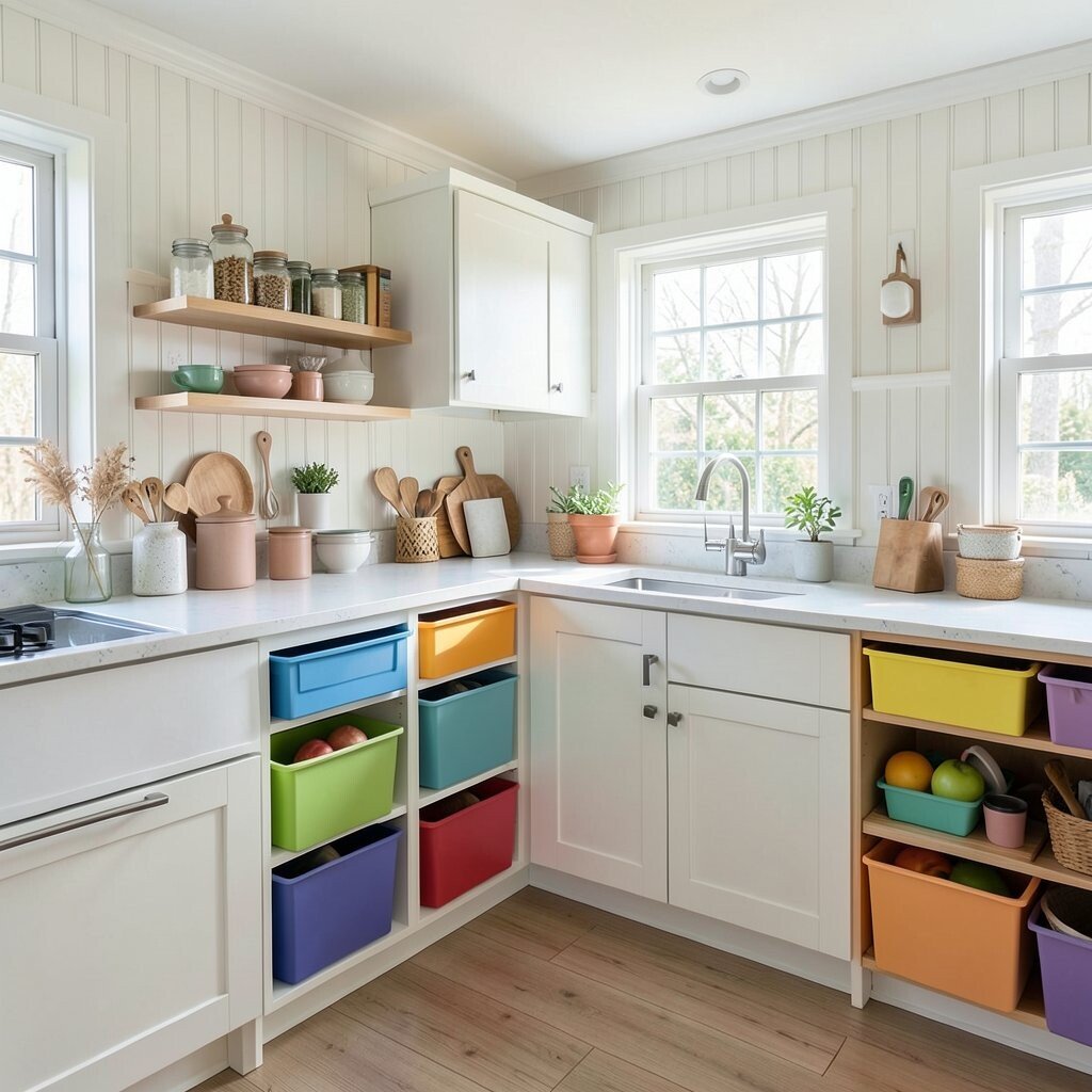
Colorful storage keeps a kitchen cheerful because it turns everyday items into decor. Think bright canisters, colorful storage bins, and a drawer organizer that groups everything by zone.
This kind of organization is unique because it’s both practical and pretty at the same time. When your spices, snacks, and utensils share a consistent color system, the kitchen always looks intentional. It also helps you find things faster, which matters when you’re cooking and multitasking.
For personalization, pick one accent color from your backsplash or pendant light and use it across storage. Use clear bins for pantry items so you can see what’s low, then use matching labels in a fun style font for easy reading. Cost considerations are manageable here because you can start with what you use most, like spice jars and a utensil container.
If you want a current-trend feel, lean into warm neutrals plus one bright pop, which keeps the kitchen from looking chaotic. Measure cabinet and drawer widths before buying sets, since wrong sizes can make storage feel cluttered. The final look should feel bright, organized, and uniquely yours, while the shiplap walls quietly do their job as a light, calming backdrop.