Abstract canvas can feel like a quiet room or a bright street festival. Either way, your wall will start telling your story.
Here are ideas that lean minimalist or maximalist, with ways to make them feel like yours.
1. One-Shape Quiet Studies in Negative Space
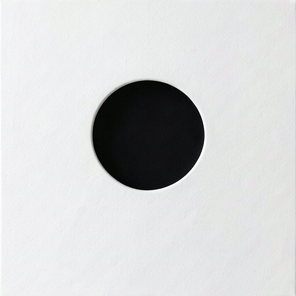
You can paint a single bold shape and let the rest of the canvas stay airy. A clean circle, a calm triangle, or a single slanted block can look crisp against lots of open white or soft gray.
Minimalism like this makes the eye rest, which feels good when the room is busy. Try using matte acrylic so edges look gentle rather than shiny, and tape off one area if you want a steady outline. Keep your color choices to a small set, like black, warm beige, and muted teal.
2. Layered Color Blocks That Feel Like Gentle Weather
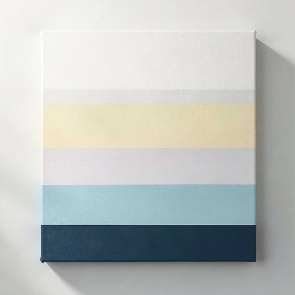
Instead of one shape, stack color rectangles like passing clouds. You might use thin bands of coral, sand, and slate, then soften the borders with a dry brush.
This approach keeps it abstract while still showing movement. It also helps you practice control, because you can cover mistakes without making the whole piece look ruined.
Use a cheap canvas panel if you want to try several variations, then move your favorite one to a nicer stretched canvas. For personalization, choose colors that match your bedding or a favorite mug, so the art feels like it belongs.
3. Single-Brush Gesture Lines with Purposeful Stops

Make a painting out of a few expressive lines instead of filling the whole surface. Think of ink-like strokes that start wide, narrow down, and then stop like a pause in music.
These lines can guide your mood, because they feel intentional and not crowded. Add small interruptions, like a tiny gap or a rough patch, so the piece has human texture.
Try a wide brush for the main stroke and a liner brush for the details, so your marks vary naturally. If you want a maximal edge, add one contrasting line in a loud color, but keep the rest restrained.
4. Pattern Explosion with Stamps, Sponges, and Tape

Go bold by building a dense field of prints and textures across the canvas. Use cardboard stamps, foam sponges, or even crumpled paper, then repeat a few motifs until the whole surface feels alive.
Maximalism like this can turn a blank wall into a focal point fast. It also hides small flaws because layers and patterns camouflage uneven areas.
For practical setup, lay down a plastic sheet and work section by section so paint doesn’t smear where you don’t want it. Personalize it by using patterns inspired by things you love, like subway tiles, fabric you own, or doodles from your sketchbook.
5. Gradients That Melt from One Mood to Another
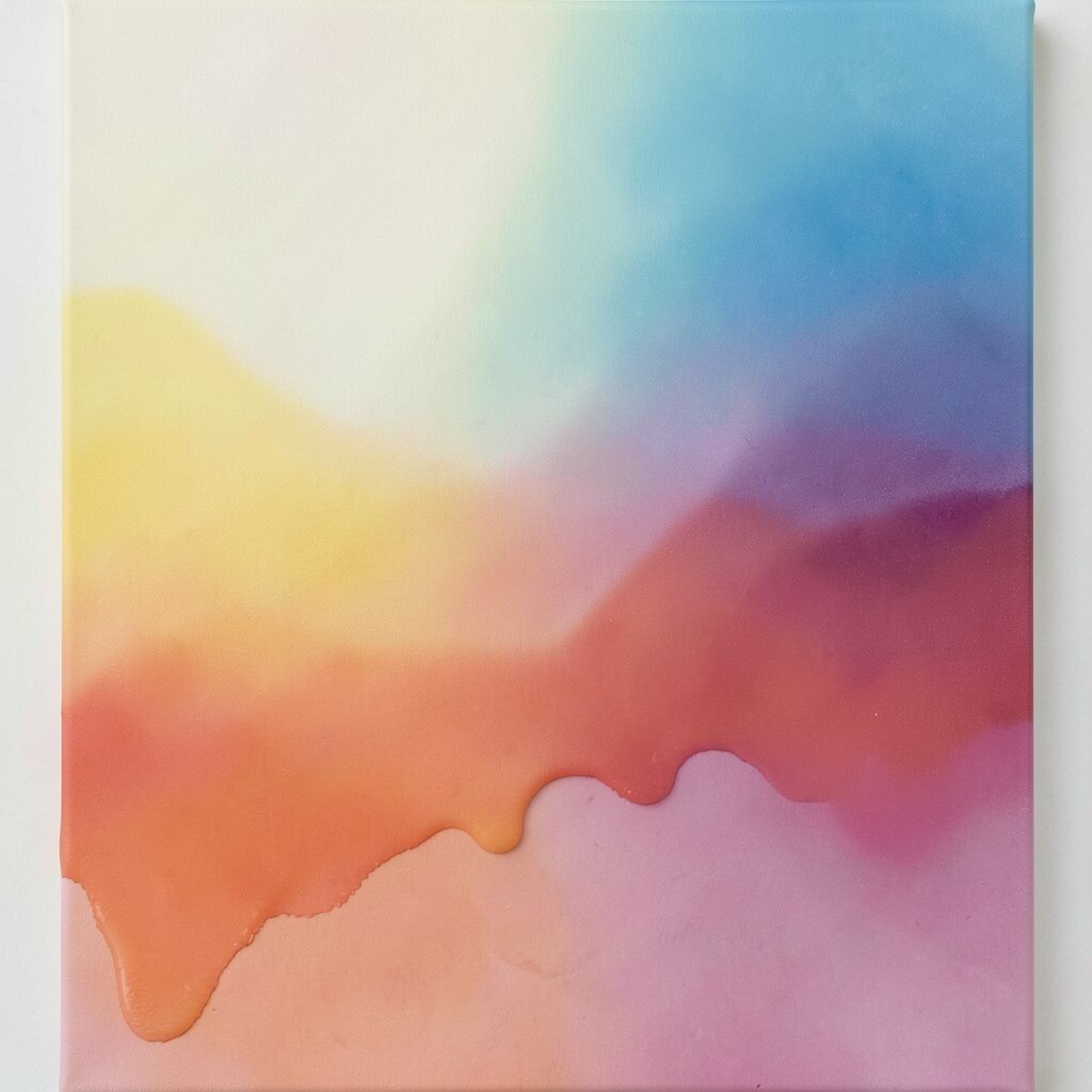
Blend colors into smooth gradients so the canvas feels like a sunrise or a calm ocean. Start with a darker shade at one edge and fade it into a lighter shade as you move inward.
Minimalist gradients feel soothing, and they look great in rooms with simple furniture. They also make your painting look more polished without needing lots of shapes.
Use painter’s tape to control the main color zones, then blend with a sponge or a soft brush. Keep cost down by choosing a small set of dye-like acrylics or student paints that still blend well.
6. Crooked Grid Collages with Found Paper Marks
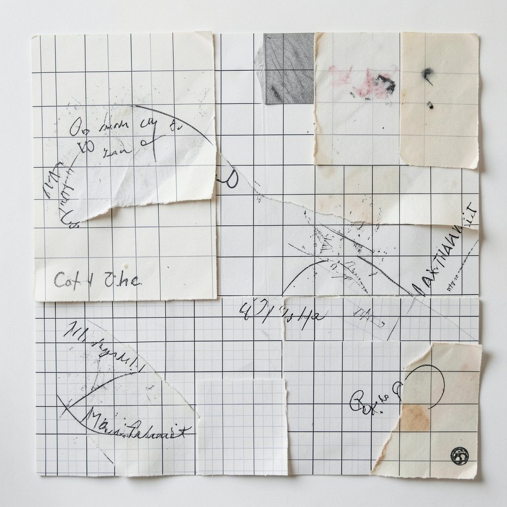
Build a loose grid using torn paper pieces, then paint over them with thin layers. The grid can be straight in your mind but slightly off in the canvas, which makes it feel human.
The benefit is that the structure keeps the chaos from getting too heavy. You’ll also get a textured surface that looks special even from across the room.
Try adding one color wash first, then collage paper scraps only where you want contrast. Personalize with ticket stubs, old book pages, or wrapping paper you already have, and seal it with a clear matte medium for durability.
7. Color-Dot Constellations with Controlled Randomness
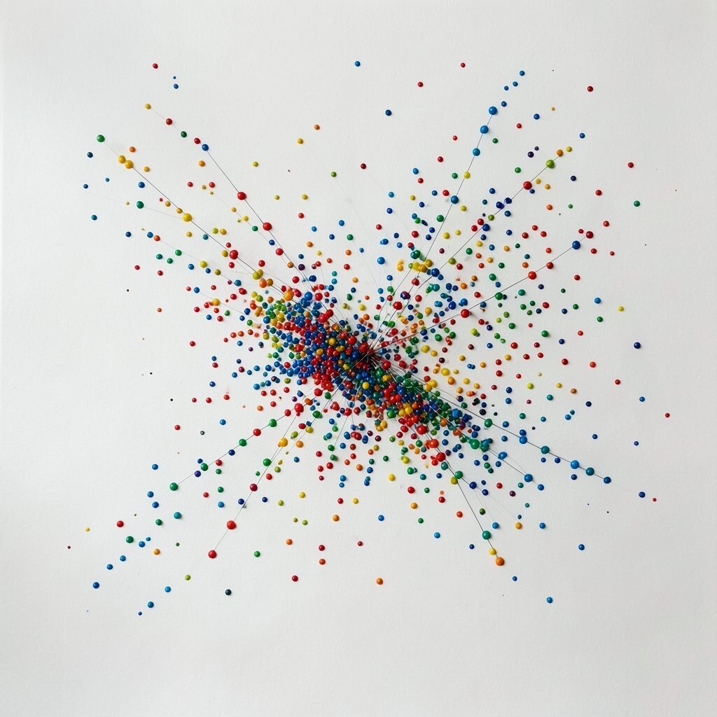
Dot paint like stars, but keep it organized enough to feel intentional. You might place clusters close together, then spread a few dots far apart across the canvas.
This idea can be minimalist when you use one or two colors and lots of breathing space. It can also shift toward maximalism if you add more colors, more dot sizes, and a few sparkly accents.
Use a toothpick or small brush tip for better control, and let each color dry before layering. A simple personalization trick is to map the dot spacing to something meaningful, like the pattern of a constellation you remember.
8. Confetti Thick Paint that Sticks Out

For a maximalist look, make your paint physically stand up from the canvas. Mix acrylic paint with a thickening gel, then add chunky strokes like confetti or small bursts.
Raised paint adds shadow, and the shadows make the colors look deeper as the light changes. It’s a fun way to make an artwork feel energetic without adding complicated shapes.
Work with a palette knife for bolder chunks, and don’t over-smooth, because texture is the point. Keep practical safety in mind by covering your table, since thick paint can splatter more than thin layers.
9. Monochrome Fields with One Tiny Accent
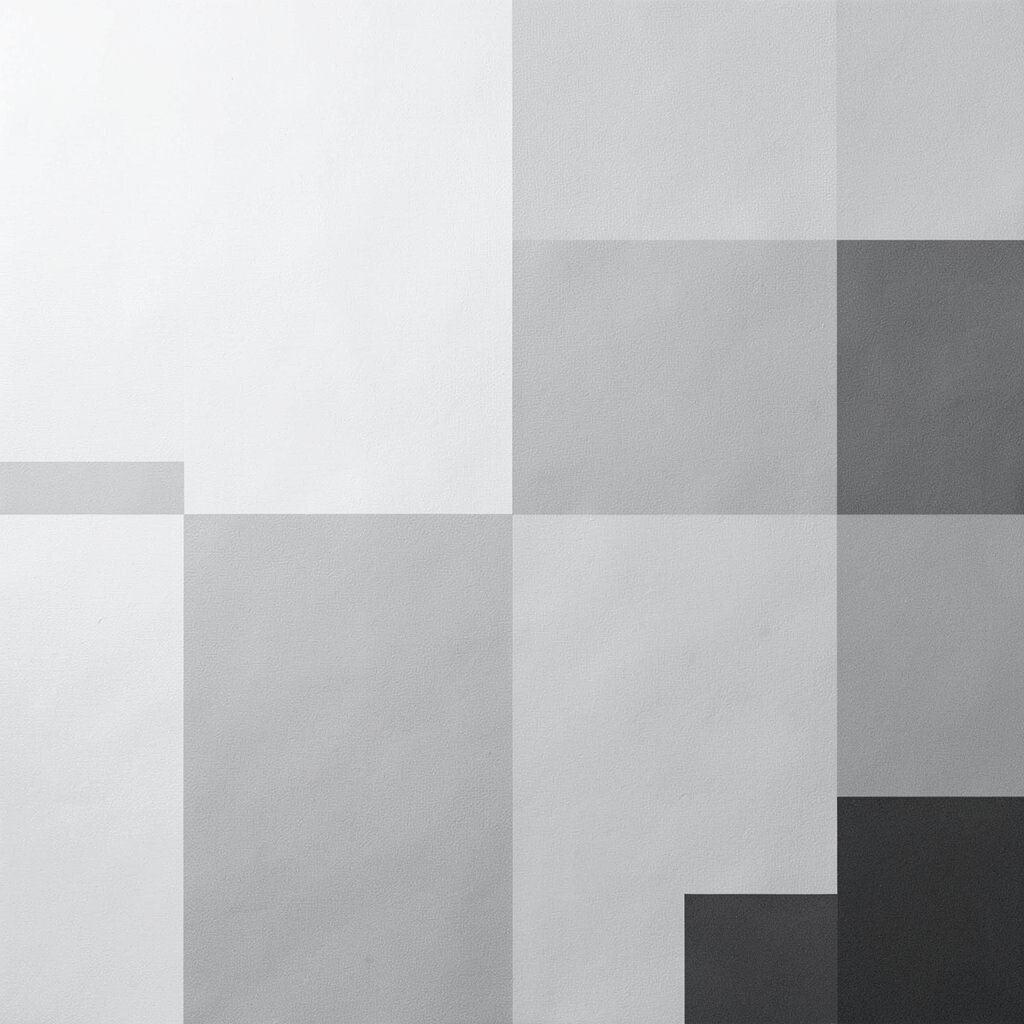
Paint almost everything in one color family, like all shades of gray or all shades of blue. Leave a single small area in a different color, so it pops like a secret.
This is minimalist power, because it gives your eye one clear place to land. The contrast also makes the accent feel more personal and intentional.
Choose a color that matches your space, then test the tiny accent on scrap first. If you want uniqueness, pick an accent color tied to a memory, like the green from a hiking trail or the gold from a holiday light.
10. Themed Maximal Motifs from Everyday Packaging
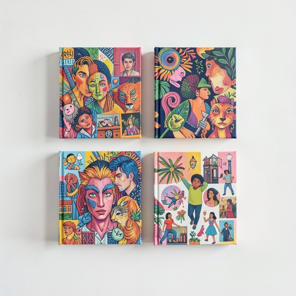
Collect wrappers, labels, and product graphics, then paint around them like they’re characters. You can copy simple icons or shapes, but keep the overall canvas abstract by twisting their placement.
These motifs feel familiar, which makes the painting more engaging for visitors. They’re also unique because your sources are your own, not something copied from a generic template.
Use glue or transfer medium to apply small elements, then cover the rest with paint so it all blends. Keep costs low by using items you’d toss anyway, and seal the final piece so the collage stays clean.
11. Soft Halo Rings That Float on the Surface
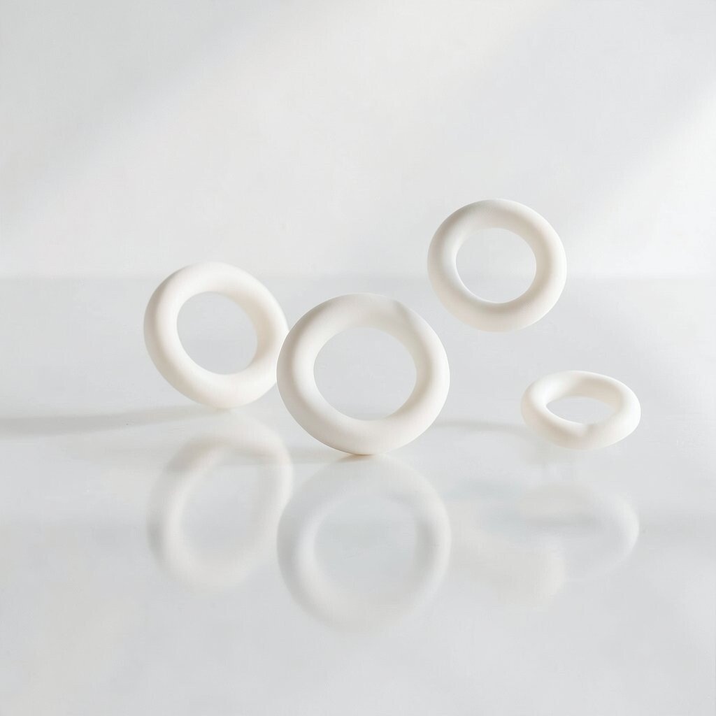
Try painting several ring shapes that look like halos, but keep them hazy instead of perfectly sharp. You can do this by wiping the brush lightly between passes so the edges stay blurred.
Halo rings create a calm rhythm, and the shapes feel like they’re drifting. Minimalist canvases like this also look great with natural wood frames.
For personalization, choose a ring color that matches the light in your room, like warm tones for a cozy space or cool tones for a modern one. If you want practical control, use a cup lid or small stencil for the first ring, then freehand the rest.
12. High-Contrast Splatter with a Color Rule

Make an energetic splatter field, but set a clear rule so it still feels organized. For example, use only two bright colors plus one dark neutral, then let them scatter across the canvas.
Splatter can feel maximal, yet your rule keeps it from turning into random mess. It also gives you instant visual impact, which is great when you want a statement piece.
Put cardboard behind the canvas while you work to reduce cleanup, and practice splatter on scrap first. Personalize the pattern by angling your canvas slightly, because gravity will shift the direction of the marks.
13. Minimal Texture Studies with Sand, Gesso, and Brush Scrapes
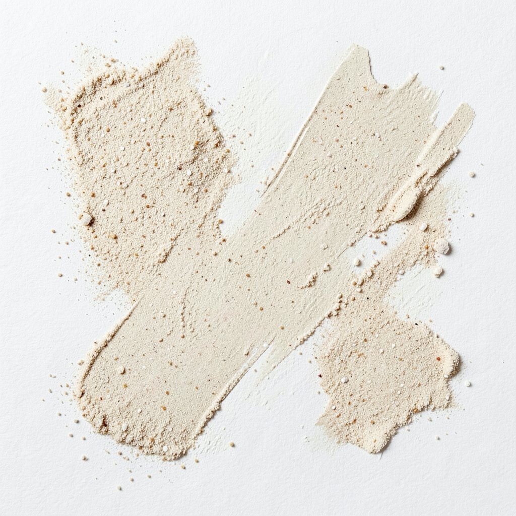
Build texture without loud color by mixing gesso with a little sand or using a thick paste. Then scrape the surface with a palette knife to make subtle lines and ridges.
This kind of canvas feels tactile, and it adds depth even when you use neutral paint. It also makes the work unique because the texture depends on your exact pressure and motion.
Keep costs in check by using leftover gesso and affordable sand from a craft store. For personalization, stamp a gentle curve or press a small object into the paste before painting over it.
14. Maximal “Museum Wall” Layers with Frames Inside the Frame
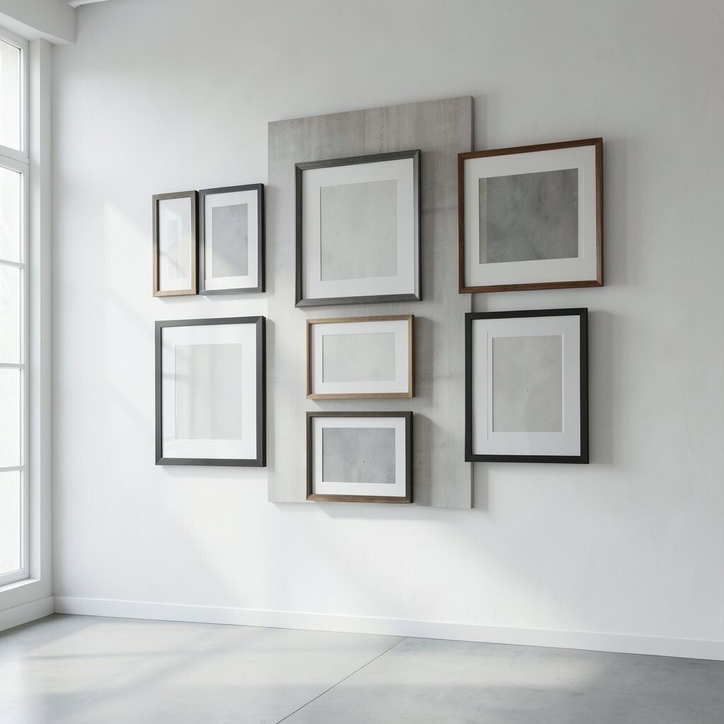
Instead of treating the canvas as one flat area, make it feel like a mini museum display. Paint multiple rectangular frames, then fill each one with different textures, colors, or short lines.
This creates a maximal feel while still staying organized, because the “frames” give the eye structure. It also helps you plan the work, which can make the process less stressful.
Use thin black paint for the frame outlines so each section looks crisp. Personalize it by turning your favorite hobbies into small abstract scenes, like quick shapes that hint at music, plants, or travel without showing clear pictures.
15. Breathy Washes with Dry Brush Edges
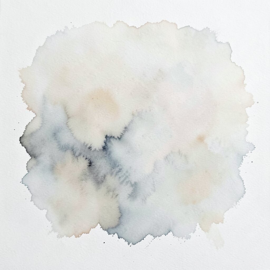
Paint a watery wash, then add dry brush strokes so the edges look torn and alive. You might do a pale wash first, then drag a darker color across while the paint is almost dry.
This balance can feel minimal because the wash is light and open. It can also lean toward maximal because the dry brush adds lively contrast in small spots.
Try using a large soft brush for the wash and a smaller stiff brush for the texture marks. Keep it personal by choosing a color theme tied to a season, like spring greens or autumn ochres.
16. Multi-Color Letter-Like Marks Without Reading Them
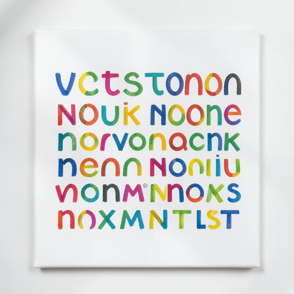
Create letter-like strokes that suggest writing, but never form real words. Use repeating curves, bars, and loops like your canvas is communicating in a secret language.
Maximal in spirit, this idea brings motion and energy without requiring actual text. The repeating marks also let you build layers fast, which is helpful if you like momentum while painting.
Use a fine brush for the line work, then fill some areas with thicker paint so the marks vary in weight. Personalize it by drawing patterns from your handwriting habits, like your “t” shapes or the way you cross certain letters.
17. Two-Color Contrast with Bold Negative Corners
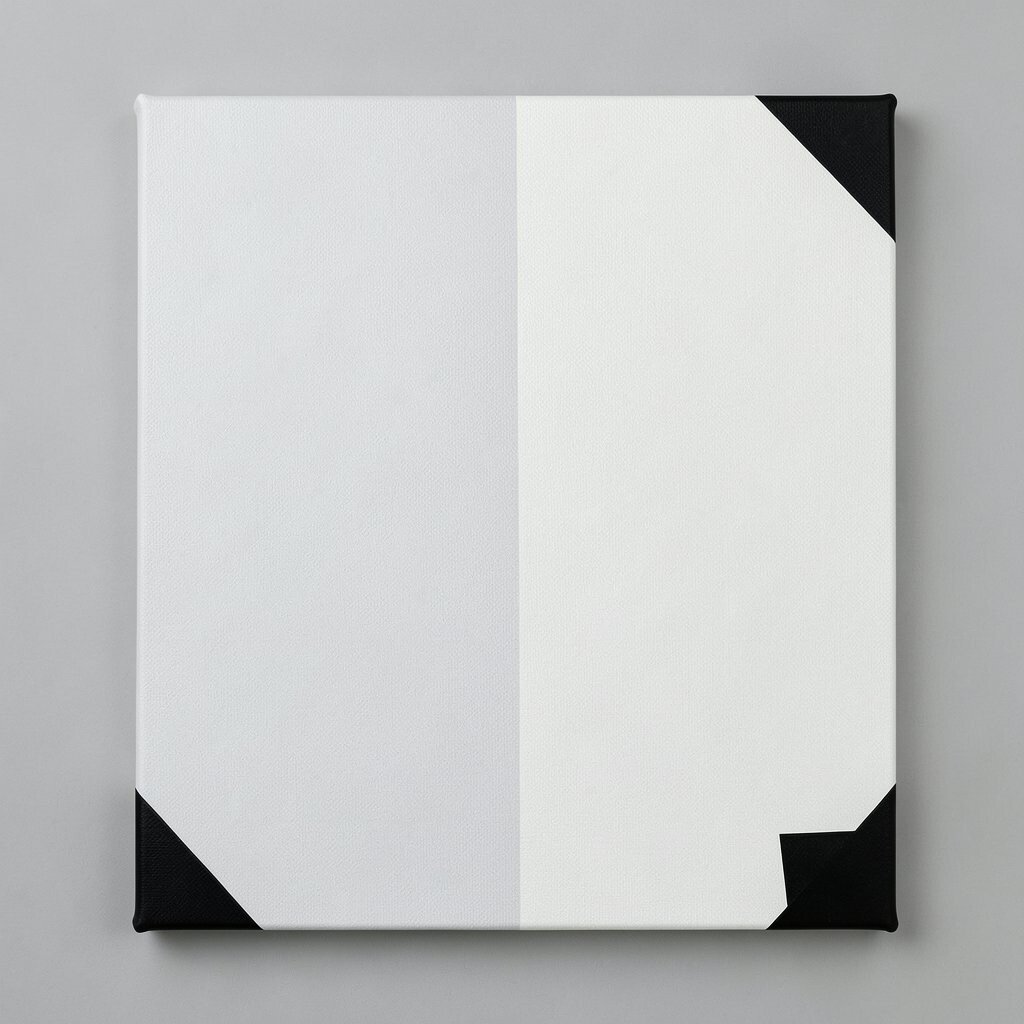
Pick two colors and keep everything else blank, including corners and edges. Paint a sweeping diagonal block in one color, then a smaller block in the other, leaving crisp empty space around them.
This minimalist design feels confident, because the emptiness is part of the art, not a mistake. It can make small rooms feel larger since the canvas doesn’t look heavy.
For practical tips, use masking tape for sharp corner borders and remove it while the paint is still slightly tacky. Cost stays low because two colors are easier to purchase, mix, and match for consistency across a series.
18. Patterned Chaos with a “Repeat Three” Method
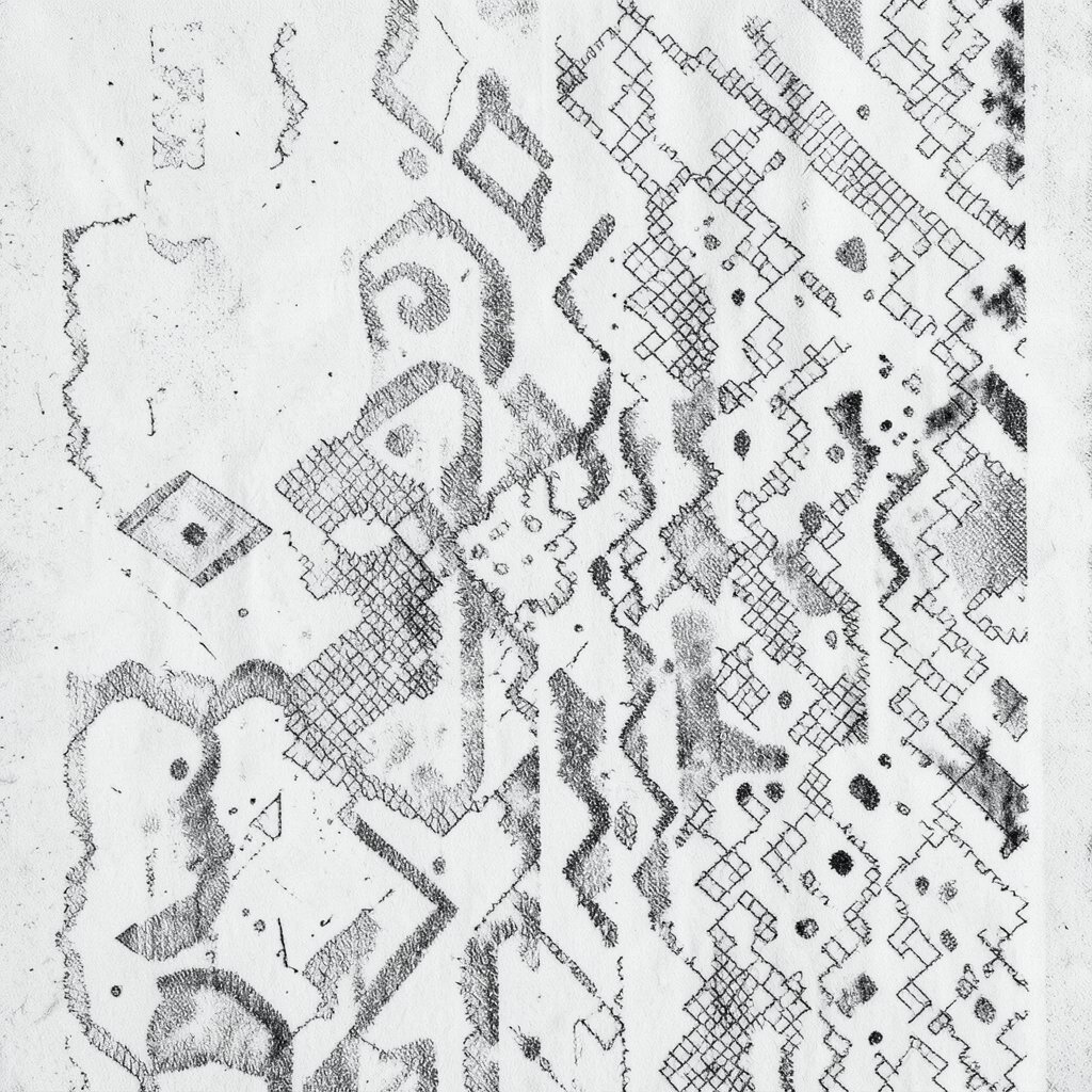
Go maximal with a repeating set of motifs, but use the same three elements everywhere. You might repeat zigzags, small circles, and crosshatch lines across the entire canvas, varying their sizes as you go.
This makes your painting feel full while still being coherent. It also helps you avoid random clutter, because you always know what motif comes next.
To keep it practical, sketch a light pencil layout first so you’re not guessing where to place the patterns. Personalize it by choosing motifs tied to your life, like the way you stack books, the pattern on your kitchen tiles, or the rhythm of your favorite playlist.
19. Split Personality Canvases with a Clear Left-Right Story
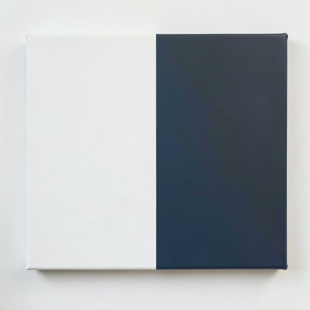
Divide the canvas into two halves that argue with each other in style. One side can be minimal, with open space and a few smooth forms, while the other side can be maximal, packed with texture and bold marks.
This is unique because it gives you a built-in narrative, even though the art stays abstract. It also helps personalization, since you can assign each side a mood, like calm and energetic.
Try using slightly different brush tools for each side, such as a soft brush for the minimalist half and a palette knife for the maximal half. Keep cost in check by reusing leftover paint colors across the whole piece, then sealing it well so the mixed textures stay intact.