Autumn walls can feel cozy without turning your space into a busy collage. The trick is choosing patterns and layouts that feel warm, balanced, and easy to live with.
When your wallpaper plays nicely with the rest of your room, everything looks styled on purpose. You get that seasonal glow while keeping the calm you actually need every day.
1. Layered Tinted Leaves in Soft Grays
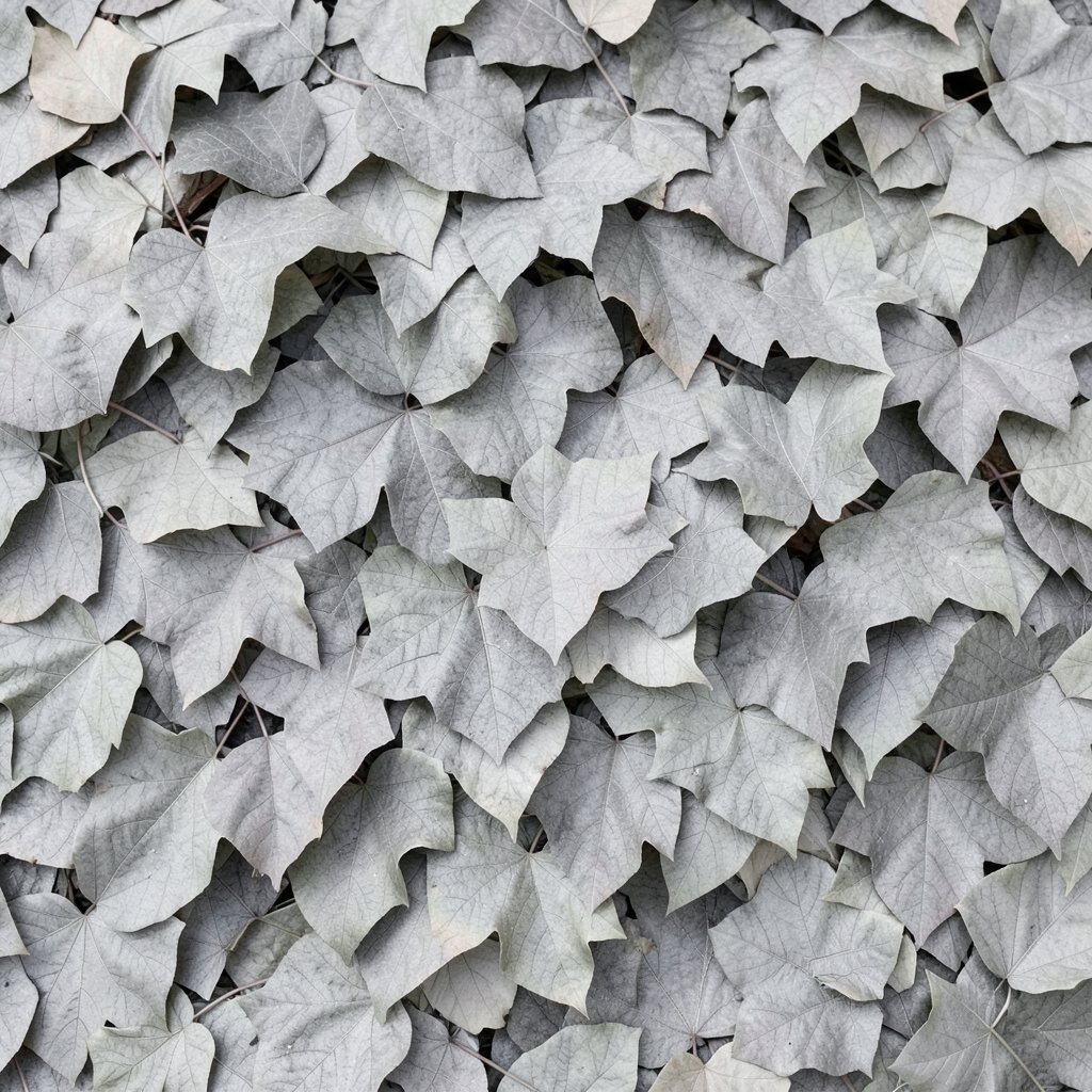
Imagine wallpaper with faint leaf shapes tinted in soft gray and dusty mushroom tones. It looks like gentle shade from a maple tree, even when the room is bright.
This style brings a calm autumn mood that never fights your furniture. Keep the rest of the room simple by choosing solid curtains and letting the wall be the main character. For a practical upgrade, match leaf undertones with your throw blanket and a single framed print for a clean look.
2. Warm Cream Planks With Faint Varnish
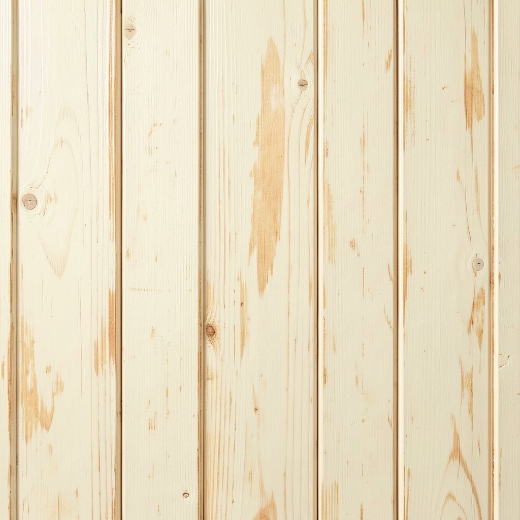
Think of thin wooden planks drawn in warm cream, with subtle lines that mimic gentle grain. The texture reads cozy but stays light enough for smaller rooms.
You get a natural autumn vibe without busy color blocks. Pair it with oat-colored bedding or a caramel-toned rug, and the space feels ready for sweater weather. To personalize, add one ceramic pumpkin in a muted glaze and a tall vase with dried wheat stems.
If you want current appeal, keep the palette warm but modern by using matte finishes on lamps and frames. For cost, look for peel-and-stick panels or smaller accent sections if you are renting or moving soon.
3. Burnt Orange Dots Over Light Linen
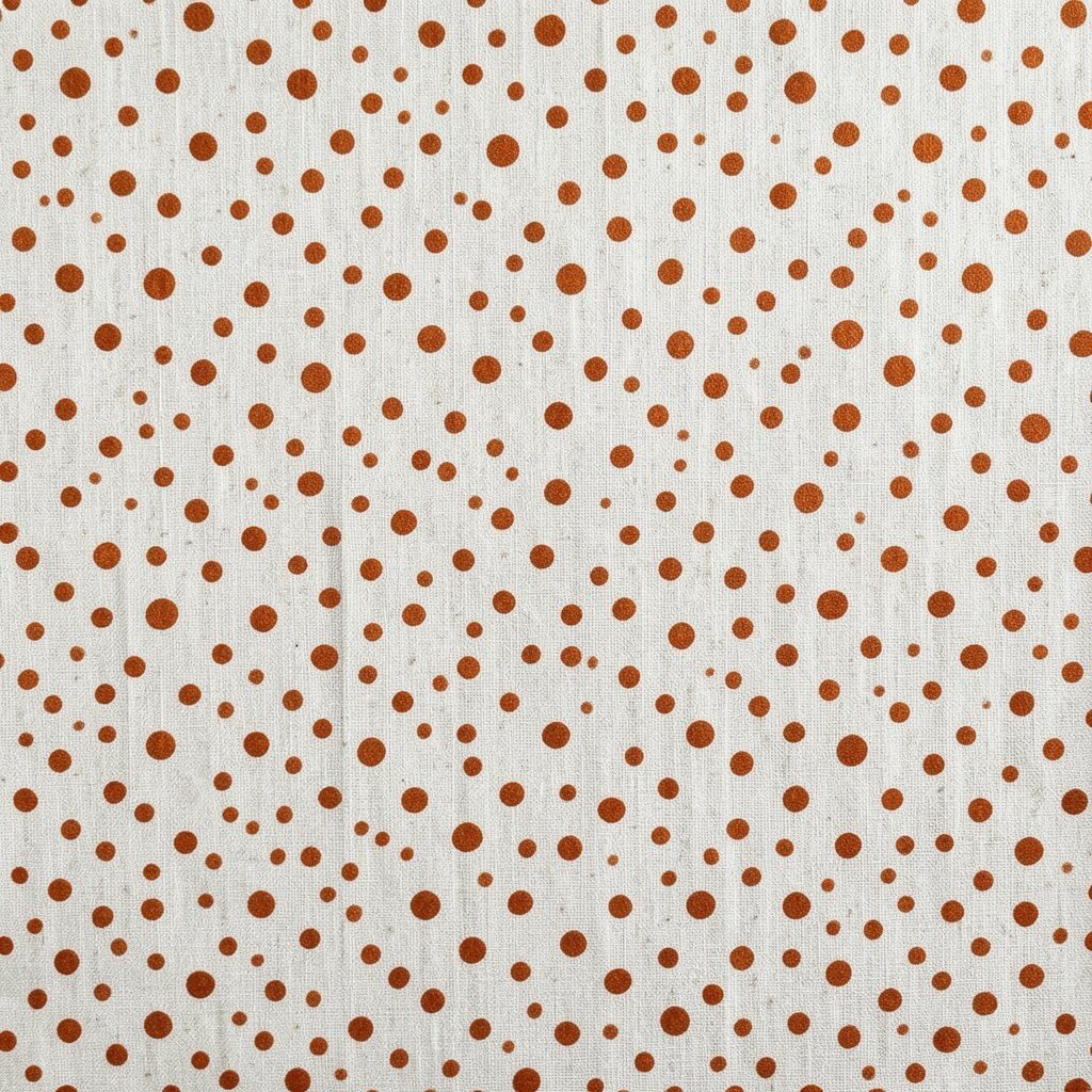
Picture tiny burnt orange dots floating across a light linen background. They feel playful, like the first crisp breeze in the fall.
The small pattern adds warmth while staying airy, which helps your space avoid clutter. Choose curtains and bedding in creamy neutrals so the dots stay the only strong detail. If you want practicality, wipeable wallpaper or washable coatings are especially helpful near kitchens and entry areas.
For uniqueness, try a dot pattern with slightly uneven spacing so it feels hand-drawn. This trend-style look pairs well with modern minimal furniture because the dots add interest without overwhelming surfaces.
Keep costs reasonable by using the pattern on one statement wall, then echo the orange in small decor pieces rather than painting everything.
4. Forest Green Vines Around a Neutral Base
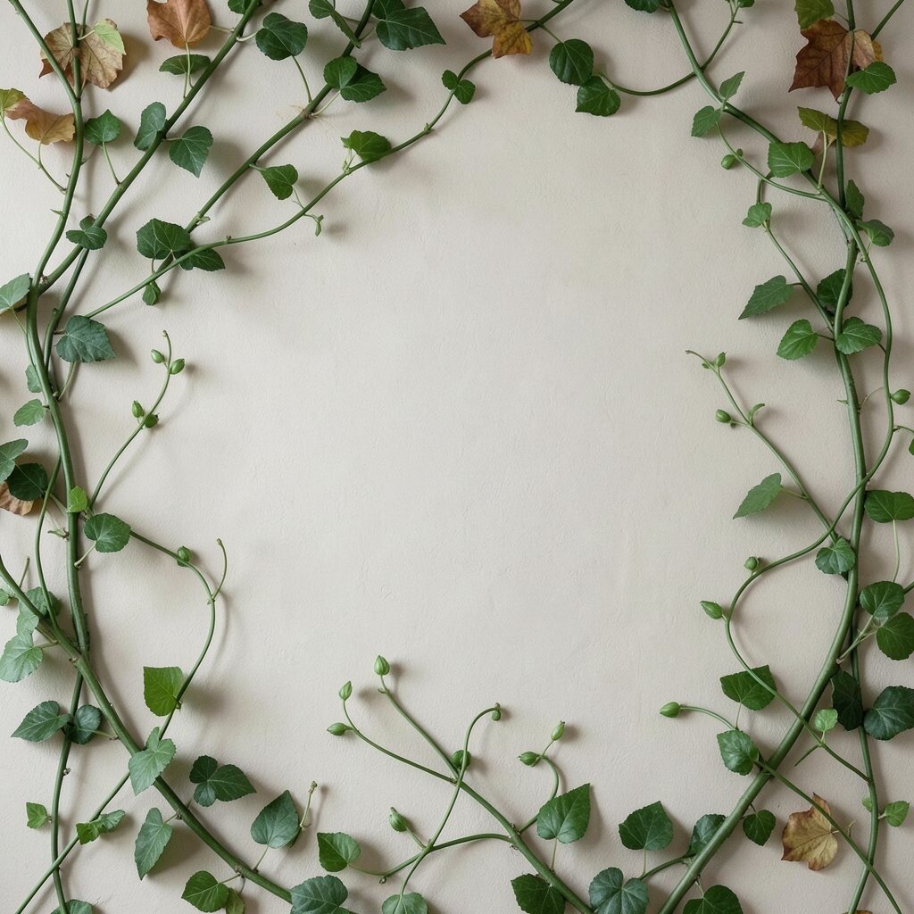
Imagine soft forest green vines winding across a warm beige background. The design feels like creeping plants outside your window.
This wallpaper gives an instant autumn outdoors feel while still reading tidy. Keep the room grounded with natural wood, black metal accents, and simple textiles. If you like personalization, swap the decor seasonally by adding a leaf garland that matches the green tones.
To stay clutter-free, limit framed items to one or two cohesive pieces and avoid mixing too many different art styles. For cost considerations, vinyl wallpaper strips can be a smarter choice for durability in high-traffic areas.
5. Terracotta Arches With Small Space-Friendly Contrast
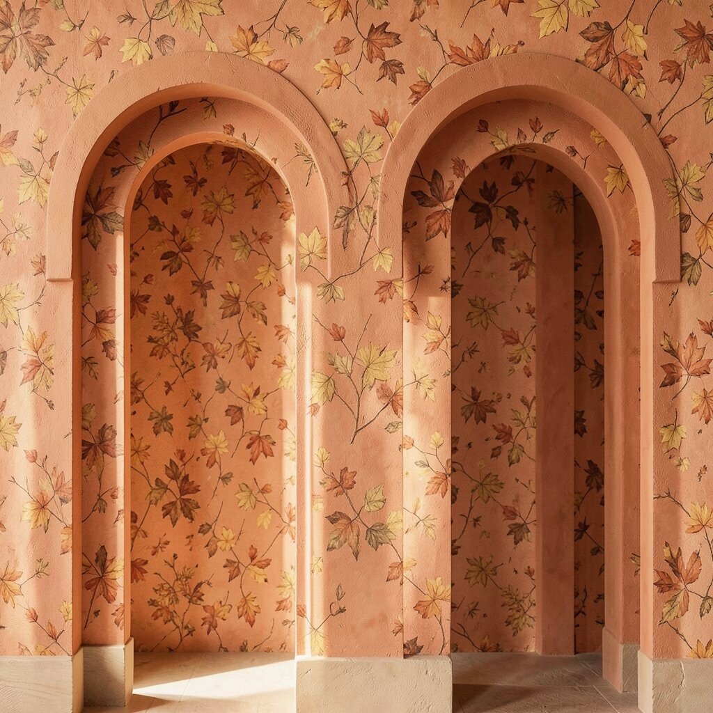
Picture repeating arch shapes drawn in terracotta, with a calm cream space around each curve. The arches create rhythm and a soft architectural feel.
This design adds warmth without heavy details that can feel crowded. Pair the arches with off-white furniture, a rust-toned lamp, and a simple geometric rug for balance. If you want a more personal touch, match the arch color to a specific item like a curtain tieback or a single pillow cover.
For uniqueness, choose an arch pattern with varying line thickness so it feels crafted, not printed. Current styles lean toward warm minimal shapes, which means this wallpaper can look modern for years instead of just one season.
6. Smoky Plaid That Reads Like Cozy Weather
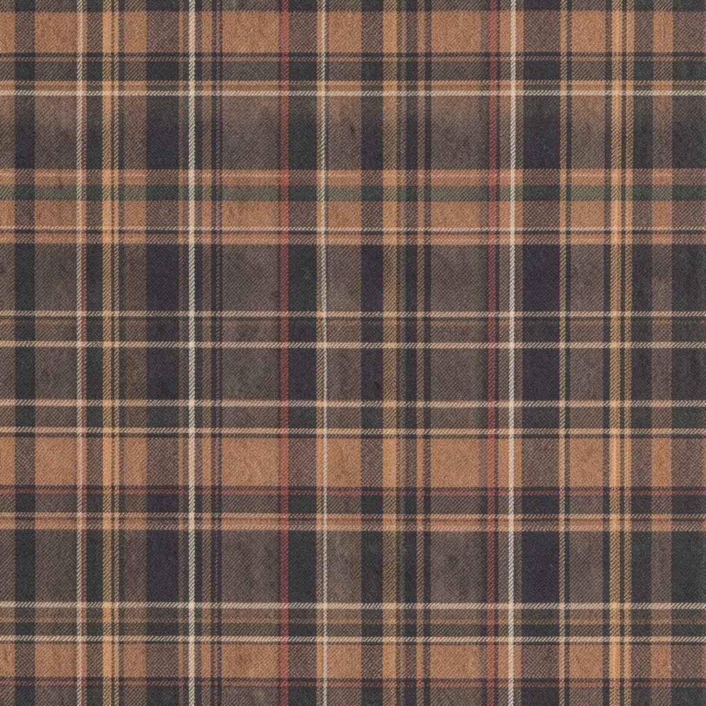
Think about plaid lines in muted charcoal, taupe, and soft caramel. From a distance it looks like cozy flannel, and up close it still stays gentle.
Plaids can feel busy, but this version stays calm thanks to muted spacing and gentle contrast. Keep your decor mostly solid-colored so the wall pattern does not compete with everything else. A practical move is to pick plaid wallpaper in a scale that fits your room size, with smaller rooms often looking best with tighter line spacing.
7. Golden Sunburst Stripes for a Gentle Glow

Imagine wallpaper with sunburst rays that fade outward like a setting sun. The color palette feels like golden hour without bold neon energy.
The visual rhythm gives warmth and interest while still looking organized. Use simple furniture shapes and neutral textiles to let the rays feel intentional rather than chaotic. For personalization, swap seasonal accents by changing only small items such as candles, a throw, or a vase.
If you want cost control, consider applying the rays to the back of a bookcase wall or a dining nook. This gives the seasonal glow where you actually look often.
For trends, soft retro sun patterns are coming back, especially when kept in muted gold and beige tones. A calm palette makes the look feel fresh instead of loud.
8. Oversized Maple Leaf Silhouettes in Dusty Brown
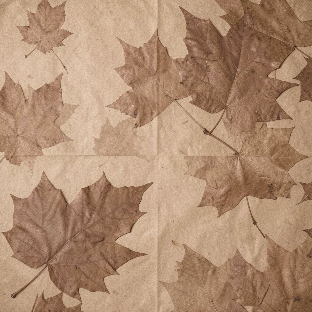
Picture a few large maple leaf silhouettes placed like gentle shadows on a light background. The leaves feel bold, but the wide spacing keeps the room from feeling crowded.
This is a strong option if you want autumn that still feels airy and clean. Pair it with simple, solid bedding and a warm neutral curtain to highlight the leaves. For practical tips, make sure the leaf colors match your existing wood tone so the room looks cohesive, not mismatched.
To personalize, add a floating shelf with two or three items in matching earthy finishes. Choose one texture like ceramic, one like woven fibers, and one like glass so it looks styled without piles.
9. Terracotta and Sage Grid Lines With Plenty of Space
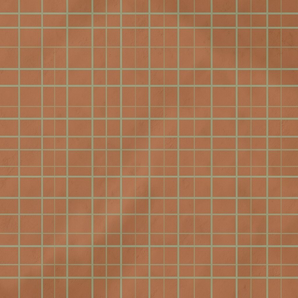
Imagine a thin grid pattern in sage green and terracotta, drawn on a warm white or oat base. It feels orderly and naturally autumn-ready.
This wallpaper helps your room look structured, which reduces the feeling of clutter. When lines are neat, your eye knows where to rest, and decor tends to feel more intentional. Keep your shelves minimal and use matching baskets so small items do not visually spill everywhere.
For uniqueness, try a grid with rounded corners or uneven line thickness that feels handmade. Cost-wise, a single accent wall can deliver the look without the expense of full-room coverage.
10. Antique Newspaper Texture With Warm Leaf Framing
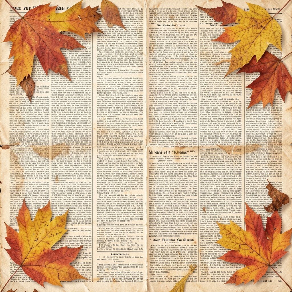
Picture subtle aged paper texture like a vintage journal page, with faint leaf shapes tucked into corners. It looks story-like and cozy, like autumn pages you keep forever.
This design feels unique while staying neutral enough for everyday living. Choose a few frames that match the paper tones and avoid adding too many small prints. For practical tips, place this wallpaper where you spend time, like behind a reading chair, so the texture feels like a comforting background.
If you want personalization, add seasonal typography using a simple lettered sign or a single quote print. For cost considerations, textured wallpapers often come in peel-and-stick options, which can reduce installation stress.
11. Soft Taupe Ombré That Feels Like Falling Leaves
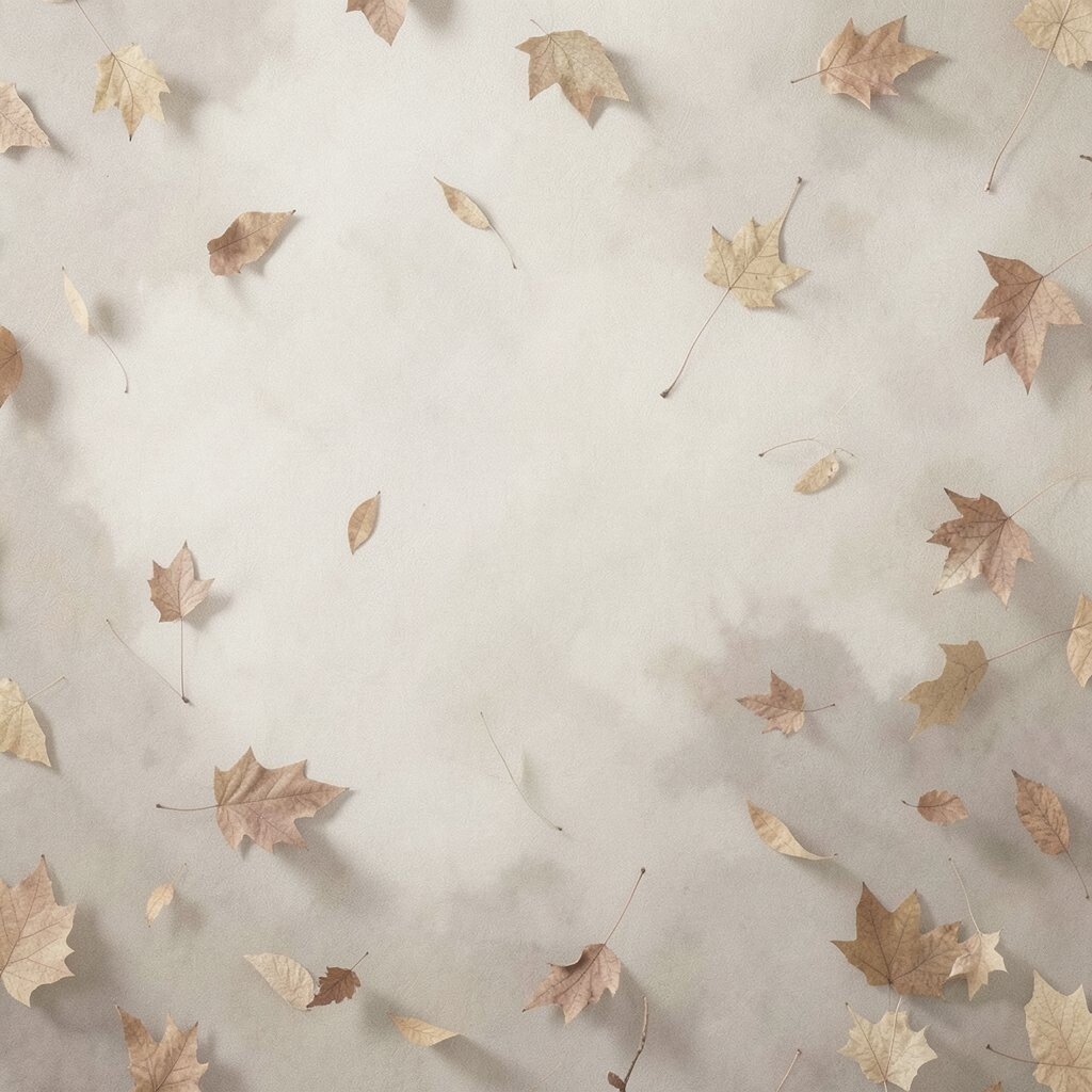
Imagine wallpaper with a gentle ombré fade, moving from lighter taupe to deeper warm browns. The effect feels like leaves settling on the ground.
This is a great choice if you want autumn color without patterns that demand constant styling. Let your furniture and decor be mostly solid so the ombré becomes the calming focal point. For personalization, use pillows that match the mid-tone and add one accent in rust for contrast.
This style also supports practical routines because it hides small marks better than very light solid walls. If you have pets or kids, choosing a textured finish can help your space stay tidy.
Trends favor subtle color gradients right now, especially when they look natural and not overly saturated.
12. Minimal Checkers in Oat and Espresso
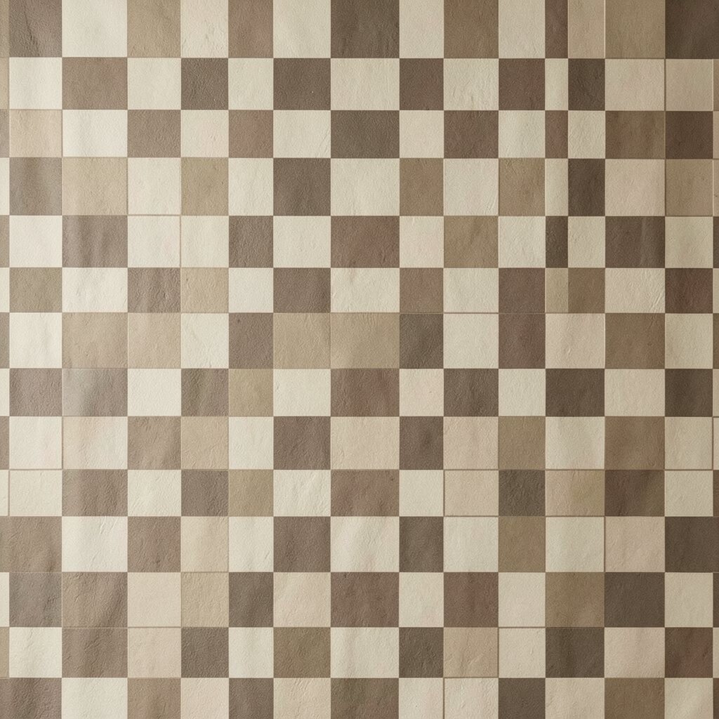
Picture tiny checker blocks in oat cream and espresso brown, evenly spaced. It feels classic and autumn without going full farmhouse overload.
This pattern adds visual structure and keeps the room from looking flat. Pair it with warm neutrals like beige, cream, and light wood so the checkers feel balanced. If you want practical personalization, repeat the espresso tone with one dark metal lamp or a single framed piece.
13. Neutral Botanical Stems With Tiny Buds
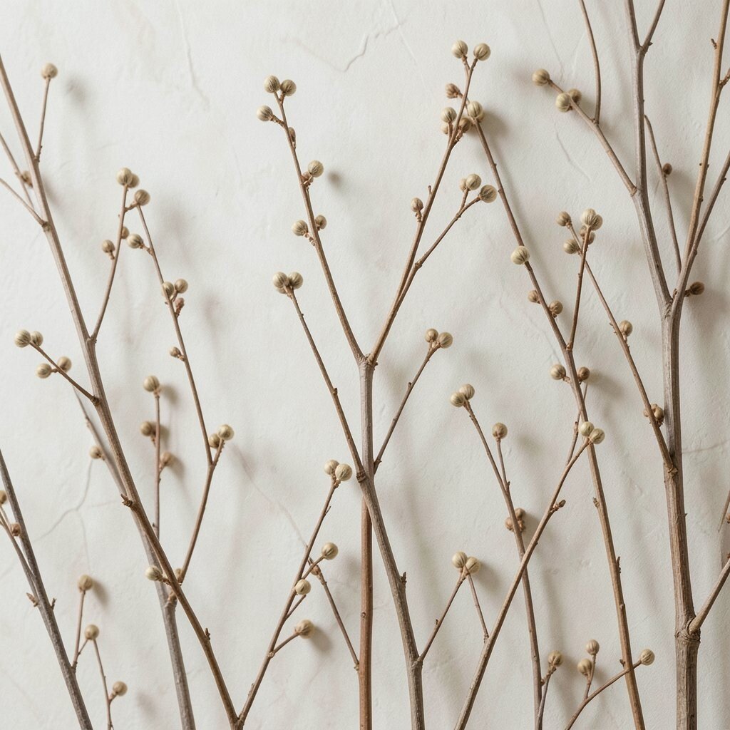
Imagine thin botanical stems drawn in muted greens and soft browns on a warm beige base. The tiny buds feel delicate and intentional.
This wallpaper offers an autumn garden mood while still staying subtle. Keep the rest of your decor airy by choosing natural fabrics such as linen, cotton, or woven throws. For practical tips, avoid too many additional wall items, since the stems already add detail.
For uniqueness, choose botanical wallpaper with off-center composition, where the stems cluster in one area like a natural bouquet. This helps your space feel styled without looking crowded.
14. Woven Straw Texture With Warm Beige Depth
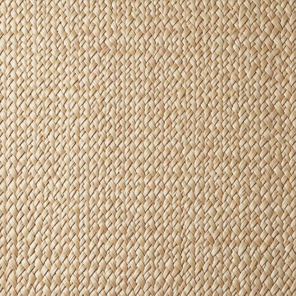
Picture a wallpaper surface that looks like woven straw, but in a smooth, even pattern. The color feels warm, like sunlight on a porch step.
This gives strong texture without visual clutter. It pairs beautifully with rattan, wood, and neutral textiles, making the room feel cozy in a simple way. For personalization, add one or two woven baskets on shelves and keep small items inside so the look stays calm.
If you are thinking cost, this is often a smart choice because textured neutrals hide wear and do not require frequent touch-ups. Many versions also work well in apartments since they read warm even in smaller spaces.
To match current trends, choose a natural tone close to sand or oat rather than very bright yellow.
15. Soft Floral Branches on Cool Mist Background
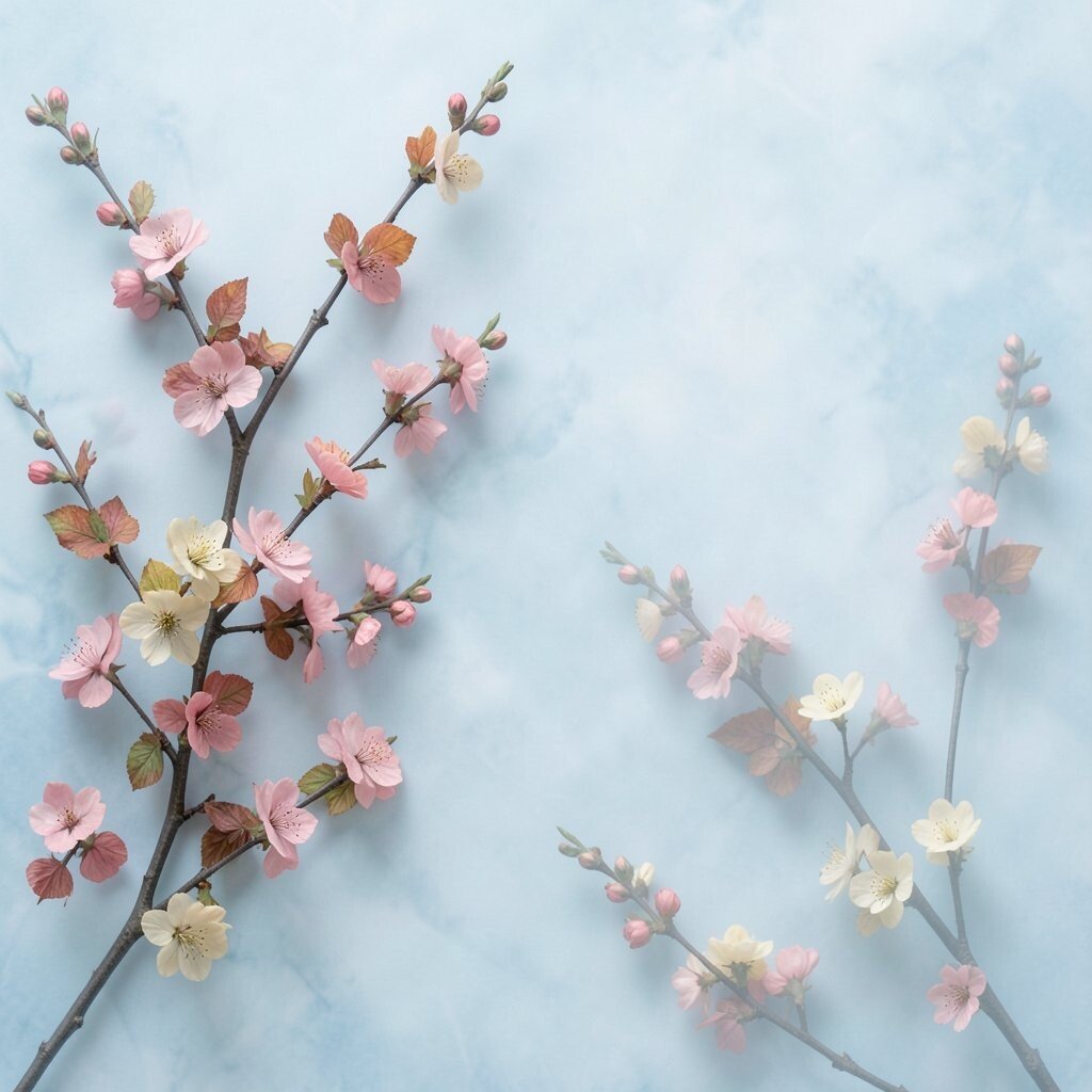
Imagine autumn floral branches drawn in muted rust and dusty rose on a cool mist gray base. The balance feels unexpected and stylish.
This wallpaper can look sophisticated instead of too sweet. Keep the room mostly neutral and let your accents bring the warmth, such as a terracotta lamp or a burnt orange throw. For practical tips, pick washable wallpaper if it will be near windows or areas that get sun exposure.
For personalization, match the floral tones to one piece of art, like a botanical print, so everything feels connected.
16. Warm Marble Swirls With Leafy Specks
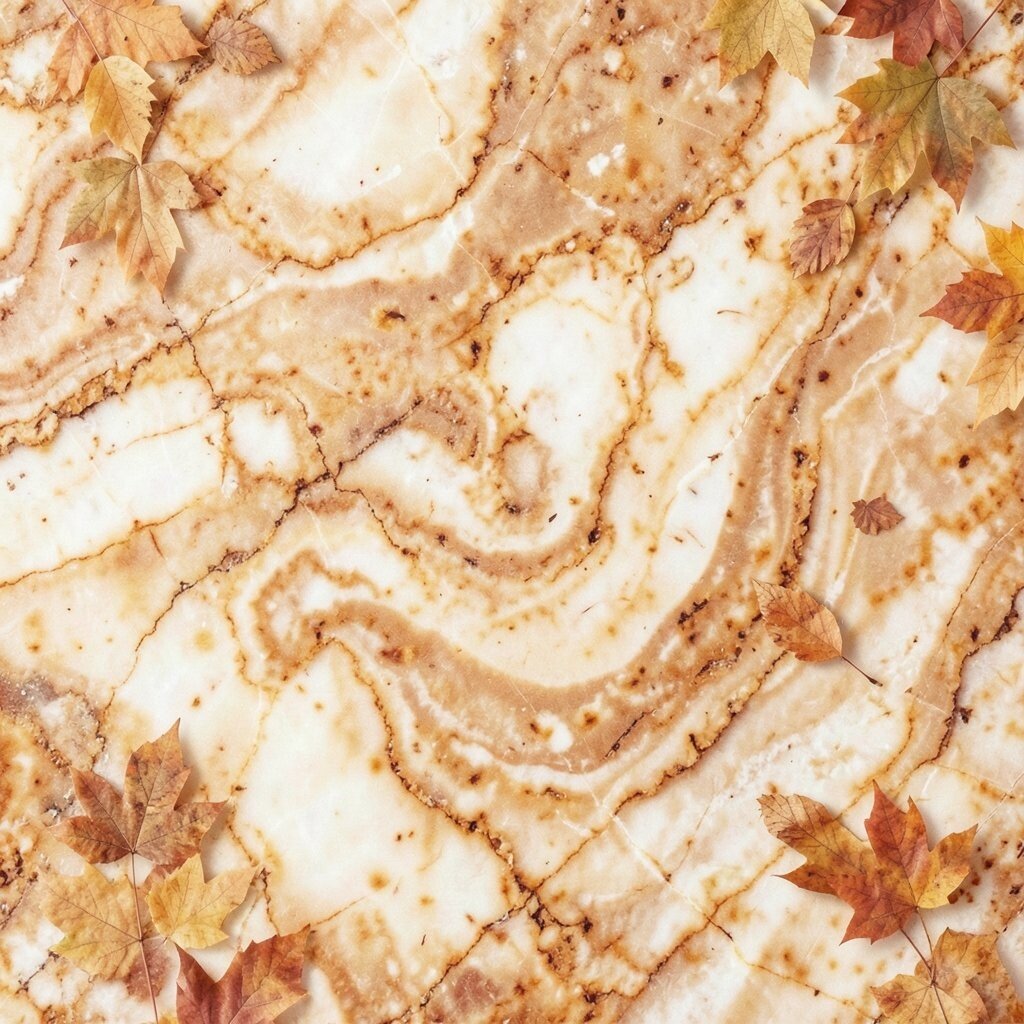
Picture soft marble-like swirls in warm cream and beige, with small specks that resemble autumn leaf fragments. The result feels elegant, not busy.
This kind of wallpaper gives a high-end look while still supporting a minimal decor style. Use solid furniture and limit patterned rugs, because the wall already offers texture and movement. For personalization, choose decor with smooth finishes like ceramic, brushed metal, or matte glass to keep the room refined.
Cost considerations matter here, since marble-style prints can be pricier, so applying it to an accent wall or a headboard backdrop can keep it manageable. Look for options with easy installation for a less stressful project.
Right now, elevated neutral textures are trending, and this fits that vibe while staying autumn-appropriate.
17. Copper Linework Leaves With White Space
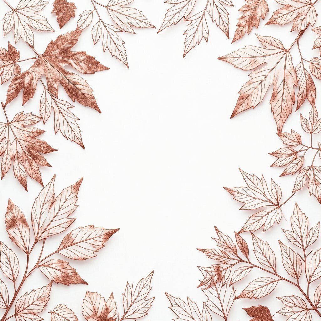
Imagine leaf shapes outlined in thin copper lines on a clean white or warm cream base. The lines look like autumn sketches.
This wallpaper is naturally clutter-resistant because the design relies on light linework. Pair it with warm wood furniture, cream bedding, and simple decor that does not compete for attention. For practical tips, keep your wall art sparse and choose pieces that echo the copper tone rather than adding new colors.
Uniqueness comes from the line style, which feels modern and artistic. If you want personalization, try adding a copper-toned picture frame or a few metallic candles in the same finish.
18. Smoky Autumn Landscape Strips in Narrow Panels
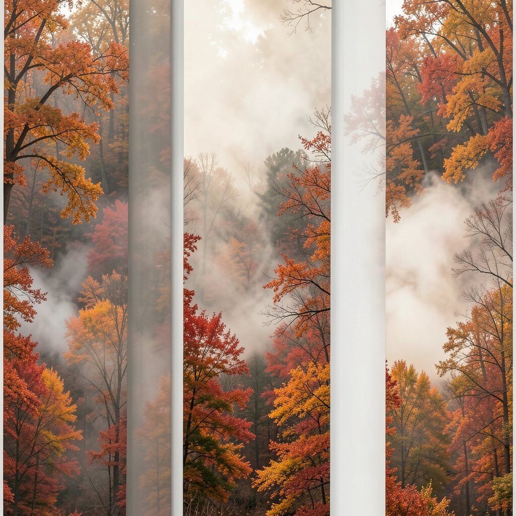
Picture wallpaper that shows a long, narrow landscape strip with foggy trees and soft ground tones. The look feels like a quiet walk through the woods.
This layout can feel calm and cinematic, especially when used behind a sofa or along a hallway. Keep furniture silhouettes simple and avoid many small decor pieces, because the landscape already creates depth. For practical tips, measure the wall carefully and match panels neatly so the scene feels continuous.
If cost is a concern, use it in a small area like a dining nook or behind a console table. This gives the full effect without paying for every wall in the room.
19. Burnt Sienna Watercolor Blobs With Minimal Repeat
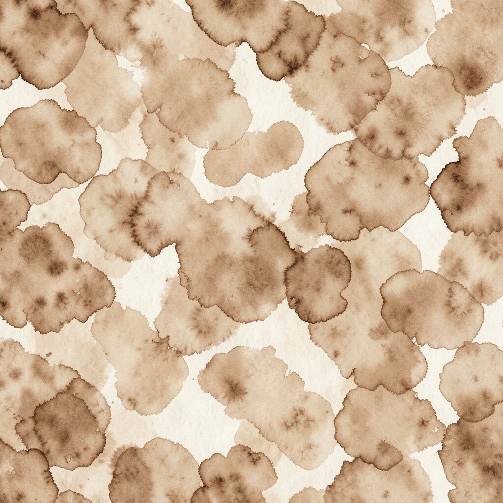
Imagine painterly watercolor blobs in burnt sienna and clay, repeating gently with lots of breathing space. The texture feels artistic and warm.
This works well for an autumn aesthetic without clutter because it is expressive but not busy. Pair it with solid fabrics and calm tones like cream, oatmeal, and soft brown. For personalization, coordinate one color from the wallpaper to your rug and one to your curtains, keeping the rest neutral.
For current trends, watercolor walls are popular because they look hand-made and forgiving. Cost-wise, the effect often looks good even when used as an accent wall, so you can stay within budget.
20. Soft Herringbone in Sandy Beige
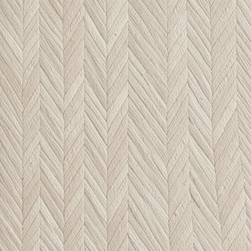
Picture a subtle herringbone pattern that looks like woven fabric in sandy beige. It creates structure without loud lines.
This wallpaper gives a cozy sense of order, which helps rooms feel tidy and styled. Pair it with warm white accents, light wood, and simple textiles for an autumn-ready look. If you want practical personalization, add a single large mirror to reflect light and make the room feel bigger.
Uniqueness can come from choosing a slightly warmer herringbone tone, like oat with a hint of cinnamon. For cost, textured patterns sometimes hide imperfections better, which reduces the need to redo areas if you are careful while applying.
21. Autumn Bookshelf Wallpaper With Empty-Looking Calm

Imagine a wallpaper that mimics tall shelves with books, but drawn in a restrained palette and spaced for calm. The shelves look full, yet the colors stay quiet.
This is a playful option that still feels controlled, especially if you keep your real shelves minimal. Choose neutral decor items and avoid adding too many small objects, because the wallpaper already suggests structure. For practical tips, place this behind a desk or reading corner where you want focus and comfort.
For personalization, style your accessories using just two or three materials, like wood, ceramic, and woven fibers. Cost considerations are easier with this idea because an accent wall can deliver the magic without covering the entire room.
It also fits a trend toward storybook interiors that still respect clean lines and balanced color.
22. Warm Gradient Sunset With Dark Corner Vignette

Imagine a sunset gradient that gets deeper toward the edges, creating a dark vignette like evening shadows. The center glows with warm amber and soft peach tones.
This wallpaper feels dramatic but remains clean when you keep decor simple. Use solid curtains and a mostly neutral rug so the wall does the work without creating visual noise. For personalization, bring in one golden accessory and one deep brown accent to match the gradient tones.
For cost, choosing a wallpaper designed for full-wall fade effects can reduce the need for extra paint or complicated blending. If you are aiming for a trend look, gradient styles remain popular because they feel modern, warm, and easy to style across seasons.
Finally, remember to leave open floor areas and clear surfaces so the glow feels intentional instead of crowded.