
The air turns crisp, and your walls can feel like they’re doing the same. Warm artwork in autumn colors makes even everyday moments seem softer.
With the right prints, a gallery wall can look styled, not random. The trick is choosing scenes and textures that repeat the feeling of fall throughout your space.
1. Maple-Leaf Gilded Silhouettes
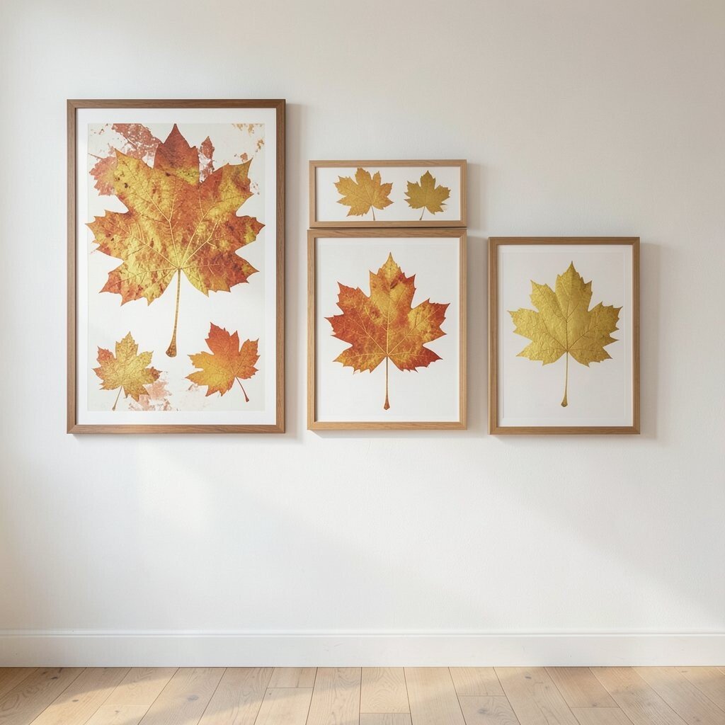
You’ll love how these prints balance simple shapes with a rich, golden mood. Think of crisp maple leaves outlined like stained paper, with a gentle glow that catches the eye.
Hang them where you spend time, like a hallway or near a reading chair, and the room will feel naturally warmer. This style works because autumn icons are instantly recognizable, so guests “get” the look right away.
For practicality, pair one larger print with two smaller ones so the leaf theme feels intentional. If you want an easy personalization, match the frame finish to your existing hardware, like brushed gold or warm walnut.
2. Cozy Cabin in Amber Light
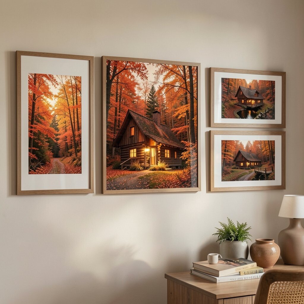
A cabin scene can make your home feel like a quiet retreat. Look for art that shows soft smoke, warm windows, and a path fading into fall leaves.
When you place these prints in an entryway or living room, they help the whole space feel more inviting. It’s also a great way to introduce depth, because the landscape naturally pulls your gaze inward.
To keep it from feeling too themed, mix the cabin with at least one abstract autumn color print. For cost planning, start with one cabin centerpiece in a slightly larger size, then add smaller complementary pieces as your budget allows.
3. Pressed Ferns and Burnt Sienna Papers
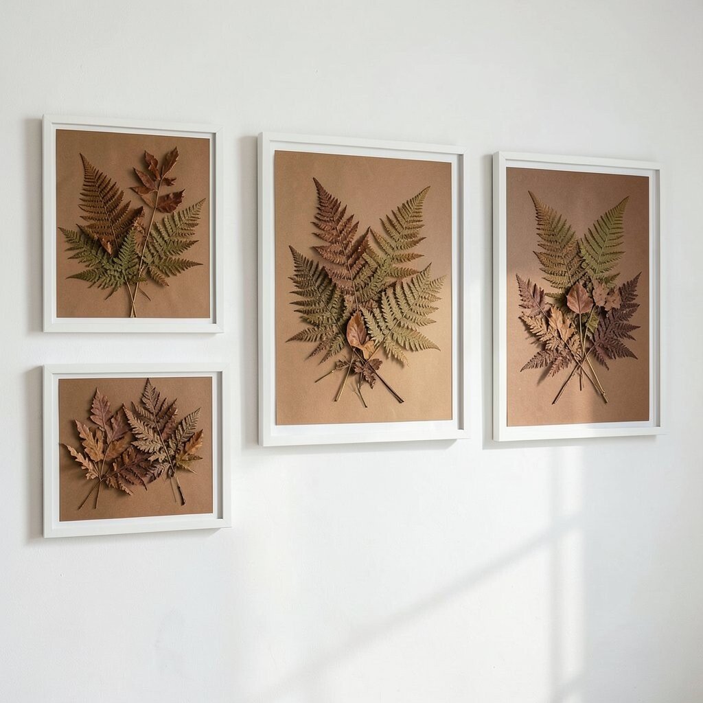
This kind of print feels like fall pressed into art form. You’ll see delicate fern shapes layered over earthy paper tones, often with a handmade, almost vintage texture.
It adds quiet charm without demanding attention, which makes it perfect for small spaces. The benefit is that greens and browns can blend with many home styles, from modern to farmhouse to cottage.
Try framing these in thin, matte black or natural wood to highlight the botanical details. If you want personalization, repeat the fern print next to a seasonal quote or a small monochrome leaf drawing.
You can also swap sizes across the wall so the botanical shapes feel like a living arrangement. If you’re watching spending, look for open-edition prints in ready-to-hang sizes, because they’re often more affordable than one-of-a-kind work.
4. Autumn Market Stroll Watercolor
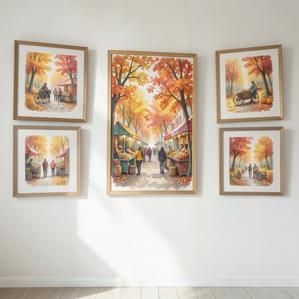
A watercolor street scene brings movement into your gallery wall. Picture rows of pumpkins, hanging lanterns, and warm sky tones fading from gold to soft amber.
This print feels especially cozy because it suggests everyday warmth, like walking slowly with a scarf on. It also helps break up lots of leaf-only artwork by adding people-scale details and real-life textures.
5. Harvest Moon Over Rolling Fields
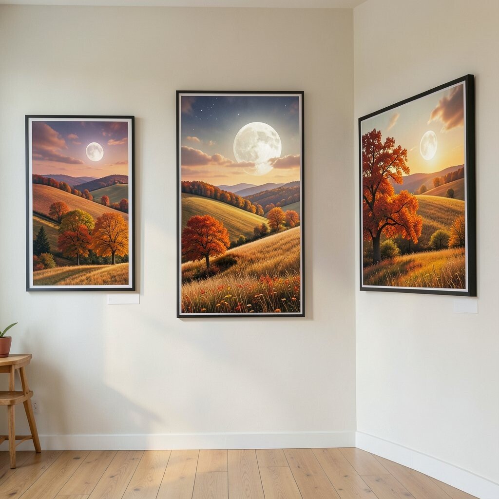
Even if your home is bright and modern, a harvest moon print can add instant fall comfort. Look for silhouettes of fields, a glowing moon, and clouds painted in gentle grays and muted browns.
These prints are unique because they mix night atmosphere with autumn colors, creating a calm, bedtime kind of vibe. The visual benefit is strong contrast, so the art reads clearly from across the room.
Hang one near a sofa or on a wall opposite a window so the moonlight feeling stays with the natural light. If you enjoy personalization, pair it with a warm-toned typography print that uses the same palette.
6. Rusty Scarf Stripes and Dried Flower Notes
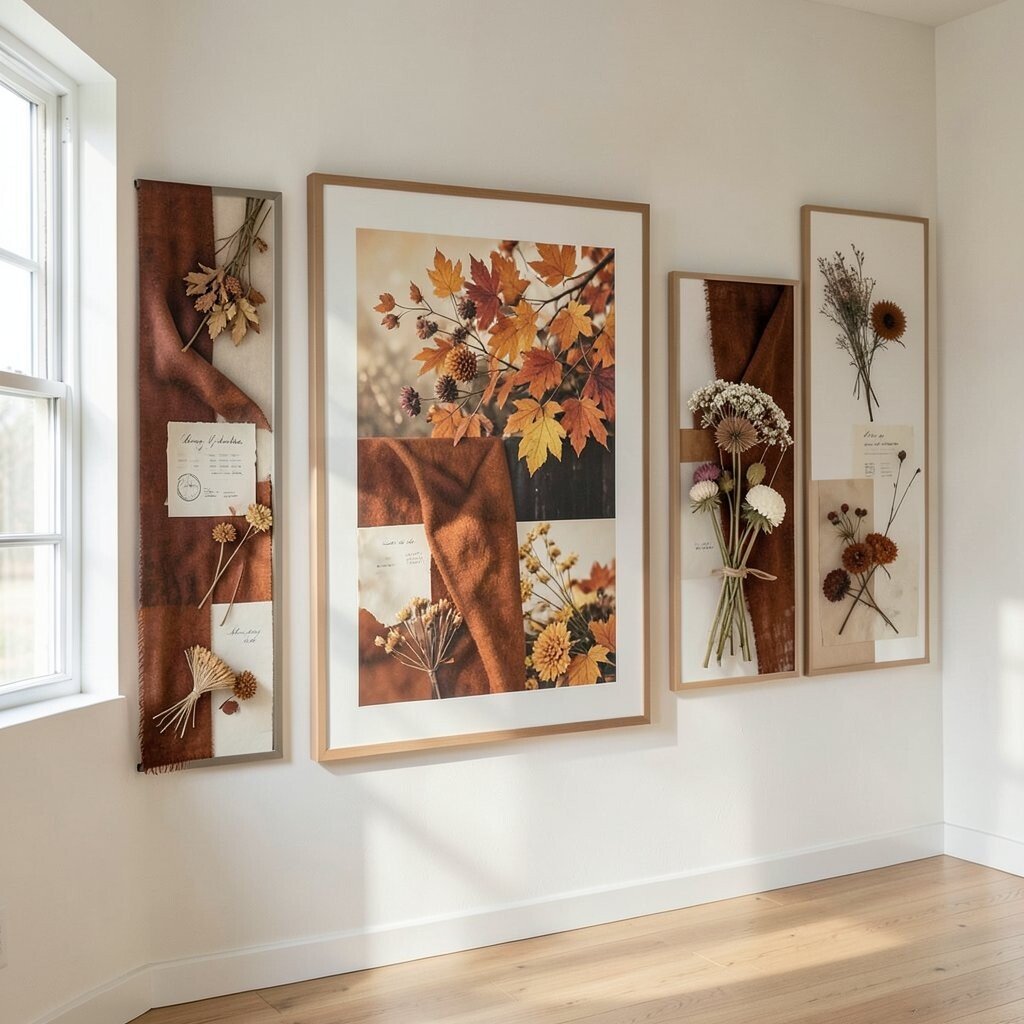
This style feels like cozy layers in print form. You’ll notice scarf-like stripes, soft shapes of dried blooms, and warm fabric textures that look almost touchable.
It works well in rooms that already include textiles, like living rooms or bedrooms, because the artwork echoes the softness. A practical bonus is that stripe patterns help keep a gallery wall looking balanced, even when you mix different subjects.
For an easy pairing strategy, combine this with one botanical print and one landscape print so the palette stays consistent. If you’re managing cost, choose smaller format prints for the patterned pieces, then invest a bit more in one hero print with richer detail.
7. Sliced Apple Still Life With Cinnamon Hues
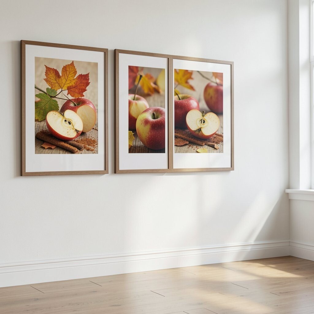
A still life print can feel surprisingly modern while still celebrating fall. Look for apples cut open to reveal star-like seeds, with warm backgrounds that hint at cinnamon and tea.
This option adds a fresh, grounded vibe to a gallery wall. It’s especially helpful if your space needs something calm and grounded rather than a busy scene.
For personalization, frame the apples with mats that pick up the same warm tone, like honey or terracotta. You can also repeat tiny design elements by pairing it with a leaf print that echoes the apple’s color accents.
When budgeting, consider mixing price points by placing a premium print in the center and using more affordable open editions around it. That way, your wall looks intentional even if you’re not buying only high-priced art.
8. Burnt Orange Mountains and Misty Valleys
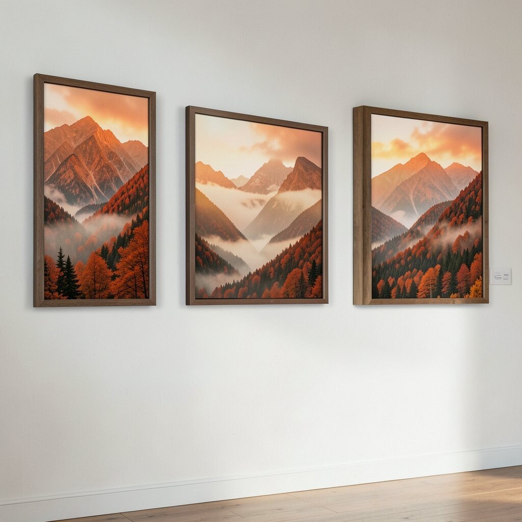
Mountain landscapes bring a soothing sense of distance to your home. You’ll see layered ridges in burnt orange, rust, and smoky browns, often with mist that softens the edges.
They’re great for cozy homes because they add “settled” color without getting too busy. Another benefit is that landscape prints often work in larger formats, which can reduce the number of pieces you need.
9. Vintage Tea Tins and Autumn Herbs
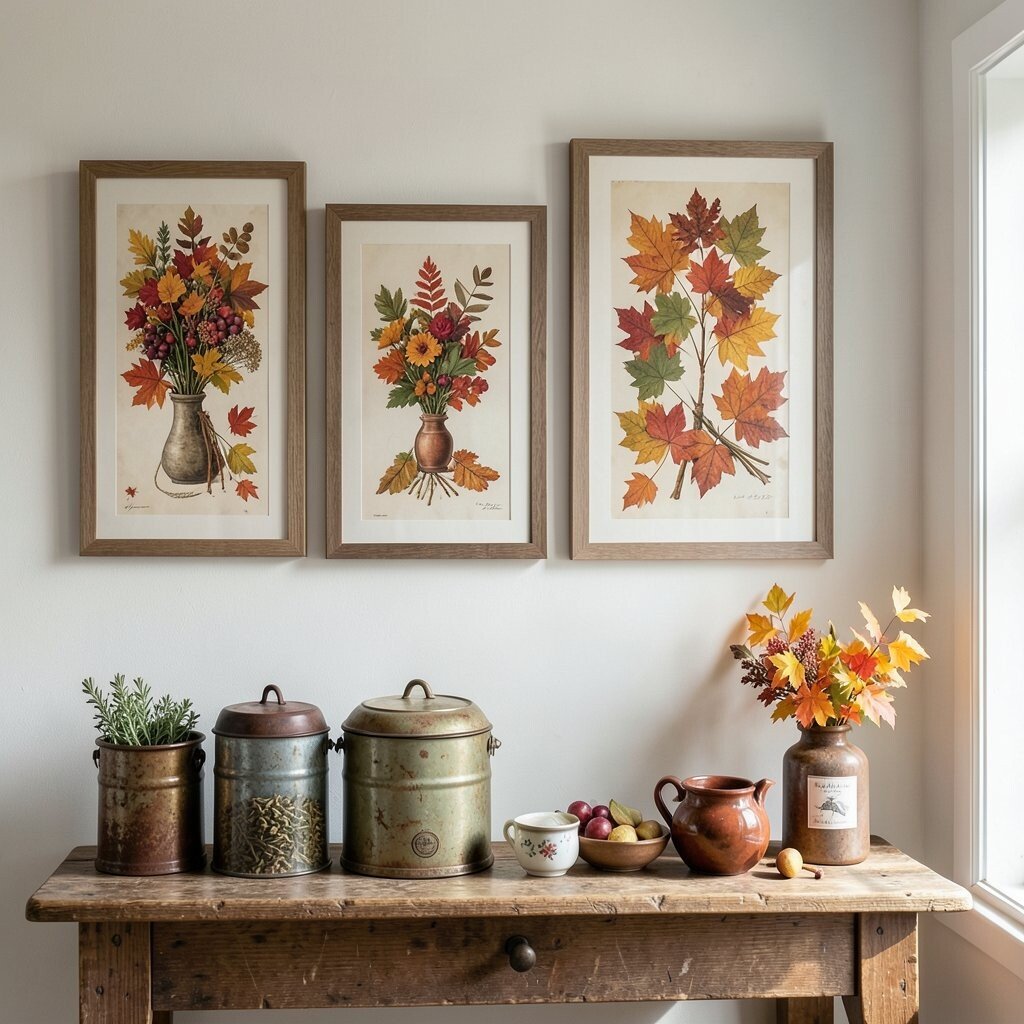
This print feels like a snapshot from an old shelf full of seasonal goodies. Watch for illustrated tea tins, herb sprigs, and warm paper backgrounds that look gently worn.
It’s unique because it mixes fall vibes with a charming, everyday ritual. If you’re a fan of kitchen or dining-room decor, these prints can make the space feel like it smells like cinnamon without actually adding anything to the air.
For practical styling, keep the palette consistent by choosing frames in the same finish across the set. You can personalize by matching the tins to your real-life favorite tea brands or by adding one small botanical print that connects to the herb colors.
10. Crisp Wind Leaves on Textured Paper
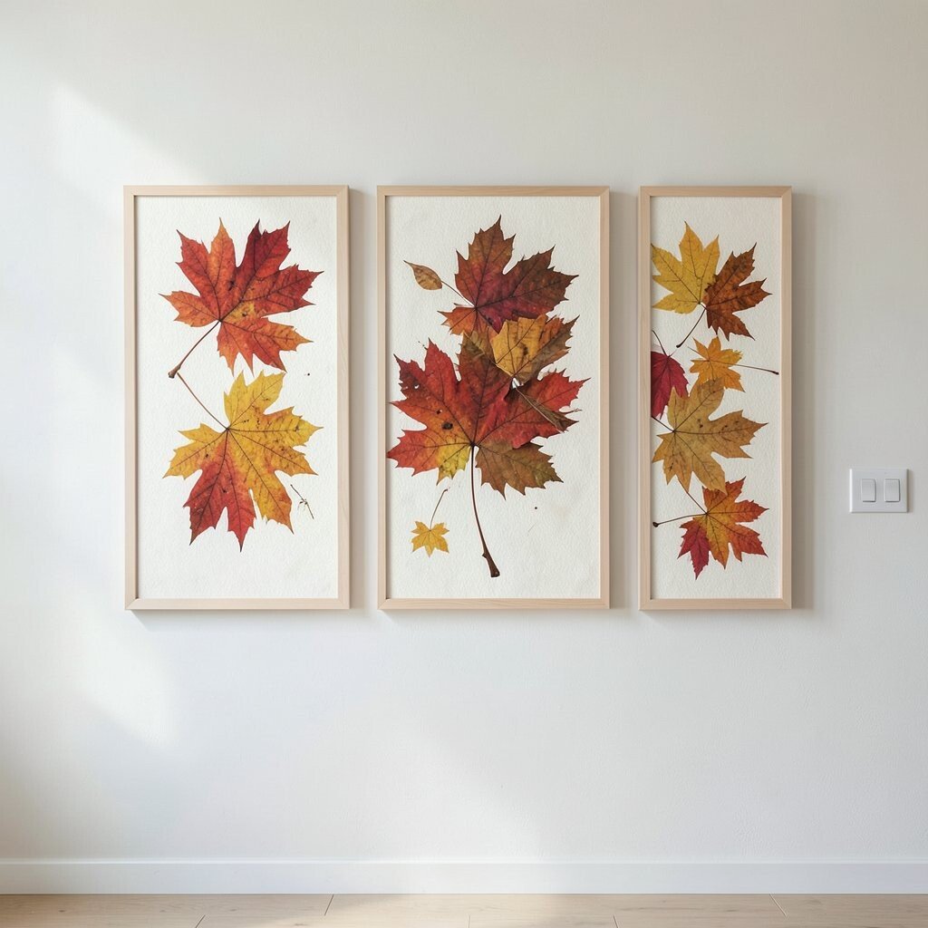
These prints capture fall motion in a gentle way. You’ll notice leaves drifting across textured backgrounds, sometimes with soft speckles that feel like dry air and late-season light.
This choice brings energy without chaos, which is ideal for a gallery wall where you want everything to feel calm. The textures can also hide minor wall imperfections, making your display look polished.
To make it actionable, place one or two of these in the middle of the arrangement so the drifting shapes “carry” your eye around the wall. If you want personalization, try mixing one textured print with a smoother, minimal print so the contrast feels intentional rather than accidental.
11. Golden Sunflowers With Soft Storm Clouds
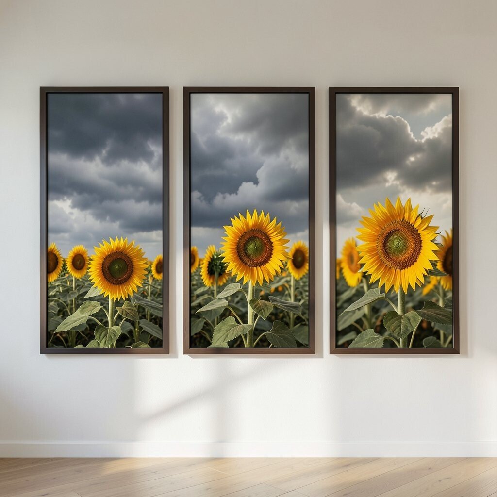
Sunflowers can feel unexpectedly perfect for fall when the colors are muted and warm. Look for blooms in golden yellows paired with darker, stormy clouds above for drama that still feels cozy.
These prints are on-trend because they combine classic autumn warmth with a more moody, cinematic atmosphere. The benefit is that they stand out even if your gallery wall includes several leaf or botanical pieces.
12. Autumn Typography With Warm Earth Palettes
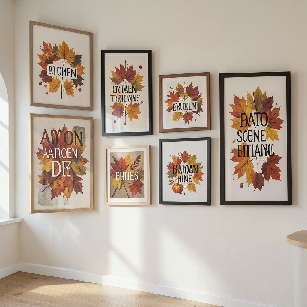
Typography prints can pull your entire gallery wall together like a favorite scarf. Choose designs that use earthy fonts and words that feel seasonal, such as “harvest,” “hush,” or “cozy nights,” with warm backgrounds.
This is a practical way to create unity, especially when your other prints include many different subjects. It also gives you easy personalization because you can choose phrasing that matches your home’s mood and routines.
If you want to keep cost reasonable, look for smaller typographic prints and place them as “breathing space” between bigger artworks. When framing, use mats or off-white borders so the text stays crisp and easy to read from across the room.
For the gallery-wall layout, consider positioning typography near the center so it anchors the collection visually. Then, surround it with one calm landscape and one detailed botanical print so your wall feels both styled and comfortable.