There’s something electric about abstract marks on canvas. They can hold mood, rhythm, and surprise all at once.
When you treat the canvas like a playground, your studio’s energy shows up in the work. These pieces give you fresh directions without trapping you in one style.
1. Kinetic Color Drift Panels
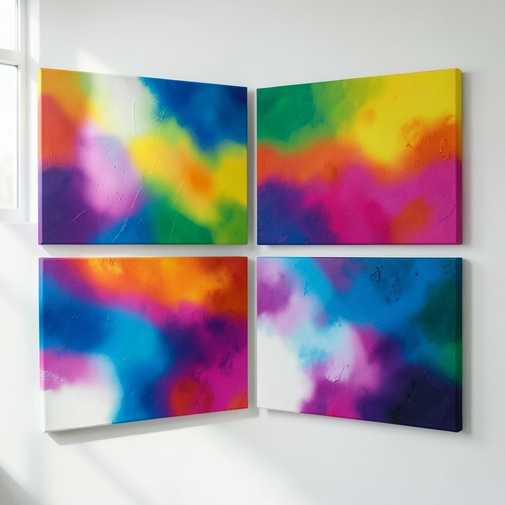
Start with broad, watery color bands that overlap like moving weather. Use a wet-on-wet approach so the edges blur and soften instead of looking planned.
Pick two or three main hues and let a contrasting accent thread through the middle. As the paint settles, tilt the canvas slightly to encourage gravity to pull pigment into unexpected arcs. For best results, work in short sessions and keep a spray bottle nearby to revive paint while it’s still active. When you’re done, lightly seal it with a matte medium to protect the surface and keep the drips from turning cloudy.
2. Grid-Laced Ripples With Hand-Stamped Texture
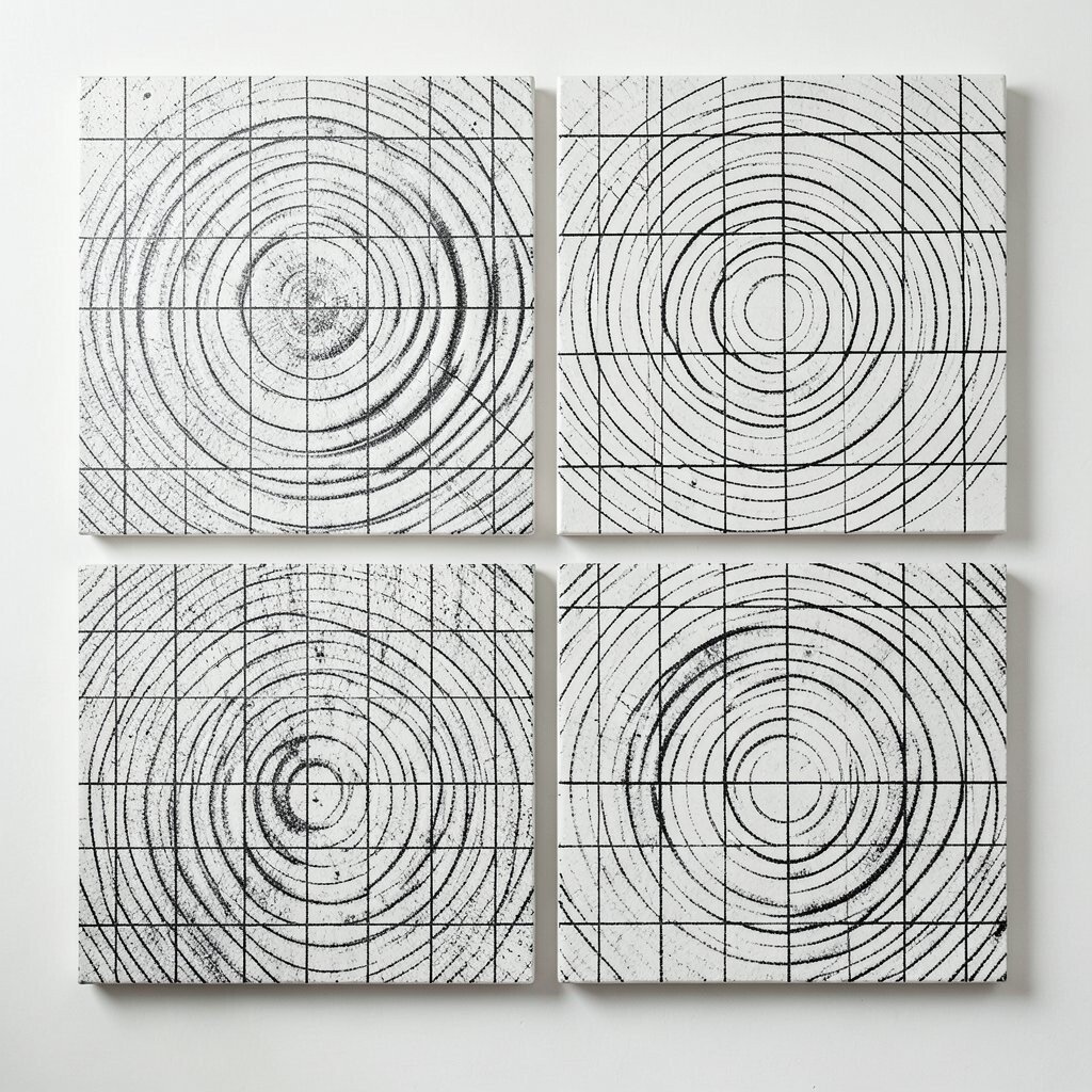
Build a gentle grid using tape or a thin marker, then interrupt it with stamped impressions. The repeated marks should feel like waves hitting a quiet shoreline.
For uniqueness, vary the stamp pressure so some areas look crisp and others look smudged. Keep your hands slow and deliberate, because small changes in pressure make the texture look alive. Choose a limited palette like ink black, warm cream, and one bright color, so the grid stays readable while the ripples steal attention. Add a thin wash over the stamps once the ink is dry to unify the layers.
Studio-friendly benefits show up fast, since stamped textures can be recreated across a series. If you want personalization, carve a simple stamp from foam or a potato, then label the tool with a number so the pressure stays consistent. For cost, tape, craft foam, and basic ink are usually enough, and you can reuse stamps for months. A current trend is mixing “order” and “mess,” and this piece hits that vibe without needing fancy equipment.
3. Cut-Paper Energy Collage on Canvas
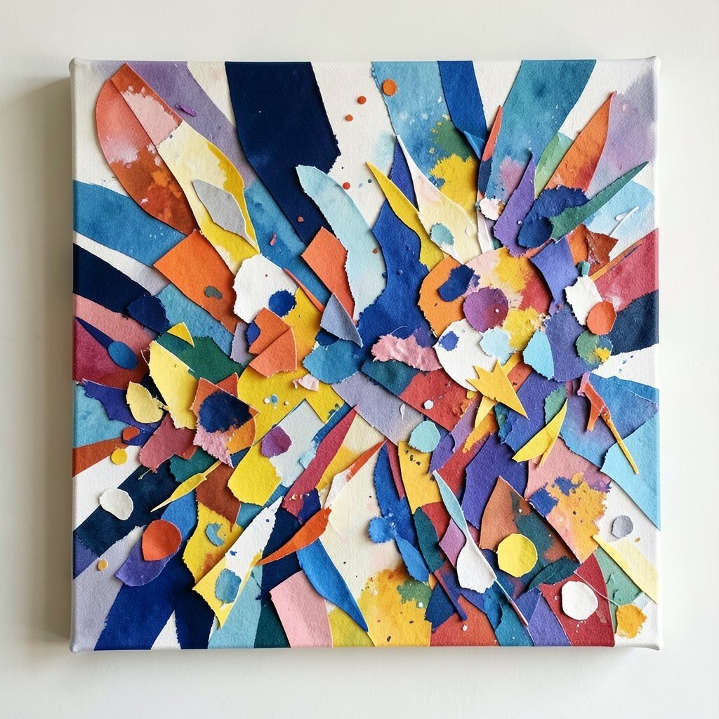
Layer torn paper shapes directly on canvas, then let paint and ink move around them. The negative spaces between pieces should feel like sparks.
Choose paper that already has patterns, like old book pages, grocery labels, or textured wrapping paper. Coat it with a thin layer of gel medium so the edges look anchored rather than glued down. Add small lines with a fine brush to connect shapes, as if the collage is humming.
Once everything dries, protect the collage with a clear varnish so the paper doesn’t curl. Personalize the work by matching colors to your studio palette or your client’s brand mood. This approach also helps you reuse scraps, which keeps waste low while letting your style grow. It’s especially useful when you want something unique that still photographs well for portfolios and social posts.
If you’re aiming for current trends, lean into layered materials and visible edges, since many studios are moving toward tactile, mixed-media looks. Try building a “path” through the collage that guides the eye from one corner to the other. Even with simple tools, the result can feel bold and collected, like a visual diary page.
4. Luminous Monochrome Bloom Studies
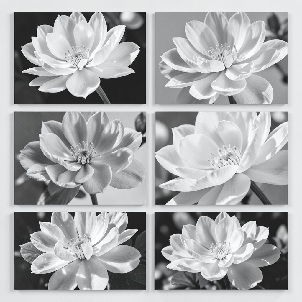
Paint in one color family, but vary the saturation until it looks like glowing petals. Use a mix of thick paint for petals and thin washes for misty edges.
Let the blooms overlap in slow clusters so the center area feels denser. Add a tiny amount of white or translucent medium to create soft highlights instead of harsh contrast. A big benefit is that monochrome pieces fit many studio spaces because they won’t fight with existing decor. For personalization, choose a single “signature shade” your studio loves, then build series works around it so collectors recognize your voice.
5. Magnetic Ink Veins and Pour Bridges
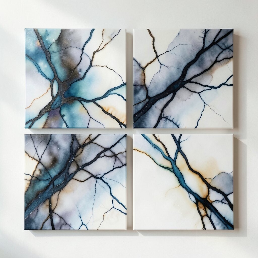
Pour ink or alcohol-based color into shallow arcs, then nudge it with a palette knife like you’re guiding currents. The goal is vein-like movement that looks natural rather than forced.
When you see a bridge forming between two puddles, stop and let it settle. Add one or two tiny drops at random points so the pattern feels discovered by accident. This piece becomes a great studio workflow tool because it gives clear visual results quickly, helping you plan series without overthinking. Keep paper towels nearby to control edges and prevent muddy pools.
For cost considerations, you can start with affordable inks and a basic canvas board. If you want a more modern finish, use a glossy medium on top so the pour lines look like glass. A current trend is high contrast between crisp edges and soft bleeding, and this style can deliver that in a single session. Personalize it by choosing ink colors that match your studio’s branding or seasonal themes.
6. Layered Horizon Lines in Windy Air
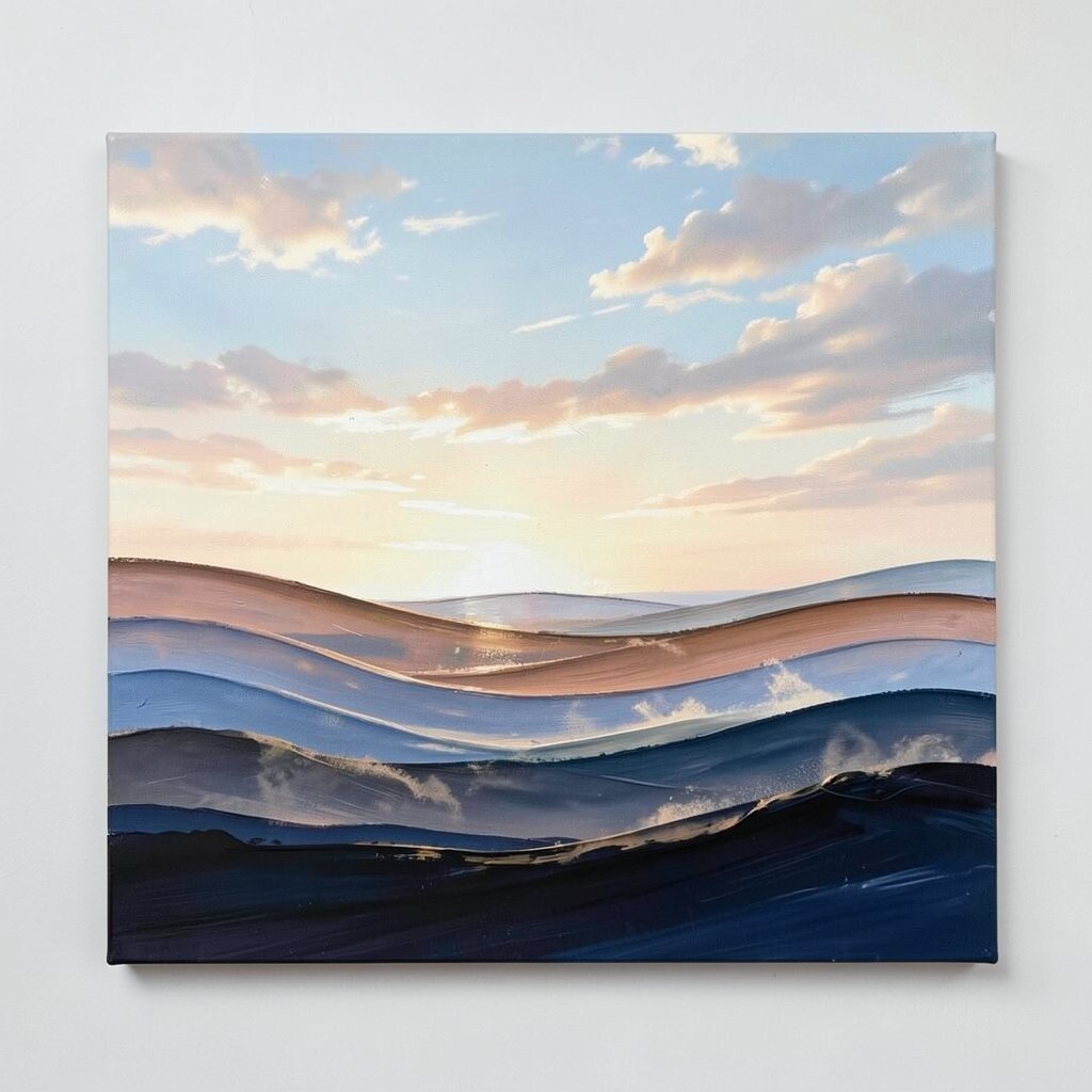
Draw horizon lines across the canvas, but curve them as if wind is bending them. Keep them thin, then paint soft fields that hover behind each line.
Use a sponge to mist color into the space so the horizons seem to drift rather than sit still. Add occasional blocks of darker pigment to anchor the composition. This layout offers a clear structure, which helps beginners feel confident while still leaving room for surprise. If you’re making a set for a studio wall, reuse the same horizon spacing but change color temperatures in each piece to keep variety.
7. Stenciled City Ghosts With Soft Noise Grain
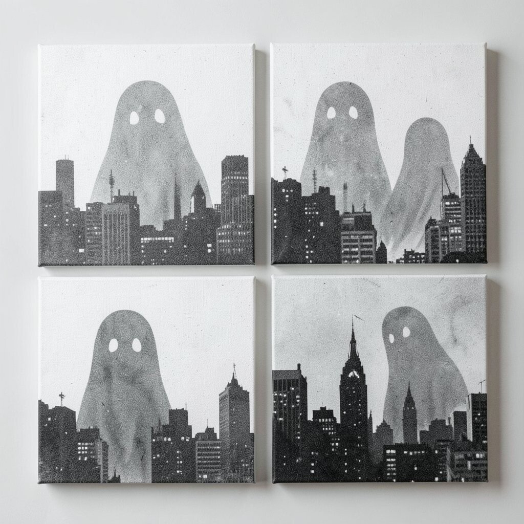
Use stencils to form partial building shapes, then blur the edges with dry brush. The city should feel like it’s fading into fog rather than standing boldly.
Sprinkle diluted paint to create light noise grain, especially around the stencil edges. When it’s time to refine, remove a stencil before paint fully sets so you keep sharp silhouettes in some areas and haze in others. This technique is useful for studios because it gives “recognizable hints” while staying abstract. You can also match the mood to different projects, from calm studio atmospheres to energetic event branding.
Personalize the city ghosts by choosing architectural shapes that reflect places your team loves, like rooftops from travel sketches or building silhouettes from a local area. For cost, stencils can be reused and even cut from cardboard. A current trend is “soft urban” art that references cities without being literal, so this piece stays relevant while still feeling handmade. Finish with a light matte coat so the grain and haze look gentle, not slick.
Try placing the densest stencil area off-center so the eye drifts naturally. If you’re working with a team, assign one person to stencil while another creates the haze, and then you’ll get quick collaboration chemistry.
8. Threaded String-Pull Lines on Primed Canvas
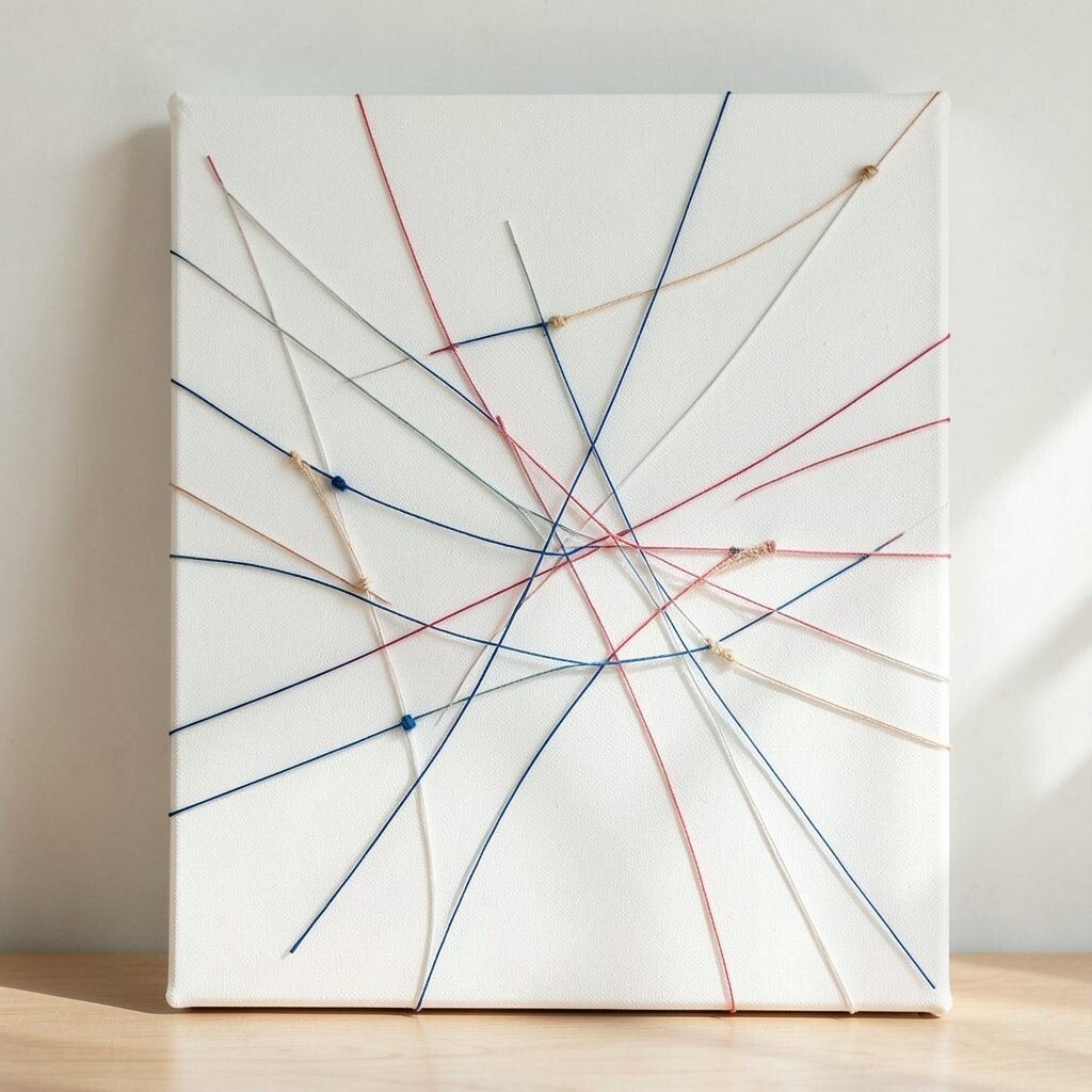
Stretch string over primed canvas and pull it tight, then drag paint along the string so it prints lines. The marks should feel like tension and motion caught in place.
Once the string is removed, you’ll reveal crisp paths with slight bleeding at the edges. Vary the string thickness and angles so the composition feels engineered yet still organic. This is a fun benefit for creative studios because it turns physical actions into visual rhythm. Personalize by using colors tied to your studio’s projects, and change the angle of the string grid for each new canvas.
9. Palette-Knife Terrain With Sanded Highlights
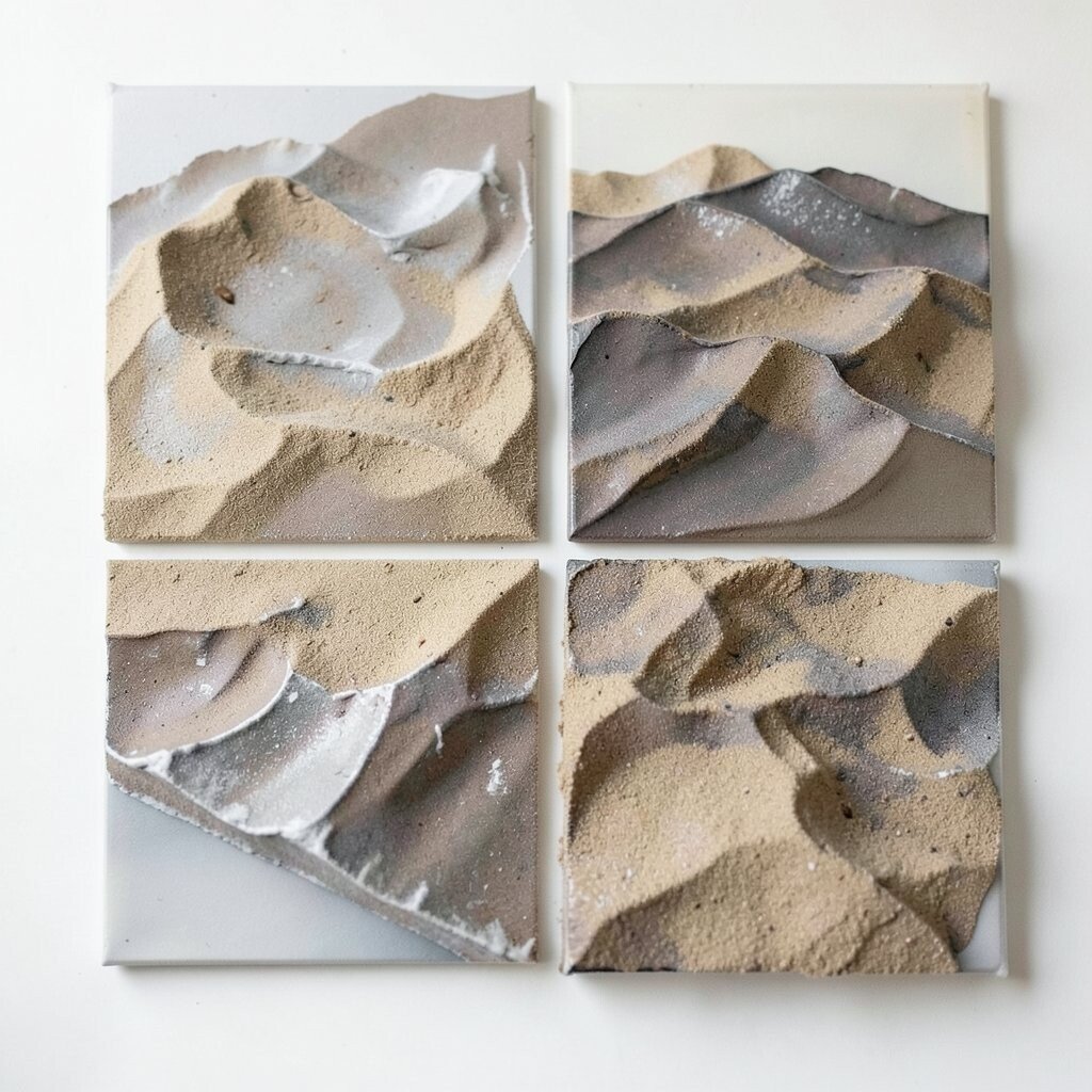
Spread paint using a palette knife in thick, uneven layers that resemble tiny hills. Let ridges catch light so the texture becomes the star, not just color.
After the paint dries, sand only a few high points to create subtle highlights. This gives a tactile effect that looks expensive even when you use basic materials. For cost, sandpaper and inexpensive acrylics go a long way, and you can reuse knives many times.
Uniqueness comes from the direction of your knife strokes, so keep track of stroke patterns in your studio notes. If you want current trends, lean toward tactile surfaces and sculpted paint, since many galleries and online feeds now reward visible texture. To personalize, incorporate a small motif like a circular “summit” or a narrow “river” channel created by dragging a darker paint through lighter layers. Finish by sealing with a clear gel medium to keep sanded areas protected.
10. Floating Geometric Frames With Broken Symmetry
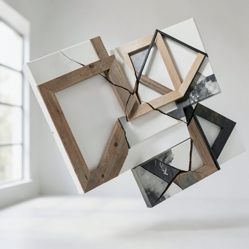
Paint geometric frames, like rectangles or circles, but break the symmetry on purpose. Cut one side short, shift one corner, or let a frame overlap another partially.
This piece stays dynamic because the geometry keeps the eye moving while the breaks create tension. Use a ruler for the first few shapes, then loosen your grip to make later lines imperfect. A benefit is that it’s easy to adjust for different canvas sizes since the rules of shape are flexible. For personalization, choose a set of shapes your studio loves and repeat them across a series while changing line thickness and color temperature.
11. Ink Wash Ombre Curtains With Bold Side Sparks
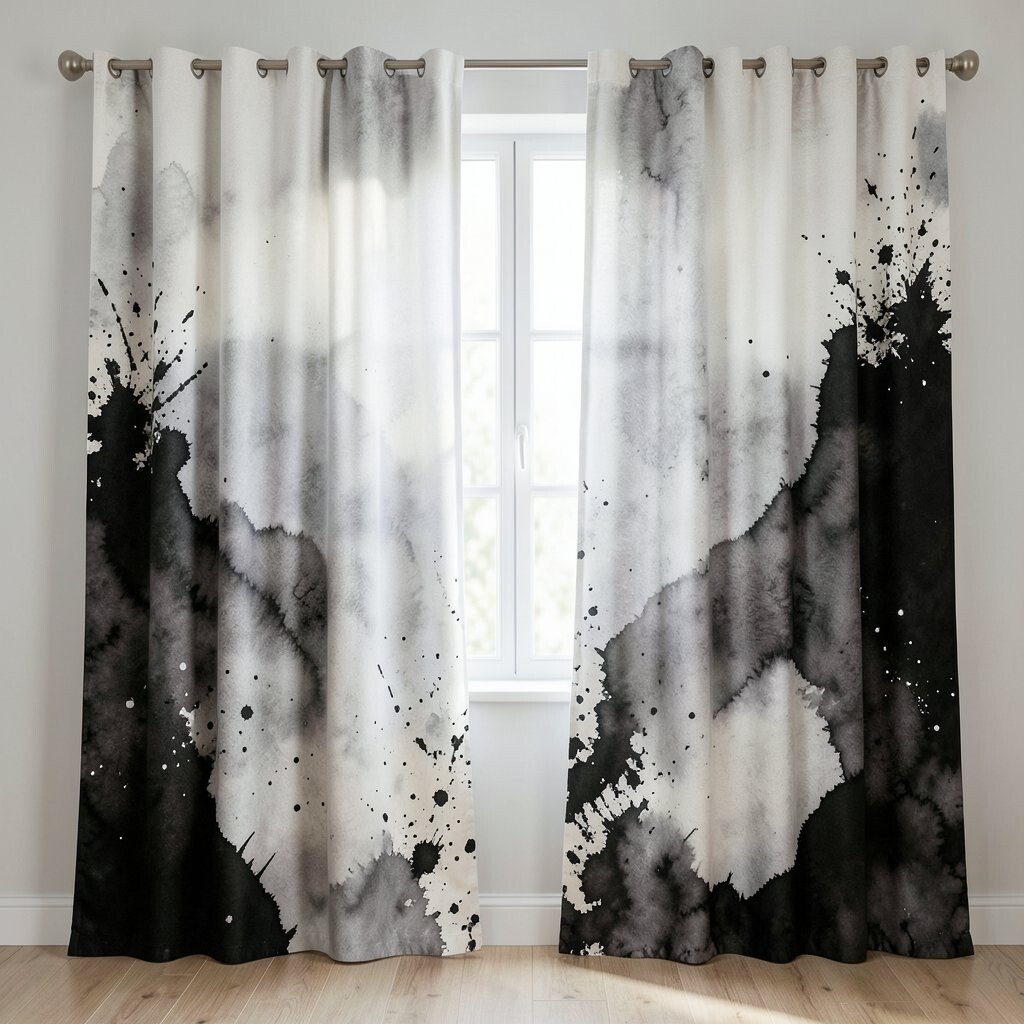
Start at one edge and pour or brush an ink wash that fades into lighter tones. Think of it like curtains of color sliding across a stage.
Then add bold side sparks using a fine brush or a splatter tool. Keep the sparks small and intentional so they look like flashes instead of chaos. This contrast gives a strong visual hierarchy, which is a practical benefit if you’re creating pieces for client presentations. Personalize by choosing a spark color that matches your brand highlight, then keep that choice consistent across works.
For cost considerations, ink washes and a simple splatter brush are usually affordable and easy to clean. A current trend is mixing soft gradient fields with tiny high-energy details, and this combo reads well in photos. Once the ink is dry, consider a translucent glaze layer so the ombre looks smoother and more unified.
Try rotating the canvas after the first wash so the fade direction changes, giving you more variation with the same method.
12. Faux Vitreous Stained-Glass Blocks in Motion
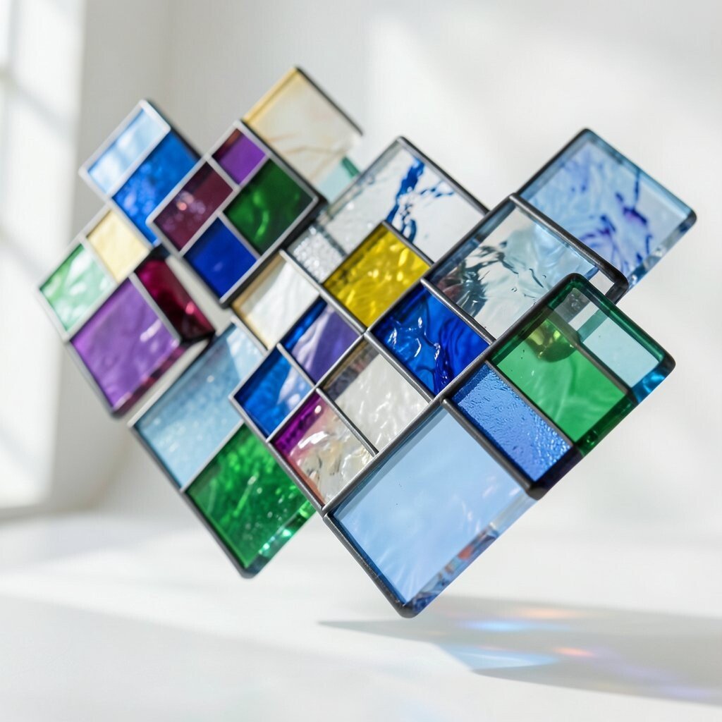
Paint outlined blocks like stained glass, then fill them with semi-transparent color. The trick is to keep edges crisp while letting colors ripple inside each block.
Use a thin outline medium and avoid overworking the fills, so each section retains its own character. Add a few “broken” glass lines that don’t fully connect to make the composition feel alive. This uniqueness works well for studios because it feels decorative without being cliché. For personalization, create a “window series” where every piece shares the same outline style but uses different color mixes.
For practical tips, test your transparency on scrap first since different acrylics and inks behave differently. Cost is manageable because you can use basic paint and a mixing palette for many canvases. A current trend leans toward luminous, modern stained-glass aesthetics with bold but simple shapes, so your work will feel current. Finish with a clear gel to enhance glow and protect the painted edges.
13. Sun-Rise Swipe Monoprint on Canvas Panels
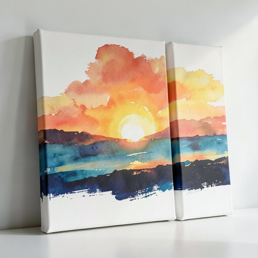
Swipe a thick paint layer across a panel, then press canvas onto it briefly for monoprint marks. Pull the canvas away to reveal streaks and ghosted textures that look like sunrise.
Repeat with fresh paint and different angles so each canvas has the same emotional direction but never the same pattern. This is a great benefit for studios because it creates a cohesive collection with quick variation. For personalization, decide on one “morning palette” for your studio and stick to it, like warm peach, soft yellow, and muted teal.
Cost considerations are friendly since monoprinting can be done with a brayer, scrap surfaces, and simple acrylics. To keep things practical, cover your workspace with paper and use a tray to contain mess. A current trend is process-driven art, and visible transfer marks give that handmade story right on the surface. Let the prints dry fully, then apply a thin varnish so the streaks hold up under studio lighting.
14. Dotted Liminal Paths With Floating Typography Shapes
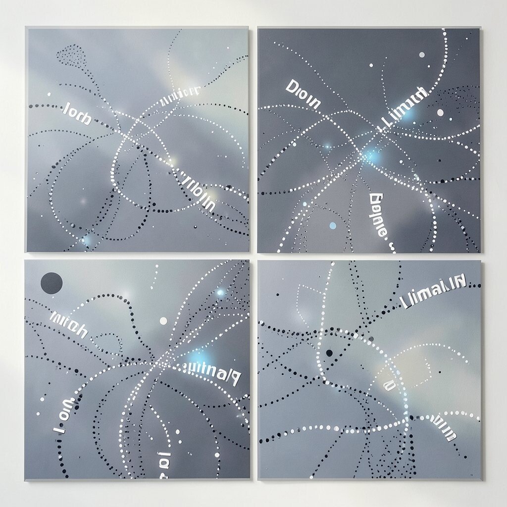
Build a dotted trail across the canvas, like a path you can almost follow. Add abstract letter-like shapes that hover near the dots without becoming readable text.
Keep spacing consistent at first, then gradually vary it so the trail feels like it’s changing tempo. This offers a unique balance between structure and play, which is a strong benefit for creative teams. For personalization, you can turn studio keywords into shapes by drawing their first letters very lightly and then distorting them into symbols.
If you want a current trend, focus on liminal, almost-language visuals, since many artworks now borrow the vibe of signage and posters without using actual copy. Use a small brush or a paint pen for dots, and let each dot sit slightly before adding the next to avoid smearing. Cost is low because simple dot tools are inexpensive and last a long time.
15. Velvet Night Swipe Textures With Dry Bristle Edges
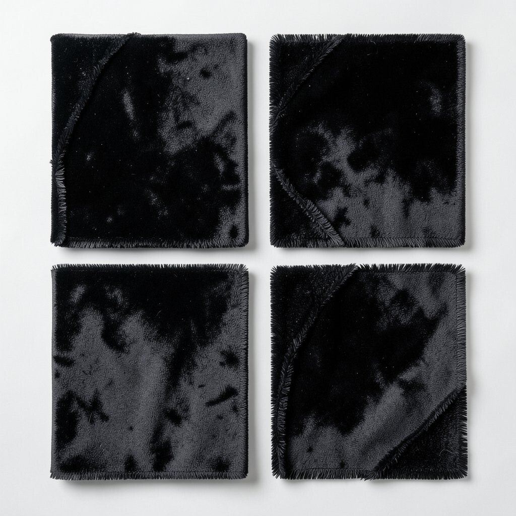
Paint a dark base like deep navy or charcoal, then swipe lighter colors across with a dry bristle brush. The brush should leave faint streaks that feel soft, like fabric in moonlight.
Layer in subtle highlights near the edges so the canvas feels like it has depth. This piece helps studios create dramatic atmosphere quickly, which is a practical benefit when you need pieces for events or themed walls. Personalize by choosing one accent color that glows against the dark, such as electric green or warm copper.
For cost considerations, dark paint and dry-bristle brushes are basic supplies, and you can repurpose old brushes. Current trends favor moody, cinematic color fields, and dry texture edges are a neat way to keep the look from feeling flat. Seal with a matte medium so the “velvet” effect stays believable in real life.
16. Wave-Rule Mandala Breaks With Asymmetrical Calm
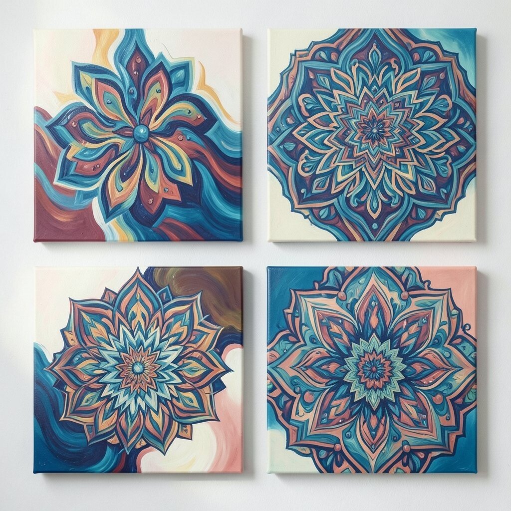
Draw a soft mandala structure using arcs and curves, then break it with asymmetrical additions. Let one section stay calm and the other become energetic with paint and marks.
Use thin lines for the early pattern, then switch to thicker paint to create a focal area. The benefit here is that you get a recognizable creative rhythm without making everything look identical. Personalization is easy since you can choose a mandala theme, like ocean waves or spinning seed pods, based on what your team loves.
To keep it practical, start with pencil or light marker underdrawing, then commit only when you’re happy with placement. Cost considerations are manageable because mandala work can be done with pencils, basic brushes, and a small paint set. A current trend is the “imperfect mandala,” where symmetry is hinted at but not obeyed, and this approach feels modern. Seal carefully if you use water-based markers under paint, so nothing smears later.
17. Weathered Paper-Mask Negative Space Portraits
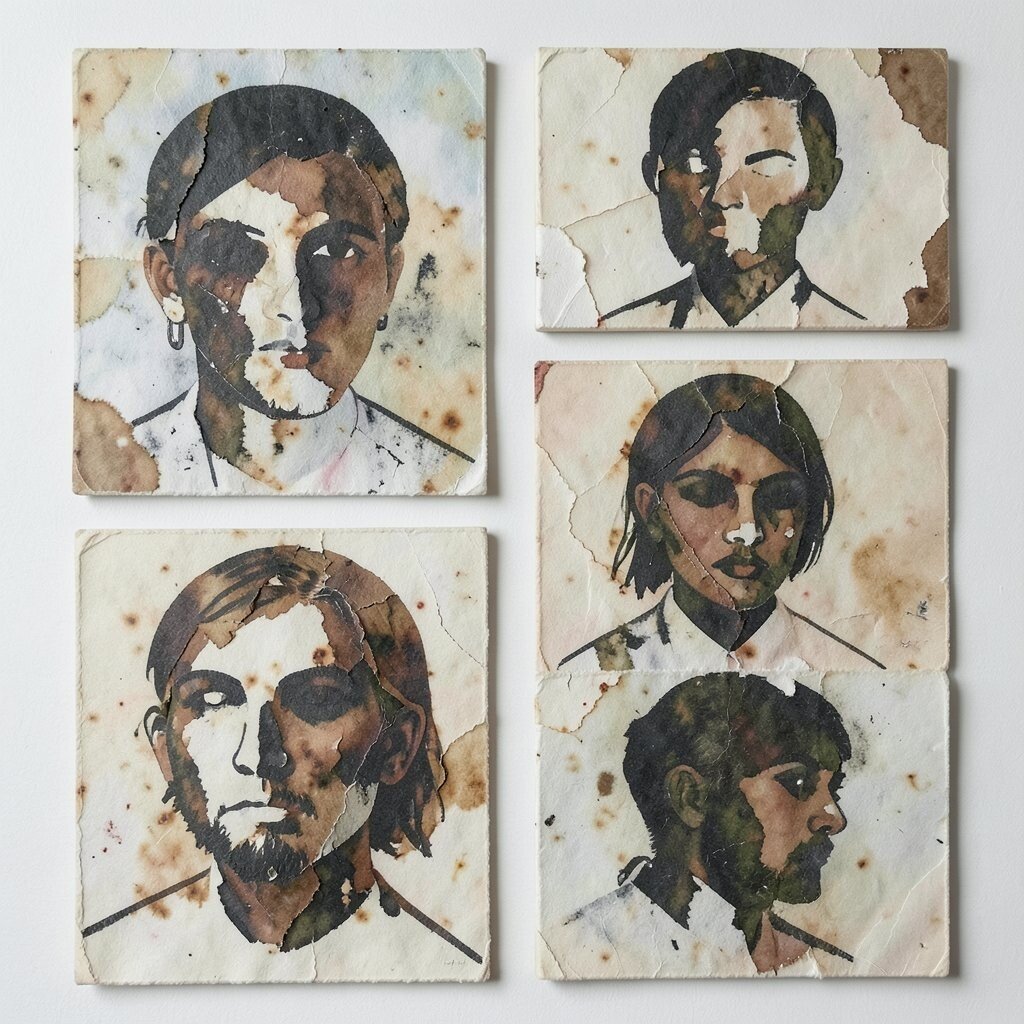
Shape paper masks into abstract portrait silhouettes, then paint around them on the canvas. The mask edges will create negative space that feels gentle and intentional.
After you remove the masks, add small expressive marks that hint at eyes, gestures, or hair without making a literal face. This uniqueness is powerful because negative space automatically creates a story even when details stay vague. For studios, it’s also practical since masks speed up layout and reduce decision fatigue during busy deadlines.
Personalize by using paper textures that match your concept, like matte drafting paper for a calm mood or rough torn paper for a tougher vibe. Cost is low because you can reuse paper and masks across sessions. A current trend is using imperfect materials and visible cut edges, so your piece will feel current and handcrafted. Finish with a clear coat that protects the painted negative spaces and keeps the contrasts crisp.
If you want extra energy, add a thin wash that bleeds slightly into the painted areas, but keep it controlled so the silhouette stays readable.
18. Solar Flux Signature Runs Across Canvas
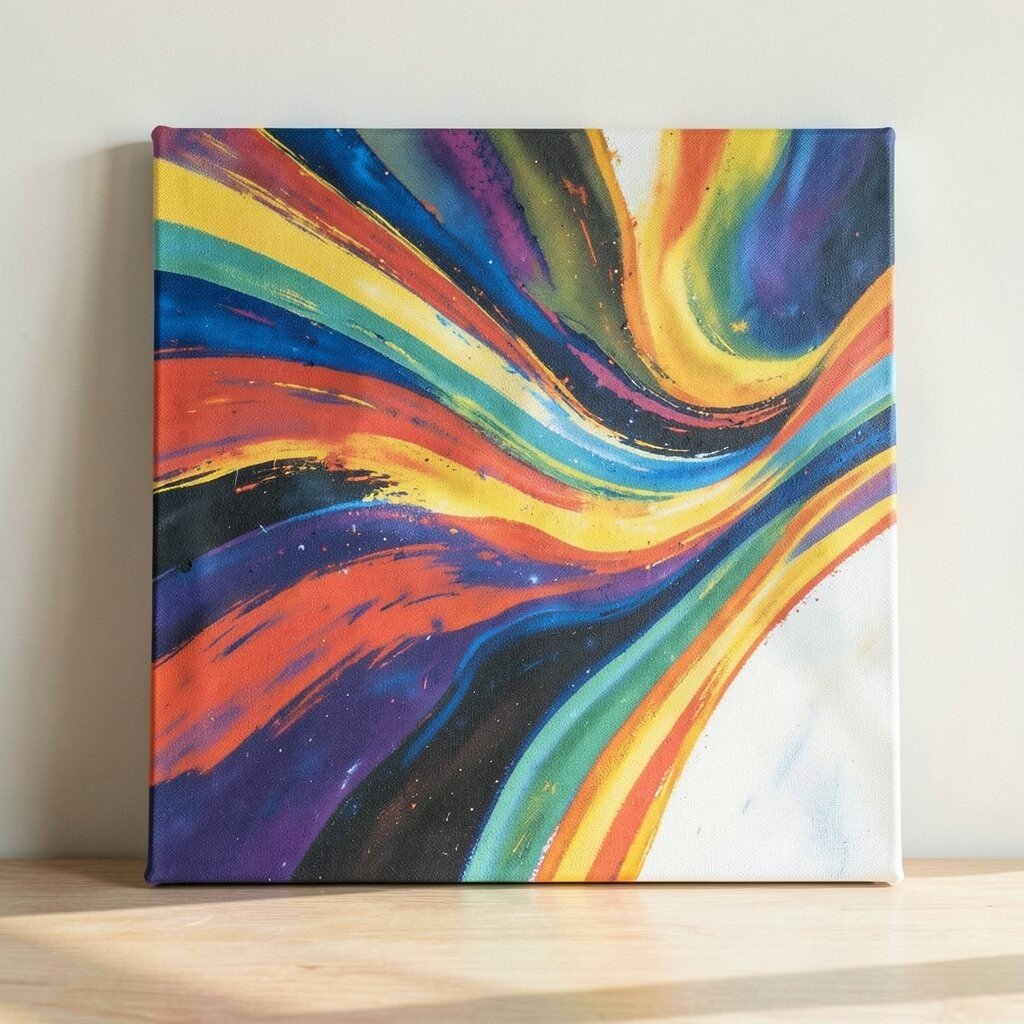
Paint a large, flowing signature-like line across the canvas, then echo it with smaller lines and loops. Treat it like a moving heartbeat, sometimes smooth and sometimes jagged.
Use contrasting colors for the echoes, but keep the darkest line closest to the viewer’s eye. This gives a clear visual hierarchy and makes the piece feel bold without losing softness. A benefit for creative studios is that “signature runs” let you build identity fast, since you can reuse the same movement style across your portfolio.
Personalize the run by making it unique to your team’s habits, such as a line that curves like a staff line or loops like a dance step. Cost considerations are simple because you only need brushes, paint, and maybe one marker for thin accent lines. Current trends often highlight personal mark-making, where the artist’s movement becomes the main character, and this piece delivers that feeling.
To keep it practical, practice the motion on scrap first so the final stroke feels confident. After the paint dries, consider a translucent glaze to unify the linework and strengthen the contrast under studio lights.
Finally, add one small surprise mark at the far end of the canvas so the viewer has something to chase, then stop before it turns into clutter.