Your home can feel calm and styled at the same time. The right neutral palette makes everyday spaces look pulled together.
Neutral colors do more than match everything. They also help light move around your rooms in a flattering way.
1. Linen-White With Warm Sand Accents
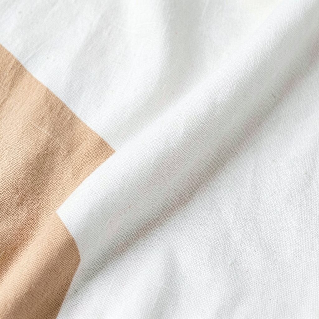
Linen-white walls bring a soft glow that feels clean without looking cold. Warm sand accents keep the room grounded and cozy.
Try pairing a matte linen-white on walls with sand-toned textiles like curtains or throw pillows. Use light oak or honey-toned wood to add warmth under the neutral mix. Add a few subtle texture changes, such as a boucle chair or a woven basket, to keep the palette from feeling flat.
2. Greige With A Hint Of Taupe

Greige sits between gray and beige like a friendly middle ground. A touch of taupe adds depth and makes the whole space feel more layered.
Paint the main walls in a greige tone, then bring in taupe for rugs, bedding, or upholstery. This pairing works especially well in living rooms that get both morning and evening light.
To keep it modern, choose hardware in brushed nickel or dark bronze. If you want personalization, add one small accent color through art, like sage green or dusty blue, but keep most surfaces neutral.
3. Soft Charcoal On A Bright Neutral Base
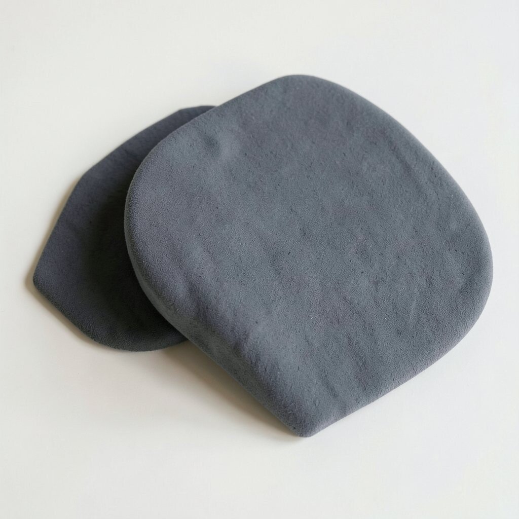
Starting with a bright neutral base makes your home feel airy and open. Adding soft charcoal gives it a polished, designer look.
Use charcoal for an accent wall, built-in shelves, or a media console. Then balance it with creamy whites and warm neutrals in curtains and bedding.
If you like a trend toward high-contrast interiors, this palette fits right in. Keep the charcoal softened by choosing a paint with a slight undertone, like charcoal-brown, and use satin or eggshell finishes for a gentle sheen.
For practical cost control, paint only the main wall and reuse existing furniture with new neutral covers. Swapping hardware on cabinets or drawers can also create a big visual upgrade.
4. Warm Beige With Caramel Leather Touches
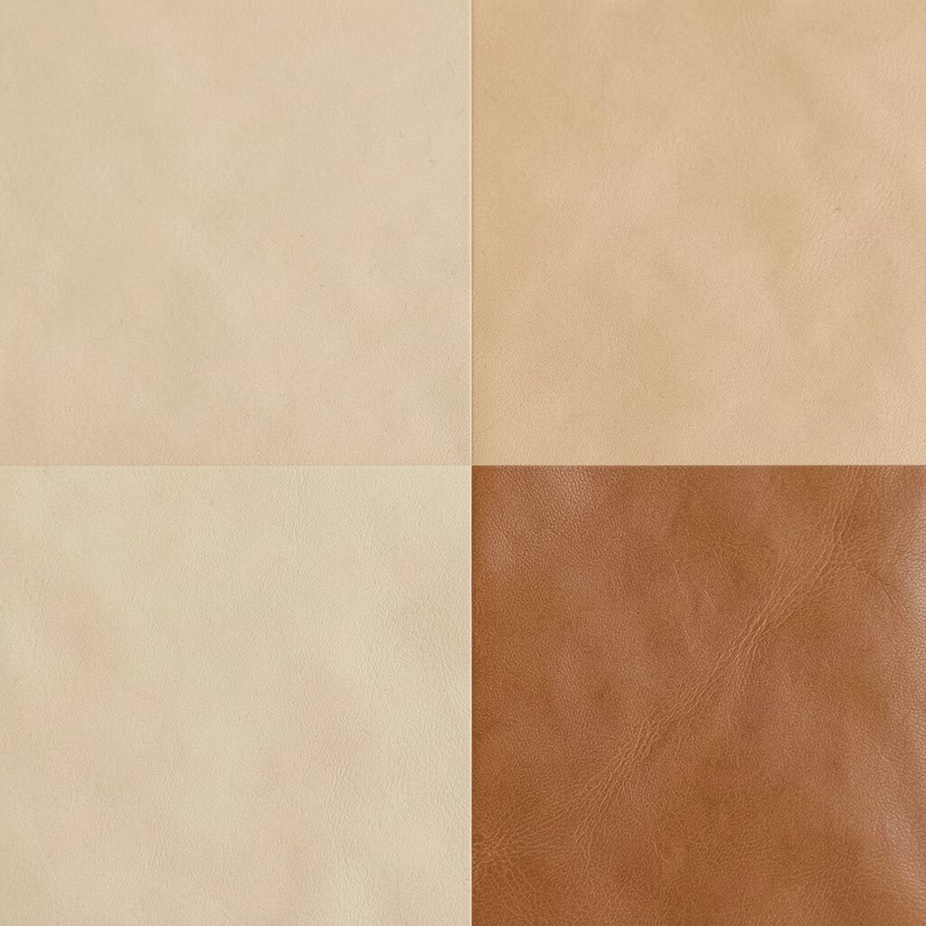
Warm beige walls feel welcoming the moment you walk in. When you add caramel leather, the room gains a rich, lived-in charm.
Think of beige as the calm background and leather as the comfortable highlight. Choose a caramel-toned sofa, chair, or ottoman, and repeat the warmth in wooden trays or small decor.
5. Cool Off-White With Steel Gray Details

Off-white can look crisp and calm, especially when it has cool undertones. Steel gray details make it feel clean and contemporary.
Use off-white for walls and ceilings, then bring in steel gray through lighting, frames, and modern storage pieces. A gray area rug can tie everything together without stealing attention from the room.
To keep the look friendly, add soft elements like a plush throw and textured knit pillows. This is a great choice if you want a neutral palette that still feels fresh and current.
6. Sage-Backed Neutrals For A Gentle Earth Mood
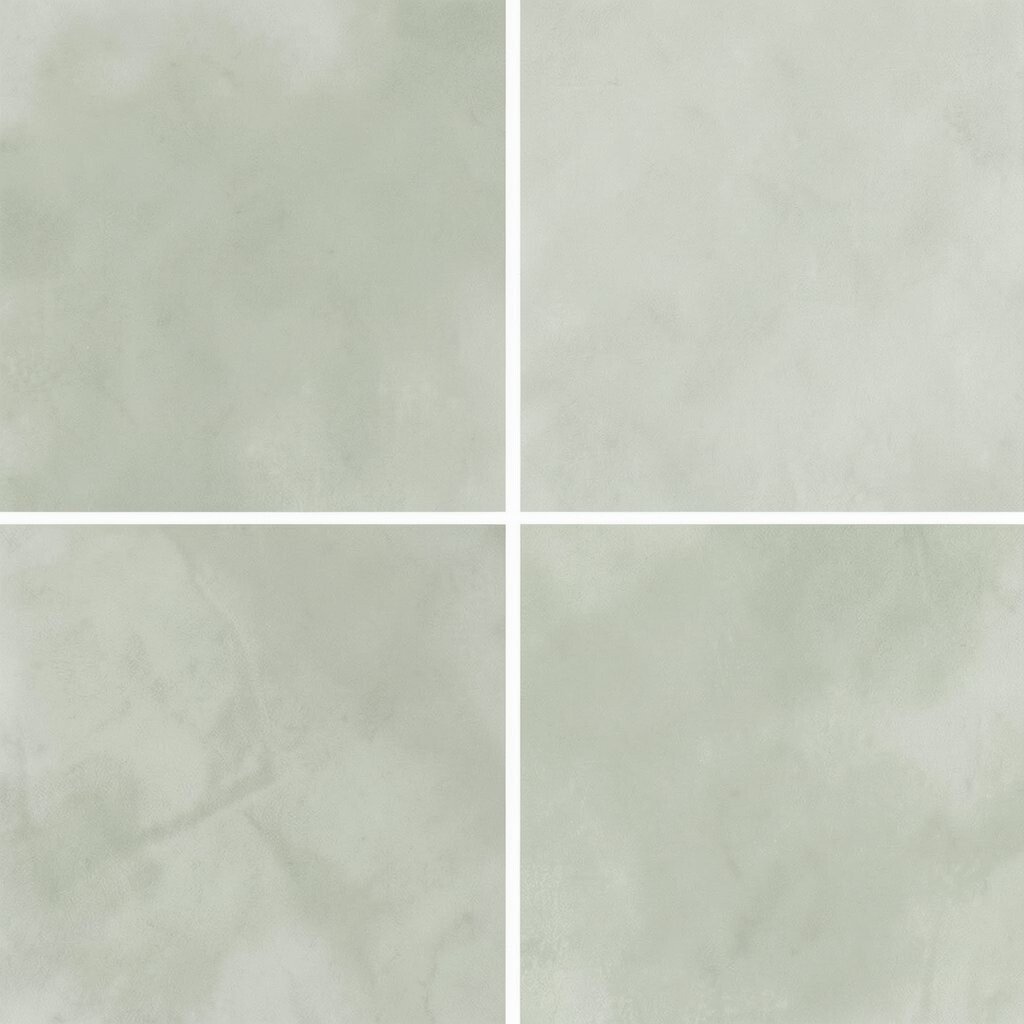
Neutral does not have to be boring, and sage proves it. It gives beige and white a mild, nature-inspired tone that feels relaxing.
Try using a warm off-white on walls, then layer in sage through cushions, linen curtains, or framed prints. You can also paint the backs of shelves in a muted sage for a subtle surprise every time you open a door.
For practicality, stick to washable fabrics for seats and pillows since sage can show small marks more clearly than darker tones. If you want to personalize, add plant pots in matte clay or terracotta to echo the earthiness.
7. Sandstone Tones With Soft Black Highlights
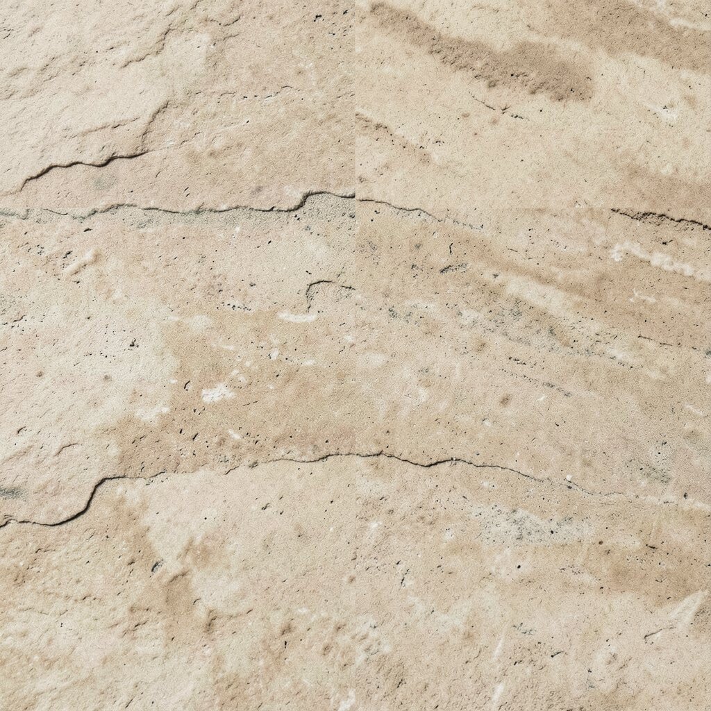
Sandstone neutrals feel like sunlight on stone. They bring warmth without turning the room overly orange.
Use sandstone for walls or the largest surfaces, then add soft black highlights through picture frames, faucet fixtures, or the legs of furniture. The combination feels modern, especially in kitchens and dining areas.
Choose black in a matte finish to keep it from looking harsh. If you’re keeping costs in check, start with black accents like cabinet pulls and light fixtures, which can refresh a space quickly.
Personalize by picking a signature object, like a black floor lamp or a sculptural vase, and repeat a small echo of black in two more places.
8. Oyster White With Natural Jute And Rattan
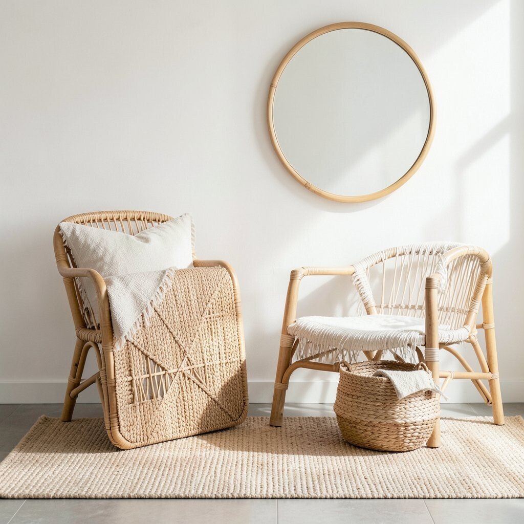
Oyster white gives a gentle cream glow that works in almost any room. Natural jute and rattan add texture, which is the secret to making neutrals look expensive.
Place a jute rug, rattan mirror, or woven baskets near seating so the fibers catch the light. Oyster white on walls helps those textures stand out without needing bold colors.
9. Mushroom Beige With Layered Fabric Depth
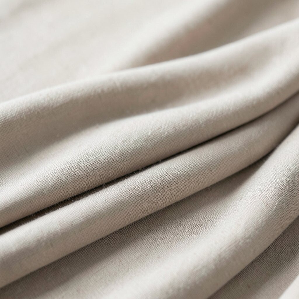
Mushroom beige is cozy and slightly mysterious. It looks great in spaces that need calm energy, like bedrooms and reading corners.
Use mushroom beige for walls, then vary the neutrals with fabrics like oatmeal knits, soft taupe faux fur, and linen blends. Layering matters here, because different tones and textures create depth without visual clutter.
For a practical approach, choose one upholstered piece in a mid-tone neutral and let the rest of the room stay lighter. Add personalization with curtains that have a subtle pattern, such as a faint weave or tonal stripe.
10. Milk Chocolate And Cream For A Cozy Classic
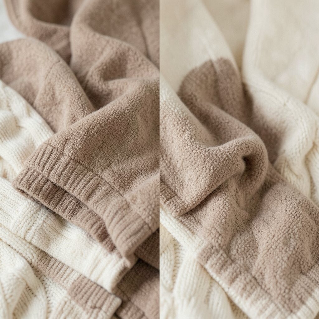
Cream and milk chocolate make a neutral palette feel rich and welcoming. This combo is especially good when you want a homey vibe that still feels polished.
Paint walls in cream, then bring in milk chocolate through wood finishes, leather seats, or a dark walnut dining table. Add soft beige throw pillows so the darker tones stay balanced.
Current design energy often favors warm, tactile materials, and this palette supports that. If you want a small budget win, refresh a coffee table with a stain-friendly clear coat, or swap out one set of accent cushions.
Personalize with artwork that includes both warm browns and creams so everything looks intentional together.
11. Clay Gray With Soft Linen Texture

Clay gray feels grounded but not heavy. It pairs beautifully with airy linen textures for a calm, modern look.
Use clay gray on cabinetry, built-ins, or an accent wall, then keep fabrics in off-white and oatmeal. Linen curtains and textured bedding help the color read softer, like it’s part of the room’s natural texture.
12. Pale Putty With Brass Warmth

Pale putty is a gentle neutral that flatters both warm and cool lighting. Adding brass details brings a little sparkle without being too loud.
Choose putty tones for walls or large furniture pieces, then bring in brass through lamps, cabinet handles, or a bar cart. The warm metal helps the neutrality feel elevated and inviting.
For trend alignment, warm metals are still popular, especially in kitchens and entryways. If you want cost control, replace just the most visible hardware first and keep other elements as they are.
Personalize with a brass tray and two coordinated vases in cream and pale sand.
13. Cool Sand With Cloud White Layers

Cool sand gives a beachy neutral feel that stays sophisticated. Cloud white layers keep it light and bright, even on darker days.
Try a cool sand tone on the main walls, then layer cloud white through trim, ceilings, and textiles. This helps edges look crisp, which makes rooms feel bigger and cleaner.
14. Light Taupe With Soft Navy For Contrast
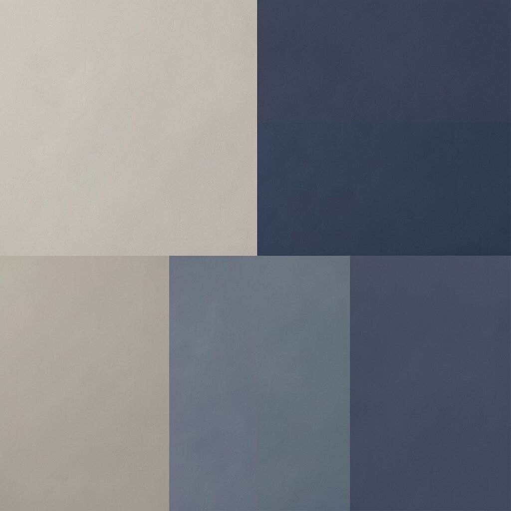
Light taupe creates a gentle base that feels calm and tidy. Soft navy adds a calm contrast that still feels neutral enough for everyday life.
Use taupe on walls, then add navy through a rug border, throw pillows, or a headboard. Keep navy muted rather than bright, so it doesn’t overpower the room.
To personalize, choose navy patterns like subtle geometric lines or faint stripes, which bring personality while staying neutral. This palette is great for families because it hides everyday wear better than very light neutrals.
For practical tips, check how navy looks in your room lighting before committing, since it can shift from grayish to deep blue depending on exposure.
15. Neutral Olive With Cream And Warm Wood
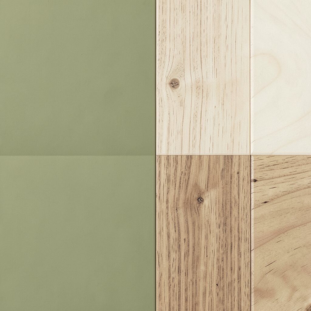
Neutral olive adds a quiet, nature-inspired mood to a home. When paired with cream and warm wood, it feels balanced and timeless.
Paint walls in cream, then use olive in accent pieces like curtains, upholstered chairs, or decorative ceramics. Warm wood floors or furniture make the olive feel natural rather than dramatic.
16. Smoky Beige With Textured Stone Surfaces
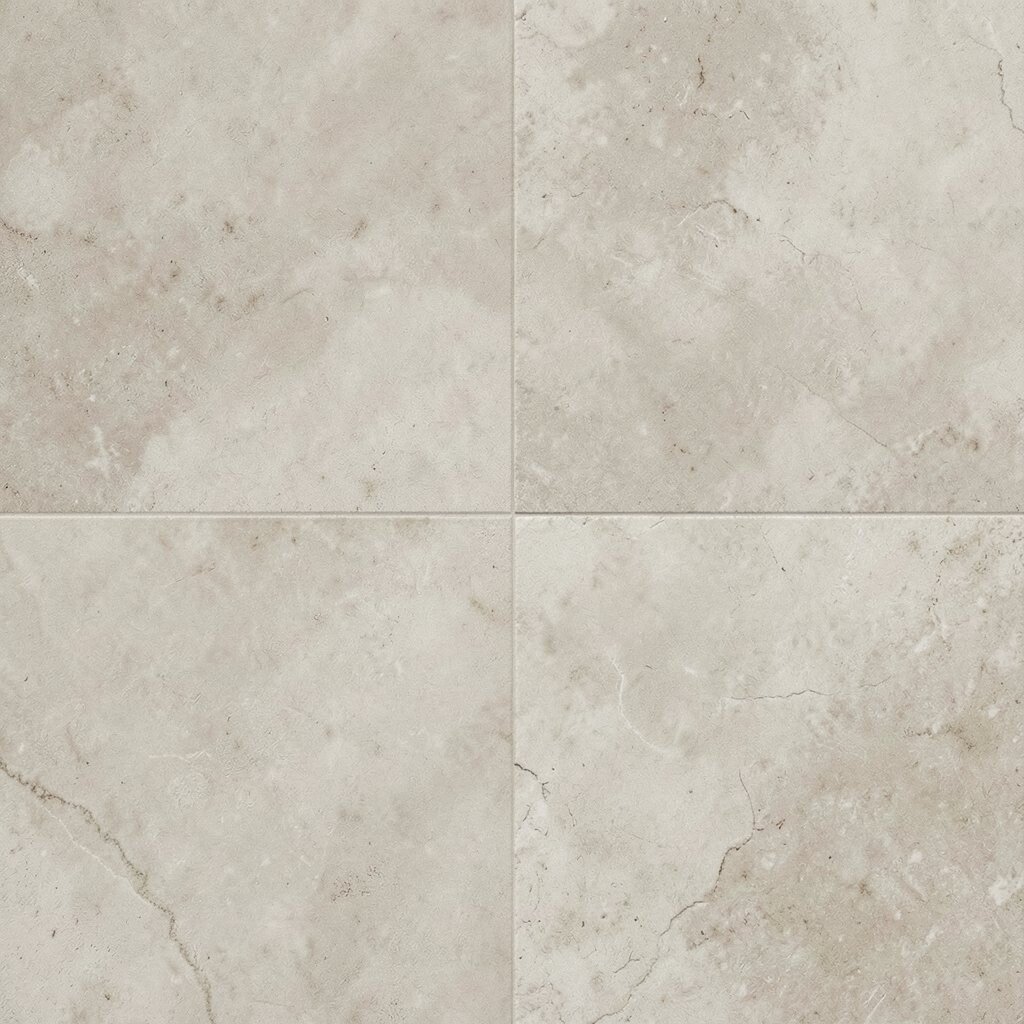
Smoky beige brings a soft, slightly dramatic tone that still stays welcoming. It works especially well with stone-like textures and earthy finishes.
Pair smoky beige walls with surfaces that look like travertine, limestone, or matte concrete. Even if you can’t install new stone, you can bring the vibe through countertop accessories, textured wall art, or tile-look options.
For practical planning, choose low-maintenance finishes like washable paints and easy-clean fabrics. Personalize with pottery in muted charcoal and sand so the room feels curated rather than random.
17. Porcelain White With Dove Gray Balance

Porcelain white can make a room feel crisp, calm, and open. Dove gray softens the look and prevents the space from feeling too clinical.
Use porcelain white on walls and trim, then add dove gray in the largest furnishings like a sofa or area rug. This balance works well in kitchens, hallways, and bathrooms where you want clean lines.
If you’re following current trends, bright neutrals paired with soft gray remain popular because they photograph well and adapt to many styles. For cost considerations, focus on updating textiles first, since pillows, curtains, and rugs are easier to swap than big furniture.
Personalize with framed black-and-white photos or a mix of simple ceramics for a lived-in feel.
18. Tawny Neutral With Off-Black Accents

Tawny neutrals feel warm and sunlit, even indoors. Off-black accents give it a sleek, modern edge.
Use tawny for walls or larger upholstery pieces, then add off-black through lighting, shelving, or picture frames. Keep the off-black slightly softer than true black, so it stays friendly.
This palette is unique because it blends classic warmth with a sharp, contemporary finish. If you want practical wins, change your light fixtures and mantel styling before buying new furniture.
Personalize by using woven materials in tan and cream so the room feels textured and comfortable, not flat.
19. Light Sand With Greige Oversized Rugs
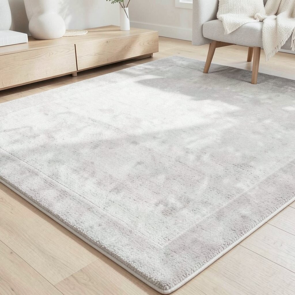
Light sand is gentle, and it pairs well with many styles of furniture. An oversized greige rug can make the whole room feel unified.
Place the greige rug so it anchors seating, then keep walls and curtains in light sand or a pale cream. This is a smart approach because the rug does a lot of visual work.
For practical tips, choose a rug with a tight weave if you have kids or pets, since it’s easier to clean. Personalize with a few bold-but-neutral items like a textured lamp base or a patterned throw that still stays within the neutral family.
20. Soft Rose-Taupe Neutral For A Subtle Warmth

Soft rose-taupe is a neutral that feels comforting and slightly romantic. It adds warmth without turning the room pink.
Use a rose-taupe tone in bedding, upholstered headboards, or accent walls. Then balance it with cream whites, warm oak, and touches of brass or brushed gold.
For cost considerations, start with textiles, since bedding and pillows are the easiest items to swap as seasons change. This palette also feels fresh with current trends that lean into warm, blush-adjacent neutrals and tactile layers.
Personalize by choosing art with warm grays and soft rosy tones so your whole room feels like it belongs together.
21. Monochrome Warm Gray With Natural Linen And Wood
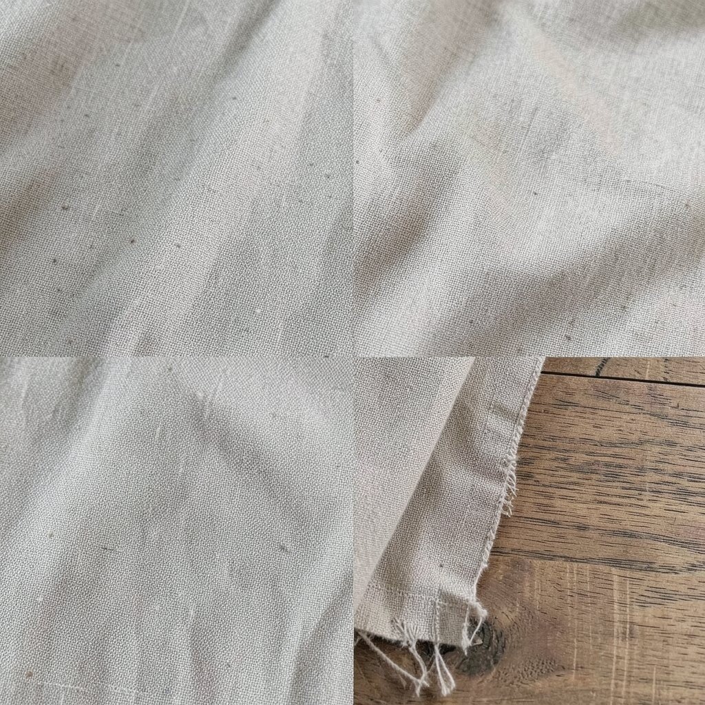
Monochrome warm gray creates a calm, cohesive look that feels designer. When you add natural linen and warm wood, it becomes comfortable instead of dull.
Paint walls in warm gray, then build layers using different gray depths across furniture, curtains, and rugs. Keep the warm wood tones consistent so the palette stays balanced.
This is a unique approach because it leans into one color family while still offering variety through texture. If you want practical tips, use satin or eggshell paint so light reflects softly, and choose linen blends for durability and comfort.
Personalize by styling a shelf with natural elements like driftwood, ceramic vases, and neutral books so the monochrome look feels lived in.
For cost control, focus on lighting, textiles, and one statement piece in warm gray, since small changes can produce a big mood shift.