The best creative prompts feel like playful accidents. Tiny design choices can turn a plain page into a world of wonder.
1. Doodle a Comet Trail Into Your Layout
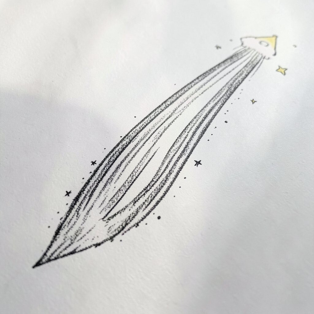
Start with a blank canvas and draw a simple comet, then let it drag a wiggly trail across the page. Use a thick marker for the path and thin lines for little sparkles to give it motion.
Pick one color as the comet and two supporting colors for the tail so the design still looks organized. Keep the trail functional by guiding the eye toward your main text or focal art, like a friendly arrow that never feels strict.
2. Make a Sticker-Style Border With “Torn” Edges

Design a frame that looks like layered stickers peeling from paper. Give the corners soft curls and add a few doodled bubbles as if someone laughed while making it.
This kind of border instantly adds character without needing complicated illustration. To keep it practical, leave clear space for content so nothing important gets covered by the “tape” lines.
For personalization, match the border to your theme with tiny icons like stars, hearts, or leaf shapes. If you’re working digitally, use a torn-paper brush set and adjust opacity for a realistic look while staying budget-friendly.
3. Turn Everyday Labels Into Pattern Play
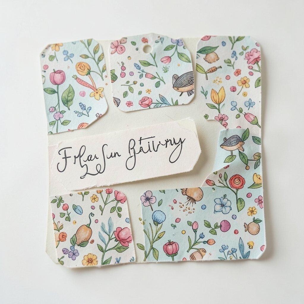
Look at a grocery receipt, a shipping label, or a barcode and steal the design vibe. Convert the shapes into a repeating pattern with stripes, blocks, and tiny symbols.
You’ll get something that feels familiar but new, which makes viewers relax and pay attention. For practical results, limit yourself to a small set of marks so the pattern doesn’t become messy.
To make it unique, pick one “secret” element that shows up in every repeat, like a tiny smiley or a spiral. You can also try swapping colors each time you print or resize the pattern, keeping the look fresh with almost no extra cost.
4. Build a Shadow-Only Scene Using Monochrome
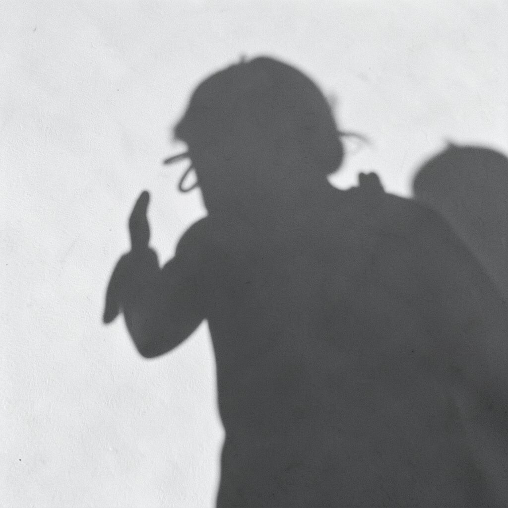
Choose one base color and create an entire picture using only shadows. Draw objects as simple silhouettes, then layer softer shadow shapes like fog drifting across the surface.
This approach makes your design feel dreamy and a little mysterious. It also helps you practice depth because you’ll focus on light direction and spacing instead of details.
5. Use Hand-Lettered Numbers as Decorative Confetti
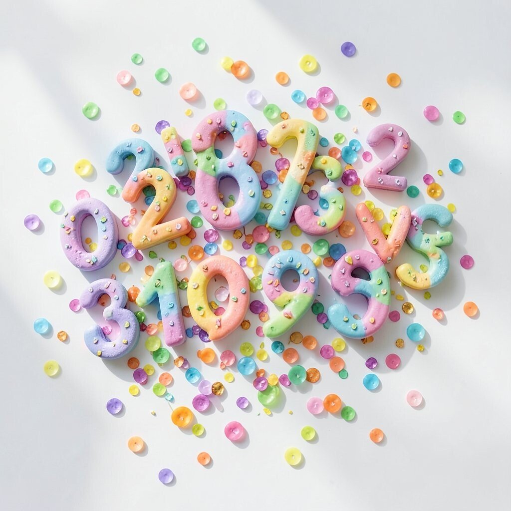
Instead of hiding numbers inside a chart, treat them like artwork. Hand-letter them in different sizes and rotate them slightly so they float like confetti.
Numbers bring structure, and turning them into ornaments keeps your layout lively. If you want it actionable, place the biggest number near the most important message and let the smaller ones “support” it around the edges.
For personalization, pick a font style that fits you, like rounded bubble lettering or vintage serif numbers. Digital tools are often inexpensive, and free font packs can give you plenty of choices without over-spending.
6. Create a “Tape Map” Guide for Imagined Directions
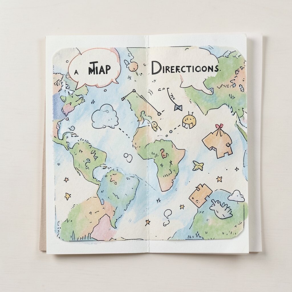
Draw a map that doesn’t point to real places, just feelings. Use strips of masking-tape shapes, with curved arrows and tiny hand-drawn landmarks like moons or teacups.
This design style feels playful and can make instructions or sections easier to follow. Practical tip: keep tape strips short and staggered so each path is readable, even when your page gets busy.
7. Design a Color Block City With Window Doodles
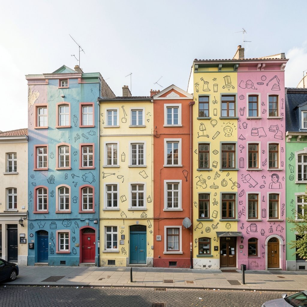
Make a grid of buildings using bold color blocks, then add little window doodles in each block. You can include curtains, stars behind glass, or a tiny lamp glow.
The benefit is instant visual interest, especially for backgrounds and covers. It’s also a great way to practice consistent spacing while still letting creativity shine.
For uniqueness, choose a story for the city, like a nighttime beach town or a dreamy space neighborhood. Cost considerations are friendly here because you can start with basic shapes and simple pens, then add details later if you want.
8. Let Misty Gradients Frame Your Main Idea
Use a soft gradient as a “cloud border” around a focal element. Keep the center clearer and let the edges fade like watercolor meeting air.
This creates a calm mood and makes the main text pop without harsh lines. For practical use, limit the gradient to two tones so it stays clean and doesn’t overpower the message.
9. Make a Pattern From One Repeated Word Shape
Pick a word you like and draw just its first letter as a custom shape. Repeat that shape in a pattern, mixing sizes and rotations for energy.
This gives you a branded feel while still feeling artistic and playful. A practical trick is to test the pattern in grayscale first, so you’ll know it works even if you later change colors.
Personalize it by turning the letter shape into something related to your life, like a leaf for a name or a swirl for a hobby. If you’re digital, you can use repeating patterns to save time, which is a smart budget move for large projects.
10. Draw a Paper-Chain That Connects Tiny Stories
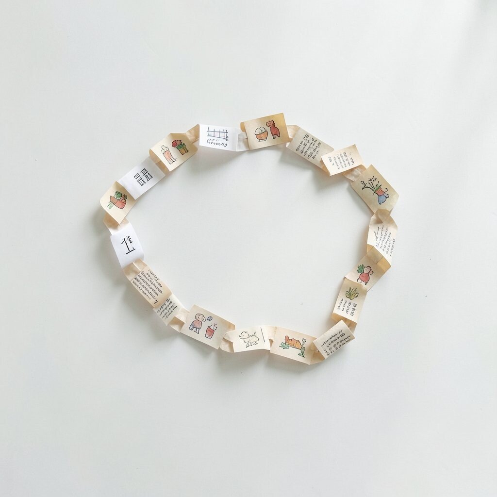
Create a chain link border made of paper circles or loops, then add a small drawing inside each link. Each link can show a different moment, like a kitten, a cloud, a book, and a cookie.
This works great for headings and as a playful organizer for ideas. Keep the drawings simple and consistent in line weight so the chain looks cohesive.
11. Try a “Museum Label” Look With Whimsical Titles
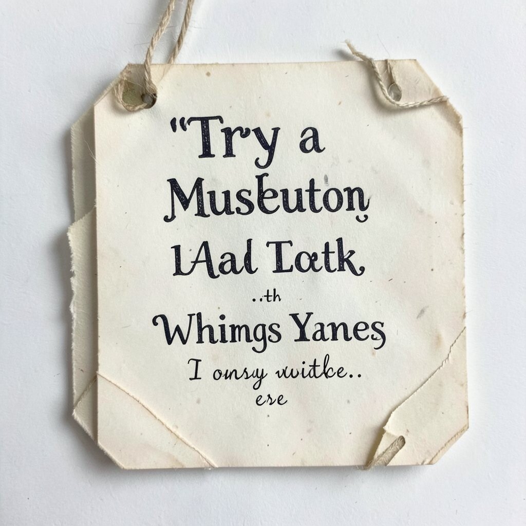
Design a small label-style block that sits beside your art, like an imaginary exhibit card. Add a fun title and a short line of description, then decorate the border with tiny stars or dots.
Viewers love this because it creates context and makes your work feel like it has a backstory. To keep it practical, make the text large enough to read and use high contrast so it doesn’t blur into the background.
12. Build a Repeating Maze Border for Movement
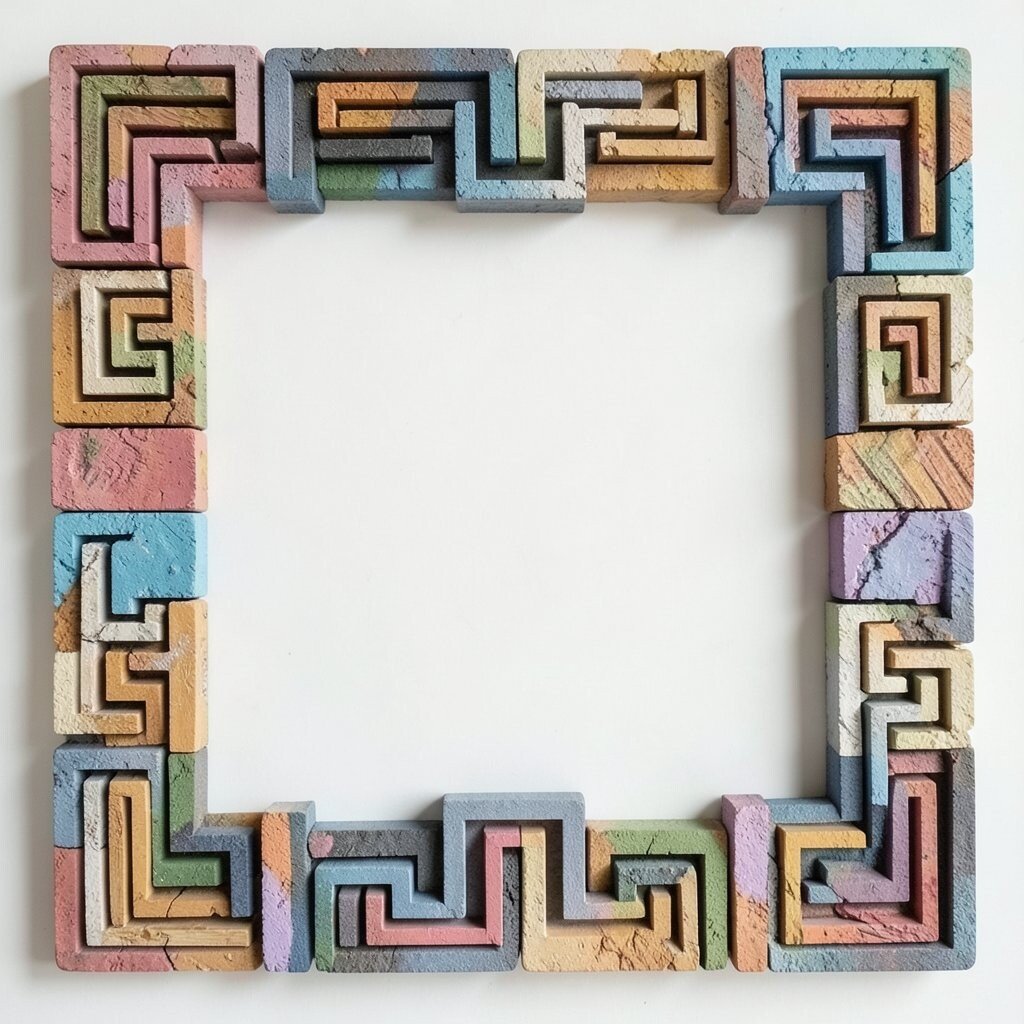
Draw a thin maze along the edges of your design, like it’s guiding you around. Make it one continuous path, and add small breaks that mark where the eye should pause.
This border gives a steady sense of motion without stealing focus from your main content. A practical tip is to keep the maze line thickness consistent, so it looks neat even when resized.
13. Make a Collage-Style Background With Only Three Materials
Choose three sources, like printed paper, fabric texture, and a marker scribble. Cut or crop them into pieces and layer them with varying transparencies.
This creates a rich texture while still staying manageable. For personalization, let each material match a theme, such as rough paper for “earth,” soft fabric for “comfort,” and crisp ink for “ideas.”
Cost considerations can be surprisingly low if you use scraps you already have. Digital collage can also be done with free texture packs, which helps you keep the budget under control.
14. Create a Weather System Illustration Around Your Text

Turn the area around your content into a tiny forecast scene. Draw sun rays, rain lines, wind swirls, or fog curls that frame the words like a gentle border.
This makes the layout feel alive and helps it match seasonal themes. Practical tip: choose one weather mood to avoid visual clutter, and use lighter opacity near the text so reading stays easy.
15. Use “Hand-Drawn” Frames Around Photos and Icons
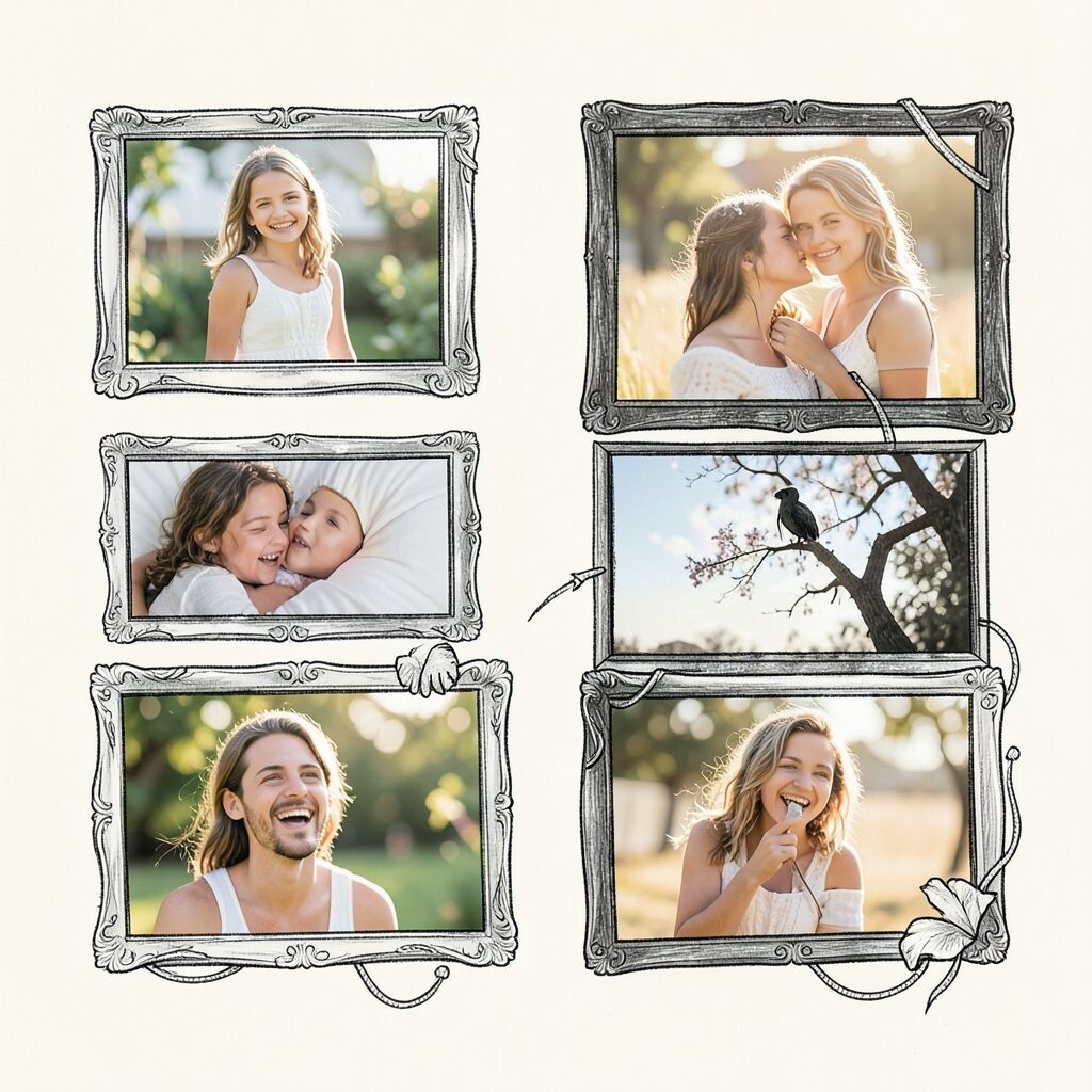
Draw uneven frames around each photo or icon, like you made them with imperfect confidence. Add tiny corner ticks and subtle scribbles so it feels human, not mechanical.
This small change makes your work look crafted and personal. Keep the frame style consistent across the page so your collection feels intentional.
To personalize, pair different frame doodles with different types of images, like stars for happy photos and snowflakes for cozy ones. If you’re printing, thick outlines can hold up better, which is a helpful cost-saving move because you won’t need as many retouches.
16. Make “Spell Circles” Using Symbols and Repeat Patterns
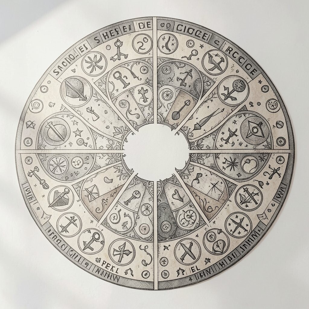
Create circular designs filled with tiny repeating symbols, like stars, plus signs, or little eye shapes. Place the circle behind a headline so it feels like the words are part of a magical design.
This gives your page a playful, mythic vibe while still being organized. Practical tip: keep the symbols small and spaced evenly, then make the center area clearer for readability.
17. Design a Fake Recipe Card for Your Creative Process
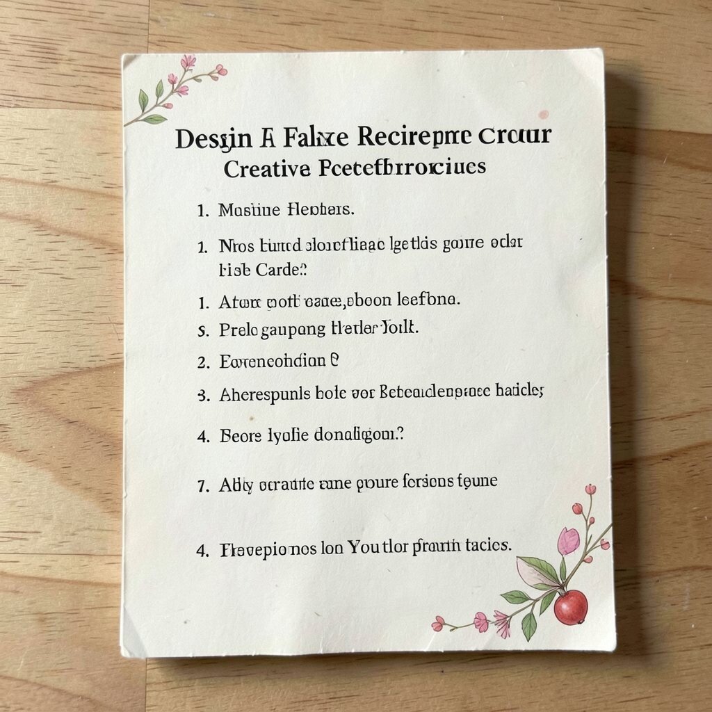
Write your own “recipe” for making art using ingredients like colors, textures, and time. Illustrate the card like a vintage recipe sheet, then add whimsical stains, doodles, or tiny measuring marks.
This is a fun way to turn process into story, and it helps people connect with your work. For practical tips, keep the wording short and set the main steps in a clear order so the card feels inviting, not overwhelming.
Uniqueness comes from choosing ingredients that reflect your real habits, like “warm tea,” “scribble paper,” or “one accidental color.” Cost considerations are easy because you can print the card on scrap paper and reuse it as a template whenever you make a new project.
18. Build a Scrapbook Timeline With Curved Arrows
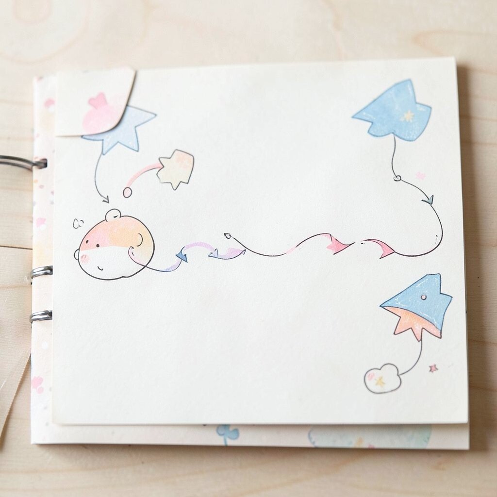
Create a timeline that curves like a ribbon instead of lining up straight. Add small cutout shapes along the path, such as tiny photo rectangles, label tags, and doodle milestones.
The benefit is that it feels nostalgic and friendly, like a scrapbook page you want to touch. For practical use, keep spacing wide enough for text and avoid cramming too many moments into a small area.
19. Turn Your Margins Into a “Universe” With Stars and Orbits

Fill the margins with stars, small planets, and faint orbit lines around your content. You can even place a tiny “comet” that passes behind the headline for extra whimsy.
This is a simple way to add depth and atmosphere while letting the main content remain the hero. A practical tip is to vary star sizes lightly and use soft opacity so the universe doesn’t compete with reading.
For personalization, pick a theme like constellations from your favorite memories or hobby symbols as planets. If you’re working on a budget, start with a single star brush and reuse it across the page, then tweak scale for variety.