The right vintage concert poster can make any room feel alive. Pick the ones that match your vibe, and you’ll enjoy them every single day.
1. The Velvet Underground and Nico (1967)
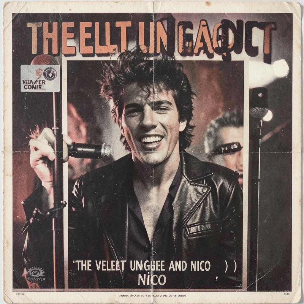
Bold lettering and a moody, close-up figure dominate this classic look. The color choices feel muted yet dramatic, like stage lights caught in fog.
Hang it where you can see it from your everyday route, such as near a desk or reading chair. If you want it to feel authentic, choose a simple black or dark wood frame and avoid shiny glass. Keep the wall around it clean, so the poster’s grain and ink textures stand out without competition.
2. Led Zeppelin at Madison Square Garden (1973)

This design often shows heavy typography and a sense of scale, like the venue is roaring back at you. Deep reds and smoky grays create a strong mood, and the layout feels built for big sound. Many versions include bold lines that guide your eyes across the page.
Place it in a hallway or entry spot where guests will notice it right away. For practical care, use acid-free backing and keep it away from direct sun to prevent fading. If you want to personalize the look, match your frame mat color to the poster’s strongest shadow tone.
It also pairs well with other rock-era pieces, especially if their palettes are similarly dark. When budgeting, consider buying a smaller print or a later reprint with the same artwork style if originals push past your price range. Modern framing services can still make a vintage-style piece feel gallery-ready without spending too much.
3. Pink Floyd at Earl’s Court (1975)
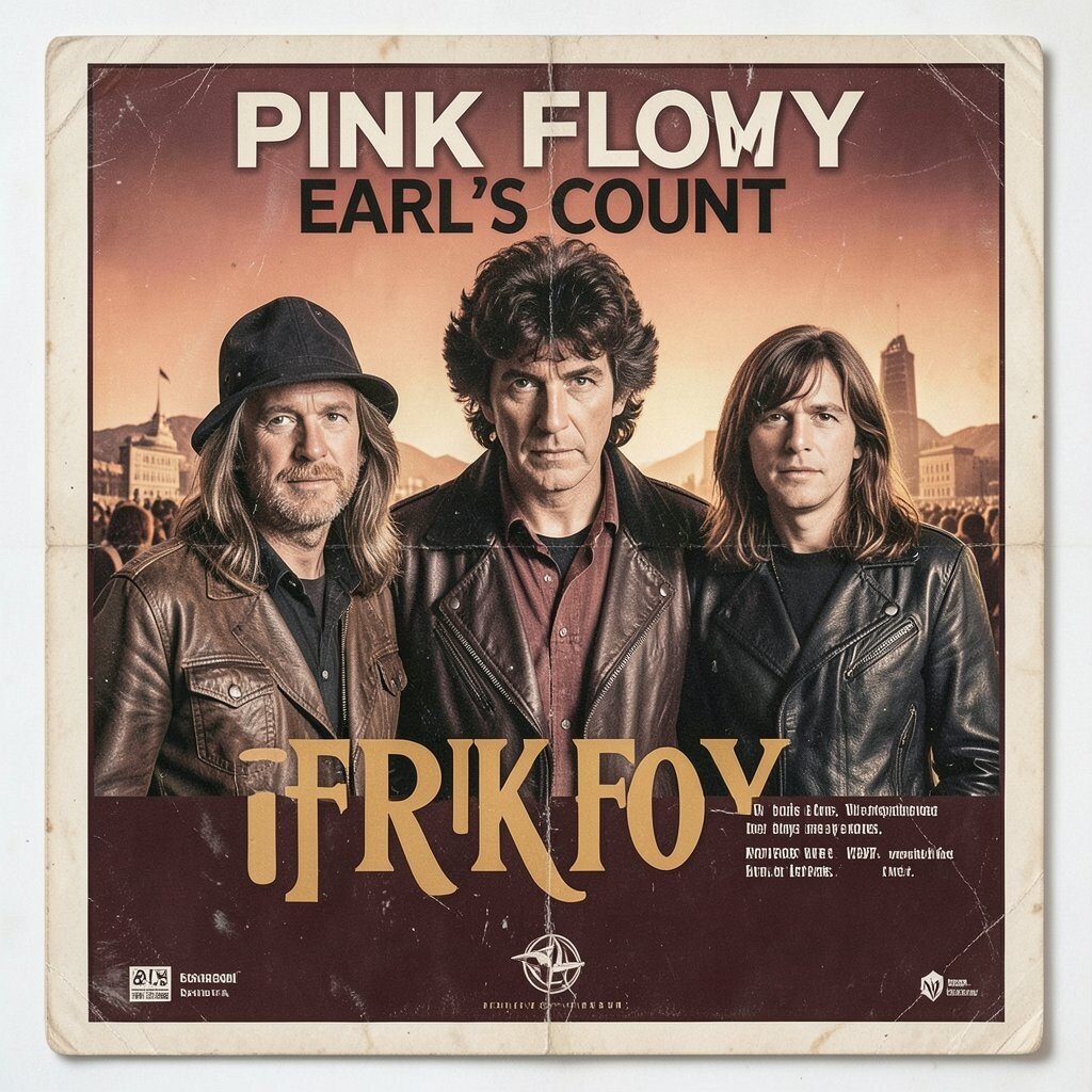
Dreamy shapes, layered color, and a sense of motion give this poster a surreal, late-night vibe. The imagery tends to feel soft around the edges, like it’s humming rather than shouting. You can almost imagine the stage lights moving behind the ink.
Put it on a wall where you relax, like a living room corner, because the design encourages a calm, thoughtful mood. For a smart display, use a wider mat so the center artwork breathes and looks intentional. Keep the surrounding decor simple, letting the poster be the visual soundtrack.
If you want it to feel uniquely yours, add a small, related accessory nearby, such as a compact record sleeve or a matching color lamp. Originals can be pricey, so compare print sizes and condition before you commit. A high-quality modern print with proper color accuracy can deliver the same mood at a more friendly cost.
4. The Who “Face Dances” Tour Poster (1981)
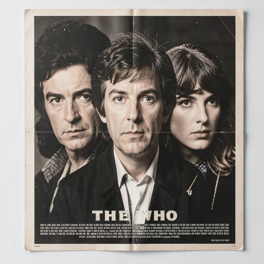
This style leans into bright energy, often featuring crisp lettering and a punchy composition. You’ll notice sharp contrast that makes the poster pop even from a distance. The overall feel is bold, theatrical, and confident, like it’s ready to start the show.
Hang it in a room where you entertain, because the color and rhythm naturally invite conversation. Use a frame with a matte finish to reduce glare from overhead lights. If you’re worried about cost, shop for posters in good condition with minimal wear, since minor edge scuffs can be less noticeable once framed.
5. Jimi Hendrix at the Isle of Wight (1970)
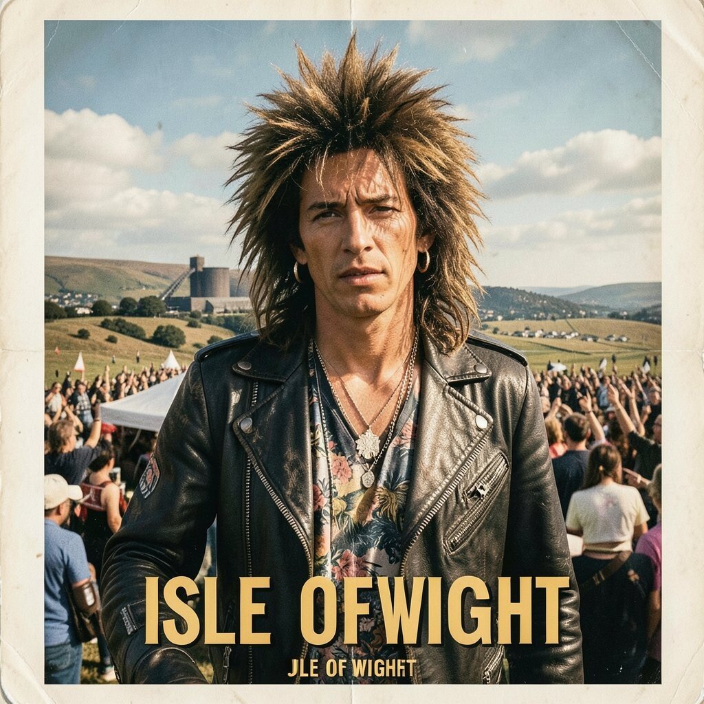
Energetic typography and a dramatic, high-contrast background create a poster that feels like live electricity. The colors often swing between deep tones and vibrant accents, giving the eye a constant path. Even when you’re not into every detail, the attitude lands instantly.
Try placing it above a stand-up desk or in a studio space, because it pairs well with creative work. For practical results, choose sturdy backing and use UV-protective glass if you have bright windows nearby. Personalize your wall by adding a second item with a complementary color, like a guitar strap or a small framed lyric card.
Original copies can cost a lot, so check for reputable sellers who provide clear photos and print details. If you want to stay practical, a reissued print can still look powerful when framed well. Pay attention to paper thickness and color accuracy, since those small details affect how vintage the final look feels.
6. Elvis Presley “Aloha from Hawaii” Promotional Poster (1973)
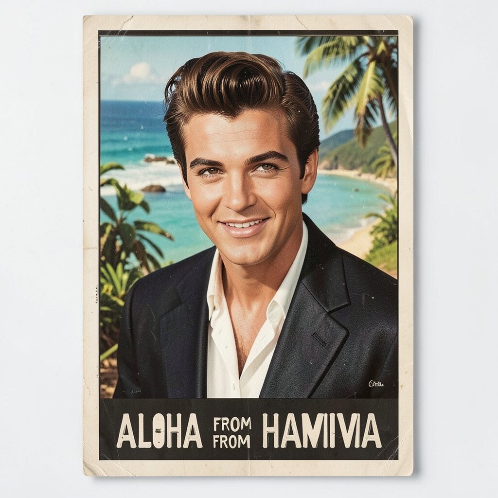
This kind of vintage promotional art often carries a warm, celebratory tone with clean, readable layout. You’ll spot bold central imagery and polished graphic styling that feels like classic TV glow. The design has a friendly charm that works even in modern spaces.
Frame it with a cream mat and a classic gold or espresso frame to keep the look timeless. Put it in a kitchen, dining area, or entry spot where the warmth makes the room feel welcoming. If you want personalization, pair it with a matching vintage photo frame or a small decorative record player.
When considering cost, decide whether you want an original or a faithful reproduction that still nails the color vibe. Reprints often let you enjoy the look without stressing about rarity. Keep it away from humidity and handle it gently, since older paper can be sensitive along the edges.
7. ABBA at Wembley Arena (1979)
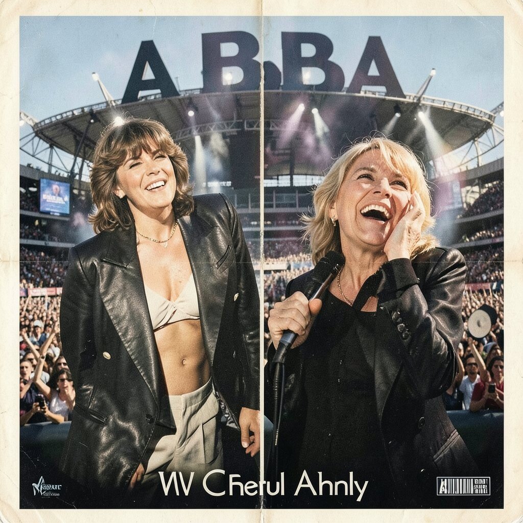
Colorful shapes and confident typography give this poster a bright, pop-star sparkle. The layout tends to feel symmetrical or gracefully balanced, which makes it look neat on a wall. Even your mood can lift when you see the cheerful palette on a gray day.
Hang it where you start your day, like near a closet door or in a small home office. For a practical tip, measure your wall space first and pick a frame that leaves breathing room above and below. If you want it to feel more personal, place it beside two smaller items, such as concert tickets or a dance-themed print, using consistent frame colors.
This is a great choice if you want variety in your collection without leaning too dark. Pricing can range widely, so compare print size and condition rather than only trusting the seller’s description. A well-made reproduction can still look lively when framed with crisp glass and clean corners.
8. The Beach Boys “Hawthorne” Tour Poster (1965)
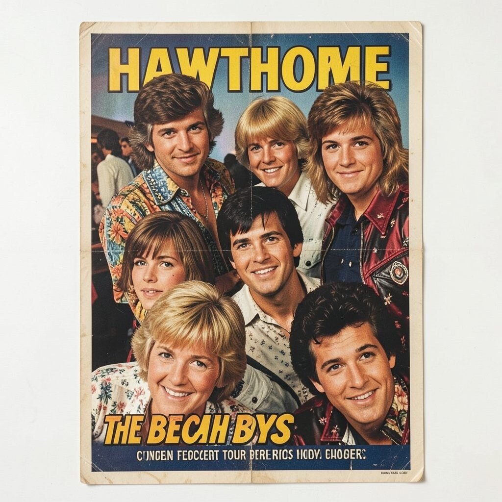
This poster style often feels sun-soaked, with breezy colors and carefree lettering. You may notice playful graphics that hint at beach life and summer fun. It creates an easy mood, like a soundtrack you can see.
Display it in a bright room or near natural light, because the colors usually look best when they glow. Use a simple white frame to keep the look airy and prevent the artwork from feeling heavy. If you want practical personalization, match the frame color to other decor accents, like curtain trim or shelf brackets.
When it comes to cost, smaller or less-rare print versions can give you the vibe without going over budget. Check for fading and paper handling marks before buying, since sunshine can be rough on older prints. A good cleaning and careful matting can make even a lightly used poster look neat and fresh on the wall.
9. Carole King “Tapestry” Era (1972) Stage Poster
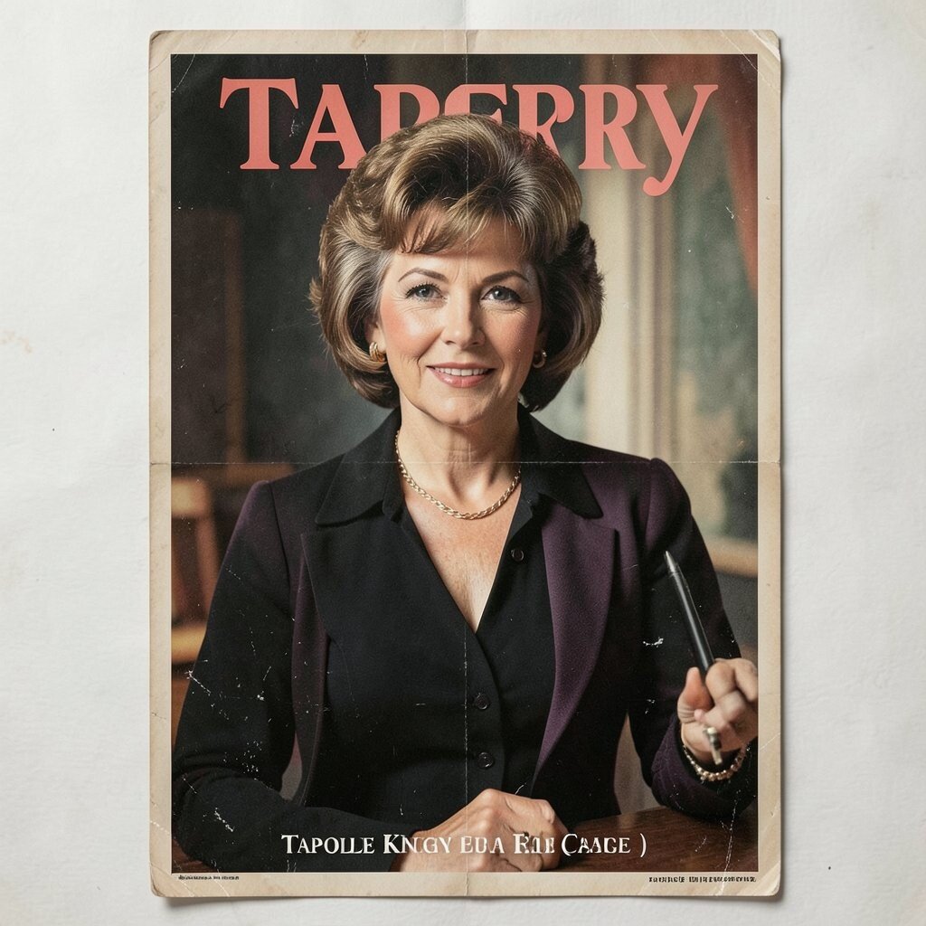
The look often feels soft and heartfelt, with gentle color fields and elegant typography. You’ll notice the focus on emotion rather than chaotic effects, which makes it feel grounded. This poster can make a room feel cozy, like a favorite song playing quietly in the background.
Hang it in a reading nook or bedroom where calm energy matters. Use a warm-toned frame, such as walnut, to keep the artwork feeling intimate. For personalization, pair it with a small listening chair, a throw pillow color from the poster, or a simple wall shelf.
Because this genre of poster can vary in rarity, your costs can swing depending on condition and original size. Consider buying a high-quality print if originals are out of reach, especially if color accuracy is strong. To protect it, keep it away from direct sunlight and consider UV glazing to slow fading over time.
10. Metallica “Master of Puppets” Tour Poster (1986)
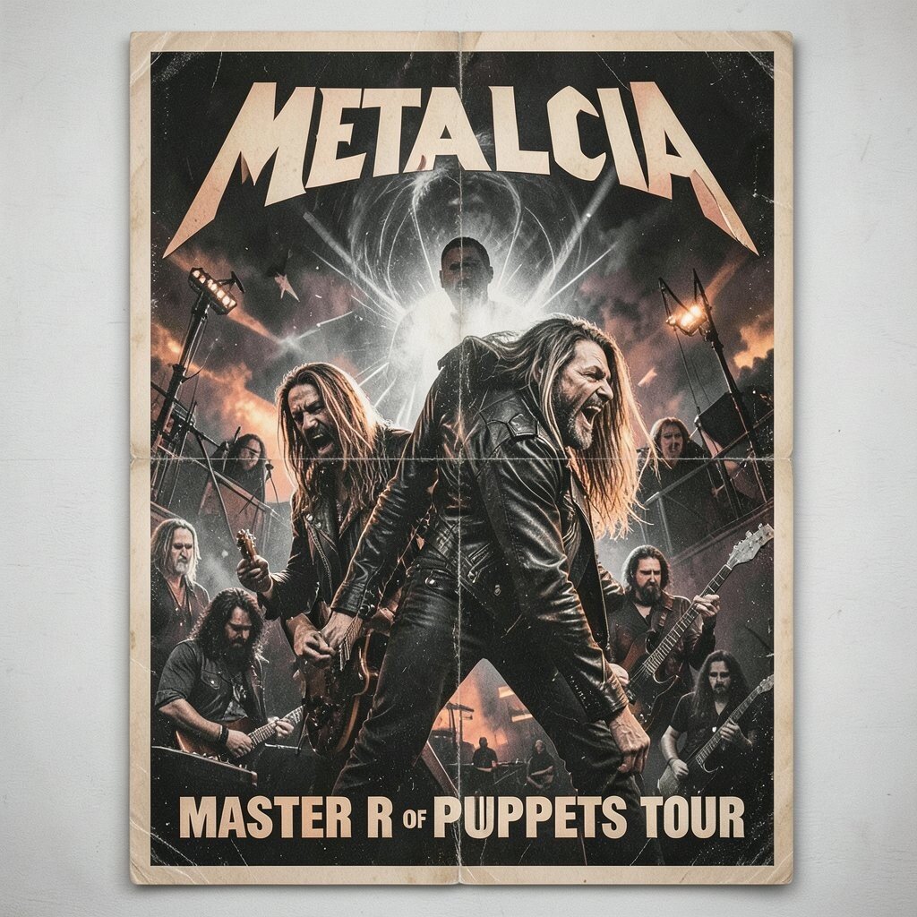
This poster style hits hard with sharp contrast, gritty textures, and intense, high-impact typography. The imagery often feels like it’s cut from a darker world, which makes it feel powerful on a wall. When you stand in front of it, it creates a strong sense of energy in the space.
Place it in a home gym, music room, or any area where you want motivation. A black frame helps keep the focus on the artwork, while a matte finish reduces glare from overhead lighting. For a practical tip, align it with a sturdy stud or use proper wall anchors, since heavy frames can weigh more than you expect.
If you want it to feel uniquely yours, add a second metal or rock poster with a complementary palette, then keep all frames the same width for a clean look. Costs can be steep for rare originals, so compare print quality, not just authenticity. Reissued posters can still feel dramatic when the inks are bold and the paper looks substantial once framed.
11. The Beatles “Sgt. Pepper” Promotional Poster (1967)

Vibrant colors, whimsical details, and playful typography make this type of poster feel like a party for your eyes. You might notice decorative shapes that seem to move around your gaze. It’s joyful, bold, and instantly recognizable, even if you’ve never owned a piece of Beatles memorabilia before.
Hang it where people gather, like a living room or game area, because the mood invites smiles. Choose a frame with a bright but not flashy finish so the artwork stays the star. If you want personalization, match your wall paint to one of the poster’s lighter backgrounds, which helps the colors feel more balanced.
Because Beatles-era art is popular, pricing can vary a lot based on printing details and condition. Set a budget early and focus on crisp edges and strong color rather than a perfect label story. A quality reprint can still deliver that vintage joy when it’s printed on good paper and framed thoughtfully.
12. Joy Division at Manchester (1980) Black-and-White Tour Poster
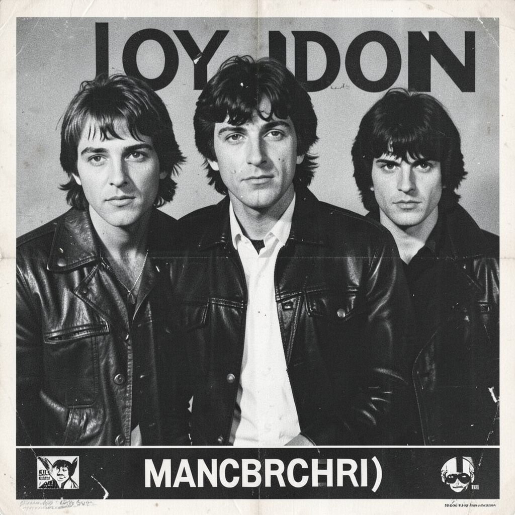
A black-and-white tour poster brings a strong, moody calm to any wall. You often see stark composition and fine detail in the lettering that feels serious and modern. The simplicity makes it easier for the art to blend with many decor styles, from minimal to industrial.
Try placing it in a home office or hallway, since the monochrome look keeps things focused. Use a thin black frame for an edgy feel, or go with a light wood frame if you want it to feel warmer. For practical personalization, keep the rest of the wall in similar tones, like charcoal, cream, or slate blue.
These posters can range in price depending on rarity, but the monochrome style is often available in many high-quality print options. Compare the contrast and the sharpness of text when choosing a print, because that’s what makes the style work. If you want originals, expect costs to be higher, especially when condition is excellent.
13. Billie Holiday “Lady Sings the Blues” Vintage Concert Poster (1950s)

Warm tones, elegant script, and a classic portrait vibe help this poster feel like old radio magic. You may notice delicate details that draw you in slowly, like a story unfolding. It gives a room a quiet sophistication without needing loud colors.
Hang it in a living room corner, near a lamp, or above a record shelf to create a cozy atmosphere. Use a frame that matches the mood, such as dark walnut or antique-style metal. For personalization, add a small brass item or a softly colored throw so the poster feels part of a bigger scene.
Cost considerations matter here too, because vintage jazz posters can be sought-after. Look for even toning across the paper and avoid pieces with heavy tears unless you have a conservation plan. If you choose a reproduction, select one with accurate shading so the artwork still feels like it came from another era.
14. The Rolling Stones “Sticky Fingers” Tour Poster (1971)

This poster type often feels bold, graphic, and a little rebellious, with a strong central image and edgy typography. You’ll see confident composition that fills space without needing extra decoration. The look feels tactile, like it’s meant to be handled with enthusiasm, not whispered about.
Place it in a garage studio, music room, or bar area where you want attitude in the air. A sturdy frame and a well-centered layout help it feel intentional rather than crowded. If you want a practical personalization, consider matching the frame to other metal accents in your space, like cabinet pulls or shelf brackets.
As for uniqueness, this is a great poster to anchor a mixed collection because its graphic style differs from many softer designs. Costs can vary depending on whether you’re buying original art, a later print, or a reissued version. Check for bold ink density and clean registration when evaluating prints, since those details affect how vintage it feels from across the room.
15. Wolfgang Amadeus Mozart “European Concert Hall” Poster (Late 1700s Style)
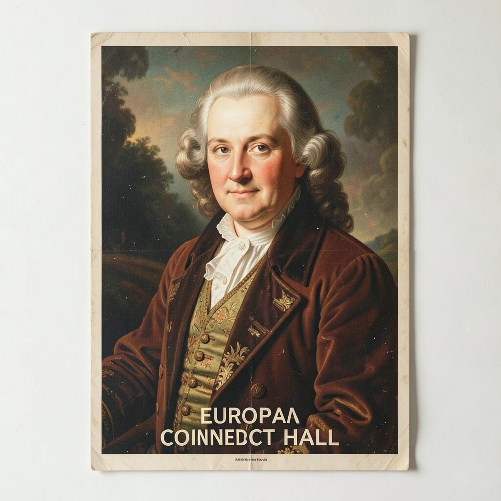
This kind of antique-style concert poster brings a formal, classical energy with ornate lettering and tidy visual structure. You might spot decorative borders and an elegant center text that feels ceremonial. It adds a refined touch that pairs well with both traditional and modern decor.
Hang it above a piano, bookshelf, or dining table area to add instant gravitas to the space. Choose a simple frame in black, dark brown, or warm oak so the ornament still feels classy rather than busy. If you want personalization, pair it with a small clock, a classical bust, or music notes art that uses similar tones.
Cost is often influenced by whether the piece is an original or a faithfully styled reproduction, so decide what fits your budget before searching. Reprints can be a smart choice when you want the look of history without paying for fragile originals. For long-lasting display, use UV protective glazing and keep it away from high-humidity areas like bathrooms.