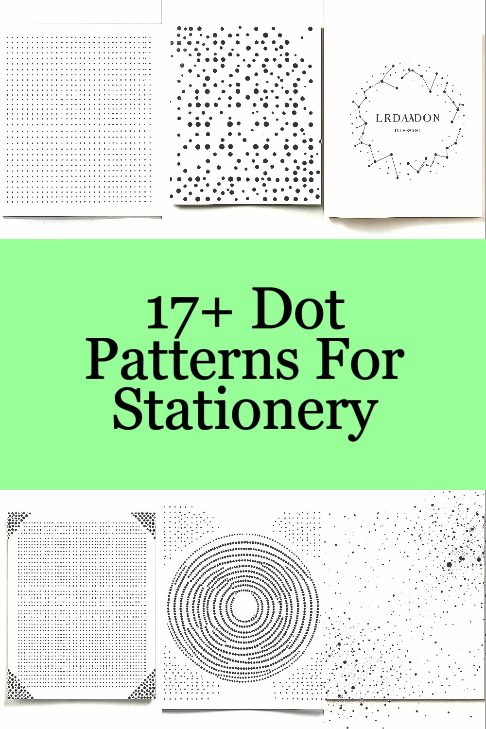
Dot patterns can feel calm, crisp, and full of personality. They also work beautifully on everyday paper goods.
From tiny points to bold clusters, these layouts help you make modern stationery that looks put-together without feeling busy.
1. Micro-Dots in a Quiet Grid
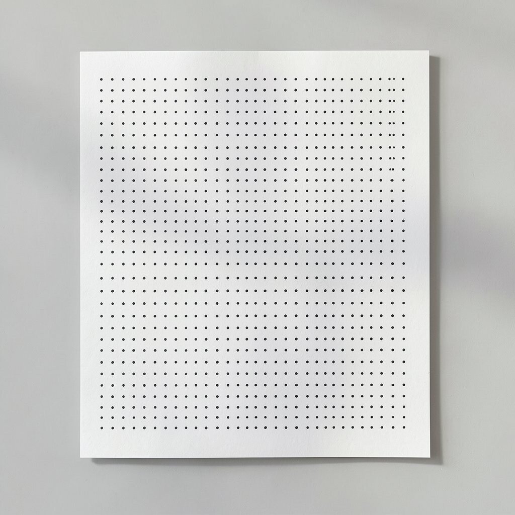
Imagine a soft field of pinprick dots that barely shows up until the light hits it. When you tilt the page, the texture wakes up and then settles again.
This pattern brings a clean, modern look to notebooks, planners, and letterheads. It also hides subtle background noise, which can make hand-written text look smoother.
For practical use, keep the dot size consistent and use one neutral color like warm gray or matte black. Personalize by stamping a single row of slightly larger dots near the top corner to mark a section, such as notes or dates.
2. Offset Dots Like a Friendly Stagger
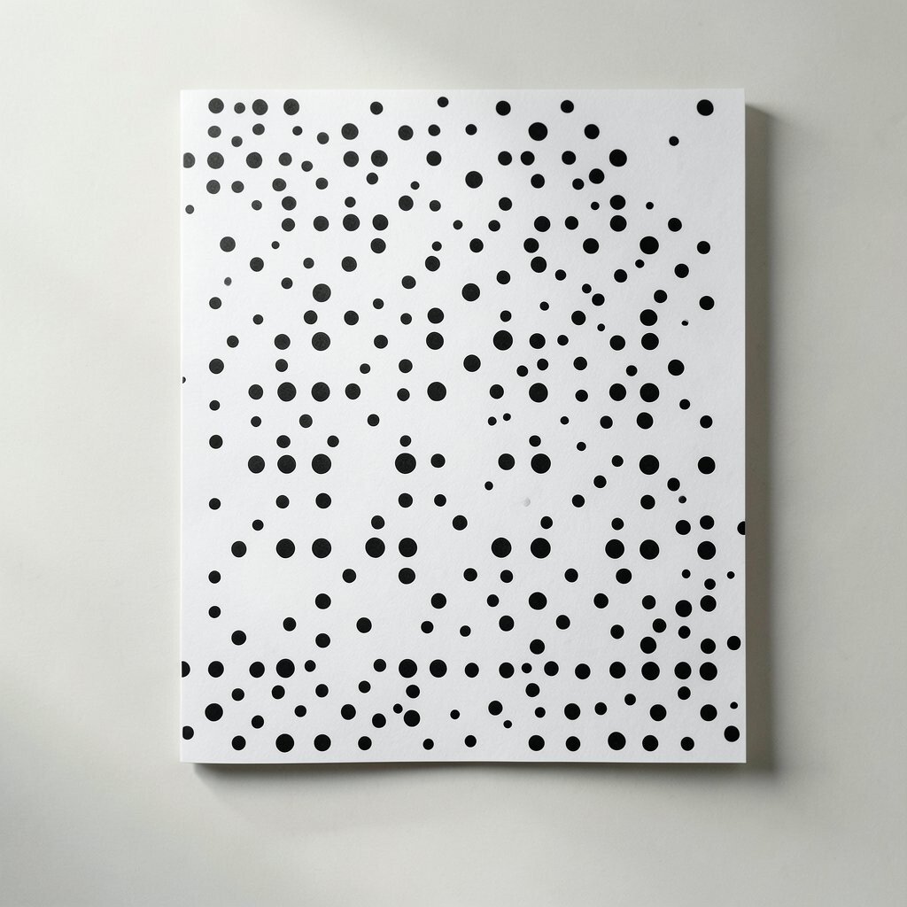
Picture circles placed in rows that never line up perfectly, like waves that pause mid-motion. The gaps feel intentional, not messy.
This staggered layout adds rhythm while still staying minimalist. It is great for modern folders, thank-you cards, and envelope liners because it looks active without being loud.
Try alternating spacing rather than changing dot size so the pattern stays crisp when printed. For cost control, use fewer inks by choosing a single ink tone and letting the paper color do the rest.
3. Constellation Dots Around Key Text
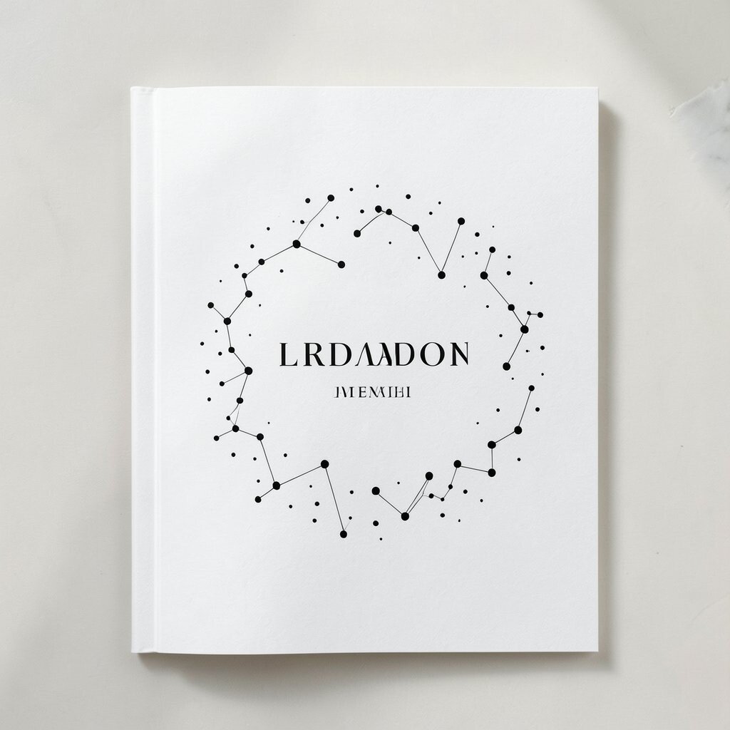
Think of small dots gathered near a name, title, or focal line like a tiny sky of stars. The main text stays the hero while the dots become a gentle frame.
This design feels special and current, especially for stationery used in events, branding, and announcements. It can guide the eye to the most important part without adding heavy shapes.
Place dots in a loose curve around headings, then taper them so they fade out before the text becomes cramped. Personalize by using your brand color as the dot color while keeping everything else in a simple dark ink.
For a practical trick, test the dot density at the size you plan to print, since small dots can clog on textured paper. If your printer struggles, increase dot size slightly and reduce the count for a clean result.
4. Half-Tone Dot Bands for a Modern Edge
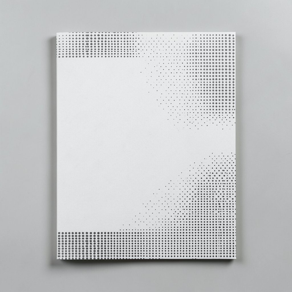
Imagine a horizontal band of dots that covers only the top half of a page. The lower part stays plain, so the band feels like an accent, not a full background.
This style looks sleek on letter stationery, policy documents, and minimalist business cards. It also helps your layout breathe, which is a big deal in modern design.
To make it actionable, align the dot band to a margin and keep the dot spacing even for a crisp look. Personalize by switching the band color for seasonal updates, like muted blue for spring or deep green for autumn.
If you are printing at home, choose a dot pattern with clear contrast and avoid overly fine dots that may smear. For budget-friendly production, keep the band to one ink color and skip gradients.
5. Minimal Rings That Repeat Like Calm Waves
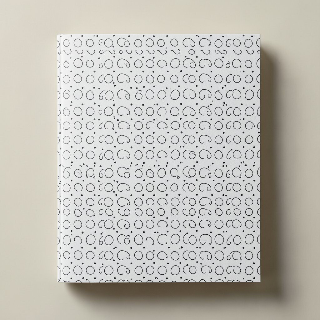
Picture thin circular rings that repeat across a cover or label, each one slightly spaced. From afar, it feels like measured motion.
Ring patterns are unique because they add shape without turning into a busy motif. They also look great on modern stationery labels, binder covers, and simple gift tags.
Use rings of two sizes, then alternate them to create a gentle grid. For personalization, hide a tiny signature dot at the center of one ring to reflect your initials or monogram.
6. Dots in a Diagonal Line of Motion
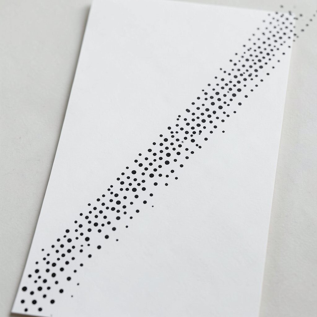
Imagine a diagonal trail of dots that moves from the corner toward your message area. The line feels like a quiet arrow even though it never points hard.
Diagonal dots add energy while staying minimalist, which is perfect for invitations and event cards. They help layouts feel dynamic, especially when the rest of the design is plain.
Make it practical by keeping the diagonal width consistent and stopping the dots before they reach the text block. Personalize by changing dot color based on event type, such as coral for celebrations and slate for work updates.
For cost considerations, use solid ink colors and avoid multi-tone dot effects that require extra printing steps. If you want a soft look, use a lighter ink or a paper with a warm tone rather than complicated effects.
7. Dot Corners for a Subtle Frame
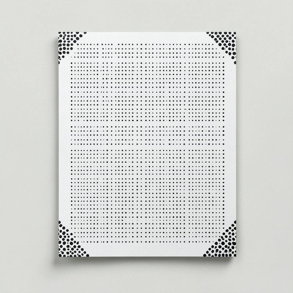
Picture only the corners decorated with dots, like a soft frame made from tiny points. The center stays clean and easy to read.
This corner-only approach keeps typography front and center, which is a major benefit for everyday writing pieces. It also makes your stationery look carefully designed even when the layout is simple.
Place dots as small clusters in each corner, then taper them inward so the frame feels light. Personalize by adding a different dot count in one corner as a visual “key,” such as your personal number, year, or brand marker.
8. Concentric Dot Targets for a Focus Point
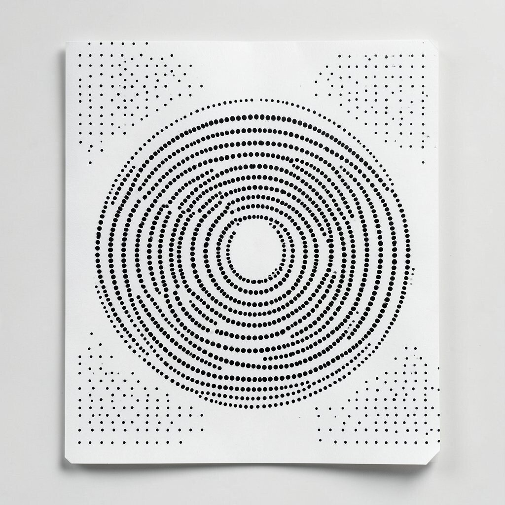
Think of a dot “target” drawn with concentric circles, but kept thin and minimal. It is a clear focal point without looking heavy.
Targets feel modern and slightly playful, which makes them great for covers, sticker sheets, and planners. They also work well for highlighting quotes, goals, or section titles.
Try placing the target behind a logo or centered above a heading, then keep the rest of the page mostly blank. Personalize by adjusting the ring spacing to match your preferred vibe, tighter for a sharp look and wider for a calmer one.
For cost control, stick to one or two ring colors and avoid layered effects. If you are printing on smaller formats like cards, keep the target centered and sized so it does not crowd the message area.
9. Scattered Dots Like Ink Dust
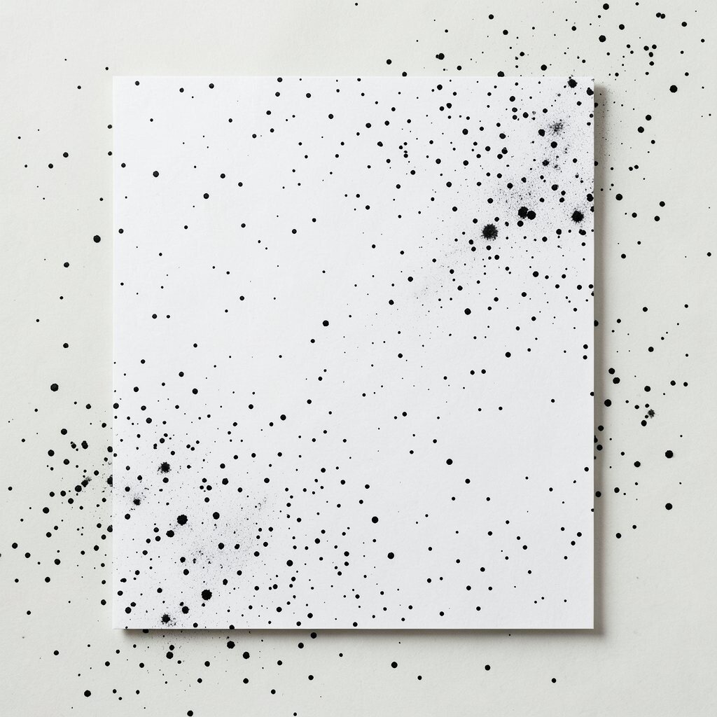
Imagine tiny dots floating across the page like ink dust after a quick sprinkle. They look casual, airy, and full of texture.
This pattern feels unique because it mimics real-world imperfections in a controlled way. It can make minimalist stationery feel human, which is a strong benefit for personal correspondence.
To keep it practical, control the dot size range and keep the majority of dots small. Personalize by clustering a few dots near one side to create a visual “weight” that balances your text.
When printing, use a consistent dot opacity so the scattered points do not vanish on lighter paper. If you want a budget-friendly upgrade, print the dots in a single ink tone and let the paper texture add the rest.
10. Polka Dot Blocks With Clean Borders
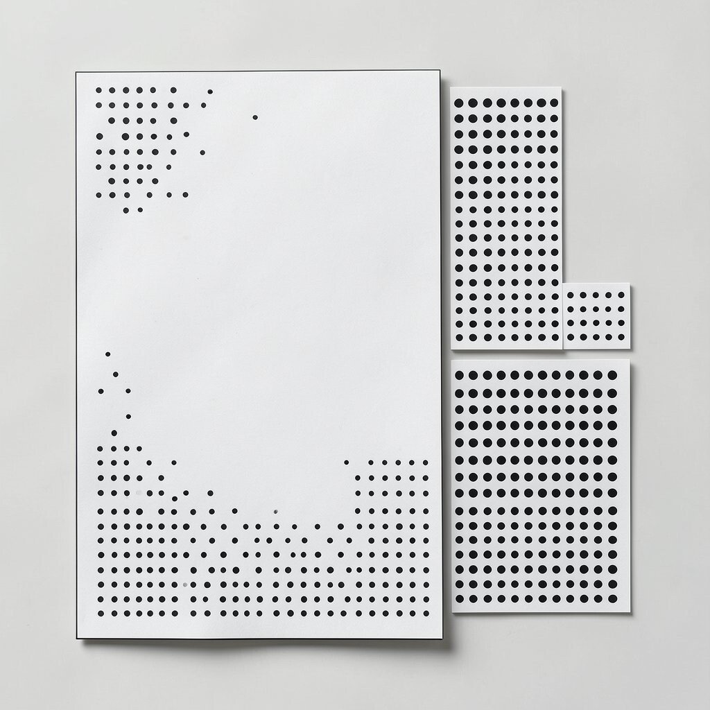
Picture several rectangular blocks filled with polka dots, separated by wide white space. Each block looks like a neat window into a different mood.
This grid-of-blocks approach is modern because it mixes structure with playful texture. It is especially good for note cards, business stationery, and product labels.
Use two or three dot densities across different blocks so the variety stays controlled. Personalize by assigning each dot density to a category, like work notes, study prompts, or personal reminders.
For cost considerations, choose a limited palette and avoid complicated patterns that require many layers. Simple blocks in one ink color can still feel premium when spacing is precise.
11. Vertical Dot Lines Like Typographic Ribs
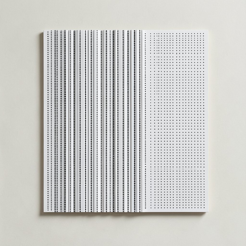
Imagine thin vertical lines built from dots, running down a page like quiet ribs. The effect feels tall, clean, and organized.
These vertical dot lines add a gentle rhythm that makes layouts easier to scan. They are a strong benefit for newsletters, report covers, and structured planner pages.
To make it actionable, keep the line thickness consistent and align the lines to an invisible grid. Personalize by varying the dot color only in one or two lines to emphasize a header or department name.
12. Lined Dots That Follow Your Text Baseline

Picture dots arranged just under a line of text, like a dotted underline that repeats in small groups. The text still stays the main focus, but the dots give it a modern frame.
This design feels current because it turns plain typography into a guided path. It is also practical for reading and organizing, since it can separate sections without using heavy boxes.
Use dot clusters that match the length of your heading, then leave space before the next section. Personalize by using a slightly different dot size under important words like “priority” or your signature.
For cost control, print in one ink and keep the underline limited to key lines. If your dot underline looks too faint, adjust contrast by using darker ink and slightly larger dots.
13. Dot Gradient Steps Using Size Changes
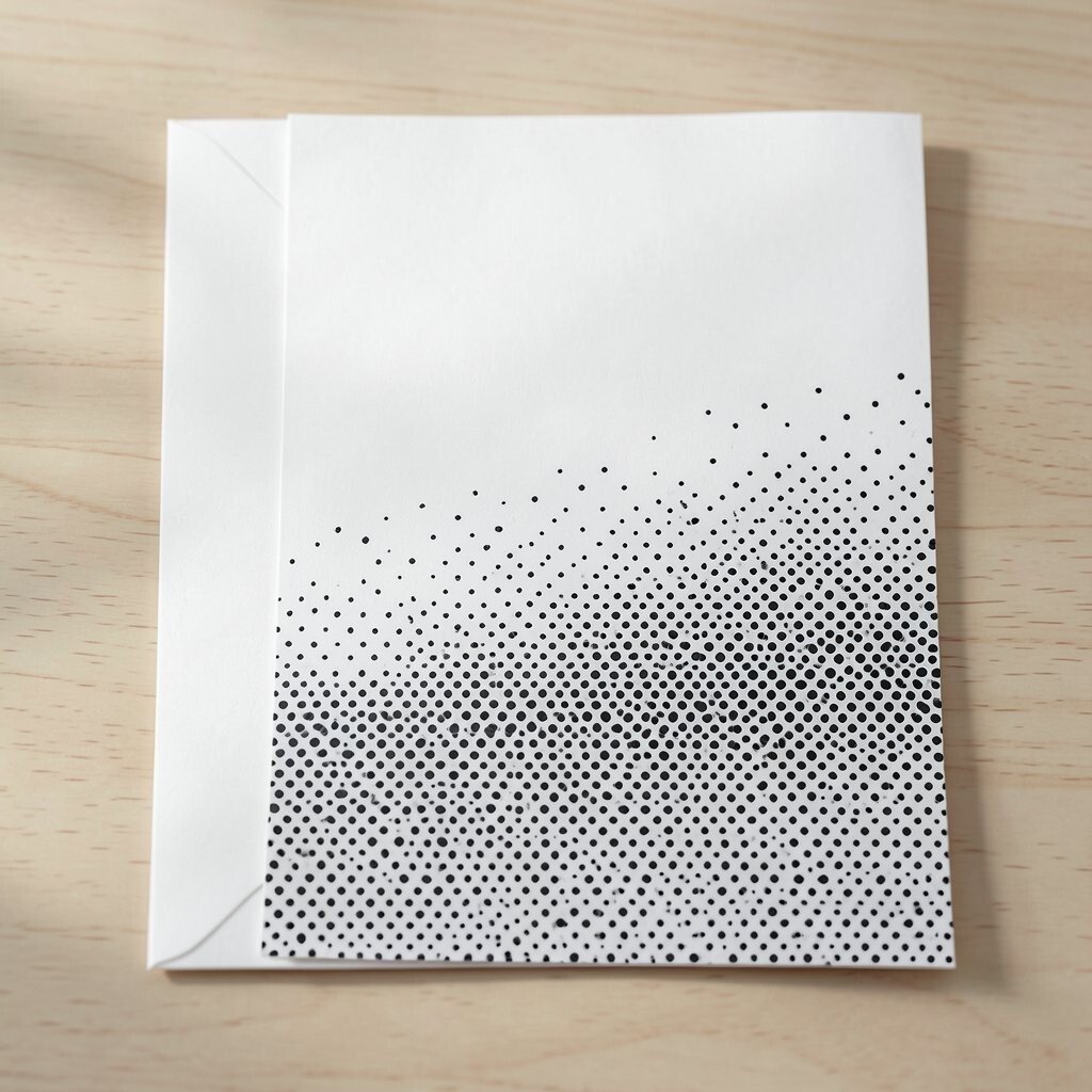
Imagine a smooth-looking fade made from dots that slowly change size from one side to the other. It feels like a gentle gradient, but still minimalist.
This approach is unique because it creates visual movement without using real gradients that can be tricky to print. It is especially good on covers, band headers, and modern stationery branding.
To keep it practical, decide the number of steps based on your layout width and test on your printer. Personalize by matching the dot growth direction to your brand style, such as dots growing toward the logo or toward the message.
14. Border of Dots That Corners the Page
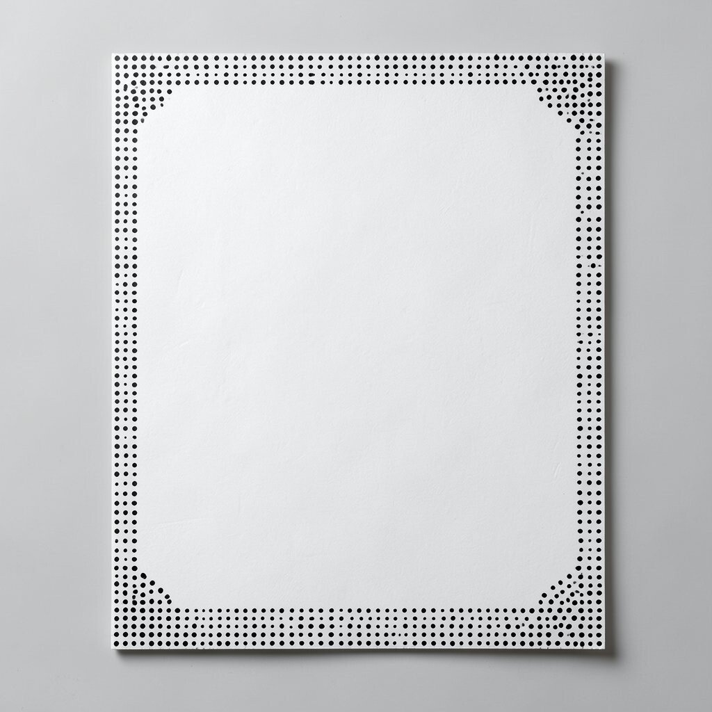
Think of a thin border made of dots running around the edge of a card or page. The border stays delicate, like lace drawn with circles.
This framing method adds polish without making the design feel heavy. It also protects your typography, because the border naturally creates a safe margin for your text.
Keep the border spacing uniform and leave a larger gap near the center so your main content breathes. Personalize by using a different dot color for the bottom border to subtly hint at the purpose of the stationery.
For cost considerations, create the border in one ink color if you are aiming for quick production. If you want extra flair, add a single contrasting dot cluster at one corner as a focal signature.
15. Stacked Dot Rows for a Modern Checklist Feel
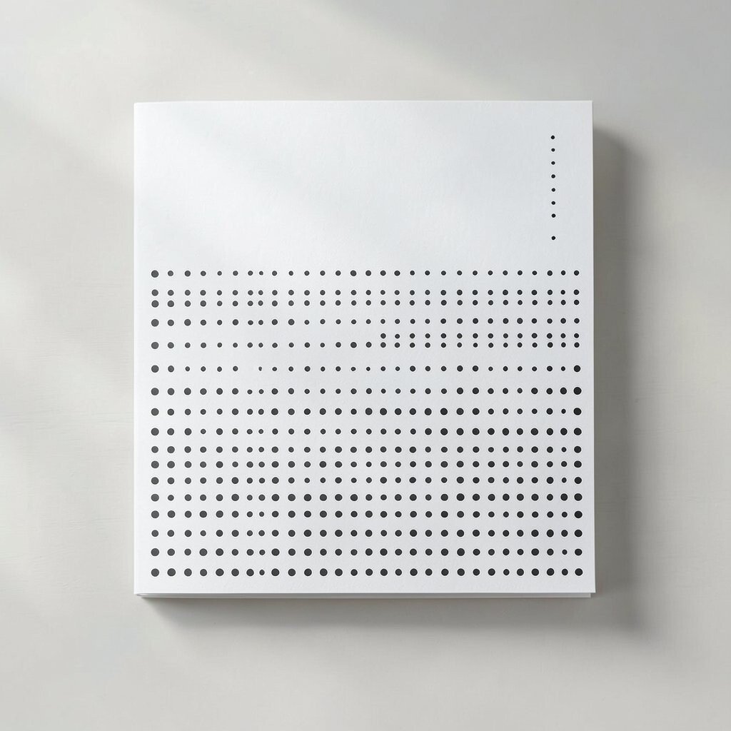
Imagine stacked rows of dots that resemble a soft checklist, but with no boxes. The page looks ready for plans, goals, and tidy updates.
This pattern can be surprisingly useful because it supports structured writing without clutter. It is great for daily journals, meeting note sheets, and habit trackers that still want a clean look.
Use evenly spaced dot rows, then leave clear space between them for writing lines or short notes. Personalize by making one row lighter or darker to indicate a priority line.
To manage cost, keep the dot pattern simple enough to print quickly and avoid overly dense coverage. If you are using pre-printed paper, choose a dot style that will not interfere with pen flow on your preferred paper texture.
16. Swirl of Dots That Never Touch
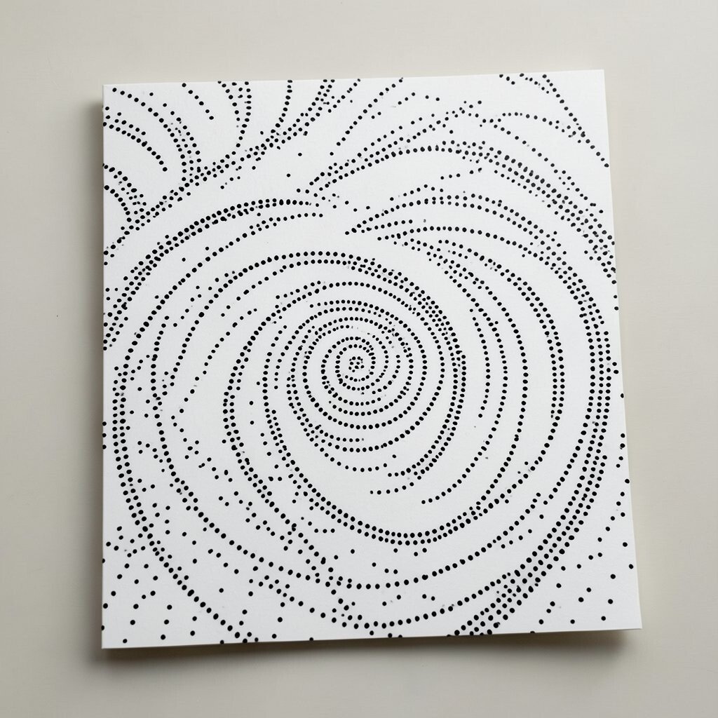
Picture a loose swirl made from separated dots, like a line drawn with tiny pauses. The curve feels graceful and modern, even when it is abstract.
This design is unique because it gives movement while still keeping negative space. It can frame a title, add flair to invitations, or add softness to hard-edged layouts.
To make it practical, keep dots spaced so the swirl stays readable at small sizes. Personalize by placing your logo near the swirl’s start point, creating a sense of direction without arrows.
If your printing budget is tight, use one dot color and rely on paper tone for contrast. For a more premium feel, choose a slightly thicker dot outline by adjusting size rather than adding more colors.
17. Dot Silhouette Hints With Negative Space
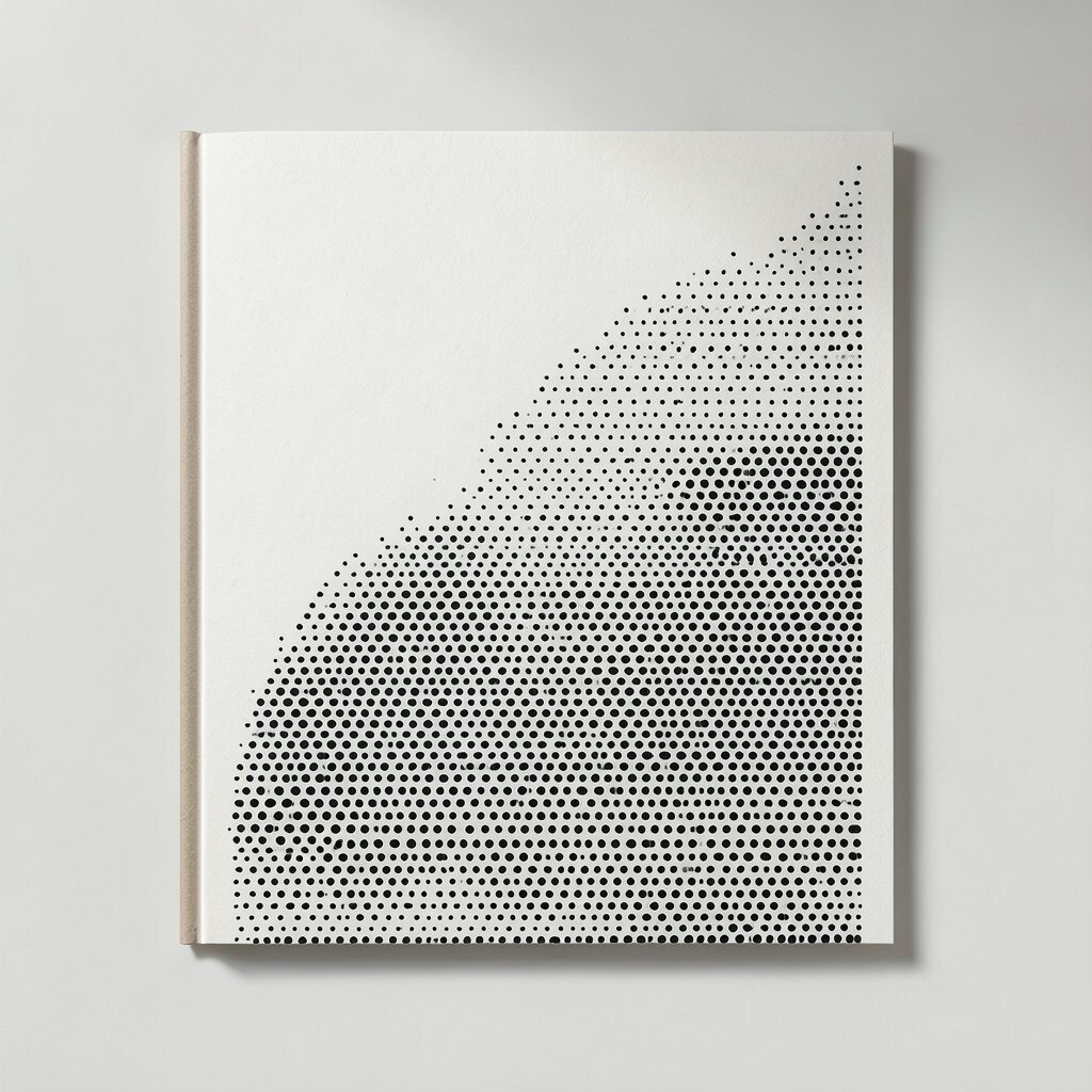
Imagine a faint shape suggested by dots, while the rest of the page stays blank. The silhouette feels like it is made from careful emptiness and tiny points.
This pattern stands out because it creates meaning without fully forming an image. It works well for seasonal cards, brand stationery, and covers that want an artistic touch without going full illustration mode.
Pick a simple shape like a leaf, a mountain, or a geometric emblem, then fill only part of it with dots. Personalize by choosing dot density based on what the shape represents, such as heavier dots for the “main” portion.
For cost considerations, use a limited dot map and avoid complex edges that may require high-resolution printing. If you are printing at home, enlarge the silhouette slightly so the dots stay crisp and do not blur into a gray blob.
18. One Bold Dot Anchor With Surrounding Quiet Points
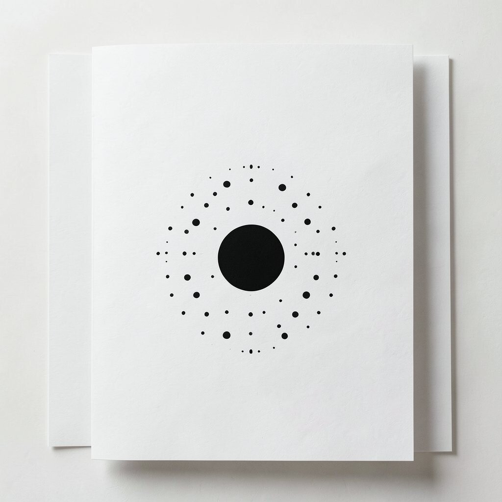
Think of a single larger dot placed as an anchor, with smaller dots fading outward around it. The composition feels balanced and intentional.
This design is modern because it follows a simple rule: one strong focal point, then gentle support. It is ideal for letterhead marks, brand stamps, and minimalist stationery with lots of writing space.
Place the bold dot near where a logo or signature would sit, then surround it with a sparse halo of small dots. Personalize by using a unique dot color for the anchor dot only, keeping everything else in a neutral tone.
To control cost, keep the pattern limited to a small area so it prints fast and uses less ink coverage. If you want variation without redesigning, swap the dot color and keep the same placement for quick seasonal refreshes.