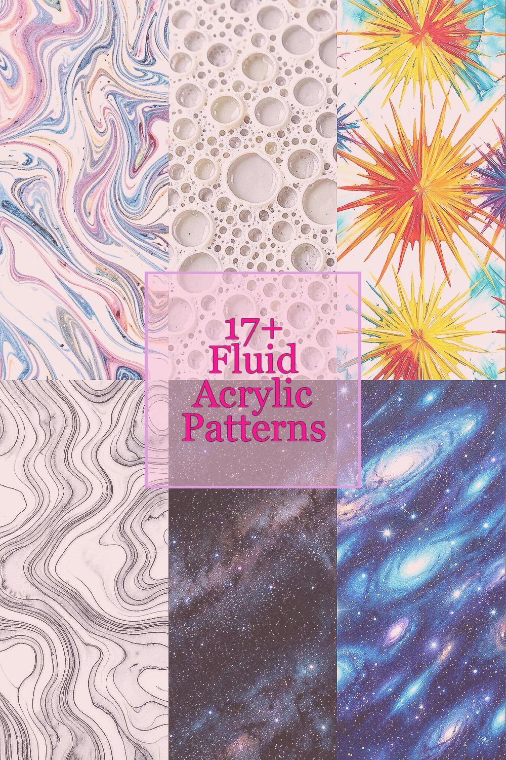
Fluid acrylic can turn ordinary surfaces into living color maps. With a few simple moves, you can make patterns that feel personal and surprising.
Each style below uses motion, balance, and playful control to help you get results you will want to share or frame.
1. Marbled Ribbon Swirls

Start with a base coat that dries smooth and bright. Pour two or three thin ribbons of fluid acrylic, then gently drag a clean stick through the paint like you are drawing on water.
You will see ribbon-like swirls form as colors fold into each other. This pattern is great for beginners because it forgives small mistakes while still giving strong visual results.
For extra shine, tilt your surface slowly so the ribbons stretch into long curves. Try personalizing it by using colors that match your room, favorite hoodie, or a season you love, like sunset oranges or calm blues.
If you want a lower-cost setup, use craft acrylics in smaller bottles and mix them with a medium you already have. You can also save money by planning a limited palette, because fewer colors often look more intentional.
2. Cellular Lace Bubbles
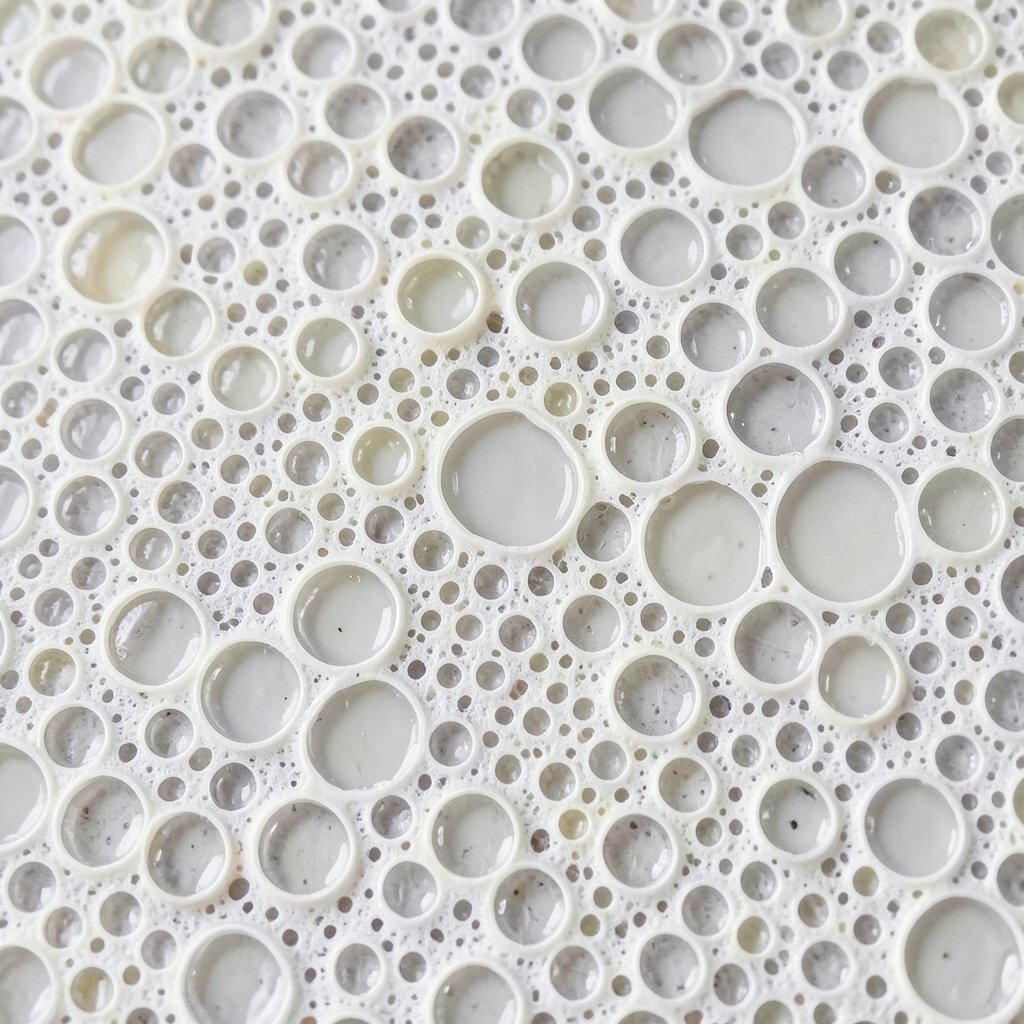
Pour paint mixed with a little extra consistency so it can break into tiny clusters. When you add the right amount of fluid, the surface can create cell-like lace as colors fight and settle.
To encourage that look, use a small rotation of the canvas and then stop before everything fully levels out. The benefit is a naturally detailed texture that looks complex without needing fancy tools.
If you prefer a softer look, keep colors close in tone, like two blues plus a hint of white. For a bolder style, contrast a dark base with bright cells that pop when they spread.
Personalize by making one corner heavier and leaving another corner calmer, like a handmade gradient. For cost, use white and one or two strong accent colors, since the cell pattern often carries the design on its own.
3. Sunburst Color Bursts

Choose a center point and pour paint in short, thick streaks that radiate outward. Use a toothpick or palette knife to nudge some streaks so they look like rays from a bright sky.
You get a burst effect that feels energetic and celebratory. It works well when you want art that looks bold even from far away.
Try tilting the canvas in quick, gentle steps so the rays stretch but stay readable. Personalize the theme by using a hot palette for a “cheer” mood, or cool pastels for a calm, morning glow.
For practical results, keep your pours relatively thick and avoid over-thinning at the start. If you are watching costs, mix a small amount of bright color into a mostly neutral base, which gives punch without wasting expensive pigment.
4. Topographic Flow Lines
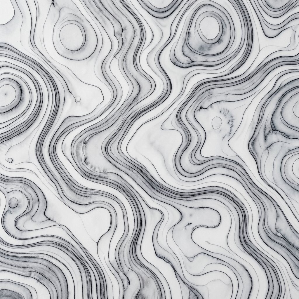
Start with a flat layer of muted paint and then pour thinner lines that sit like contour marks. Drag a comb lightly across the surface so ridges appear, then let gravity pull the paint into gentle routes.
This creates topographic-like flow that feels calm and structured. The uniqueness is in the way lines become terrain, turning your canvas into a map of moods.
To make it even more interesting, layer in a second pass with a lighter color so the contours show depth. Personalize by naming your own routes, like “coastline,” “mountain path,” or “night market,” and choosing colors that fit the story.
For cost considerations, use leftover paint from other projects and mix small batches with medium. If you run out, even a limited palette can look like a weather map with the right line placement.
5. Galaxy Veil Over Dark Matter
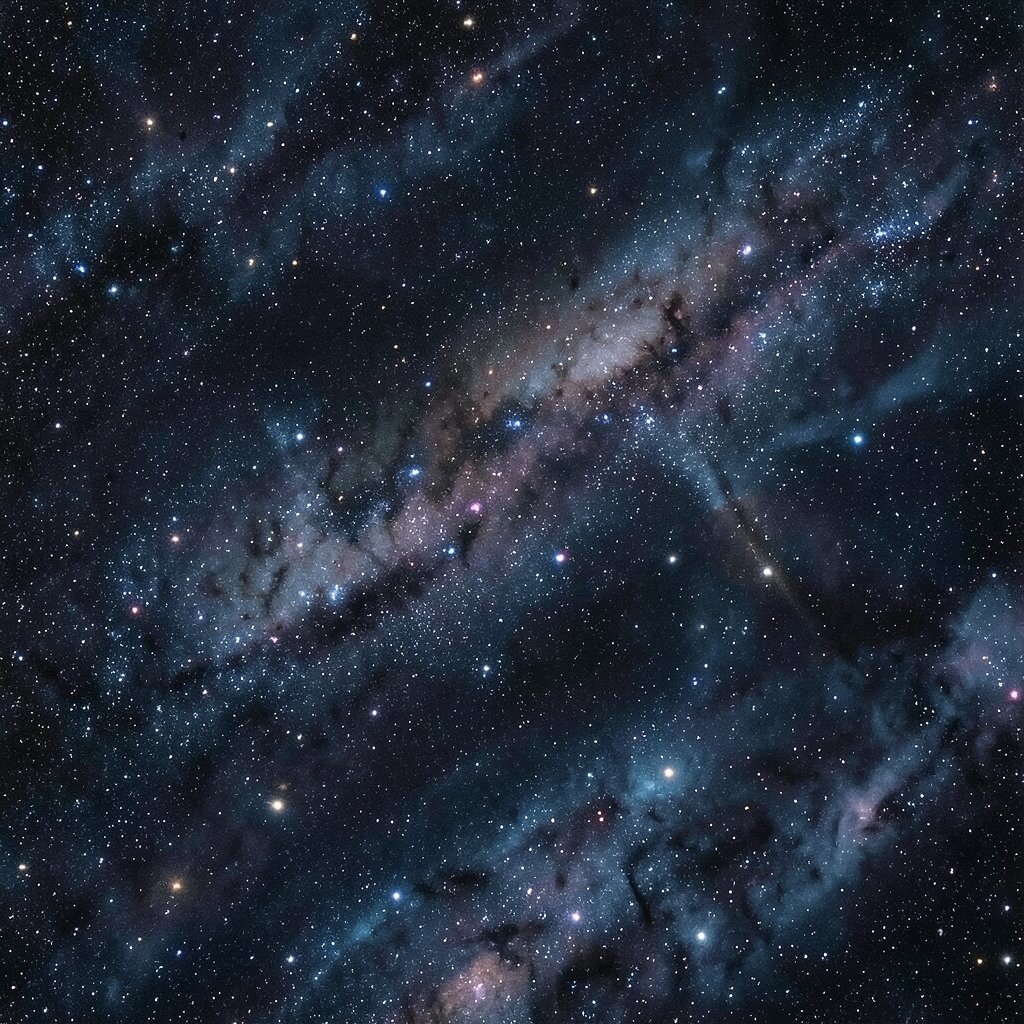
Lay down a deep base color and then pour milky paint that includes a shimmer medium. Add tiny drops of contrasting colors near the edges and lightly swirl with a skewer so they drift like stars.
You will get a veiled look where colors fade into a night-sky mood. It is a trendy style because it matches the current love for dreamy textures and slow-looking details.
For practical tips, keep the center darker and let lighter paint skim over it, since that contrast makes the galaxy effect stronger. Personalize with your favorite color theme, such as teal and violet for a cool dream or gold and rose for a warmer night.
6. Celestial Comet Tail Drag
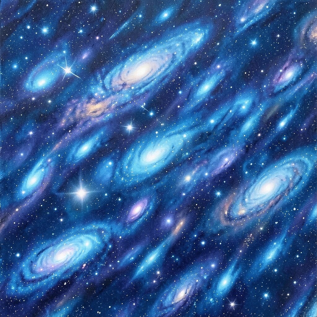
Pour a thick pool in one area and place a thinner streak behind it to act like a comet tail. Drag the tip of a clean tool through the paint in one confident direction.
You will see a comet trail stretch and taper, like motion captured midair. This pattern is unique because it combines mass and direction, giving your canvas a clear focal path.
Try moving the canvas in a slight arc so the tail curves naturally instead of staying straight. For personalization, use one dominant color for the core and two supporting colors for the tail, so your piece looks intentional.
To manage cost, choose one “hero” color and let white or transparent medium do most of the bridging work. That approach keeps you from needing many expensive bottles.
7. Mermaid Scales With Layered Ribbons
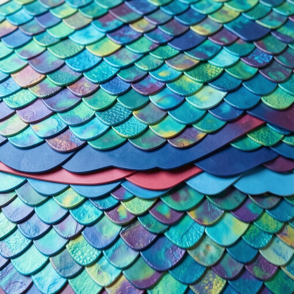
Use a layered technique by pouring overlapping ribbons that resemble scales. After each ribbon spreads a little, add another thin layer so the edges catch and lift.
That overlapping creates a scale texture you can almost feel with your eyes. The benefit is that it looks detailed while still staying playful and fluid.
For practical tips, tilt slowly and stop often, because frequent stops can help keep scale shapes visible. Personalize this by matching the colors of your favorite fish or ocean palette, like mint, sea green, and soft pearl.
If you want a budget option, use inexpensive metallic paint sparingly and let the scale form from layered matte colors. Even without metallics, your scales can look rich when the contrast is strong.
8. Whisper Wind Feather Technique
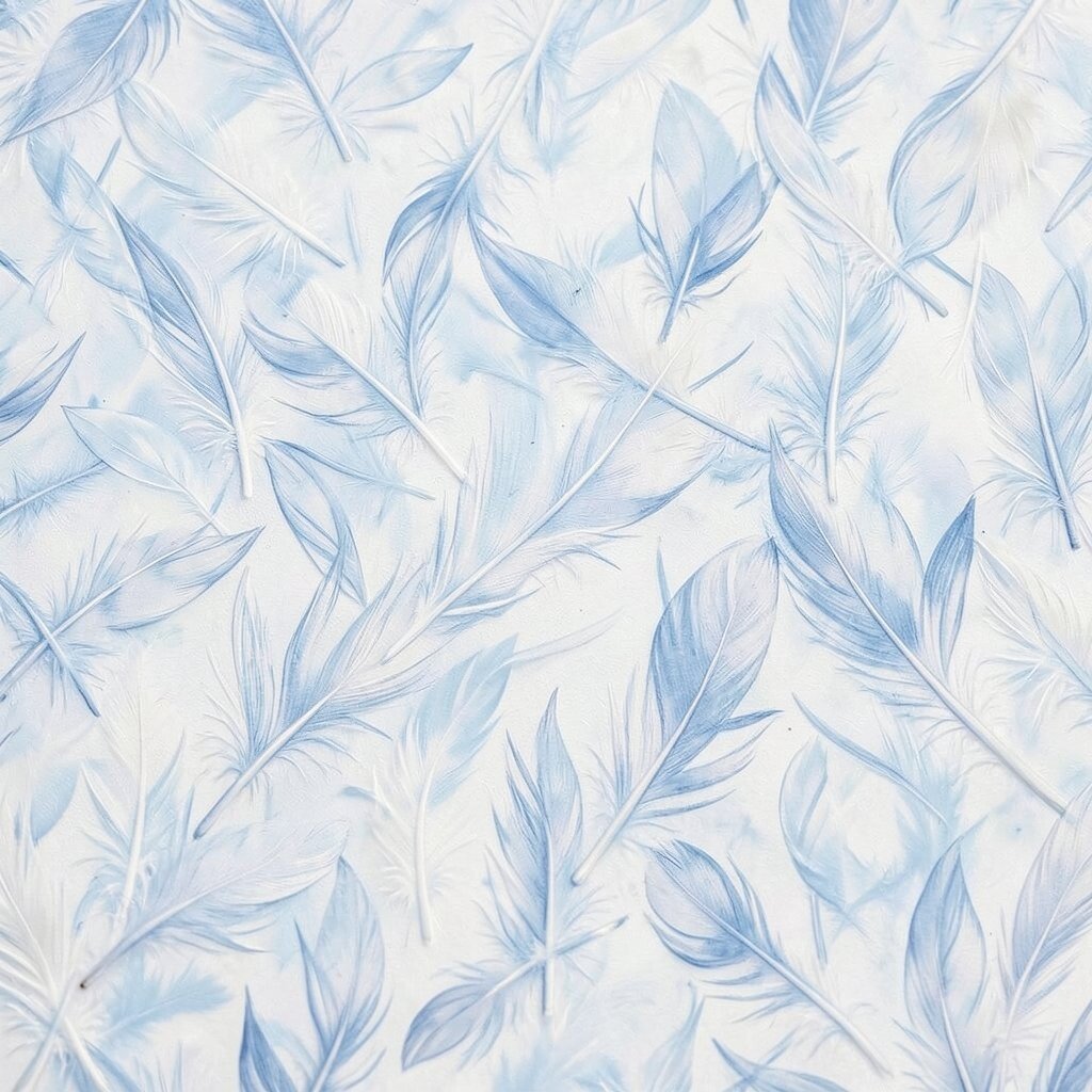
Pour multiple thin streaks close together, then drag a soft brush or feather-like tool through them. Keep the tool light so it creates gentle separations instead of mixing everything into one blur.
The result looks like wind-made feathers, with airy lines that soften across the canvas. This is a great choice when you want a calming piece that still has movement.
To get the best look, do one direction only, and then stop when you see the feather edges form. Personalize by choosing warm “breeze” colors like peach and gold, or cool “mist” colors like pale blue and gray.
For cost considerations, you can use a single color family and vary brightness by mixing in more white. That saves money while still giving variety across the feather texture.
9. Rainbow Spill With Controlled Chaos
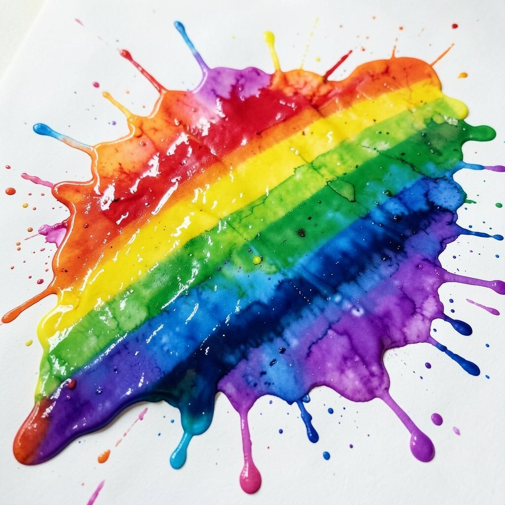
Pour rainbow stripes across the canvas, then let them bleed where they want. Use a minimal tool pass, just enough to nudge sections into smoother arcs.
You will see a spill that feels joyful, like colorful paint sliding down a playful shelf. The uniqueness comes from how you control the chaos without trying to make it perfect.
For practical tips, keep each stripe similar thickness so the pattern stays readable. Personalize by adding a tiny “secret” color drop near one edge, like emerald, to make viewers lean closer.
10. Mossy Stone Veins
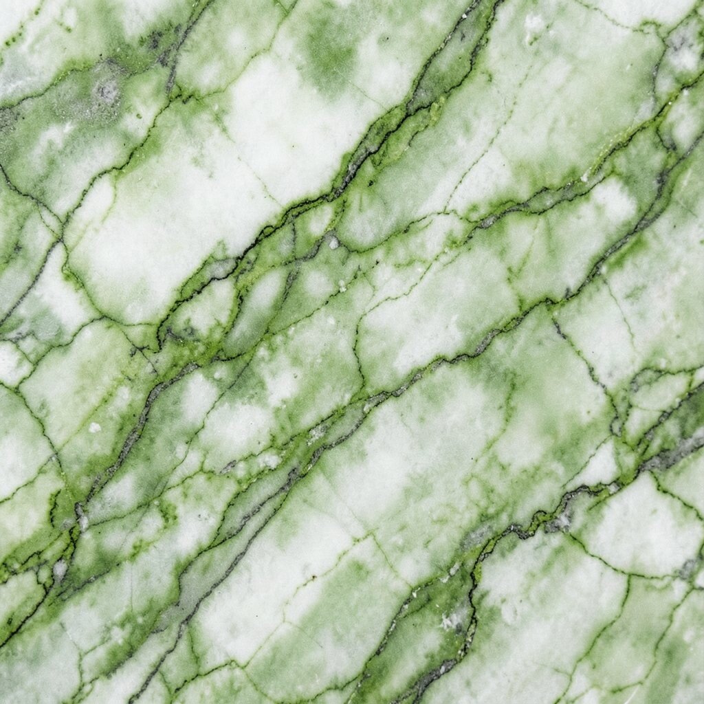
Mix greens and browns with a slightly earthy medium so they flow slowly. Pour in irregular shapes, then use a thin tool to create vein-like lines that resemble stone and moss.
This gives you an organic look that feels grounded and natural. It is useful when you want texture that looks like it belongs in a garden-inspired space.
Try adding a few darker pockets at the edges so the veins look deeper. Personalize by creating a “forest” palette with olive, moss green, and a hint of warm umber.
If you are thinking about cost, use craft store browns and greens, then unify everything with a consistent white or clear medium. That keeps your piece cohesive even on a tight budget.
11. Geometric Cut Glass Panels
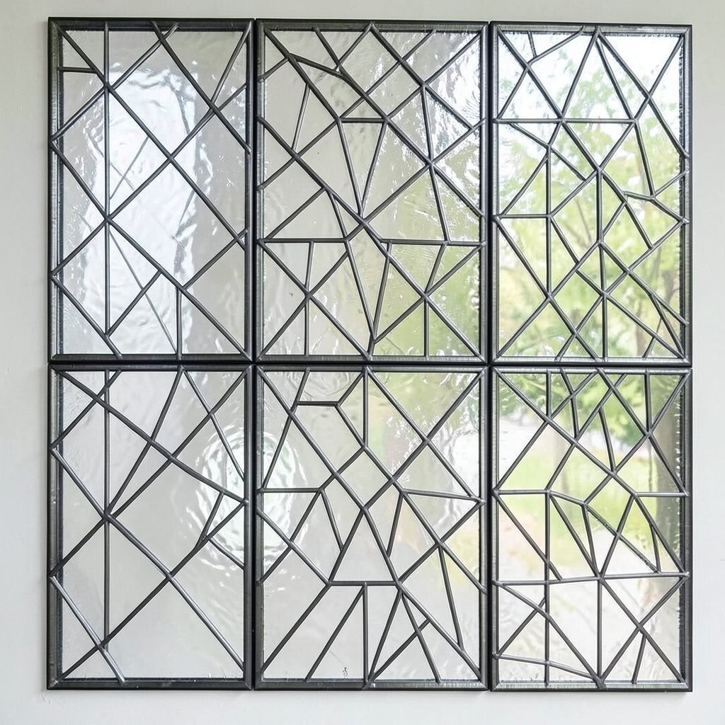
Plan a loose layout using painter’s tape or a temporary barrier pattern on the canvas. Pour fluid acrylic into sections, then remove the barriers once the paint begins to set so edges stay crisp.
You will see cut-glass panels with clean boundaries and rich color depth. The benefit is that you get structured shapes while still enjoying the surprise of fluid movement inside each panel.
For practical tips, keep your pours moderate so they reach the corners without overflowing. Personalize by using a favorite color trio and varying opacity, like mixing opaque and semi-transparent shades.
To manage cost, use mostly one base color across panels and switch only the accents. That way you get geometric impact without needing many different paint bottles.
12. Ombre River Gradient Drift

Create a gradient by pouring two or three colors that flow from dark to light. Then tilt the canvas like you are moving a river, so the paint drifts and stretches into a smooth band.
The pattern looks like water carrying color downstream. It is especially useful for backgrounds because it pairs well with later doodles, stamps, or mixed-media layers.
For practical tips, leave space around the edges so the gradient has room to breathe and does not pool too thick. Personalize by choosing colors that match your current mood, such as lavender to soft white for a dreamy look.
If cost matters, make your gradient with a smaller set of colors by mixing in white to create “new” shades. That reduces waste and still gives a smooth transition.
13. Marigold Heatwave Flames

Pour warm colors in a loose circular arrangement and pull them outward with a gentle drag. Add a small amount of white in the middle so it creates flame-like highlights as the paint moves.
You get a heatwave effect with soft flame edges that feel alive. The uniqueness comes from how the center brightens while outer colors stretch into glowing trails.
Try rotating the canvas slowly after the initial pour, since rotation can make flame shapes wrap around like a spiral. Personalize with your favorite fire tones, including red-orange plus golden yellow, or even a cool “electric” version using magenta and teal.
For practical cost planning, use fewer colors but richer contrast, because flame patterns depend on light and dark. You can also use a small bottle of bright yellow mixed into a larger amount of translucent medium.
14. Cherry Blossom Petal Drift

Use light pinks and pale whites, then pour small pools that overlap like petals. Drag a fine tool around the pools to suggest petal edges without fully flattening the shape.
The result feels gentle and romantic, like petals floating in slow air. This pattern is a strong fit for current home décor styles that favor soft tones and calming textures.
For practical tips, keep the paint thickness similar so each petal holds its boundary. Personalize by adding a tiny dot of deeper pink near one petal to create a natural “center” like a flower.
If you want to keep costs down, reuse a base neutral and focus your spending on one or two pink shades. The petal effect often looks beautiful even when your palette is simple.
15. Ink-Resist Cracked Bloom
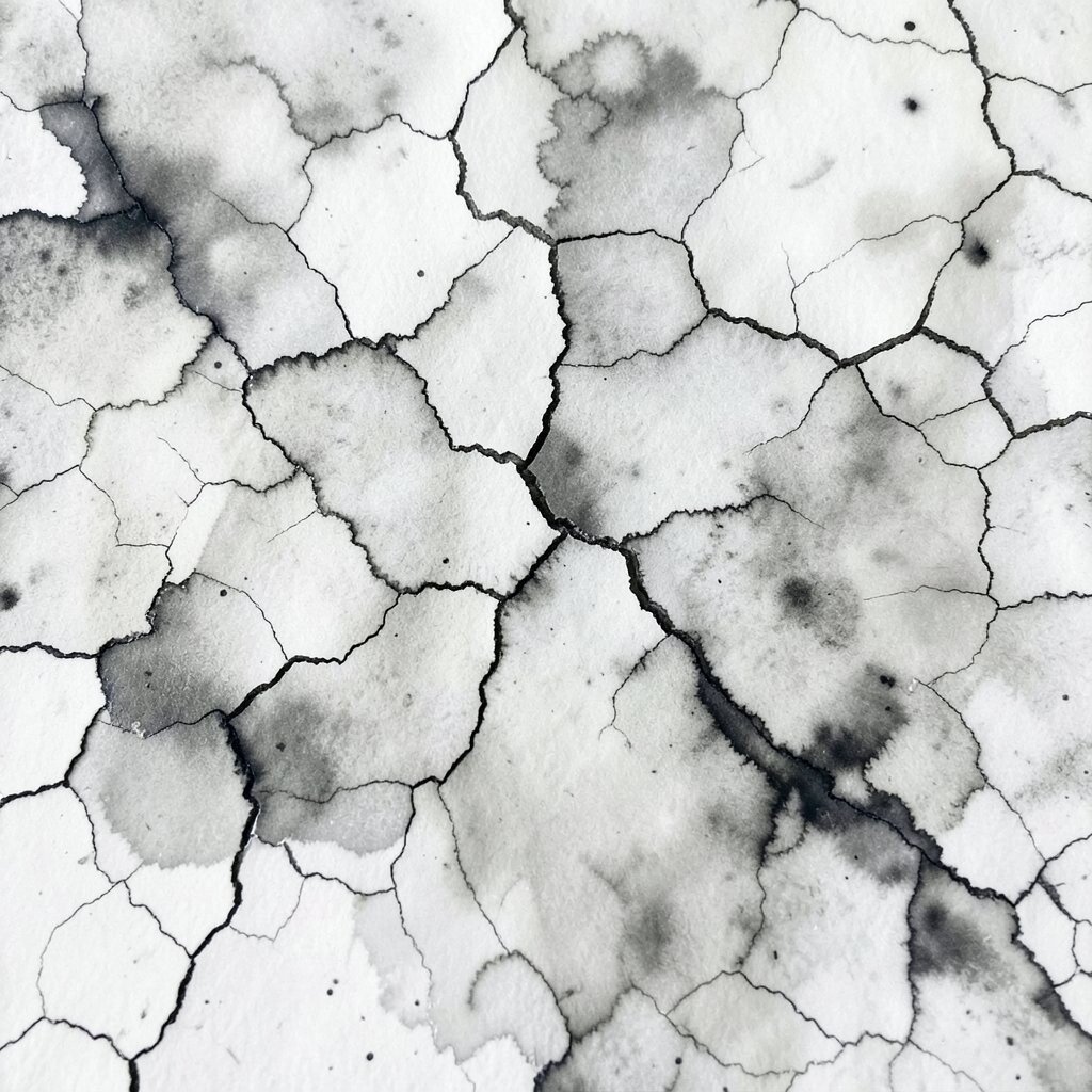
Mix your fluid acrylic with a drying additive or a slower medium, then pour and allow it to partially set. When you tilt, you can encourage cracking or split lines like a blooming map across the surface.
You will see a cracked bloom effect with fine lines that add character to every section. The benefit is that the cracks can make your painting look older and more layered, even if you made it today.
For practical tips, do not overwork the surface once it begins to change, because the texture needs time to form. Personalize by choosing one bold accent color in the cracks and keeping the surrounding layers quieter.
Cost considerations are easier here because you can use a large amount of medium-based mix and fewer pigment-heavy colors. That helps stretch your supplies while still delivering dramatic visual interest.
16. Tropical Leaf Vein Bloom
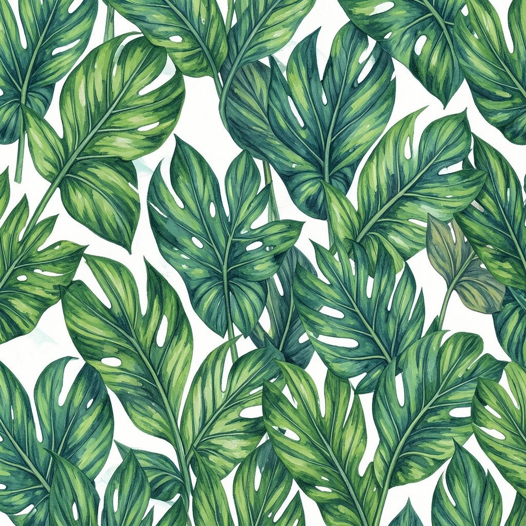
Pour a base color and then add lighter and darker green streaks that follow a leaf-like curve. Use a skewer to draw thin veins through the streaks so they branch naturally.
You will get a tropical leaf vein pattern that feels fresh and vibrant. The uniqueness shows up in how the paint creates leaf depth without needing realistic drawing skills.
Try rotating slightly after drawing veins, because that can help the branches curve like real leaf structure. Personalize by adding a touch of yellow-green for sunlit highlights or a small brown accent for shadowed depth.
For budget-friendly choices, use two main greens and let white medium create the lighter tones. You can also keep the number of pours low to reduce paint waste.
17. Nautical Rope Twist Rings

Create thick circular pours and then pull them into twisted rings using a curved tool. Think of the motion like twisting a rope, with rings that overlap and lock into each other.
This makes a nautical look with bold rhythm, like coils on a ship dock. It is actionable because you can repeat the same movement to build a series with consistent style.
For practical tips, keep your rings slightly separated so they do not merge into one blob. Personalize by adding small dots of bright blue within the rings, like highlights on ocean water.
If cost is a concern, you can use mostly a neutral base and only one accent color for the rings. That contrast helps the twist shapes stand out strongly.
18. Soft Marble Lettering Surfaces
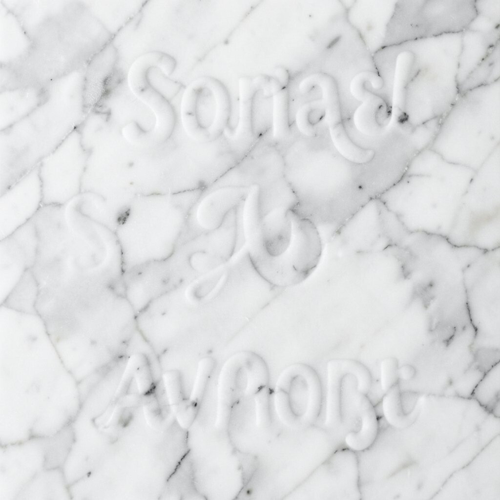
Pour a soft marble background and let it settle into smooth swirls with light contrast. After it dries to a tacky stage, add a clear overlay medium and gently press stencil shapes for lettering or symbols.
You get a polished surface that can carry words, icons, or dates without looking stiff. The benefit is that the background stays lively while your design element becomes the focal point.
For practical tips, test your timing on scrap first, since marbling can move differently depending on your medium. Personalize by choosing a meaningful phrase, favorite initials, or a small constellation icon that matches your style.
Cost considerations are manageable because you can make marbling with a limited palette and then reuse stencils you already own. In current trends, custom text and symbolic imagery are popular, and this method gives them a beautiful watery backdrop.