
The right wall can make your workouts feel louder and brighter. Abstract canvas art adds energy without taking focus from your training.
Below are practical, studio-friendly ideas you can use to shape mood, movement, and motivation.
1. Color-Flow Wind Layers
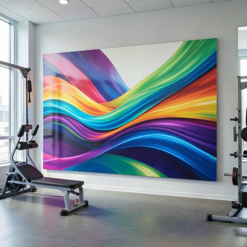
You can hang a set of wide abstract canvases that look like colored wind rushing across fabric. When people warm up, the sweeping motion in the artwork visually matches the feeling of getting faster.
Choose colors that echo your studio branding, like teal with coral or navy with gold. Keep the pieces at eye level and leave a little spacing so each canvas breathes. If you want it to feel even more personal, swap the palette for each training block, like cooler shades for recovery classes and brighter shades for strength days.
2. Geometric Circuit Breath
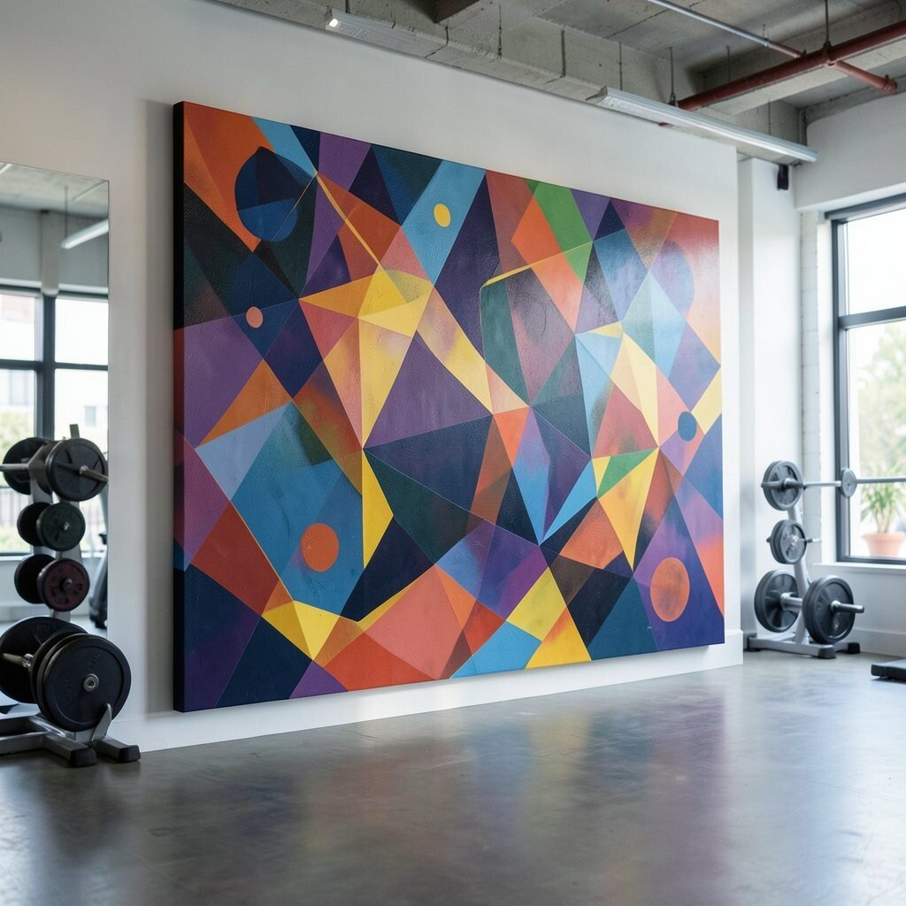
Try a canvas series made of angular shapes that connect like a circuit. From a distance, it looks crisp and modern, and up close it rewards careful glances during short pauses.
Use lines that feel like they are expanding and contracting, which can quietly support pacing and breathing. A studio benefit is that geometric art tends to hide small scuffs and wear because the pattern breaks up the surface visually. For cost control, start with one larger piece and add matching smaller canvases later as you grow your wall space.
To personalize, pick shapes that mirror your class equipment layout, such as rectangles for benches and diagonals for steps. You can also adjust the contrast so the art stays readable under bright overhead lights. Make sure the artwork doesn’t overwhelm the mirrors by keeping the darkest areas off direct mirror reflections.
3. Grunge-Soft Motion Swirls
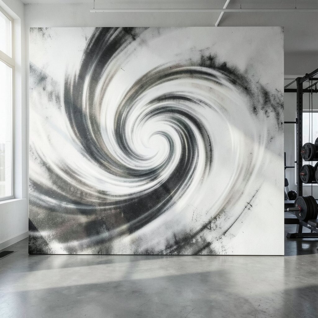
Go for abstract swirls with a slightly textured, grunge-like finish that still feels gentle. The layered paint gives a sense of motion, so your studio feels alive even on quiet mornings.
This kind of artwork pairs well with sweaty, high-energy training because it doesn’t show fingerprints as easily as smooth prints. Use it behind the cardio zone or near the open stretch area to create a visual rhythm. When the room is loud with movement, these soft swirls help calm the eye without losing excitement.
For a practical setup, hang the canvas so the widest swirls sit above shoulder height, keeping the lower half clear for mats. Personalize the palette by using a muted base and one bold accent color, like bright lime among warm earth tones. If you want to keep costs down, consider canvas prints from your chosen design instead of original paintings.
For current trends, mixed-media textures and imperfect edges are popular because they look handmade. Choose a finish that can handle cleaning, especially where towels get tossed. Lightly dust the surface with a microfiber cloth to keep the texture looking fresh.
4. Aurora Gradient Patchwork
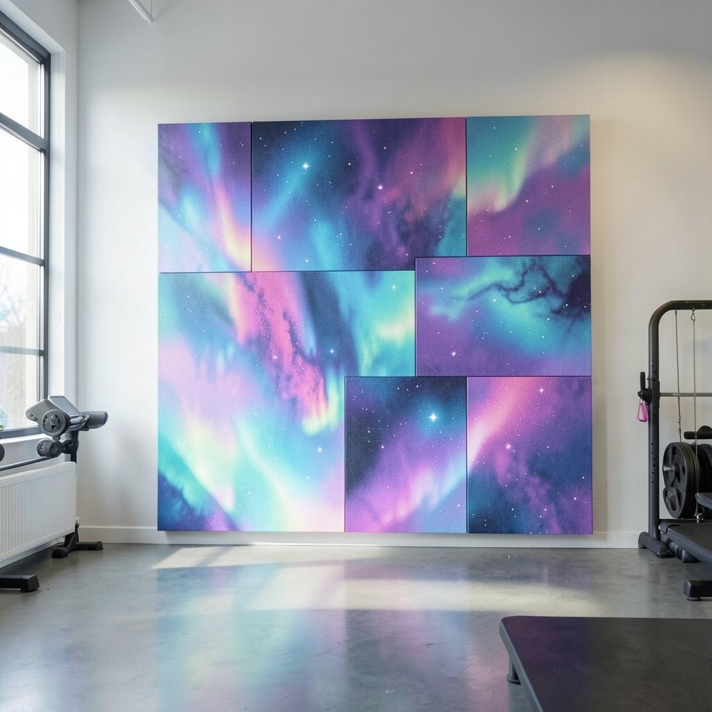
Create a calm visual field using an aurora-like gradient that fades from cool to warm. The color shift feels like fresh air, which can make stretching sessions feel more relaxed.
Hang it in a consistent spot near where clients change their pace, like the corner where foam rolling happens. Gradient art helps reduce harsh contrast, so the room feels smoother and more welcoming. If you want something affordable, look for rolled canvas prints on thick stock and frame them in simple matte frames.
5. Rhythm Lines Like Metronome
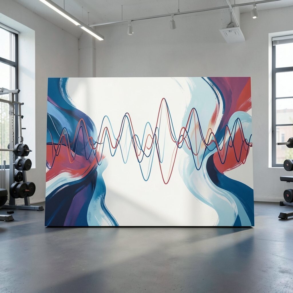
Use a canvas filled with rhythmic lines that rise and fall, almost like sound waves. Even though it’s abstract, it visually suggests timing, which can support interval workouts.
Choose line colors that match your studio’s energy, such as bright white lines on deep charcoal or warm cream lines on blue. This design is unique because it feels both orderly and playful, like a musical heartbeat in paint. A practical tip is to keep the piece large so the wave pattern reads clearly from across the room.
For personalization, adjust the curve style to match your class tempo, such as tighter waves for faster sessions. You can also pair it with a matching small canvas in the same palette for symmetry. If the budget is tight, a single statement piece can carry the whole wall while smaller accent art fills in the rest later.
6. Minimal Black-and-White Pose Duets

Pick abstract canvases in black and white that look like two figures made of blocks and gestures. The bold contrast gives a strong studio vibe, and the shapes feel like movement without being literal.
This can benefit clients because it keeps attention on posture cues while still adding style. A unique twist is to blend hard edges with soft smudges, so the artwork feels structured but human. If you use mirrors, place this artwork so it frames the space rather than reflects glare directly.
7. Warm Terracotta Lift Landscapes
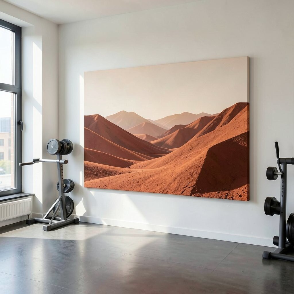
Choose abstract landscape canvases tinted with terracotta, ochre, and sandy beige. The warm tones can make the studio feel inviting, especially during early morning classes.
These pieces feel unique because they suggest horizon lines and rising energy without showing a specific place. They also help hide the occasional scuff marks from busy feet since the mid-tones mask wear. Hang them near the entry or the towel drop area so the first glance sets a positive mood.
To personalize, blend in a signature color from your brand, like teal or marigold, tucked into the “sky” layer. Consider using slightly larger canvases in this theme if your walls are bright, because warm art tends to look best with a bit of softness and scale. If you need cost control, search for open-box or print-on-demand canvas sets that match the same color system.
For current trends, warm earth palettes are staying popular because they feel grounded and modern. Pair your art with natural textures like wood benches or woven baskets to make the look feel intentional.
8. Liquid Paint Bubble Drifts
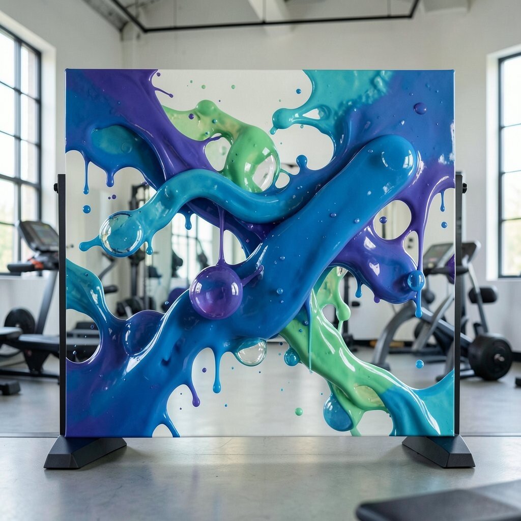
Look for artwork that resembles liquid paint with bubble-like circles and drips. It feels lively, and the playful shapes can make the studio seem less intimidating for beginners.
Bubble drifts offer a practical benefit because they can distract from minor wall imperfections. The art stays visually interesting even when clients are moving around, so it doesn’t become background noise. Personalize the circles by choosing sizes that match your class branding icons or logo dots.
9. Lateral Stretch Ribbon Walls
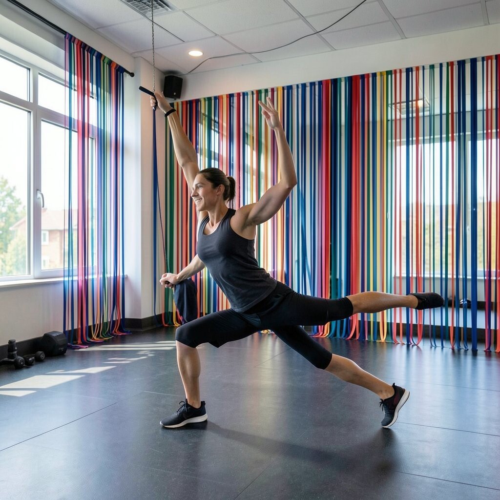
Use long ribbon-like abstract strips that curve sideways across the canvas. The visual direction can subtly encourage side stretches and lateral movement.
This idea is unique because ribbons feel both athletic and decorative at the same time. It also works well in studios with limited space since a slim canvas can fill a tall narrow wall. For practical placement, align the ribbons with where people reach their arms during cooldown.
When you want to keep costs reasonable, mix one mid-size canvas with several smaller matching ribbons. Personalize by changing the ribbon ends, like jagged tips for a tougher brand or smooth ends for a calmer vibe. If your lighting is strong, choose matte surfaces to reduce glare and keep details easy to see.
10. Studio Map Without Streets
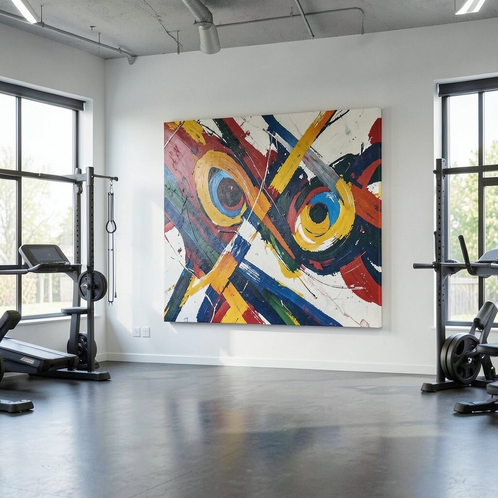
Create an abstract “map” canvas with swirling routes and layered blocks, but without readable street lines. The result feels like a creative travel poster, and it adds a sense of story to the room.
Benefits show up in how clients remember where to go, since the artwork can give a gentle sense of orientation. It’s also unique because you can hide equipment outlines inside the pattern, like suggesting a curve where the rowers sit. Personalize by incorporating the routes that match your class flow, such as paths from warm-up to circuit stations.
For cost considerations, start with one large canvas and use fabric prints or framed poster versions for smaller areas. Keep the color palette consistent with your floors and walls, so the map art looks like it belongs. If you want a modern trend look, choose semi-transparent layers that resemble digital overlays.
11. Neon Exercise Pop Windows
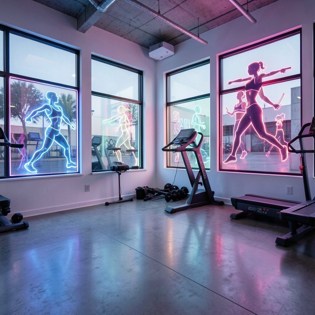
Hang abstract canvases with neon-inspired accents against a dark base. The artwork feels like a light show, which can raise energy for intense classes.
This kind of high-contrast art is unique because it turns a plain wall into a focal point without adding clutter. A practical tip is to limit the number of neon pieces so the room doesn’t feel too loud. Choose one neon accent color, like electric magenta or bright cyan, and let it appear in small streaks across the canvas.
To personalize, mirror your studio’s signature color in the neon highlights so the brand and art feel connected. For cost control, use larger printed canvases with sealed finishes so the color stays vibrant for a long time. Keep the placement away from direct sun so the neon shades don’t fade quickly.
12. Calm Mist Circle Gate
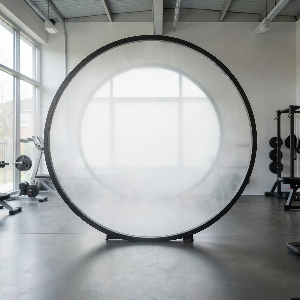
Pick a canvas with overlapping circular shapes that resemble misty halos. The soft geometry can make a studio feel safer and more comfortable, which helps people settle in.
This is a benefits-friendly choice for recovery classes because circles visually suggest slowing down. Keep the circles in a muted palette like sage, gray-blue, and soft white for a gentle mood. Personalize by using one small bold color dot near the center, like a warm ember that draws attention to the middle.
If you want practicality, mount it where it won’t compete with instructions on wall-mounted screens. In small rooms, circular art can make walls feel more expansive since the eye moves smoothly across the shapes. To control cost, you can buy a single canvas print and frame it with simple hardware.
13. High-Contrast Sprint Stripes

Use abstract striped canvases with diagonal angles that suggest speed. The sharper the angles, the more the artwork feels like it’s pushing forward.
Striped art brings a unique kind of energy because it can visually match sprints, ladders, and interval work. It’s also practical because stripes hide uneven wall textures better than detailed portraits. Personalize the stripe rhythm by spacing them so the gaps look like your class timer intervals.
For cost considerations, consider modular strips as a set of smaller panels instead of one huge canvas. This lets you swap one piece if you ever redecorate or if a color story changes. If you use mirrors, keep the stripes at a slight angle so reflected lines don’t create distracting patterns.
14. Ocean Depth Paper Cut Layers
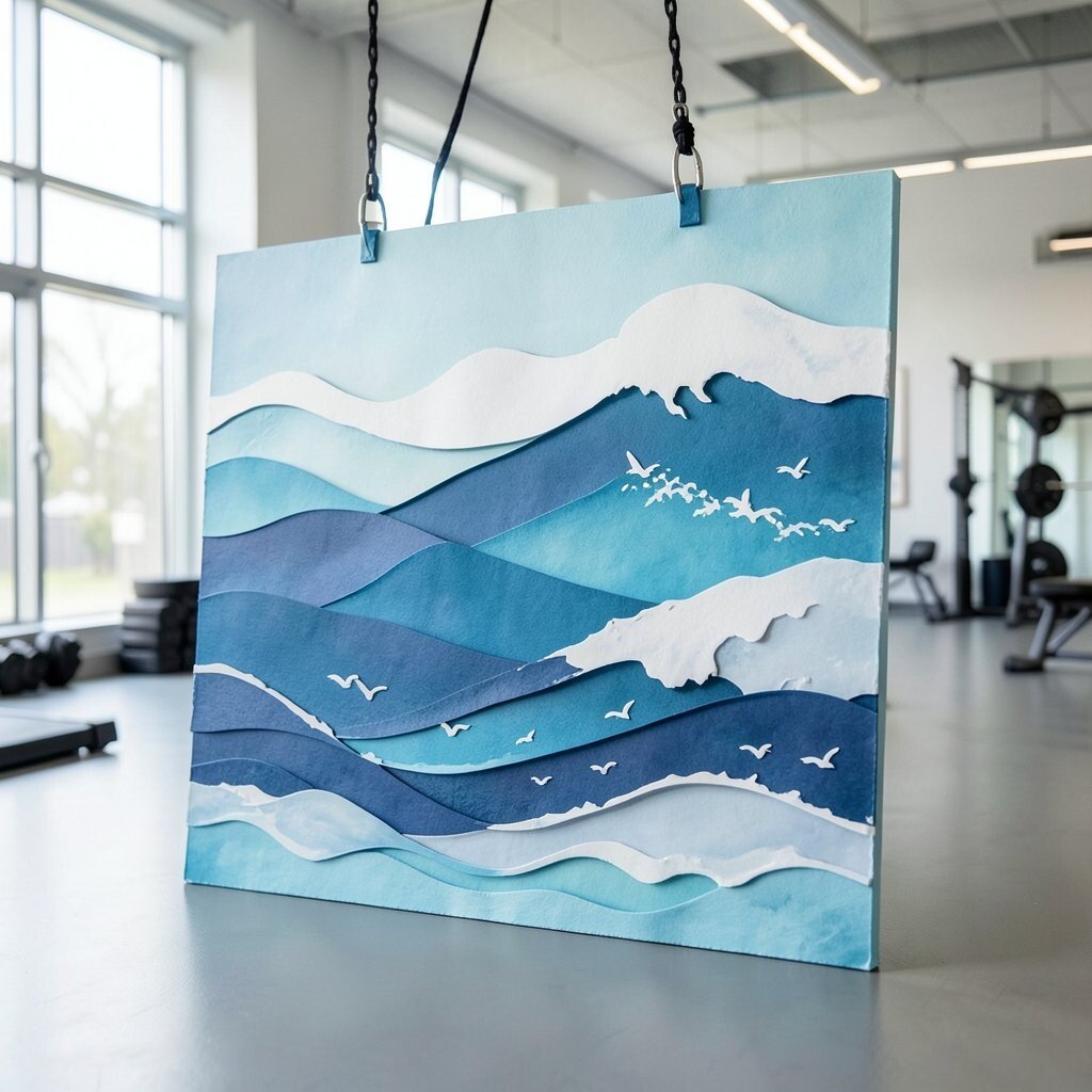
Try canvas art with layered shapes that look like paper cutouts, but painted for depth. Even abstract, it can give a sense of calm depth like a quiet ocean floor.
This benefits clients by making the room feel less harsh, especially if your flooring is bright and reflective. The layered look is unique because it adds shadows and texture that change with the light. For personalization, use colors that reflect your studio’s calming side, like deep teal, sand, and soft seafoam.
A practical tip is to use this artwork near the cooling-down mats, where clients are likely to breathe slower. Keep the layers subtle and not too glossy so they don’t glare under studio lighting. If you want to manage cost, look for prints with a textured finish rather than expensive originals.
15. Metallic Edge Action Highlights
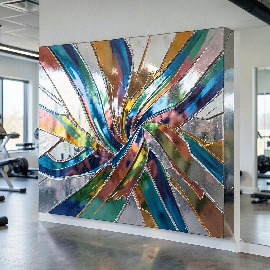
Choose abstract canvases that include metallic or foil-like edges, like silver strokes over dark paint. The reflective details can make the space feel crisp and modern, especially when lights are dimmed slightly during classes.
Metallic accents are unique because they catch motion and create tiny flashes as people move. That can feel exciting for strength circuits while still staying abstract. The benefit is that metallic details can mask tiny imperfections and minor scratches better than flat surfaces.
To personalize, use metallic only as accents, and keep the main field in one consistent color family. Match the metallic tone to your studio fixtures, like warm brass or cool chrome, so everything feels coordinated. For cost, you can buy a single canvas with metallic effect and add simpler matching art around it.
16. Soft Ink Watercolor Energy
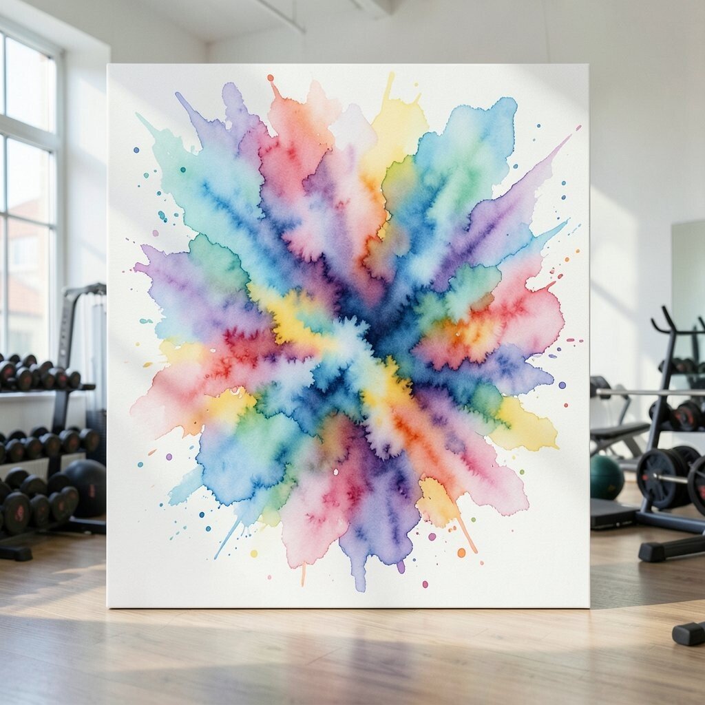
Consider abstract watercolor-style canvases with blooms, splashes, and feathery edges. This style feels friendly and human, which can reduce intimidation for new clients.
Watercolor energy is unique because it looks different every time you look at it, especially from different distances. It can benefit the studio vibe by making walls feel more breathable and less strict. Personalize by using colors connected to your most popular classes, like bright blues for cardio or warm reds for strength.
For practical tips, place watercolor art where it won’t be splashed by sweaty towels and spray bottles. Matte finishes are usually easier to keep clean. If you’re on a budget, print the artwork on canvas with good ink coverage, since watercolor gradients can look rich even without originals.
17. Target-Circle Focus Markers
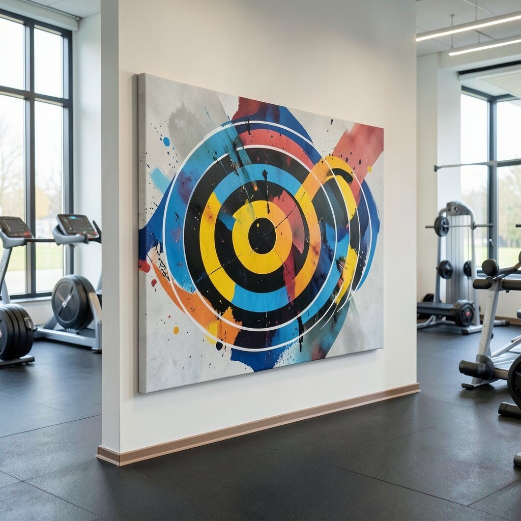
Use abstract canvases that feature concentric circles, but in a creative, imperfect way. They can echo training targets, helping clients focus during balance drills or med ball work.
These circles create a unique visual “center” for the room, which can be helpful when you cue form. The benefit is that clients can naturally track the center while listening, without needing any literal signage. Personalize the palette by choosing colors that feel motivating rather than distracting, such as deep green with pale gold.
For cost considerations, you can purchase one large canvas as a main feature and then add smaller circle accents on nearby walls. Keep the circles off the floor line so the artwork stays clearly visible in busy moments. If your studio has different floor zones, align the circles with the main equipment zone for a cohesive flow.
18. Textural Topographic Motion Ridges
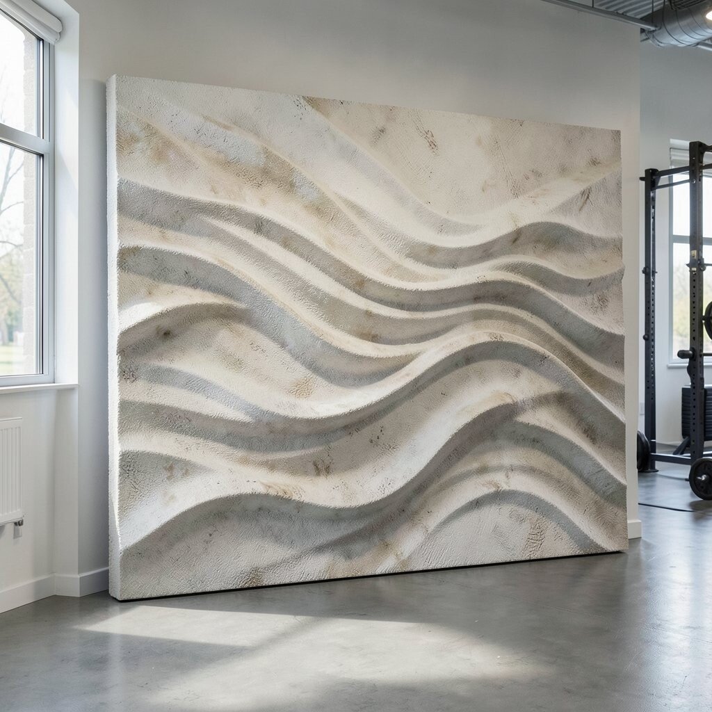
Try an abstract topographic style with ridges and contour lines, but with dynamic curves. It gives a sense of terrain that feels like movement and growth.
This is unique because it blends a familiar map idea with artistic energy, making it feel both smart and fun. It also benefits the studio by adding visual texture that can make plain walls feel richer. Personalize the ridges by selecting colors that match your training themes, such as grays and blues for endurance and warmer tones for power.
A practical tip is to place this artwork where clients look while waiting, like near the water station. If the ridges are too busy, choose a simpler color palette or increase spacing in the line work. For cost, look for canvas sets in consistent sizes so you can build a layered wall without custom framing for every piece.
19. Vertical Lift Blocks With Airy Gaps
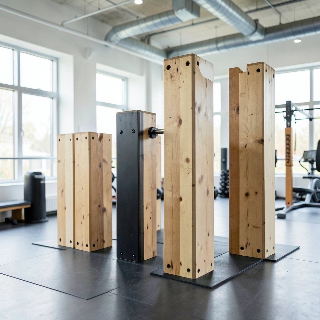
Create canvases that use vertical blocks with airy spacing between shapes. The tall direction can feel like lifting, which pairs nicely with workouts that emphasize standing strength.
Vertical blocks are unique because they add structure while leaving negative space that looks modern. The benefit is that negative space can make your room feel less crowded, even when the studio is busy. Personalize by choosing two main colors and one accent color, so the design stays clean and easy to match.
For practical placement, hang it on a wall that people face during coaching, so the vertical movement subtly supports posture. If you’re managing cost, choose one tall statement canvas and one or two smaller matching pieces rather than a full gallery wall. Avoid overly glossy paint if you have bright overhead lights that reflect easily.
20. Panoramic Abstract City Without Labels
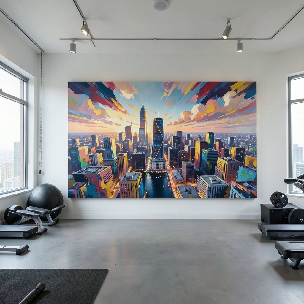
Use a panoramic abstract canvas that suggests a city skyline, but keep it fully non-literal. The wide feel can make the studio look bigger, and it gives a sense of “going somewhere” during tougher sets.
This artwork is unique because it can combine motion and calm in the same piece, especially when the skyline shapes blur at the edges. The benefit is that panoramic visuals can anchor a long wall and balance out mirrored sections. Personalize the skyline by coloring it with your studio brand hues, like adding a bright accent band that repeats across the canvas.
For cost considerations, look for wide canvas prints that fit your wall length, then add simple side pieces to fill the gap. If the room is small, choose a single wide piece rather than multiple panels. Keep the palette in the mid-range so it doesn’t compete with equipment that already draws attention.
21. Personal Signature Scribble Panels

Commission or create abstract “scribble signature” panels that include playful strokes, dots, and layered marks. When the marks feel personal, clients sense the studio’s character right away.
This idea is unique because it turns art into a kind of visual autograph, connecting the space to the people who train there. It benefits your studio by making the walls feel warm and lived-in, not generic. Personalize by adding subtle references to your community, like a repeated symbol from your logo or a pattern inspired by group challenges.
For practical tips, keep the scribbles in a limited color set so the panels look cohesive together. Consider using removable frames so you can swap panels when you run seasonal events. For cost, you can start with prints made from your original sketches, then upgrade to originals later if you decide to grow the collection.
Current trends favor hand-drawn energy and imperfect lines, which means these panels can look fashionable without needing expensive materials. Place them where clients gather for meetups or post-class chats so the art feels like part of community. Use a consistent size for each panel to create an organized layout even when the visuals are playful.