The room can change mood with just a few bold forms. Colorful shapes help you turn simple ideas into something that feels playful and brave.
When you pick geometric patterns, you also get a clear structure to build on, like a friendly map for your creativity.
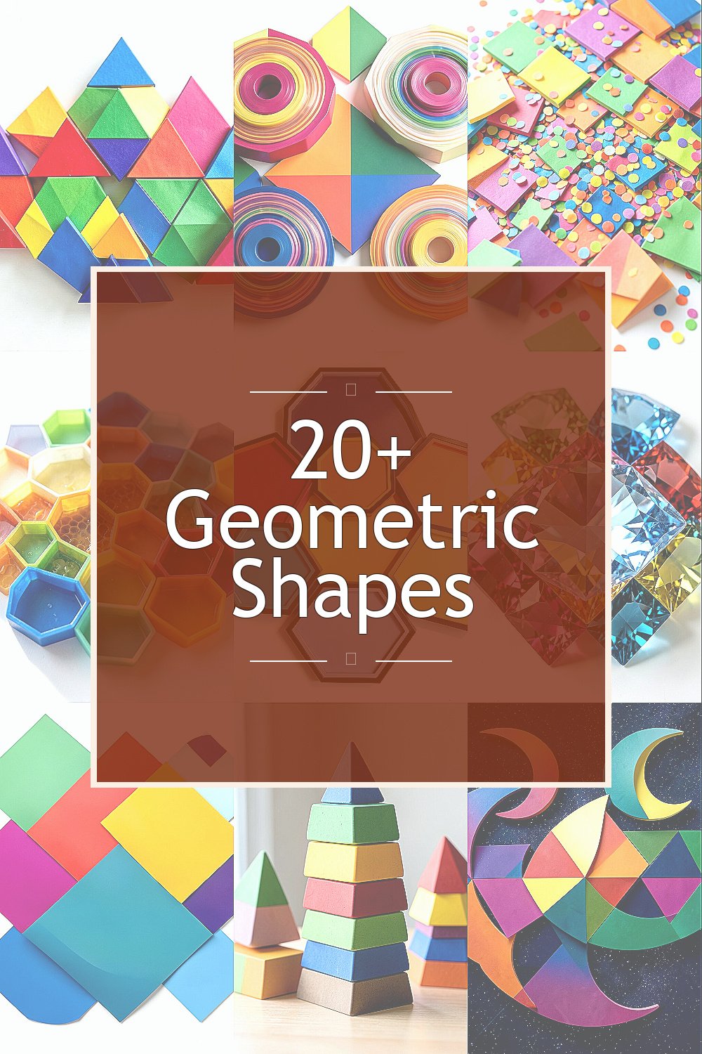
1. Rainbow Triangles With Pattern Play
Imagine triangles stacked like little roof shingles, each one painted a different bright hue. You can almost hear the pattern clicking into place as the colors repeat.
Try making triangles in a tight grid or scattering them in a looser rhythm around a page. This helps your eye stay interested without making the design feel messy, and it looks great on posters, notebooks, and party signs. Use masking tape to keep edges sharp and apply paint in thin layers so the colors stay crisp and bold.
2. Spinning Circles That Feel Like Music

Picture circles layered like sound waves, with each ring slightly offset in color. The result feels like a drumbeat you can see, especially when you use warm tones next to cool ones.
Circles are easy to repeat, so they work well for quick projects like wall art, coaster designs, or sticker sheets. Choose one bright color family, then add a contrast color so the layers pop without fighting. For a modern look, use a mix of solid circles and dotted circles, and keep the spacing even for a clean finish.
To personalize, match the circle palette to your favorite playlist vibe, like sunset oranges for a calm mood or neon blues for a party mood. If you want to keep costs low, trace circles from cups or lids and use affordable craft acrylics.
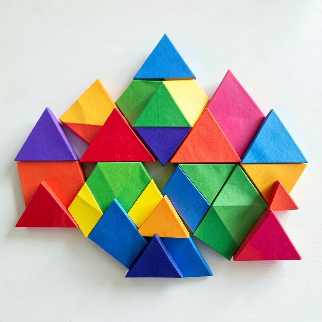
3. Confetti Squares That Keep Things Light
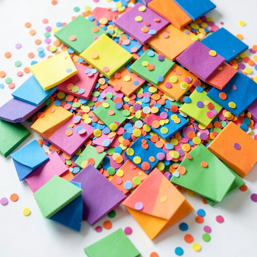
Think of squares floating across a page like confetti after a celebration. When you tilt some squares and leave others perfectly flat, the whole design looks lively.
You can use squares to frame photos, decorate envelopes, or create a fun border for a journal. Their straight edges make them feel orderly, while the bright colors bring in energy. A practical way to start is to cut small paper squares and trace them onto cardstock before committing to paint.
For uniqueness, vary the size just a little and mix matte and shiny materials like colored markers and glossy gel pens. Keep cost in mind by using scrap paper and inexpensive glue for layering, then finish with a clear sealant if you plan to display the piece often.
If you want a current trend feel, pair bold squares with white space so the colors look crisp and modern on social media. Even a small sheet can look like a big statement when the layout is clean.
4. Geometric Hexagons In Honeycomb Colors
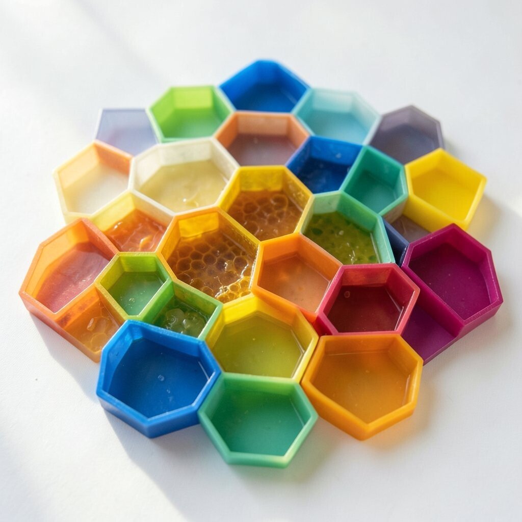
Imagine a honeycomb pattern where every hexagon is a different shade, like candy you can’t wait to bite. The shape naturally fits together, so your design looks neat even when the colors are playful.
Hexagons are great for creative organization, like labeling storage bins or designing an art wall grid. They also work well for themes, since you can set a color story that matches a season or celebration. To keep the work manageable, draw one hexagon template and trace it again and again so each edge lines up.
5. Octagons With Bold Border Frames

Picture an octagon like a stop-sign cousin, but in bright pink, teal, and sunny yellow. When you add a thick border, it feels like a badge, an award, or a fun logo.
These shapes are perfect for creating icons on labels, invitations, and decorative cards. You can also use octagons as frames for small drawings, like tiny landscapes or portraits. For practical results, sketch lightly with a pencil first, then trace the outer edges with a fine marker so the lines stay steady.
To personalize, include a letter or symbol inside each octagon that matches a theme, like hearts for kindness or stars for celebration. If you’re keeping costs down, print a stencil from free templates or cut a reusable cardboard guide.
6. Layered Rhombuses That Look Like Gemstones

Rhombuses, those diamond-leaning shapes, can look like gemstones when you stack them. Imagine gradients inside each diamond, like light bouncing across a treasure.
They’re great for wall decals, scrapbook pages, and even fabric patterns. Because the shape is slightly angled, the design feels dynamic, not flat. A practical way to start is to use colored paper layers and glue them onto a background, so you can adjust placement without repainting.
For uniqueness, try mixing one metallic color with bright matte colors to create a “sparkle” effect. Cost-wise, you can use foil gift wrap scraps for the metallic layer and still get a premium look.
7. Smooth Parallelograms For Motion Posters

Imagine parallelograms sliding across a page, like a race car made of color blocks. Their slanted edges naturally suggest movement, even on a still sheet.
This shape works wonderfully for posters, covers, and banner-style designs. You can line them up in a repeating pattern to show speed, or scatter them to feel playful and spontaneous. To keep it practical, draw a simple guide line for direction, then place the parallelograms at consistent angles.
Personalize the design by choosing colors that match your favorite sports team or your own personal “energy” palette. For current style, combine bold shapes with simple typography so it looks crisp and modern.
8. Colorful Trapezoids In Stacking Scenes
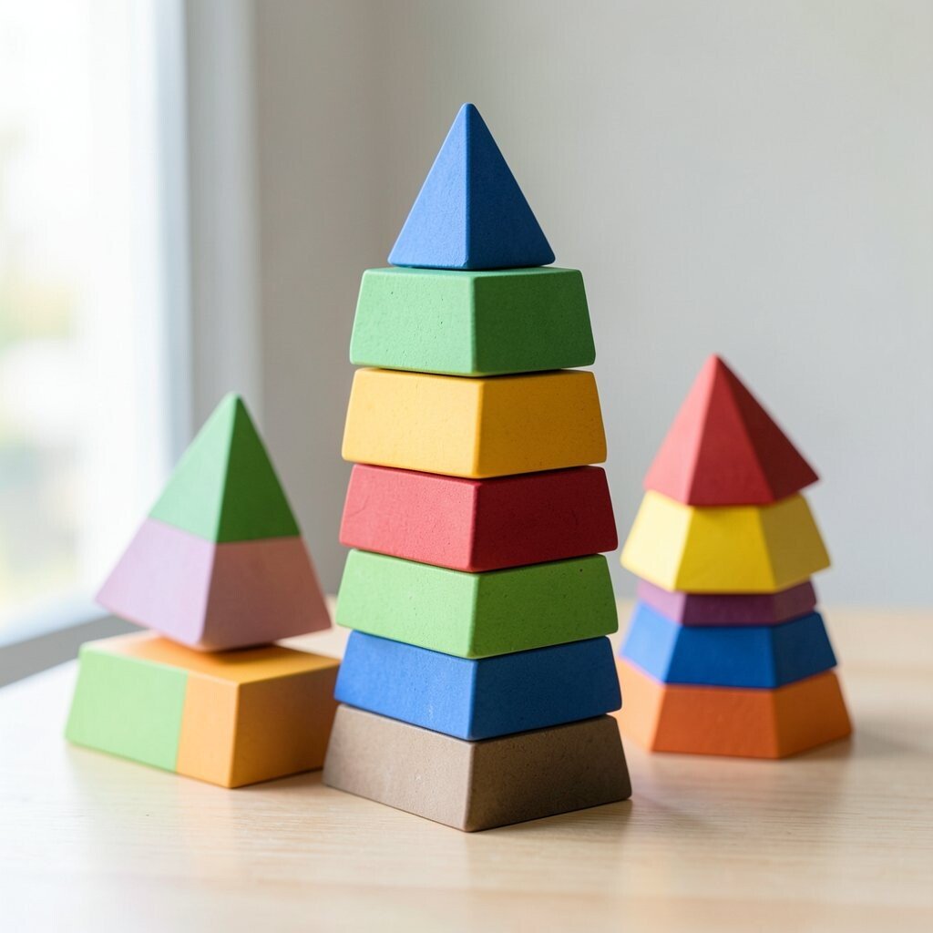
Picture trapezoids stacked like building blocks, each one a different shade of the rainbow. The wider top and narrower bottom make the shapes feel like they’re standing on stage.
Trapezoids are great for creating landscapes in a simple geometric way, like hills, tents, or abstract buildings. They also make a lovely pattern for bookmarks and gift tags. To make your work easier, start with a small set of sizes and repeat them, so the scene looks intentional.
9. Crescent Moons With Night-Sky Gradients

Crescents can feel gentle and magical when you paint them in soft colors. Imagine a line of moons getting brighter, like a sky warming up for morning.
Use this shape for greeting cards, children’s art, or calming wall pieces. The benefit is that crescents are easy to repeat, and they automatically create rhythm. For a practical approach, use a round object for tracing and then clip or paint the inside curve so the edges stay smooth.
For uniqueness, add tiny stars using dots of white paint or a stencil, and vary the moon sizes slightly. If you want to stay budget-friendly, use washable markers and a little white paint for stars, which gives a bright look without fancy supplies.
Right now, cozy night themes and “soft gradients” are trending in home decor, so this idea fits well for modern spaces. Keep the palette limited to three to five colors for a clean, stylish finish.
10. Starbursts That Make Headlines Feel Fun
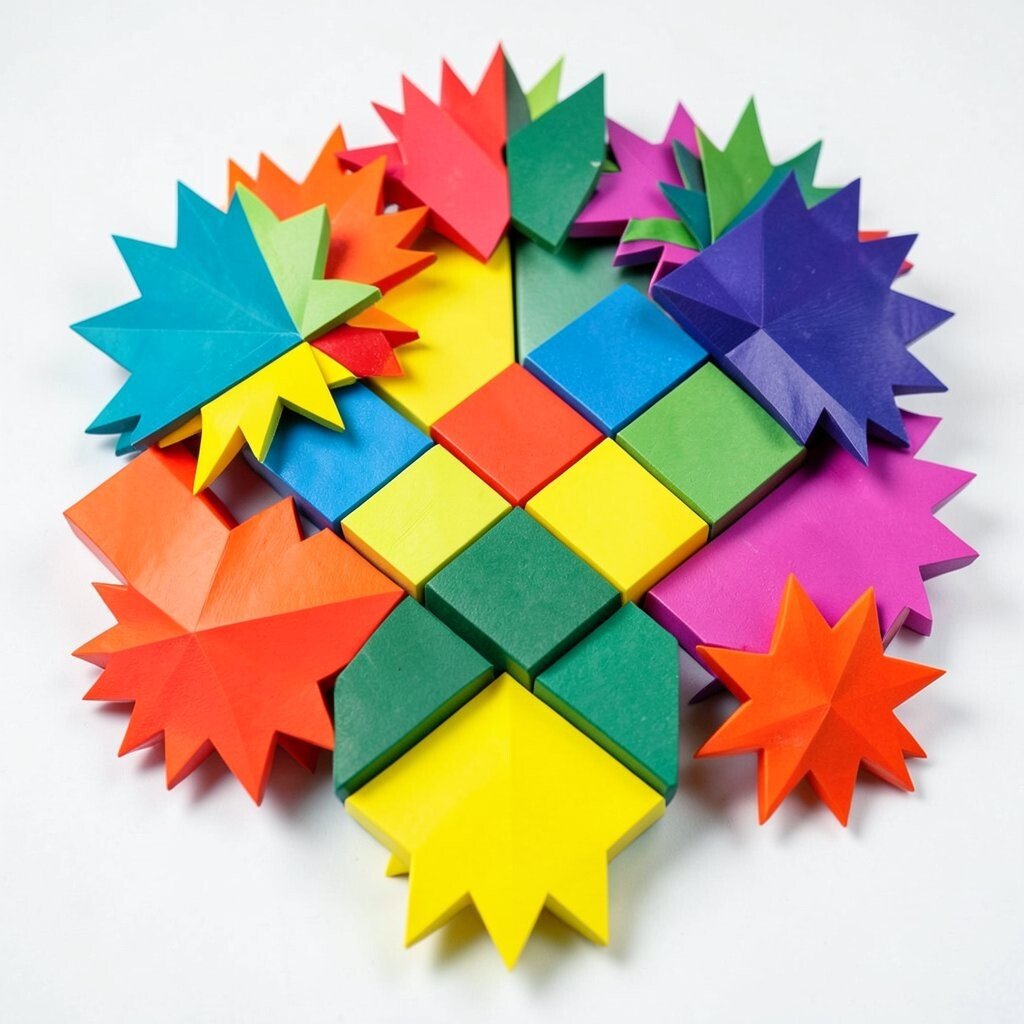
Imagine a starburst popping from the center of a page like confetti lightning. The sharp points make it feel exciting, like an exclamation mark made of color.
Use starbursts for labels, class projects, or playful announcement cards. They help your content stand out without needing complex layouts. A practical tip is to draw a simple circle first, then create point marks around it so the rays stay even.
Personalize by matching the starburst colors to the mood of the message, like bright greens and yellows for “yay” moments. For cost, craft paper and a glue stick are enough, especially if you don’t want to paint.
11. Cubes In 3D-Feeling Color Blocks

Think of cubes drawn in colorful layers so they look three-dimensional. Even without heavy shading, bold color planes can trick your eye into seeing depth.
This shape is a fun choice for art journals and classroom decor because it looks detailed but still simple. The benefit is that you can repeat cube patterns quickly, like a tile wall made of color. To keep it practical, use a ruler for straight lines, and pick two or three shades for each cube face so it stays readable.
For uniqueness, add tiny patterns to one face, like dots or stripes, while keeping other faces solid. A budget-friendly option is to use colored pencils or markers instead of paint, which also dries fast for quick projects.
12. Tall Flags Of Polka-Patterned Banners
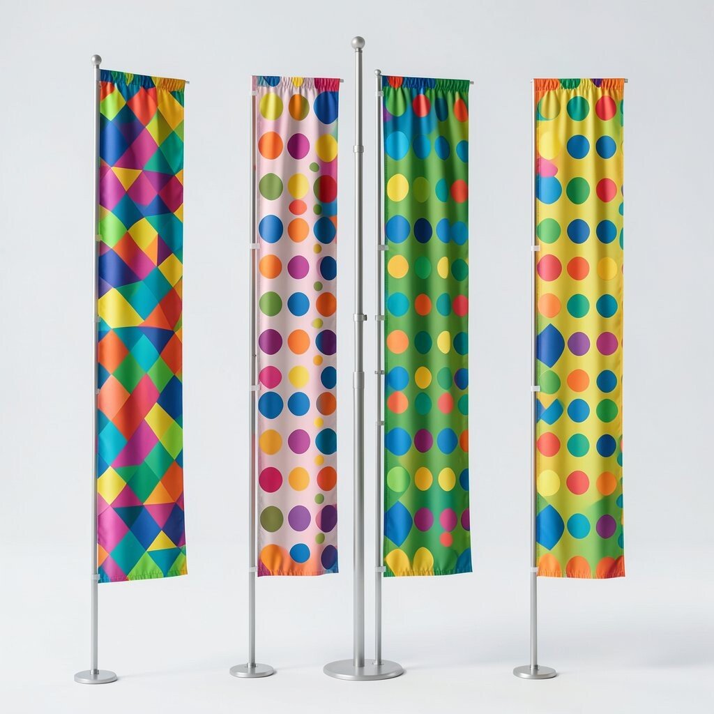
Picture a banner made from repeating flags, each one a mini geometric stage. Add polka dots or small triangles, and suddenly the whole line looks festive and cheerful.
This shape helps with party setups, classroom displays, and even wedding or birthday invites. The simple structure makes it easy to organize colors, and it gives your space an instant celebratory feeling. Try alternating two colors with a third accent so the banner pops but still feels balanced.
To personalize, print or draw a symbol in the center of each flag, like a heart, leaf, or simple letter. For cost considerations, use scrap paper and a single hole punch to string everything together.
13. Playful Waves Made From Curved Strips

Even though waves are not always thought of as geometric, curved strips can look wonderfully patterned. Imagine bands of color that curl in a repeating rhythm like a friendly ocean.
Curved shapes are great for separating sections on a page or adding movement to a design. The benefit is that they soften the sharp feel of triangles and squares, giving your artwork a balanced look. To make it easier, draw a smooth baseline curve first, then stack strip shapes evenly along it.
Personalize by picking colors that match your home, like calming blues and greens or bold magenta and orange. For a current style vibe, try using thick outlines with simple fills, since it looks modern and graphic.
14. Geometric Spirals With Center Focus

Picture a spiral that starts small and grows bigger, like a colorful whirlpool. When you pick bright colors and keep the spacing even, the spiral becomes a strong focal point.
Spirals are excellent for posters, logo practice, and cover art because they naturally draw the eye inward. You also get an easy personalization path by choosing a color palette that matches your personality, like warm sunset colors or cool ocean tones. A practical tip is to mark the center point and measure consistent spiral steps so your lines stay smooth and balanced.
To manage cost, use a basic compass tool for the curve or trace from a template. If you want a unique touch, add a few tiny “breaks” in the spiral with contrasting colors to make it feel like modern design.
15. Bold Lines Of Stepped Staircases

Imagine stepped shapes rising like a staircase made of color blocks. The sharp corners and repeated steps create a rhythm that feels strong and confident.
Staircase patterns work well for infographics, learning charts, and creative headings on cards. They also help guide the viewer’s eye, which is a big benefit when you want one part to stand out. For practical execution, decide how many steps you want, then draw evenly spaced rectangles and fill them with alternating colors.
Personalize by matching the palette to a favorite theme, like school colors or holiday accents. For cost, you can use markers and paper rather than paint, and it will still look bold and crisp.
16. Triangles In A Chevron Dance

Chevron stripes look like a zigzag dance made from repeating triangles. When the colors are bright and the lines are clean, the whole design feels energetic and playful.
This shape is perfect for scarves, notebooks, and wrapping paper ideas. It also helps you create instant texture, which makes even simple crafts look special. A practical tip is to draw a straight guideline, then keep your zigzag angles consistent so the pattern stays neat.
To personalize, choose a gradient feel by shifting color from light to dark across the chevron. Cost considerations are easy here, since you can often reuse wrapping paper scraps or tape down strips of colored craft paper.
17. Geometric Circles In Target Rings
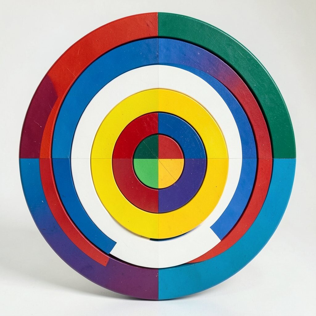
Think of a target design with circles inside circles, each one filled with a bright solid color. The bold center makes it feel like a fun game board on your wall.
Target rings can be used for art prints, learning activities, and decorative plates or trays. The benefit is that the layout is simple, so it’s easy to make and easy to customize for different spaces. For a practical approach, use a jar lid for tracing and then cut or paint each ring with a steady hand.
Uniqueness comes from choosing unexpected color pairs, like teal with hot pink, or adding a textured ring using sponge paint. If you want to keep costs low, buy a small set of craft paints and stick to a limited palette for all rings.
18. Overlapping Squares Like A Mosaic

Imagine squares stacked and overlapping like a mosaic collage, with different colors peeking out at the edges. The look feels rich and layered, like a scrapbook page that grew on its own.
This approach is great for wall art, cover backgrounds, and handmade cards where you want depth without complex tools. The benefit is that you can cover mistakes because overlapping hides uneven lines. A practical tip is to cut squares quickly with a single size guide, then arrange them until the colors feel balanced.
To personalize, add one larger “anchor” square with a pattern inside, like stripes, dots, or a small drawing. For cost, use inexpensive construction paper and keep the shapes small so you can stretch scraps farther.
19. Star Shapes In Soft Pastel Pop

Stars look classic, but they feel fresh when you use colorful pastels instead of only reds and golds. Picture small stars scattered on a clean background, like gentle celebration floating through air.
Use star shapes for calendars, birthday cards, kids’ crafts, and even cozy bedroom decor. They offer a clear cheerful mood, which is a big benefit when you want your space to feel inviting. For practical tips, use a star cookie cutter or a stencil so each shape has a similar size and crisp edges.
Personalize by mixing star colors with one bold accent color, like bright lime among soft blues. Cost considerations are friendly here, since you can use marker fill or chalk for a soft look without buying special paint.
20. Parallel Lines That Create Ribbon Geometry

Parallel lines can feel elegant when they’re made into colorful ribbons across a page. Imagine a series of stripes that curve slightly, like fabric flowing in a gentle breeze.
This shape is great for bookmarks, simple posters, and background designs behind photos. The benefit is that it gives structure without taking over the whole project, so your other elements can shine. To keep it practical, draw the lines with a ruler at even spacing, then fill alternating stripes with bright colors.
For uniqueness, add small geometric gaps, like tiny triangles or dots between ribbons. If you’re working with a budget, use paper scraps, felt-tip markers, or even crayons, then lightly seal with clear school glue mixed with water for extra durability.
21. Mixed Polygons For A Future-Ready Collage
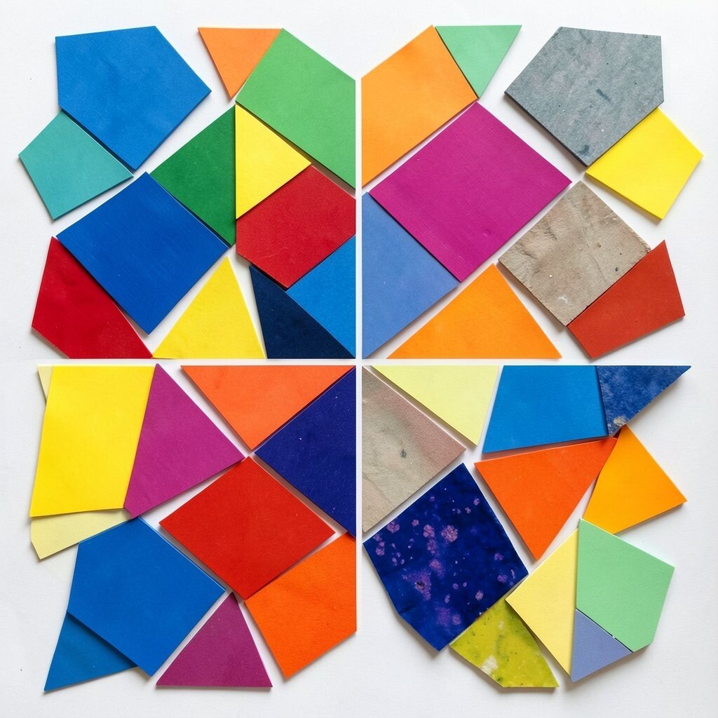
Imagine a collage where triangles, circles, squares, and trapezoids all share the same color family. The mix feels futuristic because the shapes overlap like a designed system, not random decoration.
This final idea is ideal for big art pieces, portfolio covers, and creative event backdrops. The benefit is that you can fit many small scraps into one design, which makes it both fun and practical. Start by choosing one background color, then arrange your shapes in a clear layout, such as clustering warm colors together and cool colors together.
To personalize, add a simple pattern rule, like “always outline one shape in black” or “keep one shape size constant.” For cost considerations, cut shapes from old magazines, colored paper, and packaging, then glue them down for a satisfying collage finish that still looks polished.
Right now, mixed-geometry collages and bold color blocks are popular in creative feeds, especially when the edges are clean and the palette feels intentional. With a little planning, your collage can look like a modern design studio piece made from everyday materials.