The room can feel like a brand-new world with the right bold color plan. Color blocking turns everyday spaces into photo-ready moments that still feel personal.
If you love vivid palettes, clean shapes, and a little drama, these themes give you a clear path to a wedding that looks modern and feels like you.
1. Candy-Stripe Pastels With Sharp Lines
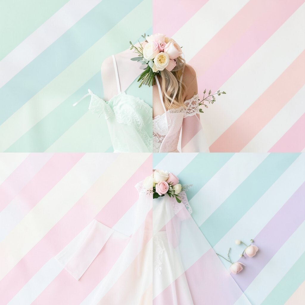
Picture a ceremony backdrop made of diagonal blocks, like a giant ribbon pinned behind you. Soft pink, mint, and baby blue look airy, while crisp edges keep everything looking neat.
You’ll get a playful vibe without the chaos, because each shade stays in its own lane. To make it practical, choose two “main” colors and let the third act as a highlight in napkins, signage ink, or small floral accents.
2. Citrus Block Tables With Zesty Energy
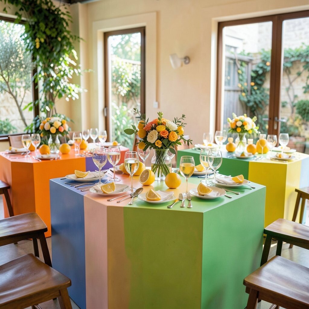
Imagine table linens and runners broken into bright orange, lemon yellow, and lime green panels. The whole reception feels like golden hour even after the sun goes down.
Color blocking like this creates strong visual lines that help guests find their seats quickly. For a budget-friendly approach, try solid-colored cloth overlays instead of custom printed fabric, and then add a few bold centerpieces to tie the theme together.
Personalize it by matching your color blocks to your favorite citrus flavors from childhood memories, like “orange peel” and “lime zest” tones. A small trend you’ll see often is using vivid stationery ink on white cardstock, so the place cards and menus stay readable while the palette stays loud.
3. Midnight Navy and Electric Teal for a Sleek Look
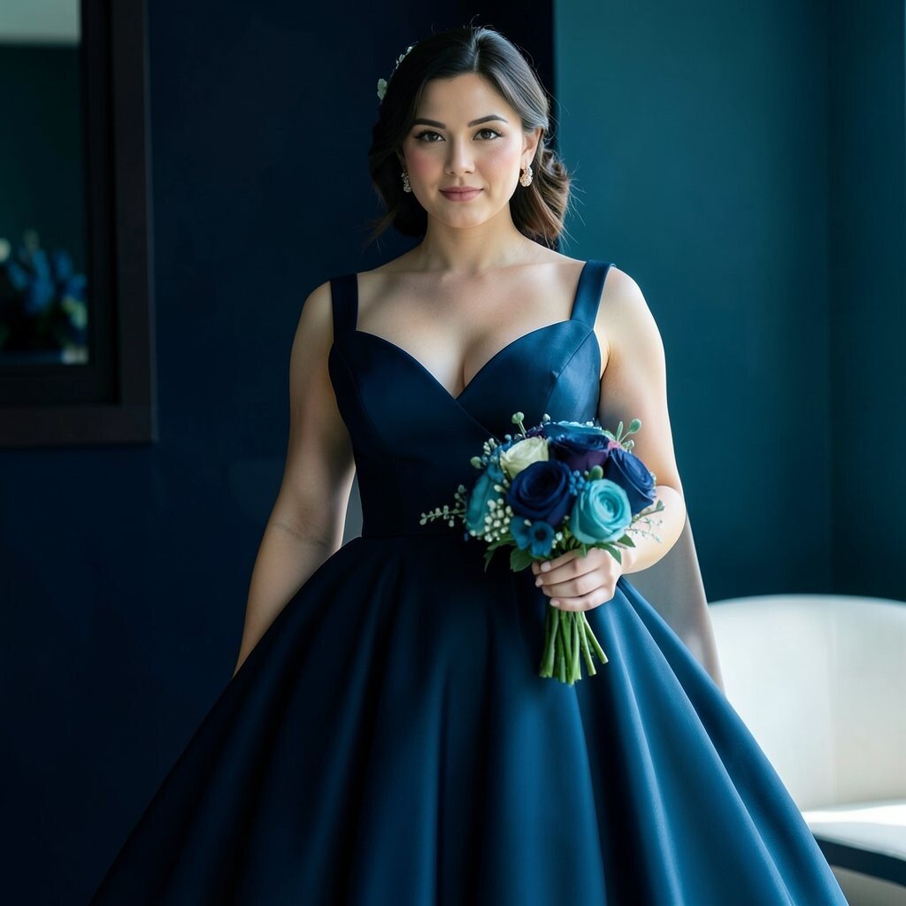
Think deep navy walls with sharp teal rectangles that pop like neon. Candlelight glows across the blocks, and the photos look extra crisp.
This theme feels grown-up and modern, especially if your venue has simple architecture. Choose teal for statement items like the bar backdrop, sweetheart table, or a single oversized floral arrangement so the look stays focused.
If you want it to feel unique, add one metallic color in small touches, like gold on frames or acrylic signage. For cost considerations, concentrate the higher-priced materials on the areas guests see most, such as the entrance and the head table.
To keep it wearable, coordinate bridesmaid dresses or suit accents with teal undertones rather than trying to color-match every fabric exactly.
4. Blush and Rose With Color-Blocked Florals
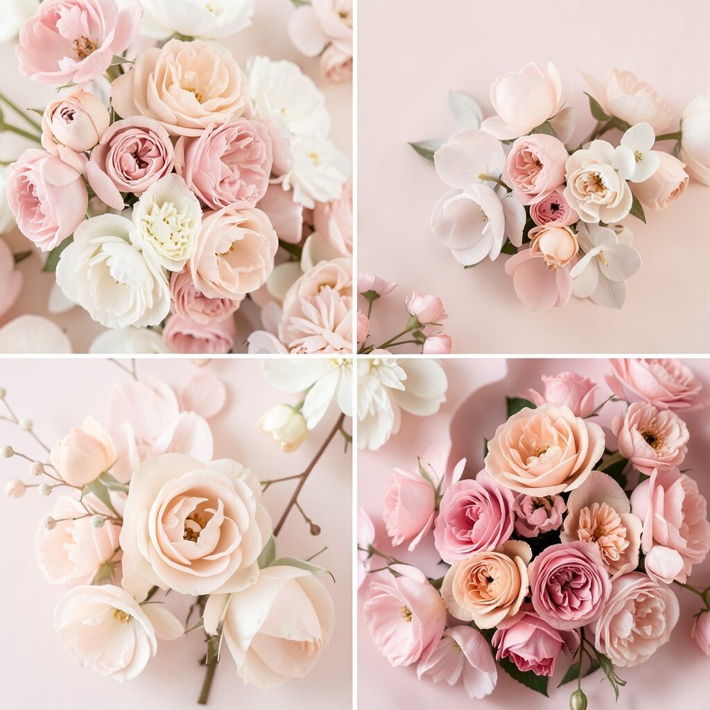
Picture bouquets that mix blush blooms with deeper rose sections, arranged in clean, repeating shapes. Even the vases can echo the look with two-tone paint or wrapping.
This works beautifully for couples who want romance but still crave visual punch. Use color blocking in your flower choices by grouping petals by shade, then letting greenery soften the edges for a natural finish.
5. Rainbow Geometry With a Friendly, Modern Twist
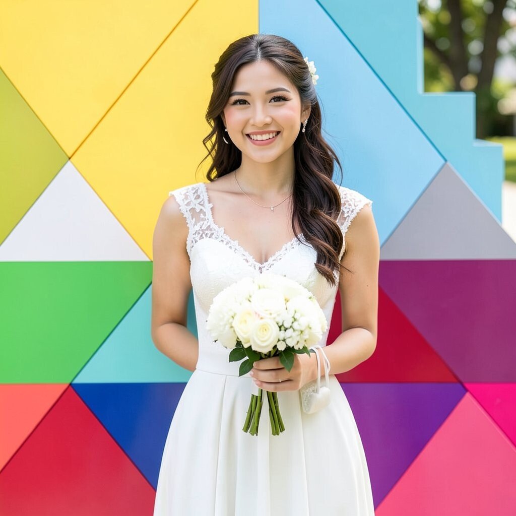
Imagine a reception entrance made from stacked blocks in multiple colors, like a playful skyline. Guests step in and instantly know the day will be bright and fun.
Rainbow geometry is great for diverse wedding parties because everyone can find a favorite shade. Start practical by limiting blocks to key areas like the photo wall and cocktail hour backdrop, so you’re not spending rainbow money everywhere.
Personalize the palette by using the exact colors from your engagement session outfits or favorite artwork. A current trend is pairing bold color with clean typography, so consider simple fonts and thick color bars behind your names.
6. Emerald and White Checkerboard Charm
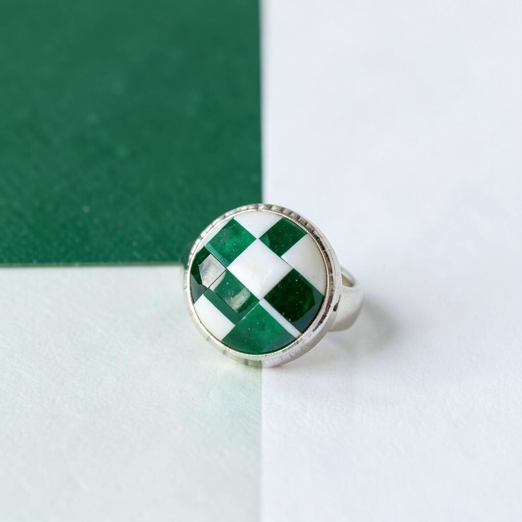
Picture a checkerboard pattern in emerald and bright white across table settings and signage backdrops. It feels classic and fresh at the same time, like a modern vintage game night.
You’ll get strong symmetry, which makes photography easier and helps the venue look polished even if the lighting is uneven. To keep it manageable, use checkerboard elements in flat surfaces like table runners, menus, and step-and-repeat panels rather than building full patterned linens for every table.
Uniqueness shows up when you mix textures, like satin for napkins and crisp cotton for signage cards. For cost considerations, rent or borrow reusable decor bases and then purchase only the printable or removable patterned pieces.
7. Terracotta and Cream With Warm Desert Blocks
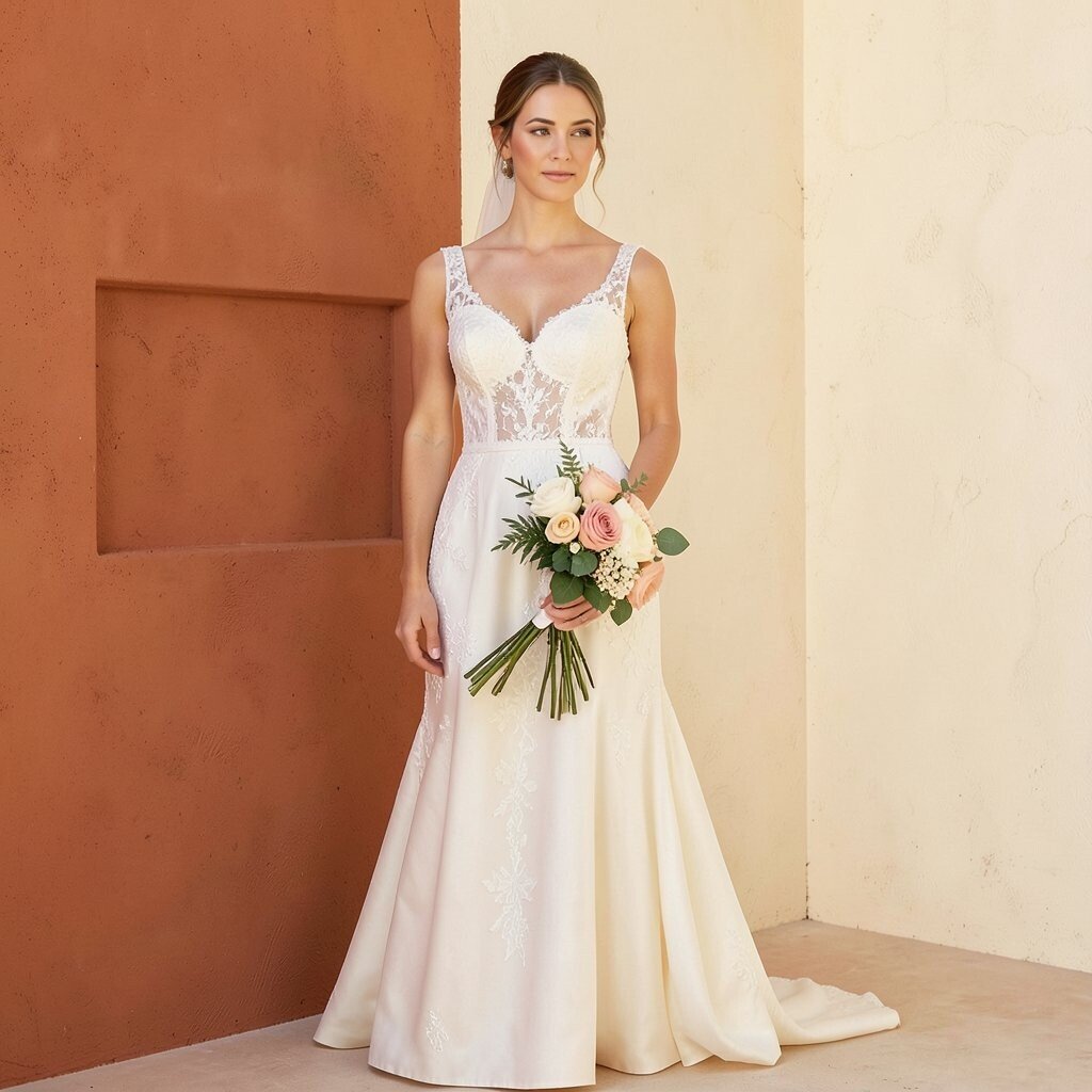
Think terracotta panels paired with creamy off-white for a warm, earthy look that feels welcoming. The palette flatters almost every skin tone, and it looks gorgeous against natural light.
This theme is perfect for outdoor weddings because it blends with gardens, clay tones, and sunny skies. Add practical touches by choosing terracotta for your stationery accents and letting cream dominate your tablecloths for readability.
Personalize it by pulling colors from your venue’s landscape, like the shade of pathway stones or a nearby brick wall. A trend you’ll notice is bringing in natural shapes, so add terracotta-colored dried florals or woven details that echo the blocks.
If you’re mindful of spending, buy one “hero” terracotta installation, like a hanging backdrop, and keep the rest simple with coordinated paper goods.
8. Berry Punch With Plum and Magenta Pop
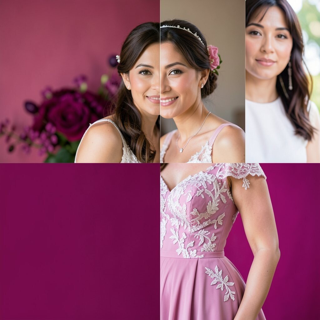
Imagine a bar area lit with plum and magenta blocks, creating a bold visual frame for drinks and desserts. It feels like a modern cocktail party with a wedding twist.
This color blocking choice makes everything look celebratory because berry tones naturally read as festive. Use practical layering by placing one strong color behind text signage and letting the other color show through in smaller items like straws, ribbons, or chair ties.
9. Canary Yellow and Navy for a Graphic Finale
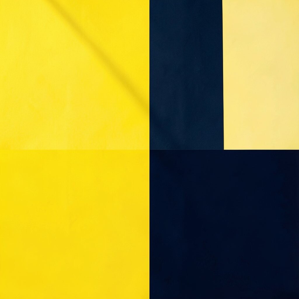
Picture bright canary yellow blocks paired with navy accents that look clean and graphic. The contrast is high, so photos pop even in dim reception lighting.
You’ll love how direct this theme feels, because every sign, banner, and table detail can be arranged with crisp edges. For practical planning, choose canary for larger surfaces like table runners or backdrop panels, while navy handles your linens, suit details, and chair covers.
Personalization can be as simple as matching the shades to your wedding playlist vibe, like sporty navy energy with sunny canary cheer. When you want to manage costs, opt for washable chair sashes and rent larger backdrop materials to avoid buying multiple items.
10. Sage Green and Soft Grey for Calm Clarity
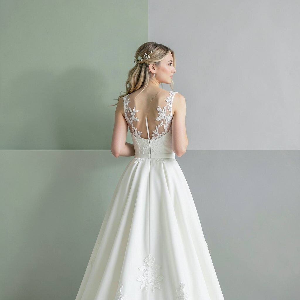
Think sage blocks paired with soft grey for a gentle look that still feels modern. The visual effect is clean, and the atmosphere feels relaxed and airy.
This theme is ideal if you want color blocking without intense brightness. Add practical tips by using sage on your florals and grey on your stationery and tableware so everything stays balanced and easy to read.
Uniqueness happens when you combine matte and glossy textures, like matte sage ribbons with lightly reflective candle holders. A current trend is using muted palettes with bold geometry, so a simple block pattern can look fresh even when the colors are soft.
11. Coral and Aqua for Beachy, Bright Frames
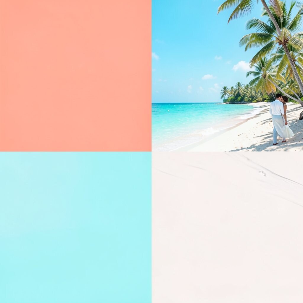
Imagine coral and aqua blocks stacked like waves across your ceremony arch. The colors feel like sun and sea, and your guests will instantly connect the theme to summer joy.
This design is great for beach venues because it mirrors natural colors without blending too much. For practical choices, use coral in florals and aqua in your signage, because mixing both shades across everything can make the look busy.
Personalize the theme by adding small nods to your story, like a “favorite trip” scent in candles or shells painted in the two block colors. For cost considerations, focus your spending on fabric backdrops that can be reused for welcome signs, photo walls, and gift table displays.
If you have worried guests about boldness, keep the table settings largely white so the colors feel like highlights rather than a full wall of brightness.
12. Lavender and Black for Nighttime Drama
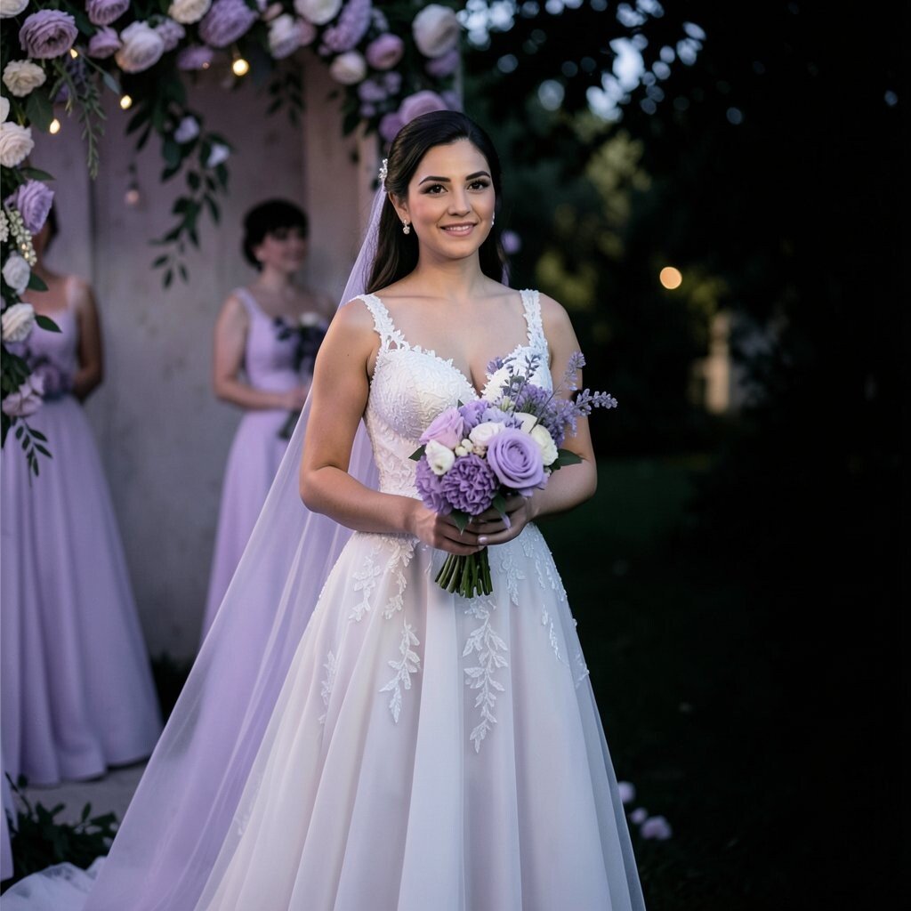
Picture lavender blocks beside deep black frames, like a chic gallery show at midnight. The contrast makes your ceremony feel cinematic, especially with warm lighting.
This theme feels unique because lavender wedding decor isn’t as common as classic florals. To keep it practical, use black as the base color for table settings and signage, then add lavender in florals, candle labels, and a limited number of backdrop sections.
13. Lemon and Olive for Fresh, Farm-to-Modern Style
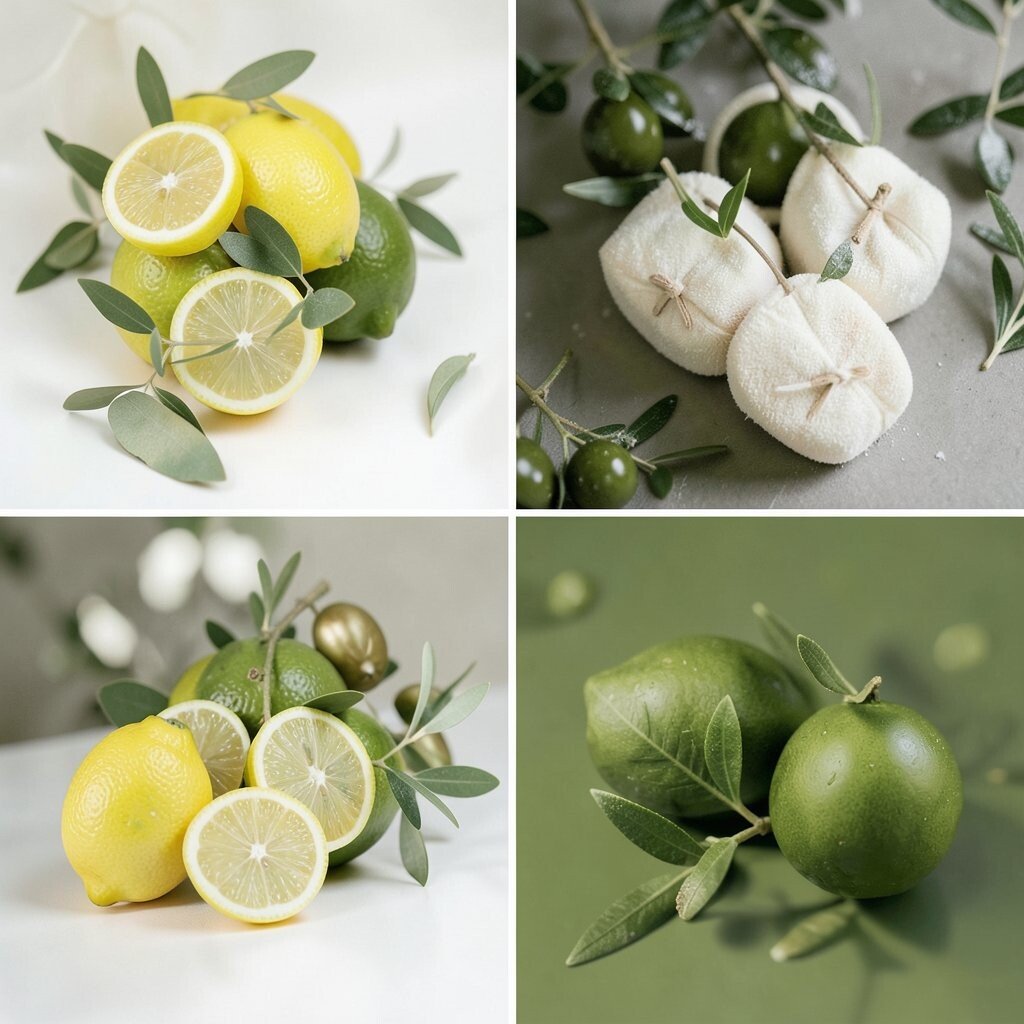
Imagine lemon blocks paired with olive green details for a look that feels fresh and slightly rustic. It’s bright, but grounded, and it works well for garden or barn venues.
You’ll get a natural charm with a modern layout, which helps the wedding feel intentional. Practical tips include using lemon for napkins or table runners and olive for the greenery-heavy parts of your decor so everything looks cohesive.
Personalize it by tying in your favorite herbs, like basil or rosemary, in small garnish-style accents on place cards. For cost considerations, choose greenery sparingly and let olive tones appear through printed stationery or colored ribbon if real greenery would be too expensive.
14. Teal and Mustard for Retro-Modern Warmth
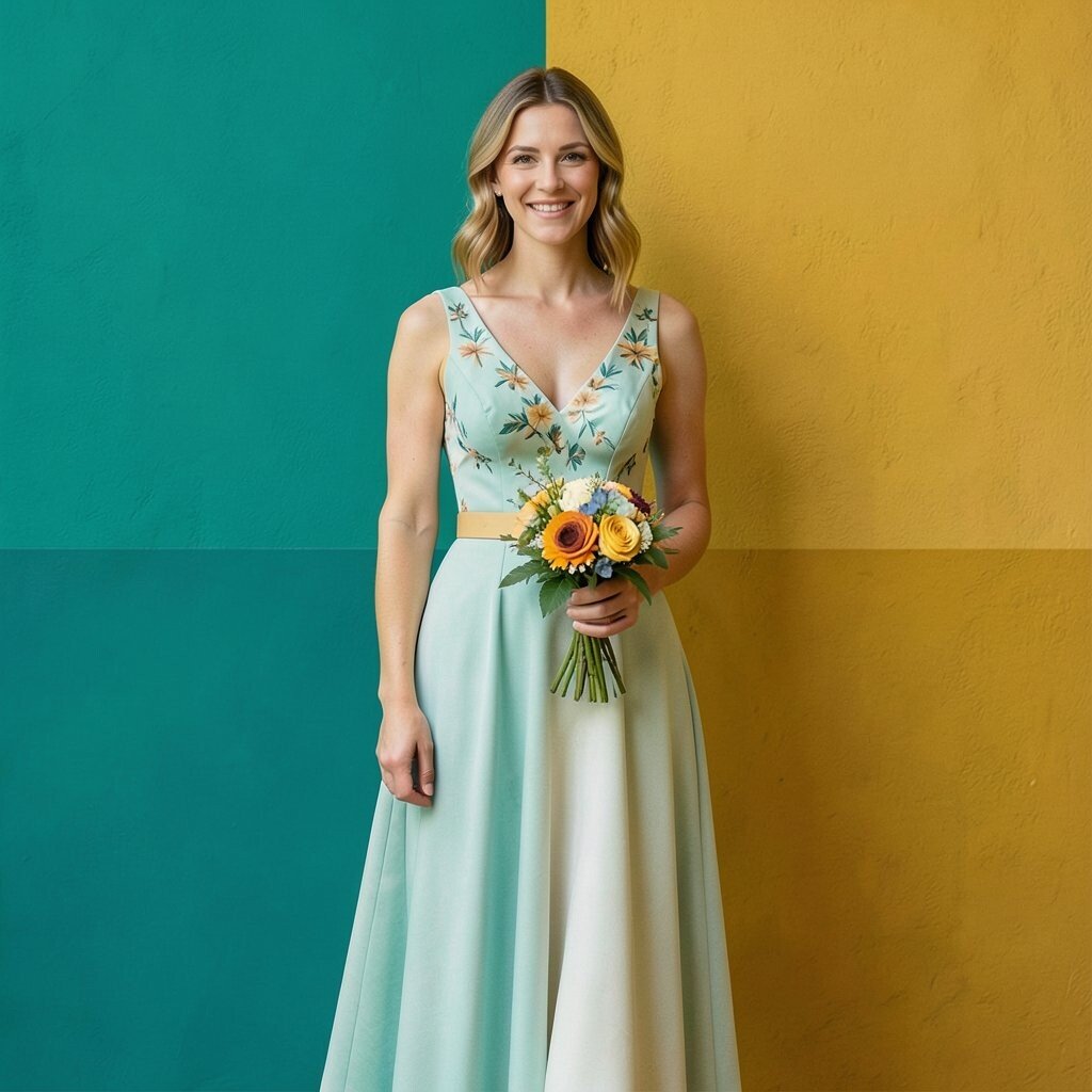
Picture teal blocks with mustard highlights on a dessert table that looks like it belongs in a retro design magazine. It feels sunny and stylish, with enough contrast to keep guests looking at every corner.
This theme is unique because it swaps out common wedding colors for a pairing that feels fresh. To keep the plan practical, pick one “bold” color for the largest surfaces, such as teal backdrops, and then use mustard as the supporting color in signage, blooms, or candles.
15. Peach and Burgundy for Soft-Heart Elegance
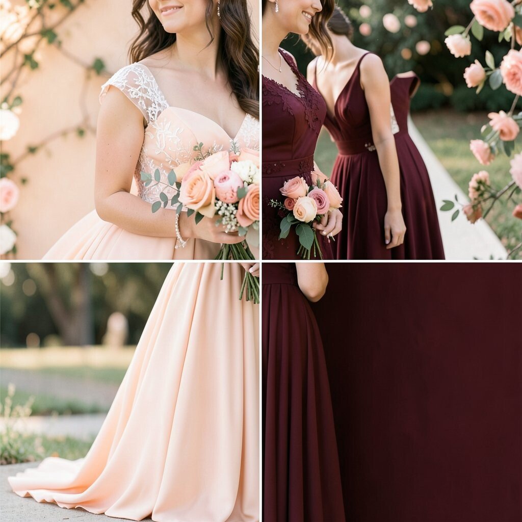
Imagine peach blocks paired with burgundy lines that look gentle but still striking. The warmth of peach makes the day feel friendly, while burgundy adds depth.
This works especially well in fall or indoor venues because the palette feels cozy. For practical tips, keep your linens light and then use burgundy in your table numbers, chair details, and floral clusters so guests can still read everything easily.
Personalize by using a burgundy shade that matches an heirloom ribbon, book cover, or a favorite sweater you both love. For cost considerations, buy paper decor in bulk and reuse them at your after-party setup if you’re having one.
Pair the color blocks with soft lighting and layered candles so the deeper shade doesn’t feel too heavy.
16. White, Hot Pink, and Neon Green for Festival Fun
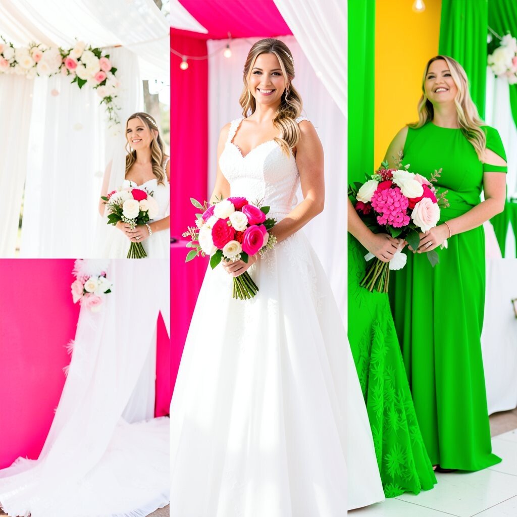
Picture hot pink and neon green blocks popping against clean white walls for a festival-like reception. It’s bold, youthful, and perfect for couples who want their wedding to feel like a party.
This theme brings instant energy to the room, and the photos will look lively even when they’re candid. Keep it practical by limiting neon green to small areas like accents, straws, signage underline bars, and flower ribbon, since neon can overwhelm if used too widely.
Uniqueness comes from how you style the edges, like rounded block shapes in the photo booth frame or geometric bunting behind the DJ. A current trend is adding mirrored or metallic elements, so consider gold or silver as tiny touches to balance the neon.
17. Monochrome Color Blocking With One Bold Accent
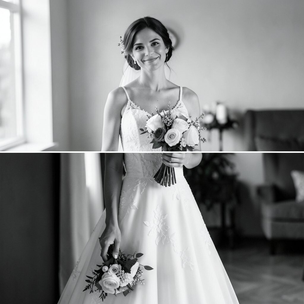
Imagine mostly white and cream decor, then one vivid block color used in a single major moment. The result feels high-end, clean, and still full of personality.
This approach is great for couples who like minimal style but want a clear statement. Practical tips include choosing one accent color, like cobalt or scarlet, and repeating it consistently in signage, napkin rings, and one floral arrangement.
Personalize it by letting the accent shade match your wedding rings or a piece of art you love. For cost considerations, monochrome reduces the need for multiple printed designs, so you can spend more on that one hero installation.
18. Classic Black, Red, and Gold for Timeless Festivity
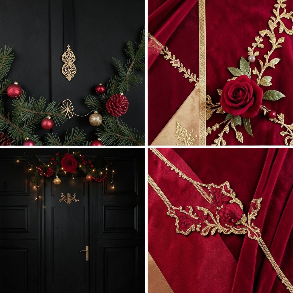
Picture black backdrops with red block panels and gold accents that look like a holiday card grown up. It feels elegant and celebratory, and it stands out in any venue lighting.
This theme is unique because it combines clean color blocking with timeless richness, so guests won’t mistake it for just another trendy palette. Use practical planning by keeping black as the base for table settings and chair covers, while red and gold handle the eye-catching elements like cake table panels and floral ribbon.
Personalize it by choosing red tones that match your favorite lipstick shade or the color of your first gift together. For cost considerations, consider renting a lighting setup that makes the gold highlights glow, because lighting can elevate the look without adding lots of decor purchases.
When you coordinate florals, aim for repeating block-like shapes so bouquets look intentional from far away, not just pretty up close.