Your next graphic can feel loud in the best way. Color blocking turns simple shapes into joyful statements.
With a few bold choices and smart spacing, you’ll get bright looks that still feel clean and usable.
1. Neon Grid Posters With Hard Edges
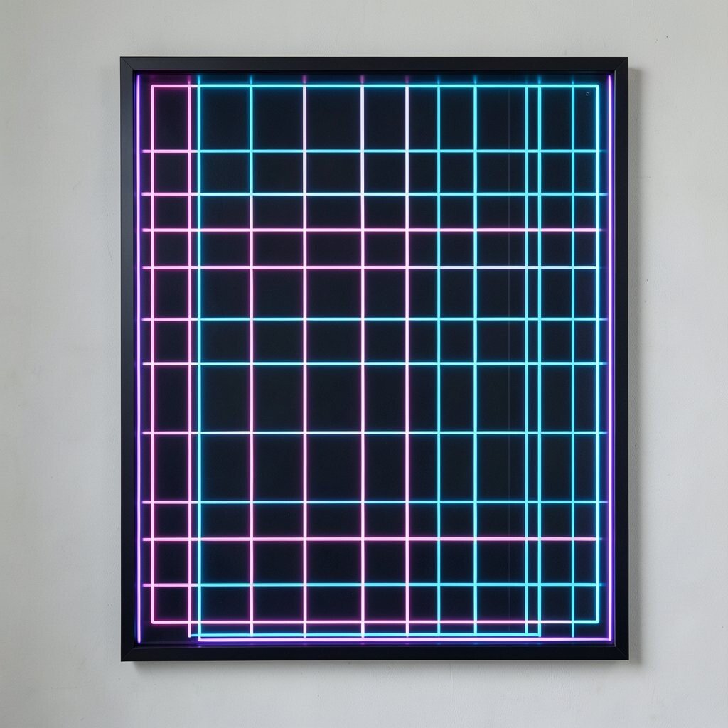
Picture a poster made from crisp squares that glow like streetlights at night. Use bright grid blocks in lime, hot pink, and electric blue, keeping the borders sharp so the layout feels organized.
This style is great for events, social posts, and quick promos because it reads fast on small screens. To make it more personal, swap one color per season and keep the grid size consistent so your brand stays familiar.
Try using a thick color border around the whole design, then place a short message inside a contrasting block for strong contrast. If you want lower cost, use a limited palette of three main colors and one neutral background, since fewer swatches are easier to reuse across a whole set of graphics.
2. Tangerine Meets Teal Split Shapes
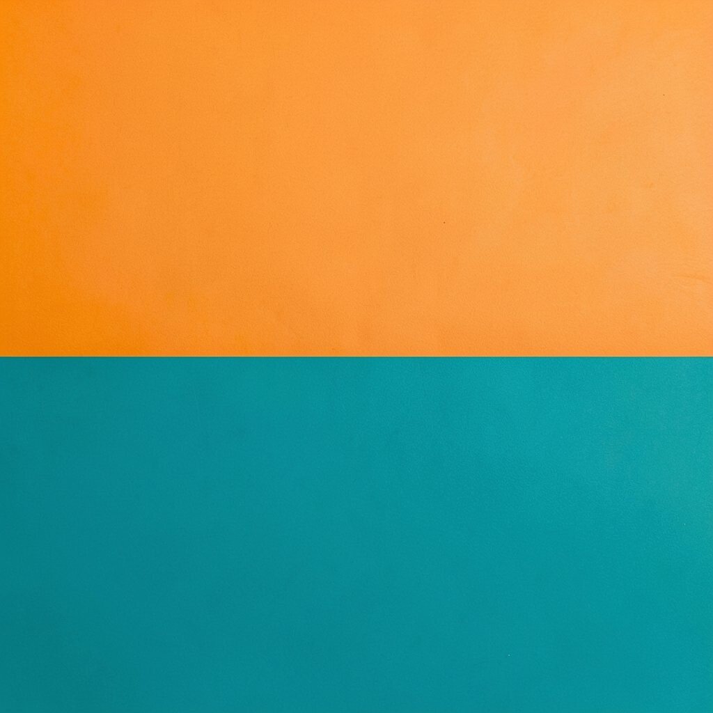
Start with a clean background, then cut the canvas into two large shapes that meet in the middle. A split design using tangerine and teal feels fresh and cheerful without looking messy.
It works especially well for banners, cover images, and product highlights because the two-color split creates clear visual focus. For practical results, choose one side for a photo and keep the other side mostly graphic, so the eye knows where to land first.
Personalize it by adding small accent islands of a third shade, like soft coral or bright yellow, in a few spots only. If you’re staying on a budget, reuse the same split layout and just change the photo and accent color across multiple posts.
3. Bold Circle Rings Around Headlines
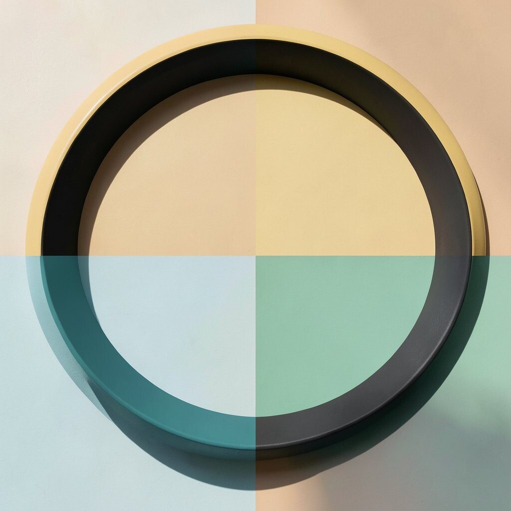
Imagine big rings that wrap around your text, like colorful halos. Use thick overlapping circles in bright yellow, fuchsia, and cyan so the headline pops instantly.
This idea is unique because the rings guide attention while still feeling playful. To keep it readable, place dark text on light blocks or light text on dark blocks, and avoid placing text directly on thin or busy areas.
You can personalize the circles by varying their sizes, then aligning one ring edge with the edge of your image for a tidy feel. For cost considerations, simple ring shapes are fast to recreate, and they work well even if you’re using free design tools.
4. Candy Stripes With Modern Spacing
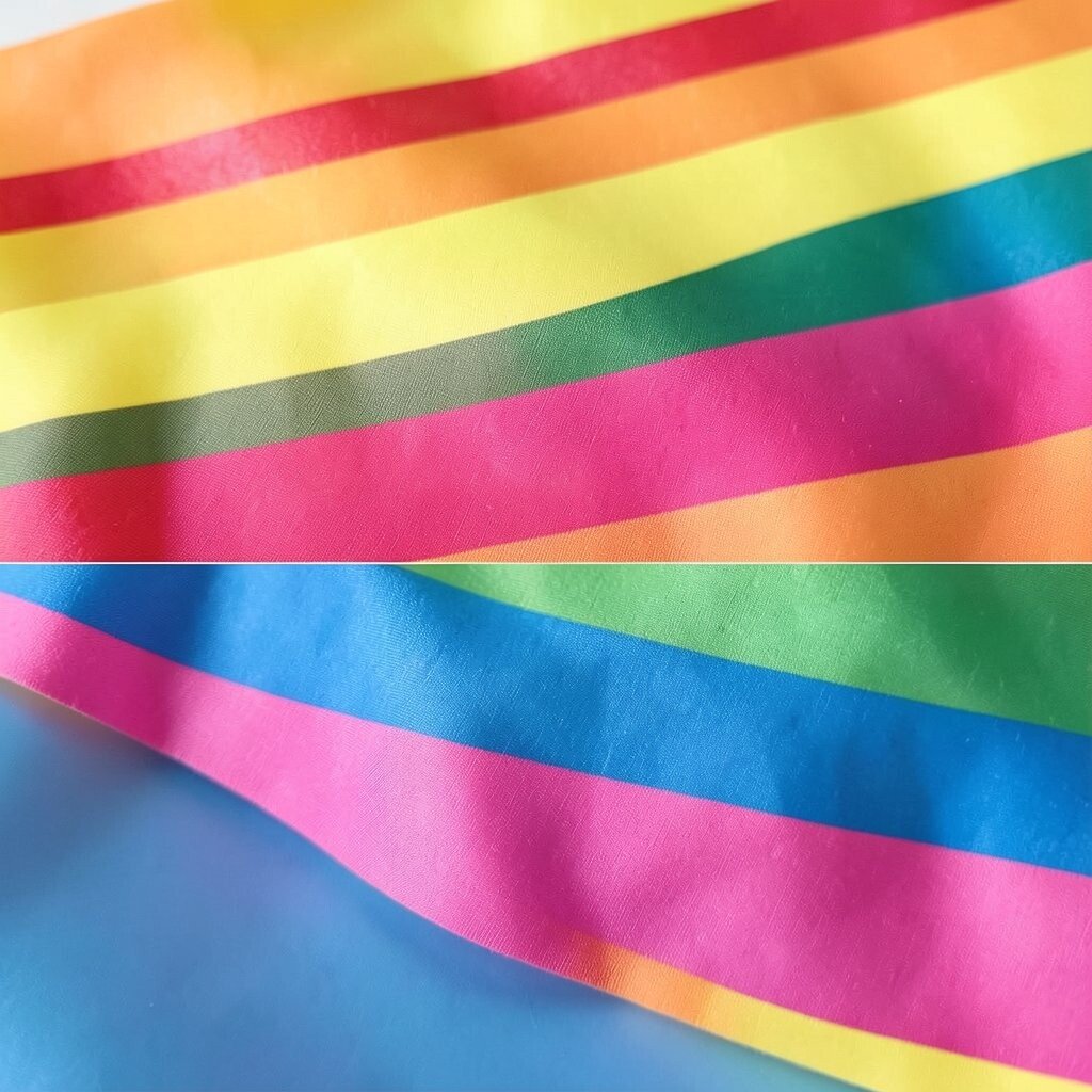
Think of diagonal stripes like wrapped candy, but spaced so they look designed, not crowded. Pick two bold colors and rotate the stripes at a gentle angle for a bright, modern look.
This style adds motion to a static graphic and can make a message feel more energetic. For practical tips, keep the stripe width consistent and leave breathing room near your main text so nothing gets lost.
5. Color Block Logo Frames
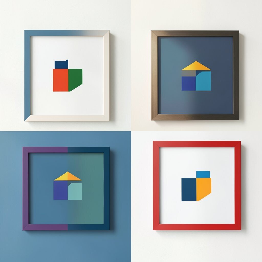
Use a strong frame around your logo by building a thick border from stacked color blocks. A bright frame in primary colors instantly makes even a simple logo feel more exciting.
This approach is beneficial when you need a consistent look across posters, social icons, and slides. To personalize, match the block colors to your brand palette and reserve one bold accent color for special campaigns.
For a practical workflow, build the frame as reusable layers so you can swap colors quickly. If you’re mindful of cost, this is one of the easiest designs to batch because the same template can become many variations.
6. Sunset Blocks With Soft Gradient Edges
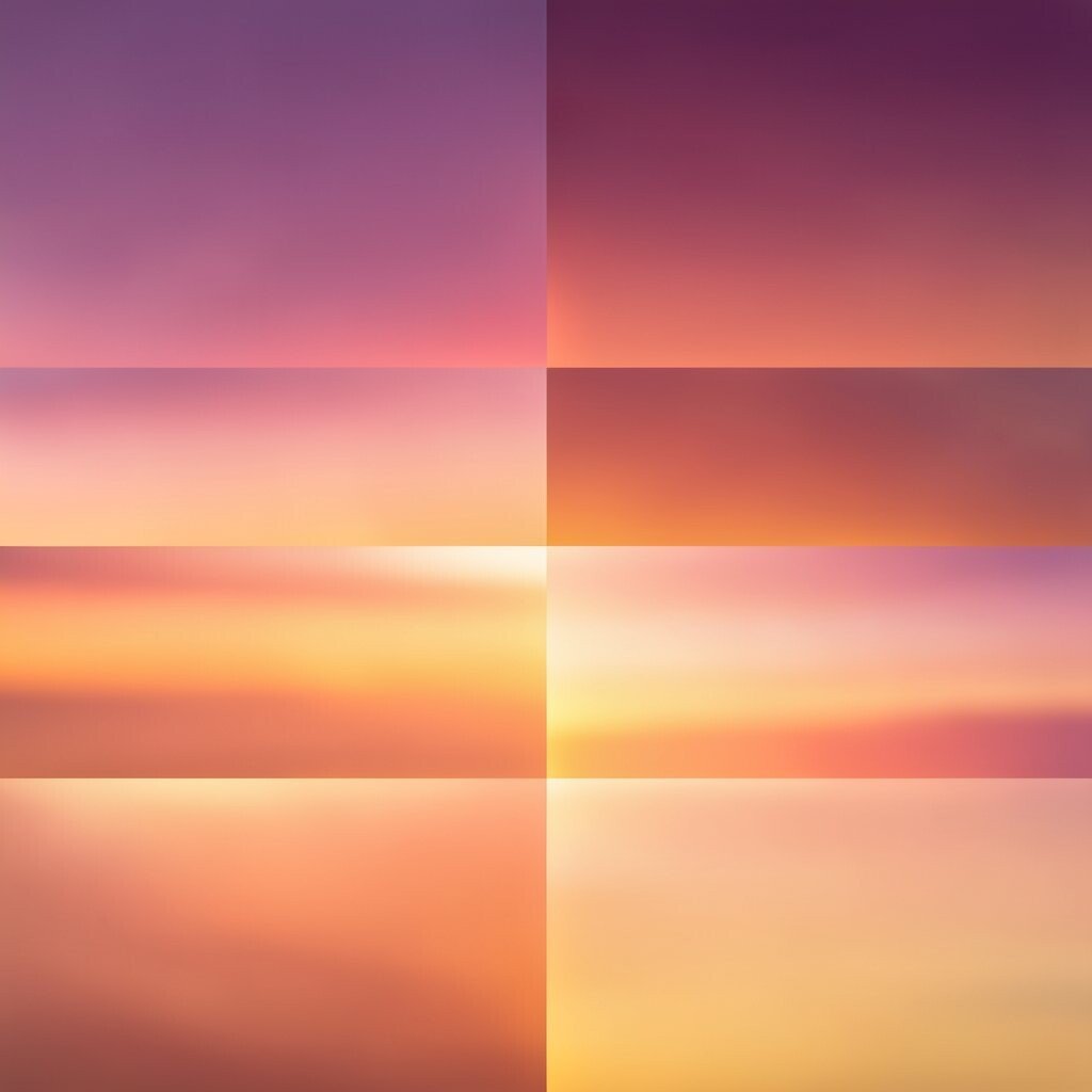
Picture layered color blocks that feel like a sunset, with teal near the top fading into warm orange and pink. Even if you keep it mostly flat, soft edges can make the shapes feel friendly and current.
This graphic style brings a calm brightness that still stands out, which is great for lifestyle brands and creative studios. Personalize it by choosing a different “sunset” combination, like magenta and amber or purple and coral, and keep the order of blocks the same for consistency.
Try pairing the blocks with one simple icon in the center so the design doesn’t feel too busy. For cost, gradients can be created with built-in tools, and you can keep the number of blocks low to make production faster.
7. Split Backgrounds Behind Photos
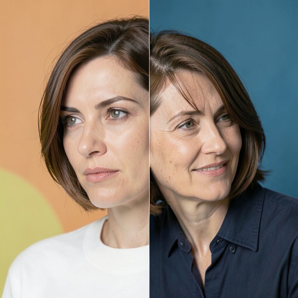
Give your photo a two-tone backdrop by placing a color block behind the image that changes at a straight line. The result looks sharp and editorial, especially when you choose a cool color on one side and a warm color on the other.
This method is useful because it helps the photo stand out without adding extra clutter. To make it feel uniquely yours, add small matching blocks near the corners, like tiny rectangles that echo the background split.
For personalization, use a consistent split angle across your whole set so your feed looks cohesive. If you want to keep costs down, use your existing photos and only adjust the background shapes, since that’s quicker than redesigning everything.
8. Checkerboard Accent Panels
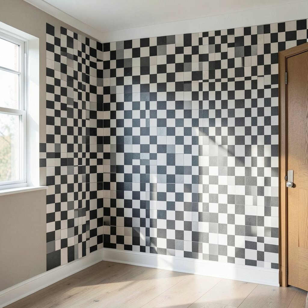
Use a checkerboard strip like a border that runs along the edge of your graphic. Pick two bright colors, then keep the checker size small enough to look neat.
This gives a fun rhythm and helps frame a title or call to action without heavy decoration. For practical tips, place the checkerboard behind text carefully so it stays readable, and use a neutral overlay if needed.
9. Bold Diagonal Corner Bursts
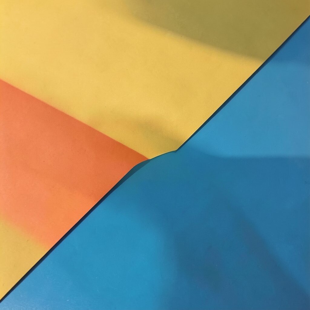
Imagine a corner of your canvas exploding into color blocks that angle toward the center. These diagonal bursts are playful and great for highlighting a tag, date, or short phrase.
The benefit is clear visual hierarchy, because the burst naturally pulls the eye to the top corner. To personalize, use one brand color plus two bright supportive shades and keep the burst style consistent across a series.
Try making the burst out of larger blocks first, then add a tiny narrow strip for a finishing touch. For cost considerations, corner shapes are easy to duplicate and recolor, so you can build multiple versions quickly.
10. Pastel Meets Punchy Mini Blocks
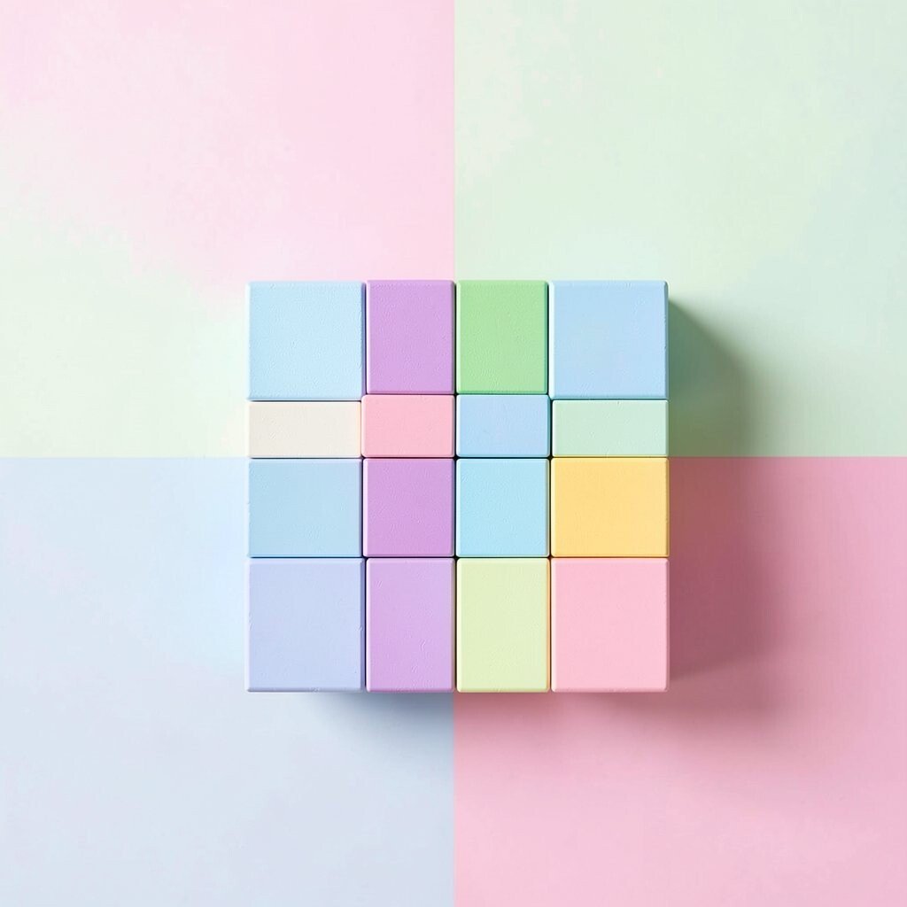
Start with a mostly light background, then add small punchy blocks scattered like confetti. The contrast between pastel and bright colors makes the whole design feel lively.
This is unique because it keeps brightness from overpowering the layout, which can feel more friendly for everyday audiences. For practical tips, limit the bright blocks to one main area so your message stays readable.
Personalize by changing the placement pattern, like clustering blocks near the headline or along a photo edge, while keeping the overall style the same. If you’re keeping costs in check, small shapes are fast to create and you can reuse the same template for many posts.
11. Color Block Photo Collage Borders

Create a collage where photos sit inside thick color block borders. Use different colors for each border so the collage looks energetic, but keep spacing consistent for a clean finish.
This layout is beneficial because it turns many images into one clear story. To personalize it, choose one “hero” border color for the most important photo and keep the others supporting.
For practical tips, keep the borders a similar width and avoid adding too many colors at once. In terms of cost, this design is efficient because you can swap photos while holding the border template steady.
12. Horizontal Banding With Big Type
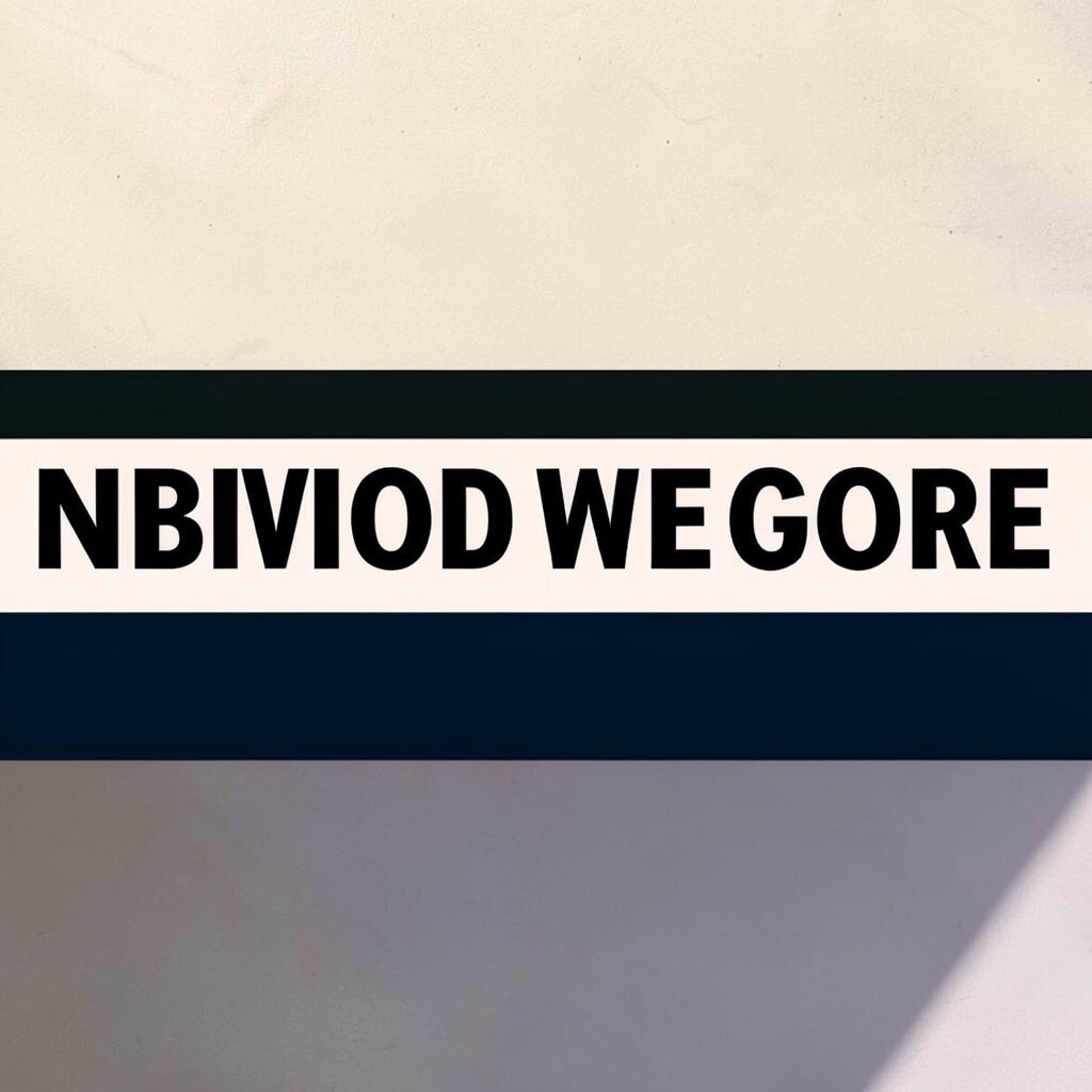
Build your design from stacked horizontal bands that run across the width. Add big, simple type that sits on one band, then use contrasting colors to make the letters feel electric.
This style works well for announcements, posters, and social covers because readers can scan it in seconds. Personalize it by using your brand font for the type while keeping the bands as a consistent framework.
To keep it from feeling flat, add one small block element that breaks the pattern, like a short vertical rectangle. Cost-wise, banded layouts are easy to remake and can be produced quickly in batches.
13. Pop Art Panels With Straight Outlines
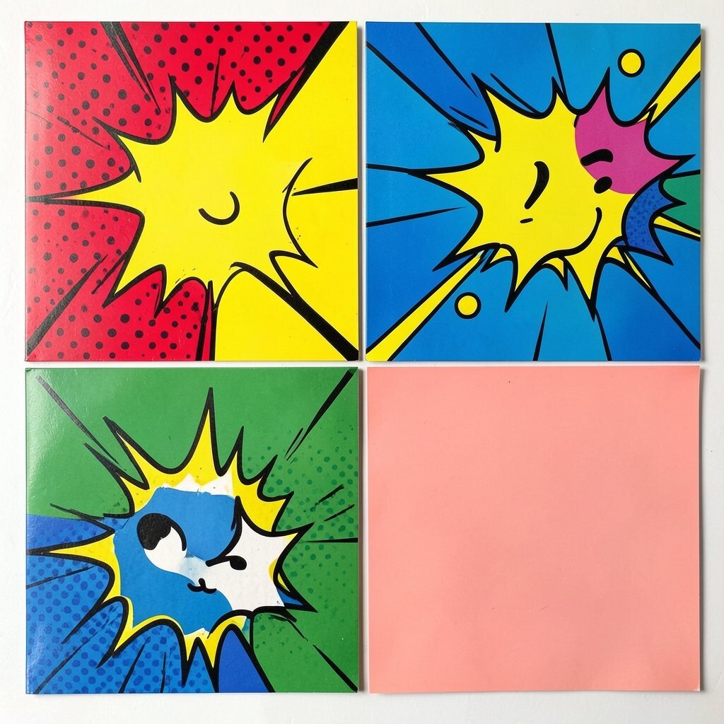
Think of pop art but simplified into strong blocks and straight lines. Use bold colors like bright teal, vivid red, and sunny yellow, then separate sections with clean outlines.
This idea feels current because it mixes classic punchy style with modern spacing. For practical tips, keep outlines thin and consistent so the graphic doesn’t look messy at small sizes.
Personalize by choosing a theme, like sports, food, or music, and match the block shapes to that vibe. If you’re budget conscious, you can make this style using basic shapes and a limited palette, which saves time and effort.
14. Geometric Ticket Stubs and Labels
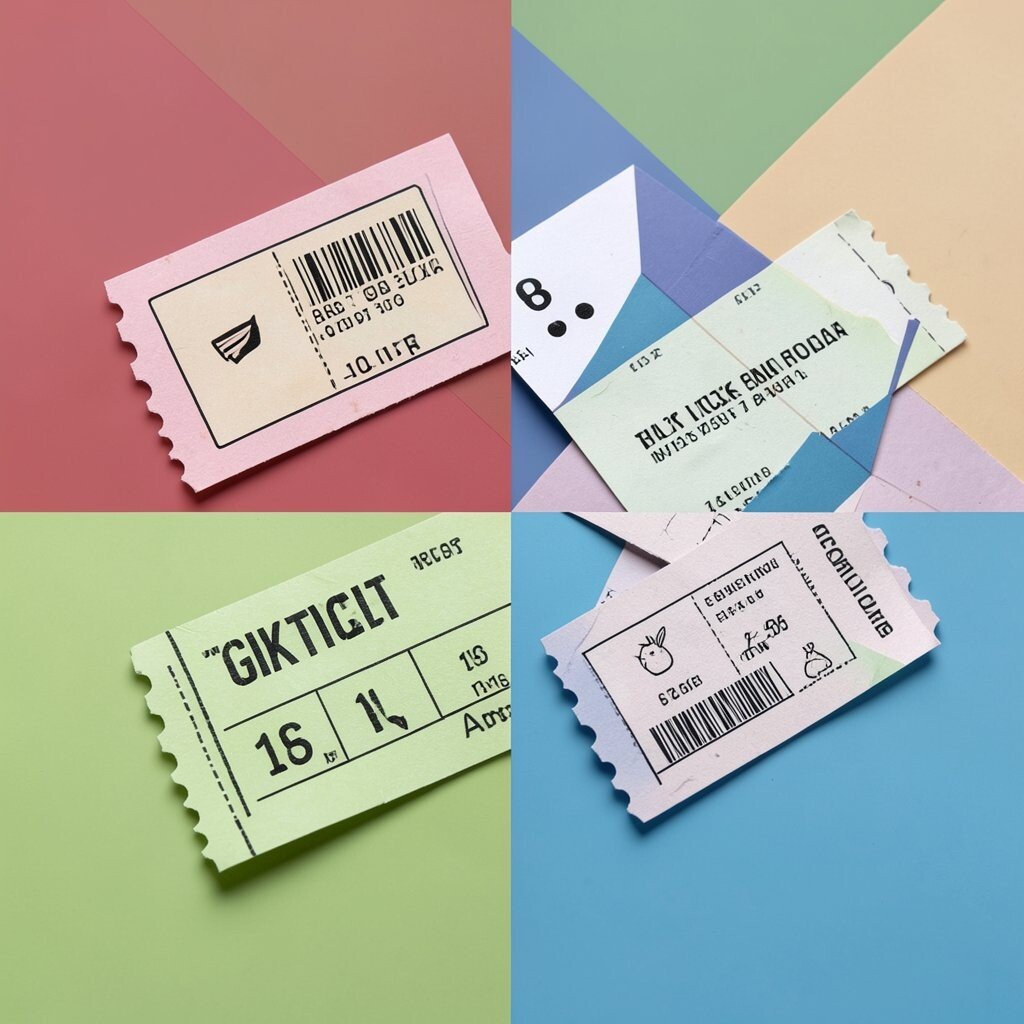
Design a graphic that looks like a set of ticket stubs made from color blocks. Use rectangles with angled ends or small notches, then add bold labels in contrasting shades.
This style is unique because it adds a sense of play and collectability, which helps social posts feel more memorable. To keep it practical, use short text segments and align them to the same rhythm across the design.
For personalization, create a series where each “ticket” uses one different color and the same icon style. On cost, you can reuse the same stub shapes and only change the label text, so producing multiple variations stays fast.
15. Vertical Stripes With Centered Logo Stamp
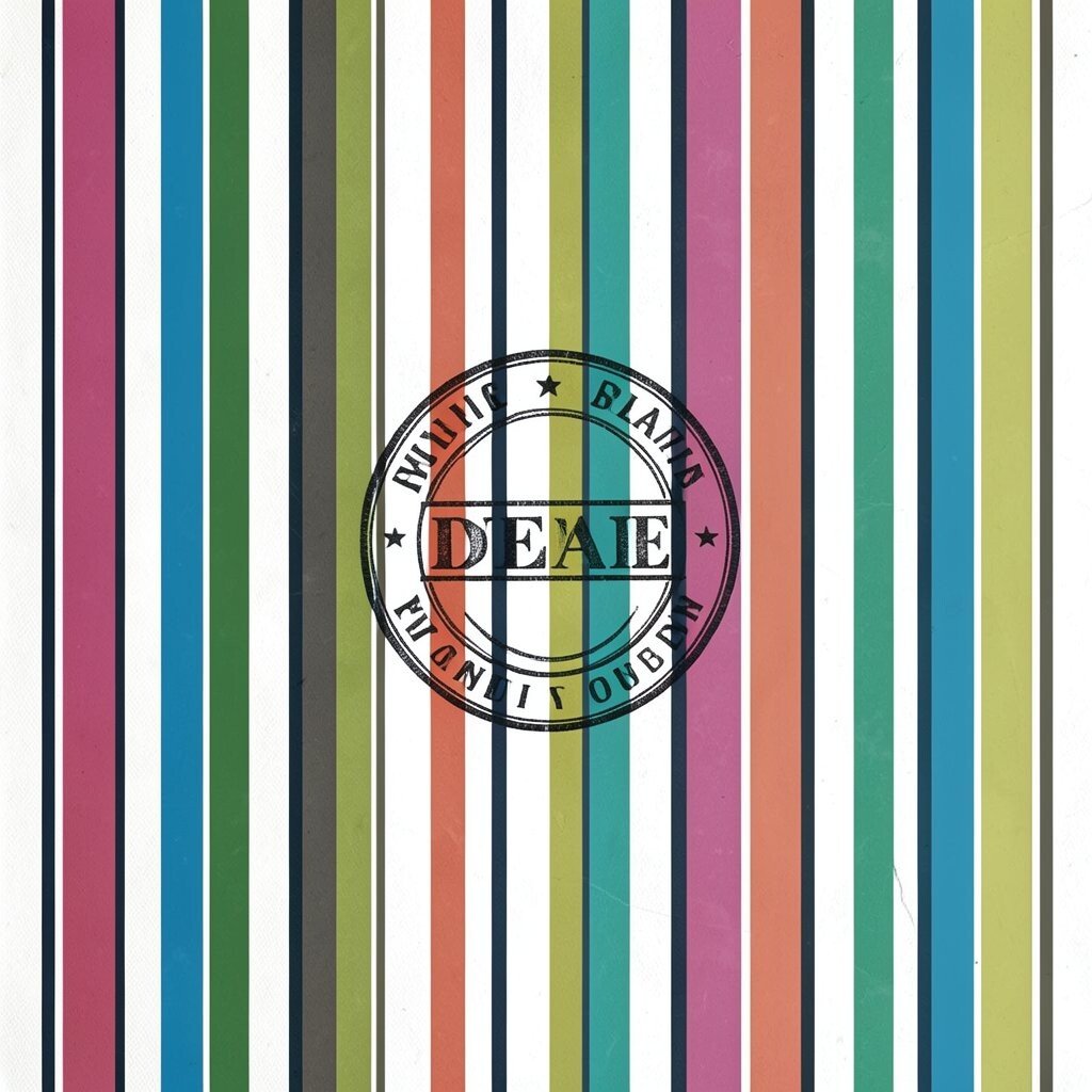
Use vertical color stripes that run behind a centered logo stamp. A thick stamp in a neutral or opposite bright color can make the whole piece look bold and balanced.
This is beneficial for branding because it keeps your logo in a steady place while the background brings energy. Personalize it by changing the stripe colors based on the campaign mood, like cool colors for summer and warm colors for fall.
Try using one stripe color repeated across the set to create a recognizable signature. For cost considerations, stripe backgrounds are quick to generate and easy to reuse, especially if you keep the stamp style identical.
16. Color Block Confetti Borders for Social Stories
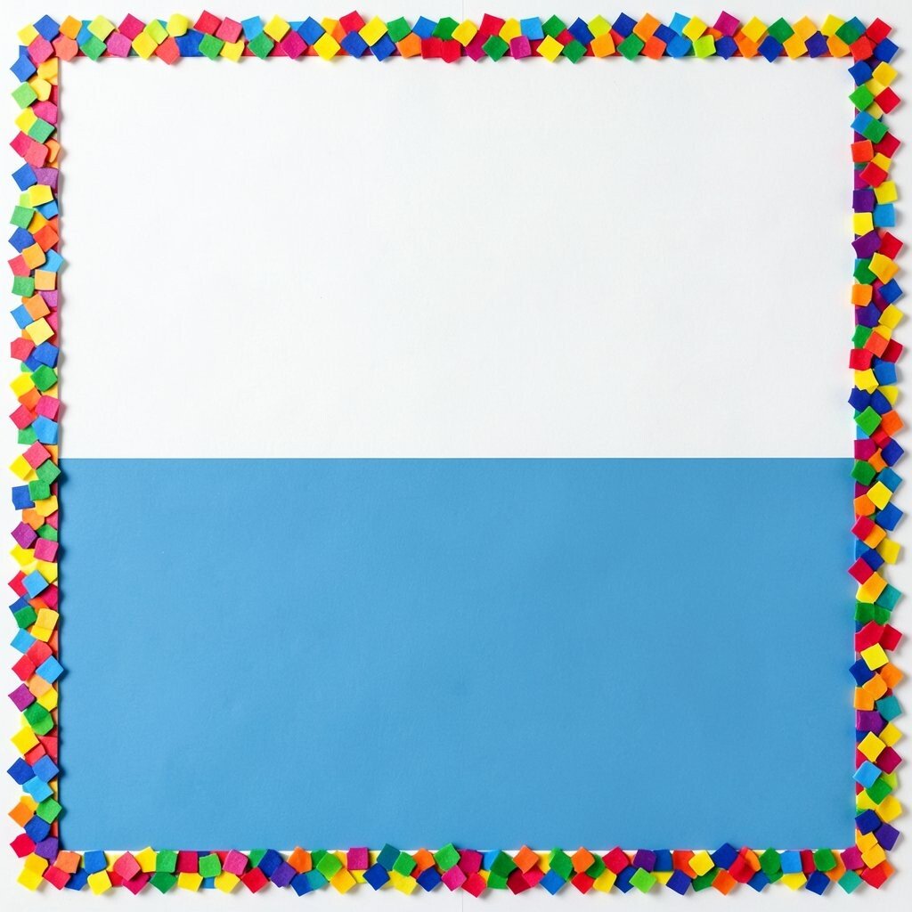
Frame your content with a confetti border made of tiny rectangles and squares in bright colors. Keep the confetti along the edges so your main text and image remain clear.
This style is great for stories, short videos, and announcements because it adds brightness without blocking the center. To personalize, mix in one darker shade for depth and vary the confetti density so it looks intentional.
For practical tips, keep the border thickness consistent and avoid using too many bright colors at full strength. If you’re thinking about cost, you can generate the confetti with a small set of shapes and duplicate them, which speeds up production a lot.