The canvas is ready for you to make patterns that feel alive. Small choices in texture and rhythm can turn simple surfaces into personal stories.
1. Constellation Dots With Controlled Spacing
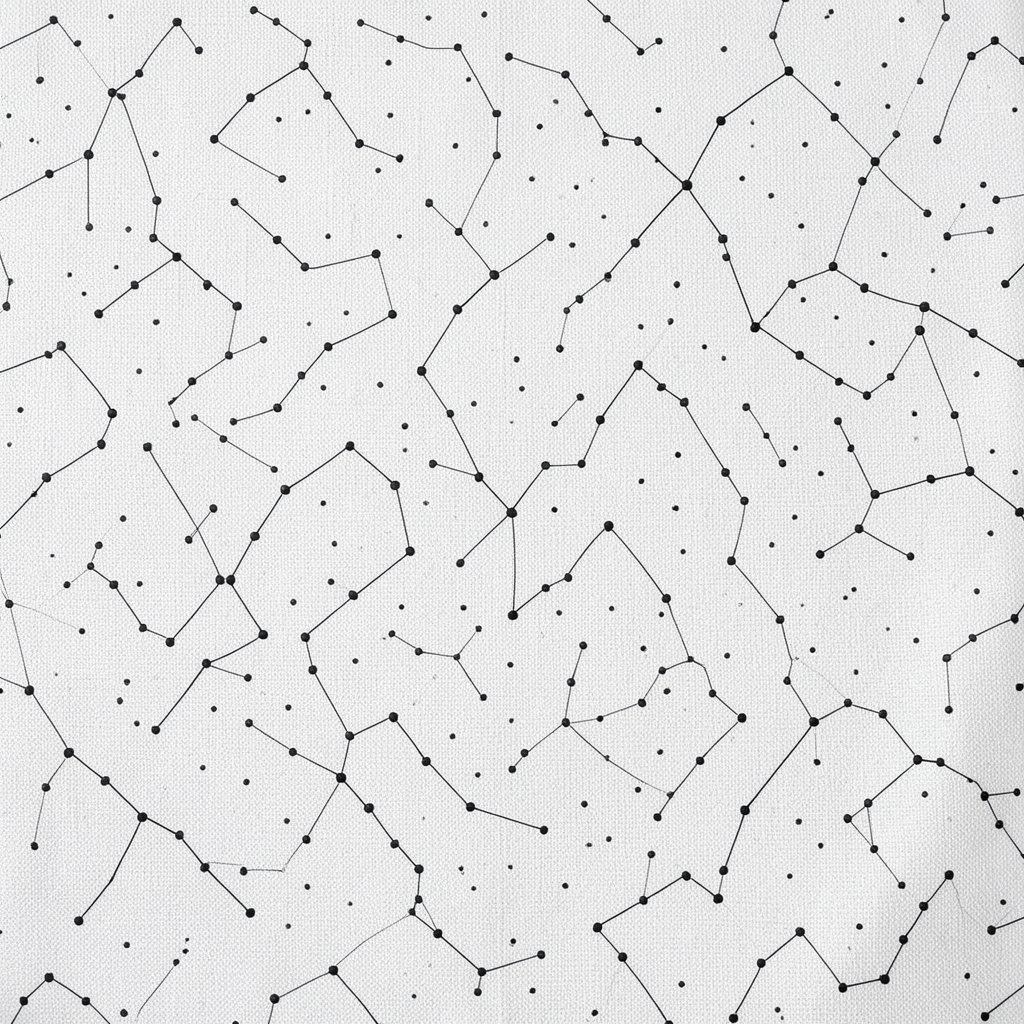
Imagine tiny points floating like night sparks across your canvas. You can vary the size slightly so the pattern feels natural instead of stamped.
Use a pencil to map a loose grid, then paint dot clusters with a round brush or a dotting tool. For a gentle look, try a limited palette like navy, cream, and muted gold. Keep gaps consistent so the design reads clearly from a distance, and let the edges fade with a soft rinse of paint.
2. Layered Rings That Look Like Ripples
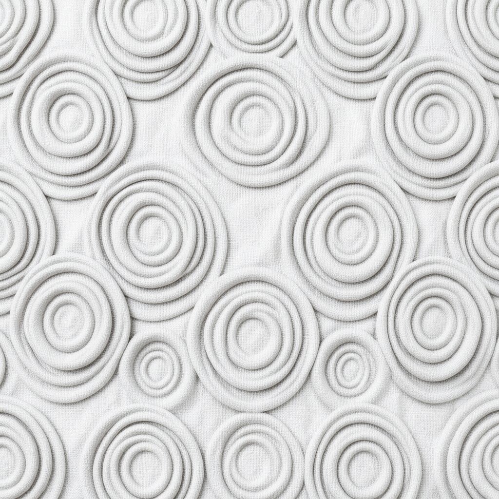
Picture smooth circles spreading outward like water after a stone lands. When rings overlap, they create a calm rhythm that feels satisfying to repeat.
Start with one center ring and paint wider rings, alternating colors so each band stays visible. Use thin paint for the early rings and thicker paint for the later ones to add depth. Leave tiny breaks in a few rings so it looks hand-made, not perfect-machine.
Try adding one ring in a brighter color to pull the eye toward the middle. If you want a trendy look, mix matte rings with a glossy highlight using a gel medium or clear gloss on top. For cost, you can use acrylic craft paint and a cheap sponge to dab highlights.
3. Brushstroke Stripes With Misty Edges
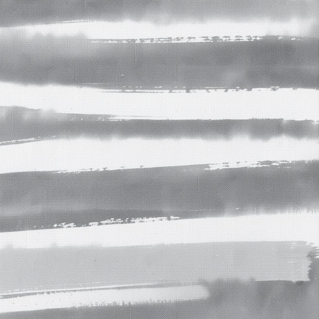
Think of bold stripes that soften at the ends, like wind moving through grass. The contrast between sharp lines and blurred edges makes the whole canvas feel energetic.
Load your brush with paint, then lightly drag the brush across water or a wet palette before laying down each stripe. Rotate the angle of your hand as you paint so the stripes vary subtly. To personalize, choose stripe directions that match a mood, like diagonal for movement or horizontal for calm.
When you let the edges blur, you also hide small mistakes. This style is popular in modern mixed media, especially when artists add layers and half-dry paint for texture. For budget-friendly results, use a flat house-paint brush that holds a wide stroke well.
You can also stamp a few stripes using a cardboard strip so the pattern feels graphic and handmade at once.
4. Geometric Tiles in Uneven Grout Lines
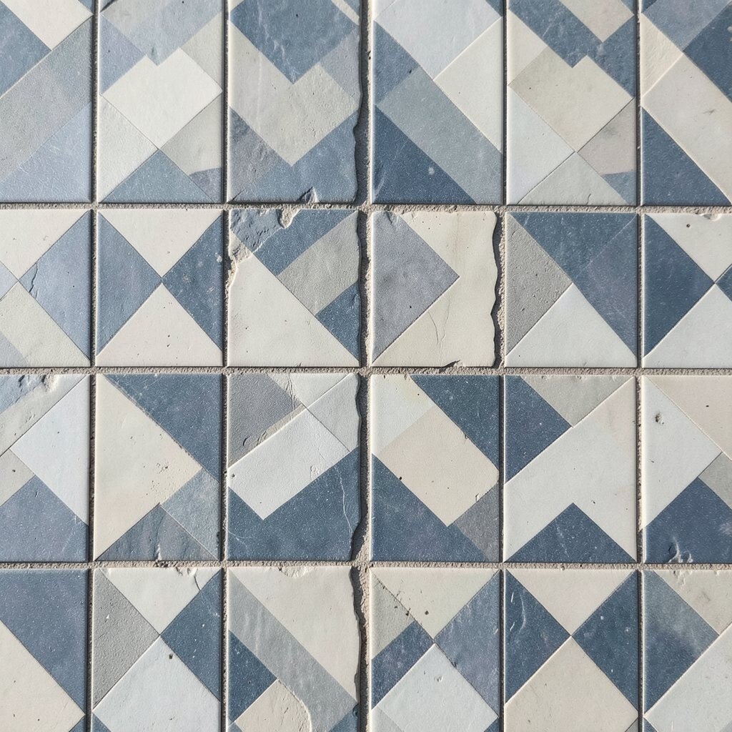
Picture a mosaic where the tiles don’t line up perfectly, like old floor patterns in a cozy alley. The slight misalignment makes it feel warm, not rigid.
Sketch tile outlines lightly, then fill each shape with a different pattern like dots, lines, or tiny chevrons. Let your “grout” lines stay slightly thick by using a dark color and steady pressure. For uniqueness, alternate warm and cool colors so the canvas has a gentle push and pull.
Personalize it by using colors from something you love, like a favorite scarf or a kitchen tile. If you like a current trend, add one metallic tile using inexpensive metallic craft paint. For cost control, keep most tiles simple and reserve detailed patterns for just a few focal shapes.
When painting, work from the background shapes forward so layers stay clean. Finish by wiping a little paint off the tile edges with a damp cloth to sharpen the mosaic effect.
5. Vintage Wallpaper Roses With Repeating Corners
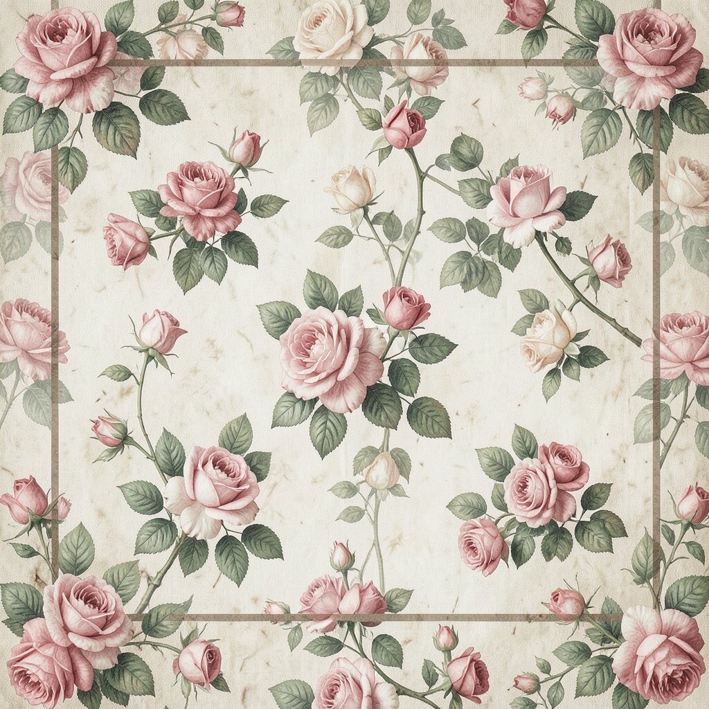
Imagine small rose clusters repeating across the corners like a vintage room. The pattern feels romantic, yet still playful on a modern canvas.
Draw a light framework of four corner boxes, then paint one rose motif and repeat it around the edges. Keep the center area a calmer color so the corners do the work. Use a thin liner brush for petals and a dot for the flower center to make it easy to control.
To personalize, swap roses for the flowers you actually like, such as daisies or tiny poppies. For a current look, add a muted background texture and let the blooms stay slightly imperfect. If you’re watching cost, paint roses using just two tones and mix a third tone from what you already have.
Once the corners feel balanced, add small leaf shapes between motifs to make the repetition feel richer.
6. Zebra Stripes With a Hand-Painted Rhythm
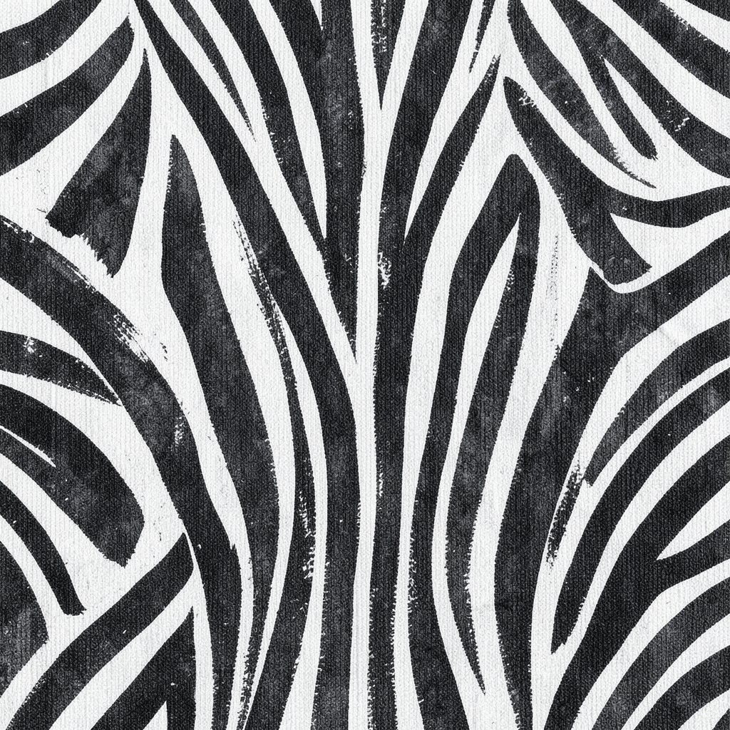
Picture bold black-and-white stripes that feel like they’re moving across the canvas. The trick is to keep them consistent enough to read, while letting the paint show your motion.
Start with a base coat, then paint stripes using a medium brush and vary the thickness slightly. Add small “gaps” where skin-like negative space shows through so it feels airy. A fun personalization idea is to use colors you love instead of classic black and white, like teal and cream or charcoal and blush.
To keep it trendy, add a soft watercolor wash behind the stripes so the background looks atmospheric. For cost, use acrylic craft paint and a cheap liner brush for the fine edges. Finish by lightly sanding or wiping once dry to create a softer stripe texture.
7. Contour Lines That Reveal Hidden Landscapes
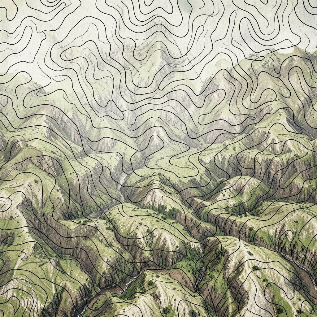
Imagine contour-like lines that form hills, faces, or waves when you step back. The pattern acts like a map that slowly turns into a scene.
Choose a simple subject such as a mountain outline, a profile face, or a shoreline. Then draw repeating contour lines around that subject, layering in a few colors. Keep your line spacing consistent, and use a darker color for the outer shapes to anchor the composition.
Personalize the landscape by adding tiny pattern details like dots for trees or short dashes for grass. This style fits current trend lines where artists use linework and negative space together. For a budget approach, a black paint pen or thin brush with a small bottle of black acrylic keeps things simple.
8. Washi Tape Inspired Patterns Without Tape
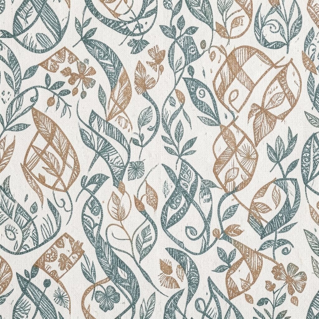
Picture clean edges and playful color blocks that look like tape pieces on a wall. Even without real tape, you can imitate that crisp “stuck-on” vibe.
Paint a base color, then use masking fluid or painter’s tape on the canvas if you have it. If you want to avoid tape costs, freehand thin borders using a ruler and a steady brush. Add small geometric panels inside the borders, like circles or tiny stripes, and keep the shapes varied but not chaotic.
9. Foil Leaf Shapes With Soft Crackle Texture
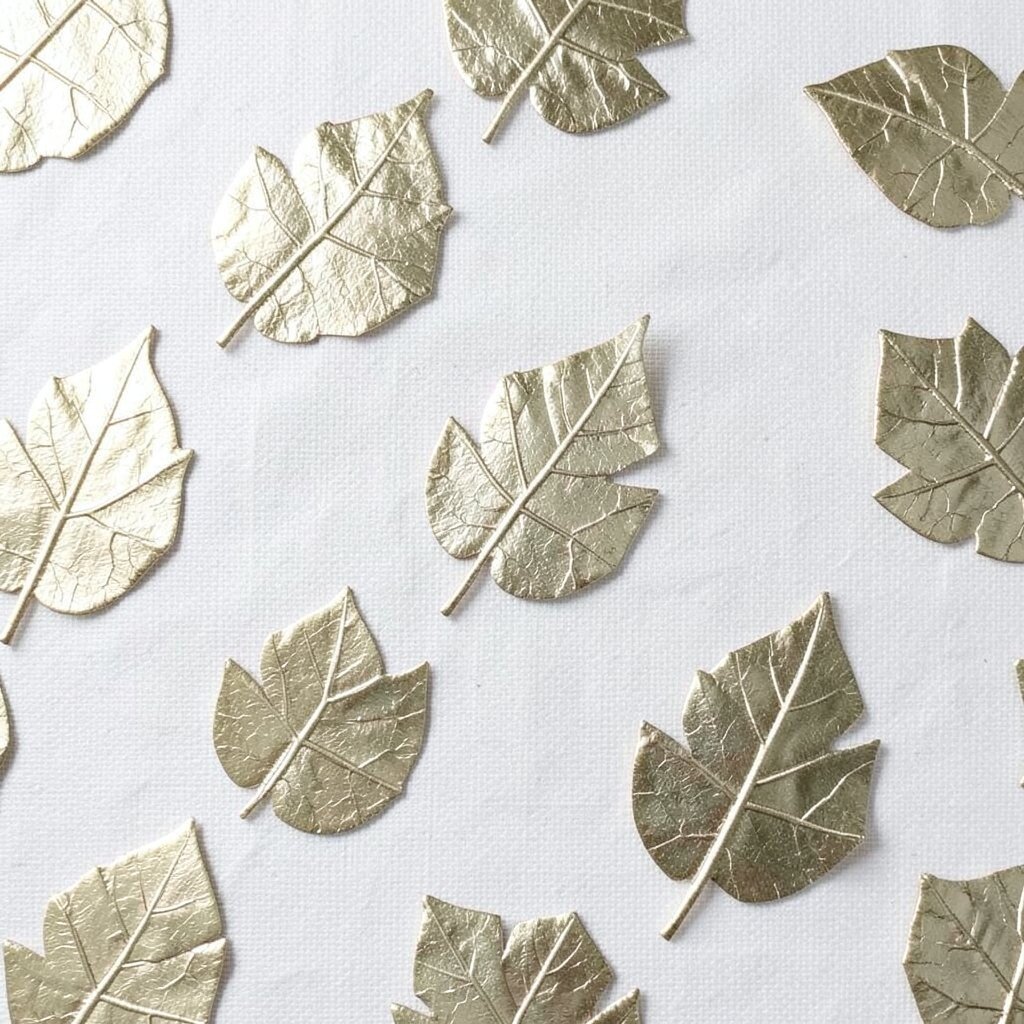
Imagine leaf silhouettes that look shiny in the right light. You get that organic pattern feel without needing perfect drawing skills.
Paint leaf shapes loosely using a template or by tracing from a real leaf. While the paint is still tacky, press in texture using crumpled paper or sponge dabs. For cost savings, use craft foil or even metallic paint layered over darker tones instead of expensive mixed media materials.
Personalize by mixing leaf types, like wide maple shapes with small fern-like fronds. A trend right now is combining nature motifs with bold color blocks, so try a bright background like coral or deep teal. Add crackle with a simple medium or even by thinning paint and letting it dry in uneven patches.
When you step back, the leaf pattern should read clearly, and the texture should catch light like tiny surprises.
10. Checkerboard Blocks With Unequal Size Squares
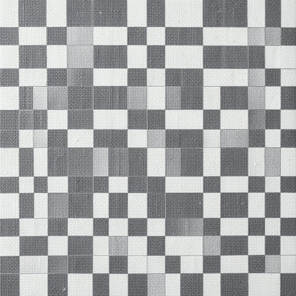
Picture a checkerboard where the squares don’t match every grid line. That change makes it feel playful and modern instead of classic and strict.
Sketch a simple grid, then resize a few squares so they look slightly stretched. Fill alternating blocks with two contrasting colors, then pick one or two special squares for extra detail like tiny patterns or gradients. Let the bigger squares act like anchors, and keep smaller ones quick and simple.
11. Diagonal Hatching That Builds a Color Glow
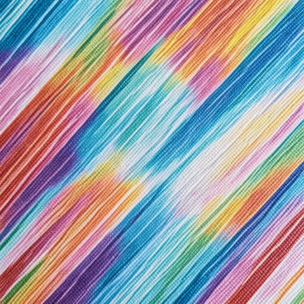
Imagine diagonal lines stacking so densely that they create a soft glow. This is a great way to make a flat color feel textured and lively.
Start with a base wash, then draw diagonal hatching lines across the canvas. Vary pressure so some lines are bold and others are barely there. If you want personalization, choose different line directions in different sections, like diagonals on one side and near-horizontal lines on another.
For uniqueness, layer another set of hatch lines in a second color after the first one dries. This method matches current “graphic texture” looks and works well with mixed media. For cost, you only need paint and a basic brush, or even a fine marker if you’re using acrylic-compatible ink.
12. Hand-Stitched Dashes Across a Painted Background
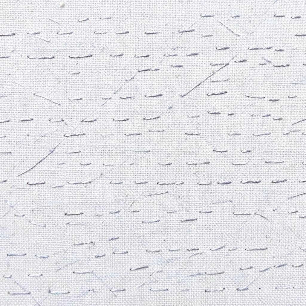
Picture tiny stitch marks running across your canvas like a craft project. It feels cozy, and it gives the eye a gentle path.
Paint a soft background first, like warm beige or cool gray. Then add dashed lines with a liner brush, spacing them evenly at first. Switch to different dash lengths in one area to create a subtle focal point, and use darker paint for contrast.
To personalize, stitch around painted shapes such as circles, stars, or clouds. This technique is popular in contemporary art because it mixes illustration with painting. Keep supplies low by using one strong thread-like color, like deep brown, instead of many colors.
13. Stamped Circles With Uneven Edge Variations
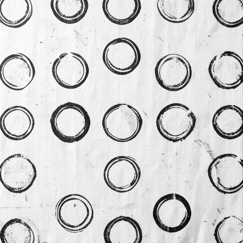
Imagine circle stamps that aren’t identical, like hand-carved cookie cutters. The irregular edges make the pattern feel alive and imperfect in a good way.
Use a sponge, bottle cap, or cut foam piece to stamp circles across the canvas. Try alternating colors in a repeating sequence so it stays organized. Leave some circles partially off the edge so the design feels like it continues beyond the frame.
Personalize by stamping different sizes in different zones, such as small circles in the top corner and larger ones near the center. This is a friendly trend in modern art that leans into repeatable textures. For cost, you can make your stamps from cardboard, cork, or household items.
Let each layer dry before adding new colors, or the stamp edges may blur too much for the look you want.
14. Wave Patterns With Negative Space Bands
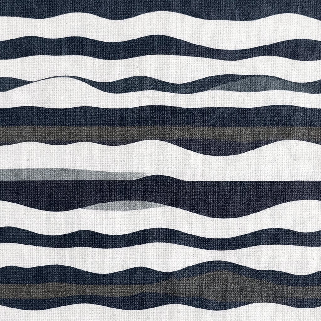
Picture waves drawn as bands where the background color forms part of the design. Negative space gives the pattern a clean, almost design-studio feel.
Paint a solid background color, then plan wave bands using light pencil curves. Fill only some bands with paint and let other bands stay as background so the pattern breathes. Use a consistent wave height for calm, and vary wave width for drama.
To personalize, place the waves so they frame a central shape, like a sun, a moon, or a letter. This style fits current trends that celebrate clean shapes and strong contrasts. For cost, choose two main paint colors and rely on background color to do the rest.
15. Petal Geometry Combining Curves and Triangles
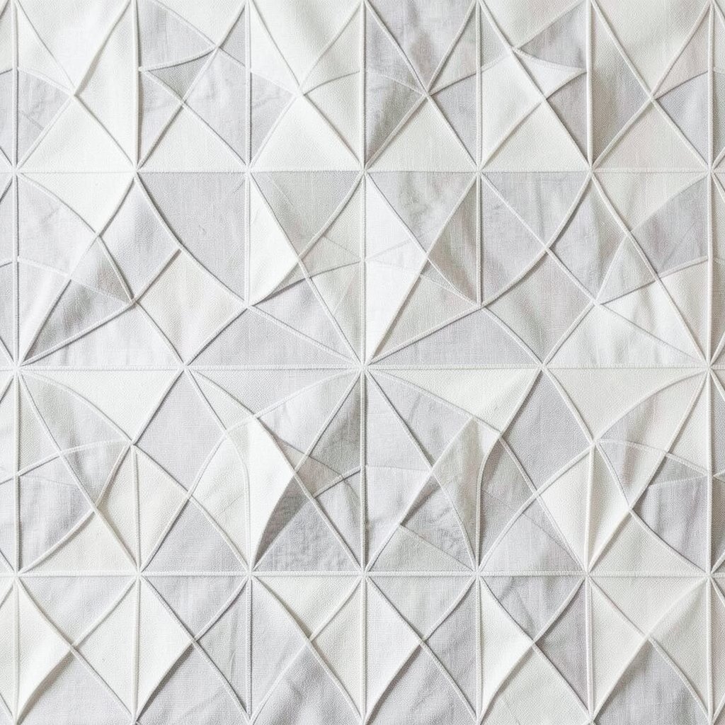
Imagine petals formed from curves but edged with triangles like a flower-shaped badge. It feels bold, detailed, and still very doable.
Start with a simple flower center, then draw curved petal outlines around it. Add triangular sections inside each petal so every petal has a built-in design. Keep the triangle sizes consistent for a neat look, or vary them for a more playful style.
Personalize by selecting a color for each petal segment, or by using one color repeated with different shades. A trending look right now is combining floral motifs with graphic geometry, especially in colorful modern posters. For cost, limited colors plus black linework can produce a striking effect quickly.
16. Ombre Stripes That Fade Like Sunset Fabric
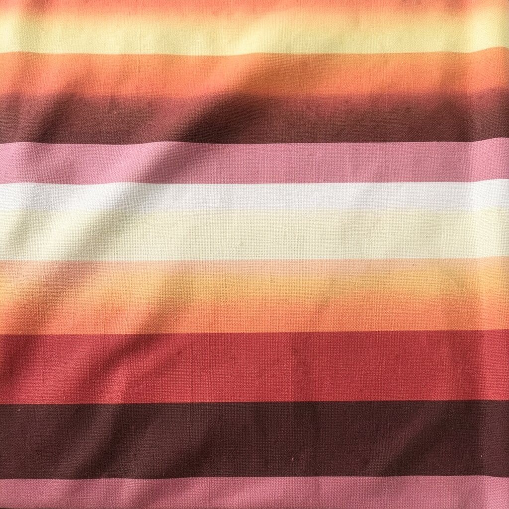
Picture stripes that fade smoothly from one color to another, like fabric dyed by sunlight. The pattern feels soft and calming, yet it still has structure.
Paint parallel stripes in a base color range, then blend the edges between stripes using a damp brush. Work slowly so the fade looks smooth instead of muddy. Add a darker stripe near one side to create depth and guide the eye across the canvas.
To personalize, choose ombre directions that match your mood, like vertical for a tall feeling or diagonal for movement. This type of gradient pattern stays popular because it photographs well and looks modern in any room. For cost, use basic acrylic colors and mix small amounts for intermediate tones rather than buying many bottles.
17. Random Polka Sprays With Controlled Color Clusters
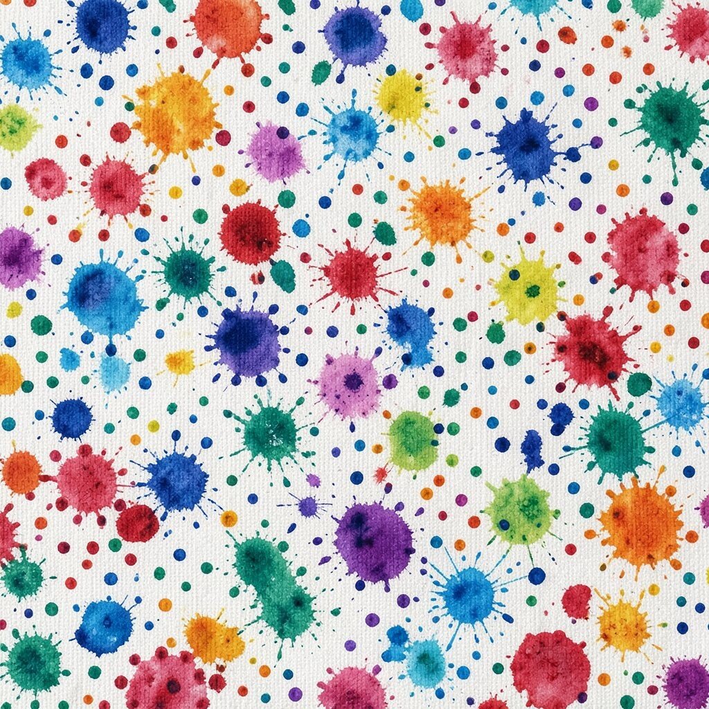
Imagine a confetti-like canvas where clusters of dots feel intentional. The randomness becomes beautiful when you guide where the colors gather.
Load a stiff brush or toothbrush with paint and practice on scrap paper first. Sprinkle dots in a few color zones, then soften transitions by using fewer dots between zones. Keep one color dominant so the pattern doesn’t overwhelm the whole canvas.
Personalize by shaping the dot clusters into a loose heart, star, or swirl without drawing strict outlines. This technique matches current “texture play” styles seen in art prints and social media. For cost, you can dilute paint with water for lighter shades and stretch your colors farther.
18. Maze Corners With Tiny Squares and Loops
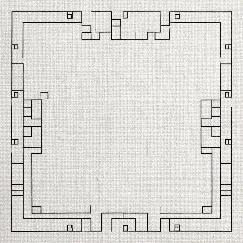
Picture a corner of your canvas turning into a mini maze that invites the eye to travel. Even if you only draw a small area, it feels detailed and surprising.
Start by sketching a maze path in one corner, then fill around the path with repeating tiny squares or loop shapes. Use one or two dark colors and one accent color so the pattern stays readable. Personalize it by choosing loops that match your favorite shape, like circles for whimsy or small teardrops for elegance.
For uniqueness, let the maze stop mid-way into blank space so it feels like a secret. This approach aligns with trends that use partial details and strong negative space. For cost, you can keep materials simple and rely on one fine brush for controlled lines.
19. Geometric Flower Mandalas With Soft Center Breathing Space
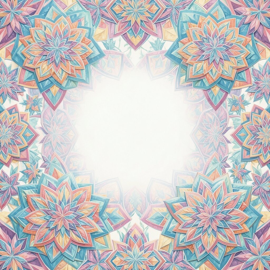
Imagine a mandala built from repeated shapes that radiate from the center. The magic happens when the center has room to feel calm.
Draw a faint circle, then place triangles, curved petals, or small squares around it like a wheel. Keep the center relatively simple, then add more complex shapes as you move outward. Use alternating colors so each ring stands out.
Personalize by using colors that match your home decor or by referencing a meaningful symbol. Mandalas remain a popular trend because they balance structure with personal meaning. For budget considerations, you can stick to a limited set of colors and vary the pattern intensity instead of buying more paint.
When you finish, outline a few shapes with a darker shade to crisp the pattern and boost contrast.
20. Brick Pattern With Hand-Let Rough Edges
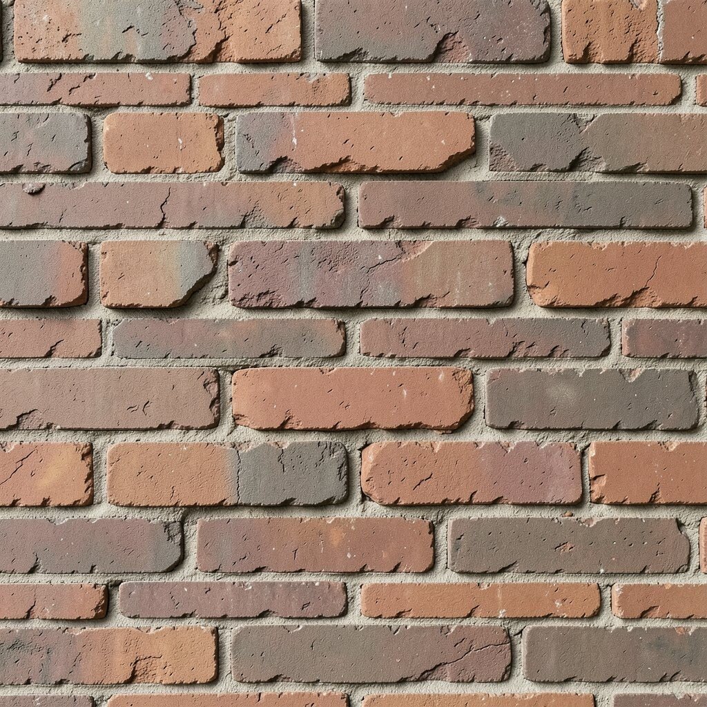
Picture a painted wall made of bricks, but with brushy, handmade edges. It feels sturdy and cozy, like you’re standing in a small studio.
Sketch a brick layout with staggered rows, then paint each brick with subtle shade differences. Use a wash to blend edges so the wall looks realistic but still artful. Add thin “mortar” lines in a contrasting shade to keep the pattern crisp.
Personalize by adding stains, splatters, or small symbol marks on a few bricks. This style feels current when paired with clean modern colors, like sage green and warm sand. For cost, you can mix mortar color from existing paint and stretch variations with simple dry-brushing.
21. Rhythm Arcs Like Music Notation Without Letters
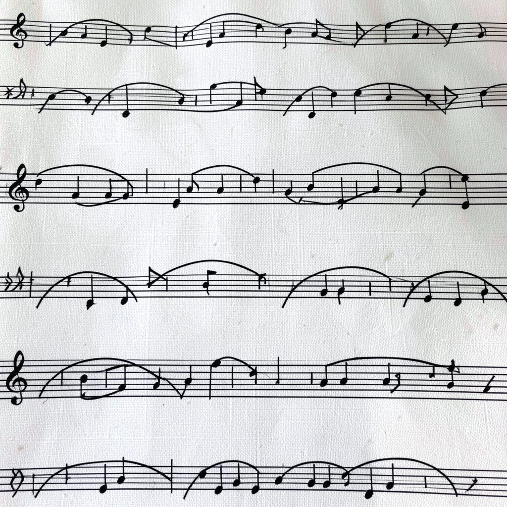
Imagine arcs that rise and fall like a song, with beats shown only through paint. The canvas feels lively even without words.
Draw long curved arcs across the surface, then add small marks along the arcs to represent beats, like dots or short lines. Alternate between thick and thin arcs so the visual rhythm feels consistent. Use a bright accent color for a few beats so it feels like a chorus.
To personalize, vary the arc height and add one cluster of higher arcs near a focal point. This technique fits modern “data-like” and “movement” art trends where marks suggest sound or motion. For cost, a couple of brushes and a limited palette can create a full feeling without extra materials.
22. Layered Stencil Shapes With Offset Shadows
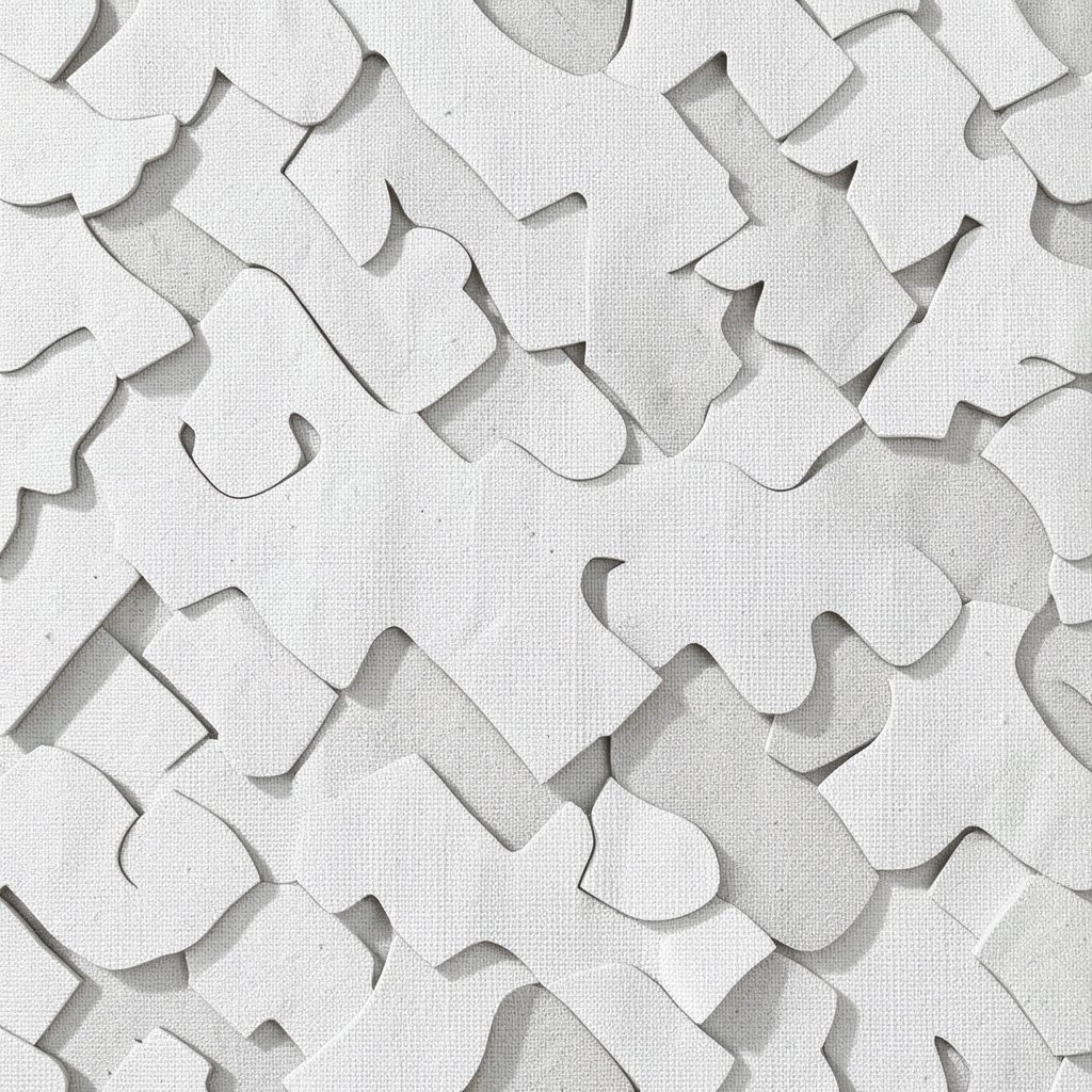
Picture stencil shapes that almost overlap themselves, creating offset shadows. The result is graphic, bold, and surprisingly easy once you plan your layers.
Choose a few stencil shapes like stars, leaves, or simple circles, then paint them in one color. After it dries, place the same stencil slightly offset and paint with a second color as a shadow layer. Keep the edges sharp by using light pressure and letting each layer dry fully.
Personalize by mixing stencil sizes across different parts of the canvas, such as larger shapes near the center and tiny repeats along the border. This is a current favorite because it looks clean in photos and works great in modern interiors. For cost, homemade stencils from cardboard or reusable plastic sleeves can save money while still giving crisp pattern results.
Finish by adding a few small hand-drawn marks inside the stencil areas so the final artwork feels uniquely yours.