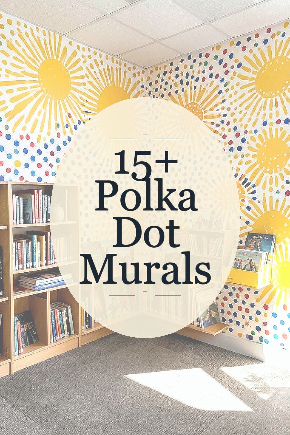
Small dots can create big feelings. When they spread across a wall, people often slow down and start noticing.
Polka dot murals bring playful color to everyday places. They also help neighbors feel like the space belongs to them, not just to whoever built it.
1. Sunburst Dots in a Community Library Corner

Picture a reading nook where the wall glows with warm golden circles like tiny suns. The dots vary in size, and a soft orange gradient makes them feel like they’re radiating outward.
This kind of mural can make a quiet corner feel welcoming without becoming loud. It can also support focus because repeating patterns are calming. Choose washable paint or mural-safe coatings so the surface stays fresh through busy library days.
2. Cool Ocean Dots for a Youth Center Hallway

Imagine teal and seafoam dots drifting across a long hallway like bubbles rising. Some circles overlap, creating a gentle sense of motion that feels friendly, not chaotic.
The visual rhythm can help kids feel calmer as they move from room to room. It also adds personality to otherwise plain walls, which can boost pride in the space. Consider using a mix of matte and satin finishes so the mural looks lively under overhead lights.
For personalization, add a few dots shaped like small waves or stars using stencils. To keep costs manageable, paint a limited palette and reuse the same dot sizes across sections. If you want extra savings, recruit volunteers for the background and hire a mural artist only for the crispest edges.
3. Rainbow Dot Pathway for a School Cafeteria

Think of stepping into the cafeteria and seeing a dotted “path” that leads the eye toward the serving area. Bright circles in rainbow bands create a fun route that feels like a game board.
The pattern encourages people to notice where they’re going, which can help with flow during busy lunch times. It also makes photos and event nights more colorful because the wall naturally frames faces. Use painter’s tape to lay out the bands in straight lines, and test dot spacing on scrap cardboard first.
To personalize, ask students to vote on their favorite color family and include a few signature dot colors tied to school clubs. A budget-friendly approach is to do large dots for the main path and smaller dots only near the edges. If you’re painting over old marks, prime the wall properly so the dots stay bold instead of dull.
4. Monochrome Dot Garden on a Community Garden Shed
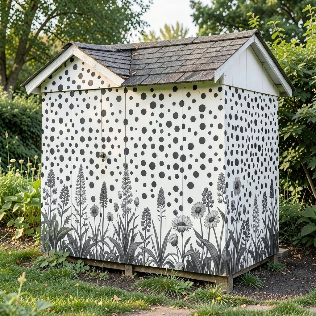
Set a shed wall against real plants and give it a quiet, stylish layer of circles in black, charcoal, and off-white. Each dot looks like stamped ink, and the spacing creates a tidy, modern rhythm.
This choice can make a small garden area feel cared for and intentional. It also works well when you want the mural to support the greenery instead of competing with it. Consider sealing the paint with an exterior topcoat so rain and sun won’t fade the dots quickly.
5. Folk-Style Dots Around a Neighborhood Bulletin Wall

Imagine a bulletin board surrounded by bold polka dots that look like fabric patterns. Red, cream, and deep green circles can frame posters so they stand out even from far away.
This mural helps information feel organized and friendly, especially when many announcements share one space. It also adds warmth to community events, from art nights to local meetings. Use weather-resistant paint if the board sits near windows or gets frequent cleaning.
For personalization, include small dot “windows” where people can add stickers or magnets that match the dot colors. Keep costs down by painting the frame first, then adding dots in layers so you can pause when supplies run out. If you’re working with a tight budget, choose a simple three-color scheme and let the contrast do the heavy lifting.
6. Soft Pastel Dots for a Senior Center Listening Room

Picture pale pink, light blue, and gentle lavender dots arranged like a calm cloud across the wall. The circles feel airy, and the light background keeps everything easy on the eyes.
Such a design can support comfort, which matters most in spaces for listening and social time. Repeating patterns also give the room a soothing vibe that doesn’t overwhelm conversations. Use low-VOC paints when possible so the space stays pleasant right after painting.
7. Night-Sky Dots With Constellation Shapes

Imagine deep navy circles dotted with tiny highlights, like a sky full of distant lights. A few dots can connect into constellation-like lines, making the mural feel magical without losing its simplicity.
This mural can inspire curiosity and storytelling, especially for youth and after-school programs. It also makes an evening atmosphere feel special near outdoor doors or covered walkways. Try using a stencil set for consistent dot sizes, then add a handful of hand-touched sparkles for character.
Personalize it by asking locals to submit constellations tied to family names, birthdays, or favorite memories. If you want to keep costs reasonable, use fewer colors and rely on light-and-dark contrast. A protective clear coat helps if the wall gets direct weather, and it can also make cleaning easier after events.
8. Sports-Themed Dot Rings for a Recreation Center Gym Entry

At the gym entrance, envision large polka dot rings that echo the shape of hoops and balls. Colors like bright lime, orange, and white can pop from a distance so it feels energetic right away.
The high-contrast look helps people feel motivated as they arrive, which can set a positive tone for the day. It also works like a visual landmark, making the entrance easy to spot. Use painters’ tape to map ring edges, and keep dot spacing consistent for a clean, athletic style.
9. Earth-Tone Dot Mosaic for an Outdoor Community Patio

Picture a patio wall dressed in dots that look like pebbles, made from earthy browns, clay reds, and warm sand. The texture can be subtle, so the mural feels like part of the landscape.
This earthy approach blends nicely with outdoor seating and garden planters. It also hides minor wall imperfections better than a super glossy finish. If you want practicality, use exterior-grade paint and a sealant that resists moisture and mildew.
For personalization, add a dot “trail” that leads from the door toward a seating area people love. To manage costs, you can paint the base tone first, then add dots with a limited set of stencils. When you plan the schedule, choose a calm weather window so drying time stays predictable.
10. Bold Hot-Pink Dots for a Corner Store Window Wall

Imagine a small storefront wall painted in vibrant hot pink, filled with crisp white polka dots. The circles catch the eye instantly, giving passersby a cheerful reason to look twice.
This mural can support local business identity by making the storefront feel memorable. It also gives community members something bright to photograph, which spreads good vibes online. Use a primer designed for smooth surfaces if the wall is glossy, and let everything cure fully before adding final dots.
11. Pastel Dot Borders for a Community Art Workshop Room

Think of long dotted borders running along the top and bottom edges of workshop walls. The dots can switch colors slowly, like a soft rainbow ribbon.
This design keeps the room playful while leaving the center wall space for hanging work. It’s practical for classes because it doesn’t compete with paintings, crafts, or student projects. Consider making dot sizes larger at the corners, then smaller near the center so the border feels balanced.
For personalization, let each class add a new stripe of dots in their chosen palette, then seal it so it stays tidy. To keep costs down, focus on borders instead of covering the whole wall. When you want a fresh look later, you can paint over small sections without repainting everything.
12. Elegant Black-and-Gold Dots for a Community Hall Entrance
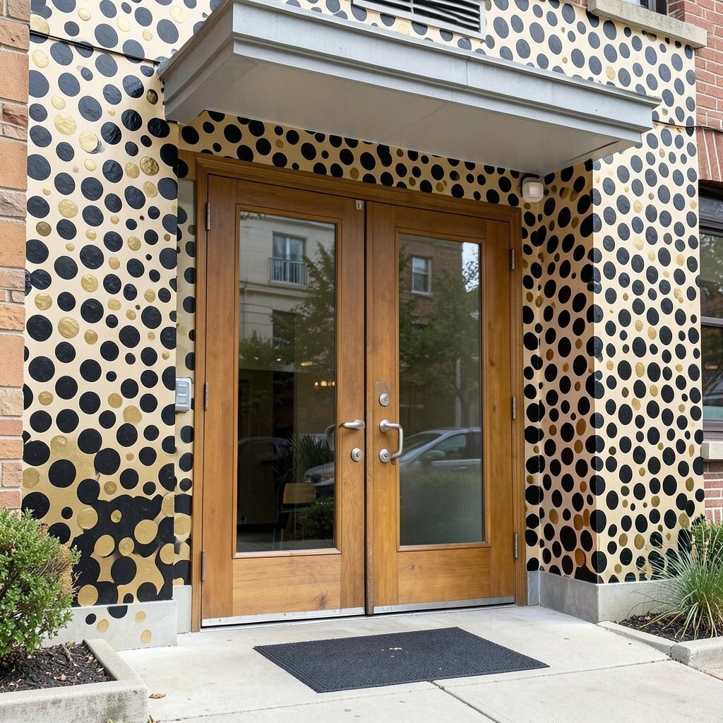
Picture an entrance that feels like a formal welcome, with black dots arranged in clean columns and gold dots sprinkled like highlights. The pattern looks polished, and the gold adds a warm glow under lights.
This mural can make events feel more special, from weddings to town meetings. It also gives a sense of care and pride, especially in spaces where people dress up. Use metallic paint carefully, because applying it evenly matters, and practice on a test panel first.
13. City Map Dot Overlay for a Public Transit Waiting Area

Imagine a mural that combines soft dots with a faint line pattern of nearby streets. The dots act like landmarks, and together they create a map that feels artistic instead of technical.
This can reduce “dead time” for riders by making waiting feel less stressful and more interesting. It also helps people recognize the area, which can make transit feel more friendly and approachable. Keep the lines light and the dot colors clear so the mural stays readable without becoming cluttered.
For personalization, include dots labeled only with icons, like a tree for a park or a music note for an event venue. You can keep costs in check by using one light background color and then layering dots with a single stencil. If the waiting area sees lots of touching and cleaning, seal the mural so wipes don’t wear it down quickly.
14. Cultural Pattern Dot Panels With Community Co-Creation

Picture a set of wall panels filled with polka dots that borrow motifs from local cultures and celebrations. Each panel can use a distinct dot arrangement, like stripes of circles, clustered constellations, or waves of repeated rings.
This kind of co-created mural builds shared ownership, which often makes people protect the space. It also celebrates uniqueness because different households and groups can bring their own color stories. Plan small community painting days where participants paint only certain dot zones, so the final look stays consistent.
For cost considerations, you can buy pre-cut stencils and share paint colors across panels to reduce waste. Use a clear layout to prevent smudging, and keep extra rollers and brushes ready for volunteers. Personalize the mural by adding a date or a small symbol per panel that represents the group that worked on it.
15. Whimsical Animal Dot Faces on a Playground Wall

Imagine a playground wall where gentle animal faces emerge from polka dot shapes. A bear can be made from stacked circles, and a rabbit can appear through dot ears and dot eyes.
This design can make playtime feel safer and friendlier because kids connect with characters. It also helps turn plain surfaces into a creative backdrop for games and pretend play. Use outdoor paint rated for high durability, since playground walls take knocks from balls and frequent cleaning.
To personalize, invite local children to choose animal silhouettes that match their favorites, then adapt the dot pattern around those shapes. Keep costs down by limiting the number of animals per section and reusing the same dot size for all character outlines. If you’re worried about weather, seal the painted surface and check it seasonally for scuffs.
16. Gradient Dot Waves for a Community Center Stairwell

Picture a stairwell where dots flow in gradient waves, creating a sense of movement as people climb. Colors can shift from cool to warm, like a sunrise rolling up the wall.
This mural can make vertical spaces feel less tiring and more inspiring. It also guides the eye up the stairs in a gentle way, which can reduce the feeling of a dark, narrow passage. Choose slip-resistant, hardwearing finishes and paint only what you can maintain, especially on hand-touch zones.
For personalization, add a few large “signature” dots at landing areas that represent community values, like kindness or creativity, using simple icons. Cost-wise, focus on a strong gradient background with fewer dot layers, then add detail only where the mural will be seen clearly. Schedule the work in phases so the community center can keep running while sections are painted and sealed.