The right wall art can make your whole room feel like yours. Small changes in color and texture can spark bigger creative moods.
1. Sunburst Scratch-Glow

Paint rays that start from one bright center and fan outward like gentle heat. Let the lines vary in thickness so some streaks look fast and others look calm.
Use a sponge or stiff brush to drag quick marks across dry paint for a scratchy glow. Keep a small palette of warm tones such as ochre, coral, and soft gold to make the pattern feel cozy instead of loud.
For a practical approach, tape off a circle template with painter’s tape, then remove it while paint is still slightly tacky for crisp edges. This design costs little because you can reuse scrap canvas or inexpensive canvas boards and paint on top of any old color.
2. Ripple Tide Rings
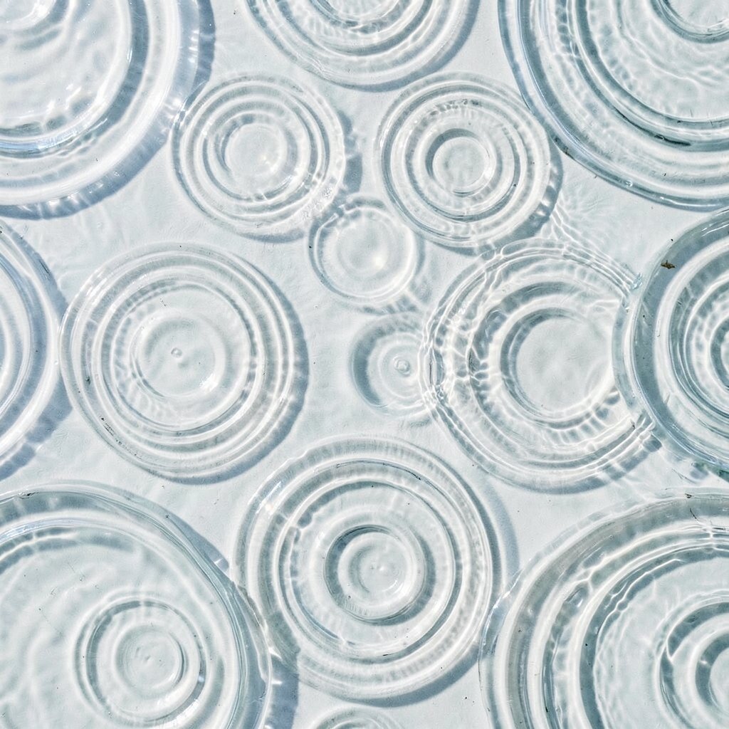
Layer curved rings across the canvas like waves spreading after a pebble hits water. Make the rings uneven so the motion looks natural, not mechanical.
Choose watery colors such as teal, seafoam, and faded navy, then blend them with a dry brush so the edges fade. This pattern feels soothing and helps your creative tools sit in a calmer visual space.
Try a simple method using a string compass for consistent curves, then rotate the canvas slightly for each new ring. If you want personalization, add one darker ring like a “current” through the middle and lighten it again as it goes out.
3. Geometric Confetti Blocks
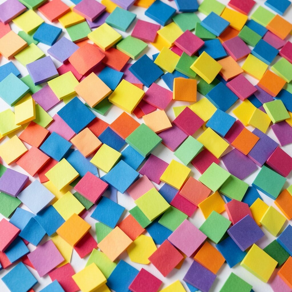
Cut shapes from paper or tape and arrange them into overlapping blocks like confetti. Press the edges down so the borders look sharp and intentional.
Fill each shape with a different color, then add a thin black line between groups for a comic-book feel. This creates a bold focal point that can energize a desk corner without needing big furniture changes.
For practical tips, work in rows and let each color dry before adding the next layer. If budget matters, use leftover craft paint and mix small batches on a palette so you don’t waste paint.
If you want it more personal, mirror your favorite color pairs from clothes, notebooks, or a mug you love. Current trends lean into playful geometry, so this style will still feel fresh even as tastes shift.
4. Soft Marble Veins
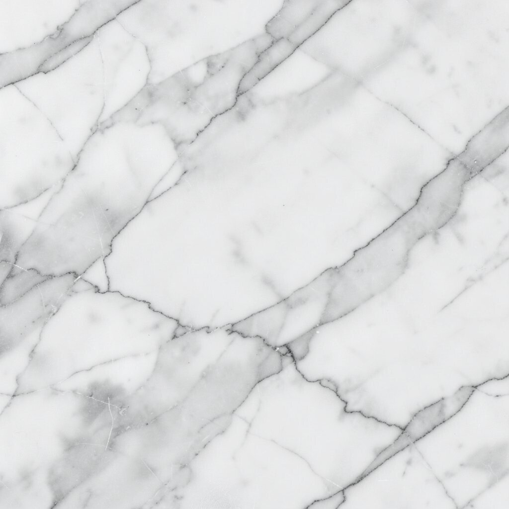
Paint creamy swirls that look like marble, then pull faint lines through them as if veins are moving beneath the surface. Keep the motion slow and fluid so the canvas feels luxurious.
Blend in layers using a damp brush so colors melt into each other instead of forming hard steps. This pattern adds calm sophistication and makes a creative space feel more “finished” even when the rest of the room is simple.
To personalize, pick two main tones and a highlight color, like cream, charcoal, and a touch of rose. A cost-friendly approach is using acrylic paint and a cheap foam brush to get smooth blends.
Marble textures are popular right now in home styling, especially in minimal rooms where one statement piece ties everything together.
5. Botanical Blueprint Prints
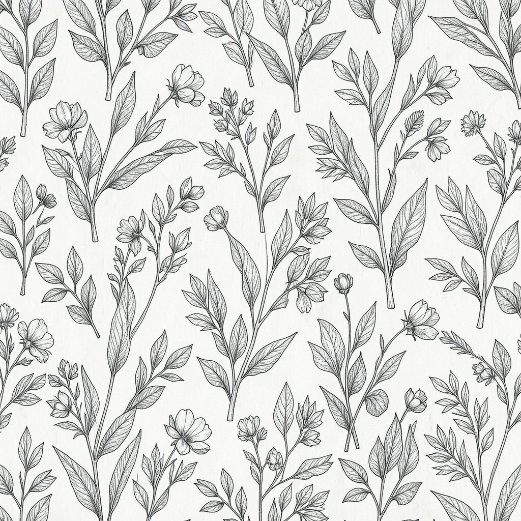
Draw plant outlines in a sketchy style, then repeat them like a blueprint layout. Use thin strokes for stems and add light crosshatching to show “growth” lines.
Color the background with a muted wash, then keep the plant lines in a contrasting shade. This helps your wall art feel creative but still grounded in real shapes.
For practical tips, print a few leaf photos for reference and trace the shapes onto your canvas lightly with pencil. If you enjoy personalization, add your own doodles along the edges, like tiny buds, seeds, or spirals.
This design is unique because it blends art and science feelings, like your canvas is a working sketchbook. Using inexpensive craft ink or diluted paint can keep the cost low while still giving crisp results.
6. Night Sky Drip Nebula
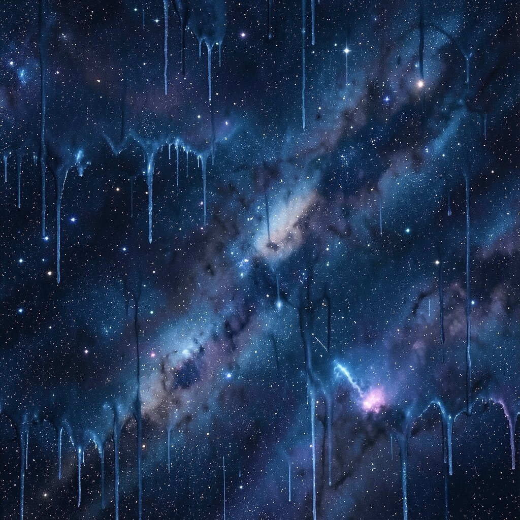
Paint a deep background, then let dots and short drips scatter like stardust. Keep the drips controlled by tilting the canvas only slightly.
Layer on foggy gradients using a sponge so the “nebula” looks cloudy, not flat. The benefit is a dreamy mood that pairs well with reading, writing, and late-night brainstorming.
Try mixing one metallic accent color, like silver or soft violet, to add tiny highlights. For practical steps, use a small brush for dots and stop dripping sooner than you think so the pattern doesn’t become messy.
If you want personalization, place a brighter cluster where you often sit, so the eye lands there when you look up. This look is trending in many studio spaces because it feels both modern and playful.
7. Archive Tape Collage Lines
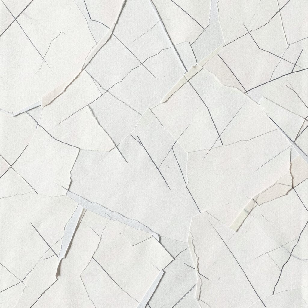
Cover part of the canvas with tape-like strips, then paint over and remove some strips to reveal clean lines. Arrange the strips like an old filing label layout, with overlapping edges.
Choose a neutral base such as warm gray, then add pops of color in sections to mimic “saved” notes. This pattern feels orderly while still staying artistic, which is great if your desk tends to collect clutter.
For practical tips, press the tape firmly and pull it slowly for sharp shapes. Personalization is easy because you can write tiny pretend labels with paint, or leave blank “windows” where you might add future designs.
Cost considerations are friendly here since tape and a few paint colors are enough. The uniqueness comes from the texture created by tape edges, which adds a tactile feel even from a distance.
8. Citrus Peel Sun Layers

Paint layered arcs like peeling orange zest, with each layer curving around the center. Keep the layers slightly different lengths so the peel feel looks natural.
Use bright citrus tones such as tangerine, lemon, and soft cream, then blend the edges with a lightly damp brush. This boosts the energy in a creative space and makes bright ideas feel easier to start.
For a simple personalization trick, add one layer in a color that matches your favorite stationery, like a teal notebook. If you want a trend-forward look, pair the bright peel with a small touch of off-black for contrast.
On the cost side, you can use fewer colors by repeating the same orange shades and just shifting their brightness across layers.
9. Soft Grid Lifted Panels
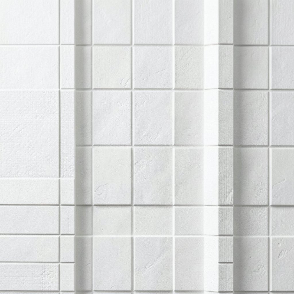
Draw a loose grid across the canvas, but leave some lines thicker and some faint. Fill select squares with color while others stay textured or blank.
This pattern makes your space feel organized without becoming strict. It can also help your eye rest when you work for long stretches.
Try using painter’s tape for straight lines, then remove it while paint is still slightly wet to avoid peeling. Personalization can be as simple as choosing one color family and changing only the intensity from square to square.
For cost considerations, use a limited set of paints and let the canvas texture do some of the work. A current trend in studios is “quiet structure,” and a softened grid fits that mood perfectly.
10. Whispering Brushstroke Sweeps

Cover the canvas with sweeping brushstrokes that curve like wind moving through tall grass. Vary the pressure so some strokes look thick and juicy while others feel airy.
Keep the palette limited to two or three related colors for a calm, cohesive vibe. This gives you an abstract background that won’t compete with your desk items.
For practical tips, plan the direction of the strokes, then work in sections so you don’t rush. Personalization can happen by choosing one “signature” color that you use in other parts of your room.
This design is unique because it focuses on movement rather than shapes, so no two paintings look the same even if you use the same brush and colors.
11. Foil Leaf Mirror Flakes
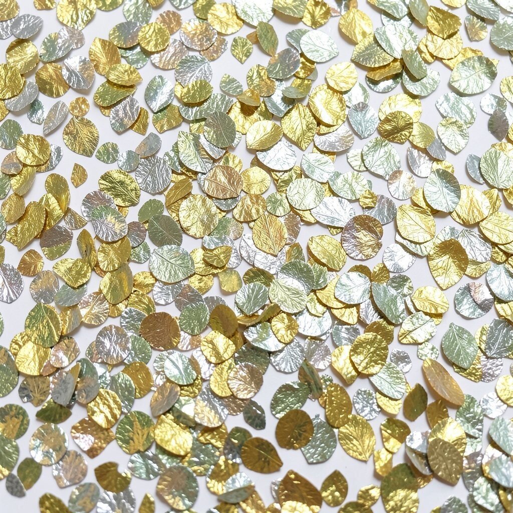
Create a leaf-like pattern using repeated angled marks that resemble mirror flakes. You can paint over faint leaf outlines, then add reflective texture on top.
Use metallic craft paint or affordable foil sheets to create little flashes that catch light. The benefit is a canvas that looks different at different times of day, which keeps your creative space feeling alive.
For practical tips, apply a thin layer of adhesive medium where you want the foil, then press gently and seal if needed. Personalization is easy since you can shape the “leaf” area around where you place your art desk or lamp.
Cost considerations depend on how shiny you go, but you can stretch metallic materials by using them only in key areas. This look connects with current trends in mixed media and light-catching surfaces.
12. Chalk Dust Ombre Steps
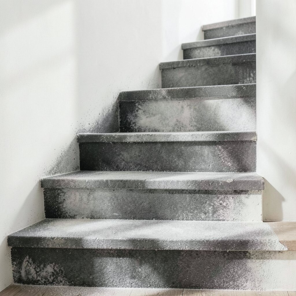
Build an ombre effect that moves upward in steps, like chalky color climbing a wall. Use a dry brush so the surface looks dusty rather than glossy.
Pick one main color family and shift from light to deep, then add a tiny contrasting shade in one corner for surprise. This pattern gives a gentle “glow” that makes a room feel softer and more welcoming.
For practical tips, blend between steps with a lightly damp sponge, then stop blending once it looks smooth enough. Personalization ideas include matching the ombre colors to the tones in your favorite blanket, rug, or wall print.
Keeping it cost-friendly is simple since dry-brush techniques use less paint than thick coverage. The uniqueness comes from the chalky texture, which looks like a living sketch instead of a perfect print.
13. Atlas Line City Topography
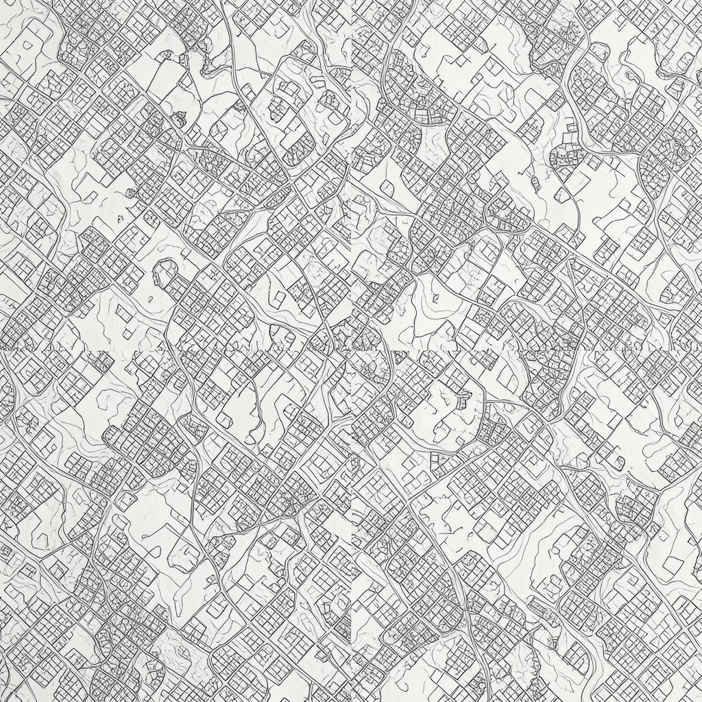
Draw looping contour lines across the canvas like a topographic map. Add small “city dots” and tiny bridges where lines meet, then repeat those motifs in a rhythm.
This pattern adds a sense of depth and invites you to imagine places you want to visit. It also works well in creative spaces because it gives your eyes a route to follow when you need a mental reset.
For practical tips, use a fineliner or a brush with steady control, then keep line thickness consistent for a clean map look. Personalization can be done by turning one area into your own mini “region,” using colors you love or symbols you use in journaling.
Cost considerations are low because line art needs minimal paint, and you can reuse old brushes. This style feels current because many people now love map-like art and subtle references to navigation and memory.
14. Lagoon Mosaic Brush Cuts
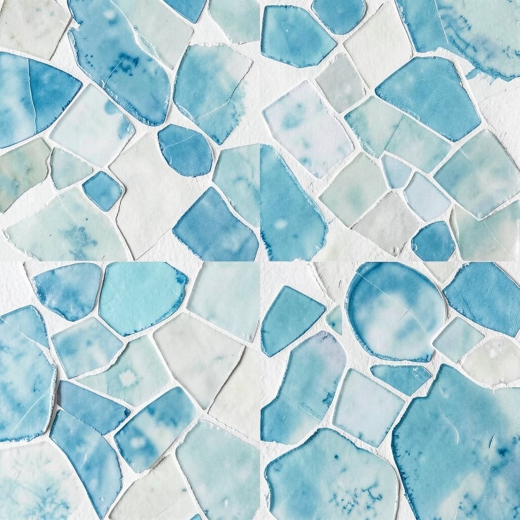
Paint a background in ocean shades, then carve “mosaic tiles” by painting over sections with a contrasting color. Instead of perfect squares, use irregular cuts so the tiles feel hand-made.
Blend the edges a little so the mosaic looks like it’s underwater, not like it’s made of rigid blocks. The benefit is a textured richness that makes an empty wall feel full.
For practical tips, sketch tile shapes lightly with pencil first, then paint inside the shapes and separate them with thin lines. Personalization ideas include adding a tile pattern that echoes something you use often, like the shape of your mugs or the pattern on your notebook cover.
If you care about cost, use fewer colors and let the canvas texture show through where you want a lighter look. This design feels unique because it mixes mosaic structure with flowing color, which is popular in contemporary abstract art.
15. Repeating Halo Stamp Motifs
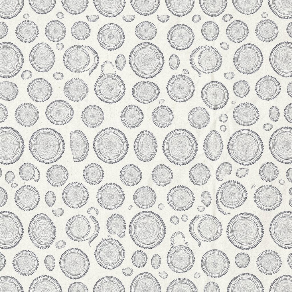
Stamp circles or halos across the canvas in a repeating pattern, then vary the size slightly so it looks alive. Use a sponge stamp, a round brush, or even a bottle cap for gentle shapes.
Choose a base color and then add halos in one or two accent shades for a clear visual plan. This pattern is great for creative spaces because it creates rhythm without distracting from your work.
For practical tips, press your stamp straight down and keep a small “grid” in mind so spacing looks even. Personalization can be done by placing one large halo where your eye naturally lands, like above a desk or near a reading chair.
Cost considerations are easy because stamps and simple tools are cheap, and the pattern works even with limited paint. This style stays relevant because repeating motifs and soft geometry remain a favorite trend in modern home art.