Silk fringe can turn a blank wall into a soft, moving moment. The look feels fancy, but it can still feel cozy and lived-in.
With the right color and placement, it adds texture, light play, and a touch of drama. Ready to see how far silk fringe can go?
1. Warm Champagne Fringe Behind a Sofa
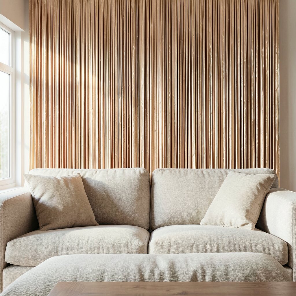
Picture a band of champagne silk fringe stretching across the wall behind your sofa. It glows when daylight hits it, and it looks extra rich at night.
Choose a fringe depth that feels full but not heavy, so the wall stays airy. For a practical start, measure your sofa width, then add a little extra on both sides for a tailored look. Pair it with warm neutrals like cream, sand, or light tan to keep everything calm and elegant.
2. Ombre Silk Fringe For A Soft Gradient Wall
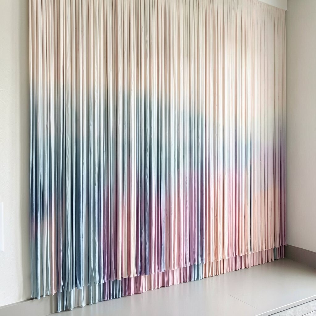
Start with a gentle ombre fringe that fades from a deeper shade at the bottom to a lighter tone above. The visual effect feels like light moving across fabric.
This style is great if you want personality without strong contrast. Hang the fringe at eye level over a console or artwork, and blend it with plain frames so the gradient stays the star.
Choose colors that already exist in your room, like dusty rose, warm taupe, or muted blue. Even a simple paint color becomes more interesting when the fringe shifts in tone.
3. Fringe Panels In A Vertical Rhythm Over Plaster
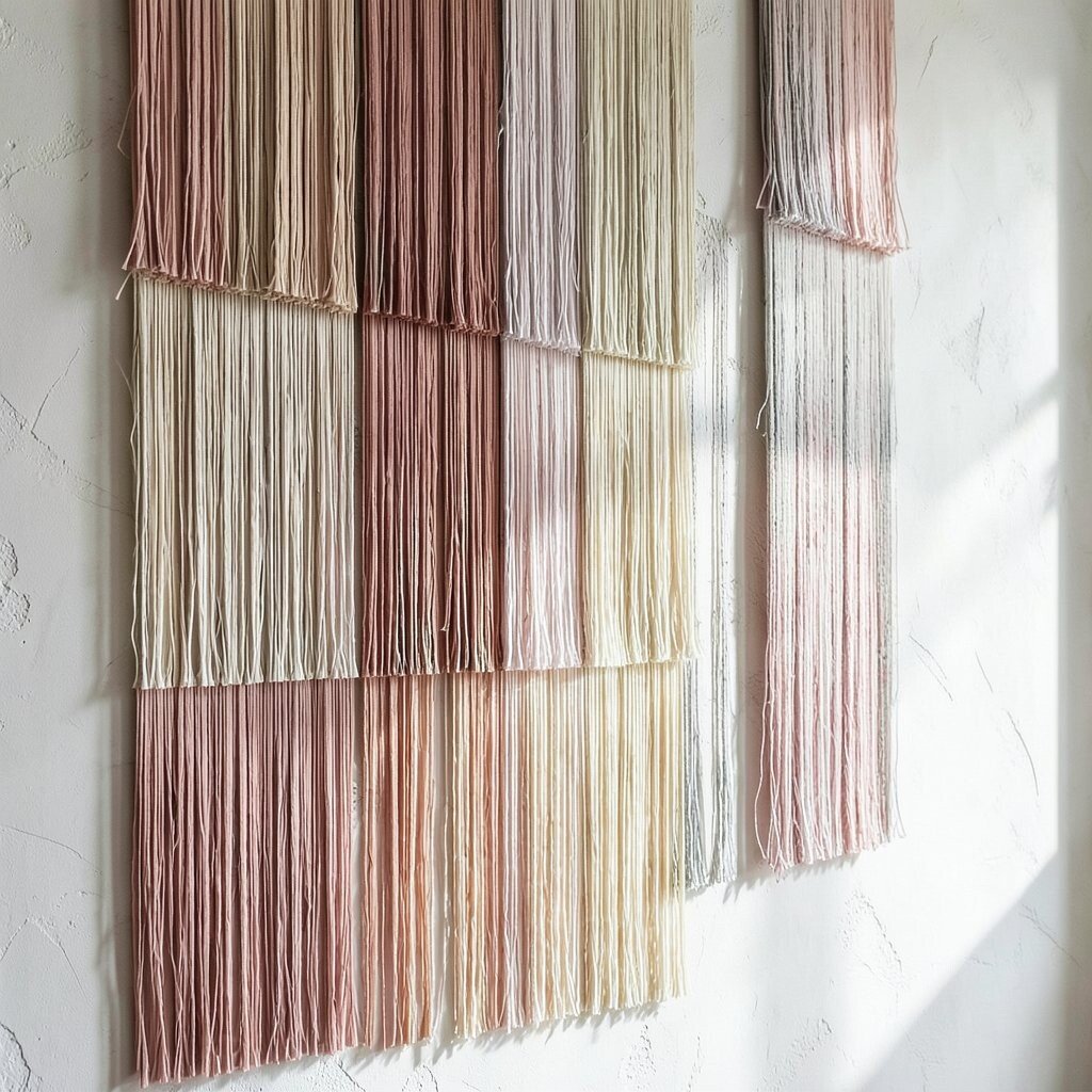
Instead of one wide strip, use several vertical fringe panels like hanging banners. They add height and make the wall feel taller and more tailored.
Vertical placement works especially well in hallways, dining rooms, and areas with tall furniture. Use a level to keep the spacing even, since symmetry makes the fringe look intentional and polished.
For personalization, pick two coordinating colors, then alternate them for a subtle pattern. If you want a lighter feel, use thinner fringe and more negative space between panels.
Current trend ideas often lean toward structured styling, so crisp spacing and clean edges will fit right in. You can also keep the rest of the wall simple to make the fringe panels pop.
4. Framed Fringe Rows For A Gallery-Like Feature

Think of silk fringe as a fabric frame for your wall decor. Install a series of fringe rows around a mirror, art piece, or even a large gallery print.
This creates a focal point that feels curated, not crowded. Try a consistent length for each row so the lines look neat, and use a slim backing panel to hide hardware.
5. Deep Emerald Fringe For A Luxurious Dining Nook

A deep emerald fringe can make a dining nook feel like a private lounge. The color looks rich in the evening, especially with warm bulbs and candles.
Keep your table setting simple so the fringe gets the attention it deserves. A practical approach is to tie the emerald to other elements like green glassware, dark wood, or brass details.
If you have guests coming often, this is a fun way to elevate everyday meals. For cost control, you can cover just one wall section instead of the entire room.
6. Soft Blush Fringe Over a Bedside Headboard Wall

Imagine blush silk fringe forming a gentle halo behind your bed. It makes the room feel romantic without needing a lot of extra decor.
Use a medium length fringe so it falls in a flattering layer rather than pooling too much. Mount it securely because a bed wall gets bumped, especially in busy mornings.
To personalize, match the fringe tone to throw pillows, bedding, or a nearby lamp shade. This style looks current when paired with simple lines and a few warm textures like boucle or linen.
7. Fringe Corner Treatment That Wraps the Room

Use silk fringe to treat a wall corner so it feels designed from every angle. When it wraps around, it softens sharp edges and makes the space feel smoother.
It also helps the corner disappear visually, which is perfect for apartments or compact rooms. Start by deciding how far you want the fringe to extend on each wall, then keep the wrap consistent.
For an easy win, choose a color close to your wall paint so the texture stands out but the space stays calm. If you want drama, select a contrasting shade and let the corner become an intentional feature.
People love this look because it feels custom, even when you keep the styling simple. It pairs nicely with minimal frames and clean furniture silhouettes.
8. Light Gray Fringe For A Modern, Airy Living Room

Light gray silk fringe can create a modern texture that still feels soft. It’s the kind of neutral that works with almost any style, from modern to classic.
Hang it in a straight line above the couch or along a media wall for a sleek upgrade. Keep the fringe length medium so it looks intentional rather than messy.
To make it feel practical, pair it with washable textiles nearby, since dust and lint can show on lighter fabrics. A quick monthly check and gentle vacuuming with a soft brush can keep it looking fresh.
For current trend energy, combine it with matte finishes like brushed steel or matte black accents. This is an easy way to add texture without clutter.
9. Textured Backdrop Fringe For A Reading Lounge
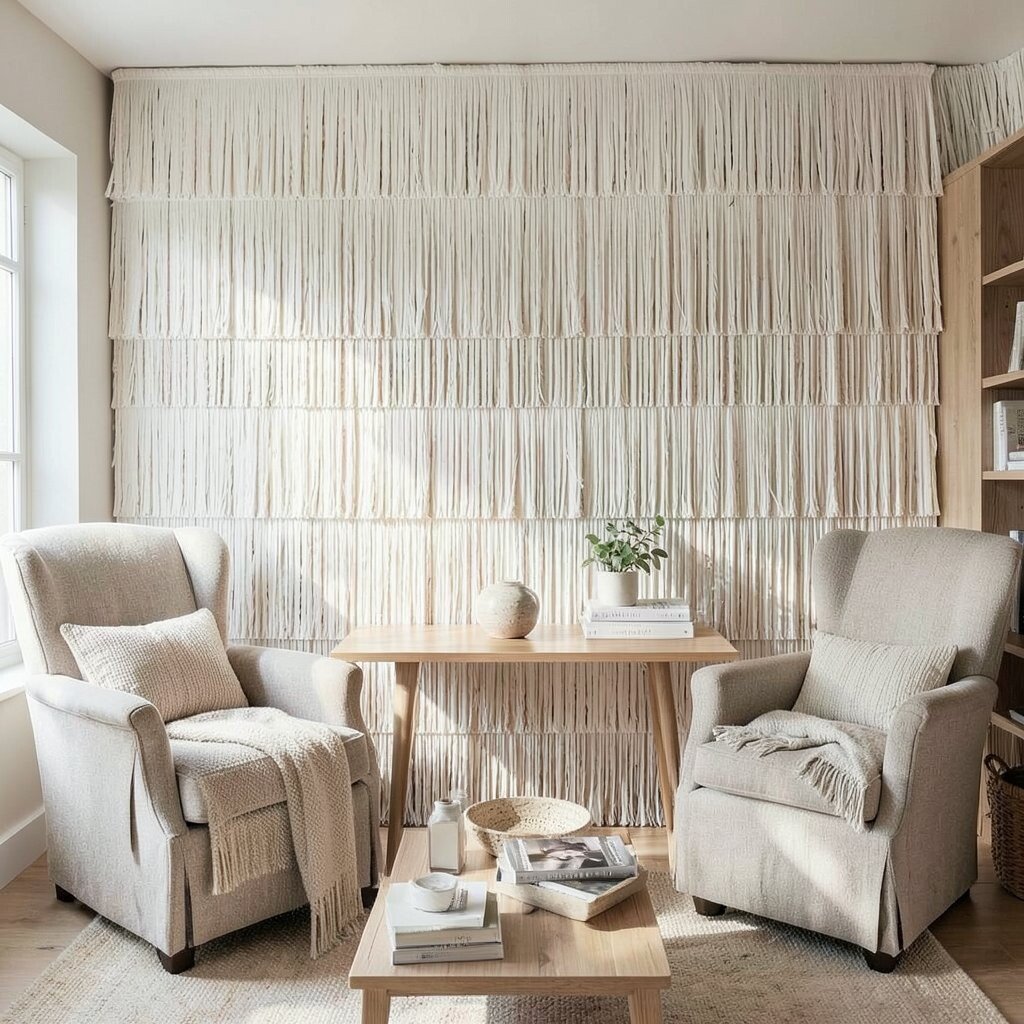
Create a cozy reading nook by placing silk fringe behind a chair or built-in bench. The texture makes the space feel inviting, and the movement adds a relaxing vibe.
Choose a warm neutral or muted caramel to keep it soothing. If your lounge gets lots of natural light, silk will catch it and add soft shine that feels comforting.
For practical setup, anchor the top rail firmly so the fringe hangs evenly. You can also add a small runner rug to balance the softness and prevent the area from feeling too slick.
This look stands out because it feels like a styled moment built around comfort. Personalize it by matching fringe color to your book covers, throw blankets, or floor lamp shade.
10. Navy Fringe With Brass Accents For A Statement Entry
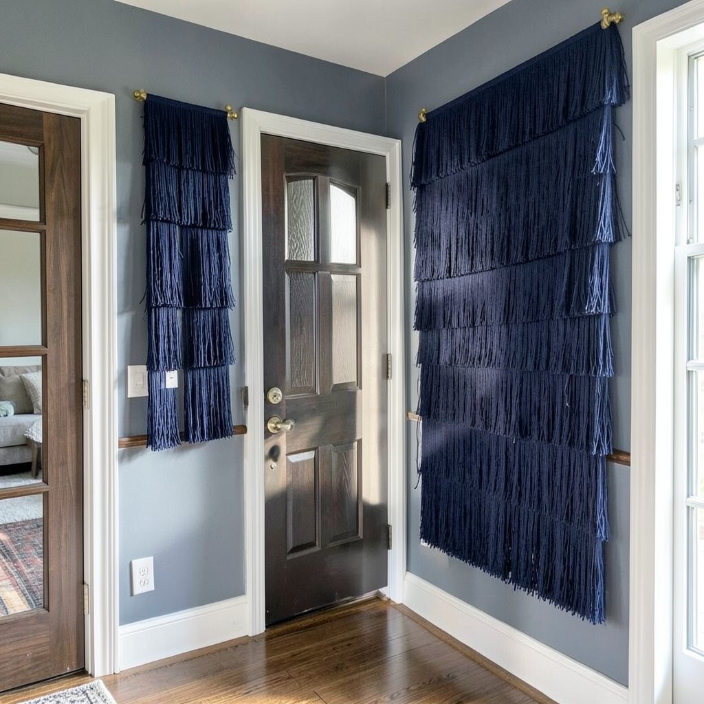
An entryway is where first impressions happen, so navy fringe can set a confident tone. It looks crisp against white walls and feels especially bold with brass hardware.
Mount it along a hallway wall near a console or coat rack for a clean, stylish landing. Keep the rest of the entry minimal so the fringe becomes the highlight.
If you’re worried about cost, cover a shorter stretch of wall and add a matching small strip near a mirror. That approach still feels intentional while staying budget-friendly.
11. Fringe Over Wallpaper For Added Depth

If you already have wallpaper, silk fringe can add a second layer of texture. The fringe makes busy prints feel richer instead of loud.
Pick a fringe color that appears in the wallpaper, like a leaf tone or a soft background shade. Place the fringe near the upper third of the wall, so you keep balance and avoid blocking the pattern.
For practical styling, keep the wallpaper pattern visible around the fringe. This keeps the room from feeling heavy and also helps you enjoy both textures.
It’s a unique idea because it blends two decorative worlds without forcing them to compete. Current styling often mixes textiles and prints, and this fits that mood well.
12. Mini Fringe Strips For A Subtle, Budget-Friendly Upgrade
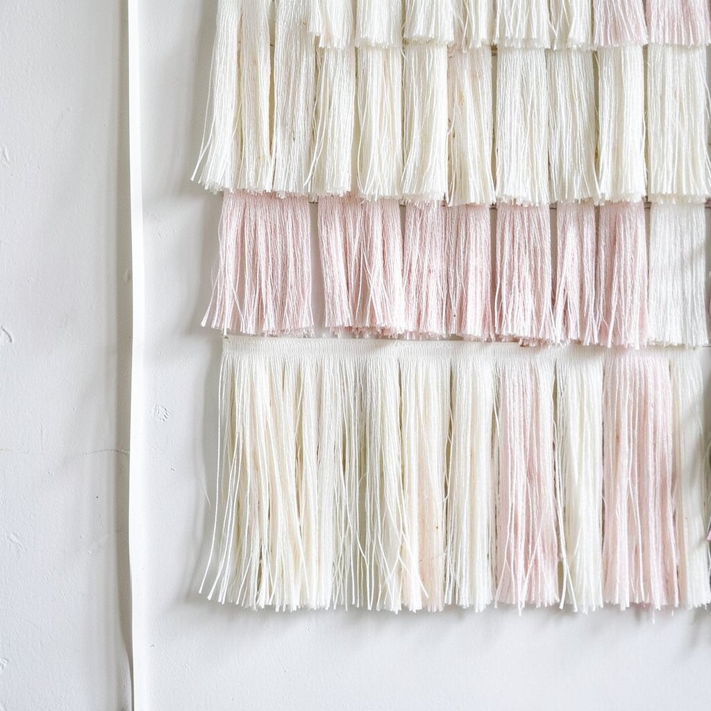
If you want the silk look without major changes, use mini fringe strips. They can line the edges of shelves, frame a narrow mirror, or accent a small wall section.
This approach is great for renters who want a stylish effect but need easier removal. Use removable mounting hardware or adhesive options designed for fabric-safe surfaces, then test in a hidden spot first.
Choose a single color that matches your existing decor so the upgrade looks smooth. Even small strips can catch light and add charm when guests walk by.
13. Curved Fringe Swags For A Soft, Elegant Look
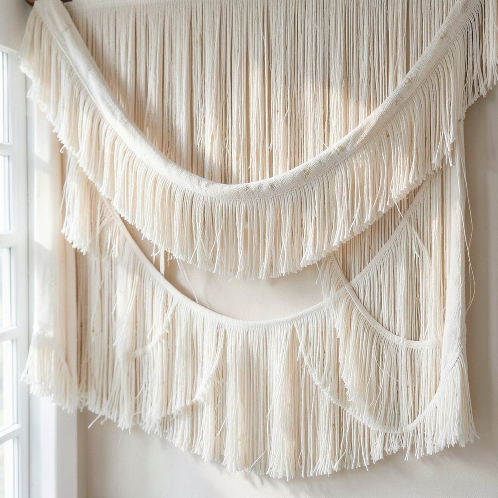
Curved fringe swags feel like fabric drapery, but on a wall. The gentle curves add romance and make the space look more dressed up.
Hang swags above a console or fireplace mantel for a dramatic yet cozy frame. For practical results, use a flexible mount or create a curved rail so the fringe falls naturally.
To personalize, choose a color that echoes your curtains or upholstery. This style looks unique because it brings movement without needing large patterns.
If your decor leans traditional, curved swags fit beautifully, but they can also look modern with crisp furniture lines. It’s all about choosing the right fringe length and keeping the surrounding elements simple.
14. Monochrome Fringe For A Calm, Designer Feel

Go monochrome by choosing fringe in the same color family as your walls. The result looks clean, modern, and quietly expensive.
This is a smart option when you already have strong furniture or artwork. It keeps attention on texture rather than color drama, which makes styling feel easy.
For a practical tip, pick a slightly different shade than your wall paint so the fringe shows clearly. Even a small shift in tone makes the texture readable from across the room.
15. Multi-Color Fringe Confetti For A Playful Kids’ Room
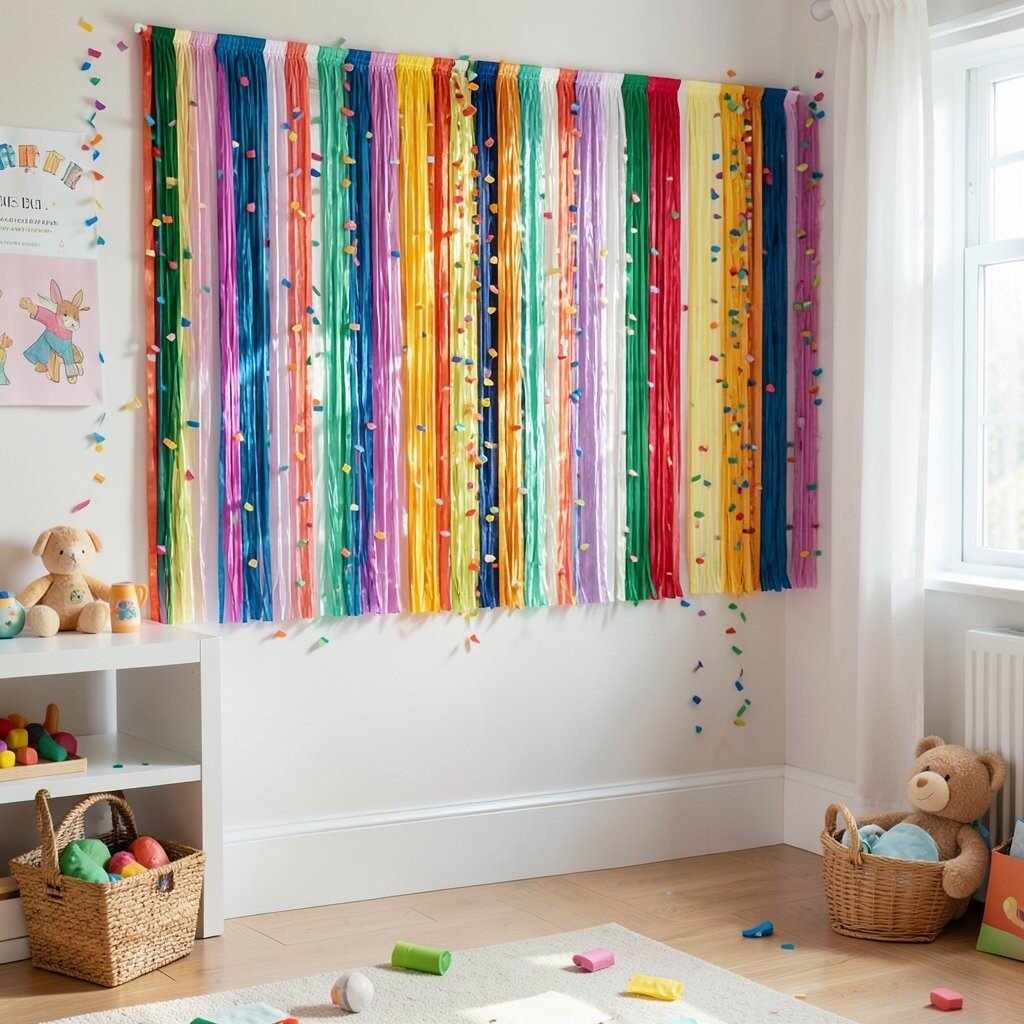
Silk fringe can also be fun, especially in a kids’ room or creative studio. Think of colorful fringe bursts like confetti, adding energy to a space that needs joy.
Choose safer, coordinated colors rather than random rainbow chaos. Mount small sections so you can swap them later as tastes change, keeping costs in check over time.
For personalization, match colors to bedding, wall art, or a favorite theme like space or ocean. This approach feels unique because it turns decor into something interactive and lively.
To keep it practical, select fringe lengths that stay clear of doors and pathways. A quick monthly vacuum with a soft brush helps keep it looking neat and fresh.
16. Fringe Behind Glass Shelving For A Glowing Display
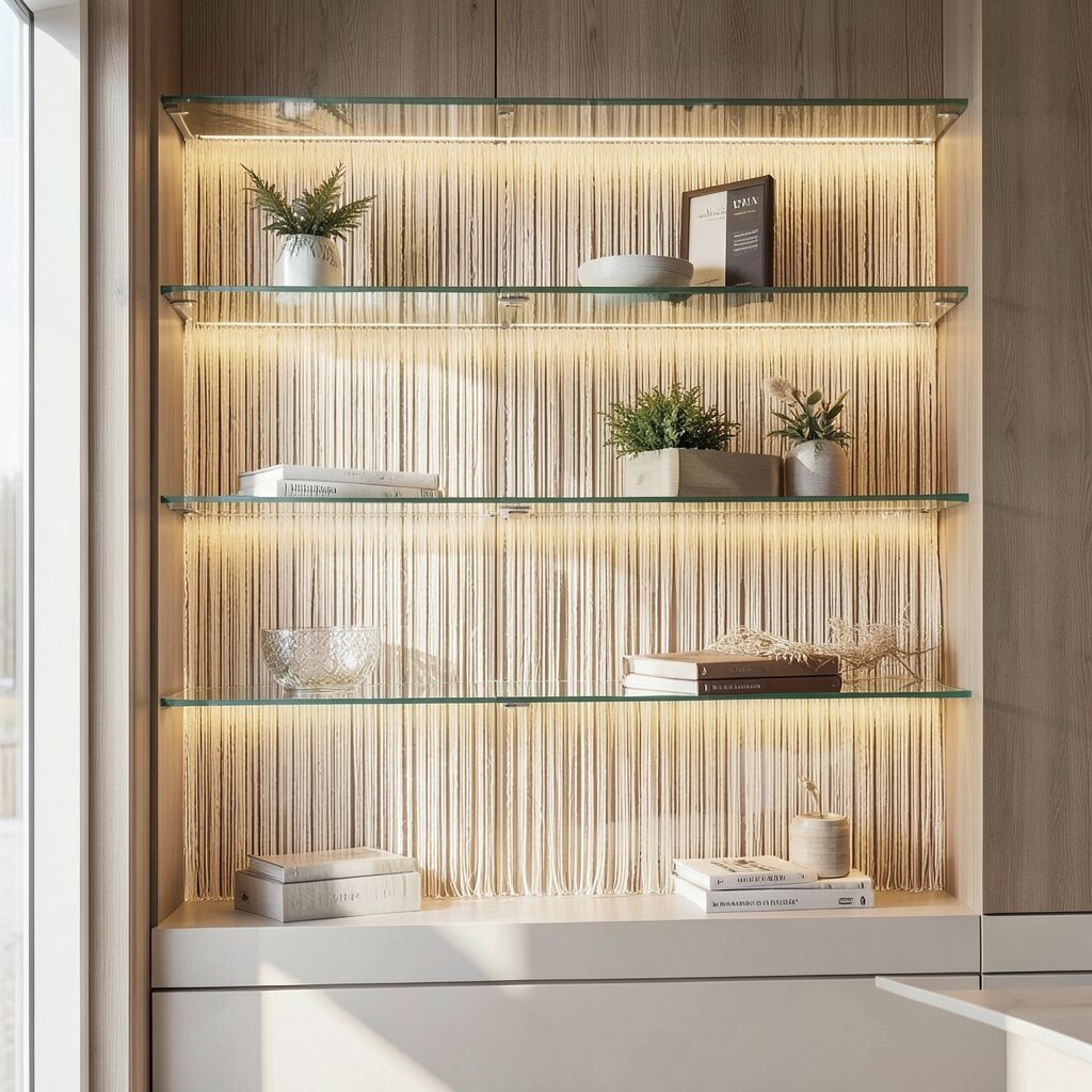
Place silk fringe behind glass shelves or open cabinets for a glowing display effect. When light hits the fringe, it makes bottles, ceramics, and small decor look brighter.
This idea feels stylish because it adds depth without cluttering the shelf space. Keep the fringe tone aligned with your room palette, like warm ivory, soft taupe, or pale gray.
For practical upkeep, choose fringe colors that won’t show dust easily. You’ll enjoy the look more when maintenance feels simple.
Personalize by mixing fringe with subtle accent lighting, like warm LED strips. The combination looks designer while still being comfortable for everyday living.
17. Fringe And Wood Slats For Warm Scandinavian Styling

Pair silk fringe with wood slats for a cozy Scandinavian-inspired wall. The combination of soft fabric and natural texture feels calm, warm, and welcoming.
Install the wood slats first, then attach fringe where you want extra softness, like between slat gaps or along the top. This creates a layered look that feels intentional and modern.
For cost considerations, you can keep wood slat coverage partial and focus on the most visible wall sections. That lets you spend more on silk and less on materials you won’t notice as much.
18. Black Silk Fringe For A Dramatic Media Wall
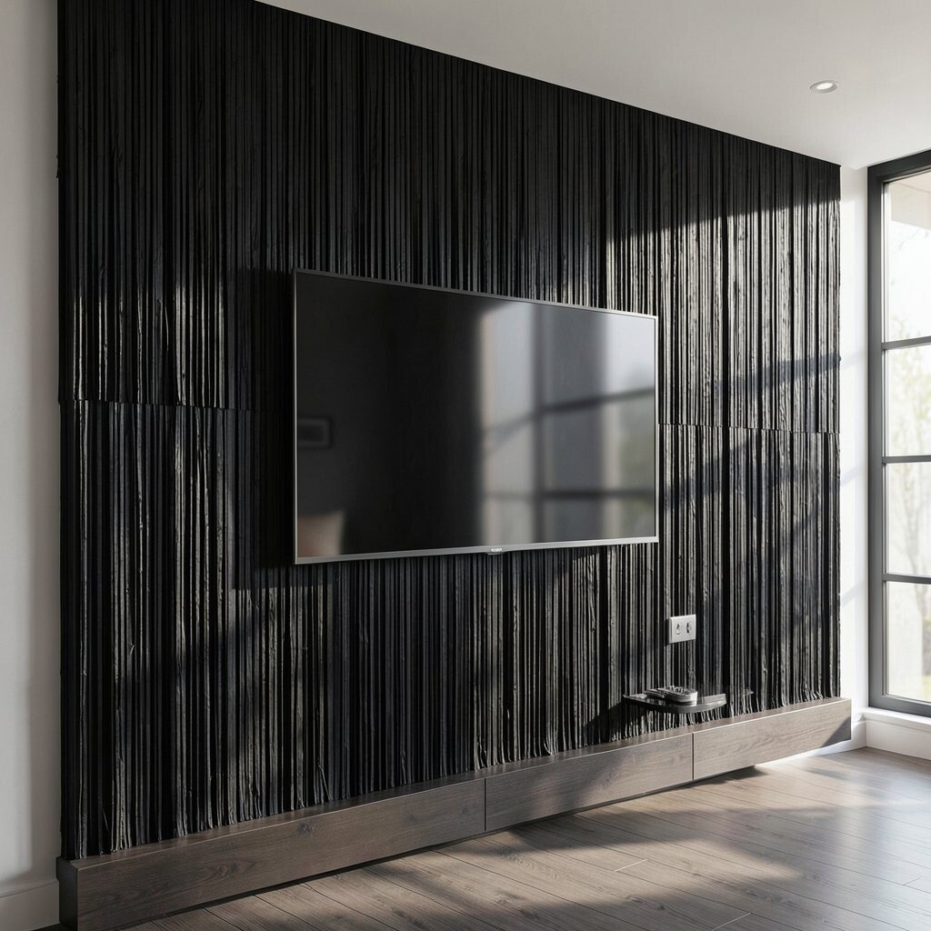
Black silk fringe can look bold and high-end, especially behind a TV or media console. It frames the screen and makes your decor look more gallery-like.
Choose a clean mounting line so the fringe looks sharp and not tangled. If the room is bright, black can help balance glare and reduce visual noise.
For practical tips, consider using a matte wall color behind the fringe. A glossy wall may reflect light unevenly, which can make the fringe look less uniform.
Personalize with subtle metallics like chrome or brushed nickel in your shelves and frames. This look is unique because it adds drama without adding clutter.
19. Fringe Over a Fireplace Wall For Cozy Evenings

Silk fringe above or around a fireplace adds instant warmth to the room. Even if your fireplace is rarely used, the fringe makes the wall feel inviting.
Use a color that complements the stone or mantel, like ivory, cream, or warm beige. This keeps the style cohesive and helps the fringe feel like part of the architecture.
For practical concerns, keep the fringe away from direct heat sources. Choose mounting methods that keep it stable and safe, especially if you have kids or pets.
This idea feels personal because it turns a common focal point into something soft and memorable. Add a couple of framed photos or simple candles to finish the vibe.
20. Fringe Lining For Built-In Bookshelves
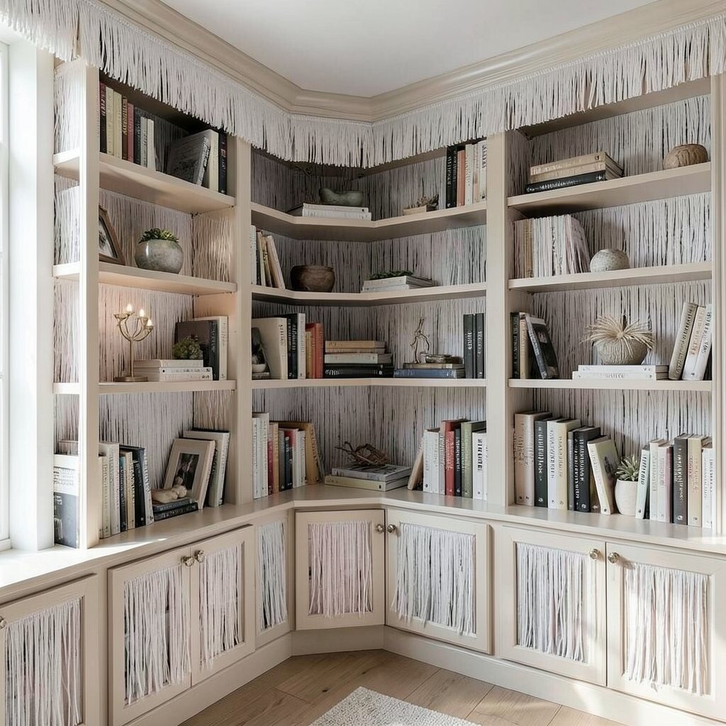
Turn built-in bookshelves into a stylish library by lining the back with silk fringe. The result adds glow behind your books and makes the whole unit feel richer.
This styling works best when you plan the fringe width so it doesn’t overwhelm the shelves. Use shorter fringe depths inside tighter spaces, and longer lengths on wider sections for balance.
To personalize, coordinate fringe color with your book cover palette. Neutral books become more interesting when the back fabric provides a soft contrast.
Cost-wise, this can be more affordable than covering a whole wall, since you only need it where the shelves already take up space. It’s also easy to update when your decor changes.
21. Fringe And Lighting For A Soft Halo Effect

Combine silk fringe with gentle wall lighting for a halo glow that feels magical. When lights hit from the side or above, the fringe looks like it’s catching floating dust of light.
Use warm lighting tones to keep the mood cozy rather than harsh. Place the fringe so it’s close enough to the light to show texture, but far enough to avoid shadows that look uneven.
This approach is unique because it turns a wall texture into a lighting accessory. Personalize by choosing a fringe color that matches your lamp shades or metal finishes.
For practical upkeep, dimmable lights help you adjust brightness as the day changes. It also makes the fringe look different in the best ways depending on the time of day.
22. Two-Tone Fringe With a Clean Center Divide
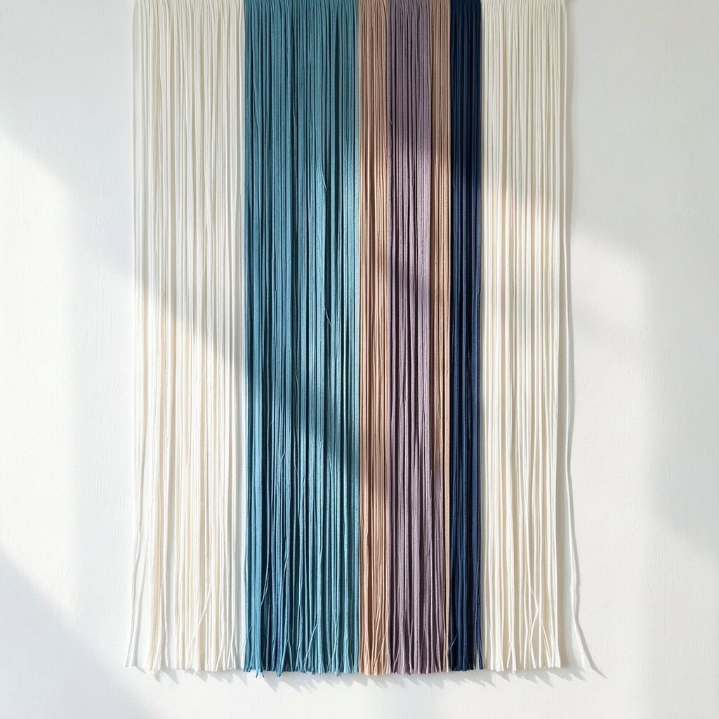
Try two-tone fringe separated by a clean vertical center line for a modern, tailored look. It’s like having a stylish fashion detail on your wall.
Choose two colors that complement each other, such as warm sand and soft blush, or cool gray and deep charcoal. Keep the split straight, because crisp lines are what make the design feel designer.
For practical tips, decide the split based on your room layout, like centering it over a sofa or console. That way the fringe supports your furniture placement instead of fighting it.
This style feels especially personal because you can mirror colors from pillows, rugs, or artwork. If you want to manage cost, use slightly less coverage by focusing the two-tone fringe on the most visible section of the wall.