
The right color can calm your mind before your head hits the pillow. Small changes can make your bedroom feel safer, softer, and sleepier.
From gentle walls to bedtime-friendly textiles, color choices can guide how your space feels. You do not need a full remodel to see a difference.
1. Soft Blue Calm for Steadier Nights
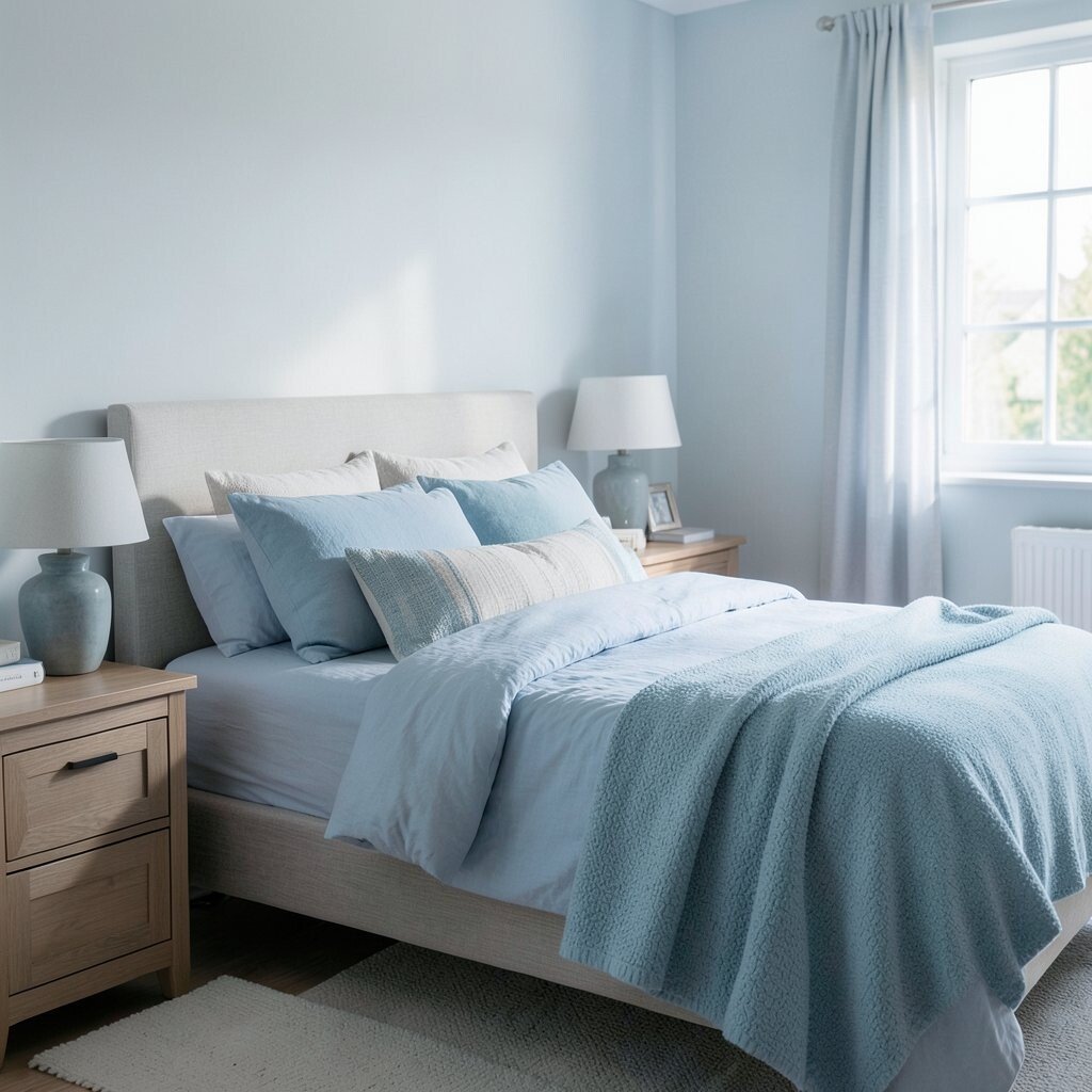
Soft blue walls can look like a quiet sky at dusk, fading the room’s edges into something gentle. When you picture clouds and open water, your body often follows the same calm signal.
This color tends to feel cool and breathable, which can help your brain slow down. Pair it with warm white linens so the room stays cozy instead of icy. Choose muted shades over bright ones so bedtime feels restful, not electric.
2. Sage Green for a Grounded, Peaceful Mood

Sage green feels like fresh air coming through a window, especially when it sits near natural wood. Light falls across it in a way that looks relaxed, not sharp.
Green is linked with balance, and many people find it reduces mental clutter. Use sage on one wall or on your bedding so you can personalize without committing to a big paint job. Try adding a small plant or two to make the color feel more alive.
When you want extra comfort, add textured curtains in cream or light gray. If you rent, use removable wallpaper panels behind the bed to get the same calm feel. Keeping the green soft will protect your sleep space from feeling too stimulating.
3. Warm Beige for Comfort That Feels Like Home
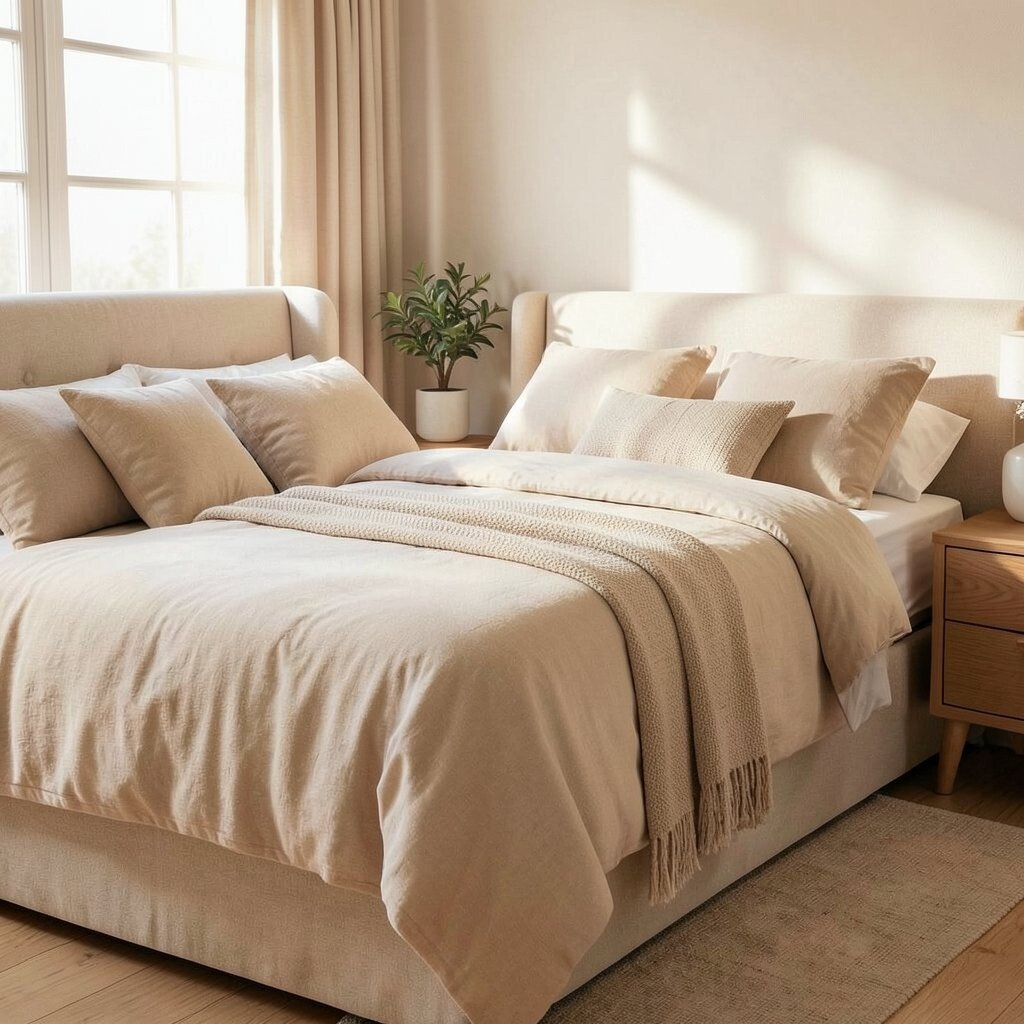
Warm beige creates an inviting glow, like sunlight caught in fabric. It makes the bedroom feel steady, which is great when your day runs fast.
Neutral tones often help your eyes rest, since there are fewer high-contrast details to process. Beige can also make furniture look more cohesive, so the whole room feels organized. If you love a simple look, this color gives you a calm foundation.
Match beige walls with darker accents like espresso wood or charcoal frames for balance. Affordable options include beige sheet sets, slipcovers, or a washable throw blanket. For personalization, choose a fabric pattern with tiny subtle lines rather than bold prints.
Be mindful of undertones, since some beiges lean yellow and others lean pink. Test samples against your night lighting so it still feels warm after sunset.
4. Deep Navy for Cozy Nighttime Focus

Deep navy looks dramatic in the best way, like a soft blackout sky around your bed. It can make your room feel wrapped and private, especially with brass or muted gold accents.
This darker color can support wind-down by signaling “night mode” to your space. Use navy on the headboard wall or choose navy bedding, then keep the rest of the room light to avoid heaviness. A pale ceiling and white trim help the navy feel rich rather than closed-in.
5. Soft Lavender for Gentle Relaxation
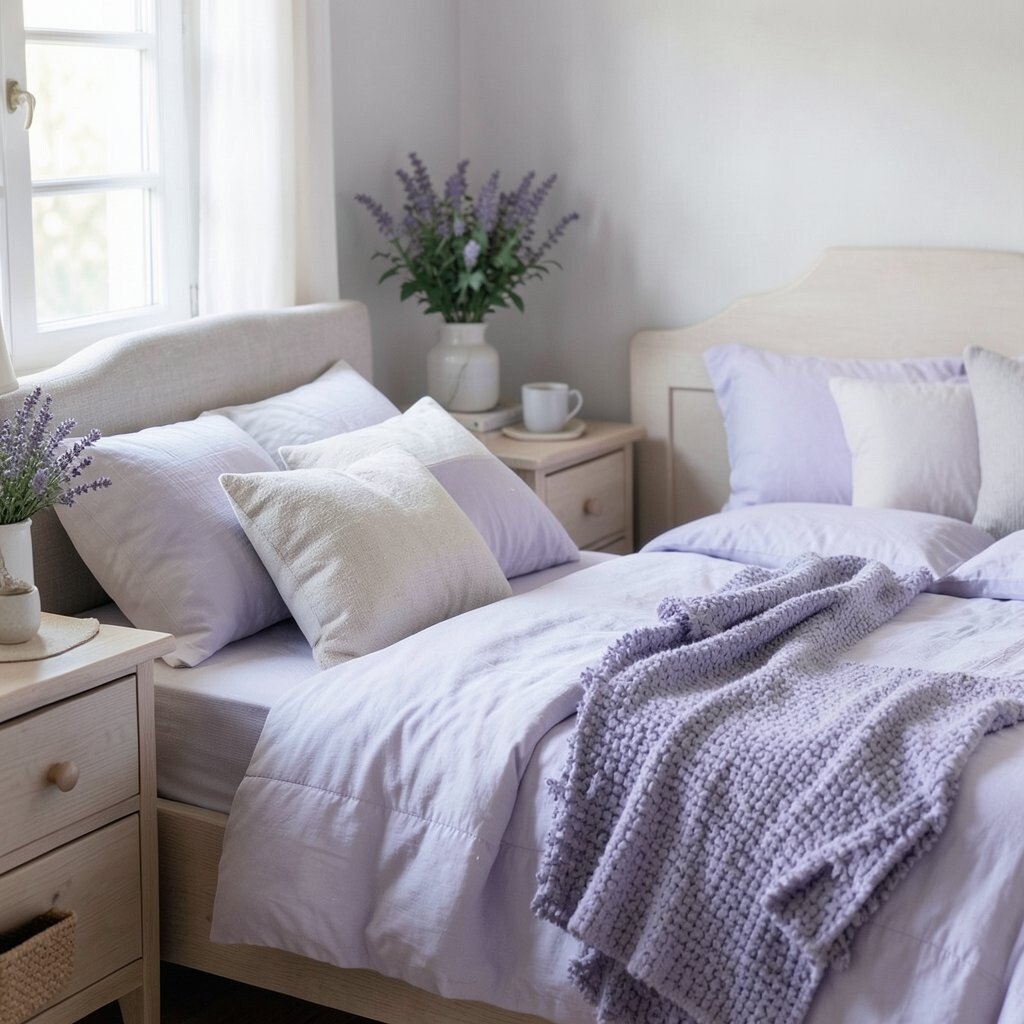
Lavender can give your bedroom a dreamy feeling, like a light purple mist. When the shade is muted, it looks calming and romantic without feeling childish.
This color often pairs well with slow breathing and evening routines, because it feels soothing and quiet. Try lavender in a duvet cover, pillowcases, or a low-sheen paint to keep everything subtle. If you have a busy mind, softer purple tones can help your space feel more forgiving.
For personalization, add neutral textures like knitted throws and linen curtains. If you want to keep costs low, shop for washable bedding in lavender rather than painting first. Combining lavender with warm whites can keep the room cozy and balanced.
6. Terracotta Warmth for Comfort and Ease

Terracotta brings a earthy warmth that feels welcoming and lived-in. It can look stunning against cream walls or natural oak furniture.
Warm colors like terracotta may help the room feel comforting, which is helpful when you want a calmer evening. Use it in small places at first, such as a rug, cushion covers, or a framed art print. This way you get the cozy vibe without overwhelming the senses.
Pair terracotta with soft green, sand, or muted clay tones for a natural palette. Many current styles lean into warm earth colors, so it can feel modern while still sleep-friendly. Choose muted terracotta rather than bright orange to keep the energy gentle at night.
7. Charcoal Gray for Low-Stimulation Quiet

Charcoal gray can make a bedroom feel like a soft, quiet shelter. It absorbs light in a way that reduces visual noise, which many people find soothing.
Gray supports a calm mindset, especially when it’s used thoughtfully. Consider charcoal only on one area, like the accent wall behind the bed or the base of a large dresser. Keep the bedding light so the room still feels open and airy.
8. Pure White for Clean Calm and Simple Focus
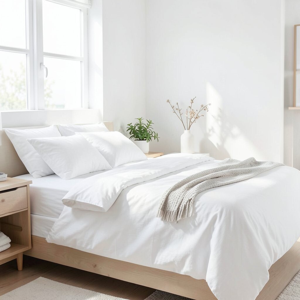
White gives a crisp, fresh look that can make your bedroom feel tidy and restful. It can also make small rooms feel bigger, which helps your mind feel less crowded.
When your space looks clean, you often feel calmer, and that can make it easier to settle down. Use warm white instead of icy white so the room stays gentle in the evening. Layer in textures like chunky knit blankets and soft cotton sheets to keep white from feeling sterile.
If you want personality, choose a headboard in wood or upholstered fabric so the room still feels warm. White also makes it easy to switch styles with seasonal bedding. This option can be cost-effective if you already own neutral furniture and just refresh fabrics.
9. Soft Coral for Calm Warmth Without Stress
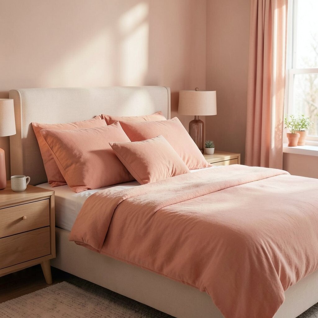
Soft coral can look like a gentle sunset, bringing warmth without the harshness of bright orange. It makes a bedroom feel friendly and cozy, especially with light wood and creamy whites.
This color can encourage comfort, but it works best in muted tones so it does not feel too energizing. Try coral through accent pillows, a bedside lamp shade, or a light-weight quilt. When you add darker neutral accents like taupe or gray, it becomes more sleep-friendly.
To personalize, choose coral with a pink undertone for a calmer feel, or choose a peachy coral for a beachy vibe. If you are worried about cost, start with textiles since they are easy to swap later. Current bedroom trends often blend warm blush tones with natural materials, making coral a stylish choice.
Keep the walls neutral so coral stays like a warm whisper, not a loud shout.
10. Butter Yellow for Cozy Cheer at Night

Butter yellow can glow softly when the light is warm, like a gentle lamp-lit corner. Used lightly, it adds optimism without feeling too active.
This color can lift the mood, which helps if you feel tired but restless. Stick to mellow shades, and keep the walls creamy so they feel calming. Add yellow through bedside trays, curtains, or a small wall color strip above the headboard.
Personalize with patterned bedding that includes yellow accents, then keep the rest of the palette soft. For a budget-friendly approach, look for thrifted frames or art with yellow tones. Pairing butter yellow with beige, white, and soft brown helps maintain a relaxing vibe.
11. Emerald Green for Rich, Restful Depth
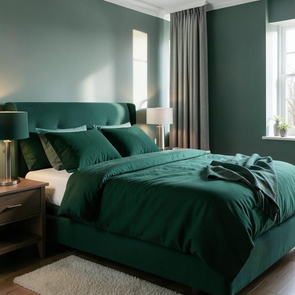
Emerald green feels luxurious and deep, like a velvet curtain in a quiet theater. In the right shade, it can create a soothing sense of privacy.
Green is often linked with balance, and emerald can feel grounded rather than loud. Use it on a headboard wall, a set of drapes, or an accent chair in your bedroom corner. If you love color but want calm, emerald is a strong choice when it is paired with light neutrals.
To keep it from feeling too heavy, add warm whites and natural textures like rattan or linen. This can also be a current trend move, since jewel tones are popular in cozy interiors. If painting feels too costly, try peel-and-stick wallpaper in a textured pattern behind the bed.
12. Warm Pink for Soft Comfort and Quiet Romance
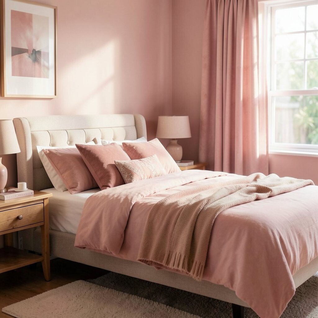
Warm pink can feel like a gentle hug, especially in dustier shades. It creates a comforting softness that works well for cozy bedrooms.
Pink can encourage comfort and emotional ease, which may help you wind down at night. Choose muted blush rather than bright fuchsia so your brain stays relaxed. Add pink through bedding, throw blankets, and framed art with neutral matting.
For personalization, consider a subtle pattern like tiny florals or soft stripes so it feels playful without being overstimulating. Budget-friendly options include swapping pillow covers and adding a pink-toned lamp base. Pair warm pink with warm white walls and beige wood for a calm, romantic look.
13. Golden Mustard for Evening Warmth and Texture
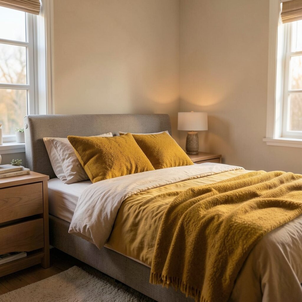
Mustard yellow can look rich and textured, especially when it is paired with dark wood. It can bring a warm glow to your bedroom that feels grounded.
This color can make the space feel cozy, which helps your body relax after a busy day. Use mustard carefully in small areas like a rug, an accent wall behind the bed, or a single upholstered chair. Mixing it with deep brown, cream, or muted olive helps keep it balanced.
For practical personalization, match mustard with patterned curtains that include small neutral tones. If you want a low-cost start, choose a mustard throw blanket and one or two decorative pillows. Keep the rest of the palette subdued so the color supports sleep, not excitement.
In current interiors, mustard shows up in vintage-inspired designs, which can feel unique and personal.
14. Metallic Rose Gold for Calm Glow and Soft Light
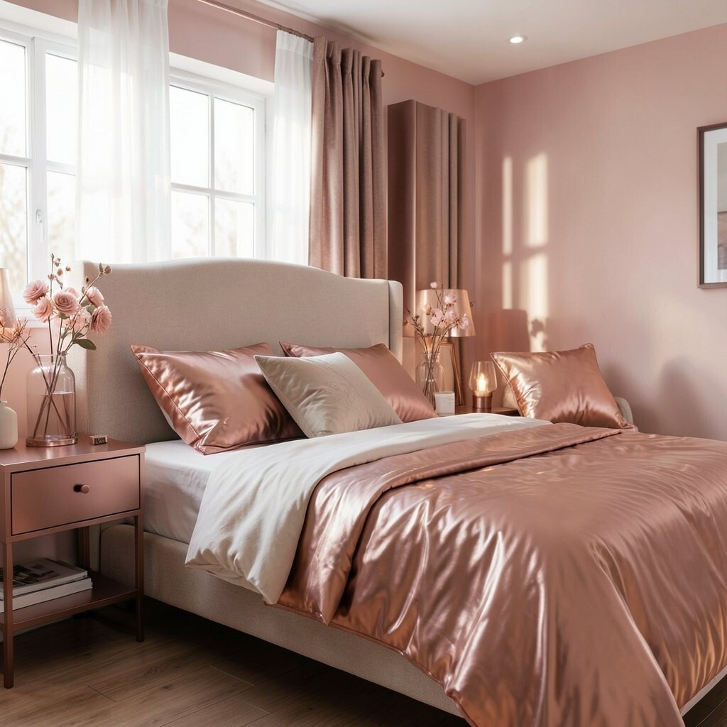
Rose gold details can create a soft glow, like candlelight in a modern frame. When you see it near your bed, it feels warm and gentle rather than flashy.
Metal accents can help you create a relaxing mood by reflecting light softly across the room. Use it for small details such as a lamp, picture frames, or a mirror with a rose gold edge. Keep the color story mostly neutral so the metallic accents feel calming, not distracting.
15. Earthy Brown for Steady Security and Rest
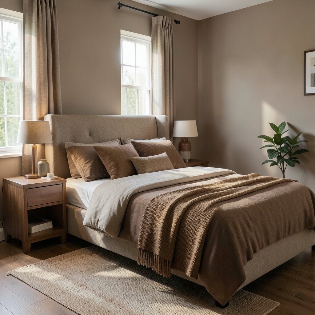
Brown brings a grounded feeling, like wood grain and warm leather. It can make your bedroom feel secure, especially when the lighting is soft and warm.
Natural browns can support relaxation because they connect to familiar materials. Try chocolate brown as an accent in a headboard, bed frame, or bedside furniture. Combine it with beige walls and warm white linens to keep the look comforting and balanced.
For personalization, add layers of texture, like a woven rug, a thick knit blanket, or curtains with a slight weave. If you want cost control, focus on textiles and furniture you already own. Current trends also value natural textures, so earthy brown can fit right in without feeling outdated.
16. Bold Red in Small Doses for Passionate Comfort
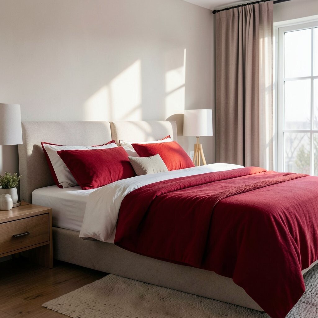
Red can feel intense, like a strong heartbeat, so it works best when you use it sparingly. In a bedroom, small pops of red can make the room feel alive without taking over.
Because red can raise energy levels, keep it limited to accessories such as a throw pillow, artwork, or a bedside book. Pair red with calm neutrals like cream and gray to keep the overall mood restful. A deep, wine-like red often feels more soothing than bright red, so choose darker tones when possible.
If you want a modern look, use red in minimalist shapes, like a simple framed print or a small rug accent. This approach is also budget-friendly since you can change accessories anytime. Personalize it by picking a shade that matches your favorite sweater or a piece you already love.
17. Multi-Color Harmony with a Sleep-Friendly Palette

A bedroom can handle multiple colors when they share one calming vibe. Imagine a gradient of soft blues, gentle grays, and warm whites that feels balanced instead of chaotic.
Using a small palette can reduce stress because your eyes have an easier time finding harmony. Choose one main color, one supporting neutral, and one accent color that you repeat in small ways like pillows and art frames. This makes the room feel designed without being busy.
For practical tips, aim for similar undertones across colors, such as cool blues with cool grays or warm beige with warm coral. Current trends favor layered, cohesive palettes, so your room can look stylish while still supporting sleep. If you want variety without cost, swap out textiles seasonally and keep the walls neutral.
Personalization can be as simple as picking a favorite color and echoing it subtly across your space. When everything fits together, bedtime feels smoother and more inviting.