
Color can turn a blank page into a lively place. When you pick bold shades on purpose, your ideas start moving faster.
1. Tropical Teal and Sunshine Yellow
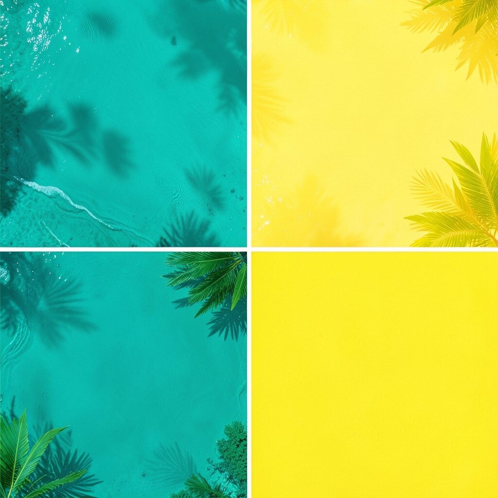
Picture a warm beach scene where teal water glows next to bright yellow light. This palette feels cheerful and awake, like a morning playlist.
Use teal as your main background and sunshine yellow for accents like buttons, headings, or key details. It can make interfaces feel friendly and help your eye find what matters quickly. To personalize it, borrow a shade from a favorite mug, mural, or beach towel and tweak the teal toward green or blue. Keep costs low by starting with two base colors and only adding a third tint for highlights.
2. Candy Coral With Minty Fresh Highlights
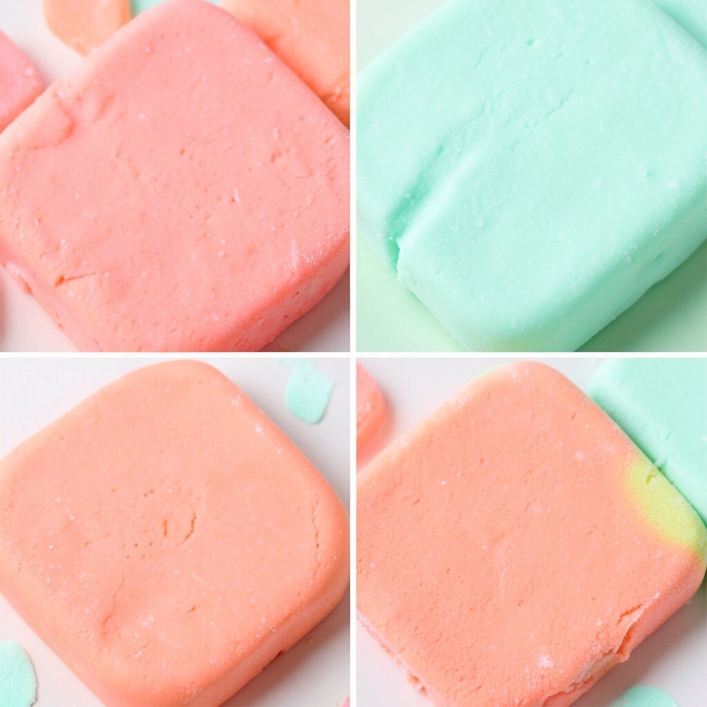
Think of fruity candy wrapped in soft coral, then cooled with a clean mint sparkle. The result feels playful, modern, and easy on the eyes.
Pair coral with mint as your main contrast, then add a neutral like cream to keep everything readable. This combination works well for packaging mockups, summer posters, and branding that needs warmth without shouting. Choose a coral that matches the mood you want, from light peach for calm energy to stronger coral for bold confidence.
If you are working on a budget, limit yourself to a small set of tones and build a gradient using tints you already own. A popular trend right now is using pastel “near-neon” accents, so try mint as your glow and coral as your focus point.
3. Electric Indigo, Hot Pink, and Crisp White
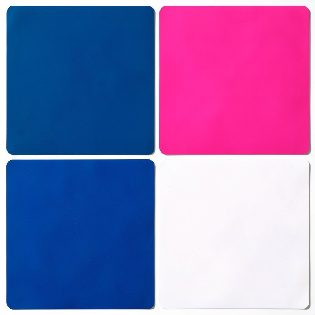
Imagine night sky indigo paired with a loud hot pink trail, then grounded by crisp white. It feels like street art under bright lights.
Indigo can carry the layout, hot pink can highlight the most important actions, and white can keep the design sharp. This palette is great for landing pages, cover designs, and event flyers where you want attention fast. Try personalizing by pulling indigo from denim or twilight photography and selecting a hot pink that matches your favorite sneakers.
For cost considerations, you can often get strong results with fewer print colors by using one main ink and letting screens handle the contrast. Current trends lean toward high-contrast palettes, so keep spacing generous and let the pink breathe.
4. Lime Green, Royal Blue, and Warm Gray
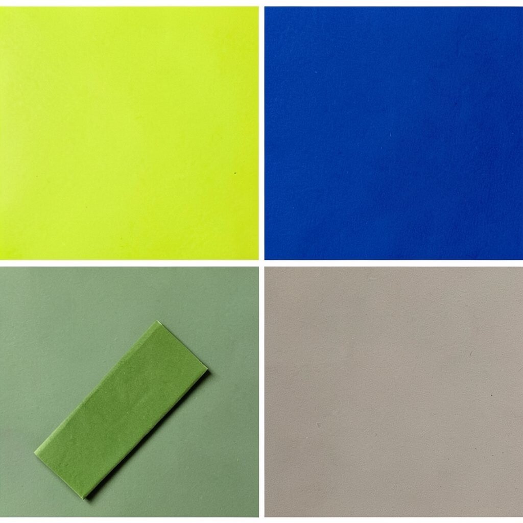
Picture a bright green leaf next to deep royal blue, with warm gray like the stone path beneath it. This mix balances energy and calm.
Use lime green sparingly for calls to action or small details, then rely on royal blue for larger blocks. Warm gray helps everything feel less harsh, which is helpful for long reads and product pages. Personalize by adjusting the lime toward yellow-green for a fresh kick, or toward chartreuse for a trendier look.
If you want practical guidance, test your palette in grayscale to make sure the contrast still works. To manage cost, choose one bold color and one grounding color first, then add gray only where it improves readability.
5. Sunburn Orange and Soft Sky Blue

Think of a sunset where sunburn orange meets gentle sky blue, like a postcard from summer. The emotions are warm, friendly, and a little nostalgic.
Orange works well for headings and highlights, while sky blue can act as a background or secondary color. This palette helps create a clear visual hierarchy without needing dark colors everywhere. Personalize it by picking an orange tone from a favorite hoodie or playlist cover and matching the sky blue to your favorite notebook page.
You can keep costs low by using orange as a single “hero” color and using multiple sky-blue tints instead of buying extra pigments. A current trend is using warm backgrounds with cool accents, so try an orange page header with sky-blue buttons.
6. Berry Purple, Gold, and Deep Charcoal
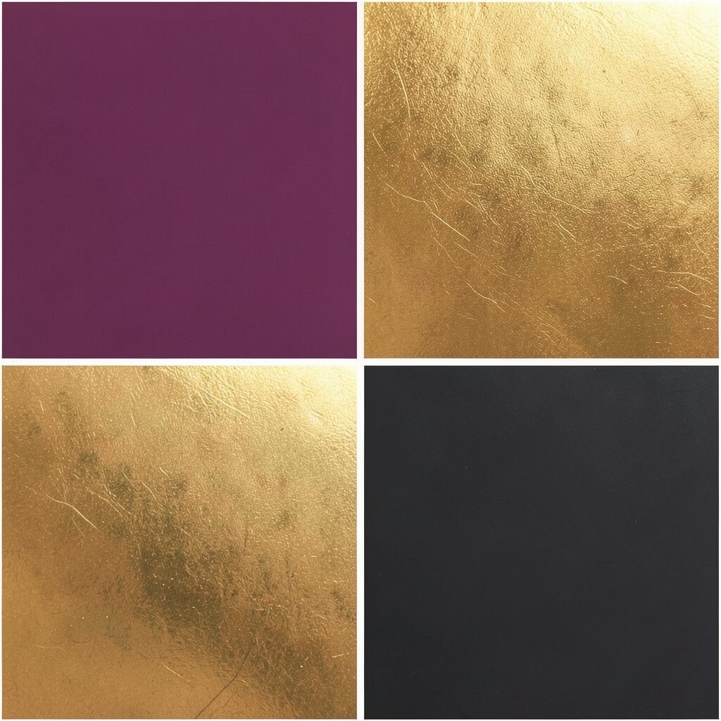
Picture berry fruit with a gold shimmer, then grounded by deep charcoal like a classy night suit. This palette feels elegant but still exciting.
Try berry purple as a main color, gold for small highlights like icons, and charcoal for text and borders. The benefit is strong readability and a premium vibe, especially for brands, portfolios, and event branding. To personalize, choose a berry tone that matches your style, like grape for rich mood or raspberry for lively fun.
If you are printing, consider using charcoal as the primary ink and reserving gold for tiny details, because metallics can raise costs. This palette is also popular in modern luxury aesthetics, so aim for clean layouts and crisp spacing.
7. Teal Smoke, Coral Flame, and Pale Sand
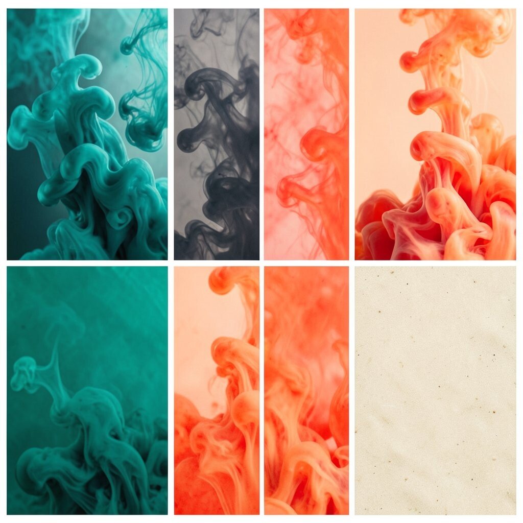
Imagine a city at dusk where teal smoke fills the air, coral flame lights the corners, and pale sand tones soften everything. It feels moody, creative, and still approachable.
Use pale sand as the base so your design stays calm, then add teal smoke for structure and coral flame for emphasis. This palette is great for art portfolios, cafe menus, and editorial layouts where you want a strong mood. Personalize by sampling teal from ocean fog photos and coral from street murals you love.
8. Neon Yellow, Black Licorice, and White Pop
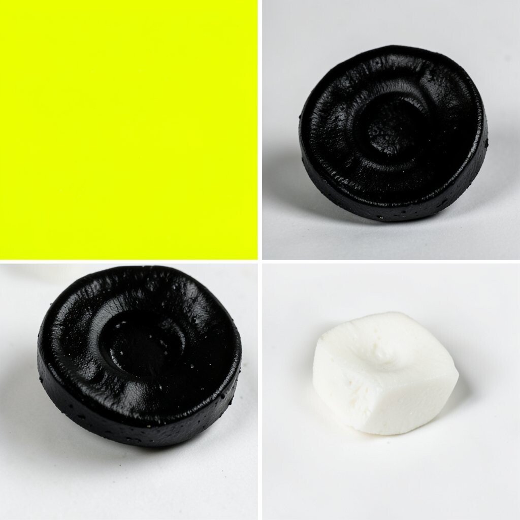
Think of a neon sign glowing over a dark sidewalk, with sharp white highlights. It is bold, energetic, and impossible to ignore.
Let neon yellow be the highlight, black licorice handle the backbone, and white pop keep the design crisp. This can be amazing for modern tech branding, nightlife posters, and bold social media templates. If you want practicality, keep your neon areas small so your audience does not feel overwhelmed.
To personalize, choose a neon yellow that feels slightly green or slightly orange, depending on your vibe. Cost can be managed by using dark backgrounds with one bright accent rather than many bright inks.
9. Rose Pink, Persimmon, and Butter Cream
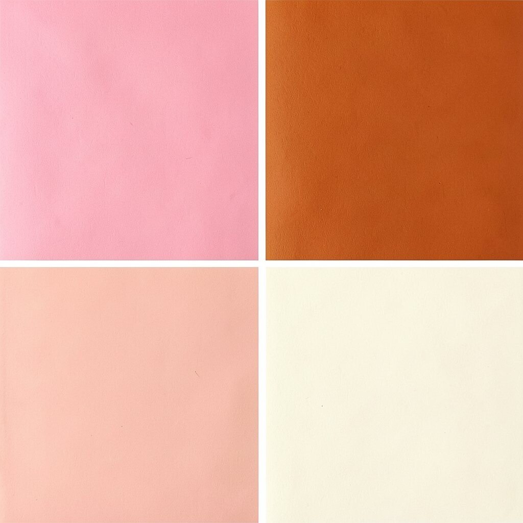
Picture a bakery window where rose pink frosting meets persimmon fruit and butter cream. This palette feels warm and inviting without needing dark colors.
Use butter cream as the background, rose pink for sections that need attention, and persimmon for playful highlights. It is a great choice for lifestyle brands, kid-friendly designs, and cozy websites. Personalize it by matching the rose tone to your favorite lip color and adjusting persimmon to feel more peachy or more orange.
For practical tips, keep text darker than your warm colors so readability stays strong. If you are printing, using lighter bases can reduce ink coverage and lower overall costs.
10. Aqua Lagoon, Tangerine Spark, and Soft Slate

Imagine turquoise water with tangerine highlights and soft slate shadows. This palette feels fresh, breezy, and full of momentum.
Let aqua lagoon lead as the background color, then use tangerine spark for icons, badges, and key callouts. Soft slate can support the typography so it does not float away. To personalize, pick an aqua that feels more green for a tropical mood or more blue for a clean tech vibe.
Cost-wise, you can reduce materials by choosing one accent color and reusing it across buttons and graphics. Current trends often mix watery colors with warm citrus accents, so this pairing fits right in.
11. Coral Peach, Ocean Navy, and Ivory
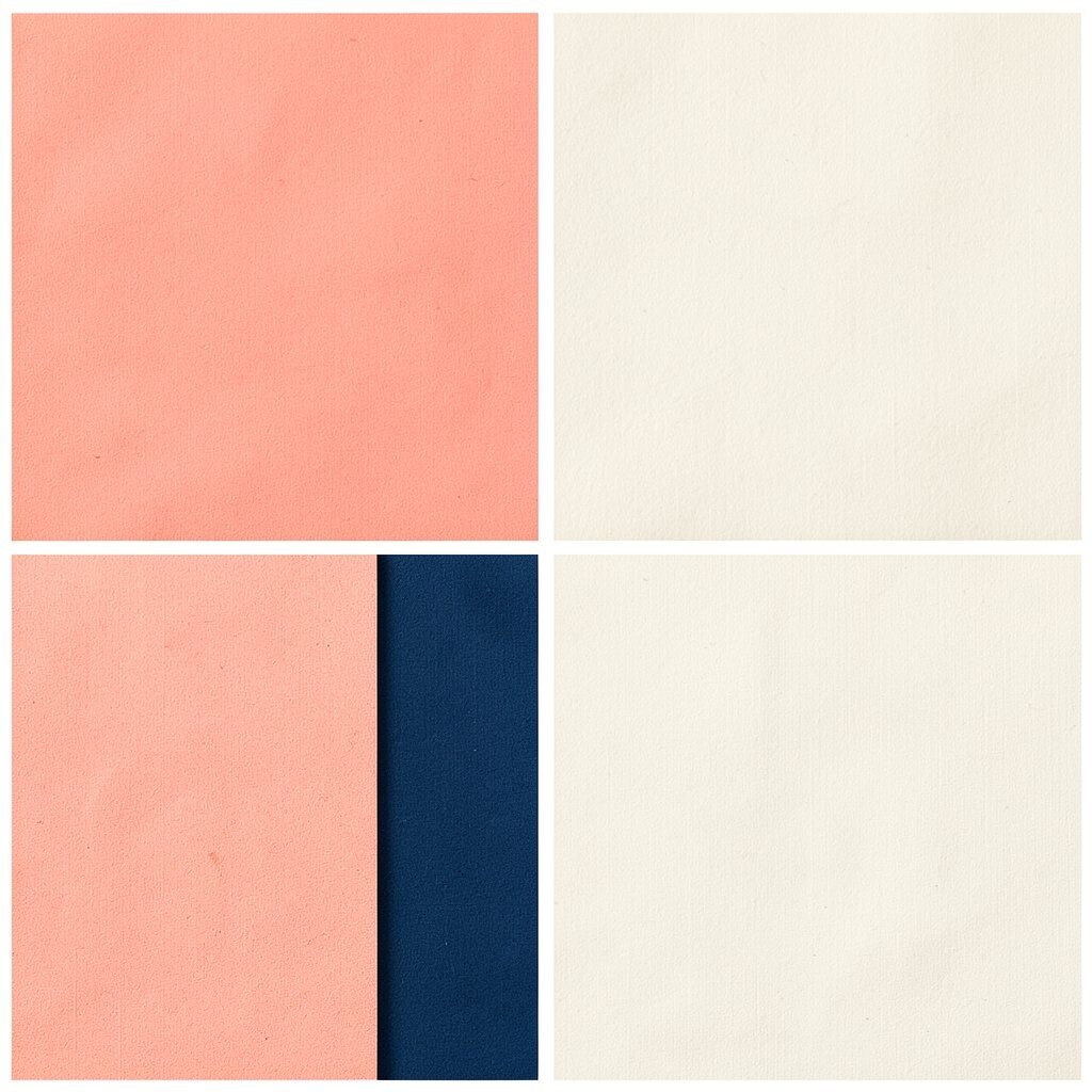
Picture a calm seaside town where coral peach storefronts glow against ocean navy skies. Ivory ties it together with a classic feel.
Ocean navy makes text and key elements readable, while coral peach brings friendly warmth. Ivory keeps the palette light and helps it work for long pages like guides and newsletters. Personalize by selecting a peach closer to pink for a softer mood or closer to orange for a bolder one.
If you want a practical approach, keep the navy as your default and apply peach only to interactive parts. For cost, start with a limited number of colors, since many designs look better with fewer choices.
12. Bright Cerulean, Hot Magenta, and Light Gray

Think of a pop of cerulean sky plus a punch of magenta marker, then softened by light gray. It has a creative, art-class energy.
Cerulean can be your main color for panels, magenta can highlight buttons and links, and light gray can support body text. This palette helps your layout feel modern and quick to scan. Personalize by trying a cerulean that leans toward cyan or blue, and pick a magenta that feels more purple or more red.
For practicality, test the palette in different lighting or screen brightness so contrast stays healthy. Cost considerations are simple here because you can rely on digital-first colors and use gray to reduce heavy ink when printing.
13. Golden Mustard, Teal, and Charcoal Ink
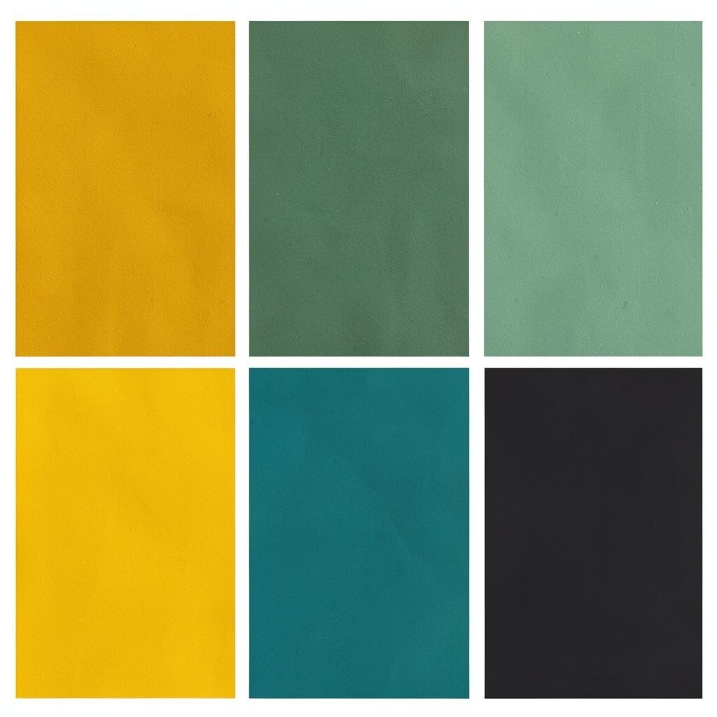
Imagine a mustard jacket with teal accents, written on charcoal paper. This palette feels bold, artsy, and full of character.
Use golden mustard as your headline color, teal for diagrams and small details, and charcoal for text. The benefit is that the mustard draws attention while the teal adds a refreshing contrast. Personalize by choosing a mustard that feels vintage and less orange, then adjust teal toward green for an earthy twist.
When budgeting, remember that deeper dark colors can cover well, so you may need less ink for printing. A current trend favors earthy brights, so this palette works well for modern branding and illustrated layouts.
14. Emerald Green, Electric Blue, and Linen White
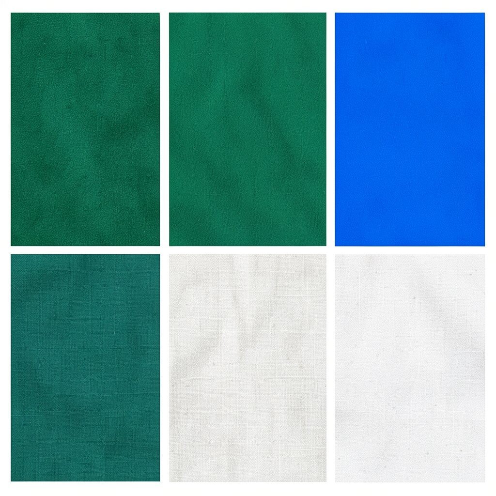
Picture lush emerald leaves paired with electric blue sparks, sitting on linen white. It looks lively, fresh, and slightly futuristic.
Emerald green can become the dominant color for sections, electric blue can highlight interactive elements, and linen white keeps everything airy. This palette is especially good for wellness brands, fashion mockups, and design portfolios. Personalize by selecting an emerald that feels more forest or more lime, depending on the mood you want.
15. Bright Azure, Coral Pink, and Soft Chalk
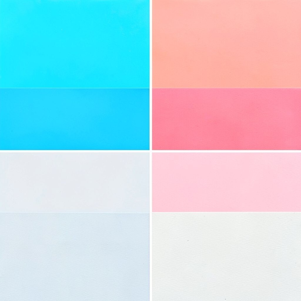
Think of bright azure waves crashing into coral pink foam, then fading into soft chalk. The overall feeling is upbeat and airy.
Use chalk tones as backgrounds for calm readability, azure for larger areas, and coral pink for highlights. This makes it easy for your audience to follow the story in a layout. Personalize by choosing whether your azure should feel more sky or more ocean, and whether your coral should feel more salmon or more rose.
If you want practical tips, keep your coral accents consistent across pages so the brand feels unified. Cost can be managed by using bright colors mostly as outlines or small fills rather than full blocks.
16. Electric Turquoise, Hot Orange, and Creamy Beige

Imagine a bright ocean festival where electric turquoise lights meet hot orange energy and a creamy beige base. It feels like movement and celebration.
Turquoise can be your main brand color, hot orange can act as the “spark” for buttons and headings, and creamy beige can soften the whole composition. This palette is great for event pages, bold social tiles, and fun product launches. Personalize it by taking turquoise from your favorite graphic and choosing an orange that feels more mango or more fire.
To keep costs in check, you can design with digital gradients first and keep printing simple by using solid fills for the main colors. Current trends often favor high-energy contrasts, and this combo fits that style nicely.
17. Crimson Red, Sky Cyan, and Warm Linen
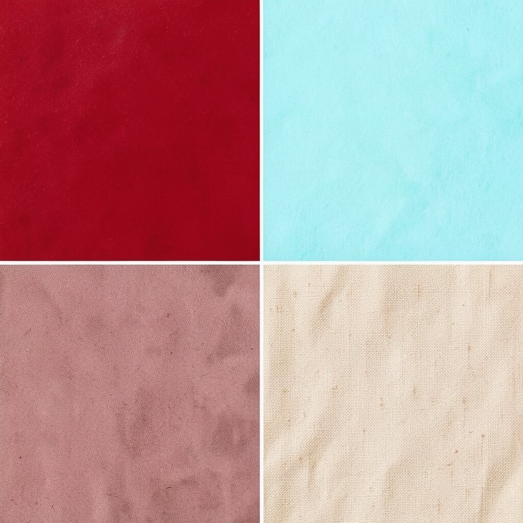
Picture a vintage poster with crimson red headlines, sky cyan accents, and warm linen paper. It feels dramatic, classic, and ready for creativity.
Crimson red grabs attention, sky cyan adds a playful technical edge, and warm linen keeps the page from feeling too intense. This palette works well for book covers, brand stories, and bold artwork where you want strong emotional impact. Personalize it by dialing the crimson toward brick for a softer vibe or toward true red for maximum punch.
If you want practical guidance, make sure you have enough light tones so your design does not feel heavy. For cost considerations, warm linen can reduce harsh contrast and help you use fewer dark backgrounds in print.
18. Lavender Bloom, Lime Zest, and Pale Charcoal

Imagine lavender flowers beside a lime-zest garnish, all set against pale charcoal shadows. It feels creative, artsy, and surprisingly balanced.
Lavender can be the background or secondary color, lime zest adds a bright focal point, and pale charcoal supports readable typography. This palette is great for wellness apps, creative blogs, and modern lifestyle branding. Personalize by choosing a lavender that feels more pink or more blue, then adjust lime toward green-yellow for extra freshness.
Keep it practical by using lime mainly for small highlights like icons or badges, which keeps designs clean. If printing, lime can be tricky, so consider limiting it to solid accents to manage cost.
19. Bright Rose, Deep Teal, and Soft Gold
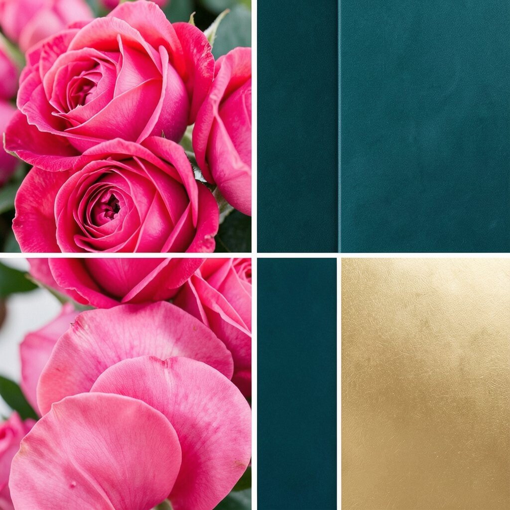
Think of bright rose petals paired with deep teal water, finished with a soft gold glow. It feels romantic, confident, and a little magical.
Use deep teal as the foundation for text and structure, bright rose for headings, and soft gold for subtle shine. The benefit is a strong contrast that still looks elegant rather than loud. Personalize by selecting a rose that fits your brand personality and choosing gold accents that feel warm, not too yellow.
For practical tips, keep gold details small so they do not overpower readability. Cost considerations matter too, since gold effects can be expensive in print, so you can use warm yellow or lightly tinted elements digitally when needed.
20. Bright White, Neon Blue, and Mango Yellow
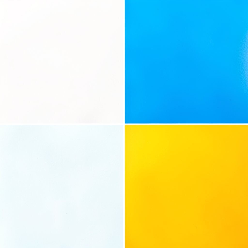
Imagine a clean studio with neon blue lines and mango yellow sparks floating on bright white walls. It feels crisp, modern, and full of fresh ideas.
Use bright white as the base, neon blue for outlines and key shapes, and mango yellow for energetic highlights. This palette helps designs feel fast and organized, which is useful for dashboards, product UI mockups, and modern posters. Personalize it by adjusting neon blue toward a more cyan hue and choosing mango yellow that feels more golden than orange.
If you are thinking about practical production, bright white backgrounds often reduce ink coverage, which can help with cost. Current trends lean toward clean minimal layouts with one electric accent, and this combination fits that vibe perfectly.