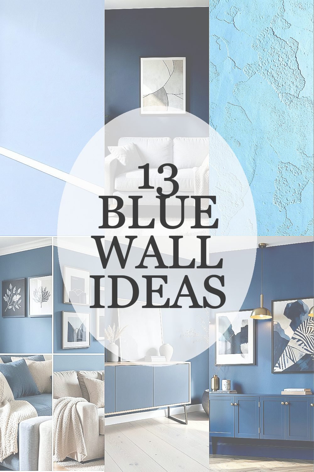
Your walls can feel like a calm sky or a dramatic ocean depending on the shade you choose. Blue also pairs with so many styles that it never feels stuck in one look.
Here are many practical ways to bring blue wall inspiration into real rooms, with easy personalization ideas and budget-friendly choices that still look high-end.
1. Soft Powder Blue With Crisp White Trim

Picture a powder blue wall that feels airy, like morning light on a quiet street. The white trim makes everything look clean and tailored.
Choose a paint shade that leans slightly cool without turning gray, especially if your room gets warm light. Pair the walls with white curtains, a light wood floor, and simple brushed metal fixtures for an instantly fresh look. Keep hardware and frames consistent so the room feels put-together without extra effort.
2. Deep Navy Accent Wall for Instant Drama

Imagine a single navy wall behind your sofa, rich and bold like a night sky. When you add warm lamps, the blue looks even more luxurious.
This works especially well in living rooms, reading nooks, and dining spaces where you want a focal point. Use lighter furniture and cream textiles to keep the mood cozy rather than heavy. If the room is small, limit navy to one wall and keep the rest in warm white.
To keep it from feeling too dark, paint the ceiling a bright off-white and choose reflective finishes like satin paint on the accent wall. Add gold or brass picture frames, and consider a large mirror to bounce light around. Test the color by painting a small section and watching it at morning and evening for the best result.
3. Coastal Blue With Texture Like Weathered Plaster

Think of soft coastal blue with a slightly rough, sandy texture that catches light in a gentle way. It gives your walls depth, even when the room has simple furniture.
Textured finishes can hide minor wall imperfections and make blue feel more artistic. Look for paints or coatings that are designed for subtle plaster-like effects rather than glossy smoothness. This style fits beach homes, but it also works in modern spaces when paired with sleek lines.
For a practical approach, start with a low-sheen paint and add a very light texture technique using a sponge or rag method. Match the tone with natural materials like linen curtains, woven baskets, and driftwood accents. If you want a cheaper route, achieve the same vibe with a textured wallpaper panel on one wall instead of redoing all walls.
Personalize it by choosing sea-inspired artwork in warm blues and soft grays. Add a few ceramic planters or a woven pendant lamp so the room feels alive. Keep colors in the same family so the texture does the talking.
4. Blue and Beige Color Pairing for a Cozy Neutral Feel

Visualize blue walls that blend into warm beige accents, creating a calm and comfortable background. Beige cushions and wooden shelves make the blue feel friendly instead of sharp.
Use a medium or dusty blue for this combo, since it softens the contrast and looks welcoming all year. Pick beige in multiple shades, such as sand, oatmeal, and taupe, to add depth without clutter. This pairing is great for everyday spaces like bedrooms, hallways, and family rooms.
5. Scandinavian Blue With Light Flooring and Minimal Decor

Picture a bright, Scandinavian-inspired room with pale blue walls and airy white furniture. The look feels clean, calm, and easy to maintain.
Choose a light blue that stays close to white, so the room stays open and bright. Keep decor minimal and choose pieces with slim legs, like a simple side table or a low media console. This style also highlights natural light, so it feels especially good in spaces with big windows.
To personalize, add a single patterned rug in muted blues, or frame a small gallery of black-and-white photos with blue mats. For cost considerations, you can refresh the room fast by painting walls first and then upgrading textiles with fewer purchases. Thrifted frames and simple wood shelving can make it look designed without a big budget.
6. Royal Blue With Brass Lighting for a Rich, Modern Look

Royal blue walls create a bold backdrop, like velvet color in a stylish boutique. When brass or warm gold lighting is nearby, the room glows.
Pair royal blue with matte black accents for a crisp contrast, or choose warm brass for a softer, elegant effect. Consider satin or eggshell paint so it reflects light gently and doesn’t look flat. This is a great choice for entryways, offices, and dining rooms where you want guests to feel impressed.
Start by selecting your lighting first, since the finish will guide the exact blue tone you should pick. Then paint a test patch and compare it beside the bulbs during the day. Add personal touches like a statement mirror, a textured ceramic vase, and a few books with blue spines or neutral covers.
7. Turquoise and White for a Playful, Sunlit Kitchen

Imagine turquoise blue walls paired with bright white cabinets, giving your kitchen a cheerful, beachy vibe. The color pops while still feeling clean and practical.
Turquoise works well when you want your kitchen to feel fresh and lively, especially in spaces with natural sunlight. Keep the rest of the kitchen light, including countertops and backsplash tiles, so the blue stays the star. Choose a durable, wipeable paint finish since kitchens need easy cleaning.
Personalize by adding simple open shelving with matching jars, or hanging a vintage-style clock for personality. If you want to keep costs lower, paint only the walls and update small hardware like cabinet pulls. Trends right now lean toward bold color pops with minimal clutter, and a turquoise accent can match that modern rhythm beautifully.
8. Powder Blue Bedroom With Layered Textiles and Soft Lighting

Picture powder blue walls in a bedroom that feels gentle and soothing. Add layered bedding in white, cream, and light gray, and the room instantly looks inviting.
Soft blue is a smart choice for sleep spaces because it feels calming rather than stimulating. Choose warmer white bedding instead of bright cool white so the room feels cozy at night. Use soft, warm bulbs in lamps to keep the blue from turning icy.
9. Blue-Grey Walls for a Contemporary, Timeless Base

Visualize blue-grey walls that read like sky meeting stone, offering a calm, modern background. They work beautifully with both wood tones and sleek metal finishes.
This shade is unique because it blends two popular neutrals, giving you the color interest of blue without feeling too bold. Pair it with warm oak furniture, charcoal accessories, and creamy white trim for a balanced look. If you like current trends, this is right in line with modern interiors that favor layered neutrals and subtle color.
To personalize, choose one accent color like blush pink, olive green, or deep teal, and repeat it in small ways across the room. For practical steps, paint a test panel and watch how the blue-grey shifts in morning light versus evening. If your budget is tight, use peel-and-stick samples or a smaller tester pot so you don’t waste paint.
Make it feel finished with textured curtains and a rug that has both cool and warm tones. When the whole room shares the same temperature, the blue-grey stays elegant instead of confusing.
10. Painted Ceiling in Blue for a Surprising Sky Effect

Imagine looking up and seeing a blue ceiling that feels like an open sky. Even a small room can feel taller when the color is lighter than the walls.
This idea is unique because it changes the whole mood without taking over every wall. Use a lighter blue on the ceiling and keep walls in a neutral shade like warm white or soft beige. Add matching lighting and ceiling fans in a simple finish so the look stays clean.
For practical tips, protect trim carefully and use painter’s tape along edges for crisp lines. Consider painting the ceiling first, then the walls, so touch-ups are easier. If you want a budget-friendly approach, paint just a strip or choose a ceiling color only above key areas like dining spots or headboards.
11. Removable Blue Wallpaper Stripes for Easy Seasonal Refresh

Picture blue striped wallpaper that instantly adds rhythm and movement to your room. Vertical stripes can make ceilings feel higher, and horizontal stripes can widen the space.
Removable wallpaper is helpful if you love change because you can update the look without repainting everything. Choose stripes with a soft blue tone so they feel modern and not overly themed. Pair with simple decor so the pattern stays the main focus.
Personalize by using two stripe widths on different walls, or mix stripes with plain blue paint for a custom style. For cost considerations, start with one feature wall to avoid buying too much pattern material. Current trends often mix geometric accents with calm neutrals, and removable stripes fit that idea nicely.
When installing, measure carefully and keep the pattern aligned so it looks crisp. If you rent or expect future changes, this approach makes the update feel low stress and fun.
12. Blue Gallery Wall With Framed Art and Open Shelving

Think of a blue wall that frames your favorite art like a living museum. When you hang frames in different sizes, the blue background makes everything pop.
This idea is uniquely practical because you can personalize without worrying about perfect painting coverage across the whole room. Use a consistent blue tone so the gallery looks cohesive even as frame styles vary. Choose matte frames or simple black frames for a modern look that works with many types of art.
To keep it actionable, map your layout on the floor first and tape the outlines to the wall before hanging anything. Mix in open shelving with small decor items like books, ceramics, and plants so the room feels layered, not flat. For a cost-friendly approach, thrift frames and repaint them in matching colors rather than buying everything new.
If you want a trendy touch, add a few larger-format prints with lots of white space, because the blue will make the negative space look even brighter.
13. Ombre Blue Wall From Light at the Top to Deeper at the Bottom

Imagine an ombre wall where the color fades like a sunset, starting light and turning deeper as it moves downward. It feels artistic, smooth, and surprisingly calming.
This is a great way to get uniqueness without adding clutter, since the gradient becomes the design. Use three close shades of blue and blend them gently so the transition looks natural rather than streaky. It’s ideal for bedrooms, nurseries, and creative spaces where you want a soft statement.
For practical tips, tape a level guide on the wall, paint the top shade, then blend the middle with a sponge or brush in light strokes. Work in small sections and keep a damp edge so the fade stays smooth. If you’re watching costs, ombre can be done with a starter set of tester paints, which often saves money compared to buying multiple full-size cans.
Personalize it by pairing the gradient with patterned bedding, or by using a simple neutral rug and letting the ombre do the work. Finish with lighting that feels warm and flattering, because soft bulbs make blue look rich and welcoming.