
Blue wall curtains can make a room feel calm and stylish at the same time. The right fabric and placement can also change how light moves through your space.
Because they’re both decorative and practical, they fit many home styles. Use the ideas below to build your own look with simple, real-world choices.
1. Denim-Blue Panels With Natural Wood Floors
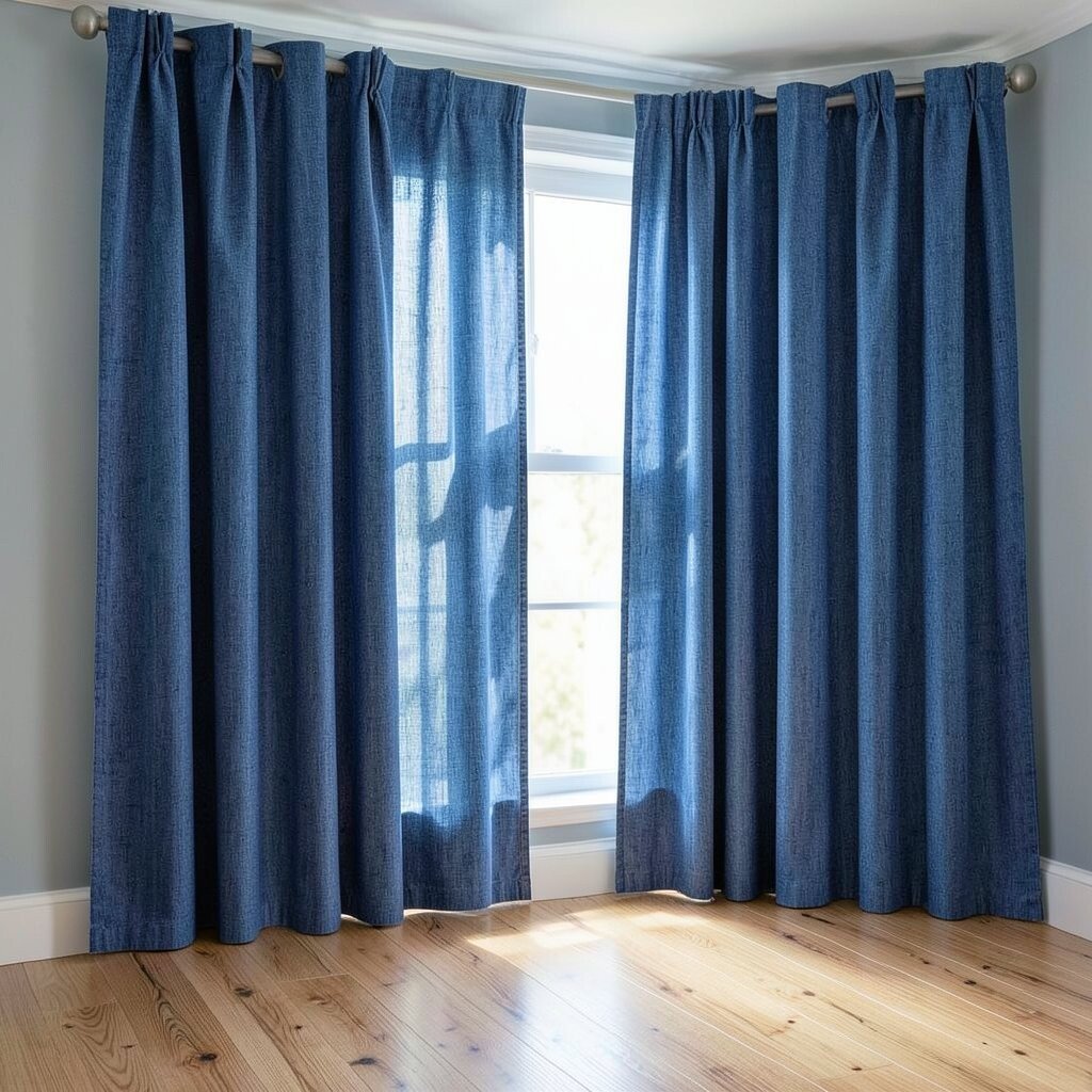
Imagine tall denim-blue curtains hanging straight across the wall, catching light like soft indigo. The texture pairs beautifully with natural wood floors and warm baseboards.
For a practical win, denim-weight fabric blocks a bit of glare and adds privacy without making the room feel dark. Choose panels with grommets or sturdy hems so they move smoothly on the rod. If you want it to look tailored, measure wall width carefully and aim for fuller coverage.
2. Cornflower Blue Sheer Layers for Bright Rooms

Picture cornflower-blue sheers drifting over a window or wall-mounted rod. Even on cloudy days, the room looks airy because the fabric lets light stay gentle.
This layered style softens the whole space and helps walls feel less bare. Keep the sheers light and flowy, and consider adding a plain white lining or a pale blue backing to control brightness. For a fresh trend, people are mixing sheer color with simple neutral interiors to get a “sunlit” look.
When setting this up, use two sheer layers with slightly different shades so the wall looks dimensional. If you’re working with a budget, search for pre-made sheer panels and trim them to length. A quick personalization trick is to steam the fabric well so it hangs with clean, relaxed folds.
3. Ombre Blue Curtains That Fade Like a Sky
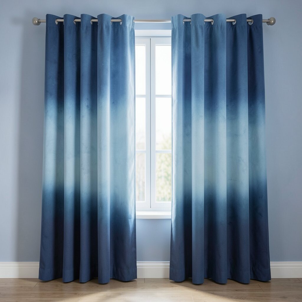
Think of an ombre curtain that starts deep blue and fades to a lighter shade near the bottom. The effect makes the wall look taller and gives the room a calm, sky-like mood.
This design is unique because it doesn’t just cover a wall, it creates a gradient focal point. Pair it with simple wall art so the color fade stays the star. For practical styling, hang the darkest part at eye level and let the lightest section soften the lower area.
To personalize, match the fade to your other colors, like navy cushions or teal ceramics. Many homeowners like this trend because it looks modern without feeling cold. In cost terms, you can often find ombre-ready curtains as sets, but custom dyeing is a cheaper DIY option if you’re handy.
Use a fabric-safe steamer to refresh the folds, especially if you buy online. When the curtain moves, the gradient becomes even more eye-catching.
4. Royal Blue Velvet for a Cozy, Lux Feel

Royal blue velvet brings a rich, touchable look to your wall. The fabric catches light in a way that feels warm and elegant, even in simple rooms.
Velvet is also practical for noise reduction, so it can make a living room or reading nook feel quieter. Choose a curtain rod that supports the weight, and use thicker lining if you want extra warmth. For personalization, try a slightly wider panel so the folds look fuller from across the room.
5. Powder Blue Cotton With Fringe for Casual Charm

Picture powder blue cotton curtains with light fringe edging at the bottom. The look feels playful and relaxed, like a fresh coastal day indoors.
This option works well for kitchens, home offices, and smaller rooms where you still want style. Cotton curtains are easier to care for and usually cost less than velvet or heavy specialty fabrics. If you want them to feel extra neat, use a fabric steamer and keep the fringe untangled while hanging.
For unique character, mix the fringe direction with your room style, such as vertical fringe for a taller feel. You can also add a matching tieback in a coordinating color like sand or cream. When budgets are tight, look for cotton curtain pairs on sale and hem them to your exact drop length.
6. Sky-Themed Blue Curtains With Minimal Pattern

Start with a light blue curtain that has a subtle pattern, like tiny clouds or gentle waves. From a distance it looks calm, and up close it adds texture to the wall.
This is a great way to add personality without overwhelming your decor. Choose a pattern scale that fits your wall size, since large motifs can dominate a small space. For practicality, patterns help hide minor wrinkles and everyday wear.
If you want personalization, pick a pattern color that echoes your accessories, like blue in a vase or a throw blanket. Current trends favor “quiet print” looks, where the pattern is present but not loud. To manage cost, compare fabric weight and consider buying single panels instead of full sets.
7. Navy Curtain Panels With Brass Rod and Rings

Navy blue curtains look bold and clean when paired with a brass rod. The warm metal detail makes the dark blue feel polished instead of heavy.
For benefits, the darker shade helps hide wall marks and gives your room a crisp, grounded feeling. Choose rings or clips that slide smoothly so you can open and close the curtains easily. To keep it from feeling too formal, soften the look with casual accessories like knit pillows or a woven rug.
8. Blue Wall Curtain Over a Gallery Spot for Instant Frame Effect

Try hanging a blue curtain where a gallery wall usually goes, then let it act like a soft frame. When the curtain is partially pulled aside, art and photos feel more intentional and styled.
This approach is unique because it combines decoration and flexibility in one setup. You can change the “window” area each season by moving the curtain panels and swapping art. A practical tip is to use a tension rod or a secondary track so you can adjust the coverage without taking everything down.
For personalization, match the blue to one color in your artwork so everything feels connected. In terms of cost, you can use shorter panels and focus on the visible middle section. Many people love this trend because it turns everyday walls into a dynamic backdrop.
If you have kids or pets, choose washable fabric and secure the rod tightly.
9. Teal Blue Linen Curtains for Textured, Modern Style
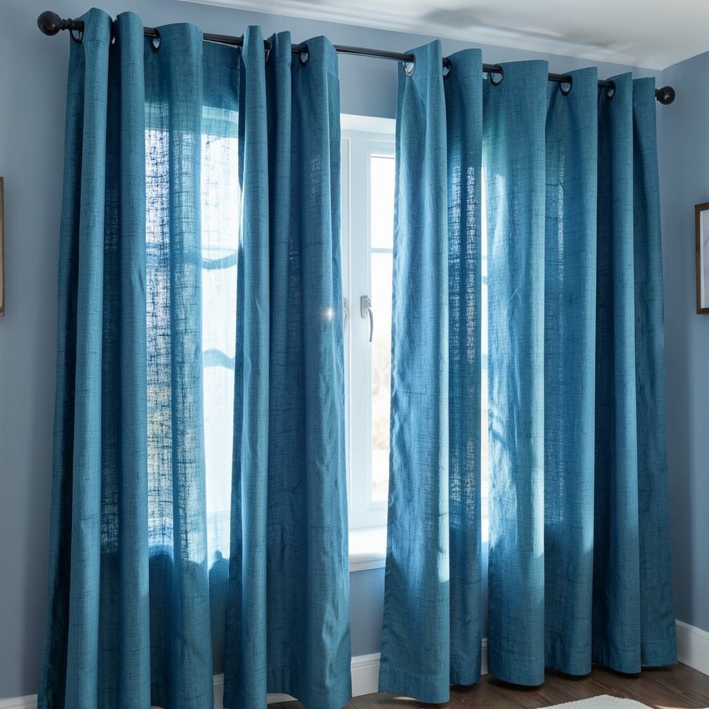
Teal linen curtains bring a relaxed, modern texture to your walls. The natural weave makes light look soft, like it’s filtered through a warm haze.
Linen is a practical choice because it balances beauty with breathable comfort. It also tends to drape nicely, which helps the curtains look expensive even when they aren’t. For personalization, layer teal linen over a neutral backing if you want richer color without going too dark.
10. Transitional Blue Stripes for Classic Yet Fresh Rooms

Blue striped curtains can make a room feel taller or wider depending on how you hang them. Thin stripes look neat and classic, while thicker ones bring a bolder energy.
This style is beneficial because stripes guide the eye and create structure, especially in rooms with plain walls. Keep the stripe spacing consistent with your existing decor so it feels coordinated. A practical tip is to choose a stripe color that matches your trim, like a similar blue to your baseboards or door frames.
For personalization, use stripes on one wall and keep the rest of the room calmer with solid colors. Current trends often favor soft stripes over high-contrast designs, which can feel more modern. When budgeting, look for ready-made striped panels and check that the pattern repeats evenly across each panel.
11. Two-Tone Blue Curtains With Different Lengths for Motion

Two-tone curtains look stunning when one panel is slightly longer and overlaps. The layered effect adds movement, especially when you open and close the fabric.
This setup is unique because it breaks the usual straight-line look and adds a “designed” feel. For practical living, make sure the longer panel doesn’t drag on the floor if you have traffic in that area. Use a rod height that lets both panels show their full color contrast.
Personalize by picking two shades that exist in your space, like dusty blue and slate blue. Many homeowners are choosing this trend because it feels playful but still neat. Cost can be managed by mixing a full-length panel with a shorter one, rather than buying a matched set of two expensive pieces.
12. Baby Blue Pleated Curtains for Clean, Tailored Lines
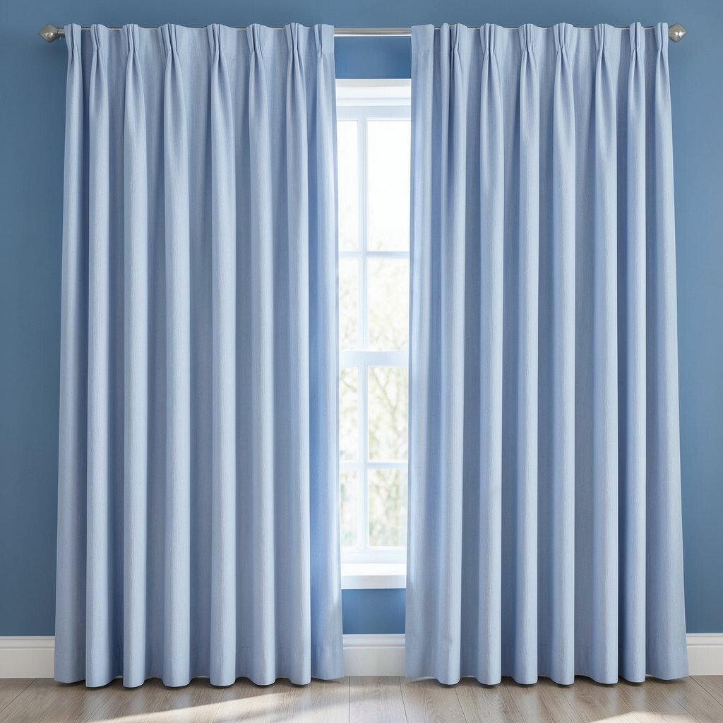
Baby blue pleated curtains give walls crisp lines and a polished look. The pleats create depth, so even a plain wall feels styled.
This option benefits you because it makes rooms feel organized without extra furniture. Pleated curtains work especially well in bedrooms and dining areas where you want a calm, orderly vibe. Choose a curtain header style that matches your rod system so the fabric hangs evenly from the start.
For personalization, pick a baby blue tone that matches your wall paint undertone. Some baby blues lean slightly gray, while others lean slightly green, and that choice changes the whole mood. If you’re cost-conscious, search for “pleat look” ready panels that mimic classic tailoring without requiring custom work.
Once installed, fluff the pleats gently so the curtain looks full right away.
13. Blue Macramé Wall Curtains for Light Patterns and Texture

Macramé blue curtains create a lace-like texture that turns light into a gentle pattern. Even when the curtains are still, the wall feels more alive.
This is a unique choice because it blends boho style with a cool blue palette. It also gives you partial privacy while still letting airflow and light through. For practical tips, use a sturdy wall-mounted rod or track so the curtain hangs straight and doesn’t sag.
Personalize the look by choosing a macramé shade that fits your decor, like periwinkle for soft charm or deep blue for drama. Many people are leaning into textured wall treatments right now, and macramé keeps the look warm instead of sterile. For cost considerations, macramé can vary widely, so compare size and knot density, not just the color.
If you have pets, keep the curtain higher and secure any loose ends.
14. Indigo Blue Blackout Curtains for Movie-Night Comfort

Indigo blackout curtains make a wall feel grounded and cozy. The deep color also helps reduce glare, so screens look better and evenings feel calmer.
For benefits, blackout fabric improves sleep and can cut down outside light, which is especially useful in bedrooms. It also adds extra insulation, helping your room stay comfortable year-round. A practical tip is to choose slightly wider panels so the gaps stay minimal when the curtain is closed.
15. Blue Curtain Panels Framed by White Trim for a Gallery Wall Look

Frame your blue curtains with white trim for a clean, built-in appearance. The contrast makes the blue look brighter and gives the whole wall a custom, designed feel.
This style is beneficial because it hides hardware and makes the setup look intentional. It also helps your curtains feel part of the architecture instead of something temporary. For personalization, match the trim width to your baseboards so everything feels balanced.
To manage cost, you can use affordable curtain panels and add inexpensive trim pieces to frame the edges. Current trends love “finished” wall treatments, where fabric looks like it belongs in the room plan. If you’re DIY-friendly, measure twice and keep edges crisp by using a light hand and careful cutting.
Choose a blue shade that flatters your walls, then test the curtain color in different lighting during the day.