Some displays feel plain, and some feel unforgettable. This one leans into charm, texture, and a handmade story.
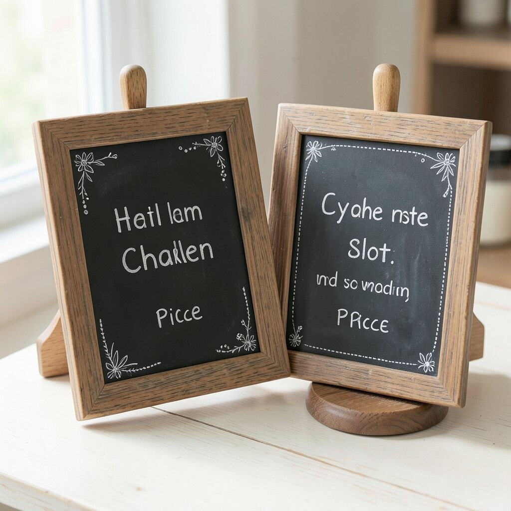
1. Soft Lettering With Floral Swirls
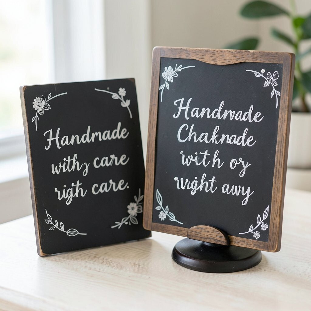
A chalkboard sign with soft cursive words and tiny flower doodles can make a jewelry stand feel warm right away. The mix of matte black chalk and shiny beads gives the whole setup a sweet, inviting look.
This style is great for booths, home shops, and market tables because it feels friendly without trying too hard. You can write a short message like “Handmade with care” and add a few leaf lines around the edges for a polished touch. It is also easy on the budget since plain chalkboard paint, a small board, and chalk markers cost very little compared with printed signs.
2. Bold Words Beside a Wooden Earring Rack
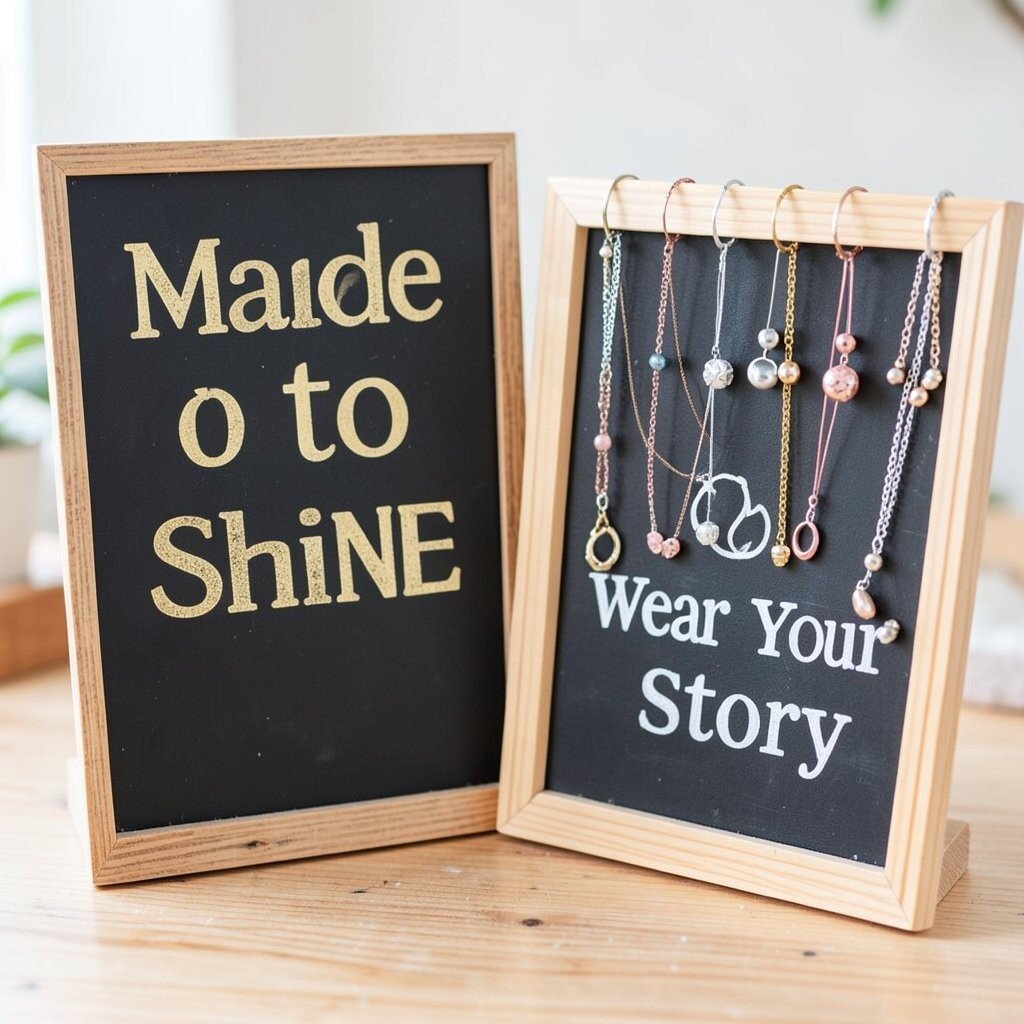
Big block letters on a chalkboard can grab attention fast, especially next to a simple wood jewelry stand. The strong lettering balances nicely with dainty rings, layered necklaces, or tiny earrings.
This look works well for busy craft fairs because people can read it from a short distance. Try a short phrase such as “Made to Shine” or “Wear Your Story” to keep the board clean and easy to read. For a personal touch, match the chalk color to the metal tone in your jewelry, like gold, silver, or rose gold.
Many sellers like this style because it feels modern and neat. It also gives your display a clear voice, which can help shoppers remember your booth later.
3. Vintage Borders With Tiny Sparkles
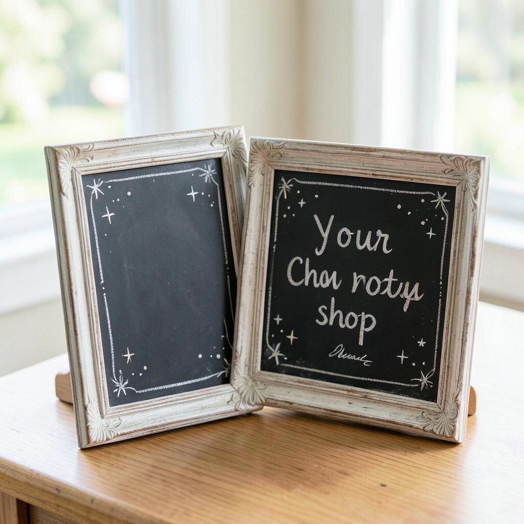
A chalkboard sign with an old-style border can make your jewelry stand feel rich and special. Add small sparkles, dots, or star shapes around the edges to keep the look playful.
This idea fits handmade necklaces, crystal pieces, and antique-looking charms very well. The border frames your message so the display feels planned, even if the setup is simple. If you want a low-cost upgrade, use white chalk first, then add just one accent color for the decorative details.
The uniqueness comes from the mix of classic and fun. A framed sign like this feels timeless, and it can be reused for many events with only a few wording changes.
To make it more personal, write your shop name in the center and add a tiny signature at the bottom. That small detail can make your work feel extra thoughtful and handmade.
4. Watercolor Chalk Marks With A Rustic Stand
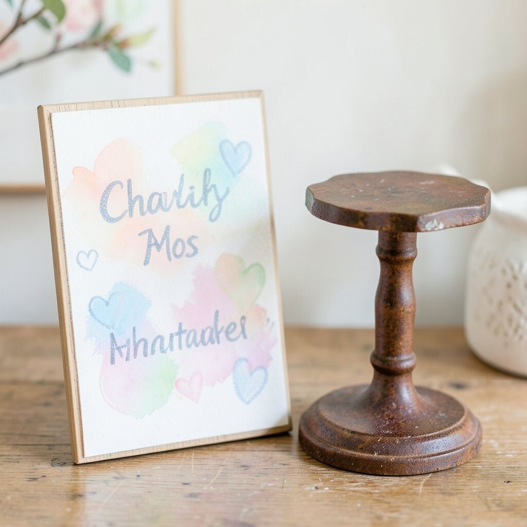
Smudgy chalk marks in soft pastel shades can look a lot like watercolor paint. When placed beside a rustic jewelry stand, the sign feels gentle, artsy, and relaxed.
This style is a nice choice for spring markets and gift tables because the colors look light and fresh. You can add a few loose circles, hearts, or brushy strokes behind the words to create more depth. If you are watching costs, pastel chalk and a simple spray fixative are both affordable and easy to find.
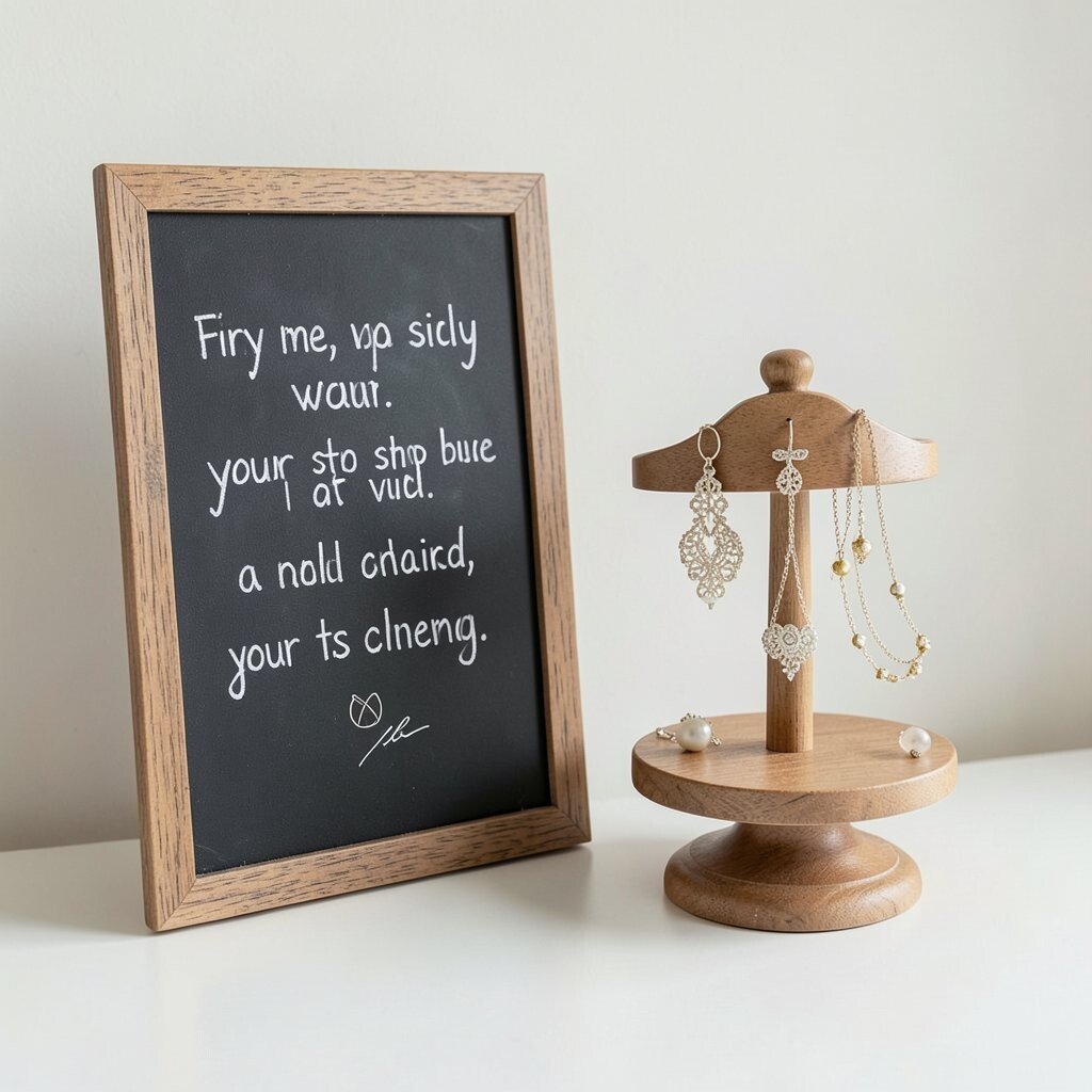
5. Tiny Doodles Around A Quote Board
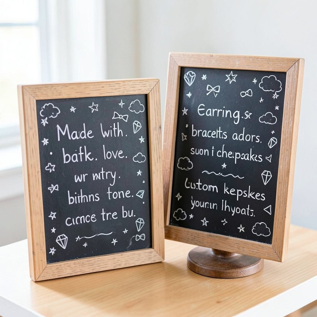
A chalkboard quote with tiny doodles can make your display feel full of personality. Little stars, bows, clouds, and gem shapes all help the jewelry stand feel more alive.
This is a good option when you want something fun but not messy. The quote can be short and sweet, like “Made with love,” while the doodles fill the open space around it. You can personalize the board by adding the kind of pieces you sell, such as “earrings,” “bracelets,” or “custom keepsakes.”
It is a smart trend too, since shoppers often stop longer at displays that feel handmade and hand-drawn. That extra attention can help your jewelry seem more special without adding much cost.
6. Elegant Script With A Minimal Frame
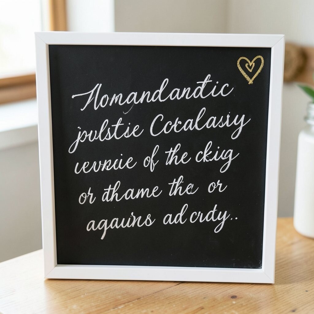
Smooth script writing on a blackboard can make handmade jewelry look classy right away. A thin white frame around the edge keeps the sign neat and helps the stand feel balanced.
This idea works well for pearl pieces, simple chains, and delicate charm bracelets. You do not need a lot of decoration because the handwriting itself does most of the work. For a personal twist, add a small heart, a dot of gold chalk, or your initials in one corner.
The best part is how easy it is to change for different events or seasons. You can update just one word or line and keep using the same board again and again.
It also stays budget-friendly because you only need a plain board and a steady hand. If your handwriting is shaky, chalk markers and stencil letters can help a lot.
7. Boho Arches Beside Layered Necklaces
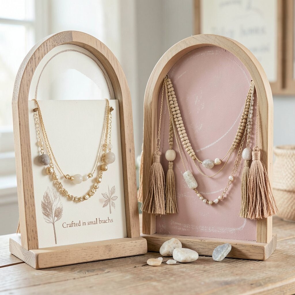
Boho arches drawn in chalk can give a jewelry stand a trendy, relaxed feel. The curved shapes look lovely behind layered necklaces, tassels, and natural stone pieces.
This style feels current because many shoppers love soft earth tones and laid-back design. Use cream, tan, or dusty pink chalk to make the board feel warm, then pair it with wood, jute, or clay accents. A short phrase like “Crafted in small batches” can make the setup feel honest and cozy.
Personalization is easy here, since you can change the arch shapes to fit your brand style. Try thin lines for a clean look or thicker curves for something bolder and more playful.
8. Hand-Drawn Frames With Price Notes
Hand-drawn chalk frames can make pricing feel neat instead of plain. When the frame sits beside a handmade jewelry stand, the whole display feels organized and cared for.
This idea has a clear benefit for shoppers because they can see details fast. You might write a small title, then place the price or product type inside the box so there is no confusion. It is also smart for your budget since you can reuse the same board and only update the writing.
Many makers like this approach because it feels honest and simple. If you want to make it more unique, draw tiny corner flowers, beads, or stitch lines on the frame itself.
9. Sunbursts And Stars For A Bright Look
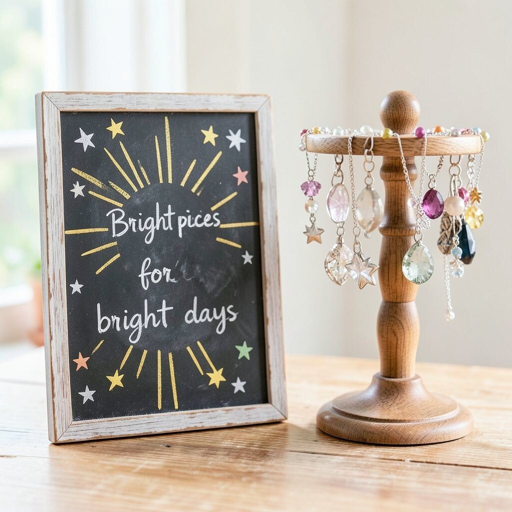
Sunbursts and stars can make a chalkboard sign feel cheerful and full of energy. Next to a handmade jewelry stand, those shapes can bring out the sparkle of polished stones and metal charms.
This style is a great fit for summer fairs, pop-up shops, and teen gift tables. The design does not need to be perfect, which makes it easier for beginners to try at home. Add a line like “Bright pieces for bright days” to tie the artwork to the jewelry.
Personal touches can be as simple as changing the star size or using one bold accent color. That little shift can make the display feel fresh while keeping the same basic idea.
10. Farmhouse Lines With Simple Heart Details
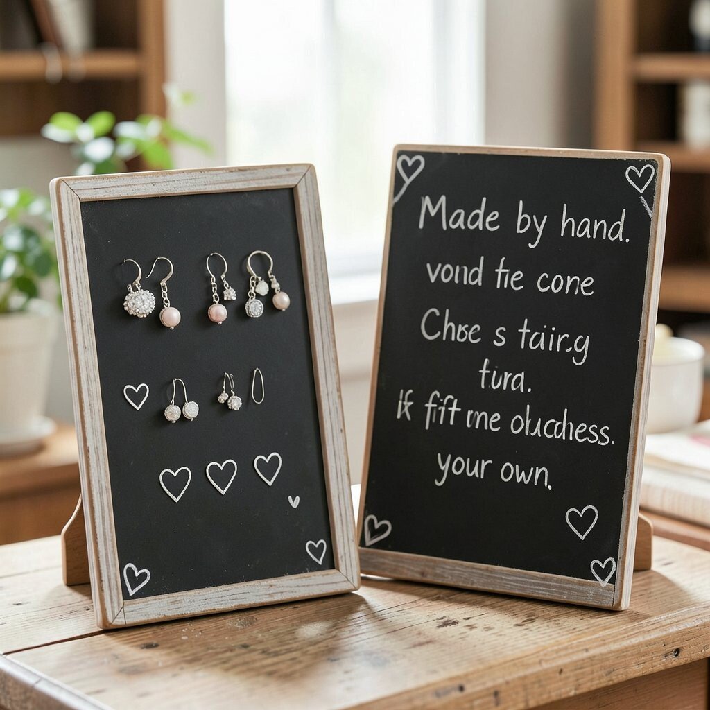
Clean farmhouse lines can give a jewelry stand a calm and cozy feel. Add a few tiny hearts near the corners, and the sign becomes sweet without looking busy.
This is a strong choice for earrings, charm necklaces, and gift bundles because the look feels soft and welcoming. It works well in indoor markets, home stores, and craft rooms too. If you want to keep costs low, use a thrifted board and write with chalk instead of buying a fancy printed sign.
The uniqueness comes from the mix of plain and pretty. A simple message like “Made by hand” can feel very warm when it sits beside your jewelry.
You can also change the heart style to fit your brand, from tiny outline hearts to chunky doodle hearts. That small choice helps the display feel like your own.
11. Layered Text With Tiny Bead Drawings
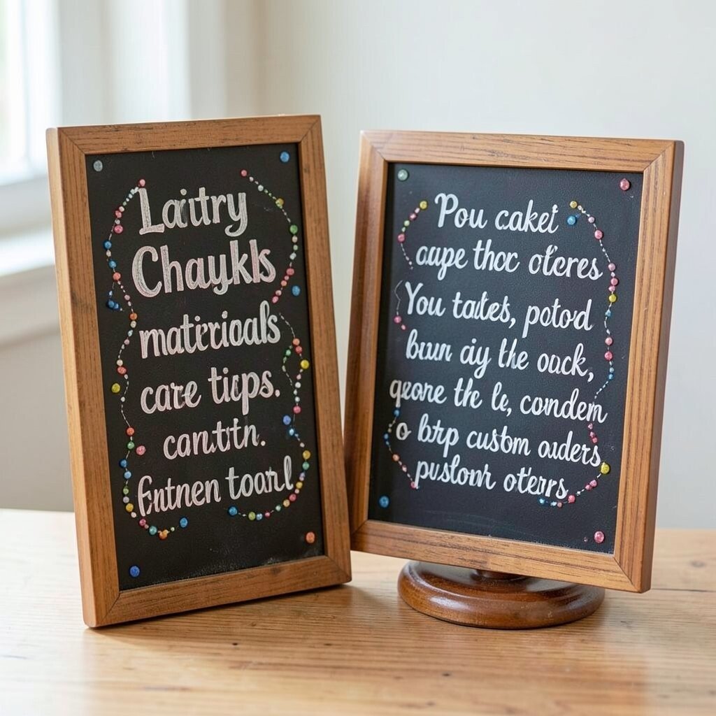
Layered text on a chalkboard can make the sign feel lively and full. Add tiny bead drawings around the words, and the board begins to echo the jewelry stand beside it.
This style is useful when you want the sign to do more than just sit there. The extra bead shapes make it clear that your items are handmade and detail-focused. For a low-cost touch, practice the design on paper first so you do not waste chalk or markers.
It also fits current display trends, since many shoppers like signs that show the maker’s process. You can write about materials, care tips, or custom orders in a friendly way.
To make it feel personal, draw beads that match the colors in your actual jewelry line. That small link can help the entire setup feel more connected.
12. Moody Chalkboard Art With Dark Jewel Tones
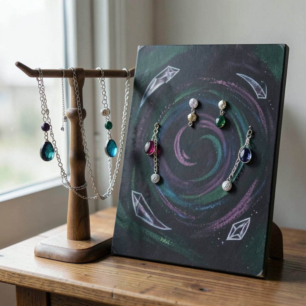
Moody chalkboard art can make colorful jewelry stand out in a big way. Deep greens, purples, and blues on the board create a rich backdrop for bright earrings and shiny chains.
This look is perfect for shops that want a more dramatic feel. Use shadowy swirls, simple crescent shapes, or gem outlines to build the mood without making the board too crowded. The style can also feel high-end even when the supplies are simple and cheap.
If you want to personalize it, match the board art to your best-selling pieces. A little color echo can make the display feel thoughtful and well planned.
13. Open Space With One Strong Message
Sometimes the boldest choice is to leave plenty of open space. A single strong message on a chalkboard beside a handmade jewelry stand can feel calm, modern, and sure of itself.
This style helps the jewelry stay in the spotlight because there is less visual noise. It works especially well for detailed pieces that need room to breathe, such as filigree earrings or layered pendant sets. You can keep costs almost nothing by using one board, one color of chalk, and a clean layout.
To make it unique, choose a message that sounds like your shop voice. Something short and warm can feel much more memorable than a crowded sign with too many words.
If you want a personal touch, add a tiny logo, a symbol, or a hand-drawn signature. That small mark can make the display feel finished without taking away the simple look.
14. Seasonal Chalk Art That Changes With The Jewelry
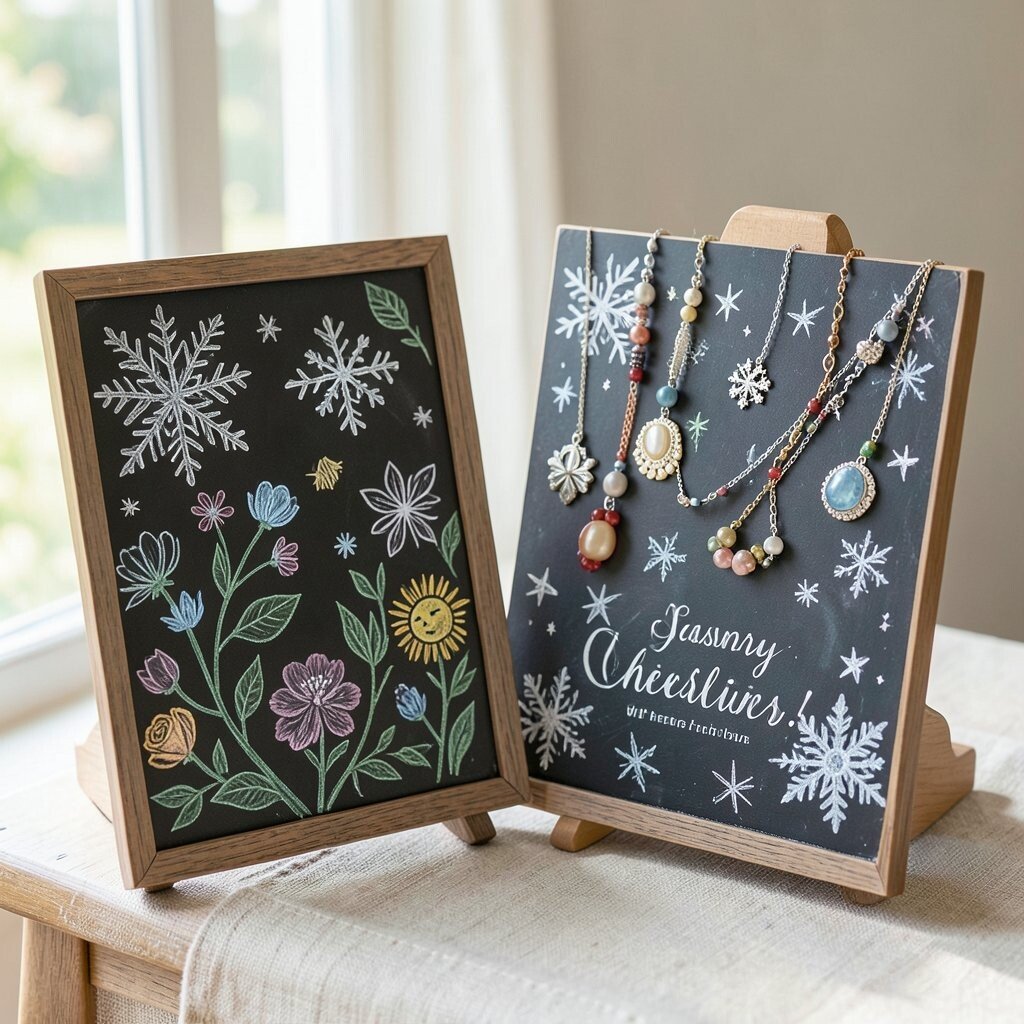
Seasonal chalk art brings a fresh feeling to a handmade jewelry stand all year long. Snowflakes, flowers, leaves, or sun shapes can shift the mood without changing the whole display.
This idea is useful because it keeps your booth from looking the same every time. You can match the sign to holidays, weather, or gift-giving seasons, which makes the setup feel current and lively. It is also a smart way to save money since one board can serve many looks with only new chalk colors and a little time.
Personalization is easy when you use themes that fit your jewelry line. Spring pieces can sit beside flowers, summer charms can sit beside suns, and winter gifts can sit beside stars or snowflakes.
Shoppers often like displays that feel fresh and seasonal because they seem more active and alive. That small change can make your handmade jewelry stand feel ready for attention every time you set it out.