Dots aesthetic can feel playful, clean, and oddly calming. Once you start, you will notice how quickly it changes the whole mood of a look.
Before you commit, it helps to be sure the style fits your life, your space, and your budget.
1. Start With One Tiny Dot Decision

Choose one place to begin, like a notebook cover or a phone case. A few dots can already show you the vibe without locking you into everything at once.
Look closely at the size and spacing you like, since that alone can make dots feel cute, classy, or sporty. If your first test looks messy, shrink the dots or add more space between them. Keep it simple so you can judge the effect fast.
2. Pick a Dot Size That Matches Your Eyes

Large dots feel bold and friendly, like a sunny pattern on a tote bag. Small dots look neat and delicate, almost like soft confetti.
Try comparing different scales in the same lighting, because reflections can change how the pattern reads. When dots are too big for a small surface, they can feel busy, while tiny dots can disappear on bright fabric.
Pick a scale that makes you smile at a glance. That quick reaction is a good sign you will enjoy the pattern day after day.
3. Choose Colors That Already Belong to Your Life
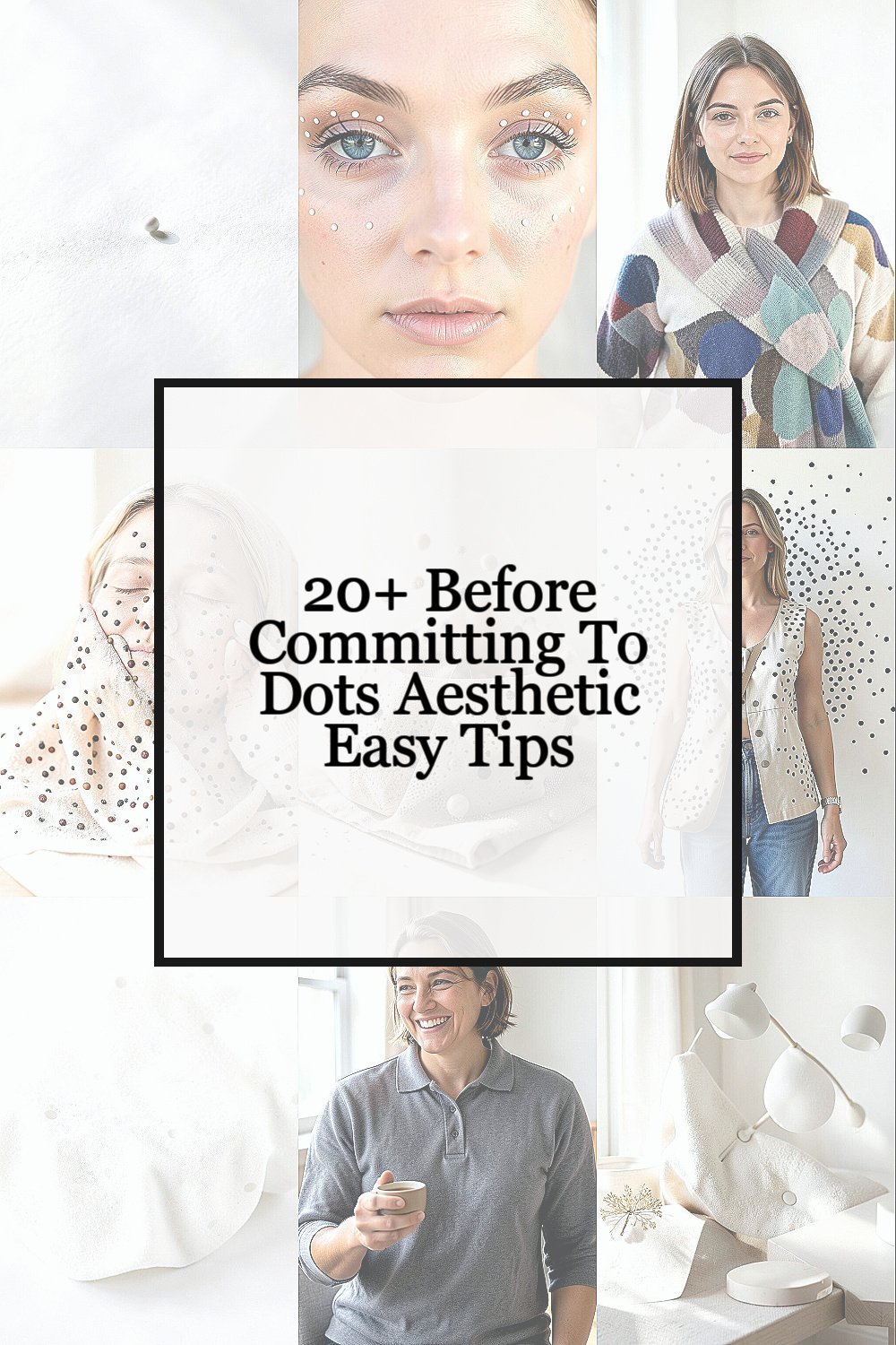
Scan your wardrobe and room for colors you use often, like black, cream, denim blue, or soft pink. Dots look best when the pattern supports your existing palette instead of fighting it.
Start by picking one main dot color and one background color. A classic black dot on white feels fresh, while pastel dots feel gentle and sweet.
If you like variety, repeat a color you already own in more than one item. That makes the style feel personal instead of random.
4. Decide the Dot Mood Before You Buy Anything
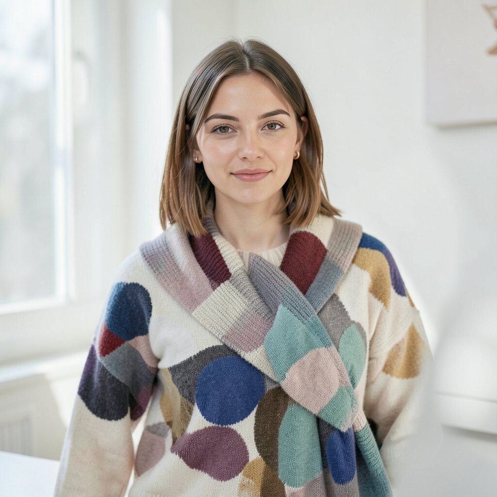
Dots can look playful, retro, elegant, or even a bit futuristic. Your goal is to pick the mood you want to wear or live with.
Notice if you prefer crisp edges or softer printed textures. Crisp dots feel sharper, while softer dots feel cozy and relaxed.
5. Let Contrast Do the Work for You
High contrast, like dark dots on a light base, makes patterns stand out right away. Low contrast, like muted dots on a warm background, feels subtle and calm.
When you feel unsure, choose a contrast level that matches how bold you want to feel. If you want an easy everyday look, go for gentle contrast and keep other details simple.
Try one item with strong contrast and another with soft contrast, then compare how you feel using them. Your comfort will guide your next step.
6. Use Dots to Guide the Eye, Not Confuse It
Dots can look stylish when they support the shape of an outfit or the layout of a room. If dots spread everywhere, it can feel loud and hard to balance.
Place dots where you want attention, like near the shoulders or down the sides of a bag. If you are working on a wall or notebook, keep larger dot zones near the center and smaller ones around the edges.
Balance your pattern with solid areas so the dots can breathe. This makes the whole look feel intentional instead of accidental.
7. Match the Dots to the Fabric’s Personality
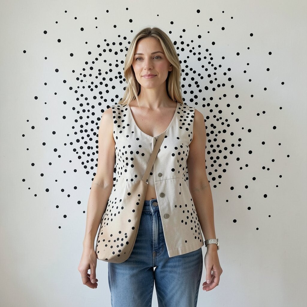
Dots can look stylish when they support the shape of an outfit or the layout of a room. If dots spread everywhere, it can feel loud and hard to balance.
Place dots where you want attention, like near the shoulders or down the sides of a bag. If you are working on a wall or notebook, keep larger dot zones near the center and smaller ones around the edges.
Balance your pattern with solid areas so the dots can breathe. This makes the whole look feel intentional instead of accidental.
. Match the Dots to the Fabric’s Personality
Dots look different on cotton, satin, denim, or matte paper. The same pattern can feel playful on a t-shirt and elegant on a skirt.
Before committing, test the dot look on the texture you plan to use. Glossy materials make dots look sharper, while matte materials soften the pattern.
If you are ordering online, check photos in natural light when possible. That helps you avoid surprises when the fabric’s sheen changes the dots.
8. Keep Your Style Link Clear and Simple
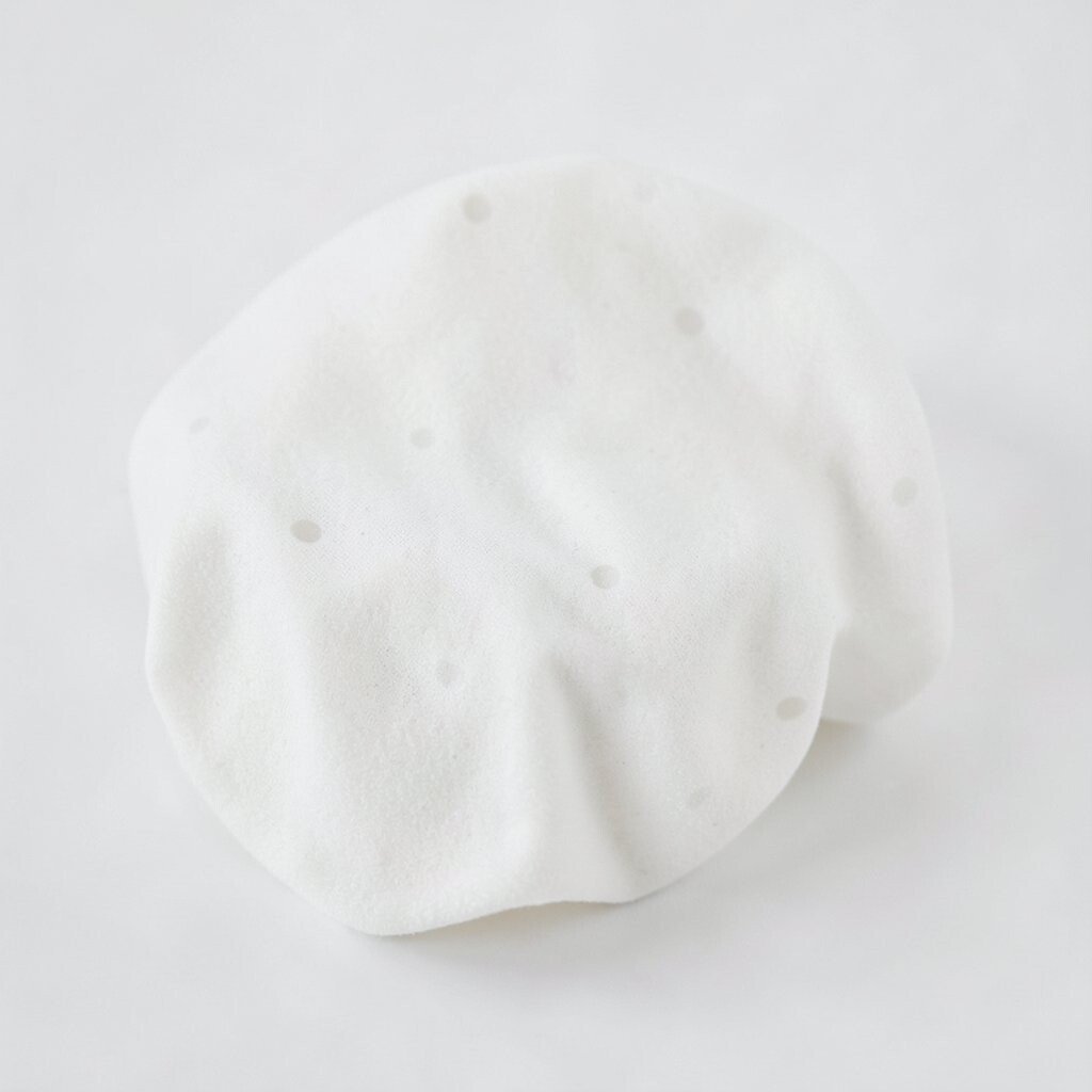
A dot aesthetic feels easiest when it connects to one clear theme. That could be retro polka energy, minimalist micro dots, or a soft sprinkle of tiny repeats.
Choose one theme and repeat it in small ways across your items. Consistency makes the look feel like you planned it, even if you started small.
9. Plan for Your Real Daily Use

Ask yourself where the dots will live in your day. A pattern on something you touch often should feel comfortable, not scratchy or annoying.
Think about cleaning too, especially for fabric. Some dot prints fade faster, so check care details before you commit fully.
When an item is practical, you will actually use it, and the dots will feel worth it. That is the real goal, not just a pretty photo.
10. Try a Single Accent Instead of Full Commitment
One dotted accent can give the look without the stress. For example, a dotted keychain, a dot-pattern scrunchie, or a tiny dot detail on a bag zipper can carry the theme.
This approach helps you learn your preferences slowly. You can build the style over time while keeping your everyday routine easy.
11. Use Spacing Like a Secret Design Tool
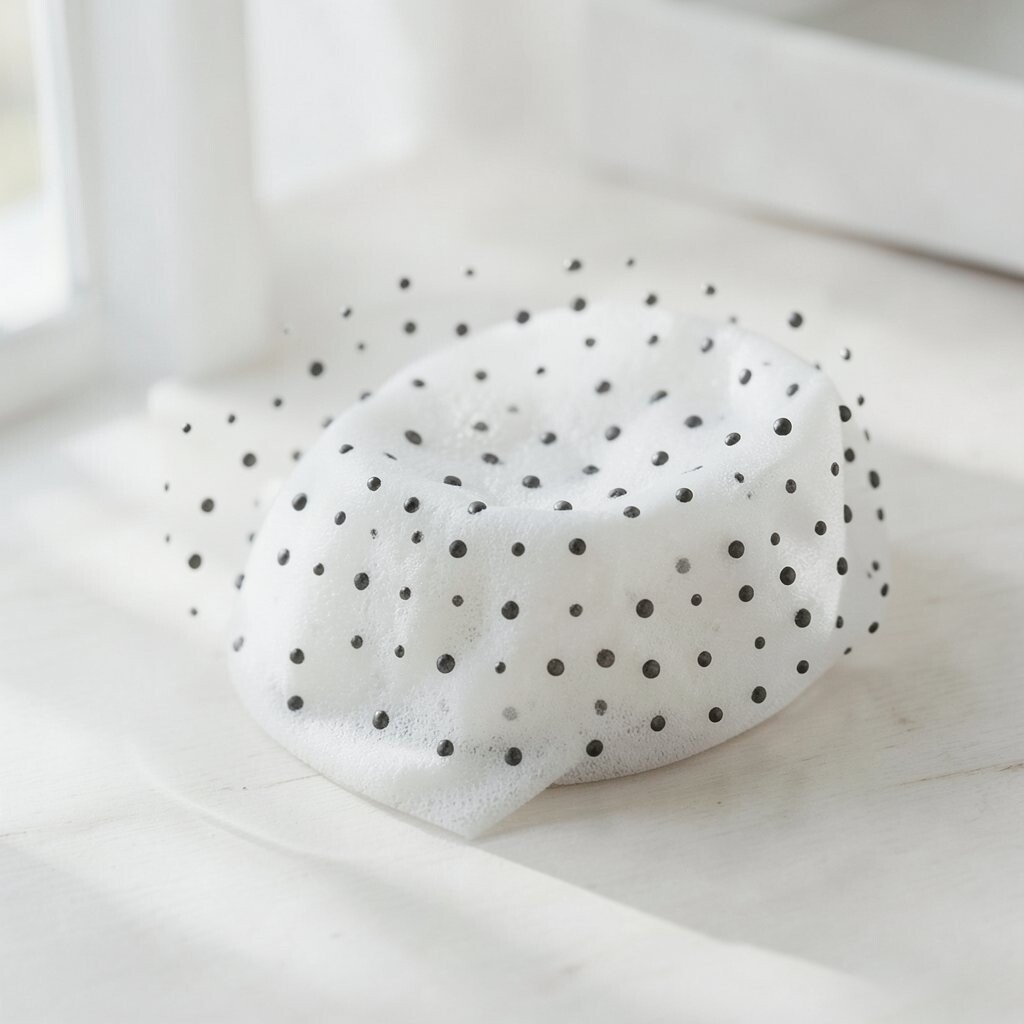
Spacing affects everything, from how tidy the pattern feels to how energetic it seems. Dots that are evenly spaced look organized, while varied spacing can feel artsy.
If you want a calm vibe, keep spacing consistent and avoid random clumps. If you want a playful vibe, allow slight variation, but still keep a rhythm so it feels designed.
Try making a small grid on paper and sketch the dot layout. Even a quick sketch can help you see what spacing you enjoy.
12. Decide Your Pattern Repeat Style

Some dot aesthetics use straight repeats, like classic polka dots. Others feel more creative, like scattered dots or a gradient of dot sizes.
Straight repeats feel orderly and easy to match with plain clothing. Scattered or fading dots feel unique and can stand out even when the rest of your look is simple.
13. Choose Matte and Gloss Carefully for Photos
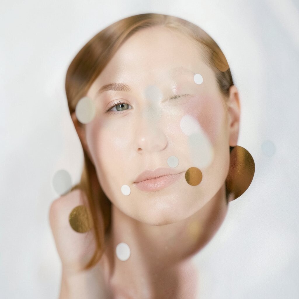
Dots can look amazing in pictures, but finishes matter. A glossy dot pattern may catch light in a way that makes your photos pop.
On the other hand, glossy finishes can show glare, especially in bright indoor lighting. Matte dots often look softer and more natural in everyday shots.
If you love sharing outfits or decor, try taking a quick photo in the lighting where you will most often look. That tiny test tells you if the finish flatters the dots.
14. Keep Other Patterns Calm So Dots Stay the Star
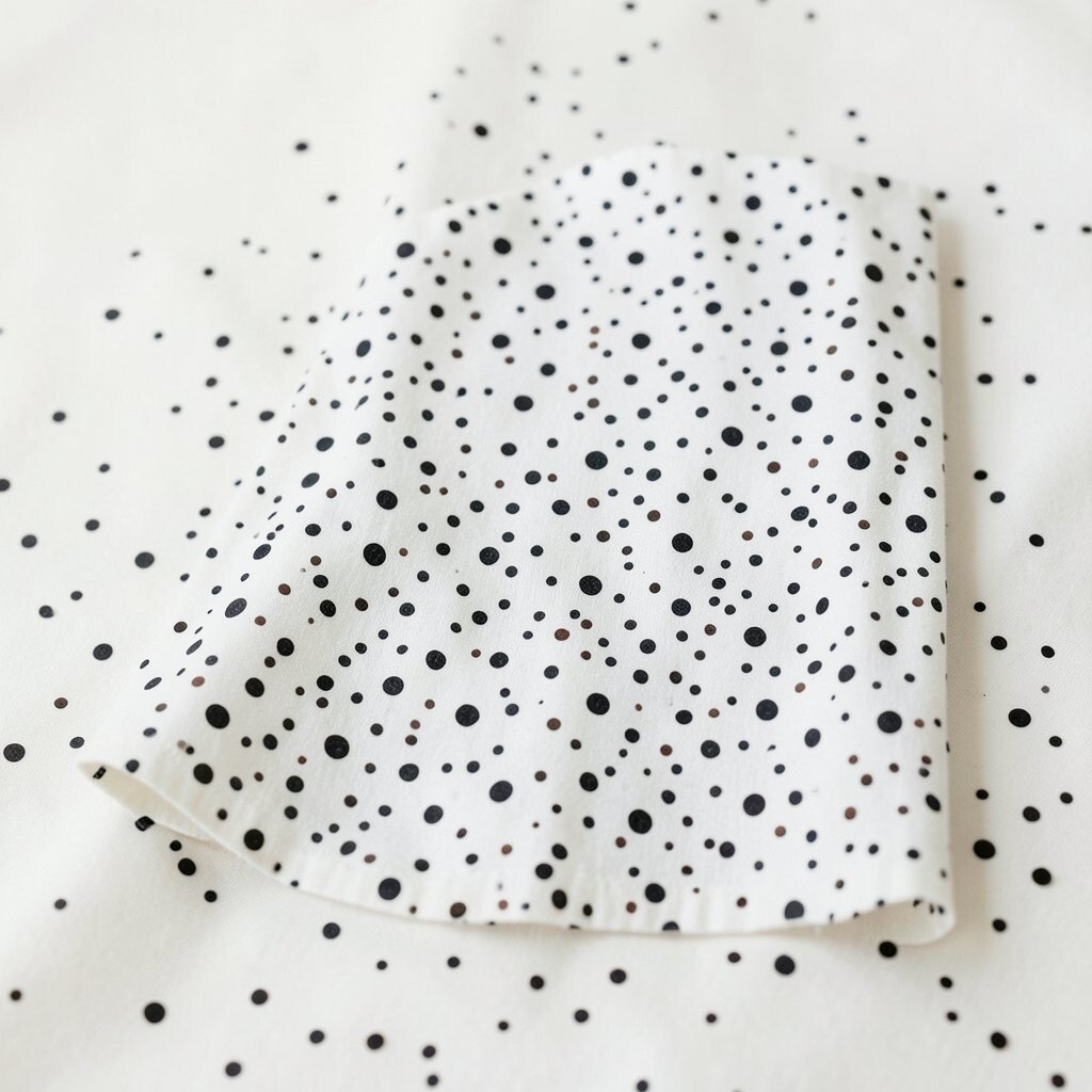
If you wear dots, pair them with mostly solid items or gentle textures. Too many patterns at once can make the whole outfit feel busy.
When you want variety, match dot themes with very simple stripes or small checks. Keep the colors close to your dot palette so everything feels like it belongs together.
15. Personalize With Small Meaning, Not Just Random Style

Make the dots feel like you by using colors tied to memories, hobbies, or favorite seasons. For example, dots could match your team colors or your favorite book cover palette.
You can also personalize by using dot shapes that feel special, like heart-like dots or tiny star dots. Even a subtle tweak can make the pattern yours, not a copy of someone else’s feed.
Consider adding a dot detail that repeats in more than one place, like a charm plus a manicure accent. That kind of tie-in feels thoughtful and easy.
16. Learn What Costs More Than You Think
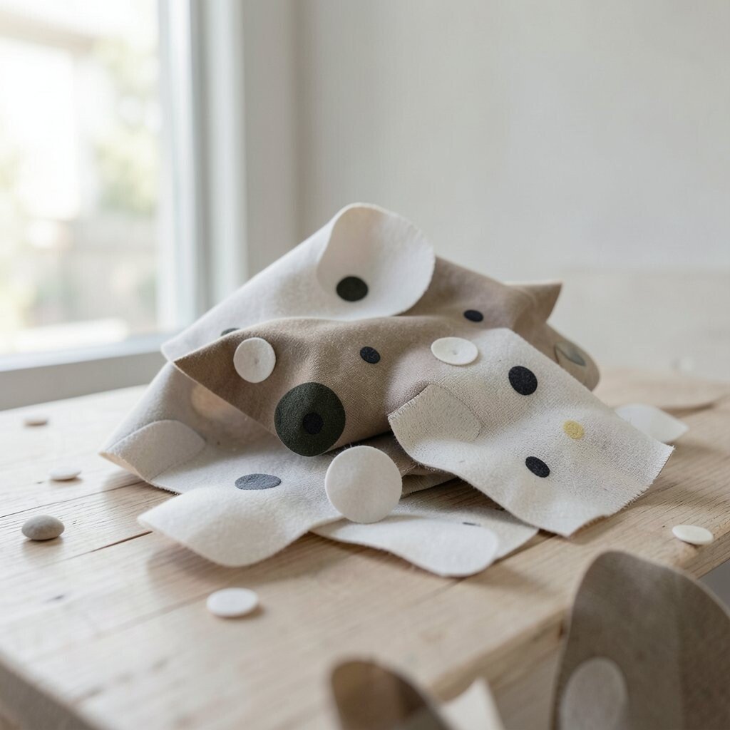
Dots aesthetic can be cheap or pricey depending on how you create it. Printed fabric, custom vinyl, and ready-made sets can cost more than simple add-ons.
Before buying, check how long the dots will last with your real routine. Something that fades quickly might cost more in the long run because you replace it sooner.
If you are on a budget, start with removable items like stickers, iron-on patches, or clip-on accessories. You still get the look while keeping your money safer.
17. Watch for Trend Feel Without Chasing Every Wave
Dots are a classic, but the way they show up changes with current trends. Right now, micro-dot patterns and mixed textures feel extra popular in clean, modern styling.
There is also a love for retro vibes, like bold polka looks paired with simple outfits. You can follow the trend without going overboard by picking just one trendy element.
Try a small upgrade that matches what you see lately, like a new dot tote or a patterned accessory. That keeps your look fresh without turning everything into a big project.
18. Test the Look Across Different Lighting
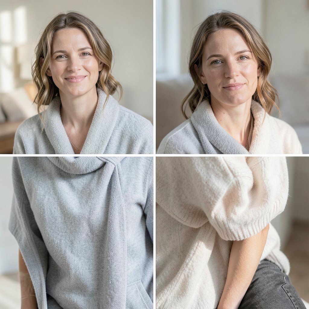
Dots can shift in appearance when the light changes from daylight to indoor bulbs. A pattern that feels perfect outside may look too strong inside.
Try looking at your test piece near a window and then under warm indoor light. If the dots feel harsh, soften the contrast or choose a calmer color pairing.
19. Make Removal and Adjustments Part of the Plan
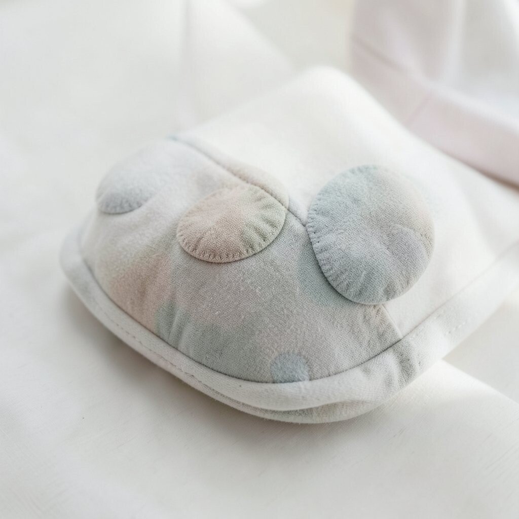
You do not have to commit forever just because you love a style. Removable decals, temporary fabric markers, and clip accessories make it easy to adjust.
Plan how you will change or remove dots if your taste shifts. That peace of mind helps you try bolder choices sooner.
When you can update the look, the dots stop feeling scary. They become playful, like a mood you can switch when you want.
20. Balance Dots With Texture for Richness
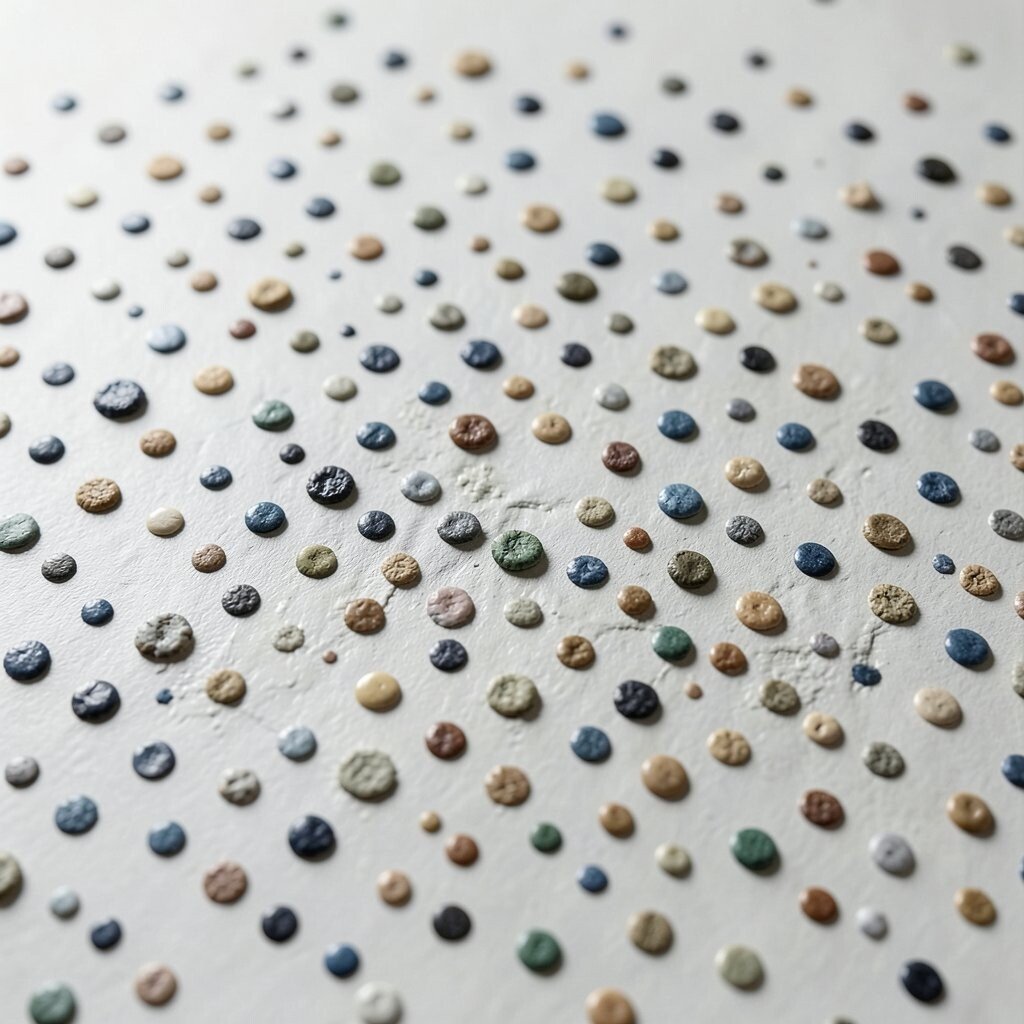
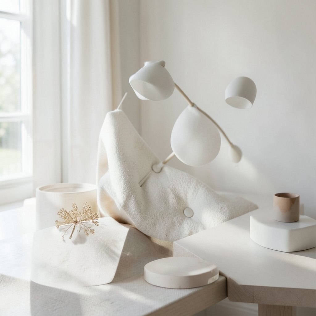
Dots feel more interesting when they are paired with textures like knit, denim, canvas, or woven paper. Texture adds depth so the dots do not have to be loud.
Try pairing a dotted item with something solid and textured, like a sweater or a canvas pouch. This makes the style feel richer even when the pattern stays simple.
Texture also helps the dots blend into real life. It turns the look from “just a pattern” into something you want to keep using.
21. Choose One “Signature” Dot Feature You Will Repeat
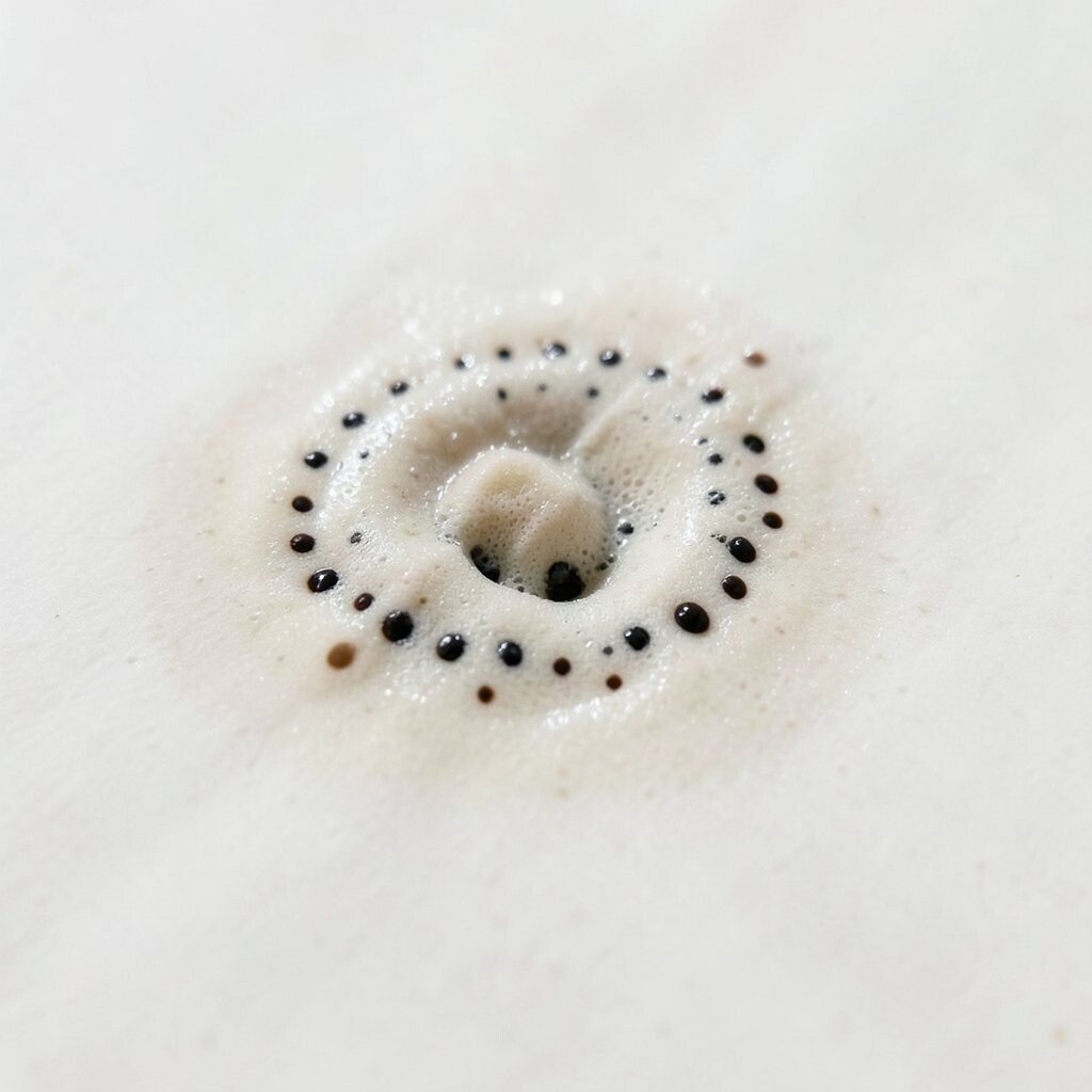
Pick one dot feature that becomes your signature, like always using tiny dots, always choosing black and cream, or always spacing dots evenly. That signature makes your aesthetic feel consistent even as you try new items.
Once you choose the signature, repeat it in different places, such as accessories, stationery, or small decor. Personal style grows when you keep a recognizable thread running through it.
When the pattern has a home in your routine, it stops feeling like a trend and starts feeling like you. Your confidence will show, and the dots will look effortless.