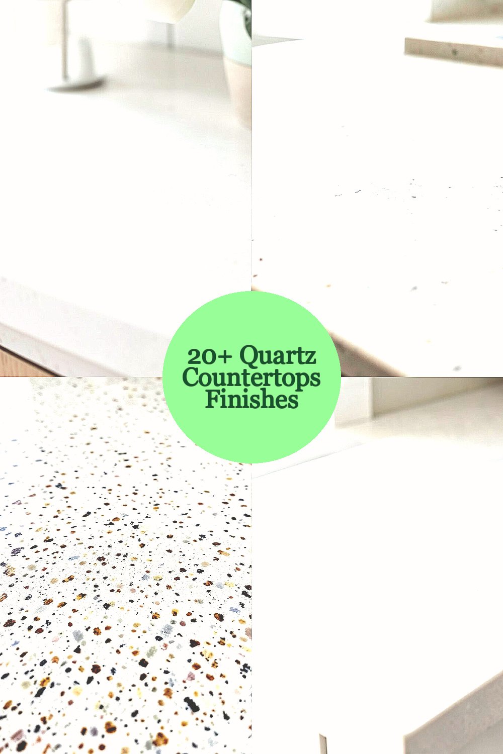
Your kitchen or bath can feel brand new without changing the whole space. The finish of your quartz is the small decision that makes the biggest visual impact.
1. Soft Matte, Velvet Touch

Soft matte quartz looks calm and modern, like the surface of a well-loved book cover. It hides fingerprints and smudges better than high-gloss options, so your counters stay neat with everyday use.
Pair this finish with warm wood cabinets or creamy paint for a cozy look that still feels clean. For practicality, choose a matte finish if your household touches the counters often, because less glare makes messes harder to notice and easier to live with. When you want a little sparkle, add a contrasting backsplash in glass or tiny stone to keep things lively.
2. High-Gloss Mirror Shine

If you love a dramatic, showroom vibe, high-gloss quartz catches light like a polished mirror. The reflective surface makes the room feel brighter and can make small areas appear larger.
This finish looks especially striking with sleek hardware, dark cabinetry, and statement lighting. To keep it looking crisp, wipe with a gentle cleaner and a soft cloth since gloss can show streaks more easily than matte. Consider adding under-cabinet lighting so the shine looks intentional, not accidental.
3. Natural Stone Look With Speckled Depth

Some quartz finishes mimic natural stone veining and speckling so closely that you feel the texture in your mind. The pattern usually has depth, with darker flecks and lighter movement that make the counter look like it belongs in a luxury setting.
This style works great when you want uniqueness without the unpredictability of natural slabs. A practical tip is to sample the exact slab patterns, because small shifts in layout can change how busy the surface feels. If your cabinets are bold, choose a calmer background so the speckling frames the space instead of competing with it.
For personalization, match the most common fleck tones with accessories like a dish set, canisters, or a rug. Keep an eye on cost too, since intricate patterns can sometimes cost more depending on availability. Installing the quartz with a thoughtful seam layout also helps keep the movement flowing across the countertop.
4. Honed Finish for a Subtle, Modern Calm

Honed quartz has a smooth, low-sheen look that feels sophisticated and not overly shiny. It creates a soft, even appearance that pairs well with both modern and transitional kitchens.
Because the surface is not glossy, you may notice fewer reflections from daily activities like cooking and prep. Choose honed finishes when you want a clean style that still feels inviting, especially in homes with lots of natural light.
5. Weathered Concrete-Inspired Gray
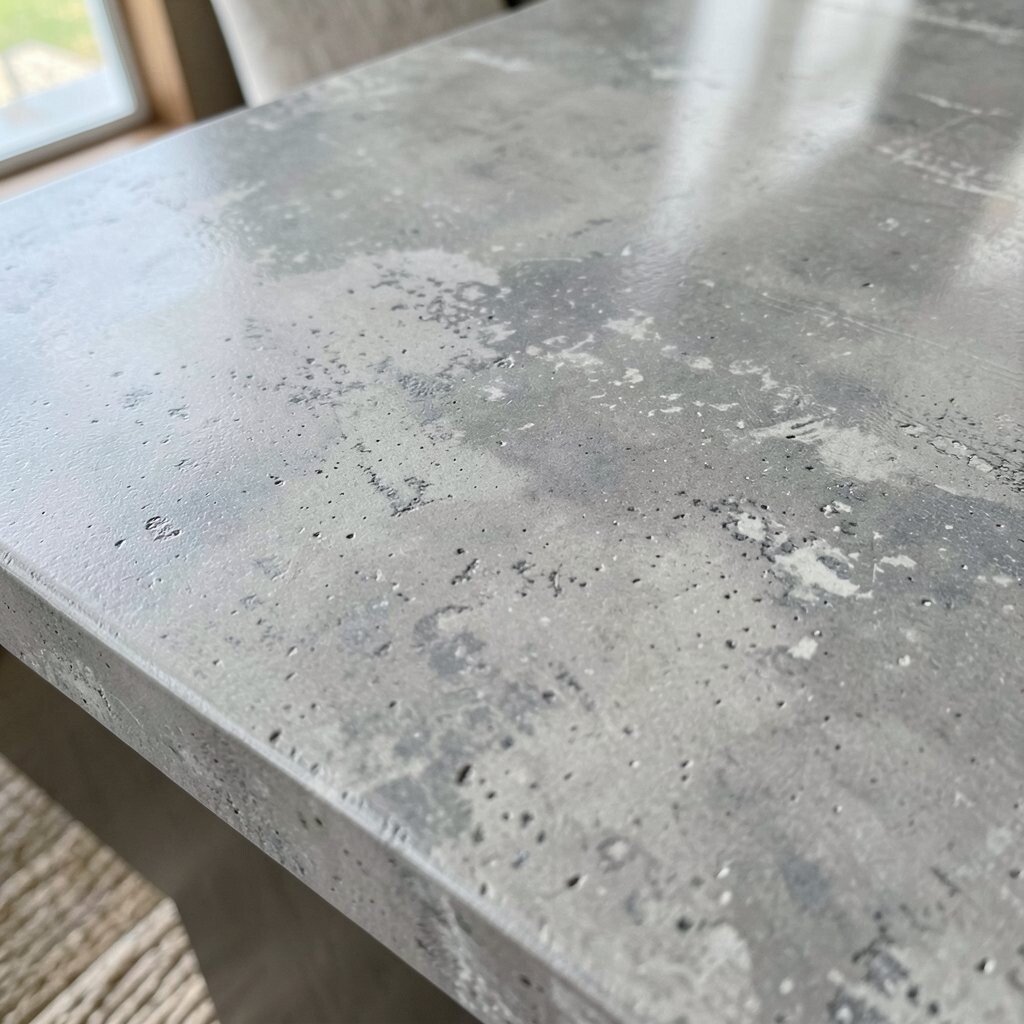
A concrete-inspired quartz finish brings a cool, urban vibe with realistic gray movement. It often has gentle speckling and tonal shifts that look like a designer countertop in an industrial loft.
This look benefits open shelves and simple cabinetry because the countertop becomes a stylish anchor. To make it feel warmer, add brass faucets, light wood stools, or a soft cream backsplash that balances the gray. For personalization, choose a concrete look with either more uniform color for a calm feel or more texture for a bolder personality.
In terms of cost, concrete styles can vary widely based on pattern complexity and color availability. If budget matters, pick a more straightforward gray movement and let your hardware and lighting provide the wow factor. Clean with non-abrasive products, since textured looks can catch residue if you’re not careful.
6. Minimal White With Clean, Tight Veins

Minimal white quartz with tight, controlled veining makes your counters look crisp and tidy. The lines feel deliberate, and the overall finish tends to show a timeless, airy vibe.
This finish helps small kitchens look bigger because the white reflects light well. It also pairs smoothly with nearly any color palette, from soft pastels to deep navy accents. A practical step is to choose veining direction that complements your layout, since long lines can visually lengthen the space.
7. Bold Black With Soft Movement
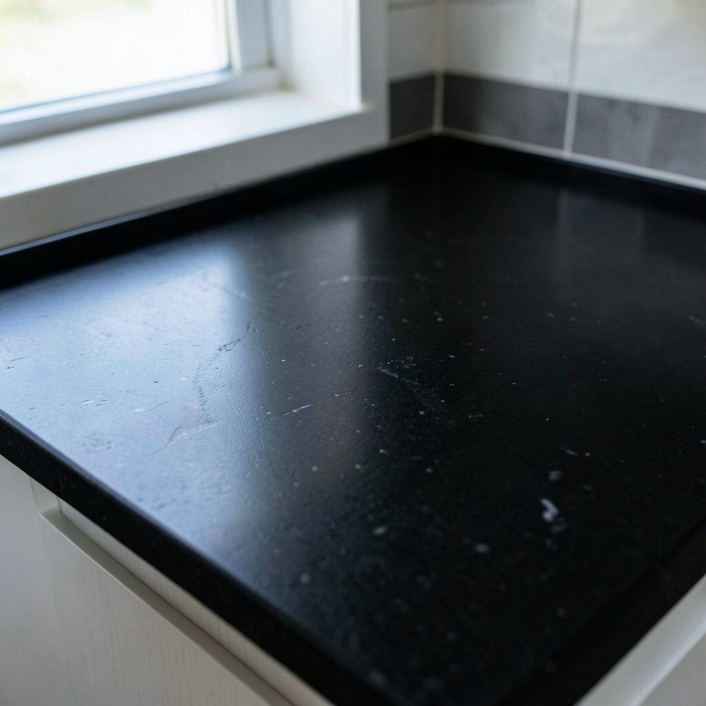
Black quartz finishes can look sleek and upscale, especially when the movement is softer and not too chaotic. The surface often feels dramatic yet grounded, like a deep stain with subtle character.
You’ll love how black creates high contrast with light cabinets, and it also makes gold and warm metals pop. Keep in mind that darker finishes can show water spots more than lighter ones, so a quick dry after rinsing helps a lot. For personalization, pair black quartz with a patterned backsplash for a rich, designed look without needing to add extra clutter on the counters.
If you’re cost-conscious, ask about standard black options before going for the rarest variations. Some bold looks come with premium pricing due to limited pattern selection, so it’s smart to compare a few samples. A matte or honed variation can be a great middle ground for hiding everyday marks.
8. Warm Ivory With Subtle Cream Veins

Warm ivory quartz brings a soft, welcoming tone that never feels harsh. Subtle cream veining gives it personality while still keeping the surface calm and easy to match.
This finish benefits busy households because it hides tiny imperfections better than bright stark white. It also makes rooms feel more comfortable, especially when you have oak cabinets, beige walls, or natural fabrics. For practical styling, use darker cutting boards or utensil holders so the countertop doesn’t blend into the rest of the palette.
9. Beige “Sandy” Textures With Natural Variation

Beige quartz with a sandy or granular texture offers a grounded look that feels like sun-warmed stone. The best versions have variation that looks organic, not flat, so your counters stay visually interesting.
This finish can be a smart choice if you want warmth but don’t want heavy veining. It often pairs well with white or light gray cabinetry, and it can also play nicely with earthy decor like terracotta and olive green. For personalization, pick a beige pattern that matches the undertone in your flooring so the whole room feels pulled together.
When considering cost, textured and layered looks can be priced higher if the color variation is complex. You can save by choosing a simpler beige option and adding interest with a dramatic faucet or modern lighting. Maintenance is usually straightforward, but textured finishes benefit from regular wiping so crumbs don’t settle into tiny areas.
10. Stainless Steel-Like Metallic Accents
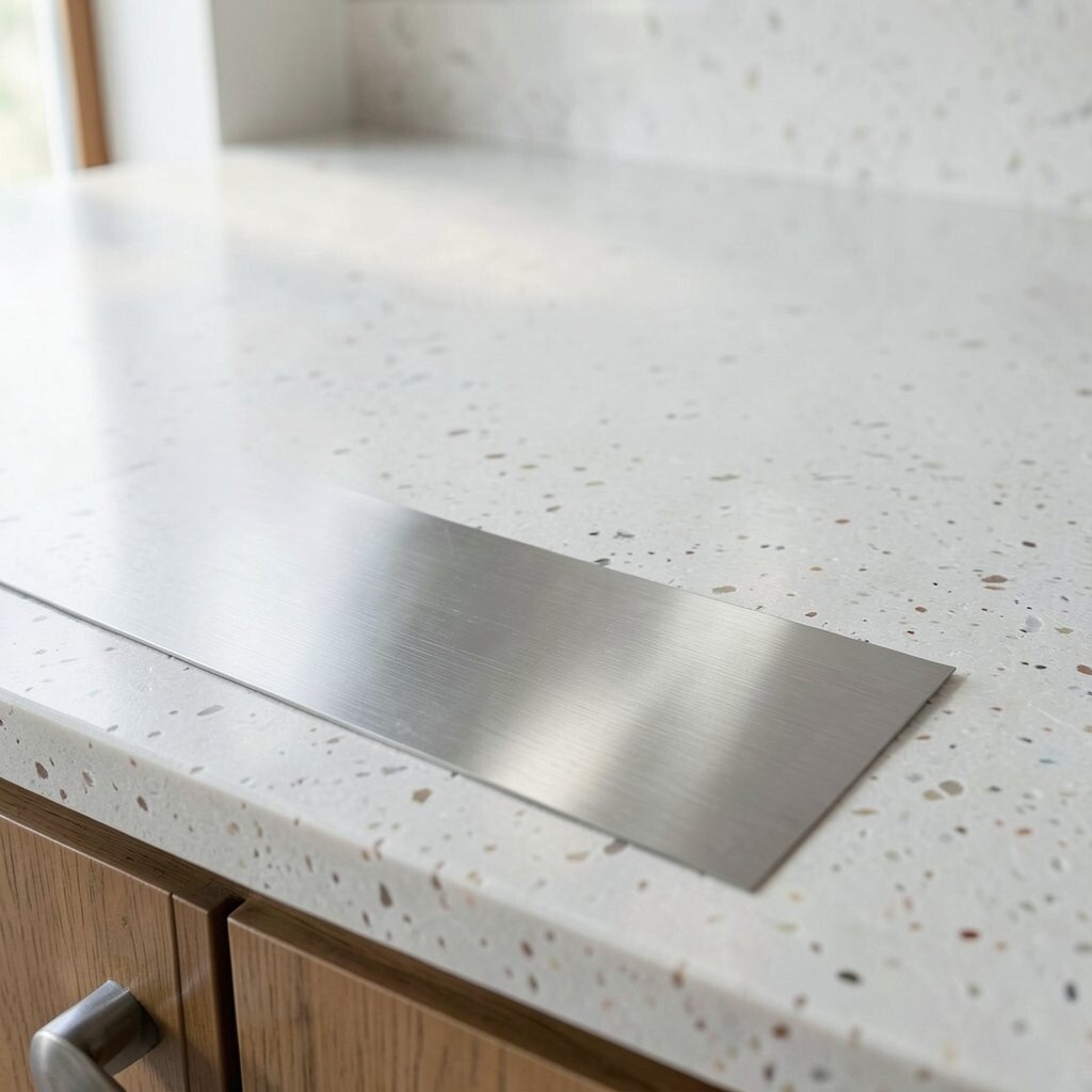
Some quartz finishes include metallic flecks that resemble stainless steel or brushed metal. The effect is eye-catching without needing bold colors, and it can feel modern and fresh.
This finish benefits your design when you have metal appliances, faucets, or light fixtures because everything visually connects. To keep the look balanced, avoid overly busy backsplashes and let the countertop provide the sparkle. A practical tip is to choose a finish where the metallic accents are subtle enough to hide fingerprints, especially if you cook often.
11. Classic Carrara-Inspired Gray Veining
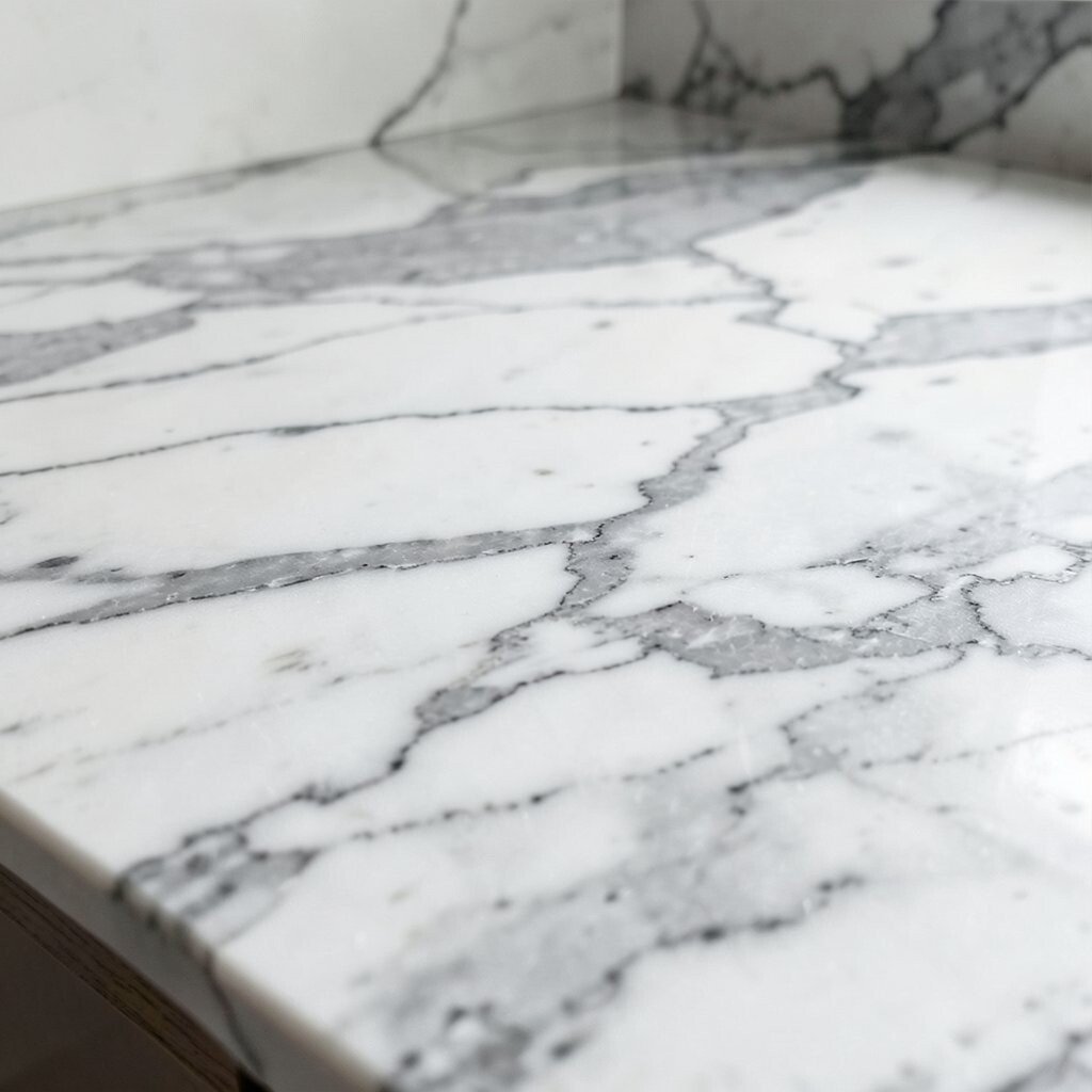
Carrara-inspired quartz delivers elegant gray veining across a light background. The look feels refined, like marble, but the quartz surface brings everyday durability.
This finish is popular because it fits both traditional kitchens and contemporary spaces. You’ll get benefits like a bright surface that stays timeless, plus less worry about sealing compared with many natural stone options. Personalize by choosing the veining intensity that matches your style, from light wisps for calm spaces to more dramatic movement for statement kitchens.
For practical planning, consider how the slab seams will line up with the veining so the pattern looks continuous. Costs can vary based on how bold the veining is and whether the finish is a top-tier match. If your budget is tight, pick a more standard carrara style and upgrade your backsplash or cabinet hardware instead.
12. Calacatta Style With High-Contrast Drama
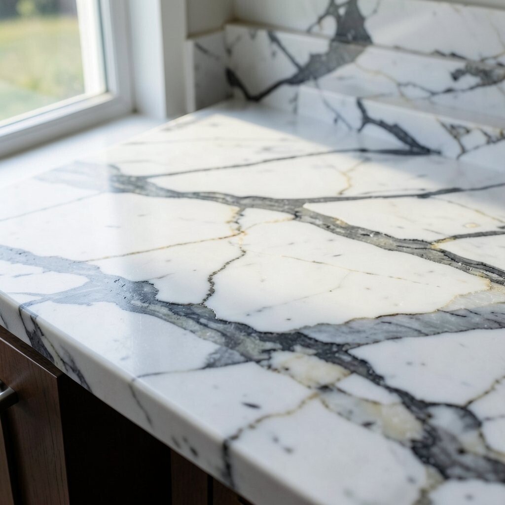
Calacatta-inspired quartz brings strong, bright backgrounds with bold veining that looks like art. The finish is made for people who want their countertop to be the centerpiece.
This option benefits your space by creating instant visual energy, especially against darker cabinets or warm wood tones. Keep it practical by pairing the countertop with simple cabinet fronts, so the overall look stays clean instead of busy. For personalization, choose accents like matching bar stools, a coordinating rug, or a dramatic soap dispenser to echo the veining color.
13. Single-Tone Solid Color for a Clean Look

Solid-tone quartz finishes look sleek and modern, with color that stays consistent from edge to edge. This style feels very current and works beautifully in minimalist kitchens and bathrooms.
You benefit from fewer visual distractions, which makes decorating easier since everything else can stand out. Solid color countertops also help with organization, because the uniform look makes it easier to judge what still needs wiping down. For practical tips, pick a color that matches your flooring undertone, and consider a slightly darker shade if you want to hide daily splashes.
Cost can be more friendly with simple solid colors, since the material doesn’t rely on complex pattern matching. For personalization, you can still make the look special through edge profiles, hardware finishes, and under-mount lighting. This is also a great choice if you like to change your decor often.
14. Biophilic Green Tones With Leafy Subtlety

Green quartz finishes can bring a fresh, nature-inspired feel without turning your room into a themed space. The best ones lean into soft mossy tones, leaf-like speckles, or gentle movement that looks calming.
This finish benefits your mood by adding warmth and color depth, especially when paired with wood and neutral walls. For practical style, keep other surfaces simple and choose textiles in cream, tan, or warm gray so the green stays the star. Personalize with greenery in planters near a sunny window, and consider a backsplash that echoes the undertone of the quartz.
15. Rosy Quartz Blush With Soft Pink Hints

Blush or rosy quartz finishes add a delicate pop that feels modern and inviting. The tone can range from barely-there warmth to a more noticeable pink character.
This finish benefits people who want color but still want their kitchen to feel light and friendly. It pairs well with brushed gold, white cabinetry, and warm light bulbs that bring out the rosy glow. A practical tip is to test the color under your actual lighting, since pink can shift from warm to cooler depending on bulbs.
When it comes to cost, rarer blush shades sometimes cost more because fewer slabs are available. You can budget smart by choosing a finish with softer movement, which can be easier to match across projects. Finish the look with matching accessories like canisters or a soap bottle so the color feels intentional.
16. Porcelain-Look Quartz With Smooth, Boardlike Clarity

Porcelain-look quartz aims for a clean, elegant finish that resembles sleek ceramic surfaces. It often has a subtle, even color body with faint movement that reads sophisticated rather than flashy.
This finish benefits anyone who wants a bright, polished look without heavy veining. It also hides small imperfections fairly well because the surface tends to be uniform while still offering gentle variation. For personalization, combine porcelain-look quartz with matte cabinet finishes to create a balanced texture mix.
17. Marble-Style Veining With Random Flecking

Marble-style quartz with random flecking offers a natural, lived-in elegance. You get movement that feels organic, with small flecks that break up the surface and make it look rich up close.
This finish benefits open-concept homes because it adds visual depth that doesn’t feel flat on camera or in bright lighting. Choose this style when you want uniqueness, since pattern variety makes every countertop feel slightly different. A practical tip is to plan around busy activity areas, like near the sink, so you can wipe spills before they dry and leave residue on textured surfaces.
Costs may climb with high-contrast flecking because those slabs tend to be more in-demand. Save by selecting a balanced pattern where the flecks are present but not overwhelming. Then make the room pop using complementary hardware and a backsplash with subtle texture.
18. Deep Blue Tones With Inky Vein Networks

Deep blue quartz finishes can feel bold and elegant, especially when the veins look like ink spreading through paper. The color adds depth that makes neutral kitchens feel more styled and dramatic.
This finish benefits spaces with warm lighting because the blue looks richer and more inviting. It also creates a strong contrast with white cabinetry and wood floors, giving you a high-end look. For personalization, match your blue tone with decor like glassware, a patterned curtain, or a blue-gray rug for a cohesive vibe.
Consider cost since darker colors sometimes fall into premium tiers depending on availability. If you want to stay budget-friendly, choose a deep blue with softer movement that uses more common slab patterns. Maintain the surface with gentle cleaners and wipe promptly after cooking since oil can make dark finishes look dull.
19. Warm Walnut Brown With Linear Movement

Warm walnut brown quartz brings a grounded, earthy vibe that feels cozy and upscale. Linear movement mimics wood grain or stone striations, creating a refined look that works in many styles.
This finish benefits design when you want warmth without going fully dark, especially if you have light walls and natural light. It pairs nicely with black hardware, cream tile, and brushed metal fixtures for a balanced contrast. A practical tip is to choose a color that matches your undertones, because walnut browns can lean redder or more neutral depending on the slab.
20. Titanium Gray With Subtle Linear Striations
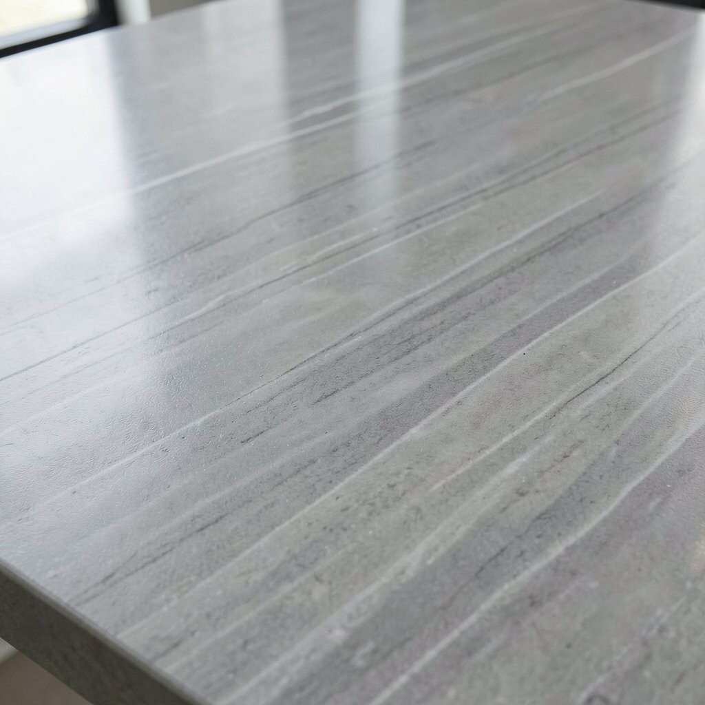
Titanium gray quartz delivers a modern, industrial feel with subtle linear striations. The finish looks clean and technical, but it still feels inviting because the tones are not too stark.
This finish benefits contemporary kitchens because it matches stainless appliances while adding a softer, warmer surface than pure metal. For practical care, a satin or honed version can help hide fingerprints compared with glossy options. Personalize with lighting that creates gentle highlights along the lines, and keep the backsplash texture light so the striations remain the focal point.
Costs usually depend on how complex the striation pattern is and what color range the quartz comes in. To budget wisely, select a finish with consistent movement so seam placement is easier during installation. That can reduce surprises and keep the look aligned across the whole countertop.
21. Two-Tone Blended Finishes for High-End Custom Style

Two-tone quartz finishes blend colors for a custom, high-end appearance that feels designer-made. You might see soft transitions, layered movement, or gradients that create depth without looking chaotic.
This finish benefits your space by adding dimension and helping your layout feel intentional, especially on large islands. It also lets you personalize more than you think, since you can pick the two tones that match your cabinetry and flooring. For practical planning, talk with your installer about how the pattern will run across seams so the blend looks smooth from one edge to the next.
Two-tone options can cost more because the slab selection is more specific, but the impact is often worth it. Keep the rest of the room simple so the countertop blend stays the hero, and add one coordinating accent like a faucet finish or cabinet hardware color. With the right lighting, this finish can look stunning in both daytime and evening, making your whole kitchen feel fresh.