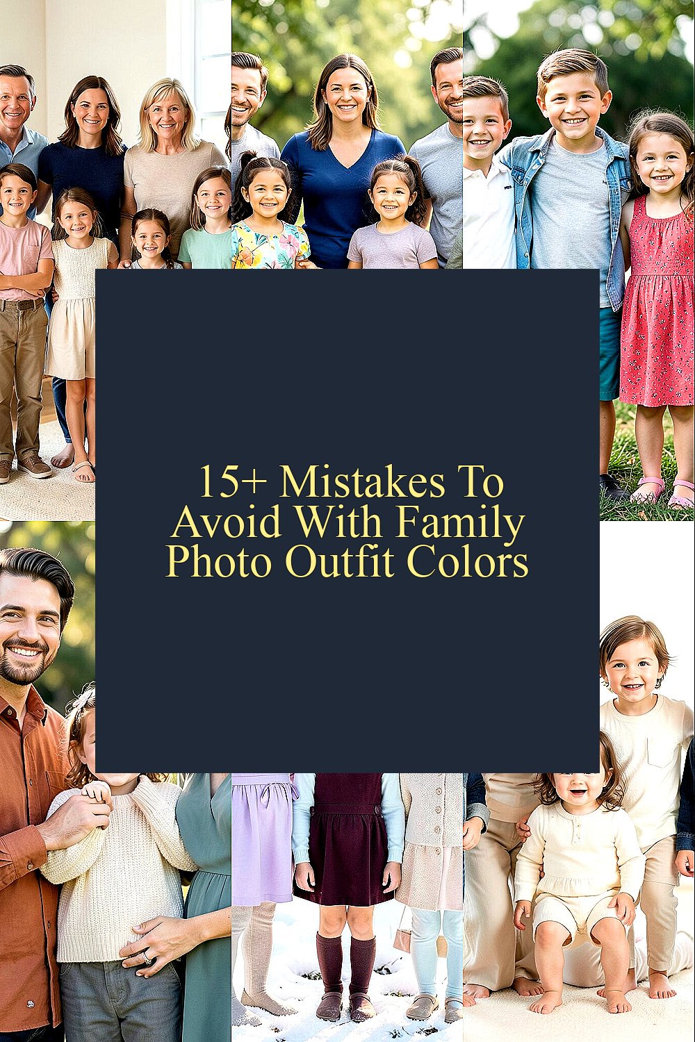
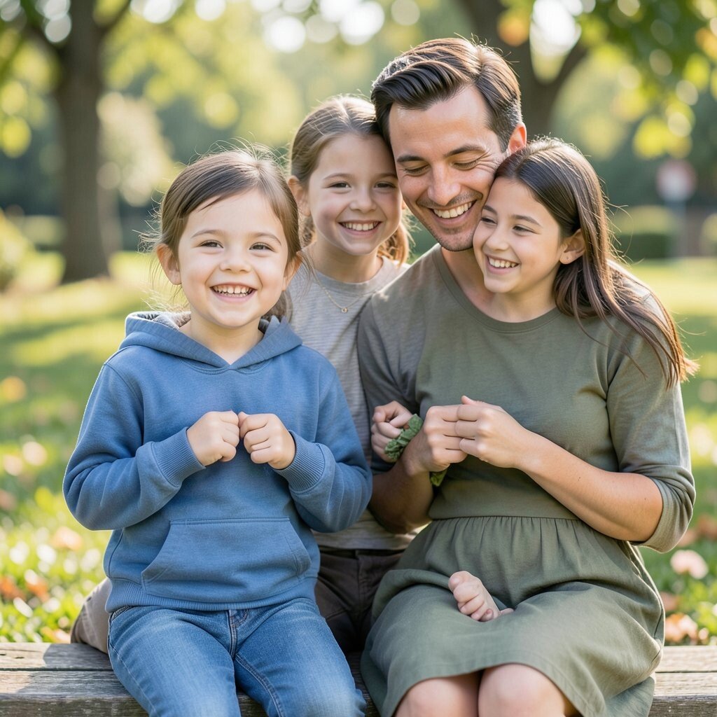
Family photos can look magical or messy. Color choices make a bigger difference than most people expect.
1. Picking colors without a shared plan

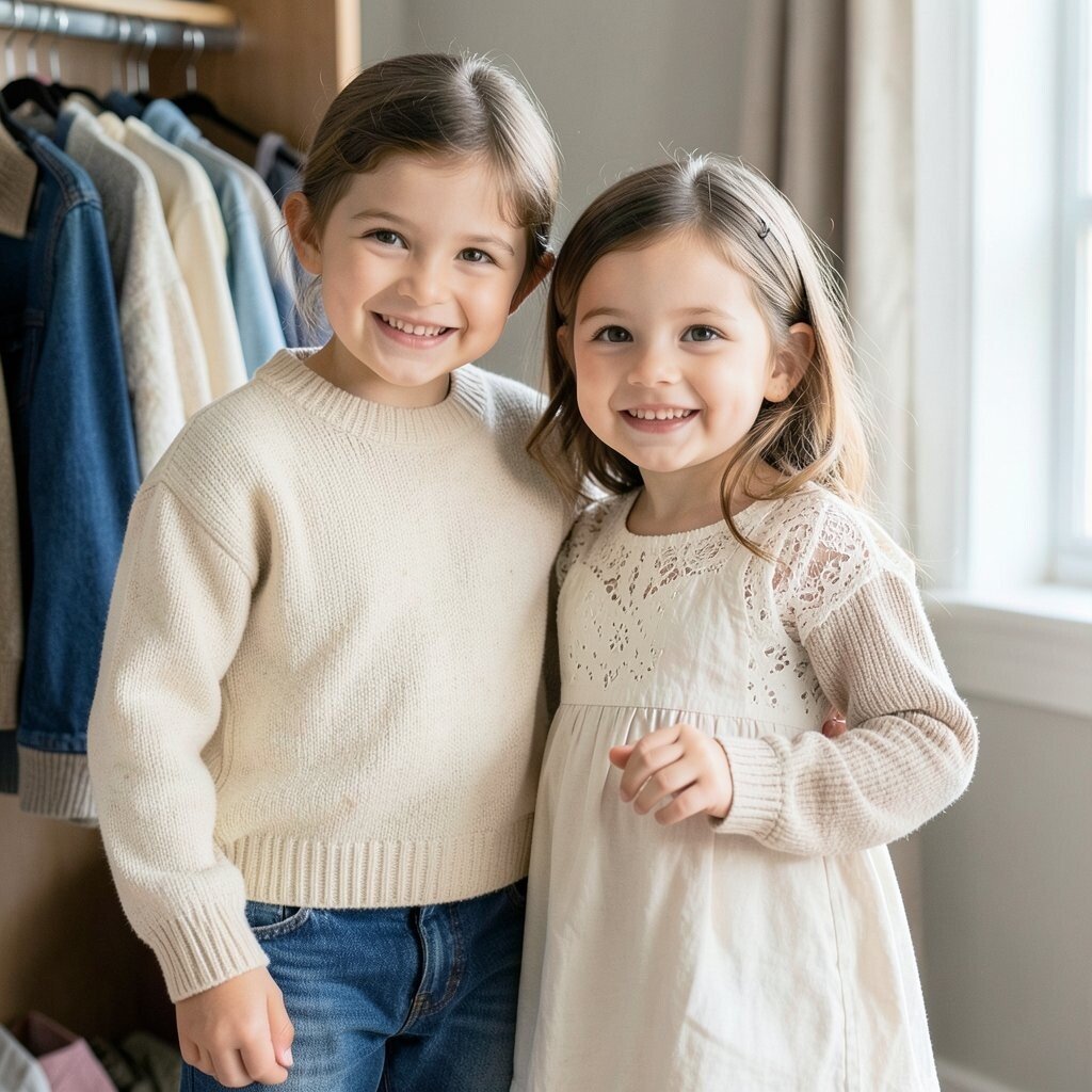
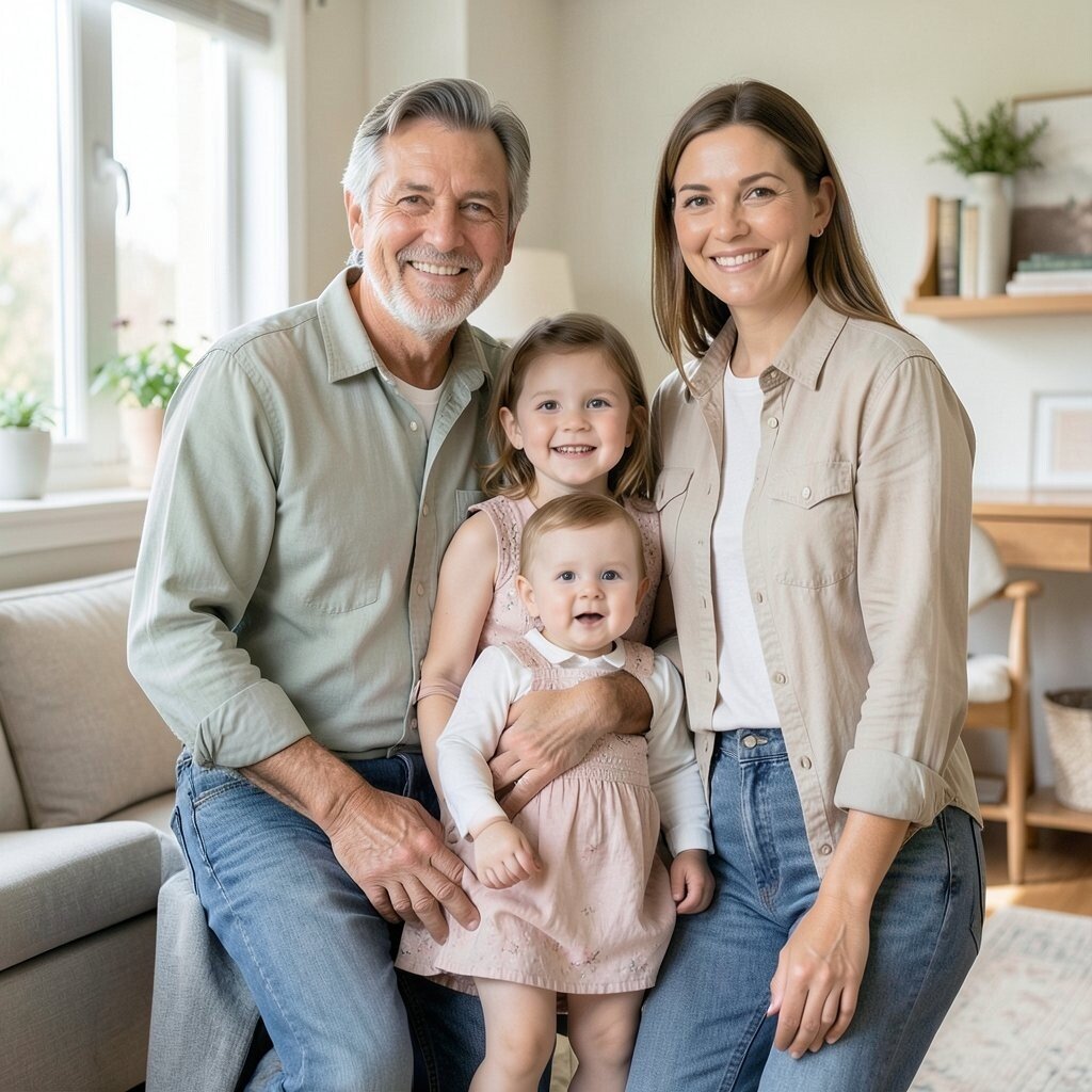
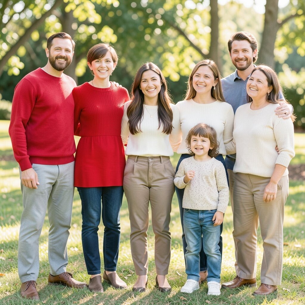
When everyone chooses clothes on their own, the photo can feel noisy and uneven. A simple color plan helps the whole group look calm and connected.
Think about two or three main colors and one soft accent. This keeps the image fresh, and it also makes each person feel included instead of squeezed into the same look. A shared plan can save money too, because family members can shop their closets before buying anything new.
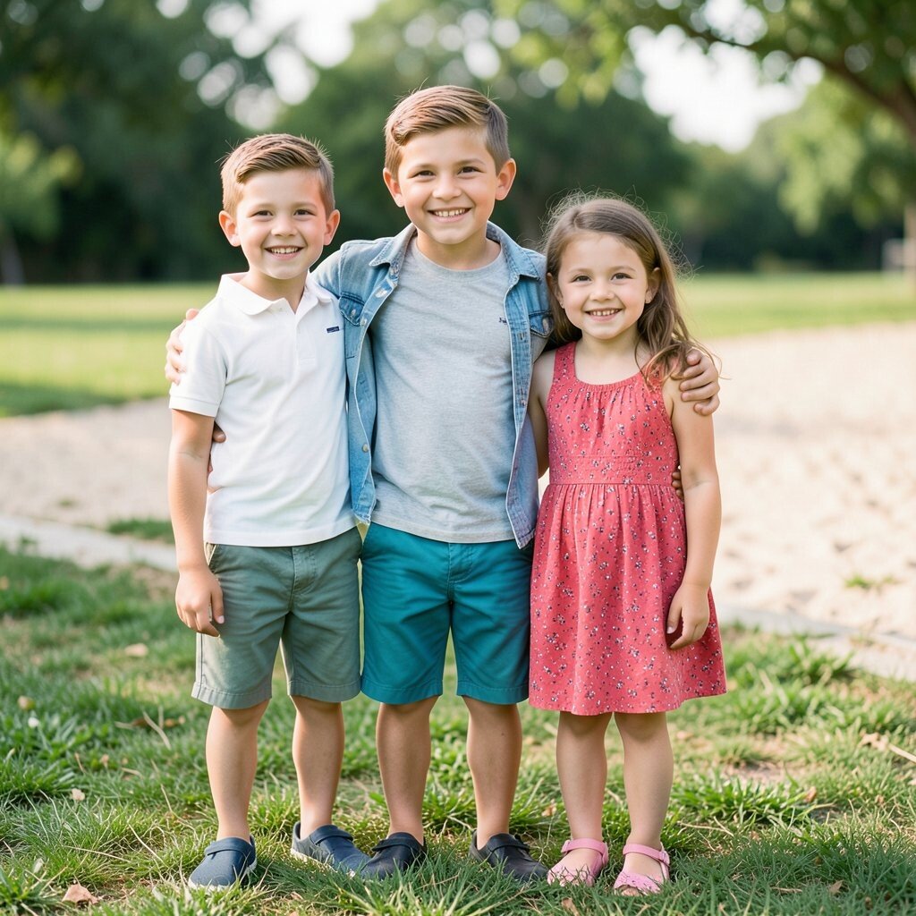
2. Wearing every bright shade at once

Bright colors can be fun, but too many strong shades fight for attention. The camera may show a lot of energy, yet the people in the photo can get lost.
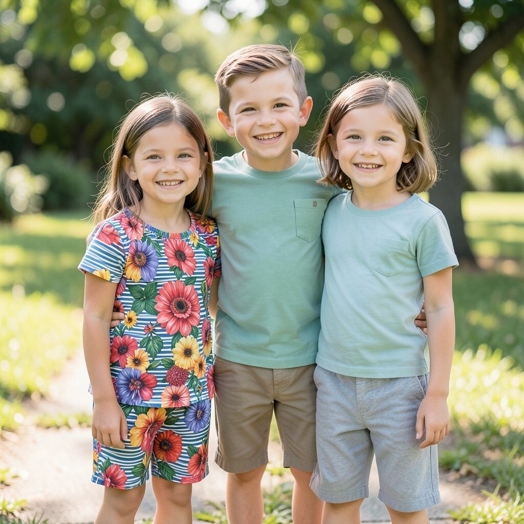
Choose one bold color and let the rest of the group wear calmer shades. That balance creates a cleaner look and gives the photo a modern feel. If one child loves neon sneakers or a vivid dress, use that as a small pop instead of building the whole outfit around it.
This trick also helps with cost, since you do not need a full set of new clothes in loud colors. Softer pieces are easier to reuse after picture day, which is great for busy families. Current style trends often lean toward rich earth tones, dusty blue, and soft green, because they feel lively without shouting.
3. Ignoring the background
A beautiful outfit can vanish if it blends into the wall, grass, or sand behind it. The setting should support the clothes, not swallow them up.
If the photo is outdoors, avoid shades that are too close to the leaves, sky, or dirt. For studio shots, think about the backdrop color before picking shirts and dresses. A little contrast makes everyone stand out in a clean and flattering way.
Matching the background can be useful when you want a quiet, dreamy look. But if you want faces and smiles to pop, a stronger contrast is better. Families who plan this well often get photos that look more polished without spending much extra.
4. Choosing colors that clash too hard
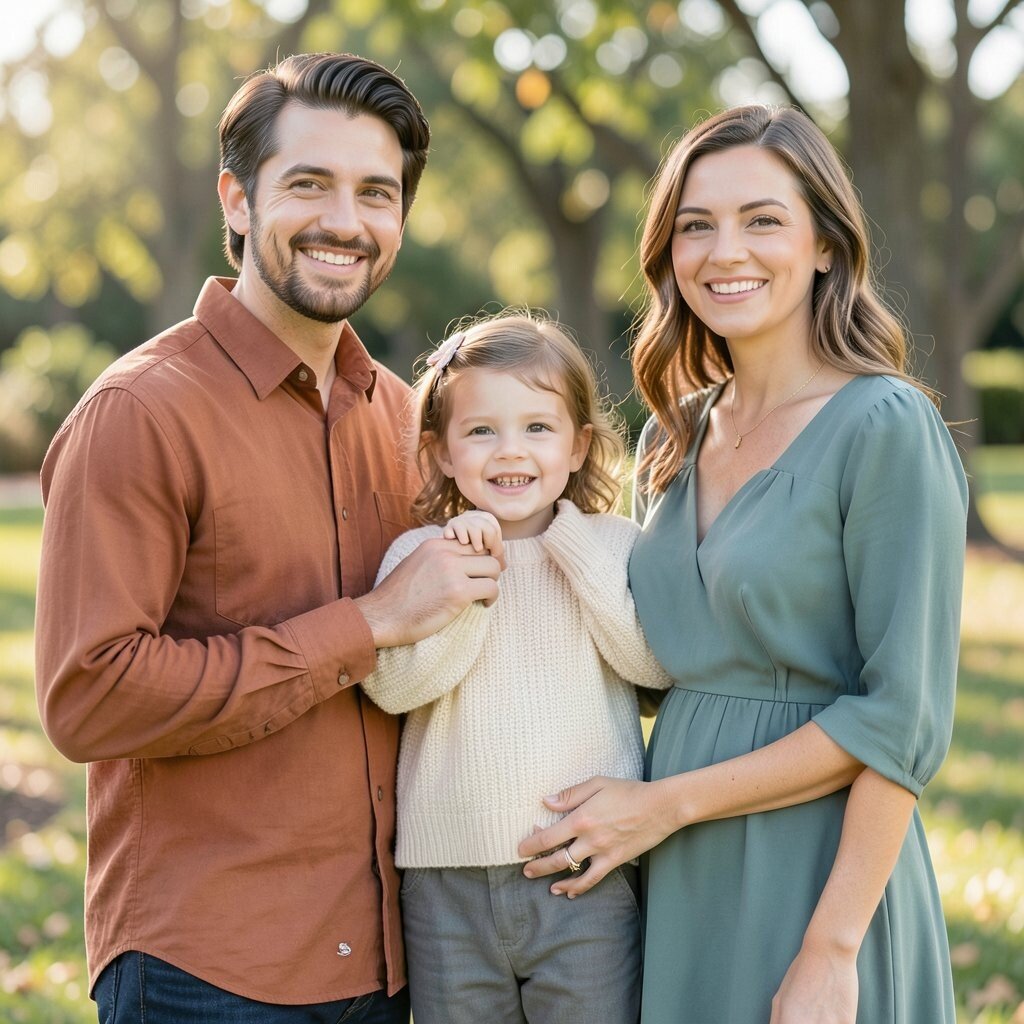
Some color pairs fight each other and make the whole image feel tense. Loud red next to neon green can look exciting in a bad way.
Try mixing warm colors with warm colors and cool colors with cool colors. This gives the eye a smoother path across the picture. If someone really wants a tricky shade, place it with softer tones so it feels special instead of sharp.
Unique outfits do not need to be wild to be memorable. A gentle rust shirt, a cream sweater, and a muted teal dress can look rich and personal. These choices often cost about the same as everyday clothes, so style does not have to mean a big bill.
5. Forgetting the season
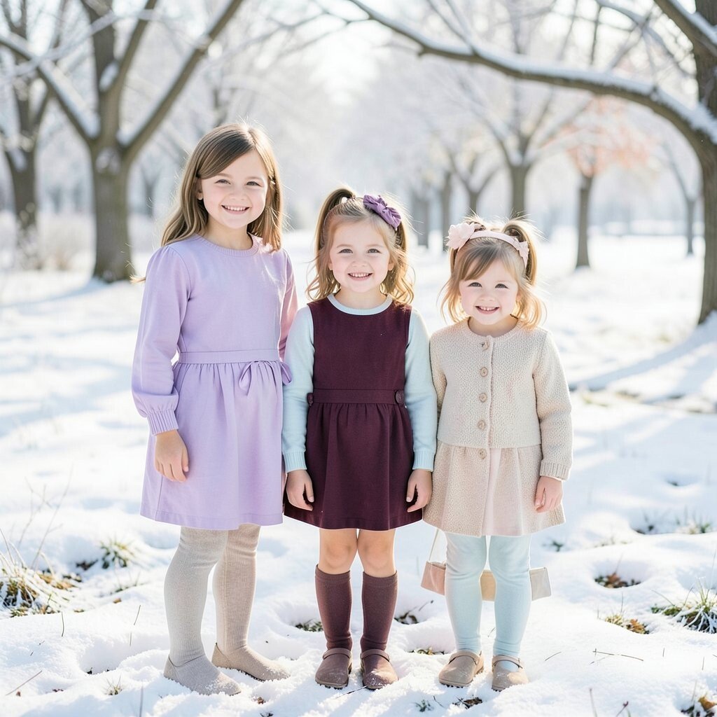
Colors that feel perfect in summer can look out of place in winter. Seasonal tones help the photo feel natural and in sync with the world around you.
Light pastels often shine in spring, while deeper tones can feel cozy in fall. Winter photos may look lovely with icy blues, deep burgundy, or creamy white. For summer, breezy shades like soft coral, light blue, and tan often look fresh and simple.
You can still be personal inside a seasonal palette. A child who loves purple can wear lavender in spring or plum in colder months. Seasonal colors also help families shop smarter, since many stores put out matching pieces that fit the time of year.
6. Using too much pure white
White can look clean and bright, but too much of it can wash out the picture. It may also show wrinkles, stains, and harsh light more than expected.
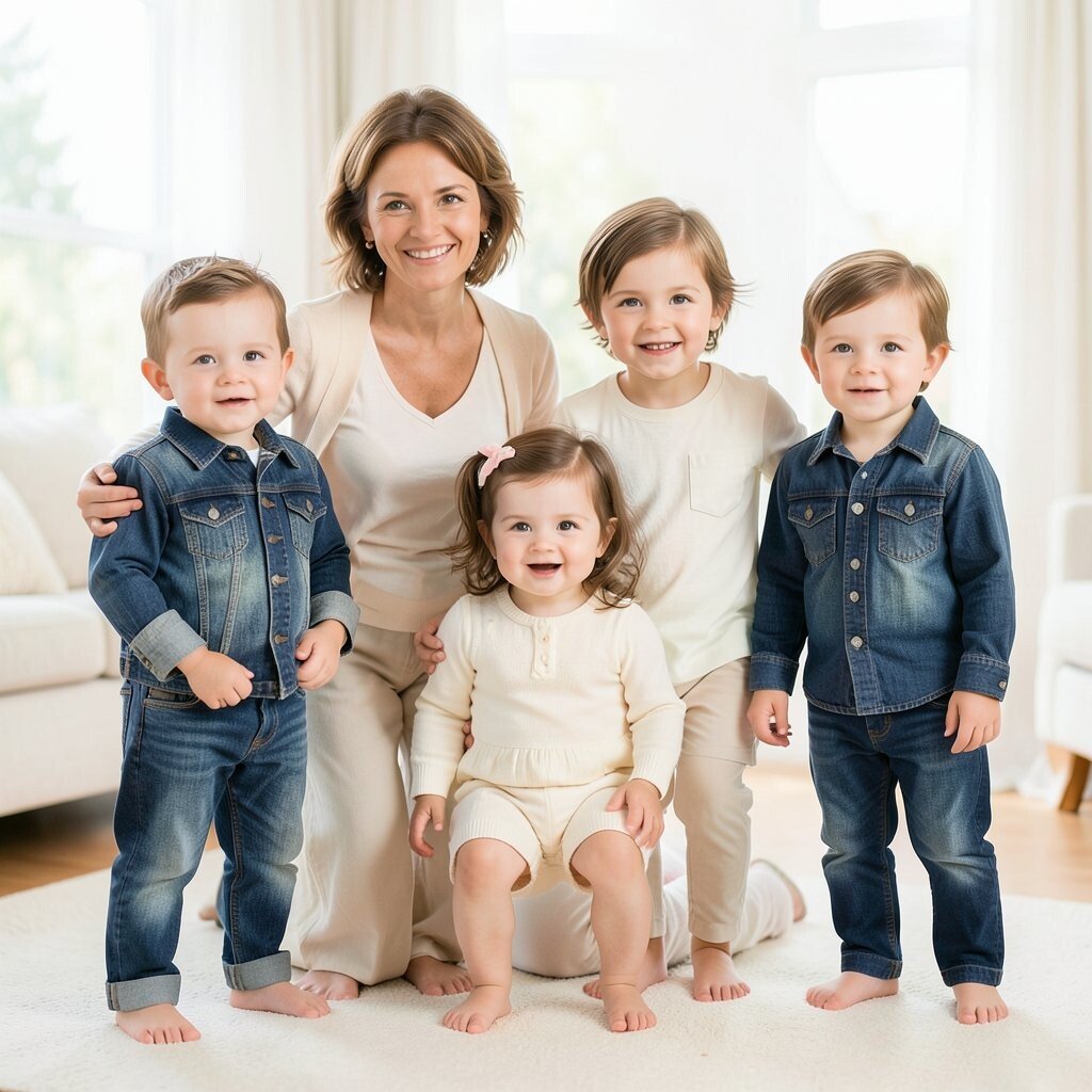
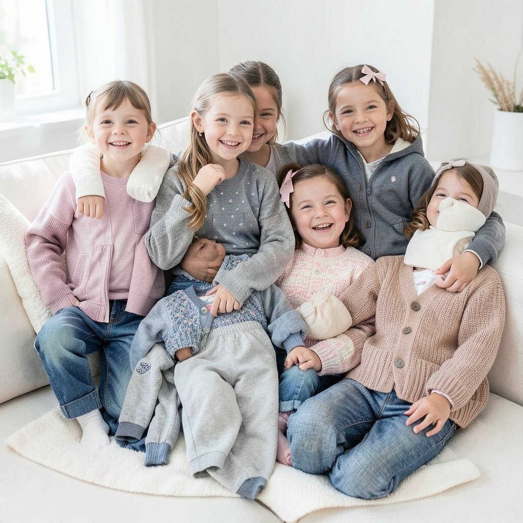
Off-white, cream, and ivory usually feel softer on camera. These shades still give that light, airy look without being so sharp. When mixed with denim, brown, sage, or navy, they create a calm style that feels easy and expensive.
Many families like white because it feels classic, yet it is often tricky in real life. Small children may spill on it, and that can raise stress before the session even starts. If you love the look, keep white as one part of the group rather than the whole story.
7. Wearing matching outfits that are too exact
Matching shirts can look sweet, but exact copies sometimes flatten the photo. The family may look more like a team uniform than a real group of people with different personalities.
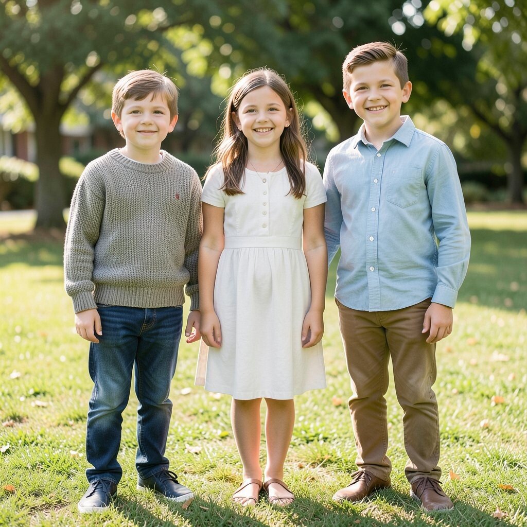
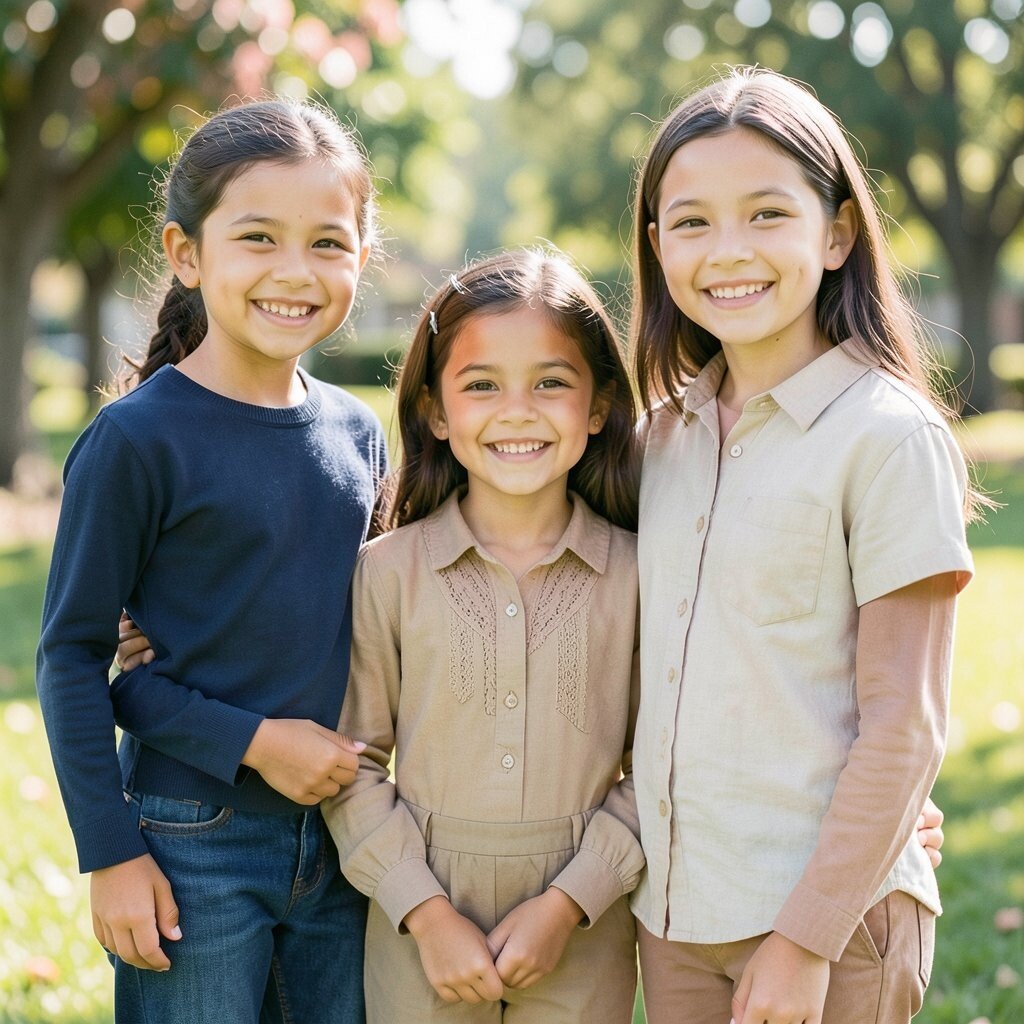
Instead, try the same color family with different textures and shapes. A knitted sweater, a cotton dress, and a button-down shirt can share a mood without looking identical. This gives each person a little space to shine.
That kind of variety is helpful for personal style and comfort. One child may hate stiff fabric, while another likes layers, so same-color pieces can solve both problems. It is also a smart cost choice, because you can pull from different closets and still look coordinated.
8. Forgetting about skin tones
Not every color flatters every face the same way. A shade that glows on one person may make another look tired or pale.
Hold clothing near each face in natural light before picture day. Warm skin tones often love earthy colors, while cool skin tones often pop in jewel tones or icy shades. The goal is not strict rules, but a look that makes everyone feel bright and happy.
Families with mixed skin tones can use a broader palette so everyone has a good fit. Soft navy, cream, olive, and dusty rose work well for many people. This kind of planning makes the whole photo feel more personal, and it helps each person look like themselves.
9. Choosing busy prints as the main focus
Large prints can pull the eye in every direction. Stripes, giant flowers, and loud checks may become the star instead of the faces.
One small print can work well if the rest of the outfits stay simple. Try placing prints on one person and keeping others in solids that match the same color family. That gives the photo texture and interest without making it feel crowded.
Smaller patterns often cost less and are easier to wear again later. They also make it easier to build outfits from pieces you already own. If a family member loves a print, use it as a highlight rather than the whole theme.
10. Wearing colors that are too dark for the mood

Deep colors can look elegant, but too much black or charcoal may make the photo feel heavy. The faces may also blend into the clothing if the light is low.
Try mixing dark colors with lighter layers to keep the image open. For example, navy with cream or dark green with tan can feel strong without becoming gloomy. Good balance gives the picture depth and keeps the smiles easy to see.
Some families choose dark outfits because they seem safe and simple. That can work, but adding soft colors gives the shot more warmth and life. It often costs nothing extra to swap in a lighter scarf, cardigan, or pair of pants from home.
11. Ignoring texture when colors are simple
Even nice colors can look flat if every outfit has the same smooth finish. Texture adds life and helps simple shades feel rich.
Try mixing knits, denim, lace, cotton, or corduroy within the same color plan. A cream sweater next to a cream dress can look far more interesting when the fabrics differ. This is a great way to create uniqueness without adding loud color.
Texture is also helpful when the family wants a soft, timeless style. It makes the photo feel layered and cozy, especially in close-up shots. Many texture-rich pieces can be found secondhand or already hanging in the closet, so the look does not have to be expensive.
12. Picking trendy colors that do not fit your family
Social media can make one color palette seem like the only choice. But a trend is not worth much if it does not feel like your family.
If a popular shade makes someone uncomfortable, skip it. Choose colors that match your home, your skin tones, and the place where the photo will hang. A personal palette often ages better than a fast-moving trend.
You can still use current style ideas in small ways. Soft sage, warm beige, faded denim, and dusty mauve are popular because they are easy to wear and easy to blend. The best outfit colors are the ones that look nice now and still feel right years later.
13. Letting one outfit color dominate the whole image
Sometimes one person shows up in a strong color that takes over the photo. That can happen when a dress is much brighter than everything else around it.
To fix this, spread color weight across the group. If one outfit is bold, give others medium tones that help balance the scene. This makes the photo feel steady and keeps the attention moving to every face.
A dominant color can still be beautiful if it is planned with care. A red sweater may look stunning beside soft gray pants and cream tops. The result feels lively, unique, and easy to enjoy without looking chaotic.
14. Forgetting the location style
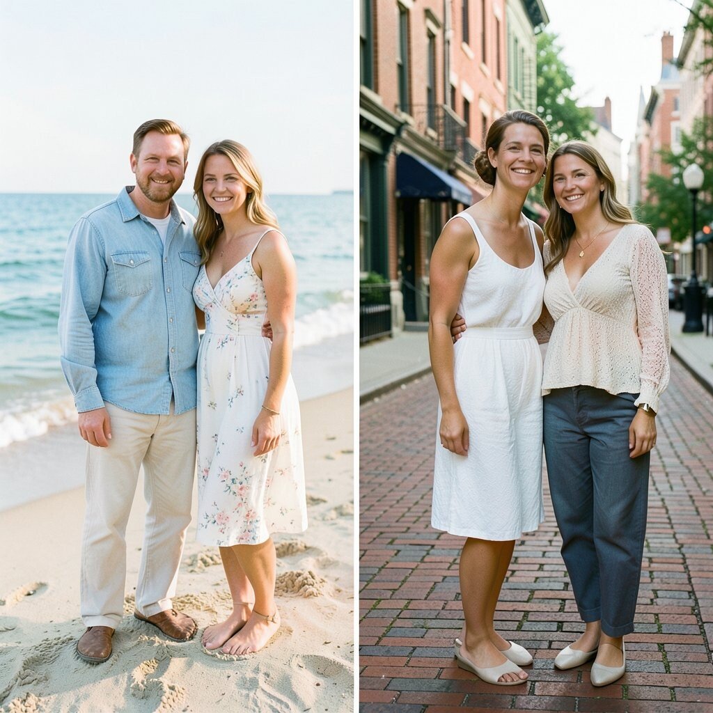
A beach photo and a city photo ask for different color moods. Outfits that fit the setting can make the whole image feel more natural.
Soft blues, sand, and white often look lovely by the water. Brick streets, parks, and old buildings may call for deeper greens, rust, and tan. Matching the location gives the photo a sense of place and helps it feel complete.
This can also help with planning because you can use the setting as part of your color guide. Families who think about location often need fewer clothing changes and less shopping. That saves time, money, and stress while still giving the photo a custom feel.
15. Skipping comfort in the name of color
If someone feels itchy, cold, or squeezed, it will show on their face. A pretty color means very little if a child keeps tugging at a shirt or a parent cannot sit well.
Choose colors after comfort comes first. Soft fabrics, easy fits, and weather-friendly layers help everyone relax and smile for real. Comfort also makes it easier to get natural poses and sweet moments.
Personal style matters here too, because happy people look better on camera. A child may light up in a favorite blue hoodie, while a teen may feel good in a simple olive dress. When clothes feel good, the photo gains warmth that no fancy color palette can fake.
16. Waiting until the last minute
Last-minute outfit picking often leads to random color choices. People grab whatever is clean, and the final mix can look rushed and uneven.
Start early and lay all the pieces together in good light. This gives you time to test colors, swap items, and fix problems before picture day. Early planning also helps with cost, since you can wait for sales or use clothes already owned by the family.
Ahead-of-time planning makes room for small personal touches too. A favorite hair ribbon, a cozy cardigan, or a special family color can be added without stress. That little extra care gives the photo a polished look and makes the whole group feel more confident.