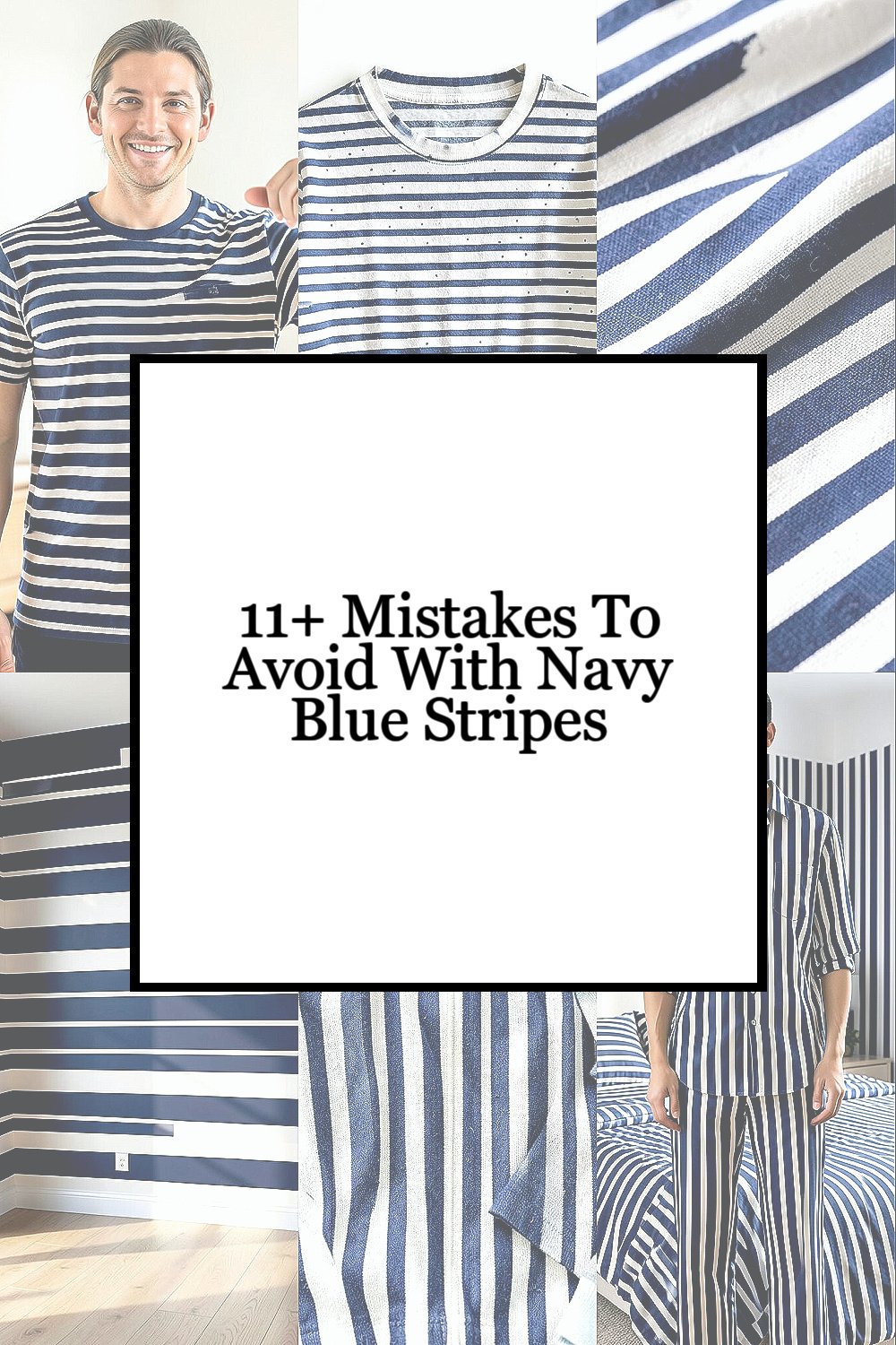
Dark stripes can look sharp or awkward fast. The difference often hides in tiny choices.
1. Picking the Wrong Stripe Width

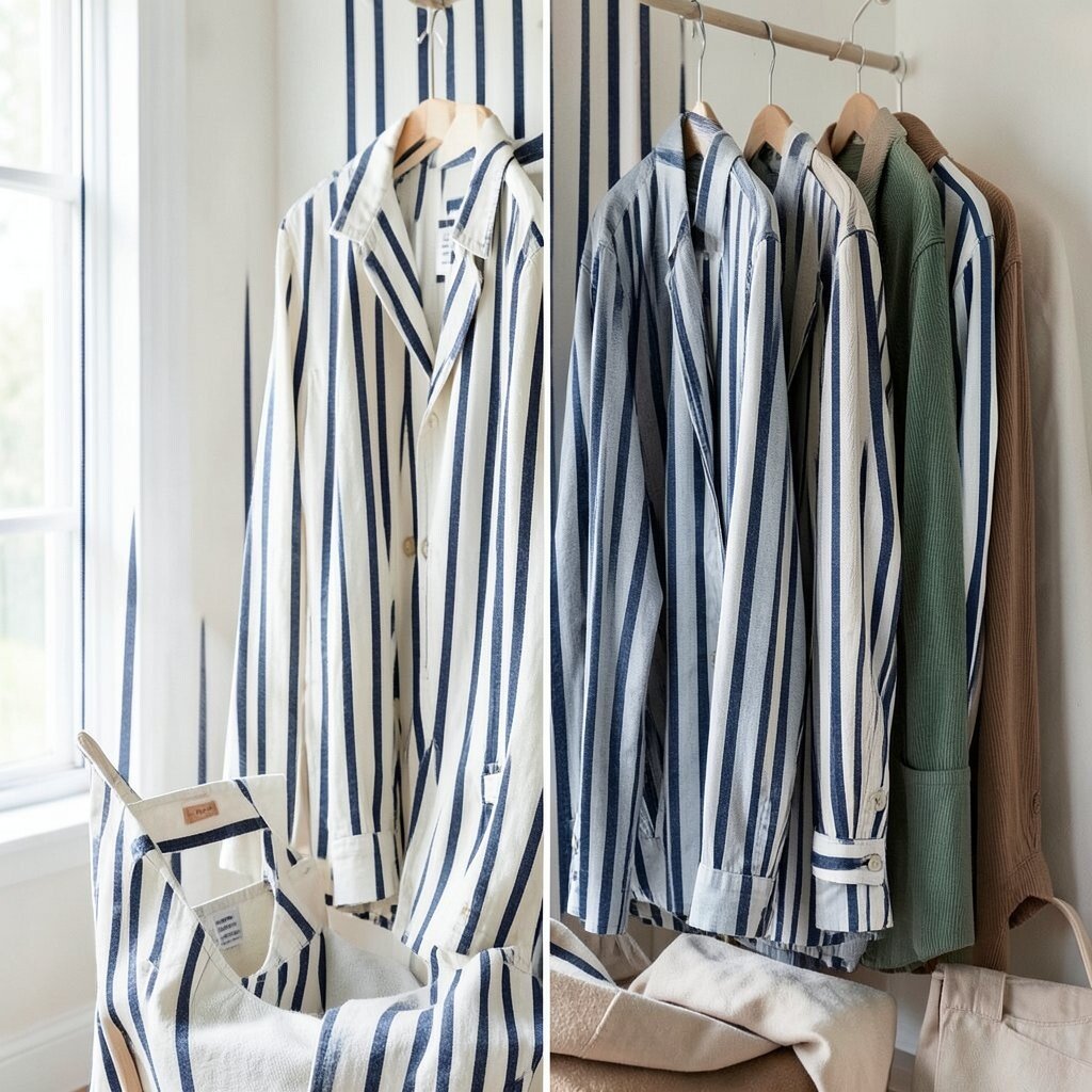
Very thin stripes can blur from far away, while very wide ones can feel loud and heavy. Navy blue stripes look best when the stripe width matches the item, the room, or the body shape they are meant to flatter.
For clothing, a medium stripe often gives a clean, classic feel that works in many settings. For home decor, stripe width can change the whole mood, from calm and tailored to bold and playful. If you want a safe path, test a sample, hold it at arm’s length, and see how the pattern reads in real light before you spend more.
2. Mixing Too Many Busy Patterns
Navy blue stripes already bring strong visual energy, so pairing them with loud prints can make the whole look feel crowded. The charm of stripes is their neat rhythm, and that rhythm gets lost when every surface is shouting at once.
One simple print can work if the colors stay quiet and the scale stays different. Try stripes with solids, soft dots, or a small check if you want a fresh look without chaos. This keeps the style unique while still feeling easy to wear or easy to live with.
Think about cost too, because a busy mix often leads to returns or extra shopping for pieces that “go better.” A more careful pairing gives you more use from each item and saves money over time. Current style trends still like pattern mixing, but the best looks leave some space to breathe.
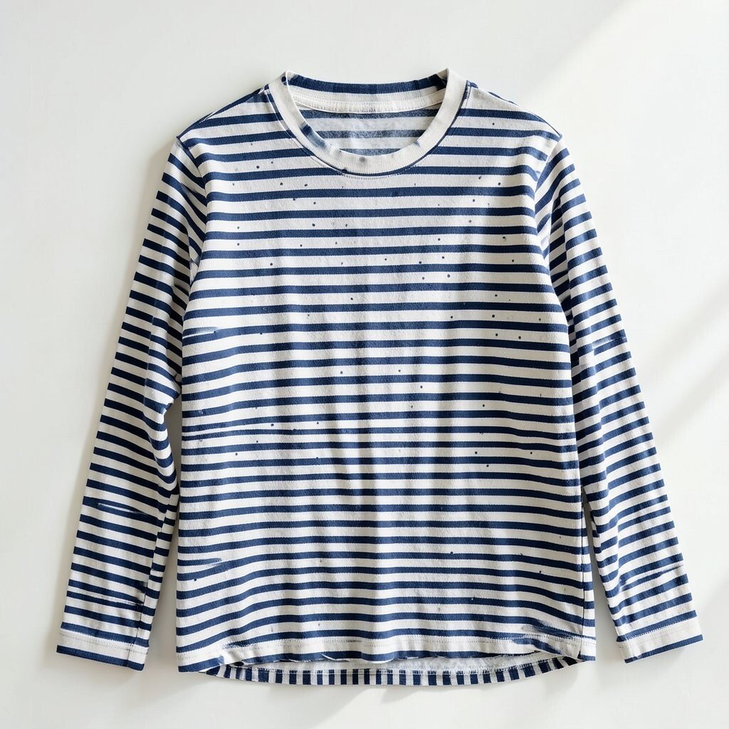
3. Ignoring Fabric and Texture
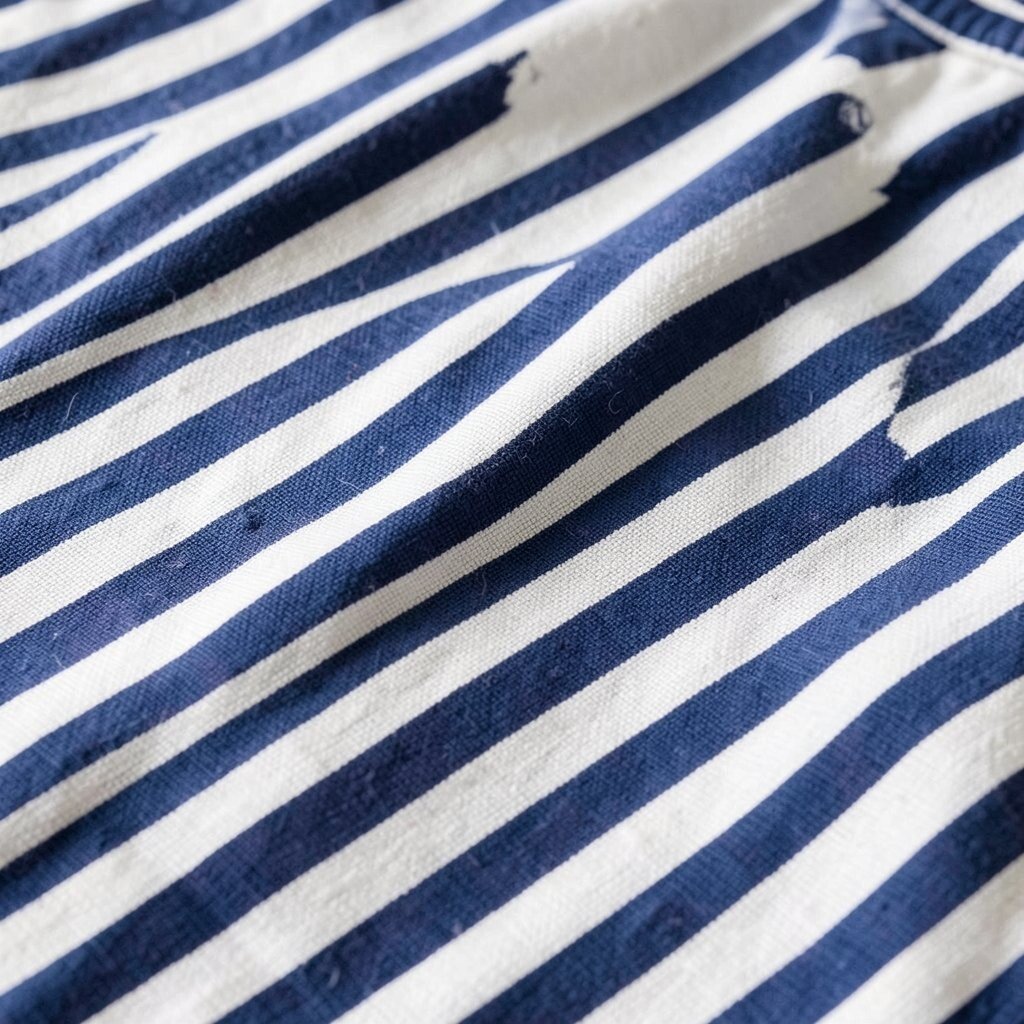
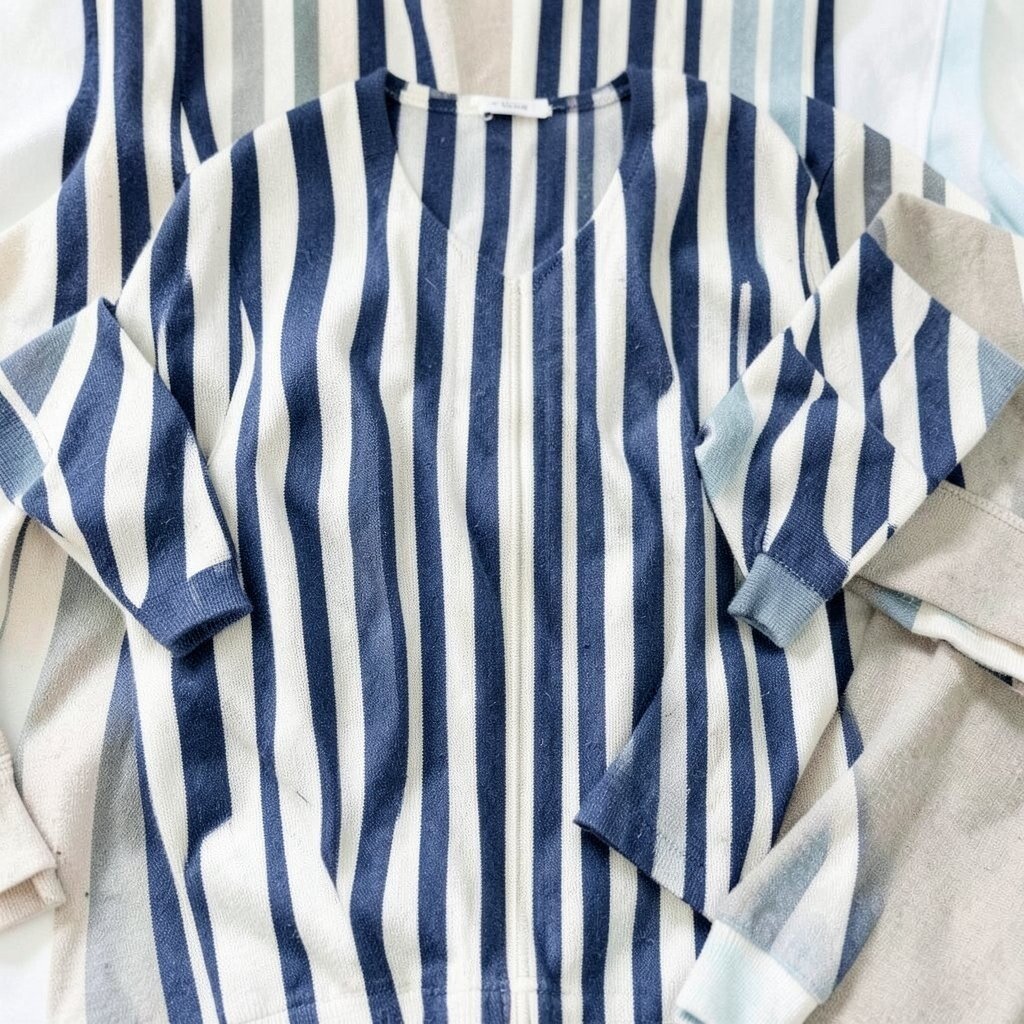
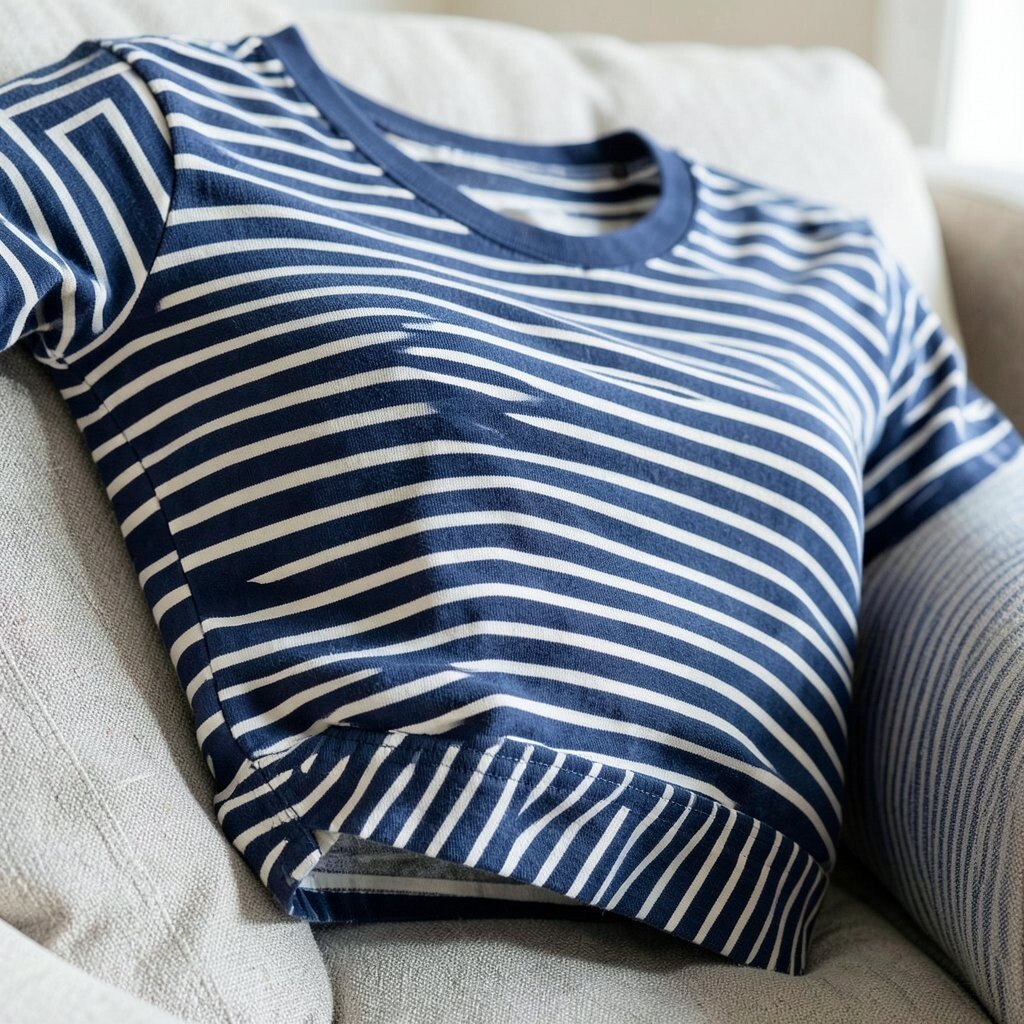
Navy blue stripes on crisp cotton feel very different from the same stripes on knit, linen, or canvas. Texture changes how light hits the lines, which can make the pattern look softer, richer, or more casual.
A smooth fabric can make stripes look clean and polished, while a rough weave can give them a relaxed, beachy feel. That means the same stripe design can serve many moods if you choose the right material. It also helps with personalization, since texture can make a common stripe pattern feel more like your own.
If you are shopping for clothing, check if the fabric stretches, wrinkles, or fades easily. Lower-cost pieces sometimes save money at first, but weak fabric can make the stripes lose their sharp look fast. For home use, a sturdy fabric may cost more, yet it often keeps the pattern neat for a longer time.
4. Forgetting About Scale in the Space or Outfit
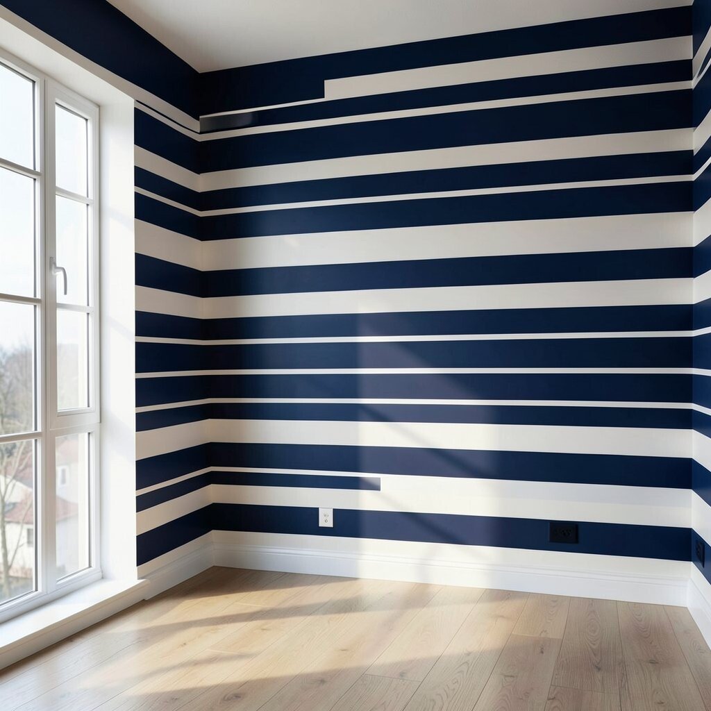
Stripe scale matters because small rooms and small frames can get swallowed by huge bands of navy. Large spaces and taller shapes can handle bolder lines, but even then the rest of the design needs balance.
In a room, wide stripes can make a wall feel dramatic, while narrow stripes can feel tidy and airy. On clothes, the same idea applies: the stripe size should support the shape, not fight it. A good match makes the whole look feel more natural and more flattering.
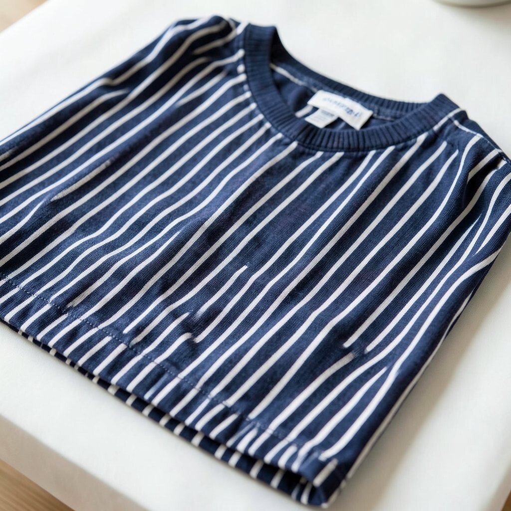
5. Using Navy Blue Stripes Without Enough Contrast
If the stripes sit too close to the background color, the pattern can fade into a dull block. Navy blue needs enough contrast to show its clean lines and give the design that crisp, stylish edge.
White is the classic partner, but cream, pale gray, sand, and soft sky blue can also work well. These combinations keep the look fresh and easy to style, which is why they stay popular in both fashion and interiors. If you want something more personal, try a stripe set with a small accent color in trim, pillows, socks, or accessories.
Before buying, compare the stripe color in daylight and indoor light, since navy can look deeper at night. A low-cost item may seem fine online but look muddy in person if the contrast is weak. Strong contrast usually gives better value because the pattern stays readable and sharp.
6. Wearing or Placing Stripes in the Wrong Direction
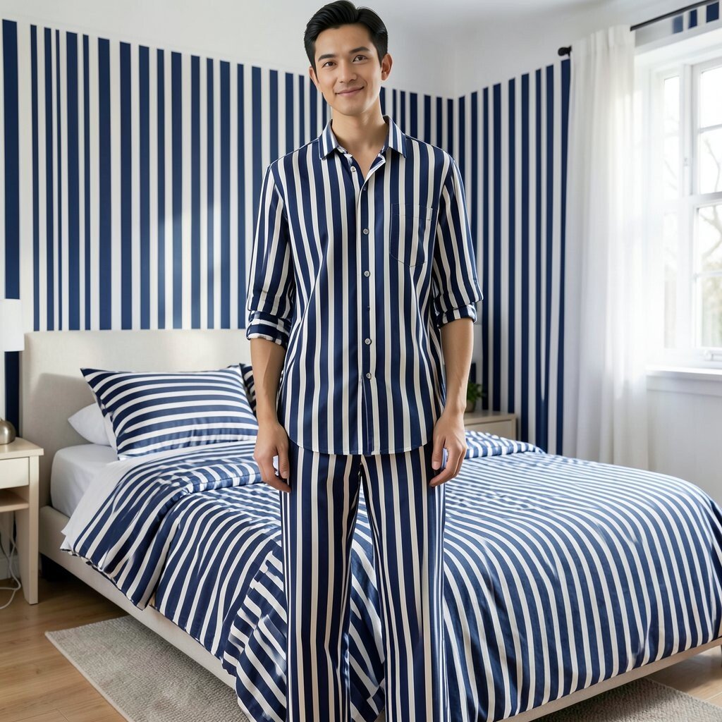
Horizontal and vertical stripes send different visual messages, and navy blue makes both feel stronger. The wrong direction can make a body line seem shorter or a room seem less open than you want.
Vertical stripes often feel taller and neater, while horizontal stripes can feel relaxed and wide. That does not mean one is always better; it means the choice should match the goal. If you want a room to feel taller, or an outfit to feel longer, direction becomes a simple but powerful tool.
Try to think about where the eye will travel first. On clothing, a stripe direction can highlight the shoulders, waist, or legs in a very clear way. On walls or bedding, it can guide the whole mood, so choose with care instead of guessing.
7. Choosing the Wrong Accessories
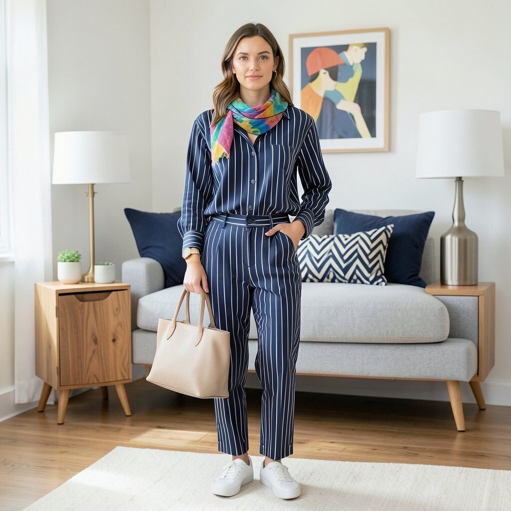
Accessories can lift navy blue stripes or make them feel messy and unfinished. The best extras support the stripe pattern instead of competing with it for attention.
For clothes, simple shoes, plain bags, and clean jewelry often work better than too many shiny details. For rooms, solid throw pillows, plain lamps, and natural wood can balance the bold line work. This kind of restraint gives the stripes room to shine and makes the look feel more expensive.
Personal touches still matter, so add one item that shows your style, like a bright scarf, a favorite art print, or a bold cushion. That single accent can turn a safe stripe look into something memorable. If your budget is tight, accessories are a smart place to spend less and still get a fresh result.
8. Overlooking the Mood of the Setting

Navy blue stripes can feel nautical, formal, playful, or calm depending on where they are used. The mistake is treating them like a one-style-fits-all choice when the setting changes everything.
A striped shirt at a summer party feels very different from striped drapes in a quiet study. The first may feel bright and friendly, while the second can feel steady and smart. That unique range is a big benefit, but only if the mood matches the moment.
Before you buy, think about the event, the room, or the daily use. A bold stripe may be perfect for a vacation look but too strong for a work outfit. A softer stripe may be better for everyday wear, especially if you want something easy to repeat.
9. Skipping Fit and Placement Details
Even a lovely stripe can look off if it lands in the wrong place on the body or object. A seam, hem, or corner that cuts the stripe badly can break the neat flow and make the item seem cheaper.
Look closely at how the lines meet at shoulders, sleeves, cushions, or furniture edges. Clean placement can make a simple design feel custom-made, which is a big win for uniqueness. When the stripes line up well, the whole piece looks more thoughtful and more polished.
If you are shopping online, zoom in on product photos and read the details about pattern matching. Better pattern placement may raise the price a little, but it often gives more value in the long run. For DIY projects, take time to mark and measure before cutting, because small mistakes show fast in striped designs.
10. Forgetting Seasonal Feel
Navy blue stripes can work all year, but some versions feel more suited to warm days and others to cooler months. Light fabrics and airy spacing give a breezy look, while heavier materials and tighter lines feel more grounded.
In spring and summer, navy stripes often pair well with white, tan, and soft blue for a clean, fresh mood. In fall and winter, they can look rich with gray, burgundy, forest green, or warm brown. This makes them a smart choice for people who want one pattern that can shift with the season.
If you want more use from one purchase, choose a stripe style that can move across seasons with small changes in accessories. That keeps cost down and makes your closet or room feel more flexible. Trend-wise, this kind of mix-and-match style is still very popular because it feels practical and personal at the same time.
11. Buying Without Checking Care Needs
Some navy blue stripes stay crisp after many washes, while others fade, shrink, or twist out of shape. Care matters because a pattern that looks great on day one can lose its charm very quickly if the fabric is hard to maintain.
Read the label before you buy, especially if the item is for daily use. Easy-care cotton blends, color-safe fabrics, and sturdy stitching can save time and stress later. That is especially helpful for busy families, renters, or anyone who wants style without extra work.
Cost can be tricky here, because the cheapest piece is not always the best deal. A slightly pricier item that keeps its stripe shape may last much longer and look better the whole time. If you want a personal touch, choose pieces you will actually use often instead of buying a stripe just because it looks good in the store.
12. Making the Look Too Predictable

Navy blue stripes can lean classic, but classic does not have to mean boring. The mistake is stopping at the safest choice and never adding one detail that makes the look feel alive.
Try a modern cut, an unexpected stripe angle, a mixed texture, or a small color twist to give the design its own voice. In a room, that might mean striped wallpaper with a bold chair; in clothing, it might mean a striped top with an unusual collar or sleeve shape. These little choices keep the pattern fresh and give it a style that feels personal instead of copied.
Even on a budget, you can make stripes feel new by changing how you wear or place them. A belt, a frame, a cushion, or a scarf can shift the mood without a big cost. The best navy blue stripe looks feel easy, useful, and a little surprising all at once.