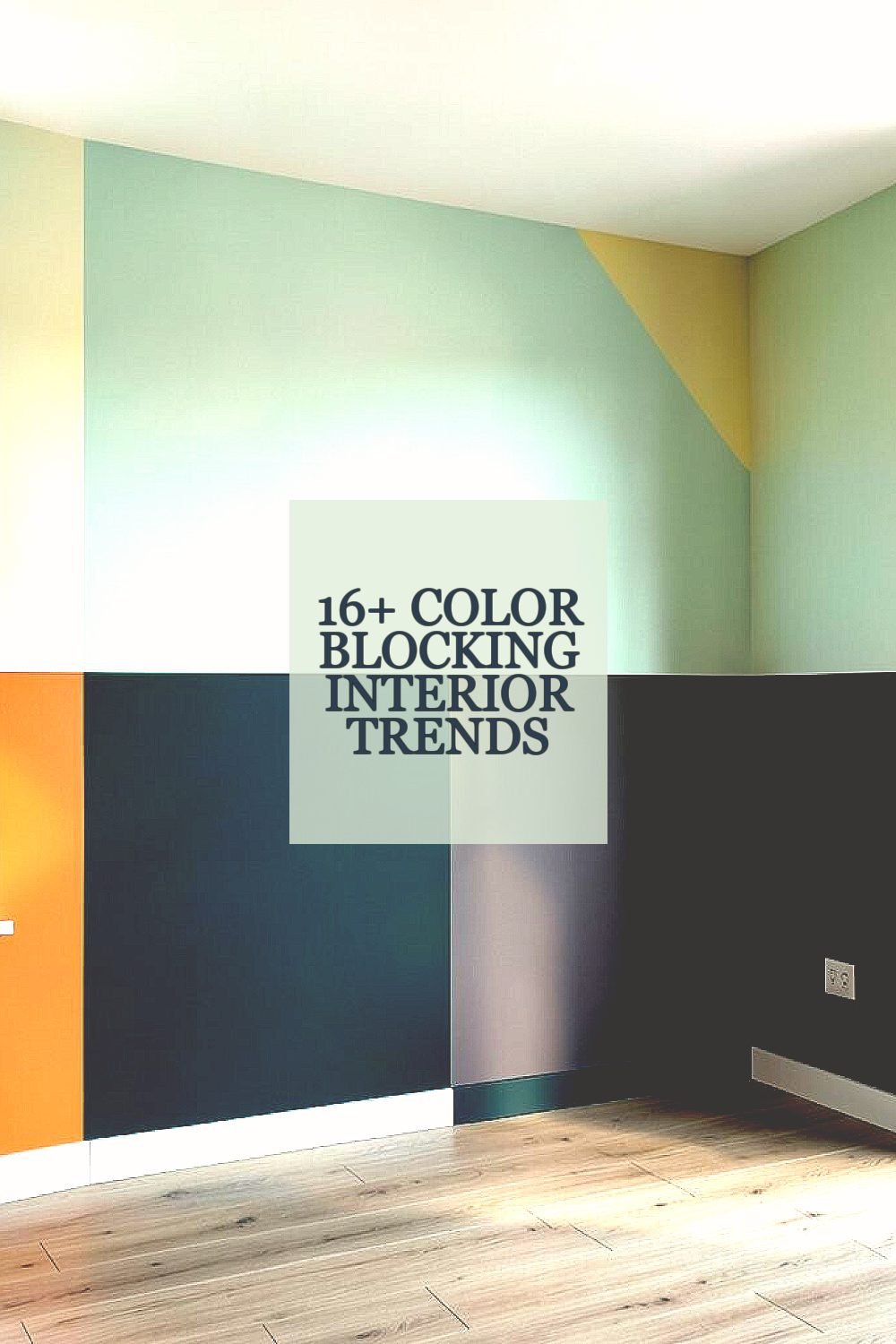
Bright spaces feel alive when color has a clear job to do. The trick is using bold blocks that guide your eye and shape your mood.
Here are fresh, practical interior trends you can use right away, with ideas that fit many budgets and styles.
1. Bold Two-Tone Walls With Sharp Edges
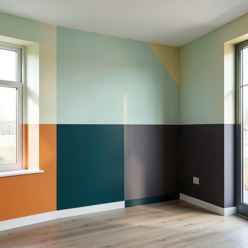
Start with a wall that splits into two strong colors, like a clean stripe that runs across the room. Pick shades that feel confident together, such as crisp white paired with a saturated teal or warm clay.
Keep the boundary sharp so the look stays crisp and modern. Use painter’s tape and a steady hand, then check the line from different angles before you commit. This style boosts brightness because light bounces off the lighter color, while the darker block adds depth. If you want it to feel personal, mirror the second color in a pillow, a vase, or a framed print.
2. Color Blocking Around Windows and Trim
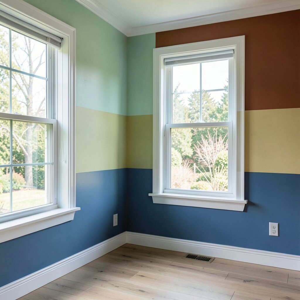
Wrap your window area in a mini color moment by painting the trim or the wall directly beside it. A soft neutral background with a bright band around the window makes the view feel more framed and intentional.
For a practical approach, choose one accent color and repeat it on chair rails, baseboards, or a single wall panel. This trend feels unique because it highlights the room’s architecture instead of fighting it. It can also reduce the need for heavy artwork since the trim already creates a focal point.
If you rent, use removable vinyl for a narrow accent, then upgrade later. When planning your palette, consider how daylight shifts through the day so the color doesn’t look dull in the morning or too intense at night.
3. Ceiling Color Blocking for a Bright, Lifted Mood
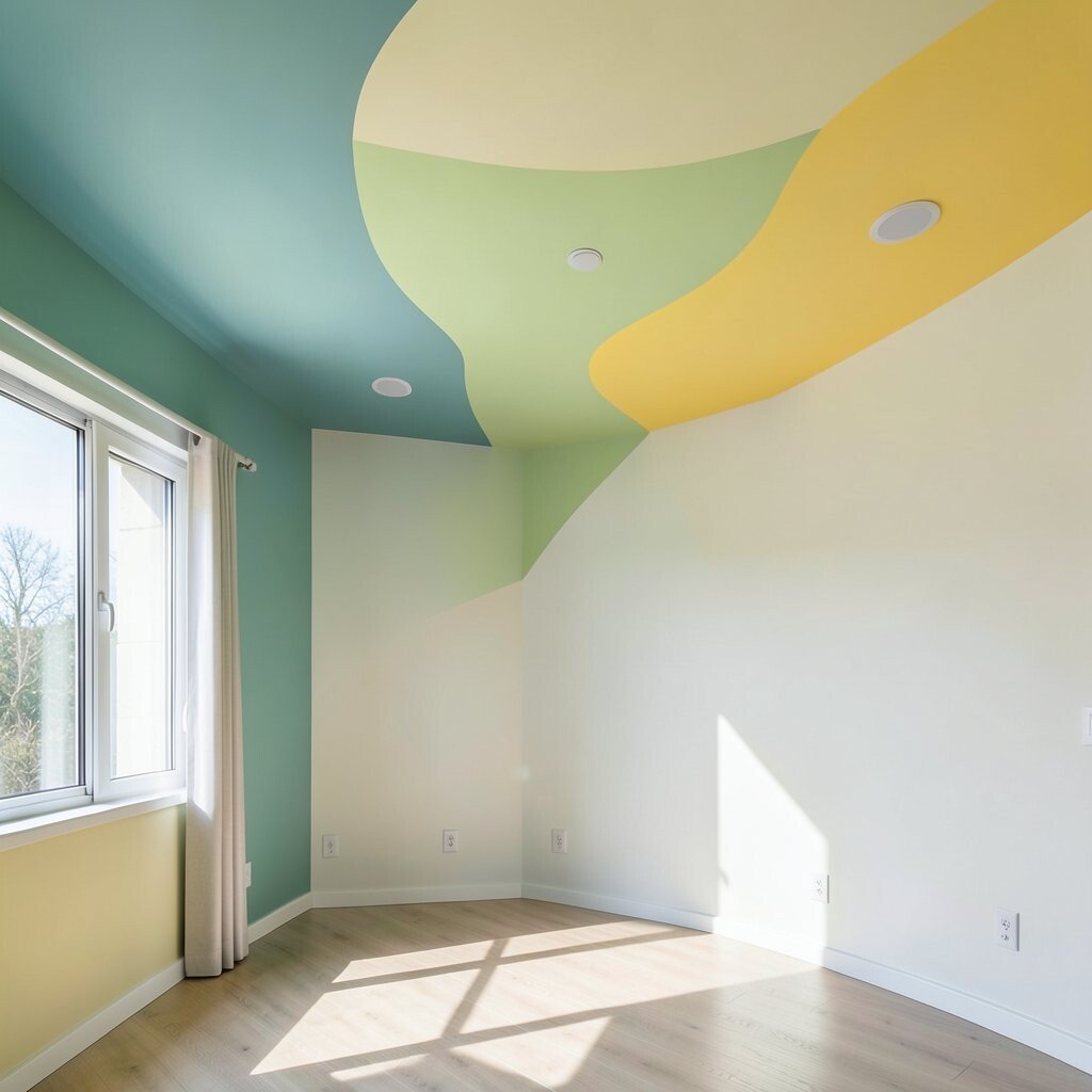
Painting part of the ceiling with a light, playful color can make a room feel higher and more cheerful. Even a narrow band can brighten the whole space by pulling attention upward.
Try a pale coral edge, a soft sage stripe, or a gentle sky tone that looks airy rather than heavy. This trend feels fresh because most people stop at the walls, and your ceiling adds a surprising layer.
For practical tips, use low-odor paint and cut in carefully so you get clean lines at the wall corners. Consider cost by using only one ceiling section, not the entire top, and you’ll still get a big visual payoff.
4. Geometric Floor Color Zones With Rugs
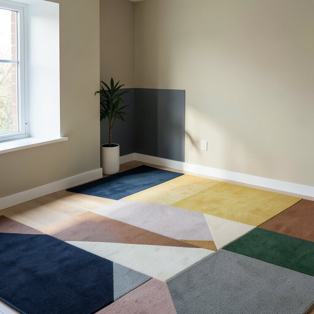
Instead of painting floors, create color blocking through rugs that act like zones. Place a patterned rug with bold blocks in the center, then layer a solid mat in front of it for a clean split.
Visual contrast helps the eye sort the room into “work,” “rest,” or “play” areas, especially in open layouts. This approach is practical, since rugs are easier to change than paint when your tastes evolve. If you want it to feel unique, choose one unexpected color block, like mustard next to ocean blue, and repeat it once elsewhere for balance.
5. Staircase or Hallway Steps Painted in Alternating Blocks
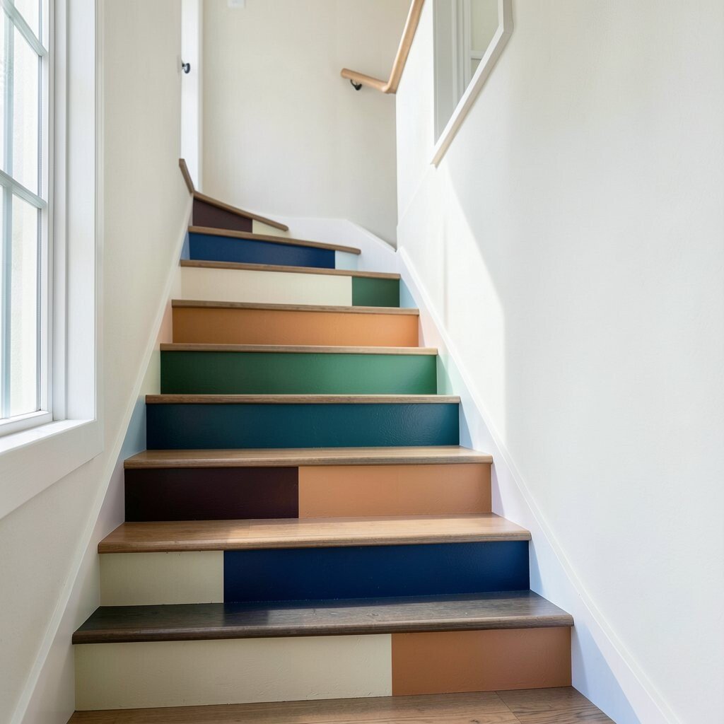
Make hallways feel less plain by painting stair risers or hallway sections in alternating color blocks. A bright set of accents along the route can turn everyday walking into something fun.
Keep the main walls light so the brighter blocks don’t overwhelm the space. This trend stands out because it uses motion and rhythm, guiding you through the home with color.
For personalization, repeat the pattern in a small way using a runner rug or a picture rail. When thinking about cost, remember that painting risers is a targeted project, so it can be cheaper than redoing every room.
6. Kitchen Cabinet Color Blocking With Two Finishes
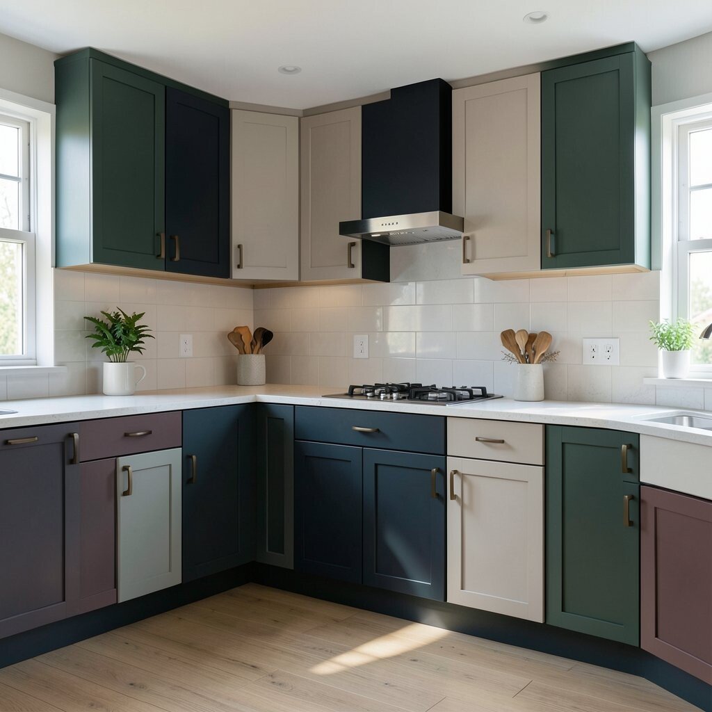
Color blocking in the kitchen can be as simple as mixing one bold cabinet color with a light base. Imagine glossy sky-blue uppers paired with warm white lowers, creating a clean visual line.
Choose finishes that fit your lifestyle, like durable semi-gloss for busy areas. This trend helps brightness because light-colored surfaces reflect more, and the bold section adds character without requiring a full makeover.
For practical steps, consider painting only one cabinet run first, or swap hardware to make it feel new. If you want to stretch your budget, focus on doors that show most often, then leave the less visible cabinets until later.
7. Accent Nook Panels for Reading or Entry Corners
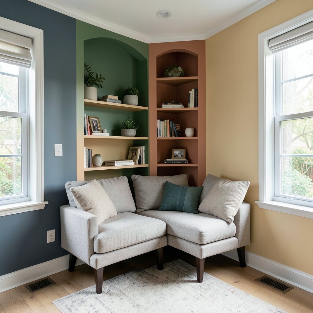
Turn a small corner into a bright focal point with a color-blocked panel behind a chair or a bench. A block of bright yellow on one section, balanced by a calmer tone on the next, can make the nook feel custom.
This trend is great because it works in small spaces where bold choices can still feel cozy. Use it to personalize your home by matching the palette to your favorite mug, artwork, or a throw blanket you already own.
For cost considerations, you can use peel-and-stick panels or pre-primed boards to keep the project manageable. If you’re nervous about color, test samples on the wall and check them under evening light.
8. Color Blocking With Built-Ins and Shelving
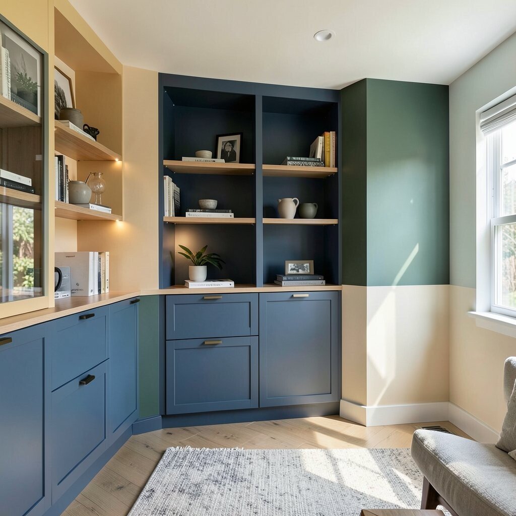
Built-ins can look sharper when you treat the compartments like a grid of color blocks. Paint the back panels in one bright shade, then let the shelves stay lighter or vice versa.
This creates a clean, modern look while also making it easier to style your items. Visual contrast helps books and decor pop, which means your shelves look curated even when they’re not perfectly styled.
Try using two complementary colors so your collection of objects feels organized instead of chaotic. For practical personalization, keep the color scheme consistent with your living room accent so the whole home feels connected.
9. Fresh Front Door and Entry Wall Blocks
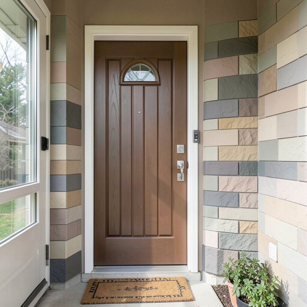
Your entry is the first bright moment guests see, so it’s a great place for color blocking. Paint one entry wall in a warm tint and add a bold rectangular panel beside the door or above a console.
This style feels unique because it turns a simple entry into a “welcome” sign without needing extra clutter. Bright spaces benefit from this because the entry wall can bounce light inward from the doorway.
For practical tips, pick a paint finish meant for wear, like semi-gloss for areas that get touched often. If you want a lower cost option, use a removable mural or temporary wall decals for the block shapes while you decide on the final palette.
10. Sectional Sofa Backdrops With Wall Blocks
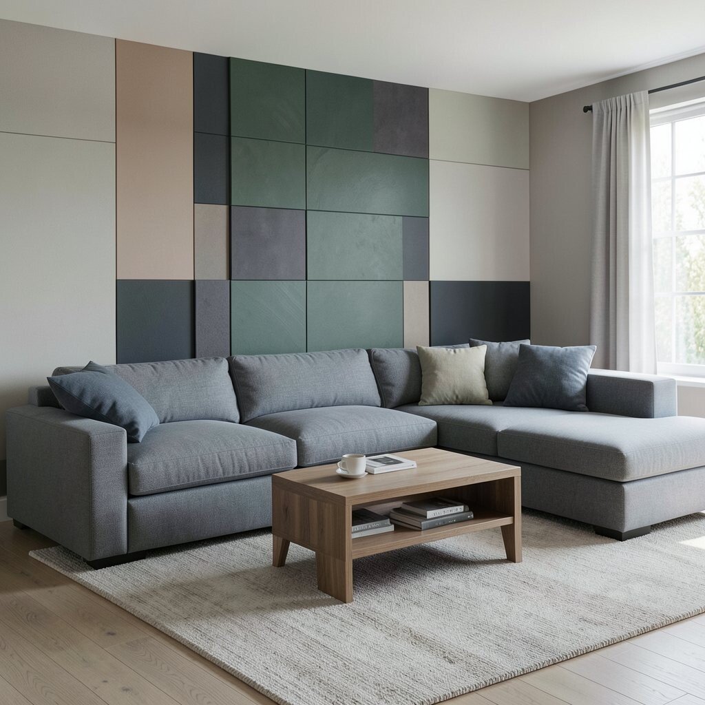
Use the wall behind a sofa like a stage set for color blocking. A wide block behind the back cushions makes the whole seating area look anchored, especially in bright living rooms.
Choose a color that complements your upholstery rather than matching it exactly. This trend adds uniqueness because it changes the room’s “shape,” making the sofa feel more like a designed piece than a default one.
For personalization, pull one block color into a throw or curtain trim, so everything ties together. If cost is a concern, you can repaint one wall instead of changing furniture, and the visual impact still feels big.
11. Bedroom Accent Wall With Layered Color Blocks
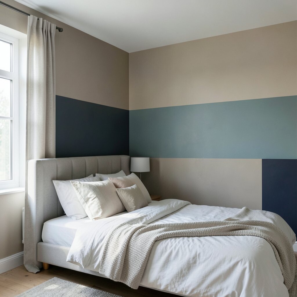
A bedroom can still be bright while using color blocking for calm focus. Try a layered effect with three tones, such as a soft base wall plus two stacked accent blocks in muted shades.
This trend is practical because bedrooms often need a focal point that’s not too busy. The layered approach also helps you balance bold color with rest, since quieter shades keep the room relaxing.
12. Bathroom Color Blocking With Easy-Wipe Paint Zones
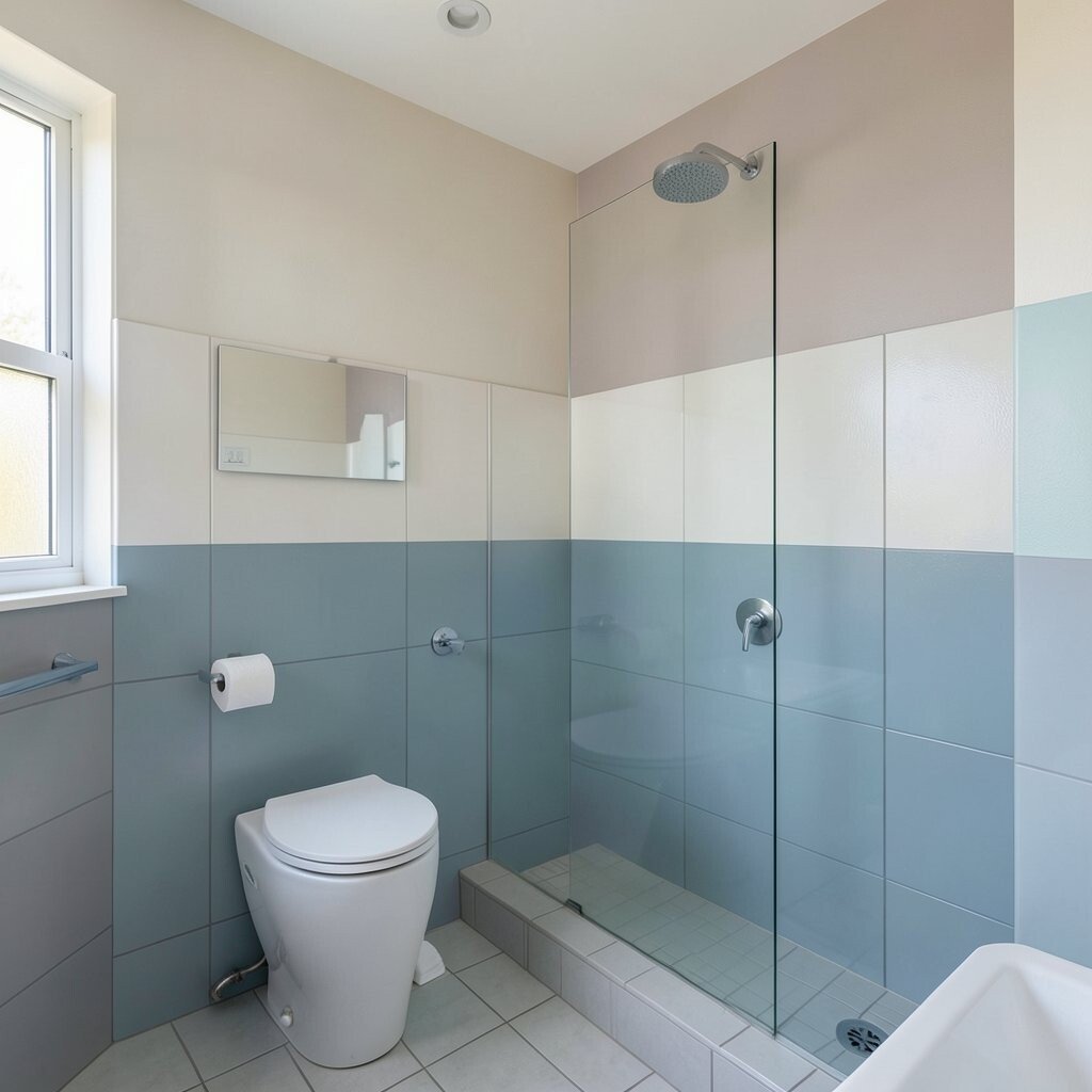
Color blocking works surprisingly well in bathrooms because the space already feels designed for bright clarity. Paint a bright horizontal block behind the vanity or a vertical block beside the mirror so it frames your routine.
Because bathrooms need easy cleaning, choose moisture-resistant paint and seal the edges carefully. Visual contrast makes mirrors feel brighter too, which is a real daily benefit on sleepy mornings.
For personalization, repeat the color in towels or a shower curtain accent strip. If you want to keep costs down, paint only around the vanity and skip the far walls.
13. Color Blocking With Wallpaper Panels in Bold Shapes
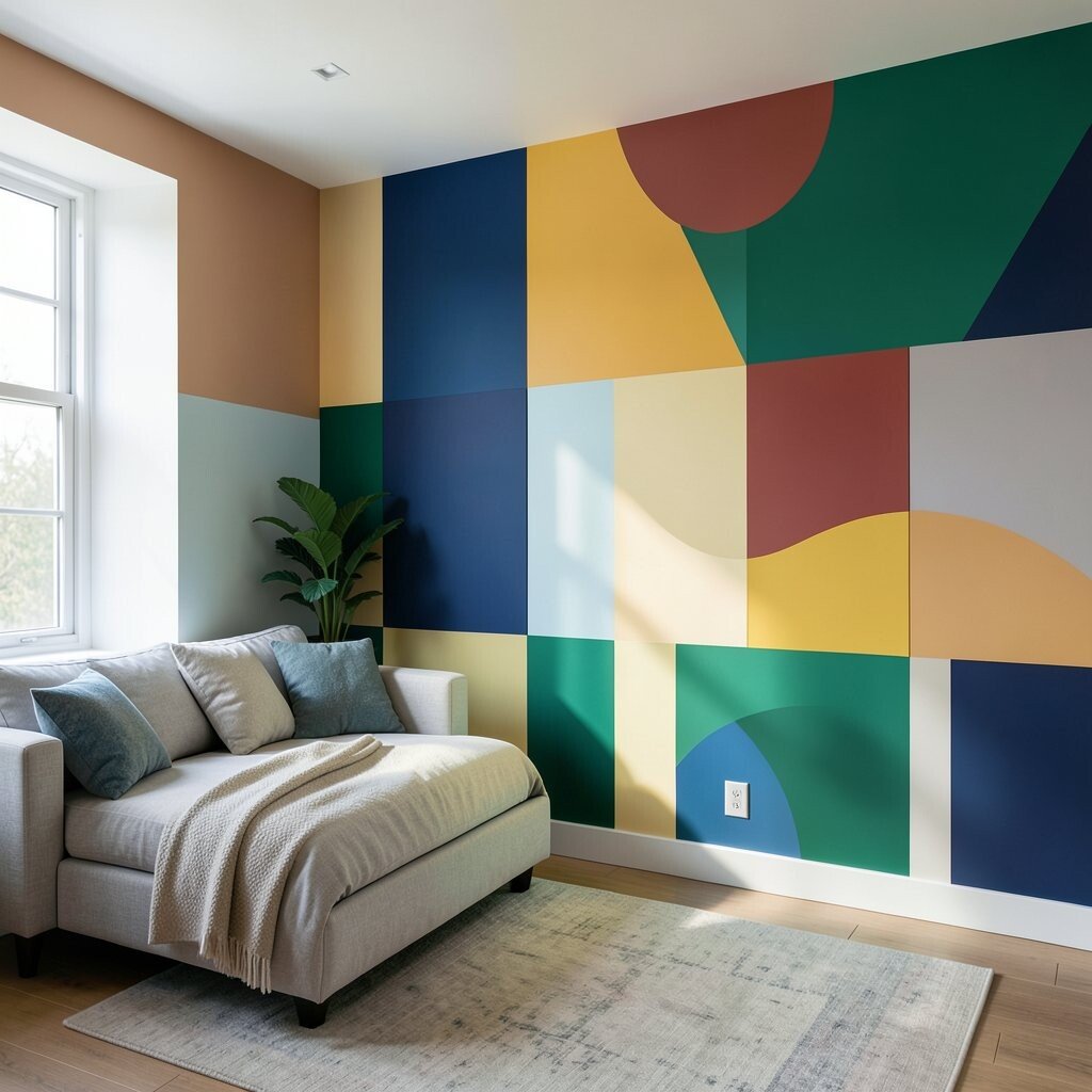
Wallpaper gives you instant color blocks without waiting for multiple paint coats. Choose a bold geometric or solid-block design, then cut or frame sections so they look like planned color zones.
This approach feels unique because you can mix patterns with clean edges while keeping the overall palette bright. It’s also practical if you want texture, since wallpaper adds depth that paint alone can’t match.
To personalize, match one wallpaper block color to your curtains, and repeat another in framed art. Consider cost by limiting wallpaper to one wall panel or behind a desk, where it creates the most impact.
14. Outdoor-to-Inside Palette Blocking With Sunlit Colors
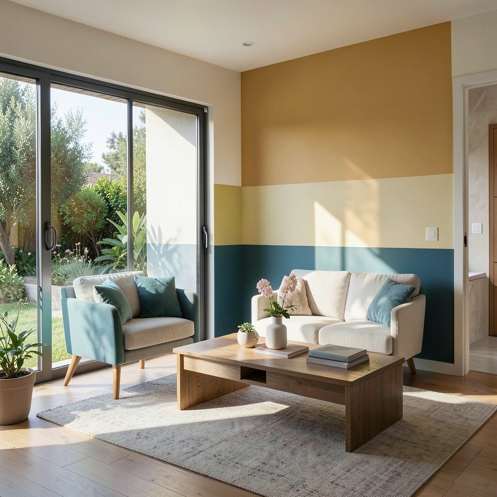
Borrow colors from daylight and nature to make bright spaces feel grounded. Think lemon, sky, terracotta, or fresh mint as color blocks that echo what you see outside.
This trend brings calm energy, and it helps rooms feel optimistic without needing heavy decor. For practical personalization, choose colors that match your home’s exterior trim or landscaping tones, so everything feels connected.
If you’re watching your budget, pick one main accent and keep everything else neutral. Then use small accessories like plant pots, a lamp base, or a candle holder to bring the palette together.
15. Dining Area Color Blocking With Statement Panels or Sideboards
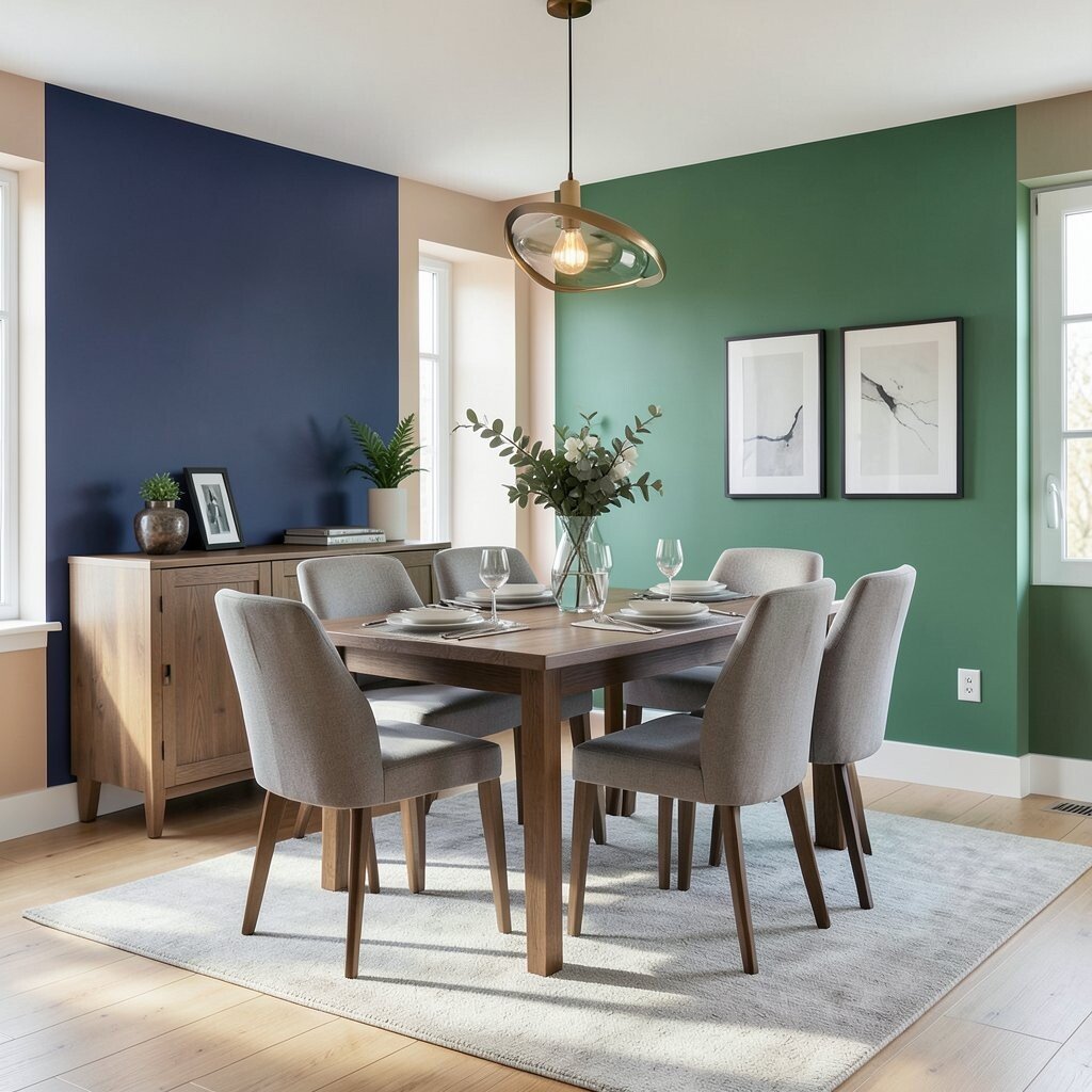
In dining rooms, color blocking makes meals feel more special. Paint the wall behind the table with a large block, or add color through a sideboard painted in a bright solid shade.
This helps define the dining zone, especially in open-plan homes where the kitchen and living area blur together. Visual contrast also boosts brightness by reflecting light across dinner surfaces and glassware.
For practical tips, keep the chair color neutral and let the block do the talking. If you want a cost-effective upgrade, repaint a sideboard or update cabinet fronts instead of replacing the entire dining set.
16. Laundry and Utility Rooms With Cheerful Task-Friendly Blocks
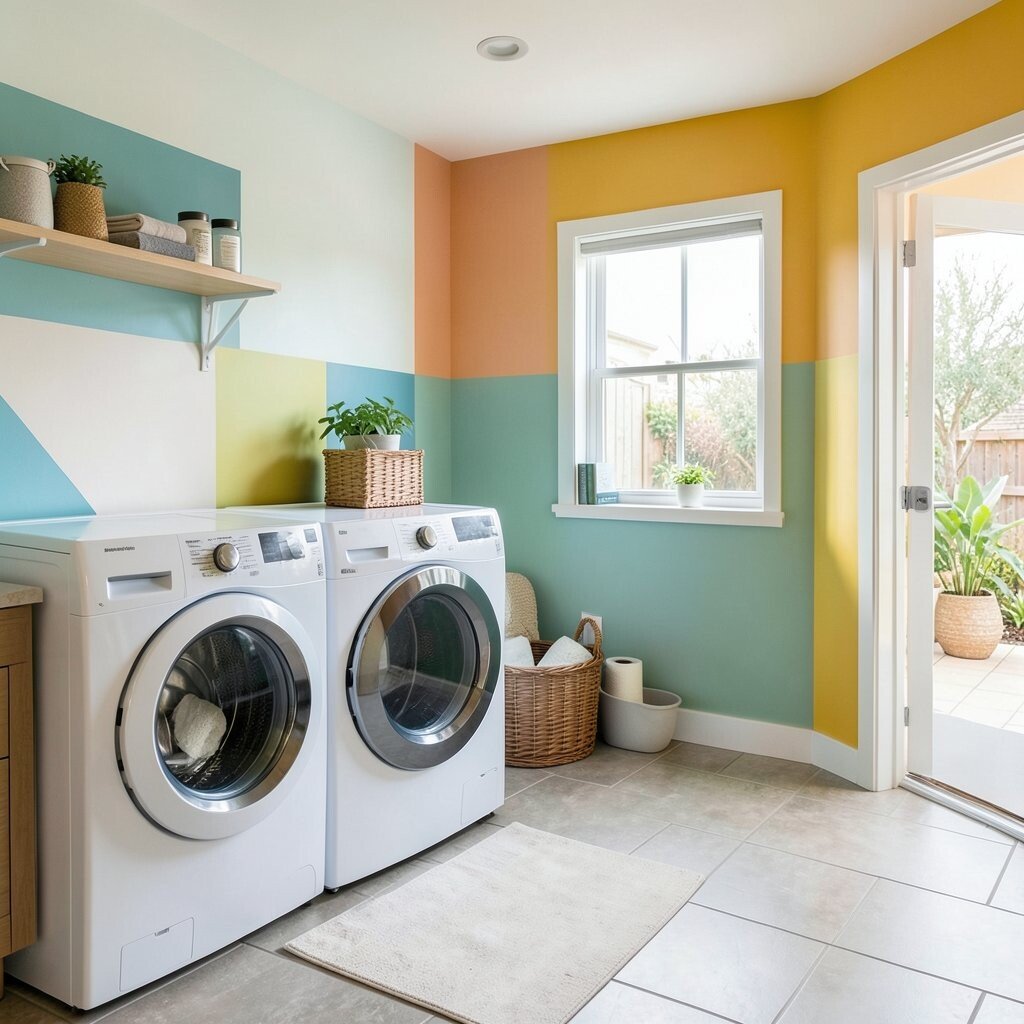
Laundry rooms can look and feel lighter when you add bright blocks where you need clarity. A color stripe near shelves or hamper storage makes sorting feel less annoying and more organized.
This trend is practical because it supports everyday tasks with visual cues. It also adds uniqueness, since utility spaces rarely get the same design love as living rooms.
To personalize, choose one playful accent that matches your everyday supplies, like a coordinating laundry bag or a bright clock. For cost considerations, focus on painted areas near eye level and use simple organizers so the color looks intentional, not random.
17. Mixing Color Blocking With Minimal Decor for Maximum Light
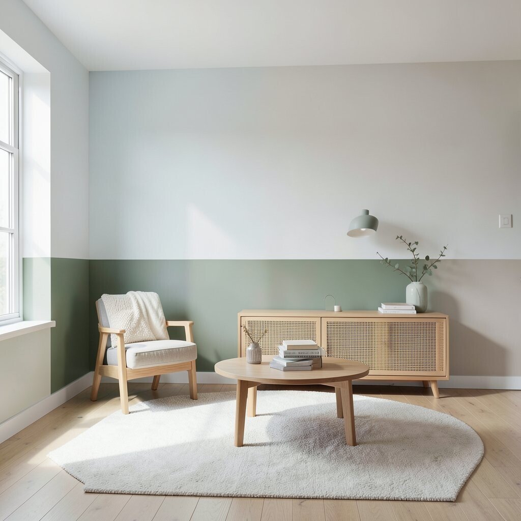
If your home already has lots of brightness, you can keep the decor light and let the color blocks lead. Use one or two bold blocks per room, then style with minimal shapes and open space.
This trend benefits you by keeping the room calm while still looking design-forward. The visual uniqueness comes from contrast between bold color and clean surfaces, which makes everything feel crisp instead of cluttered.
For personalization, pick a signature color you love and repeat it across small items like frames, vases, or cabinet knobs. If you want to control cost, start with one room and one wall, then build from there once you see how you feel in the space.